> ## Documentation Index
> Fetch the complete documentation index at: https://docs.digifist.com/llms.txt
> Use this file to discover all available pages before exploring further.
# Trust Indicators
> Display key brand promises and trust-building messages with icons and customizable layouts.
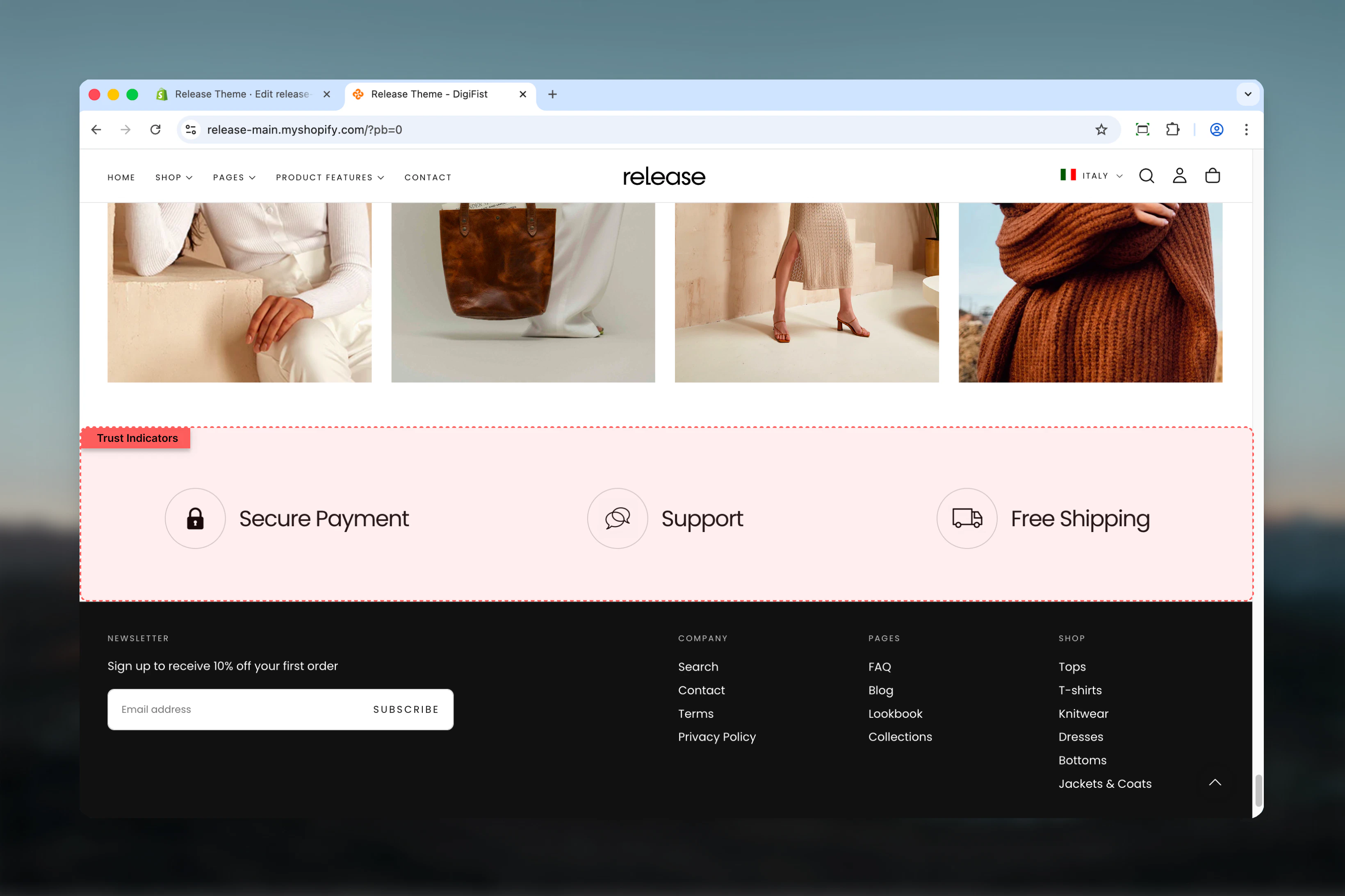
The Trust Indicators section displays key brand promises, service highlights, or trust-building messages in a visually engaging format. It supports icons, text content, and optional links to provide customers with confidence-building information.
Trust indicators help build credibility and reduce purchase anxiety by highlighting key value propositions like free shipping, secure payments, or quality guarantees in a scannable, visual format.
 ## What this section controls
This section controls trust indicator displays with the following capabilities:
* Up to 4 customizable indicator tiles
* Theme icons or custom image support
* Horizontal or vertical content layouts
* Carousel behavior on mobile and tablet
* Flexible alignment and sizing options
* Section-level and block-level color schemes
## How the Trust Indicators section works
The Trust Indicators section uses a block-based system:
* Displays trust indicators as individual tiles
* Supports up to 4 indicator blocks
* Icons can be theme icons or custom images
* Content direction can be horizontal or vertical
* Supports carousel behavior on mobile and tablet
* Fully customizable alignment and sizing
## Getting started
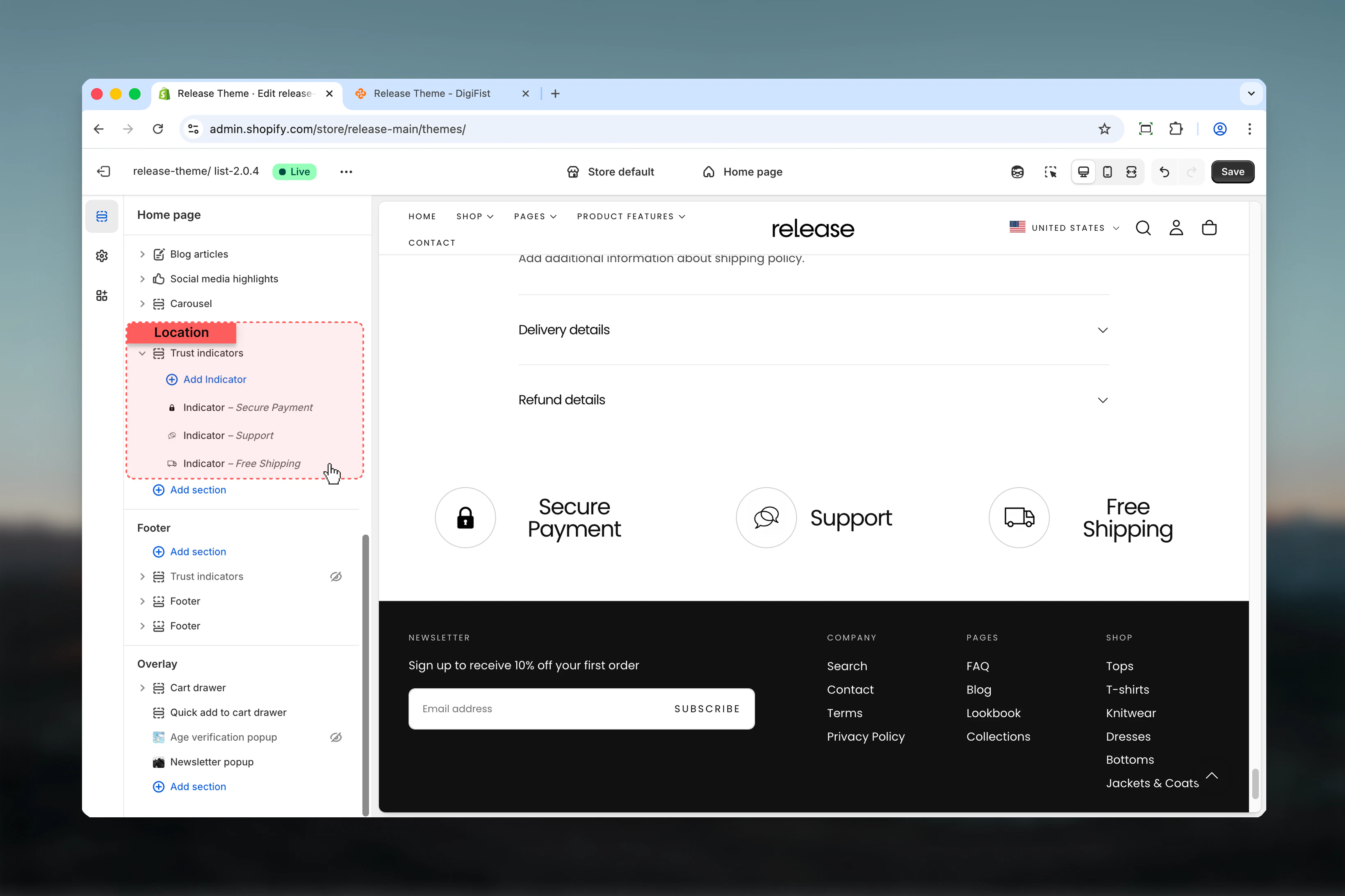
From Shopify admin, access the Theme Customizer.
Add the Trust Indicators section to your page or template.
Click **Add Indicator** to create trust indicator tiles.
Add heading, icon, and optional link for each indicator.
## What this section controls
This section controls trust indicator displays with the following capabilities:
* Up to 4 customizable indicator tiles
* Theme icons or custom image support
* Horizontal or vertical content layouts
* Carousel behavior on mobile and tablet
* Flexible alignment and sizing options
* Section-level and block-level color schemes
## How the Trust Indicators section works
The Trust Indicators section uses a block-based system:
* Displays trust indicators as individual tiles
* Supports up to 4 indicator blocks
* Icons can be theme icons or custom images
* Content direction can be horizontal or vertical
* Supports carousel behavior on mobile and tablet
* Fully customizable alignment and sizing
## Getting started
From Shopify admin, access the Theme Customizer.
Add the Trust Indicators section to your page or template.
Click **Add Indicator** to create trust indicator tiles.
Add heading, icon, and optional link for each indicator.
 ## Section settings
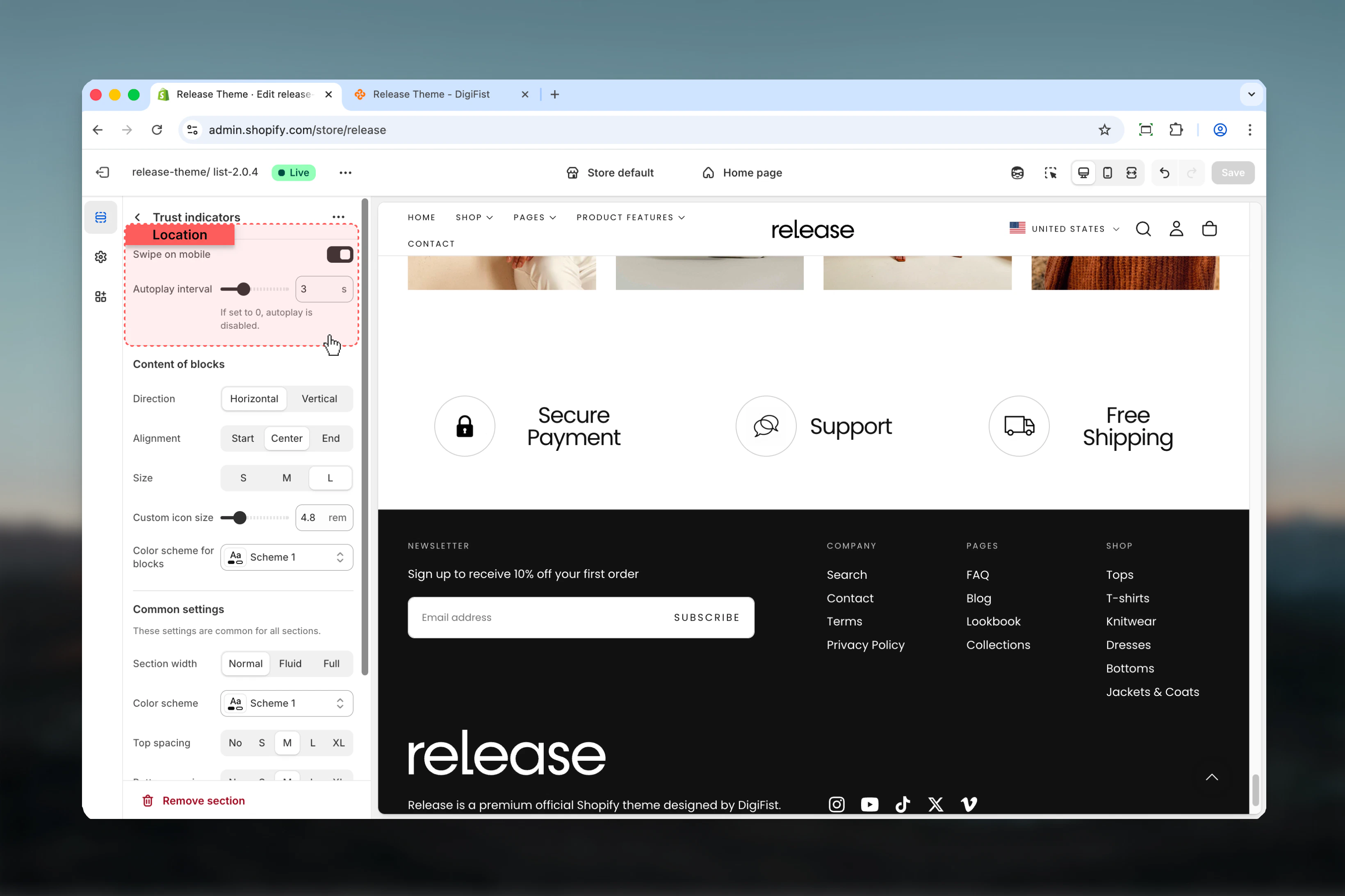
Section settings control slideshow behavior, content styling, and overall layout.
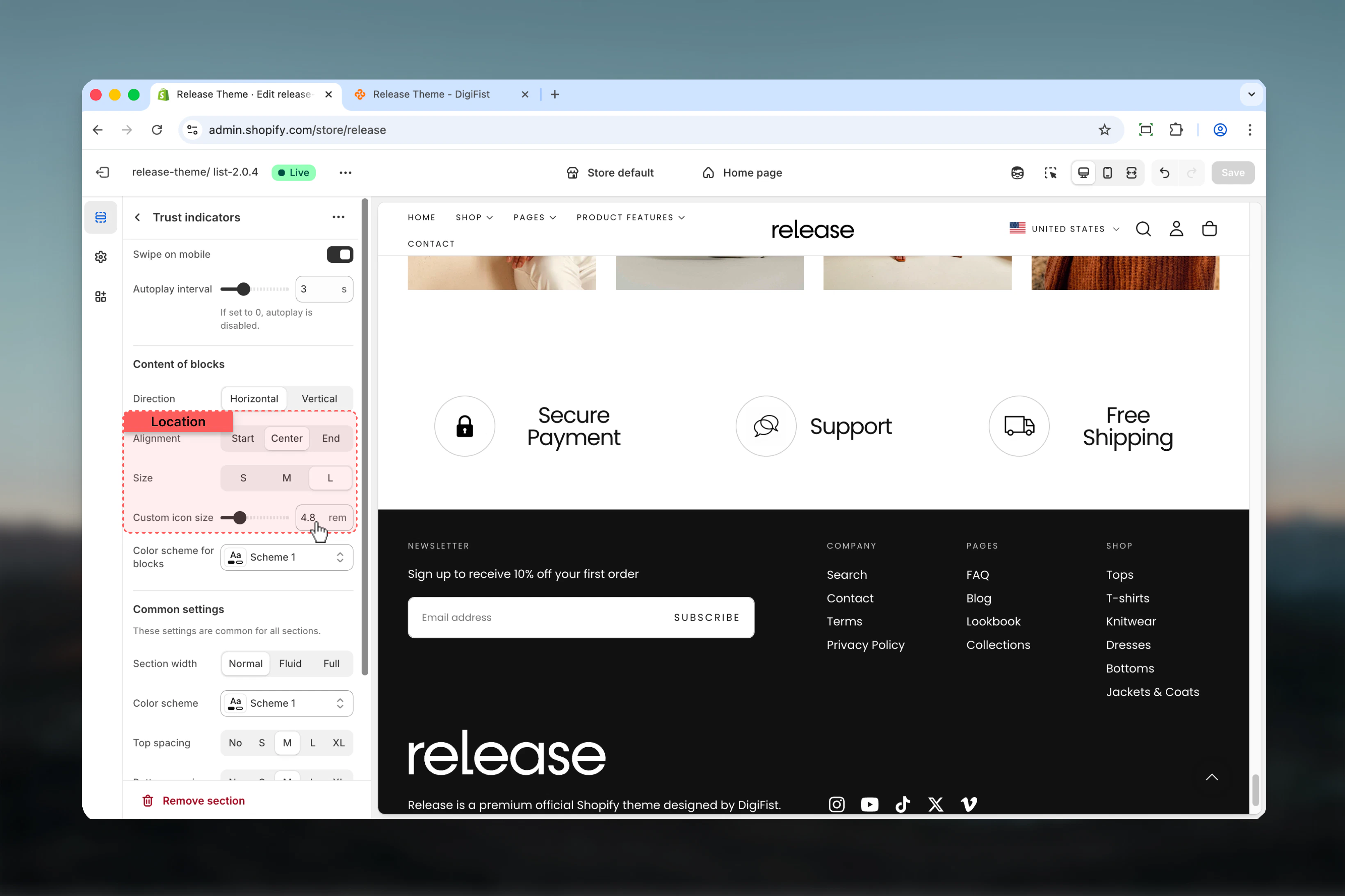
### Swipe on mobile
Enables carousel behavior on mobile devices.
**Options:** True / False
**Default:** True
### Slideshow autoplay interval
Controls automatic slide advancement.
**Range:** 0 – 10 seconds
* Set to `0` to disable autoplay
* Default: 3 seconds
## Section settings
Section settings control slideshow behavior, content styling, and overall layout.
### Swipe on mobile
Enables carousel behavior on mobile devices.
**Options:** True / False
**Default:** True
### Slideshow autoplay interval
Controls automatic slide advancement.
**Range:** 0 – 10 seconds
* Set to `0` to disable autoplay
* Default: 3 seconds
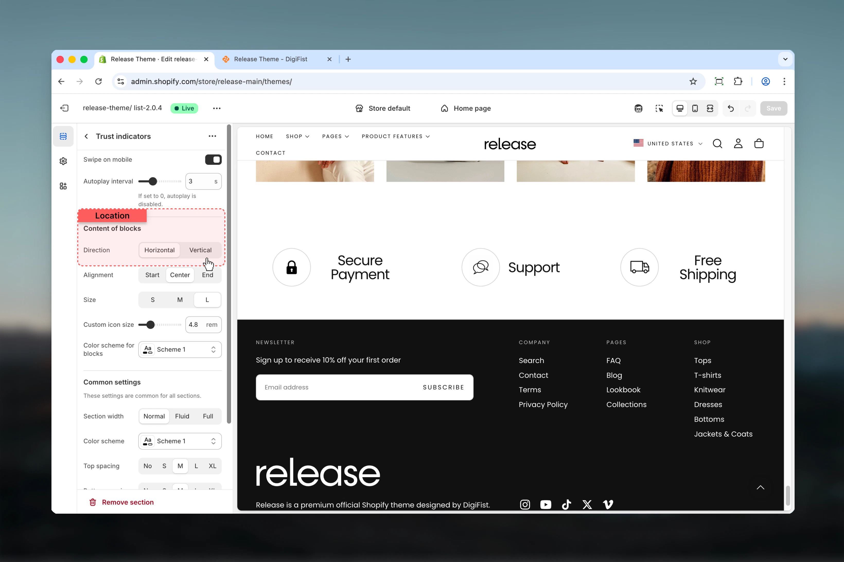
 ### Content direction
Controls the layout direction of icon and text.
**Available options:**
* **Horizontal:** Icon and text appear side by side
* **Vertical:** Icon appears above text
**Default:** Horizontal
### Content direction
Controls the layout direction of icon and text.
**Available options:**
* **Horizontal:** Icon and text appear side by side
* **Vertical:** Icon appears above text
**Default:** Horizontal
 ### Content alignment
Controls horizontal alignment of content.
**Available options:** Start, Center, End
**Default:** Center
### Content size
Controls the size of title text.
**Available options:** S, M, L
**Default:** L
### Icon size
Controls the size of icons.
**Range:** 2.4rem – 12.8rem
**Default:** 4.8rem
### Content alignment
Controls horizontal alignment of content.
**Available options:** Start, Center, End
**Default:** Center
### Content size
Controls the size of title text.
**Available options:** S, M, L
**Default:** L
### Icon size
Controls the size of icons.
**Range:** 2.4rem – 12.8rem
**Default:** 4.8rem
 ### Color scheme for blocks
Controls background and text colors for indicator tiles.
* Shopify color scheme selector
* **Default:** Scheme 1
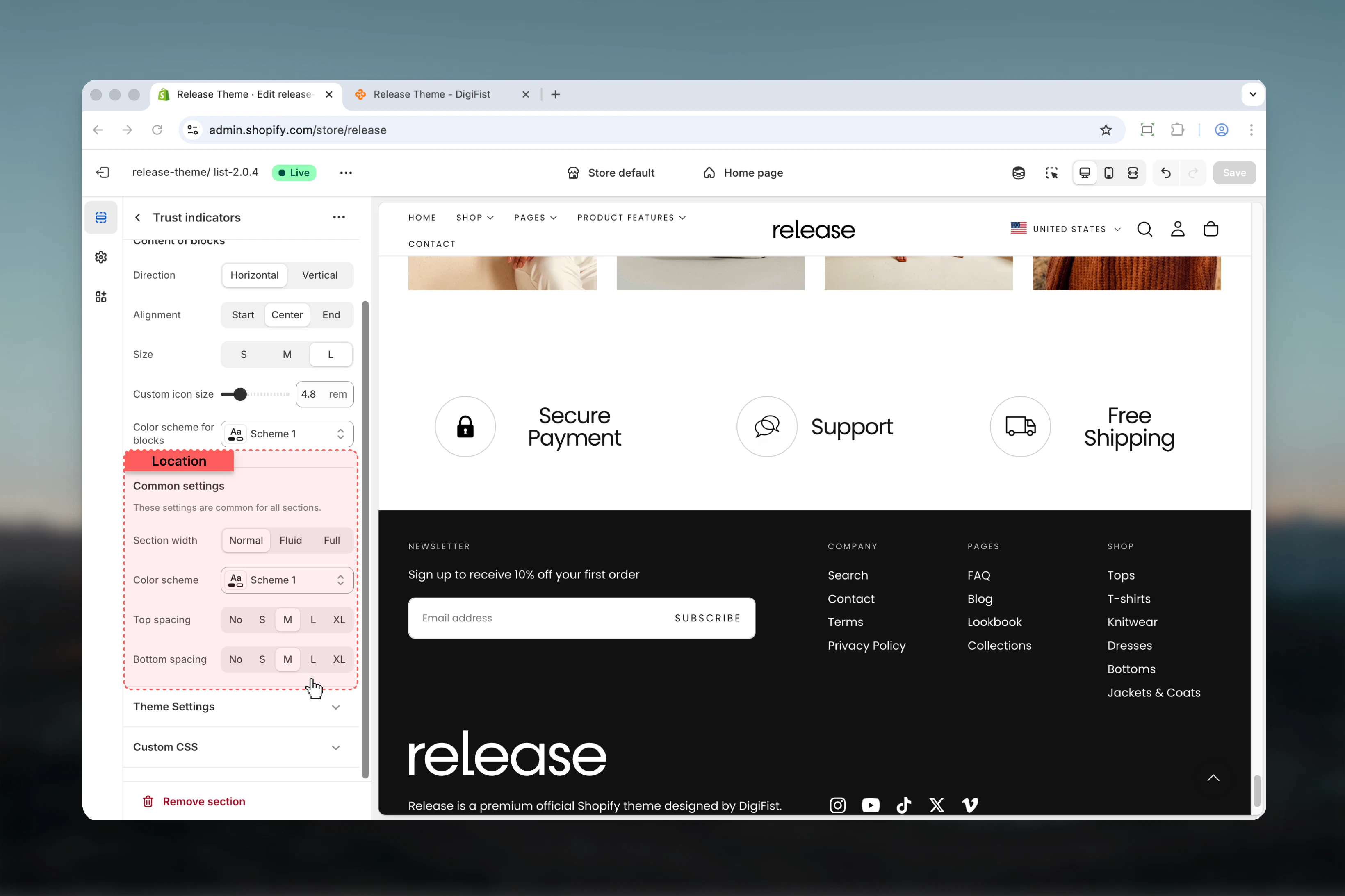
### Section width
Controls the maximum width of the section.
**Available options:**
* **Page:** Standard page width
* **Fluid:** Wider than page width
* **Full:** Full viewport width
**Default:** Page
### Color scheme
Controls background and text colors for the section container.
* Shopify color scheme selector
* **Default:** Scheme 1
### Spacing top
Controls spacing above the section.
**Available options:** None, S, M, L, XL
**Default:** M
### Spacing bottom
Controls spacing below the section.
**Available options:** None, S, M, L, XL
**Default:** M
### Color scheme for blocks
Controls background and text colors for indicator tiles.
* Shopify color scheme selector
* **Default:** Scheme 1
### Section width
Controls the maximum width of the section.
**Available options:**
* **Page:** Standard page width
* **Fluid:** Wider than page width
* **Full:** Full viewport width
**Default:** Page
### Color scheme
Controls background and text colors for the section container.
* Shopify color scheme selector
* **Default:** Scheme 1
### Spacing top
Controls spacing above the section.
**Available options:** None, S, M, L, XL
**Default:** M
### Spacing bottom
Controls spacing below the section.
**Available options:** None, S, M, L, XL
**Default:** M
 ## Block settings
Block settings control individual indicator tiles. Each block represents a single trust indicator.
Maximum of 4 indicator blocks can be added per section.
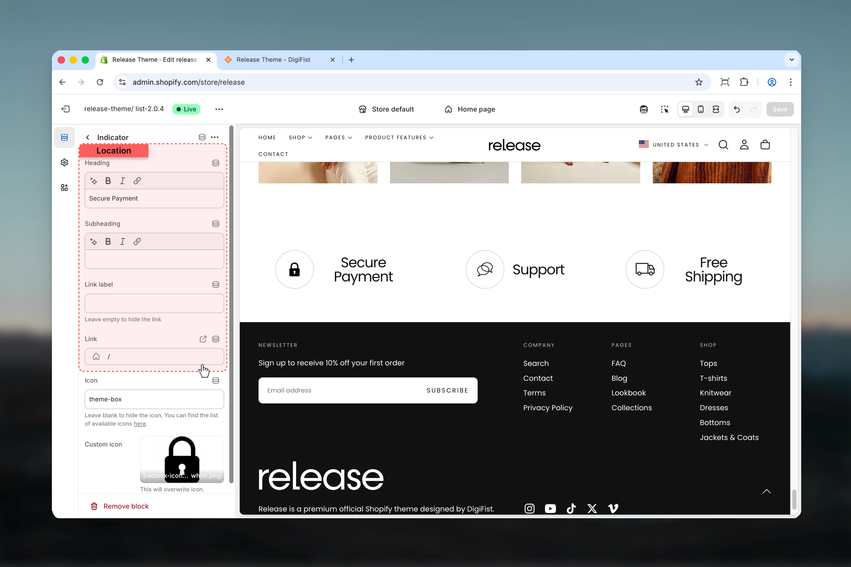
### Heading
Main title text for the indicator.
* Inline rich text supported (bold, italic, links)
* **Default:** "Title of the trust indicator"
### Subheading
Optional descriptive text below the heading.
* Inline rich text supported
### Link label
Text for the optional link.
Leave empty to hide the link.
### Link
Destination URL for the link.
* Shopify URL selector
* **Default:** /
## Block settings
Block settings control individual indicator tiles. Each block represents a single trust indicator.
Maximum of 4 indicator blocks can be added per section.
### Heading
Main title text for the indicator.
* Inline rich text supported (bold, italic, links)
* **Default:** "Title of the trust indicator"
### Subheading
Optional descriptive text below the heading.
* Inline rich text supported
### Link label
Text for the optional link.
Leave empty to hide the link.
### Link
Destination URL for the link.
* Shopify URL selector
* **Default:** /
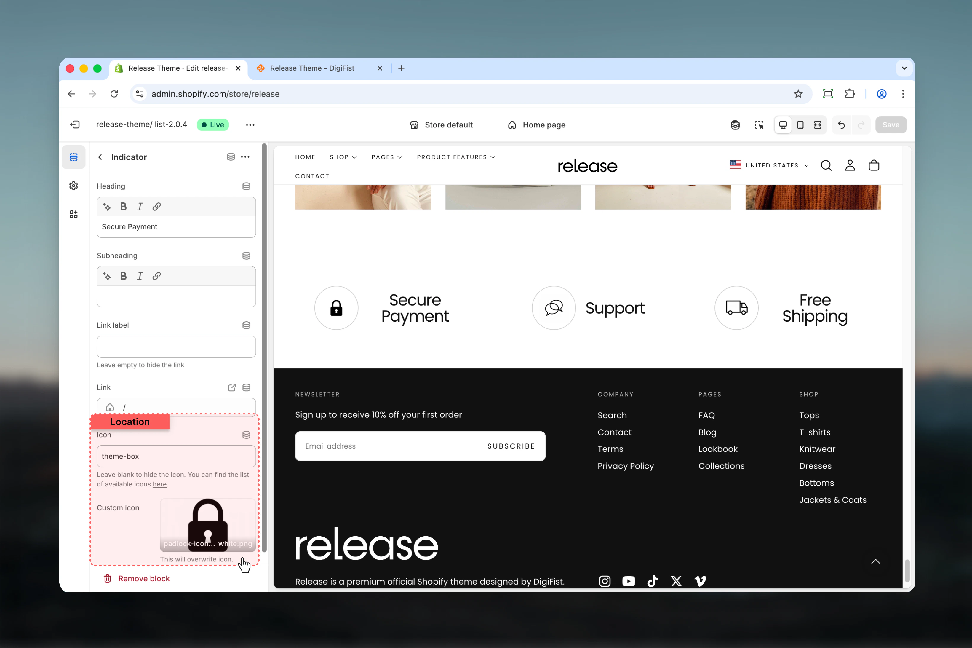
 ### Icon
Theme icon identifier.
* Text input
* **Default:** theme-box
See available icons in theme documentation.
### Custom icon
Upload a custom icon image.
* Shopify image picker
Overwrites theme icon when selected.
### Icon
Theme icon identifier.
* Text input
* **Default:** theme-box
See available icons in theme documentation.
### Custom icon
Upload a custom icon image.
* Shopify image picker
Overwrites theme icon when selected.
 ## Best practices
* Keep headings concise and impactful (2-5 words) for quick comprehension
* Use consistent icon sizes across all indicators for visual harmony
* Limit to 3-4 indicators for optimal clarity and to avoid overwhelming users
* Choose icons that clearly represent the message being communicated
* Use custom icons for brand consistency and unique visual identity
* Test carousel behavior on mobile devices to ensure smooth interaction
* Ensure sufficient color contrast for readability across all color schemes
* Order indicators by importance or customer priorities
* Use actionable language that builds confidence ("Free Shipping", "Secure Checkout")
* Consider placement above the fold or near add-to-cart for maximum impact
## Common use cases
* **Free shipping and return policies** - Highlight shipping benefits to reduce cart abandonment
* **Secure payment guarantees** - Build trust with payment security messaging
* **Customer service highlights** - Showcase 24/7 support or easy contact options
* **Sustainability commitments** - Display eco-friendly practices or certifications
* **Quality assurance messages** - Emphasize product quality or guarantees
* **Delivery time promises** - Set clear expectations for shipping timelines
## Related guides
Learn about common settings shared across sections
## Best practices
* Keep headings concise and impactful (2-5 words) for quick comprehension
* Use consistent icon sizes across all indicators for visual harmony
* Limit to 3-4 indicators for optimal clarity and to avoid overwhelming users
* Choose icons that clearly represent the message being communicated
* Use custom icons for brand consistency and unique visual identity
* Test carousel behavior on mobile devices to ensure smooth interaction
* Ensure sufficient color contrast for readability across all color schemes
* Order indicators by importance or customer priorities
* Use actionable language that builds confidence ("Free Shipping", "Secure Checkout")
* Consider placement above the fold or near add-to-cart for maximum impact
## Common use cases
* **Free shipping and return policies** - Highlight shipping benefits to reduce cart abandonment
* **Secure payment guarantees** - Build trust with payment security messaging
* **Customer service highlights** - Showcase 24/7 support or easy contact options
* **Sustainability commitments** - Display eco-friendly practices or certifications
* **Quality assurance messages** - Emphasize product quality or guarantees
* **Delivery time promises** - Set clear expectations for shipping timelines
## Related guides
Learn about common settings shared across sections