> ## Documentation Index
> Fetch the complete documentation index at: https://docs.digifist.com/llms.txt
> Use this file to discover all available pages before exploring further.
# Announcement bar
> Display important messages and promotions at the top of your store with carousel, dropdown cards, and countdown timers.
The announcement bar displays site-wide messages for promotions, shipping updates, or time-sensitive information. It supports carousel rotation between multiple slides, expandable dropdown cards for detailed content, and countdown timers.
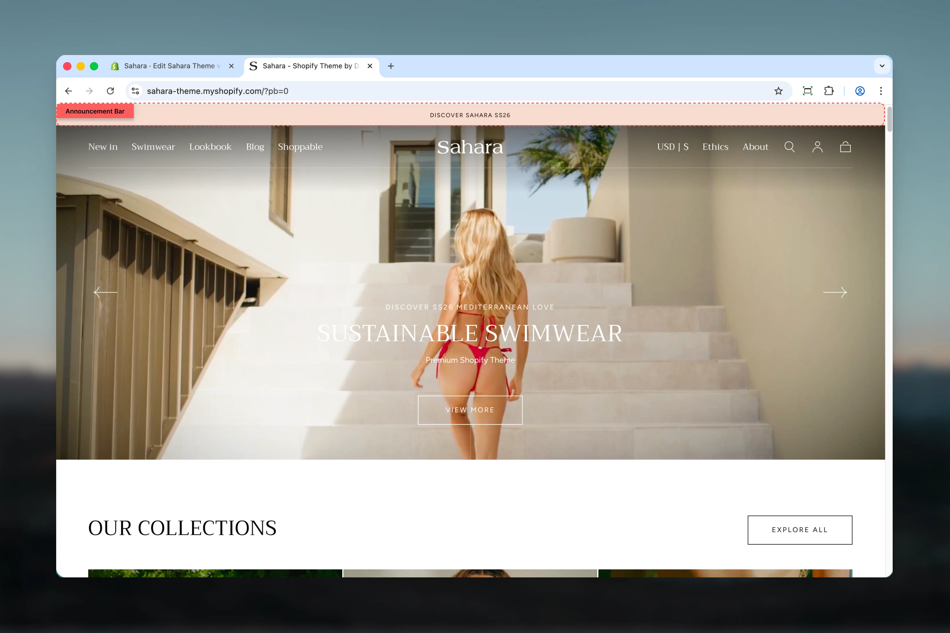 ## What this section controls
* Announcement message content and carousel rotation
* Dropdown cards with up to 3 expandable detail cards
* Countdown timers for time-sensitive promotions
* Section borders and spacing
* Color schemes for bar and dropdown areas
## Getting started
From Shopify admin, access the Theme Customizer.
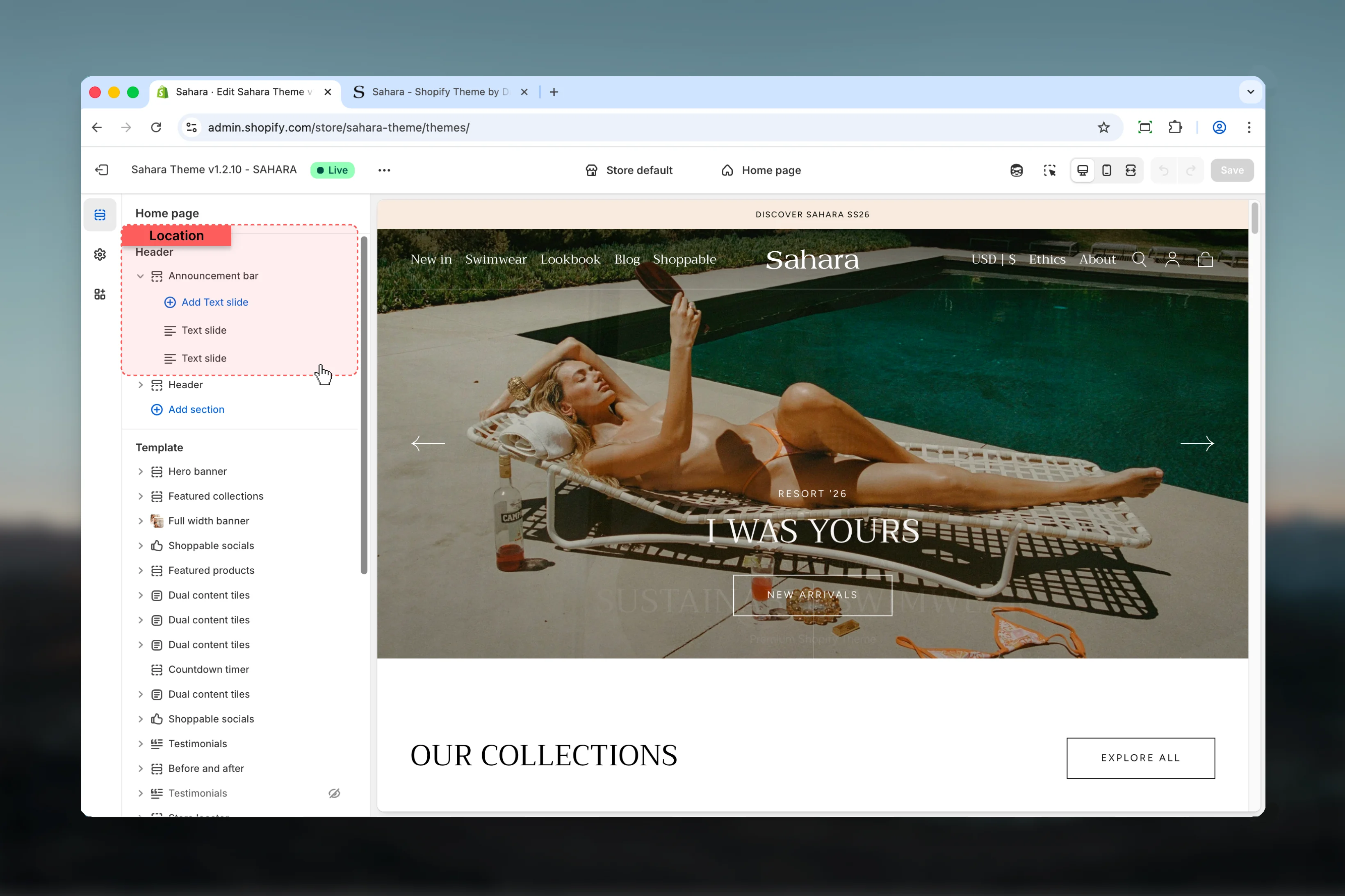
The Announcement bar section is typically positioned at the top of your store. Look for it in the sections list or add it using the "Add section" button.
Click **Add block** and select **Text slide** to create announcement messages.
Add your announcement text and optionally enable dropdown cards or countdown timers for enhanced functionality.
## What this section controls
* Announcement message content and carousel rotation
* Dropdown cards with up to 3 expandable detail cards
* Countdown timers for time-sensitive promotions
* Section borders and spacing
* Color schemes for bar and dropdown areas
## Getting started
From Shopify admin, access the Theme Customizer.
The Announcement bar section is typically positioned at the top of your store. Look for it in the sections list or add it using the "Add section" button.
Click **Add block** and select **Text slide** to create announcement messages.
Add your announcement text and optionally enable dropdown cards or countdown timers for enhanced functionality.
 ## Section settings
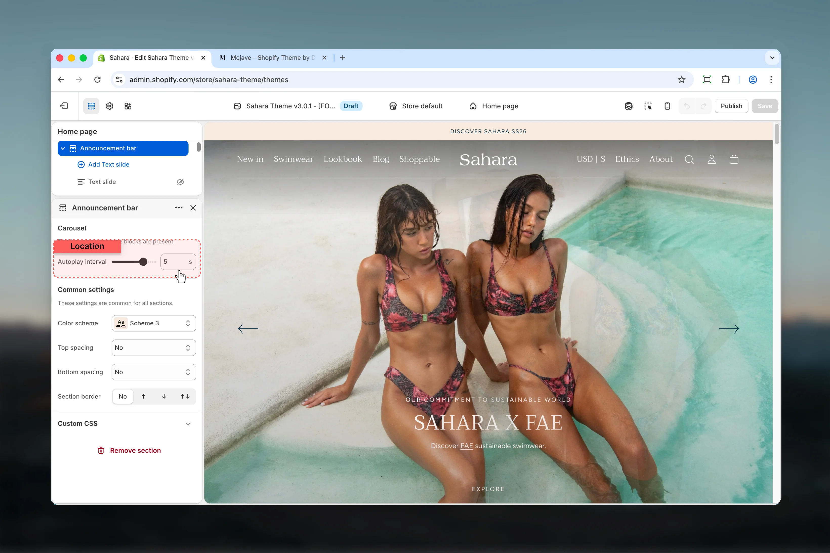
Section settings control the overall behavior and appearance of the announcement bar.
### Slider autoplay interval
Controls how quickly slides rotate when multiple text slides are present.
**Range:** 2 – 6 seconds (0.5s increments)
**Default:** 3 seconds
Carousel is automatically enabled when 2 or more text slide blocks are added. With a single block, the announcement displays as static content.
Slower intervals (5-6s) give visitors more time to read detailed messages. Faster intervals (2-3s) work for short alerts or urgent announcements.
## Section settings
Section settings control the overall behavior and appearance of the announcement bar.
### Slider autoplay interval
Controls how quickly slides rotate when multiple text slides are present.
**Range:** 2 – 6 seconds (0.5s increments)
**Default:** 3 seconds
Carousel is automatically enabled when 2 or more text slide blocks are added. With a single block, the announcement displays as static content.
Slower intervals (5-6s) give visitors more time to read detailed messages. Faster intervals (2-3s) work for short alerts or urgent announcements.
 ### Color scheme
Choose which color scheme applies to the announcement bar background and text.
**Available options:** Scheme 1, Scheme 2, Scheme 3, Scheme 4, Inverse
**Default:** Scheme 1
Use a contrasting color scheme to make announcements stand out from the rest of your header.
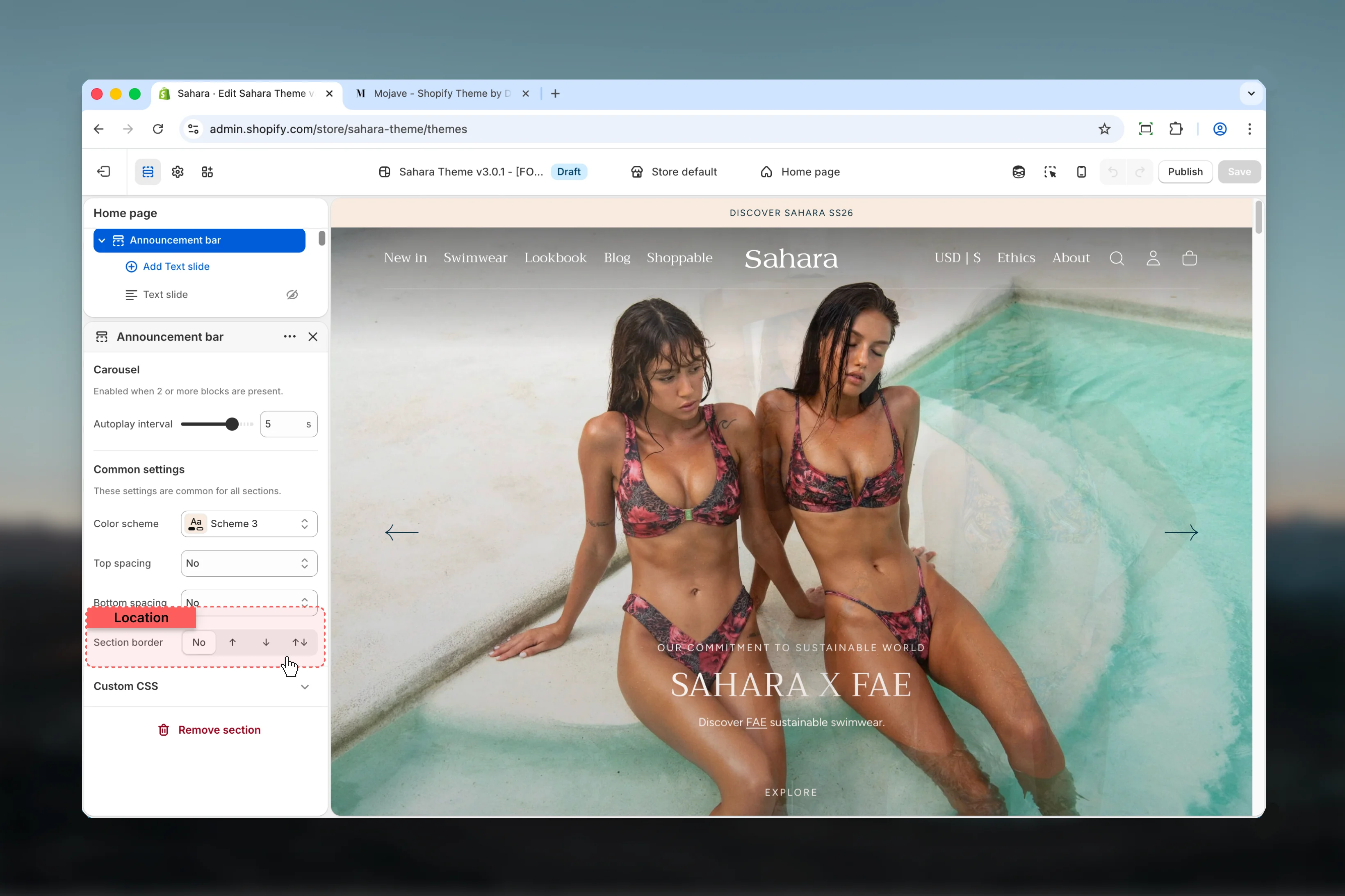
### Section border
Add visual separation by displaying borders on the announcement bar.
**Available options:**
* **None:** No borders (seamless integration)
* **Top:** Border line above the announcement bar
* **Bottom:** Border line below the announcement bar
* **Both:** Border lines on both top and bottom
**Default:** None
Use bottom border to separate announcements from header navigation. Use both borders for maximum visual distinction.
### Color scheme
Choose which color scheme applies to the announcement bar background and text.
**Available options:** Scheme 1, Scheme 2, Scheme 3, Scheme 4, Inverse
**Default:** Scheme 1
Use a contrasting color scheme to make announcements stand out from the rest of your header.
### Section border
Add visual separation by displaying borders on the announcement bar.
**Available options:**
* **None:** No borders (seamless integration)
* **Top:** Border line above the announcement bar
* **Bottom:** Border line below the announcement bar
* **Both:** Border lines on both top and bottom
**Default:** None
Use bottom border to separate announcements from header navigation. Use both borders for maximum visual distinction.
 ### Spacing top
Controls the padding above the announcement bar content.
**Available options:** None, S, M, L, XL
**Default:** M
### Spacing bottom
Controls the padding below the announcement bar content.
**Available options:** None, S, M, L, XL
**Default:** M
Use larger spacing (L or XL) when displaying countdown timers to ensure adequate breathing room.
## Block settings
Block settings configure individual text slides within the announcement bar. Each text slide represents one message in the carousel.
### Body text
The main announcement message displayed to visitors.
**Type:** Rich text
**Default:** "Welcome to our store"
Supports text formatting including bold, italic, and links. Keep messages concise for better mobile display.
For promotional messages, use action-oriented language and include a link to the relevant page or collection.
### Spacing top
Controls the padding above the announcement bar content.
**Available options:** None, S, M, L, XL
**Default:** M
### Spacing bottom
Controls the padding below the announcement bar content.
**Available options:** None, S, M, L, XL
**Default:** M
Use larger spacing (L or XL) when displaying countdown timers to ensure adequate breathing room.
## Block settings
Block settings configure individual text slides within the announcement bar. Each text slide represents one message in the carousel.
### Body text
The main announcement message displayed to visitors.
**Type:** Rich text
**Default:** "Welcome to our store"
Supports text formatting including bold, italic, and links. Keep messages concise for better mobile display.
For promotional messages, use action-oriented language and include a link to the relevant page or collection.
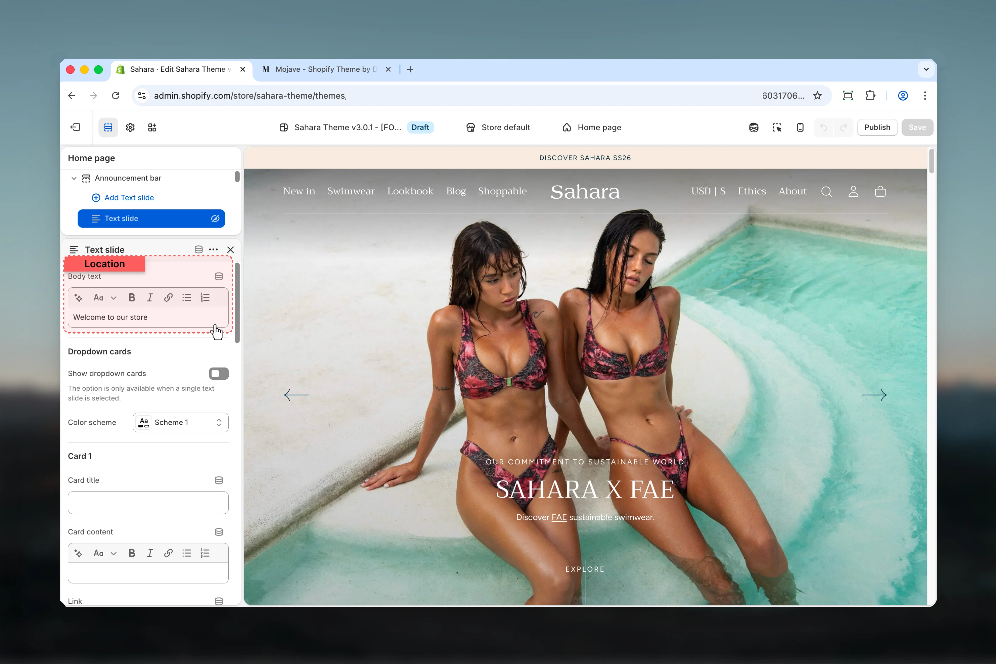 The dropdown cards feature allows you to add expandable detailed content beneath a single announcement message.
Dropdown cards only work when exactly **one** text slide block is present. Adding a second slide will disable this feature.
Enable expandable dropdown menu containing up to 3 detailed cards beneath the announcement text.
**Type:** Checkbox
**Default:** Disabled
Dropdown cards work well for multi-region shipping announcements, detailed sale terms, or store policies that need more space than the main bar allows.
The dropdown cards feature allows you to add expandable detailed content beneath a single announcement message.
Dropdown cards only work when exactly **one** text slide block is present. Adding a second slide will disable this feature.
Enable expandable dropdown menu containing up to 3 detailed cards beneath the announcement text.
**Type:** Checkbox
**Default:** Disabled
Dropdown cards work well for multi-region shipping announcements, detailed sale terms, or store policies that need more space than the main bar allows.
 Choose the color scheme for the dropdown menu. This can differ from the main announcement bar color scheme for visual hierarchy.
**Available options:** Scheme 1, Scheme 2, Scheme 3, Scheme 4, Inverse
**Default:** Scheme 1
First dropdown card with title, content, button text, and destination URL.
**Card title** (text): Heading displayed on the card
**Card content** (rich text): Detailed information or description
**Link** (text): Button text (e.g., "Shop now", "Learn more")
**URL** (url): Destination when clicking the button
Keep card titles under 5 words for better scannability.
Second dropdown card with the same configuration options as Card 1.
**Card title** (text): Heading for second card
**Card content** (rich text): Additional details
**Link** (text): Button label
**URL** (url): Button destination
Third dropdown card with the same configuration options as Card 1 and Card 2.
**Card title** (text): Heading for third card
**Card content** (rich text): Supporting information
**Link** (text): Call-to-action text
**URL** (url): Link destination
You don't need to fill all 3 cards. Leave cards empty to display fewer options.
Add urgency to announcements with time-based displays that count down to a specific deadline.
Toggle the countdown timer display for this text slide.
**Type:** Checkbox
**Default:** Disabled
Countdown timers add visual weight. Use sparingly and only for genuinely time-sensitive offers to maintain credibility.
Set the exact date and time when the countdown reaches zero.
**Timer year** (number): Year (e.g., 2024, 2025)
**Timer month** (select): January through December
**Timer day** (range): 1-31
**Timer hour** (range): 0-23 (24-hour format)
**Timer minute** (range): 0-59
**Default:** January 1, 2024 at 00:00
Choose the color scheme for the dropdown menu. This can differ from the main announcement bar color scheme for visual hierarchy.
**Available options:** Scheme 1, Scheme 2, Scheme 3, Scheme 4, Inverse
**Default:** Scheme 1
First dropdown card with title, content, button text, and destination URL.
**Card title** (text): Heading displayed on the card
**Card content** (rich text): Detailed information or description
**Link** (text): Button text (e.g., "Shop now", "Learn more")
**URL** (url): Destination when clicking the button
Keep card titles under 5 words for better scannability.
Second dropdown card with the same configuration options as Card 1.
**Card title** (text): Heading for second card
**Card content** (rich text): Additional details
**Link** (text): Button label
**URL** (url): Button destination
Third dropdown card with the same configuration options as Card 1 and Card 2.
**Card title** (text): Heading for third card
**Card content** (rich text): Supporting information
**Link** (text): Call-to-action text
**URL** (url): Link destination
You don't need to fill all 3 cards. Leave cards empty to display fewer options.
Add urgency to announcements with time-based displays that count down to a specific deadline.
Toggle the countdown timer display for this text slide.
**Type:** Checkbox
**Default:** Disabled
Countdown timers add visual weight. Use sparingly and only for genuinely time-sensitive offers to maintain credibility.
Set the exact date and time when the countdown reaches zero.
**Timer year** (number): Year (e.g., 2024, 2025)
**Timer month** (select): January through December
**Timer day** (range): 1-31
**Timer hour** (range): 0-23 (24-hour format)
**Timer minute** (range): 0-59
**Default:** January 1, 2024 at 00:00
 Automatically extend the countdown by a specified number of days after it expires. This creates a "rolling" promotion effect.
**Range:** 0 – 30 days
**Default:** 0 (no extension)
When timer extends, it resets to the specified number of days from the expiration time. Useful for ongoing promotions that reset daily or weekly.
Message displayed when the countdown reaches zero (if not extending).
**Type:** Inline rich text
**Default:** "Sale has ended"
**Examples:**
* "Offer expired - Stay tuned for more!"
* "Flash sale completed - Check back soon"
* "Pre-order now closed"
Control which time units are displayed in the countdown.
**Show timer days** (checkbox): Display days remaining (default: enabled)
**Show timer hours** (checkbox): Display hours remaining (default: enabled)
**Show timer minutes** (checkbox): Display minutes remaining (default: enabled)
**Show timer seconds** (checkbox): Display seconds remaining (default: enabled)
Showing seconds increases urgency but requires more visual attention. Use for flash sales under 1 hour. For multi-day promotions, showing only days and hours creates a cleaner display.
Automatically extend the countdown by a specified number of days after it expires. This creates a "rolling" promotion effect.
**Range:** 0 – 30 days
**Default:** 0 (no extension)
When timer extends, it resets to the specified number of days from the expiration time. Useful for ongoing promotions that reset daily or weekly.
Message displayed when the countdown reaches zero (if not extending).
**Type:** Inline rich text
**Default:** "Sale has ended"
**Examples:**
* "Offer expired - Stay tuned for more!"
* "Flash sale completed - Check back soon"
* "Pre-order now closed"
Control which time units are displayed in the countdown.
**Show timer days** (checkbox): Display days remaining (default: enabled)
**Show timer hours** (checkbox): Display hours remaining (default: enabled)
**Show timer minutes** (checkbox): Display minutes remaining (default: enabled)
**Show timer seconds** (checkbox): Display seconds remaining (default: enabled)
Showing seconds increases urgency but requires more visual attention. Use for flash sales under 1 hour. For multi-day promotions, showing only days and hours creates a cleaner display.
 ## Best practices
Limit announcement text to under 60 characters for optimal mobile display and quick readability.
Dropdown cards work well for regional information, detailed terms, or multiple CTAs without cluttering the main bar.
Keep carousel to 2-3 slides maximum. More slides reduce effectiveness and split user attention.
Enable countdown timers only for genuinely time-sensitive offers to maintain credibility and urgency impact.
Faster intervals (2-3s) work for very short messages, slower intervals (5-6s) for detailed content or countdown timers.
Use section borders to separate announcement bar from header when using similar color schemes.
Avoid running multiple promotions simultaneously in carousel. Focus on one clear message per slide.
Test dropdown cards on mobile before publishing to ensure content is easily accessible and buttons are adequately sized.
For ongoing promotions, use timer extend rather than manually updating dates each time expiration occurs.
Coordinate dropdown card color scheme with your brand while maintaining sufficient contrast for readability.
Countdown timers display in the visitor's local timezone. Ensure your promotion terms account for global timing differences.
## Common use cases
* **Flash sale announcement** - Single slide with countdown timer showing hours/minutes/seconds for 24-hour sale
* **Free shipping promotion** - Multiple slides rotating between free shipping threshold and current promotion details
* **Regional announcements** - Single slide with dropdown cards showing shipping information for different countries or regions
* **New collection launch** - Countdown timer with days/hours leading up to product release date
* **Holiday hours** - Single static slide with dropdown cards detailing hours for different store locations
* **Sale rotation** - 2-3 slides showcasing different product categories currently on sale
* **Pre-order campaign** - Countdown to pre-order closing with clear end message when timer expires
* **Seasonal promotion** - Extended timer (7-30 days) for ongoing seasonal discounts that reset automatically
## Best practices
Limit announcement text to under 60 characters for optimal mobile display and quick readability.
Dropdown cards work well for regional information, detailed terms, or multiple CTAs without cluttering the main bar.
Keep carousel to 2-3 slides maximum. More slides reduce effectiveness and split user attention.
Enable countdown timers only for genuinely time-sensitive offers to maintain credibility and urgency impact.
Faster intervals (2-3s) work for very short messages, slower intervals (5-6s) for detailed content or countdown timers.
Use section borders to separate announcement bar from header when using similar color schemes.
Avoid running multiple promotions simultaneously in carousel. Focus on one clear message per slide.
Test dropdown cards on mobile before publishing to ensure content is easily accessible and buttons are adequately sized.
For ongoing promotions, use timer extend rather than manually updating dates each time expiration occurs.
Coordinate dropdown card color scheme with your brand while maintaining sufficient contrast for readability.
Countdown timers display in the visitor's local timezone. Ensure your promotion terms account for global timing differences.
## Common use cases
* **Flash sale announcement** - Single slide with countdown timer showing hours/minutes/seconds for 24-hour sale
* **Free shipping promotion** - Multiple slides rotating between free shipping threshold and current promotion details
* **Regional announcements** - Single slide with dropdown cards showing shipping information for different countries or regions
* **New collection launch** - Countdown timer with days/hours leading up to product release date
* **Holiday hours** - Single static slide with dropdown cards detailing hours for different store locations
* **Sale rotation** - 2-3 slides showcasing different product categories currently on sale
* **Pre-order campaign** - Countdown to pre-order closing with clear end message when timer expires
* **Seasonal promotion** - Extended timer (7-30 days) for ongoing seasonal discounts that reset automatically