> ## Documentation Index
> Fetch the complete documentation index at: https://docs.digifist.com/llms.txt
> Use this file to discover all available pages before exploring further.
# Header
> Configure your store's primary navigation, logo, menu structure, and utility tools.
The header section controls your store's primary navigation area, appearing consistently across all pages. It manages logo display, menu structure, search and cart access, and provides flexible layout options to match your brand identity.
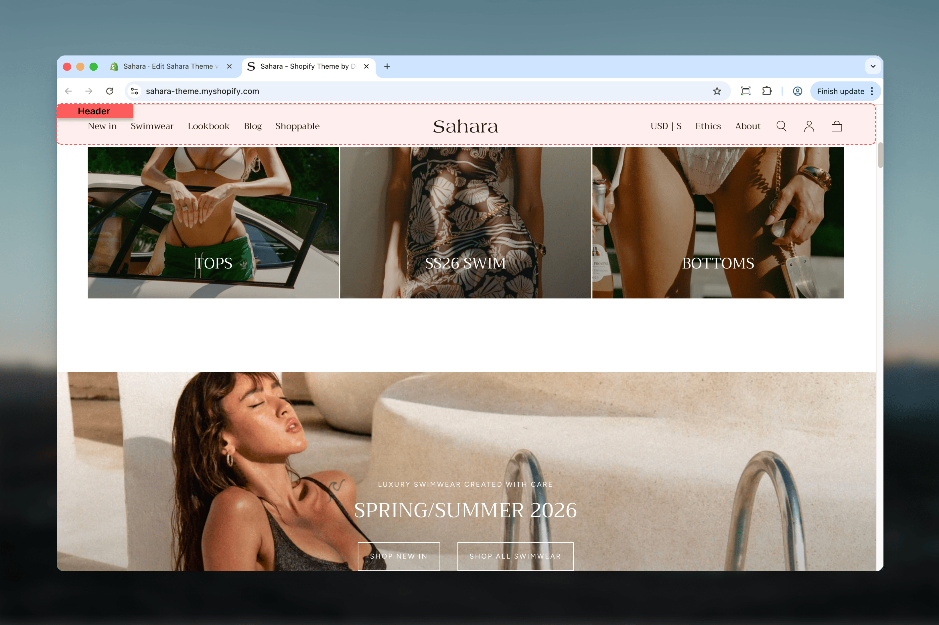 ## What this section controls
* Logo display and sizing for desktop and mobile
* Navigation menu structure and layout
* Megamenu promotional cards and badges
* Search, cart, and account utilities
* Sticky header behavior and transparency effects
* Country/language selector placement
## Getting started
From Shopify admin, access the Theme Customizer.
The Header section is automatically present at the top of your store. Find it in the left sidebar under Static sections.
Select your preferred layout from 6 available options to match your brand style.
Add your logo image or SVG code to replace the default store name text.
## What this section controls
* Logo display and sizing for desktop and mobile
* Navigation menu structure and layout
* Megamenu promotional cards and badges
* Search, cart, and account utilities
* Sticky header behavior and transparency effects
* Country/language selector placement
## Getting started
From Shopify admin, access the Theme Customizer.
The Header section is automatically present at the top of your store. Find it in the left sidebar under Static sections.
Select your preferred layout from 6 available options to match your brand style.
Add your logo image or SVG code to replace the default store name text.
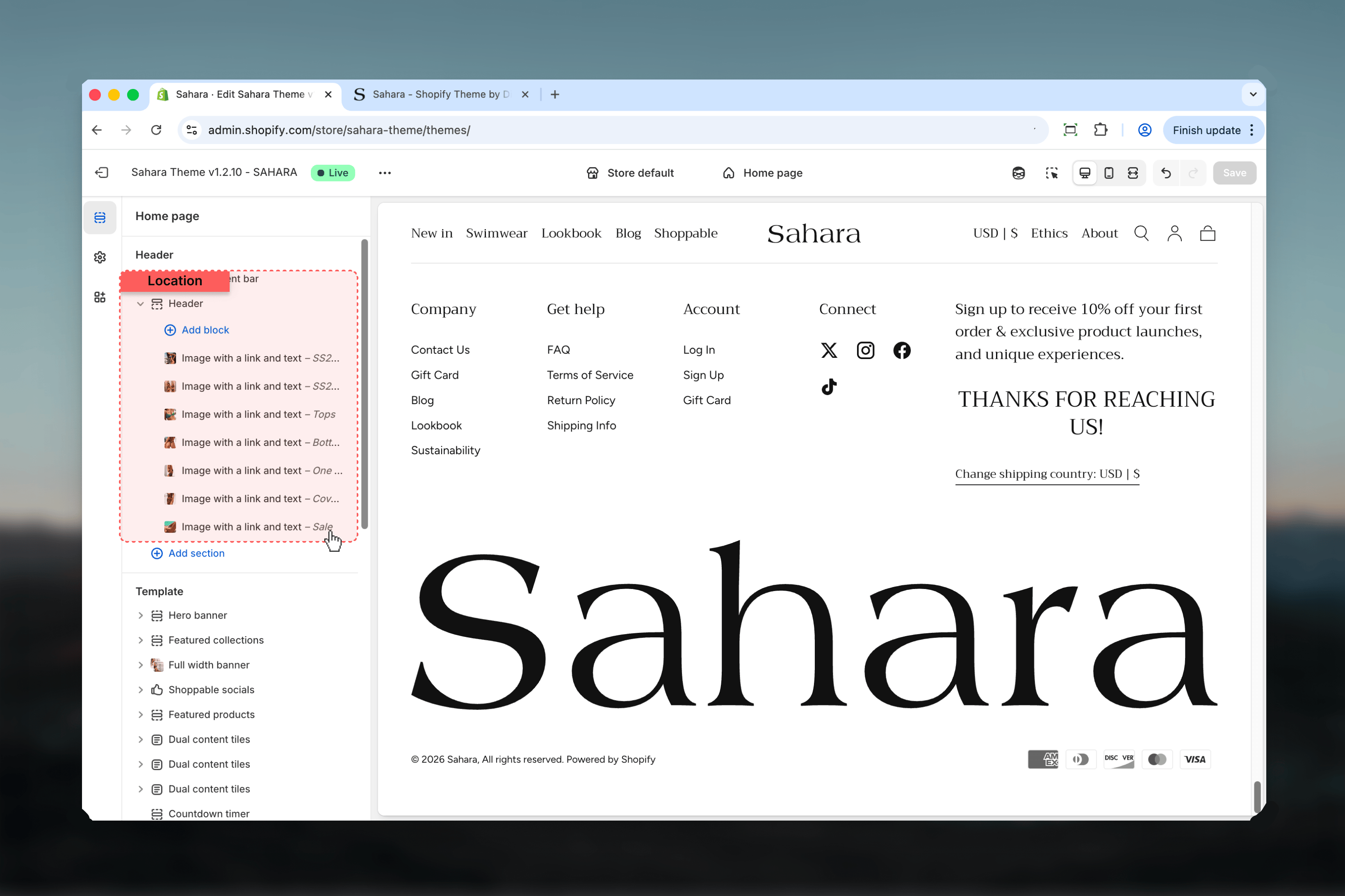 ## Layout options
Choose from 6 header layouts to control navigation and logo placement:
**Default layout** - Logo centered with navigation split on left and right sides.
Utilities (search, cart, account) appear on the right. Best for brand-focused stores where logo prominence matters most.
## Layout options
Choose from 6 header layouts to control navigation and logo placement:
**Default layout** - Logo centered with navigation split on left and right sides.
Utilities (search, cart, account) appear on the right. Best for brand-focused stores where logo prominence matters most.
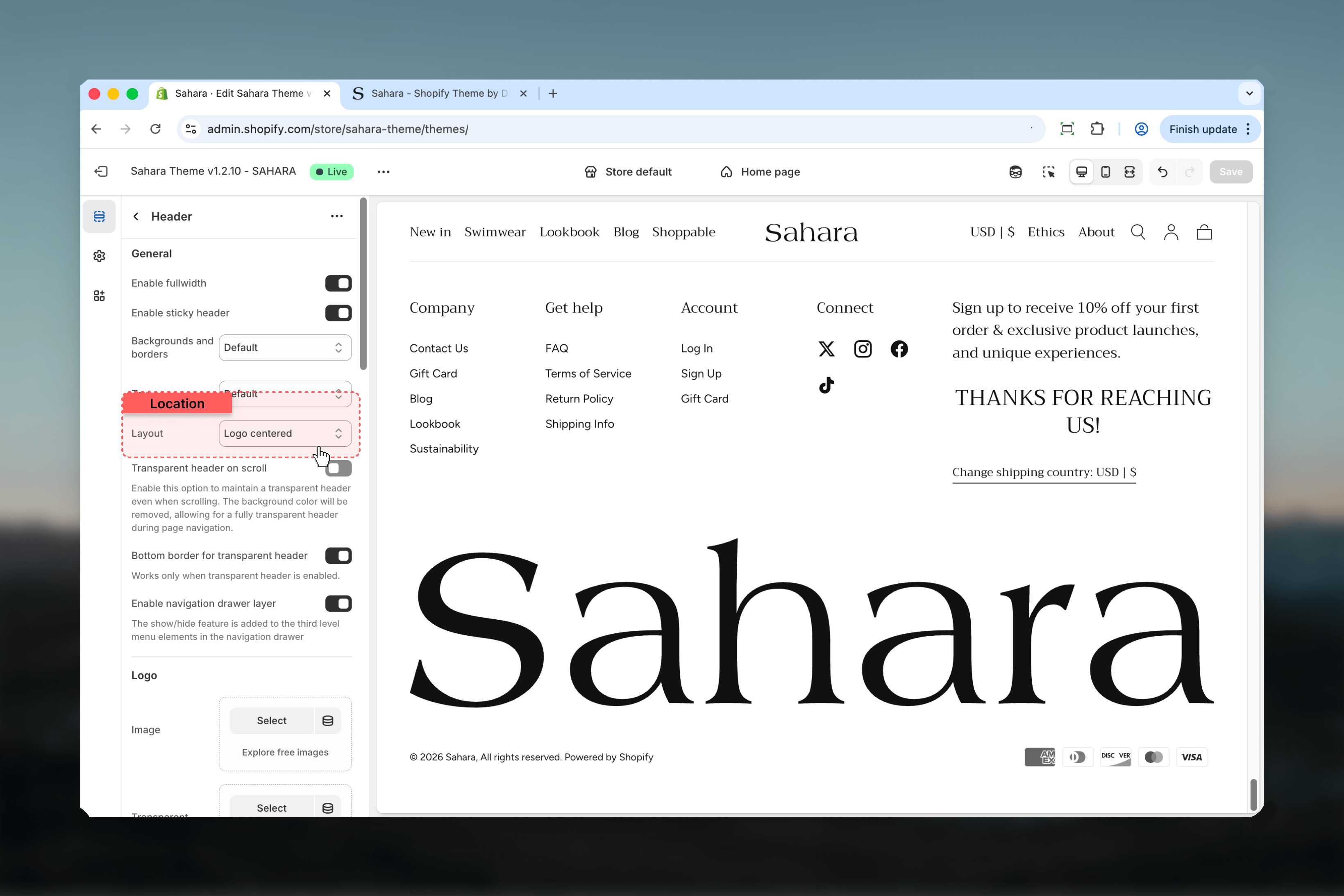 Navigation menu centered with logo on the left and utilities on the right.
Works well for stores with concise navigation (3-5 menu items).
Navigation menu centered with logo on the left and utilities on the right.
Works well for stores with concise navigation (3-5 menu items).
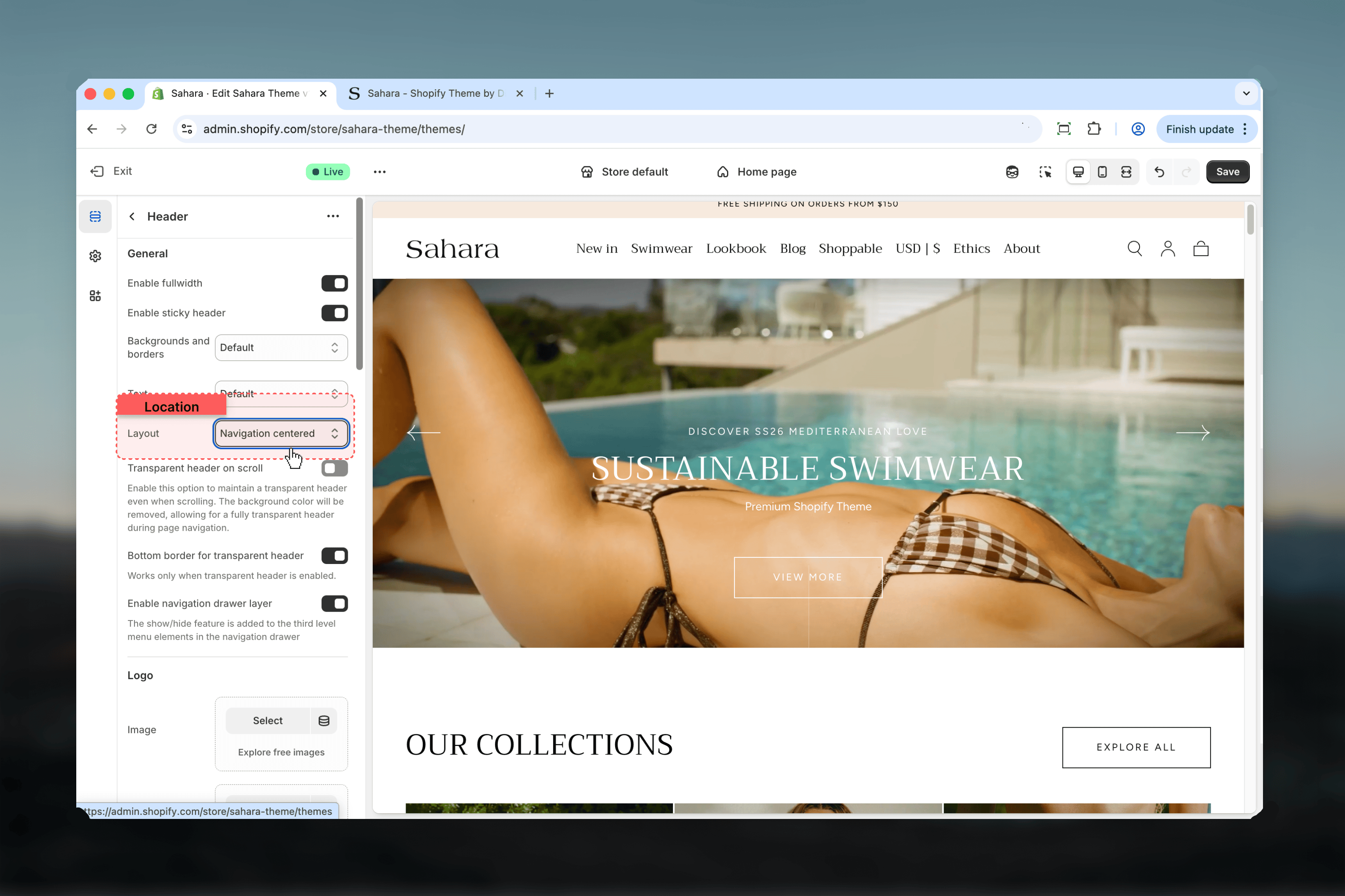 Logo centered on first row, navigation centered below on second row.
Creates distinct visual separation. Ideal for stores with many menu items that need more horizontal space.
Logo centered on first row, navigation centered below on second row.
Creates distinct visual separation. Ideal for stores with many menu items that need more horizontal space.
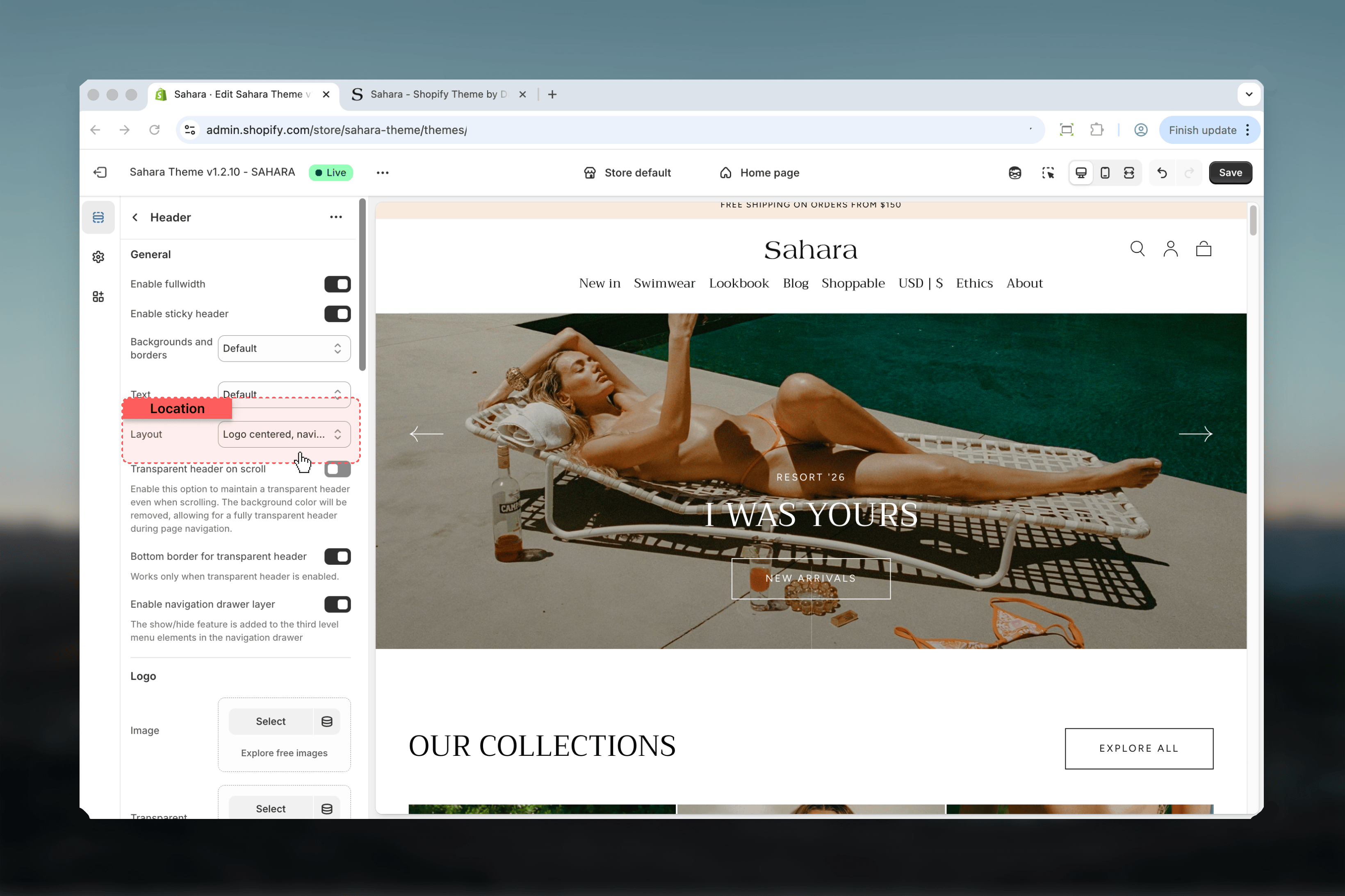 All content (logo, utilities) on first row, navigation centered below on second row.
Maximizes logo and utility visibility while giving navigation dedicated space.
All content (logo, utilities) on first row, navigation centered below on second row.
Maximizes logo and utility visibility while giving navigation dedicated space.
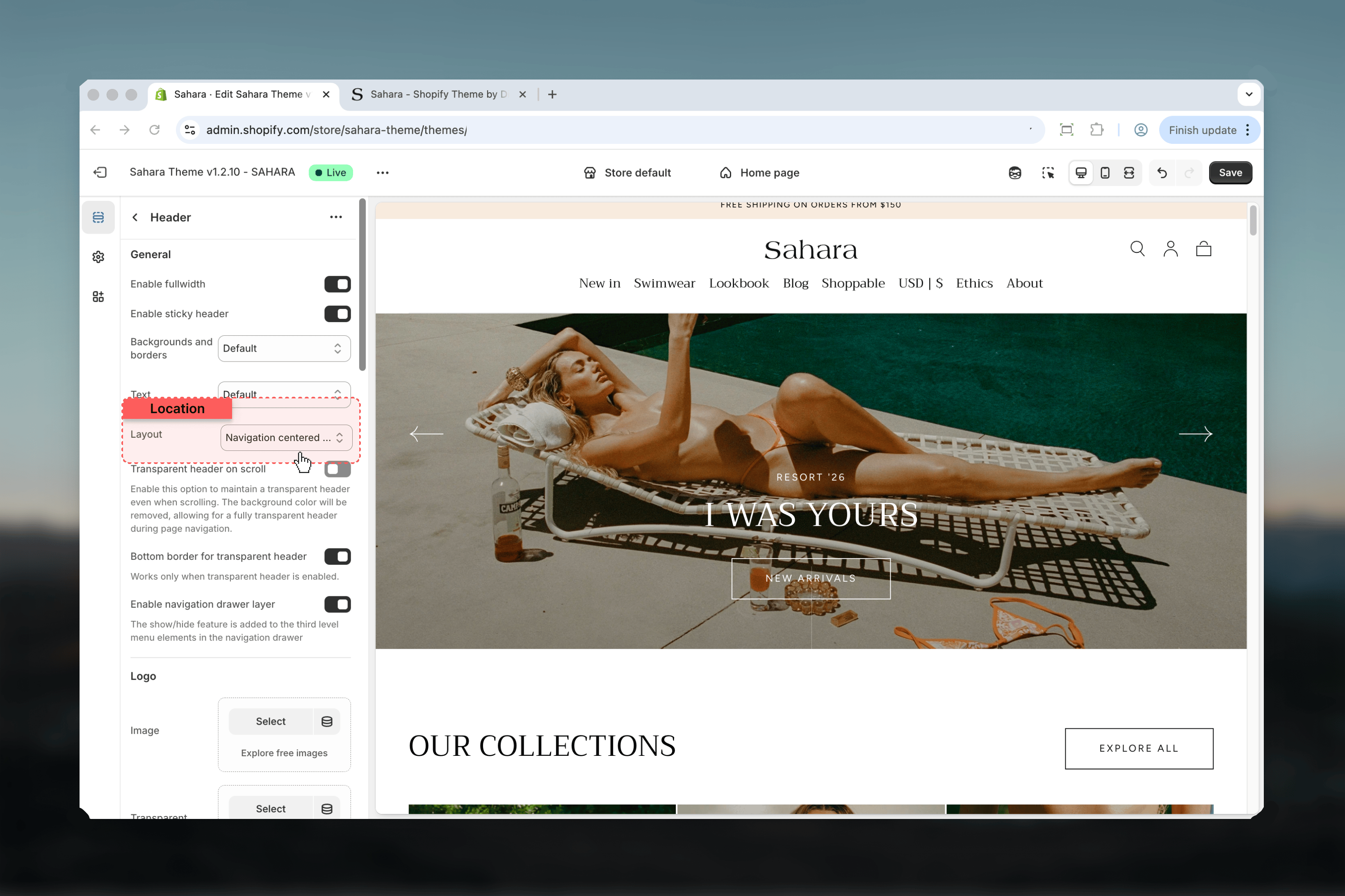 Logo and navigation aligned to the left, utilities on the right.
Clean left-aligned layout. Works for minimal designs or when utilities need prominence.
Logo and navigation aligned to the left, utilities on the right.
Clean left-aligned layout. Works for minimal designs or when utilities need prominence.
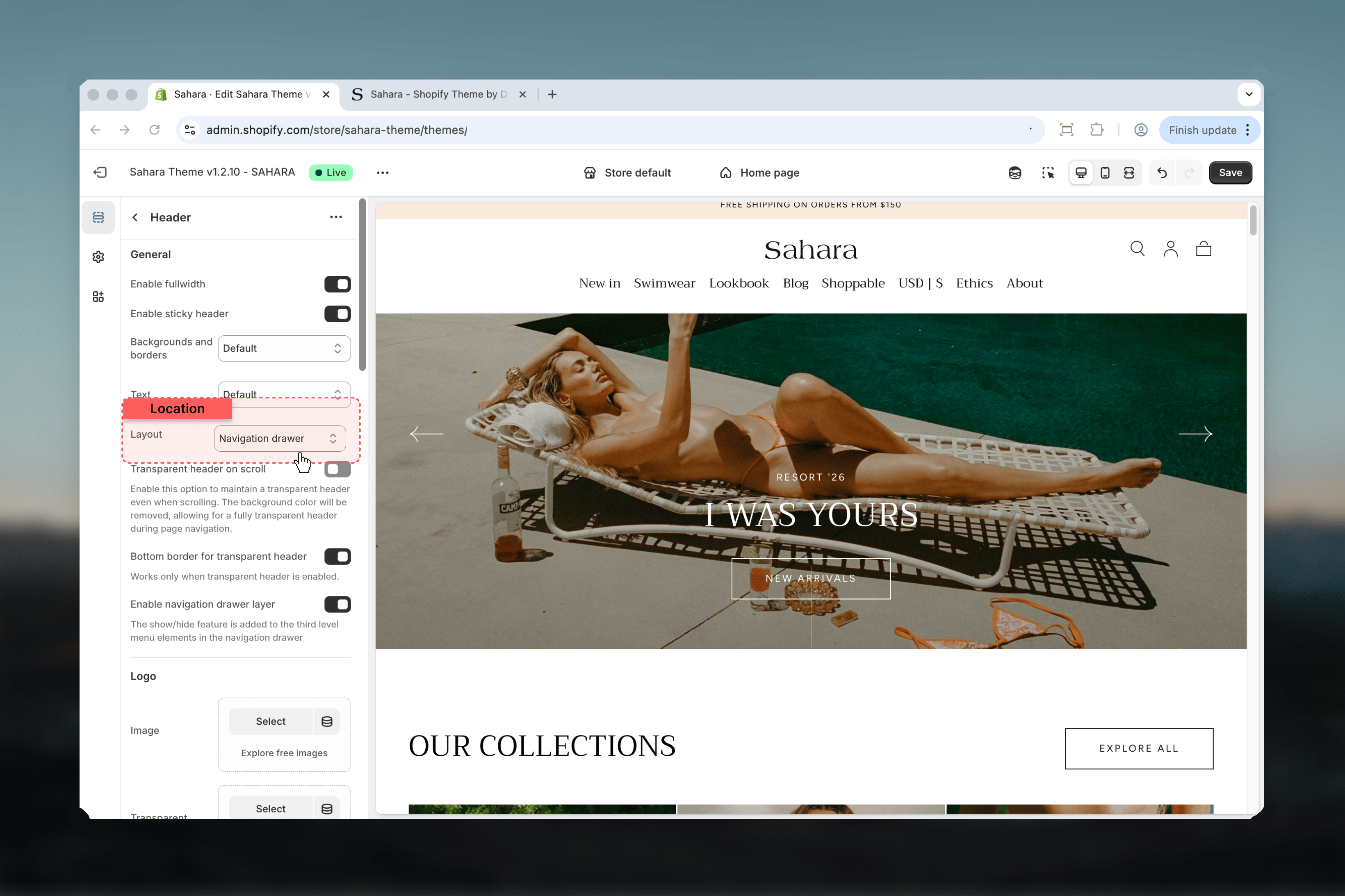
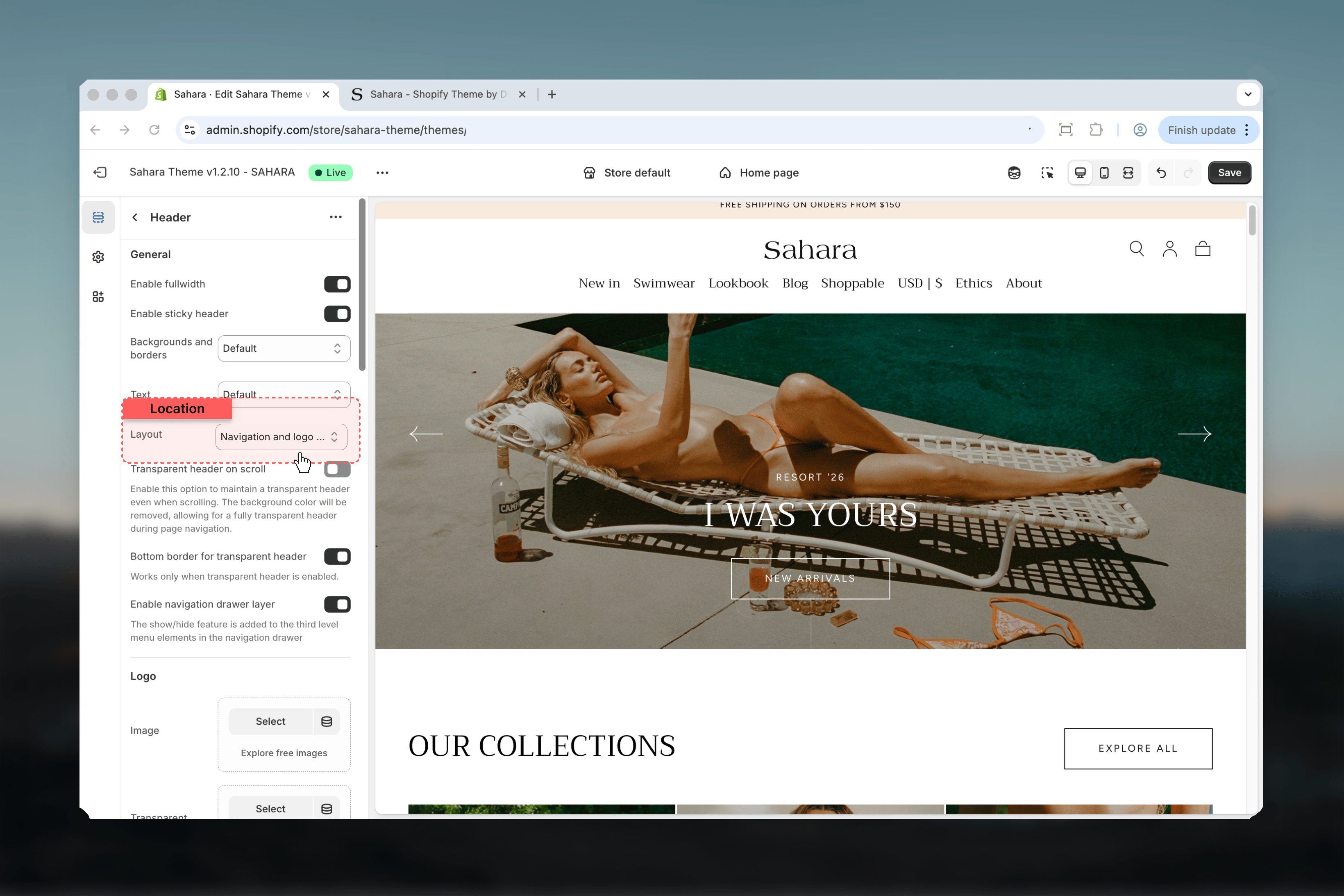 Mobile-style drawer menu for desktop and mobile. Hamburger icon opens full-screen navigation menu.
Best for complex navigation with many categories or deep menu hierarchies.
Mobile-style drawer menu for desktop and mobile. Hamburger icon opens full-screen navigation menu.
Best for complex navigation with many categories or deep menu hierarchies.
 ## General settings
### Enable sticky header
Header remains visible when scrolling down the page.
**Default:** Enabled
Keeps navigation and cart accessible throughout browsing. We recommend leaving this enabled for better user experience.
## General settings
### Enable sticky header
Header remains visible when scrolling down the page.
**Default:** Enabled
Keeps navigation and cart accessible throughout browsing. We recommend leaving this enabled for better user experience.
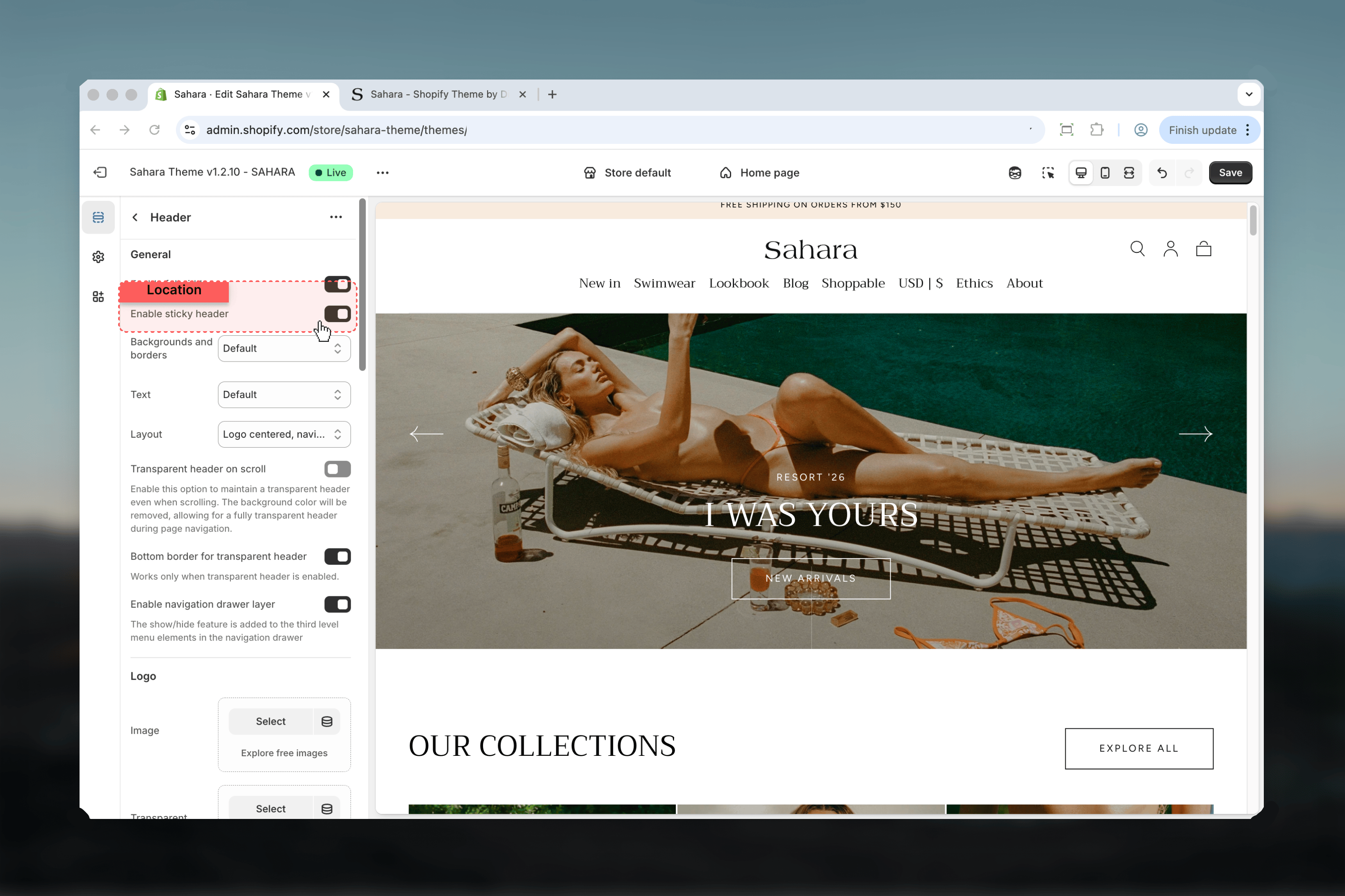 ### Transparent header on scroll
Maintains transparent header background even when scrolling.
**Default:** Disabled
When enabled, the header background remains transparent during page navigation. Use this for immersive homepage experiences where content flows behind the header.
Requires sufficient contrast between header text and page content. Test thoroughly to ensure navigation remains readable.
### Bottom border for transparent header
Adds subtle border line at bottom of transparent header.
**Default:** Enabled
Provides visual separation between header and page content when transparency is active. Only works when transparent header is enabled.
### Transparent header on scroll
Maintains transparent header background even when scrolling.
**Default:** Disabled
When enabled, the header background remains transparent during page navigation. Use this for immersive homepage experiences where content flows behind the header.
Requires sufficient contrast between header text and page content. Test thoroughly to ensure navigation remains readable.
### Bottom border for transparent header
Adds subtle border line at bottom of transparent header.
**Default:** Enabled
Provides visual separation between header and page content when transparency is active. Only works when transparent header is enabled.
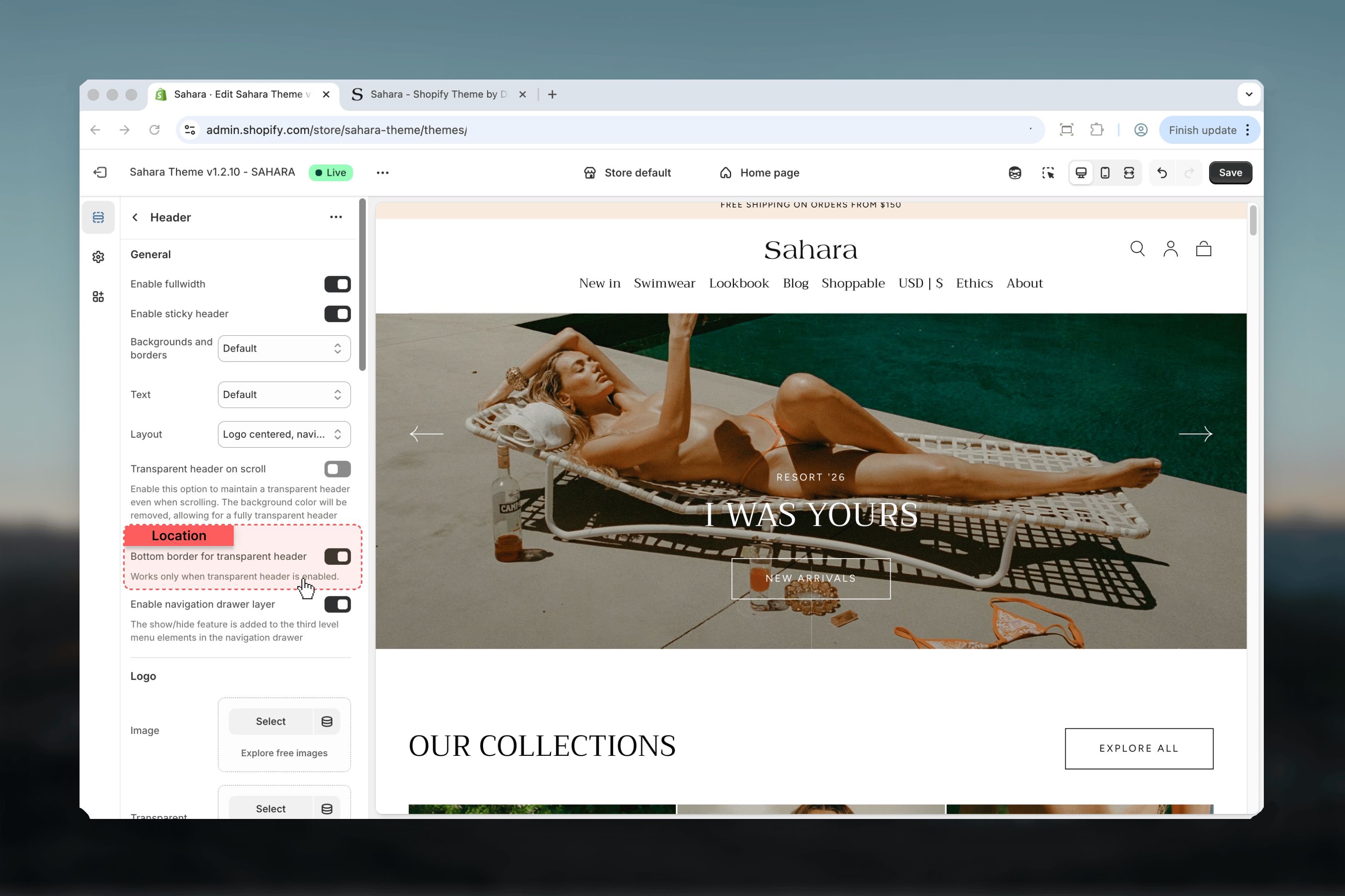 ### Enable navigation drawer layer
Adds show/hide toggles to third-level menu items in navigation drawer.
**Default:** Enabled
Creates accordion-style expansion for deep menu hierarchies. Disable if you have shallow navigation (1-2 levels) to simplify the drawer interface.
### Enable navigation drawer layer
Adds show/hide toggles to third-level menu items in navigation drawer.
**Default:** Enabled
Creates accordion-style expansion for deep menu hierarchies. Disable if you have shallow navigation (1-2 levels) to simplify the drawer interface.
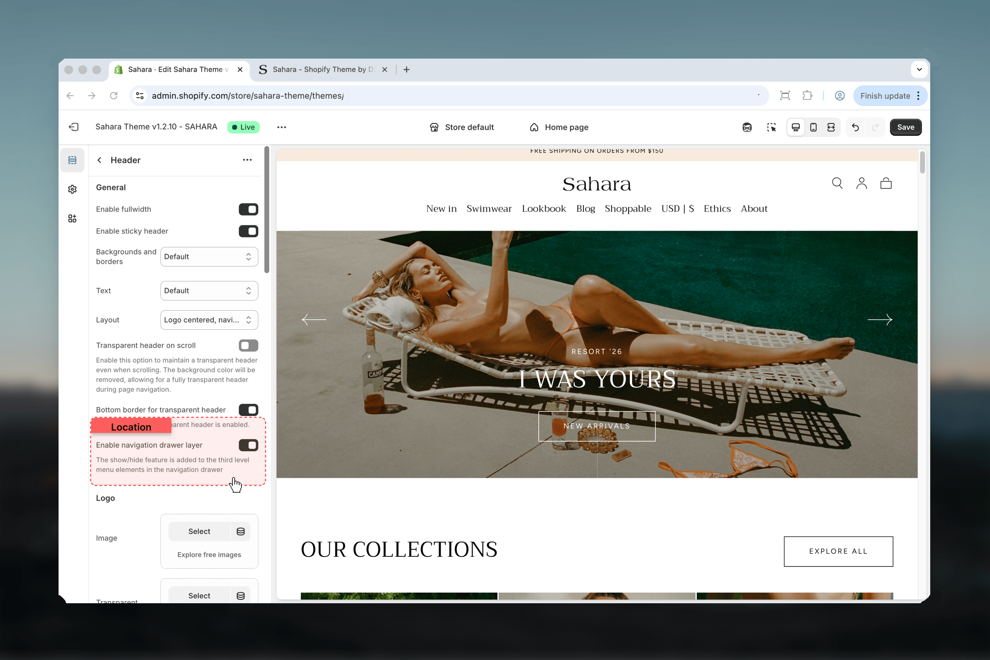 ## Logo settings
### Logo
Primary logo image displayed in the header.
Upload PNG or JPG with transparent background. Recommended size: 400×100px.
### Logo for transparent header
Alternative logo used when transparent header is enabled.
Use a version with different color (typically white or dark) to ensure visibility against varied backgrounds.
### SVG code
Paste SVG code directly for vector logo display.
Overwrites uploaded image if SVG code is present. SVG logos scale perfectly at any size.
SVG logos load faster and scale perfectly. Use SVG code when possible for best quality.
## Logo settings
### Logo
Primary logo image displayed in the header.
Upload PNG or JPG with transparent background. Recommended size: 400×100px.
### Logo for transparent header
Alternative logo used when transparent header is enabled.
Use a version with different color (typically white or dark) to ensure visibility against varied backgrounds.
### SVG code
Paste SVG code directly for vector logo display.
Overwrites uploaded image if SVG code is present. SVG logos scale perfectly at any size.
SVG logos load faster and scale perfectly. Use SVG code when possible for best quality.
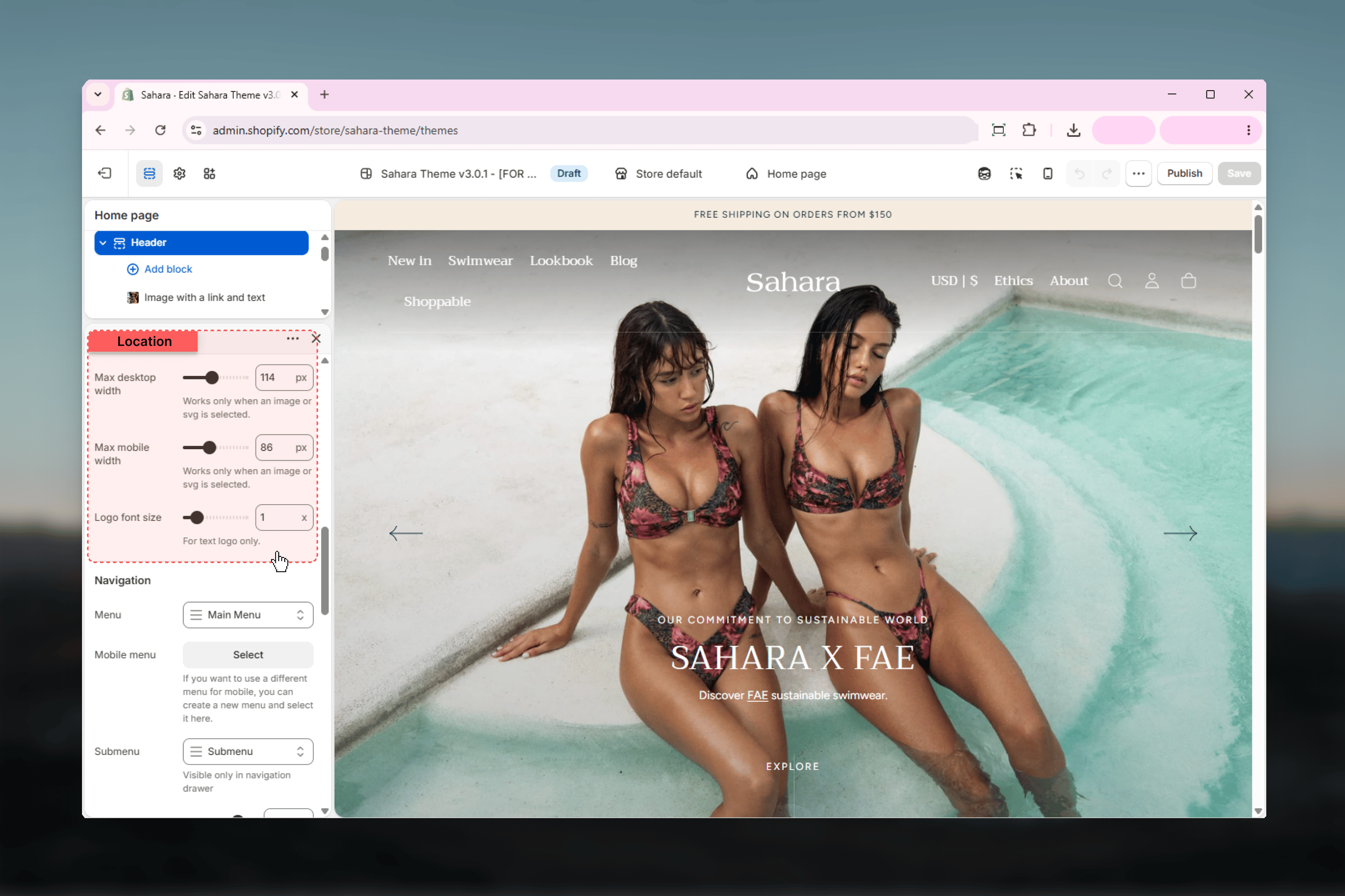
 ### Max desktop width
Controls logo width on desktop screens.
**Range:** 50-200px\
**Default:** 120px
Only applies when logo image or SVG is present. Text logos use font size setting instead.
### Max mobile width
Controls logo width on mobile screens.
**Range:** 40-160px\
**Default:** 80px
Smaller default ensures header elements fit on mobile screens.
### Logo font size
Controls text logo size when no image/SVG is uploaded.
**Range:** 0.5× - 4.0×\
**Default:** 1.0×
Only affects text-based logos (when logo image/SVG fields are empty).
### Max desktop width
Controls logo width on desktop screens.
**Range:** 50-200px\
**Default:** 120px
Only applies when logo image or SVG is present. Text logos use font size setting instead.
### Max mobile width
Controls logo width on mobile screens.
**Range:** 40-160px\
**Default:** 80px
Smaller default ensures header elements fit on mobile screens.
### Logo font size
Controls text logo size when no image/SVG is uploaded.
**Range:** 0.5× - 4.0×\
**Default:** 1.0×
Only affects text-based logos (when logo image/SVG fields are empty).
 ## Navigation settings
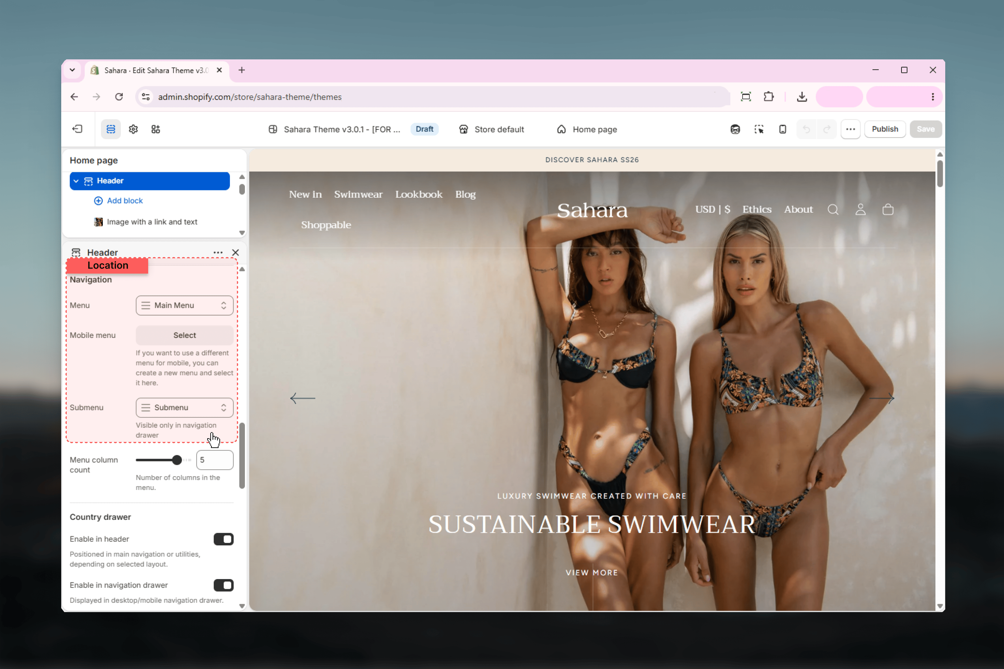
### Menu
Primary navigation menu for desktop.
**Default:** main-menu
Create menus in Shopify admin under **Online Store > Navigation**.
### Mobile menu
Alternative menu for mobile devices.
Leave empty to use the same menu as desktop. Create simplified mobile menu for better small-screen experience.
### Submenu
Additional menu visible only in navigation drawer layout.
**Default:** main-menu
Appears below primary navigation in drawer. Use for secondary links like policies, help center, or social links.
## Navigation settings
### Menu
Primary navigation menu for desktop.
**Default:** main-menu
Create menus in Shopify admin under **Online Store > Navigation**.
### Mobile menu
Alternative menu for mobile devices.
Leave empty to use the same menu as desktop. Create simplified mobile menu for better small-screen experience.
### Submenu
Additional menu visible only in navigation drawer layout.
**Default:** main-menu
Appears below primary navigation in drawer. Use for secondary links like policies, help center, or social links.
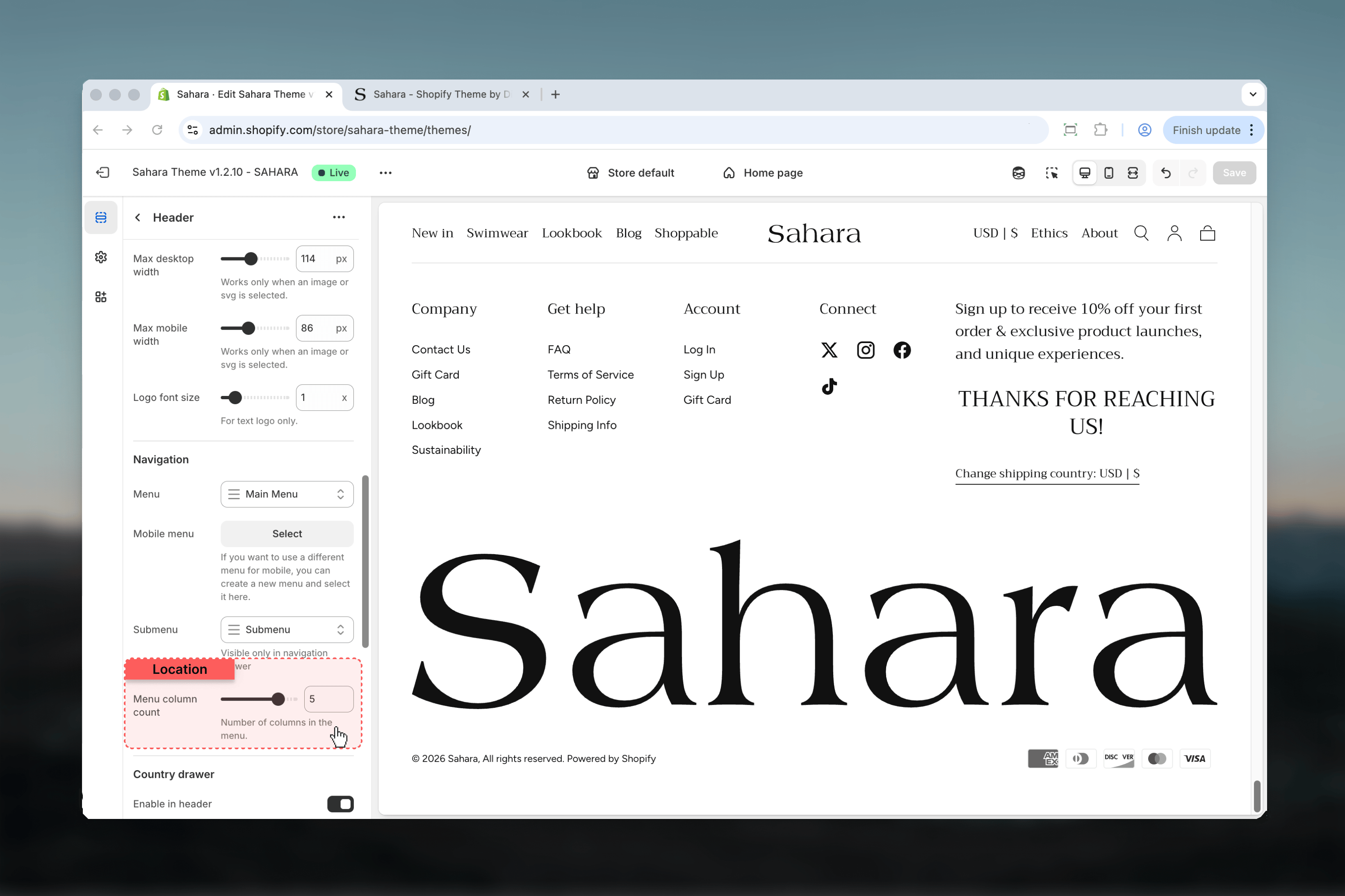
 ### Menu column count
Number of columns in megamenu dropdown.
**Range:** 1-6 columns\
**Default:** 5
Controls how menu items distribute horizontally in megamenu. More columns = wider megamenu. Fewer columns = more compact display.
Adjust based on number of items in your menu. 3-5 columns works well for most stores.
### Menu column count
Number of columns in megamenu dropdown.
**Range:** 1-6 columns\
**Default:** 5
Controls how menu items distribute horizontally in megamenu. More columns = wider megamenu. Fewer columns = more compact display.
Adjust based on number of items in your menu. 3-5 columns works well for most stores.
 ## Additional links
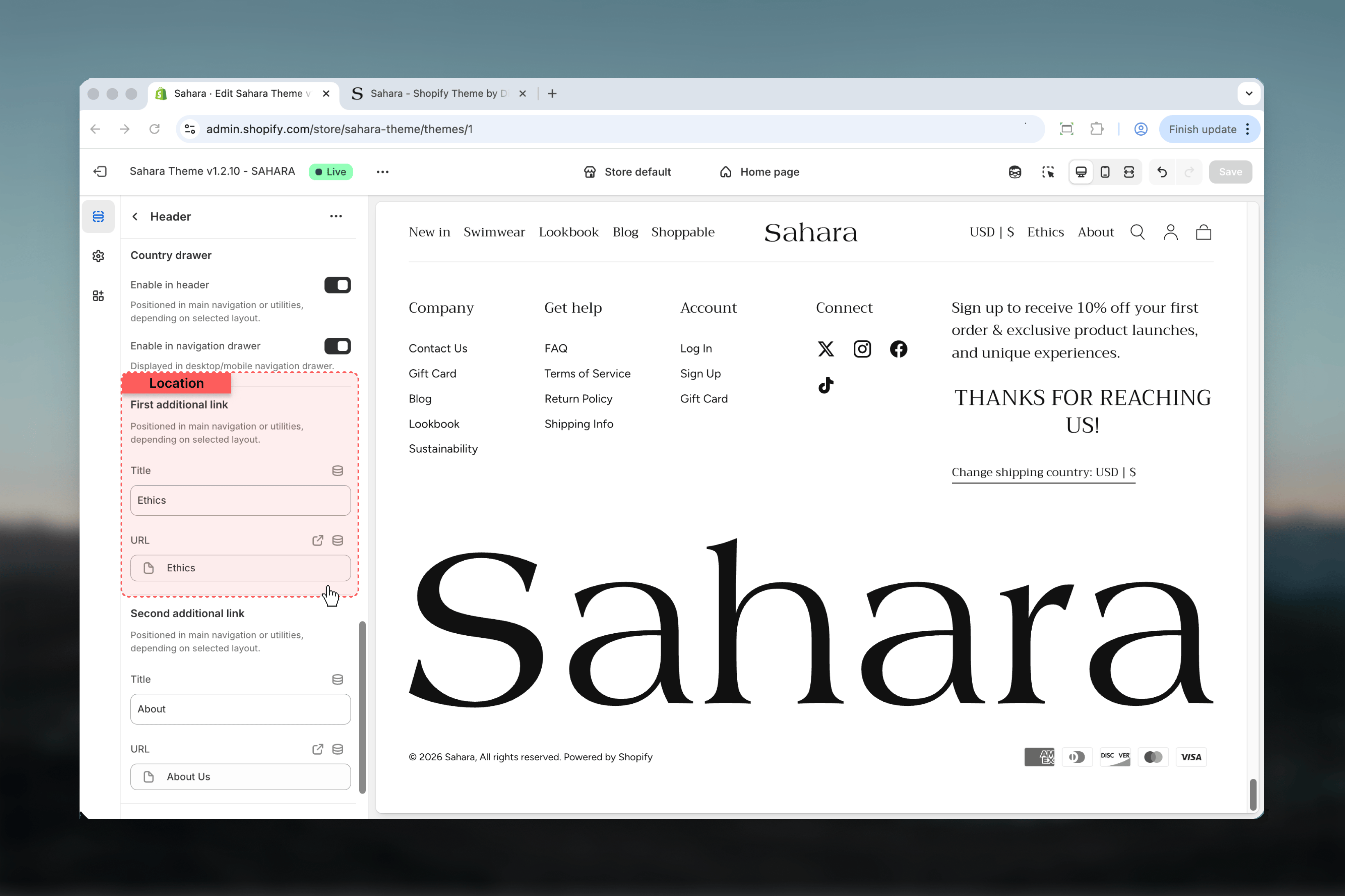
Add up to 2 standalone links in header navigation or utilities area (placement depends on layout).
### Label
Link text displayed to visitors.
**Default:** "Collections"
### Link
Destination URL for the link.
**Default:** /collections
## Additional links
Add up to 2 standalone links in header navigation or utilities area (placement depends on layout).
### Label
Link text displayed to visitors.
**Default:** "Collections"
### Link
Destination URL for the link.
**Default:** /collections
 ### Label
Link text displayed to visitors.
**Default:** "Products"
### Link
Destination URL for the link.
**Default:** /collections/all
### Label
Link text displayed to visitors.
**Default:** "Products"
### Link
Destination URL for the link.
**Default:** /collections/all
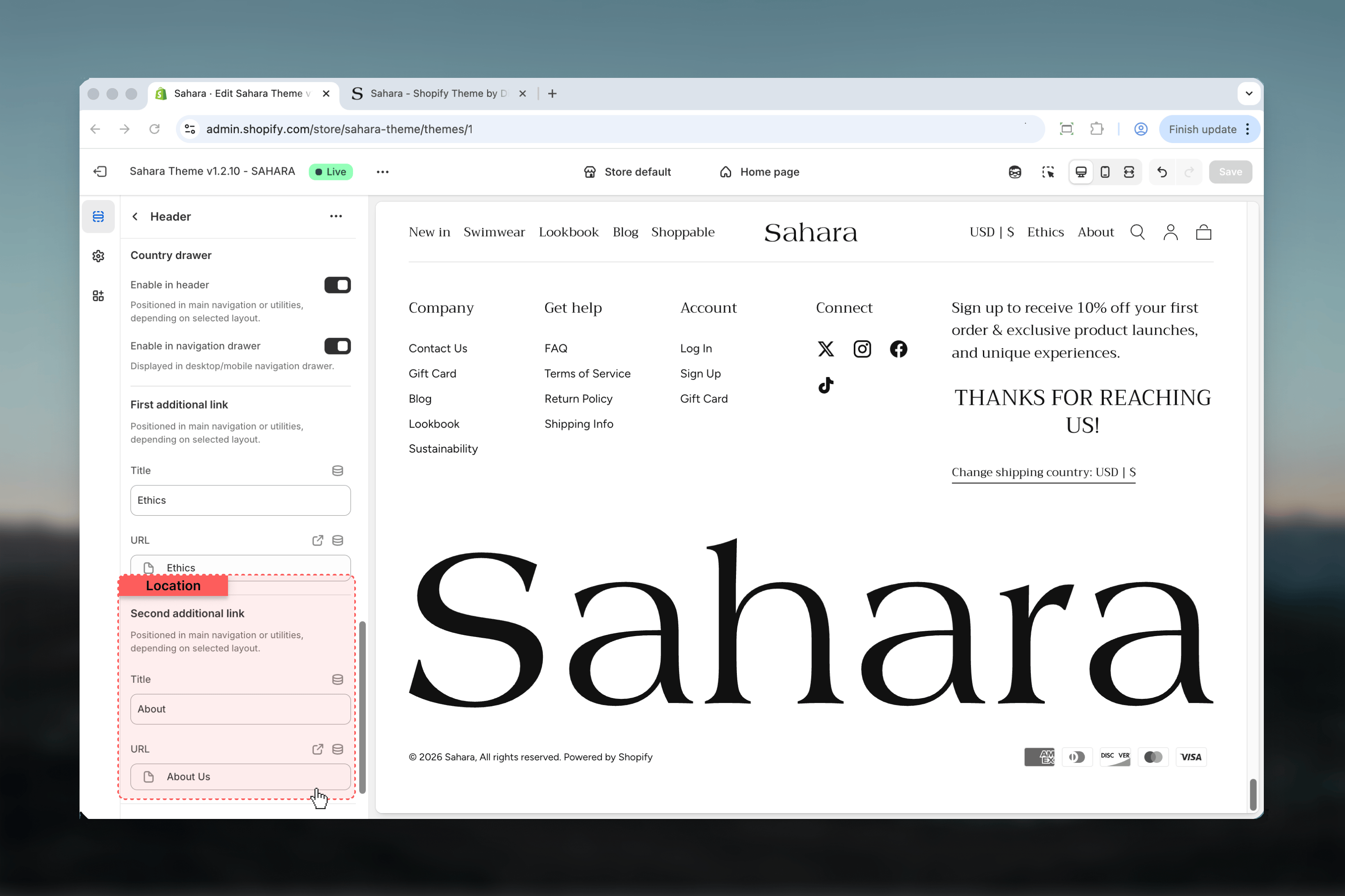 Additional link placement varies by layout. In centered layouts, links appear in utilities area. In left-aligned layouts, links appear in main navigation.
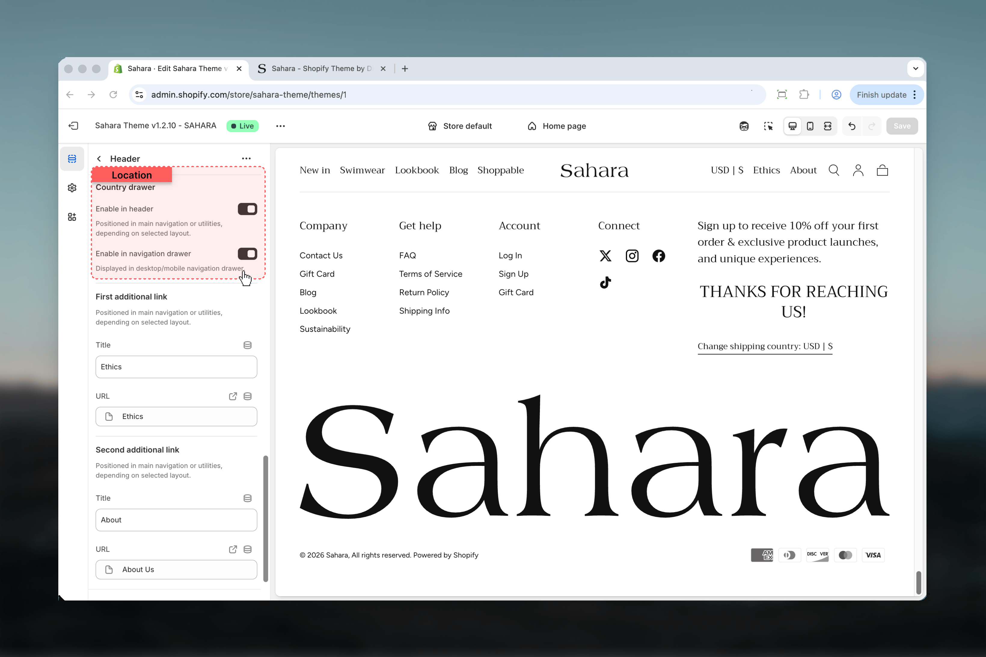
## Country drawer
Control where language and currency selectors appear.
### Enable in header
Display country/language selector in main header navigation or utilities.
**Default:** Enabled
Position depends on selected layout.
### Enable in navigation drawer
Display country/language selector in navigation drawer menu.
**Default:** Enabled
Appears at bottom of drawer menu on both desktop and mobile.
Enable in both locations for maximum accessibility, or choose one location to simplify header design.
Additional link placement varies by layout. In centered layouts, links appear in utilities area. In left-aligned layouts, links appear in main navigation.
## Country drawer
Control where language and currency selectors appear.
### Enable in header
Display country/language selector in main header navigation or utilities.
**Default:** Enabled
Position depends on selected layout.
### Enable in navigation drawer
Display country/language selector in navigation drawer menu.
**Default:** Enabled
Appears at bottom of drawer menu on both desktop and mobile.
Enable in both locations for maximum accessibility, or choose one location to simplify header design.
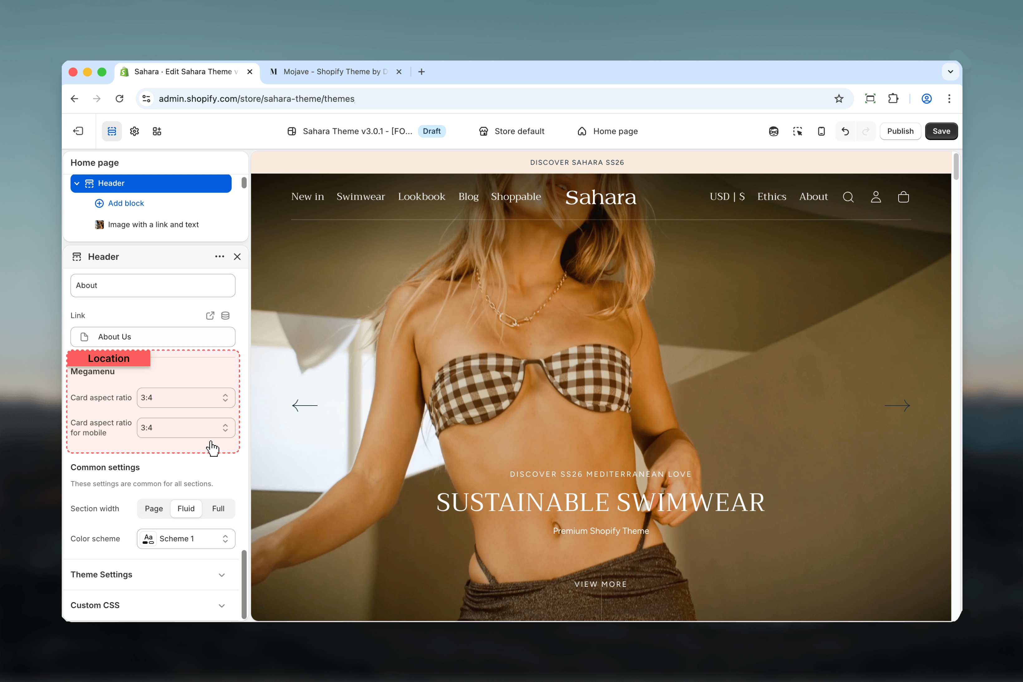
 ## Megamenu settings
### Card aspect ratio
Image proportions for megamenu promotional cards on desktop.
**Options:** auto, 1:1, 4:3, 3:4, 3:2, 2:3, 5:4, 4:5, 16:9, 9:16, 2:1, 4:1, 8:1, 1:2\
**Default:** 3:4 (portrait)
### Card aspect ratio for mobile
Image proportions for megamenu cards on mobile screens.
**Options:** (same as above)\
**Default:** 3:4
Aspect ratio only affects promotional cards added via blocks (Image with link and text), not regular menu items.
## Megamenu settings
### Card aspect ratio
Image proportions for megamenu promotional cards on desktop.
**Options:** auto, 1:1, 4:3, 3:4, 3:2, 2:3, 5:4, 4:5, 16:9, 9:16, 2:1, 4:1, 8:1, 1:2\
**Default:** 3:4 (portrait)
### Card aspect ratio for mobile
Image proportions for megamenu cards on mobile screens.
**Options:** (same as above)\
**Default:** 3:4
Aspect ratio only affects promotional cards added via blocks (Image with link and text), not regular menu items.
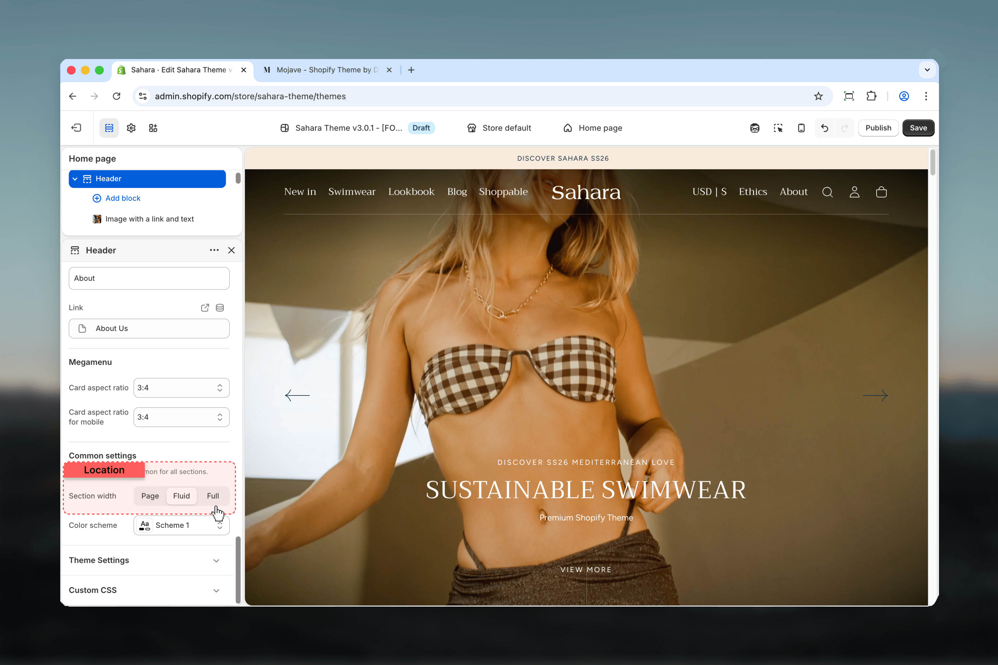
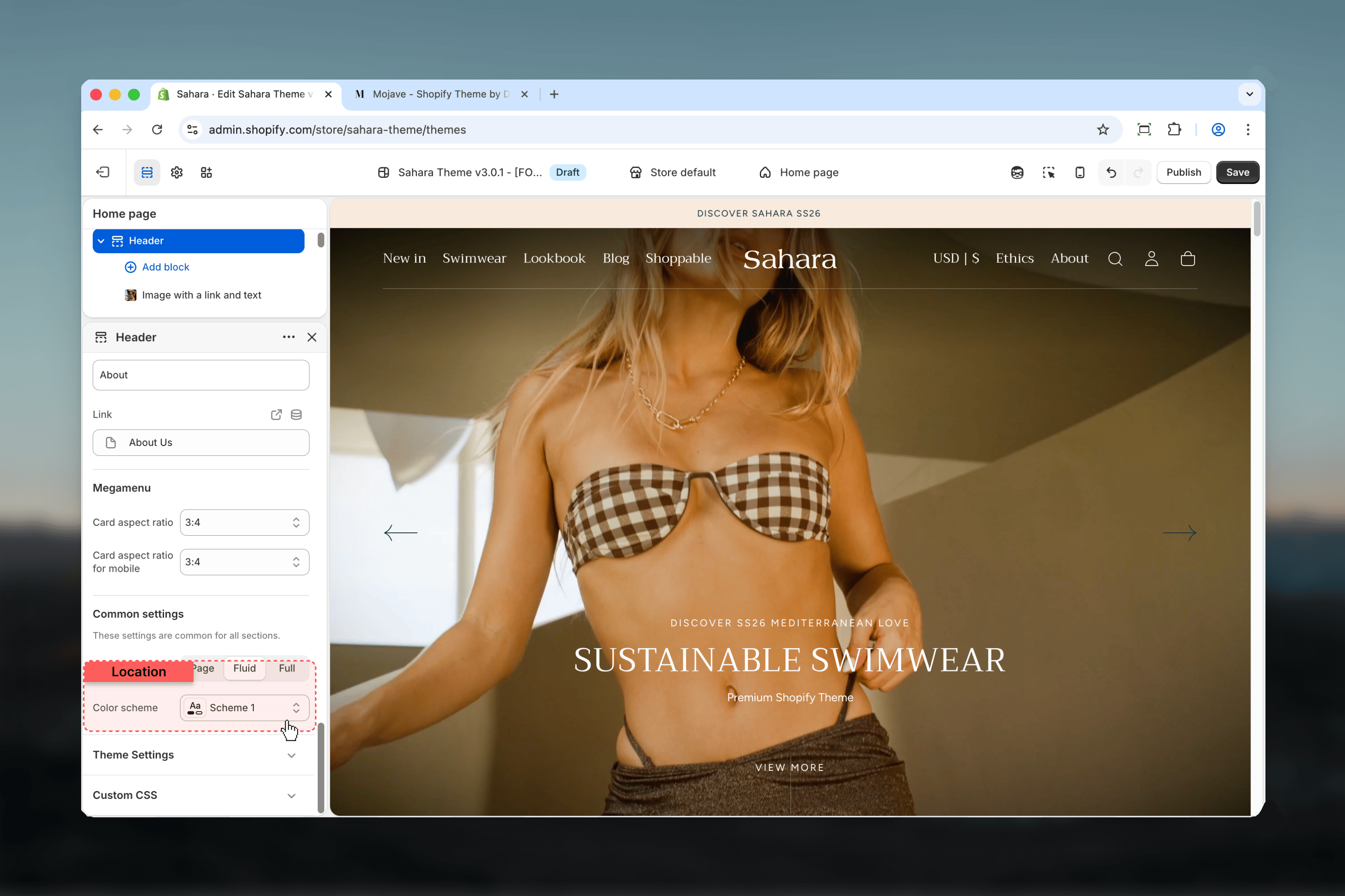
 ## Design settings
### Section width
Controls header container width.
**Options:**
* **Page** - Content width (1400px max)
* **Fluid** - 90% viewport width
* **Full** - Edge-to-edge (100vw)
**Default:** Fluid
## Design settings
### Section width
Controls header container width.
**Options:**
* **Page** - Content width (1400px max)
* **Fluid** - 90% viewport width
* **Full** - Edge-to-edge (100vw)
**Default:** Fluid
 ### Color scheme
Background and text colors for header.
**Default:** Scheme 1
Choose scheme with sufficient contrast for navigation readability.
### Color scheme
Background and text colors for header.
**Default:** Scheme 1
Choose scheme with sufficient contrast for navigation readability.
 ## Block settings
Add promotional elements to your navigation using blocks.
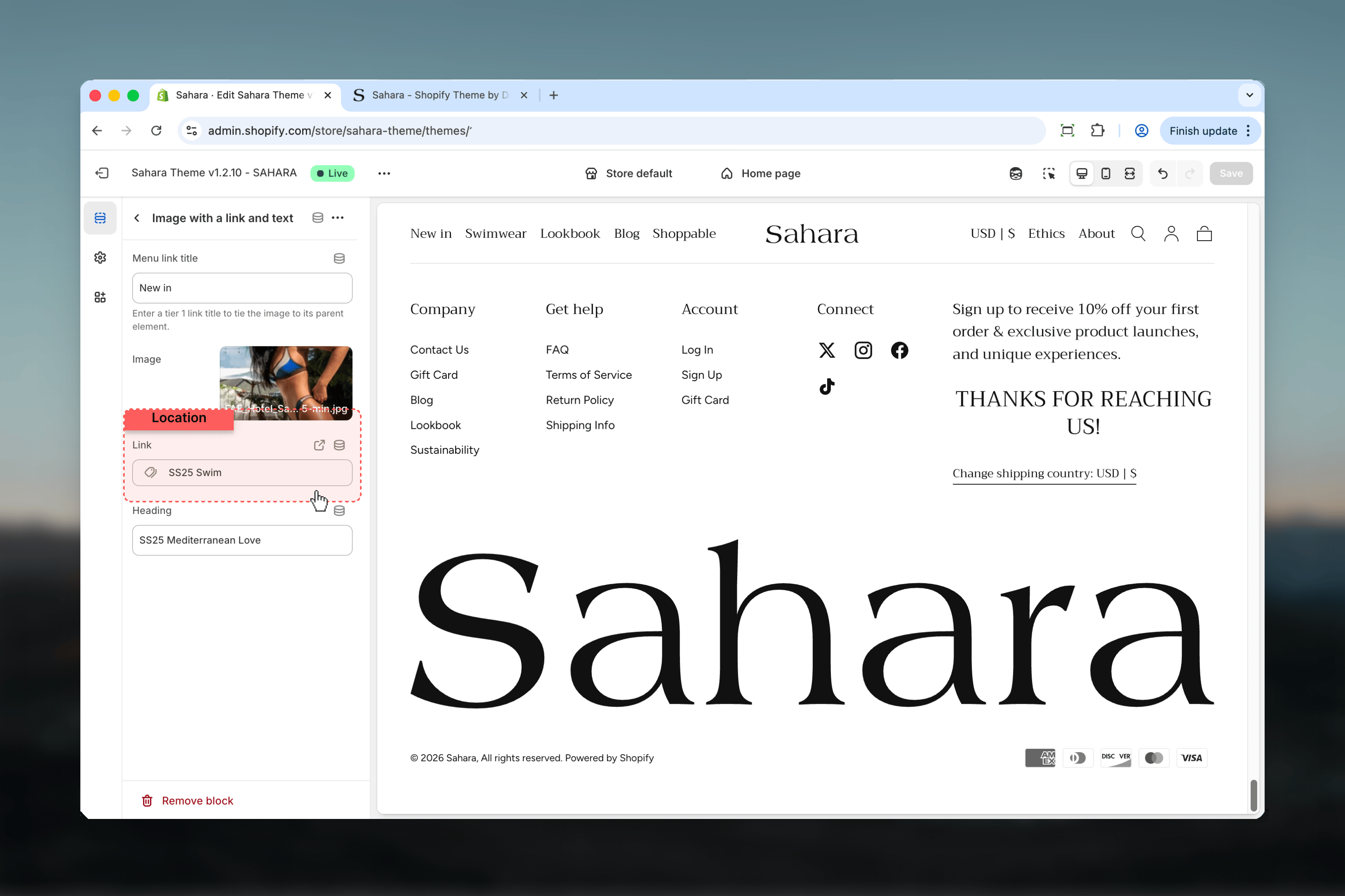
Add promotional card with image and text to megamenu dropdown.
### Available settings
Links the block to a specific top-level menu item.
Enter the position number (1, 2, 3, etc.) of the tier 1 menu link. The block appears in that menu item's dropdown.
**Example:** Enter "2" to attach block to second menu item.
## Block settings
Add promotional elements to your navigation using blocks.
Add promotional card with image and text to megamenu dropdown.
### Available settings
Links the block to a specific top-level menu item.
Enter the position number (1, 2, 3, etc.) of the tier 1 menu link. The block appears in that menu item's dropdown.
**Example:** Enter "2" to attach block to second menu item.
 Background and text colors for promotional card.
**Default:** Scheme 1
Can differ from header color scheme for visual emphasis.
Card background image.
Recommended size based on aspect ratio setting (e.g., 400×533px for 3:4 portrait).
Vertical alignment of card content.
**Options:**
* **Top** - Content aligned to top
* **Center** - Content centered vertically
* **Bottom** - Content aligned to bottom
**Default:** Center
Background and text colors for promotional card.
**Default:** Scheme 1
Can differ from header color scheme for visual emphasis.
Card background image.
Recommended size based on aspect ratio setting (e.g., 400×533px for 3:4 portrait).
Vertical alignment of card content.
**Options:**
* **Top** - Content aligned to top
* **Center** - Content centered vertically
* **Bottom** - Content aligned to bottom
**Default:** Center
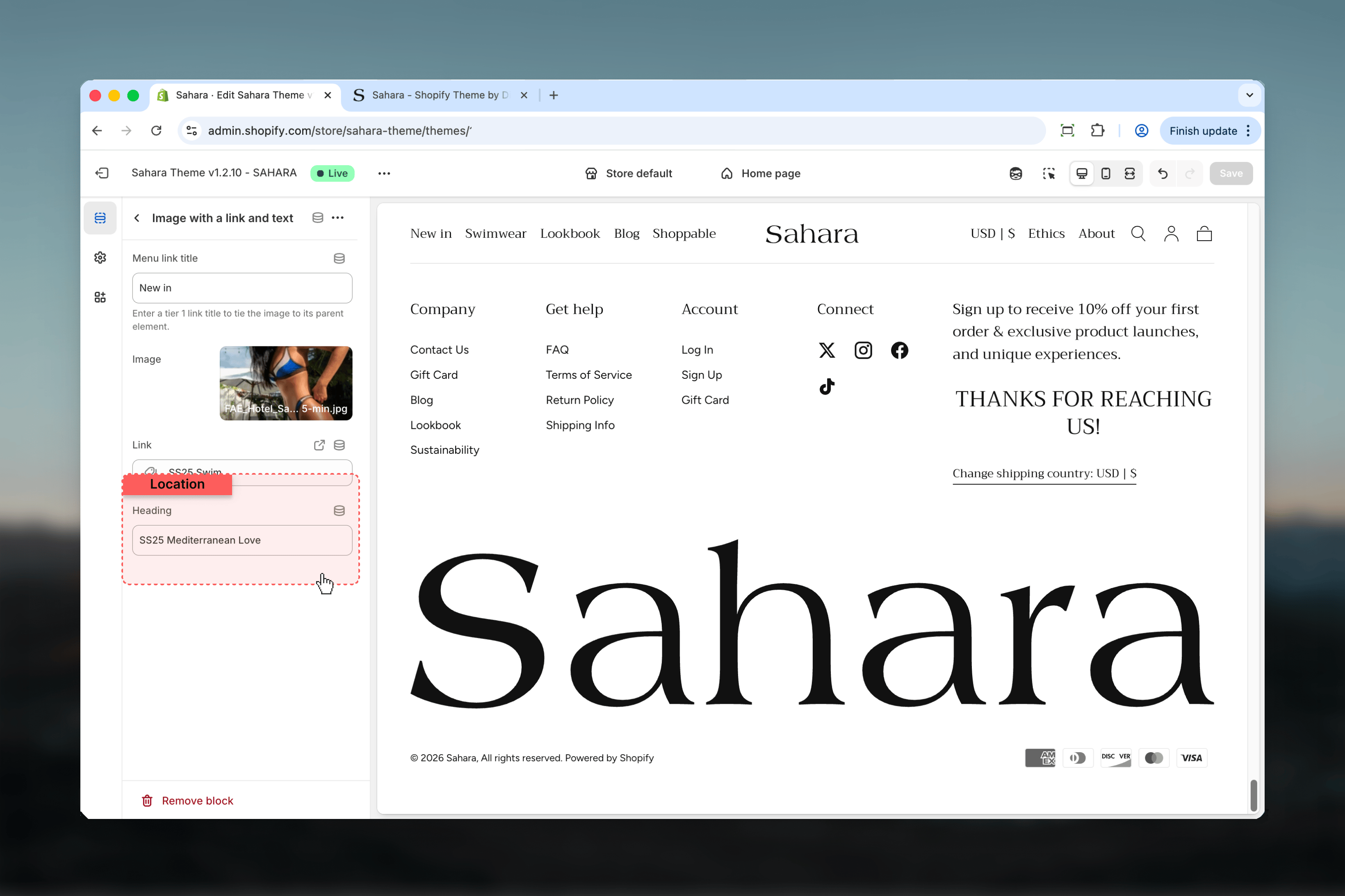
 Card title text.
**Default:** "Heading goes here"
Supports inline formatting (bold, italic).
How visitors interact with the card.
**Options:**
* **Button** - Shows clickable button with custom text
* **Card** - Entire card is clickable (no visible button)
**Default:** Card
Card title text.
**Default:** "Heading goes here"
Supports inline formatting (bold, italic).
How visitors interact with the card.
**Options:**
* **Button** - Shows clickable button with custom text
* **Card** - Entire card is clickable (no visible button)
**Default:** Card
 Text displayed on button.
Only visible when Link type is set to "Button".
**Example:** "Shop Now", "Learn More"
Destination URL when clicking card or button.
Use promotional cards to highlight featured collections, new arrivals, or seasonal campaigns directly in navigation.
Add badge labels to menu items (e.g., "New", "Sale", "Hot").
### Available settings
Links the badge to a specific top-level menu item.
Enter position number (1, 2, 3, etc.) of the tier 1 menu link. Badge appears next to that menu item's text.
Text displayed on button.
Only visible when Link type is set to "Button".
**Example:** "Shop Now", "Learn More"
Destination URL when clicking card or button.
Use promotional cards to highlight featured collections, new arrivals, or seasonal campaigns directly in navigation.
Add badge labels to menu items (e.g., "New", "Sale", "Hot").
### Available settings
Links the badge to a specific top-level menu item.
Enter position number (1, 2, 3, etc.) of the tier 1 menu link. Badge appears next to that menu item's text.
 Text displayed in the badge.
Keep short (1-4 characters) for best display. Examples: "New", "Sale", "%"
Text displayed in the badge.
Keep short (1-4 characters) for best display. Examples: "New", "Sale", "%"
 Visual shape of the badge.
**Options:**
* **Square** - Sharp corners
* **Rounded** - Rounded corners (pill shape)
**Default:** Rounded
Visual shape of the badge.
**Options:**
* **Square** - Sharp corners
* **Rounded** - Rounded corners (pill shape)
**Default:** Rounded
 Use badges sparingly. Too many badges reduce their effectiveness and create visual clutter.
## Best practices
Logo centered works for brand-focused stores. Navigation drawer suits stores with deep navigation hierarchies (10+ categories).
Keep sticky header enabled (default) to ensure cart and search remain accessible while customers browse.
Desktop logos at 100-140px and mobile at 60-100px create balanced proportions. Test on actual devices.
Transparent header works best on homepage hero images. Ensure sufficient text contrast throughout scrolling.
Create separate mobile menu with fewer items (5-7 max) for better small-screen usability.
3-5 columns works for most stores. Adjust based on menu item count to avoid awkward spacing.
Attach promotional cards to your most popular or seasonal menu items for maximum visibility.
Use 1-2 badges maximum. Focus on promoting new collections or active sales only.
Enable in header for quick access. Enable in drawer for cleaner header appearance. Test both.
SVG logos scale perfectly at any size and load faster than PNG/JPG images.
## Related guides
Configure messages and promotions above the header
Use badges sparingly. Too many badges reduce their effectiveness and create visual clutter.
## Best practices
Logo centered works for brand-focused stores. Navigation drawer suits stores with deep navigation hierarchies (10+ categories).
Keep sticky header enabled (default) to ensure cart and search remain accessible while customers browse.
Desktop logos at 100-140px and mobile at 60-100px create balanced proportions. Test on actual devices.
Transparent header works best on homepage hero images. Ensure sufficient text contrast throughout scrolling.
Create separate mobile menu with fewer items (5-7 max) for better small-screen usability.
3-5 columns works for most stores. Adjust based on menu item count to avoid awkward spacing.
Attach promotional cards to your most popular or seasonal menu items for maximum visibility.
Use 1-2 badges maximum. Focus on promoting new collections or active sales only.
Enable in header for quick access. Enable in drawer for cleaner header appearance. Test both.
SVG logos scale perfectly at any size and load faster than PNG/JPG images.
## Related guides
Configure messages and promotions above the header