> ## Documentation Index
> Fetch the complete documentation index at: https://docs.digifist.com/llms.txt
> Use this file to discover all available pages before exploring further.
# Blog articles
> Showcase selected blog posts with customizable layouts, flexible metadata display, and manual article selection options.
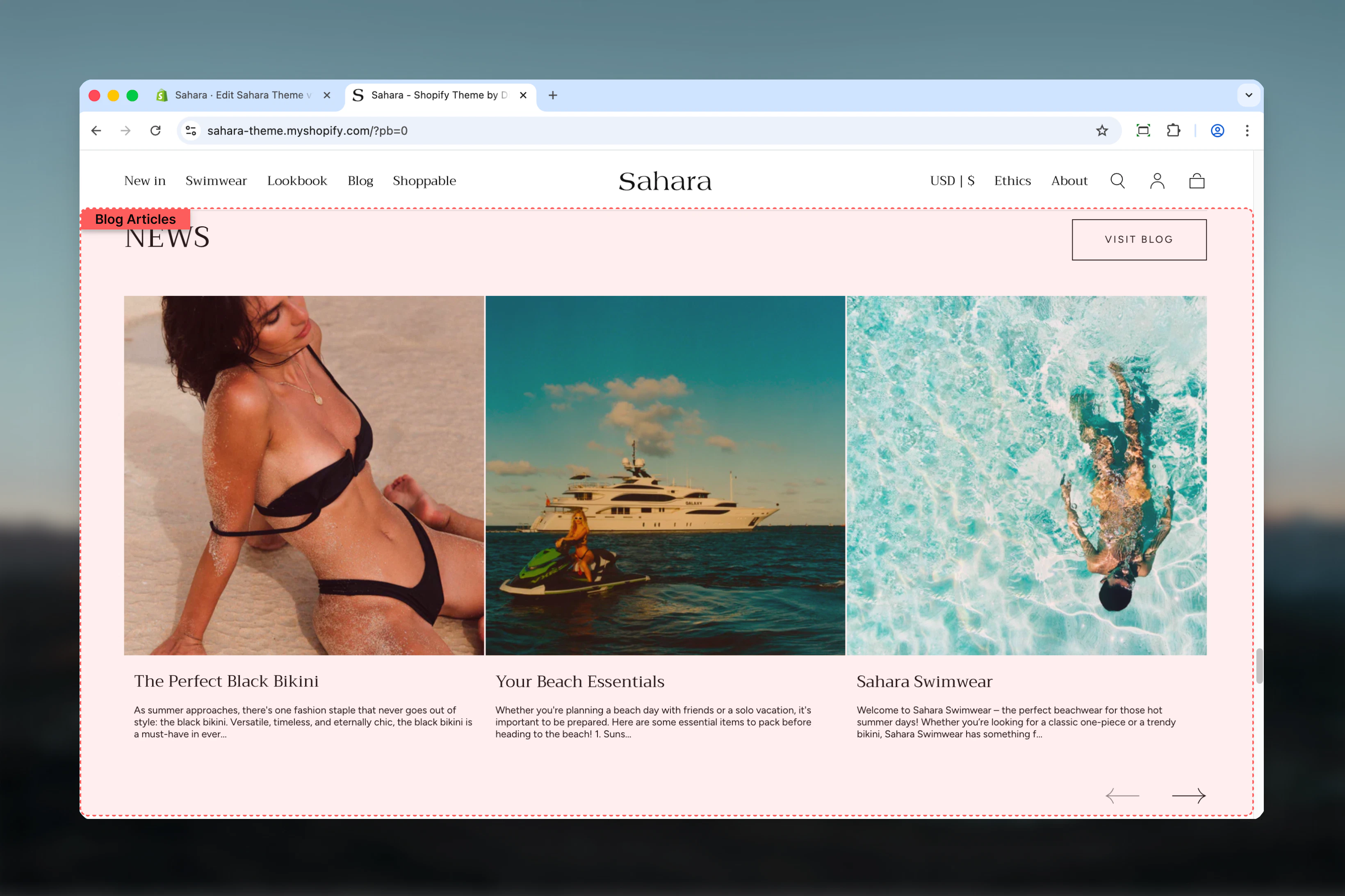
The Blog articles section displays selected blog posts from a Shopify blog. It supports two layout styles, customizable metadata (author, date, excerpt), and both automatic blog-based display and manual article selection through blocks.
Blog articles help drive content engagement by featuring editorial content, company updates, tutorials, or educational resources directly within your storefront pages.
 ## What this section controls
This section controls blog article displays with the following capabilities:
* Automatic article display from selected Shopify blog
* Manual article selection via Article blocks
* Two distinct layout options
* Customizable metadata visibility (excerpt, date, author, read more link)
* Flexible content alignment
* Section-level button linking to blog
* Responsive grid design
## How Blog articles works
The Blog articles section uses a flexible content system:
**Automatic mode:**
* Select a Shopify blog as the source
* Displays most recent articles automatically
* Updates when new blog posts are published
**Manual mode:**
* Add Article blocks to hand-pick specific posts
* Override automatic ordering
* Curate featured content manually
You can combine both approaches: select a blog for defaults, then add Article blocks to prioritize specific posts at the beginning.
## Getting started
From Shopify admin, access the Theme Customizer.
Add the section to your homepage or page template.
Choose which Shopify blog to pull articles from using the Blog selector.
Click "Add block" and select Article to manually choose featured posts.
Toggle excerpt, date, author, and read more link visibility.
## What this section controls
This section controls blog article displays with the following capabilities:
* Automatic article display from selected Shopify blog
* Manual article selection via Article blocks
* Two distinct layout options
* Customizable metadata visibility (excerpt, date, author, read more link)
* Flexible content alignment
* Section-level button linking to blog
* Responsive grid design
## How Blog articles works
The Blog articles section uses a flexible content system:
**Automatic mode:**
* Select a Shopify blog as the source
* Displays most recent articles automatically
* Updates when new blog posts are published
**Manual mode:**
* Add Article blocks to hand-pick specific posts
* Override automatic ordering
* Curate featured content manually
You can combine both approaches: select a blog for defaults, then add Article blocks to prioritize specific posts at the beginning.
## Getting started
From Shopify admin, access the Theme Customizer.
Add the section to your homepage or page template.
Choose which Shopify blog to pull articles from using the Blog selector.
Click "Add block" and select Article to manually choose featured posts.
Toggle excerpt, date, author, and read more link visibility.
 ## Section settings
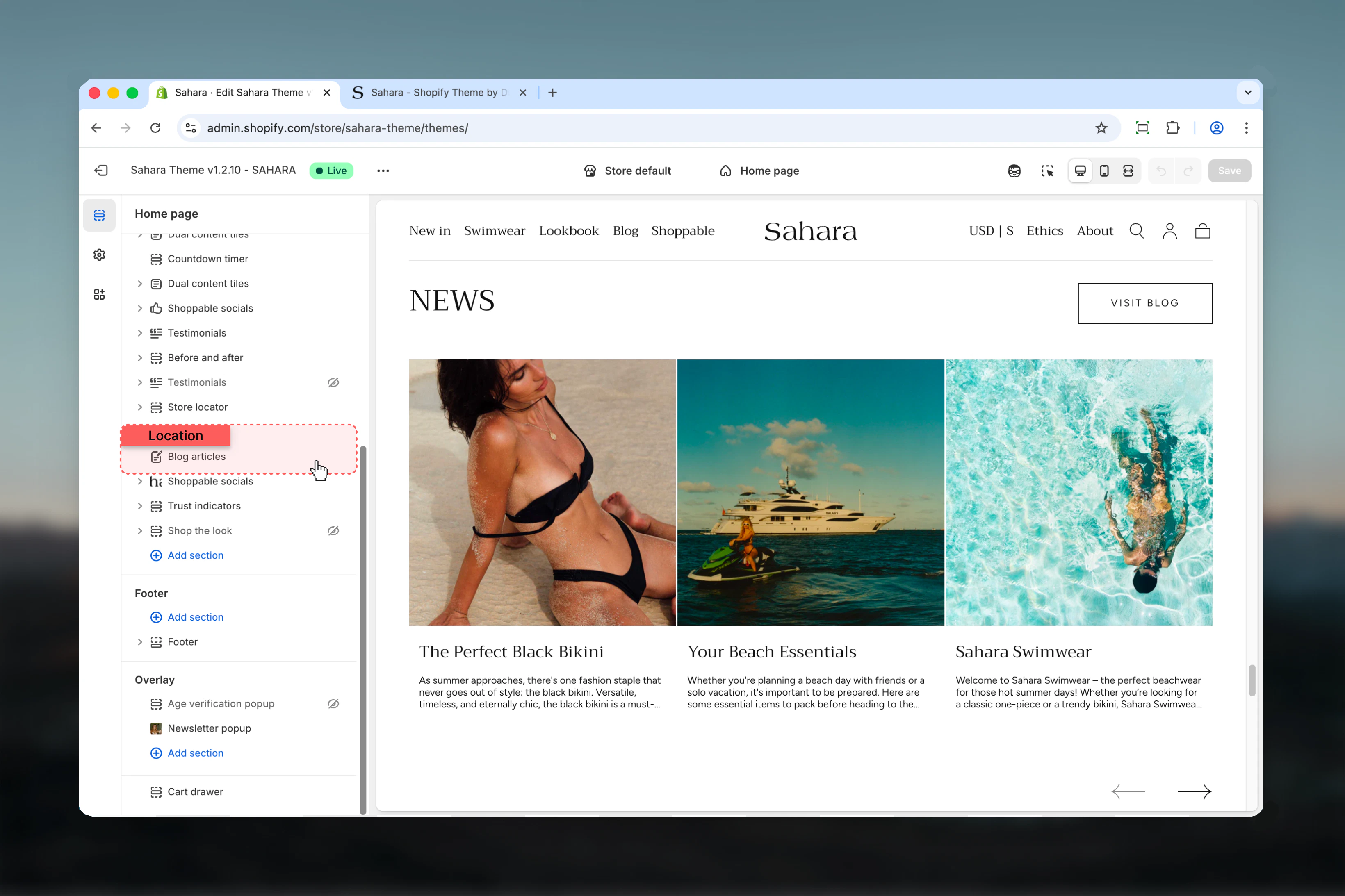
### Heading
Main title text for the section.
* Inline rich text supported (bold, italic, links)
* **Default:** "Blog"
### Heading size
Controls the size of section heading.
**Options:** XS, S, M, L, XL\
**Default:** XL
## Section settings
### Heading
Main title text for the section.
* Inline rich text supported (bold, italic, links)
* **Default:** "Blog"
### Heading size
Controls the size of section heading.
**Options:** XS, S, M, L, XL\
**Default:** XL
 ### Blog
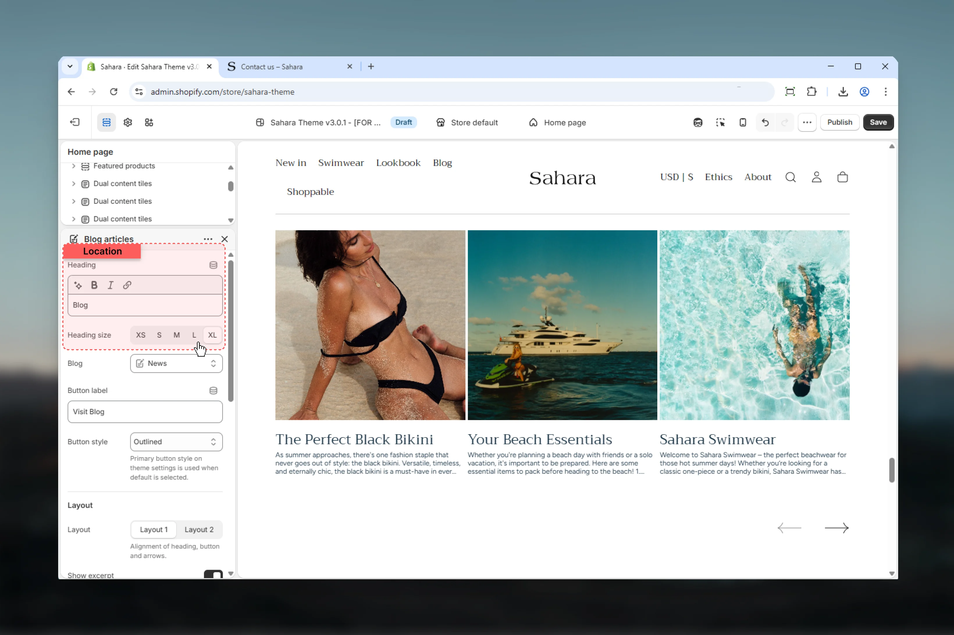
Select which Shopify blog to display articles from.
* Shopify blog selector
* Provides automatic article source
* Manual Article blocks override automatic ordering
If you add manual Article blocks, they appear first, followed by automatic articles from the selected blog.
### Button text
Label for section-level button linking to the blog.
* Plain text
* **Default:** "Visit Blog"
* Leave empty to hide button
### Button style
Visual style of the section button.
Solid background with contrasting text (default).
**Best for:** Primary CTAs, strong visibility
Border-only style with transparent background.
**Best for:** Secondary actions, subtle CTAs
Standard text link styling.
**Best for:** Minimal designs, non-intrusive links
### Blog
Select which Shopify blog to display articles from.
* Shopify blog selector
* Provides automatic article source
* Manual Article blocks override automatic ordering
If you add manual Article blocks, they appear first, followed by automatic articles from the selected blog.
### Button text
Label for section-level button linking to the blog.
* Plain text
* **Default:** "Visit Blog"
* Leave empty to hide button
### Button style
Visual style of the section button.
Solid background with contrasting text (default).
**Best for:** Primary CTAs, strong visibility
Border-only style with transparent background.
**Best for:** Secondary actions, subtle CTAs
Standard text link styling.
**Best for:** Minimal designs, non-intrusive links
 ### Layout
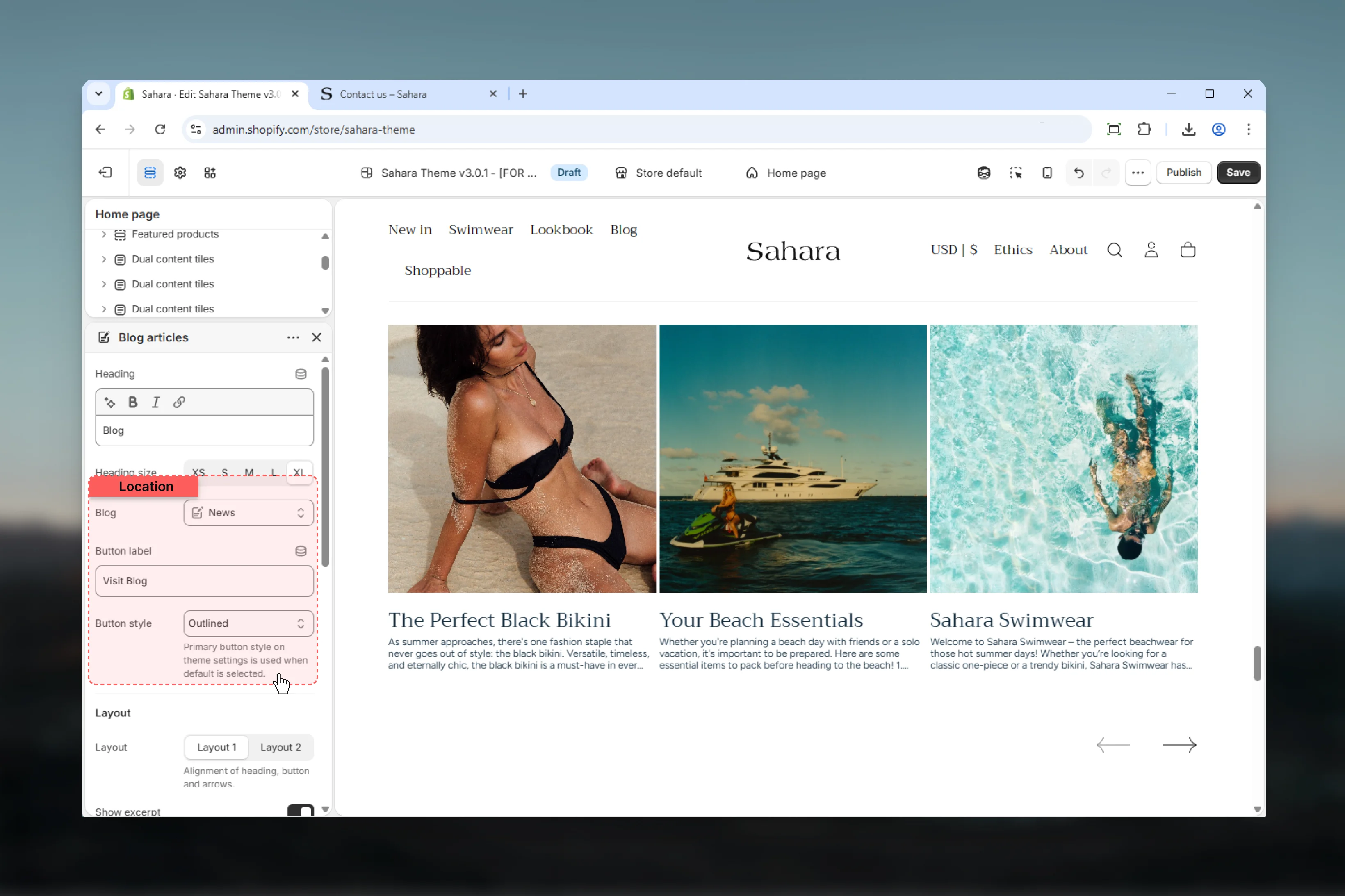
Controls the visual style and arrangement of article cards.
Standard article card layout with consistent styling (default).
**Best for:**
* Clean, minimal designs
* Focus on article imagery
* Standard blog displays
Alternative layout with different card treatment and spacing.
**Best for:**
* Visual variety
* Differentiation from other sections
* Enhanced visual hierarchy
### Layout
Controls the visual style and arrangement of article cards.
Standard article card layout with consistent styling (default).
**Best for:**
* Clean, minimal designs
* Focus on article imagery
* Standard blog displays
Alternative layout with different card treatment and spacing.
**Best for:**
* Visual variety
* Differentiation from other sections
* Enhanced visual hierarchy
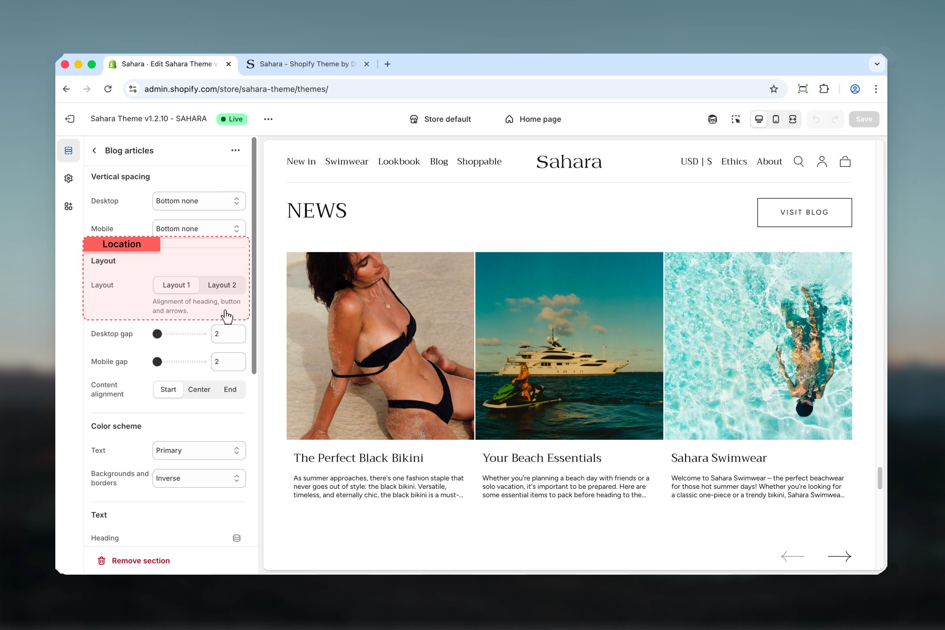 ### Content alignment
Controls horizontal alignment of text within article cards.
**Options:** Left, Center (default), Right
Center alignment works best for image-focused layouts, while left alignment suits text-heavy editorial designs.
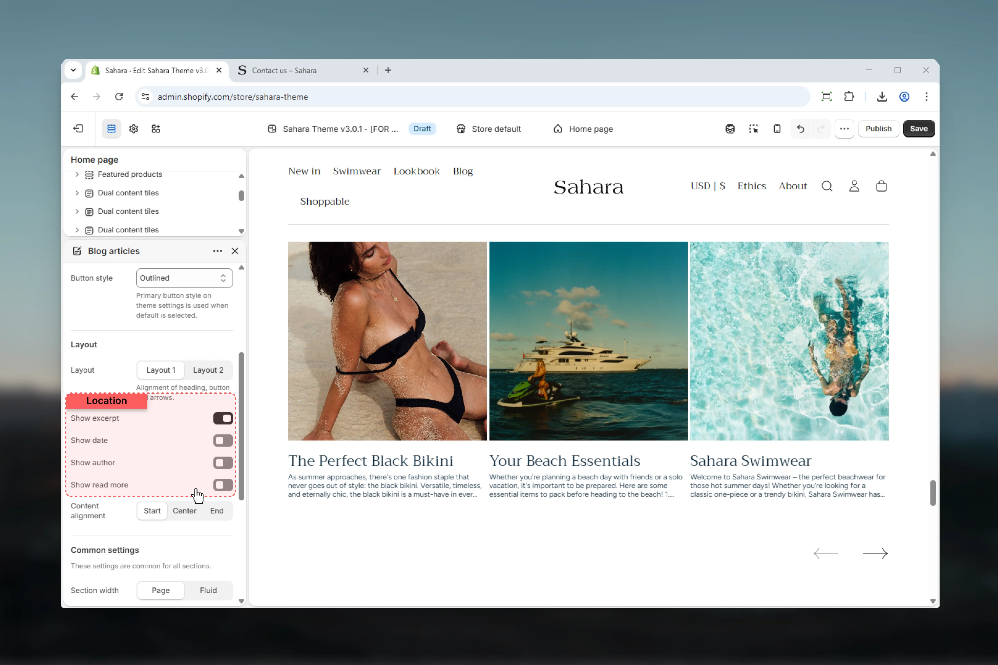
### Show excerpt
Displays article excerpt text below the title.
**Default:** True
**Enabled (True):**
* Shows article excerpt (if available)
* Provides content preview
* Helps users decide which articles to read
**Disabled (False):**
* Only shows article title
* Cleaner, more minimal cards
* Image and title focus
Keep excerpts enabled for editorial or storytelling layouts to provide context. Disable for visual-first designs.
### Show date
Displays article publication date.
**Default:** False
Dates help users understand content freshness, especially for time-sensitive topics like news or seasonal content.
### Show author
Displays article author name.
**Default:** False
Author display is useful for multi-author blogs or when building authority around specific writers.
### Show read more
Displays "Read more" link on article cards.
**Default:** False
**Enabled (True):**
* Adds explicit "Read more" or "Continue reading" link
* Provides clear call-to-action
* Improves accessibility with text links
**Disabled (False):**
* Entire card is clickable
* Cleaner design
* Less visual clutter
### Content alignment
Controls horizontal alignment of text within article cards.
**Options:** Left, Center (default), Right
Center alignment works best for image-focused layouts, while left alignment suits text-heavy editorial designs.
### Show excerpt
Displays article excerpt text below the title.
**Default:** True
**Enabled (True):**
* Shows article excerpt (if available)
* Provides content preview
* Helps users decide which articles to read
**Disabled (False):**
* Only shows article title
* Cleaner, more minimal cards
* Image and title focus
Keep excerpts enabled for editorial or storytelling layouts to provide context. Disable for visual-first designs.
### Show date
Displays article publication date.
**Default:** False
Dates help users understand content freshness, especially for time-sensitive topics like news or seasonal content.
### Show author
Displays article author name.
**Default:** False
Author display is useful for multi-author blogs or when building authority around specific writers.
### Show read more
Displays "Read more" link on article cards.
**Default:** False
**Enabled (True):**
* Adds explicit "Read more" or "Continue reading" link
* Provides clear call-to-action
* Improves accessibility with text links
**Disabled (False):**
* Entire card is clickable
* Cleaner design
* Less visual clutter
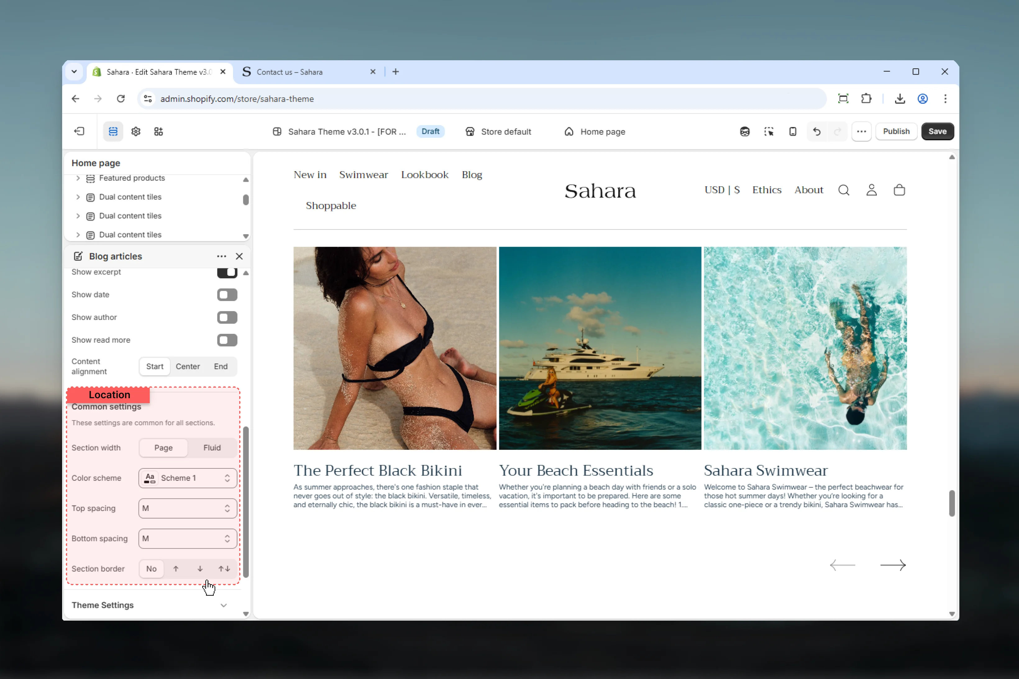
 ### Section width
Controls horizontal width of the section.
**Options:**
* **Page** - Standard container width (default)
* **Fluid** - Wider layout
### Color scheme
Select color scheme for section background and text.
### Spacing
Control vertical spacing around the section:
* **Spacing top** - Margin above (None, S, M, L, XL)
* **Spacing bottom** - Margin below (None, S, M, L, XL)
Both default to M.
### Section border
Add decorative borders: None (default), Top, Bottom, Both
### Section width
Controls horizontal width of the section.
**Options:**
* **Page** - Standard container width (default)
* **Fluid** - Wider layout
### Color scheme
Select color scheme for section background and text.
### Spacing
Control vertical spacing around the section:
* **Spacing top** - Margin above (None, S, M, L, XL)
* **Spacing bottom** - Margin below (None, S, M, L, XL)
Both default to M.
### Section border
Add decorative borders: None (default), Top, Bottom, Both
 ## Block settings
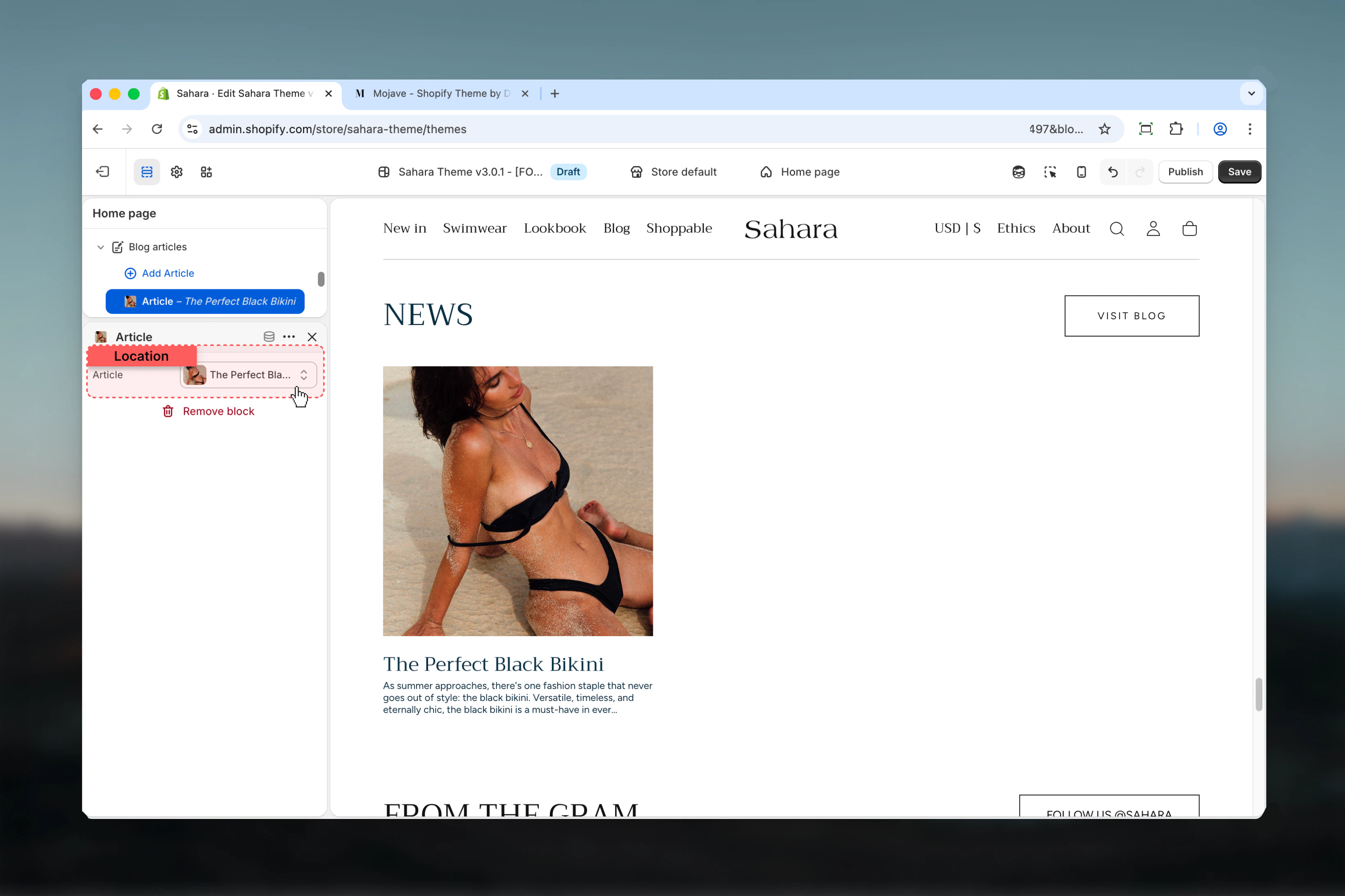
Article blocks allow manual selection of specific blog posts, overriding automatic blog ordering.
### Article
Select a specific Shopify article to display.
* Shopify article selector
* Pick from any blog in your store
* Manual articles appear first, before automatic blog articles
**Manual curation scenarios:**
* Highlighting featured or important posts
* Showcasing specific campaigns or announcements
* Creating curated collections of articles
* Overriding chronological order
**Keep automatic blog:**
* Fresh content sites
* High-frequency publishing
* Dynamic, time-based content
* Minimal manual maintenance
Add 2-4 Article blocks to feature important posts at the beginning, then let the blog selector fill remaining space with recent articles automatically.
## Block settings
Article blocks allow manual selection of specific blog posts, overriding automatic blog ordering.
### Article
Select a specific Shopify article to display.
* Shopify article selector
* Pick from any blog in your store
* Manual articles appear first, before automatic blog articles
**Manual curation scenarios:**
* Highlighting featured or important posts
* Showcasing specific campaigns or announcements
* Creating curated collections of articles
* Overriding chronological order
**Keep automatic blog:**
* Fresh content sites
* High-frequency publishing
* Dynamic, time-based content
* Minimal manual maintenance
Add 2-4 Article blocks to feature important posts at the beginning, then let the blog selector fill remaining space with recent articles automatically.
 ## Best practices
Use manual Article blocks to highlight key content or featured posts at the beginning of the section.
Keep excerpts enabled for editorial layouts to provide content previews and improve engagement.
Hide author or date for minimal designs focused on visual impact and clean aesthetics.
Ensure article featured images use consistent aspect ratios for visual harmony across all cards.
Show only essential metadata (1-2 items) to reduce visual clutter and improve readability.
Use section button to drive traffic to your main blog page for deeper content exploration.
Choose Layout 1 for standard blog displays, Layout 2 when differentiating from other sections.
Use center alignment for image-focused cards, left alignment for text-heavy editorial content.
## Common use cases
Select main blog, show excerpt and date. Hide author and read more. Center alignment. Layout 1. Button: "Read our blog" (filled style). Show 3-4 most recent articles automatically.
Add 3 manual Article blocks for curated posts. Show excerpt only (hide date, author, read more). Center alignment. Layout 2 for visual distinction. Button: "View all articles" (outlined style).
Select blog, show all metadata (excerpt, date, author). Enable read more link. Left alignment. Layout 1. Button: "Explore more stories" (default style). Emphasize written content.
No manual articles, select main blog. Hide all metadata except title. Center alignment. Layout 2 with tight spacing. Button: "All news" (filled style). Focus on article images.
Add 2-3 Article blocks, select blog for more. Show excerpt and author (hide date and read more). Center alignment. Layout 1. Button: "Meet our authors" linking to about page.
## Related sections
Sliding card displays for varied content
Collection showcase with custom styling
## Best practices
Use manual Article blocks to highlight key content or featured posts at the beginning of the section.
Keep excerpts enabled for editorial layouts to provide content previews and improve engagement.
Hide author or date for minimal designs focused on visual impact and clean aesthetics.
Ensure article featured images use consistent aspect ratios for visual harmony across all cards.
Show only essential metadata (1-2 items) to reduce visual clutter and improve readability.
Use section button to drive traffic to your main blog page for deeper content exploration.
Choose Layout 1 for standard blog displays, Layout 2 when differentiating from other sections.
Use center alignment for image-focused cards, left alignment for text-heavy editorial content.
## Common use cases
Select main blog, show excerpt and date. Hide author and read more. Center alignment. Layout 1. Button: "Read our blog" (filled style). Show 3-4 most recent articles automatically.
Add 3 manual Article blocks for curated posts. Show excerpt only (hide date, author, read more). Center alignment. Layout 2 for visual distinction. Button: "View all articles" (outlined style).
Select blog, show all metadata (excerpt, date, author). Enable read more link. Left alignment. Layout 1. Button: "Explore more stories" (default style). Emphasize written content.
No manual articles, select main blog. Hide all metadata except title. Center alignment. Layout 2 with tight spacing. Button: "All news" (filled style). Focus on article images.
Add 2-3 Article blocks, select blog for more. Show excerpt and author (hide date and read more). Center alignment. Layout 1. Button: "Meet our authors" linking to about page.
## Related sections
Sliding card displays for varied content
Collection showcase with custom styling