> ## Documentation Index
> Fetch the complete documentation index at: https://docs.digifist.com/llms.txt
> Use this file to discover all available pages before exploring further.
# Carousel
> Display multiple content cards in a sliding carousel with customizable media, flexible layouts, and desktop/mobile-specific positioning.
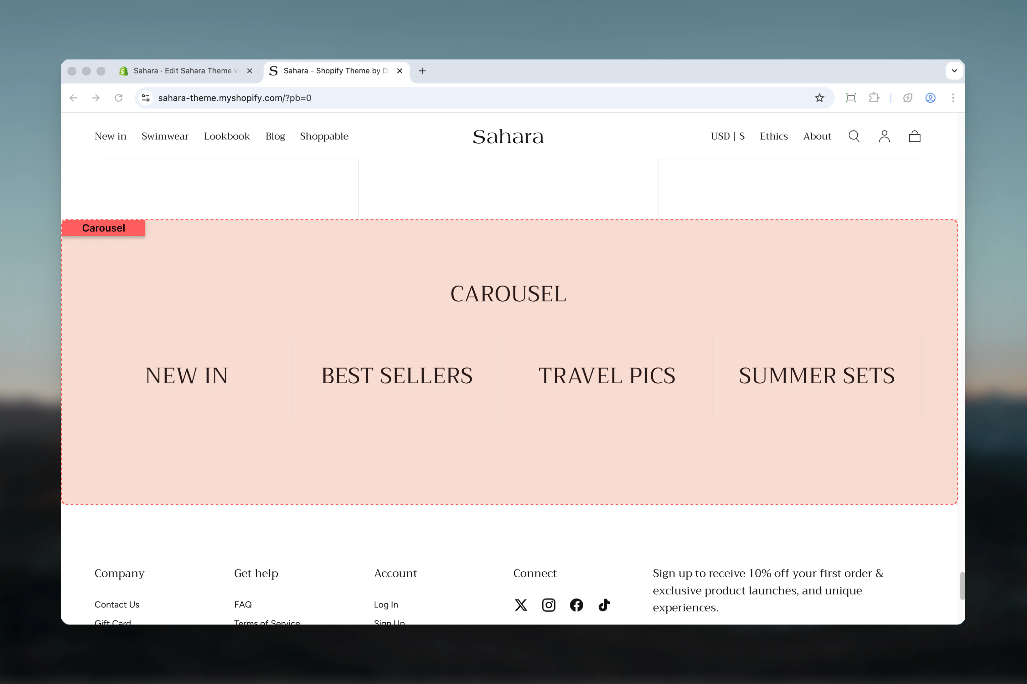
The Carousel section displays multiple content cards as interactive slides. Each card can contain media (images or videos), headings, text, and call-to-action buttons with independent desktop and mobile configurations for optimal display across all devices.
 ## What this section controls
This section controls carousel displays with the following capabilities:
* Unlimited customizable card blocks
* Two distinct layout modes (plain and image-only)
* Configurable slides per view (1-6 cards)
* Independent desktop and mobile media
* Flexible content positioning and alignment
* Per-card color schemes and aspect ratios
* Automatic or manual slide navigation
## How the Carousel section works
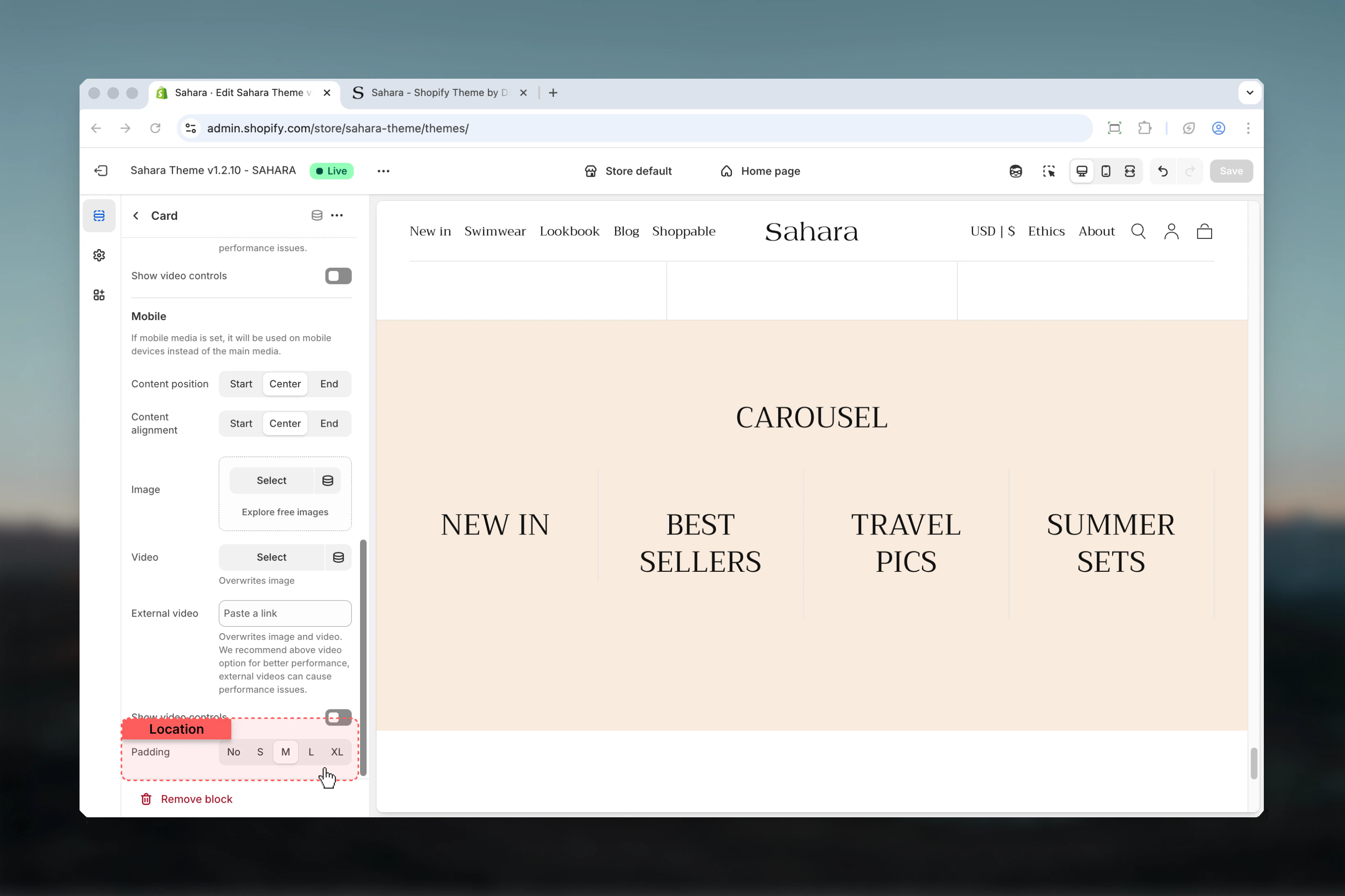
The Carousel uses a block-based system where each "Card" block becomes a carousel slide. You can add unlimited cards, each with its own media, content, and styling. The section automatically handles responsive behavior, showing fewer slides on mobile devices while maintaining optimal viewing.
## Getting started
From Shopify admin, access the Theme Customizer.
Add the section to your page or template.
Click "Add block" and select "Card" to create carousel slides.
Add media, heading, text, and optional button for each card.
Configure slideshow behavior, slides per view, and spacing.
## What this section controls
This section controls carousel displays with the following capabilities:
* Unlimited customizable card blocks
* Two distinct layout modes (plain and image-only)
* Configurable slides per view (1-6 cards)
* Independent desktop and mobile media
* Flexible content positioning and alignment
* Per-card color schemes and aspect ratios
* Automatic or manual slide navigation
## How the Carousel section works
The Carousel uses a block-based system where each "Card" block becomes a carousel slide. You can add unlimited cards, each with its own media, content, and styling. The section automatically handles responsive behavior, showing fewer slides on mobile devices while maintaining optimal viewing.
## Getting started
From Shopify admin, access the Theme Customizer.
Add the section to your page or template.
Click "Add block" and select "Card" to create carousel slides.
Add media, heading, text, and optional button for each card.
Configure slideshow behavior, slides per view, and spacing.
 ## Section settings
### Section layout
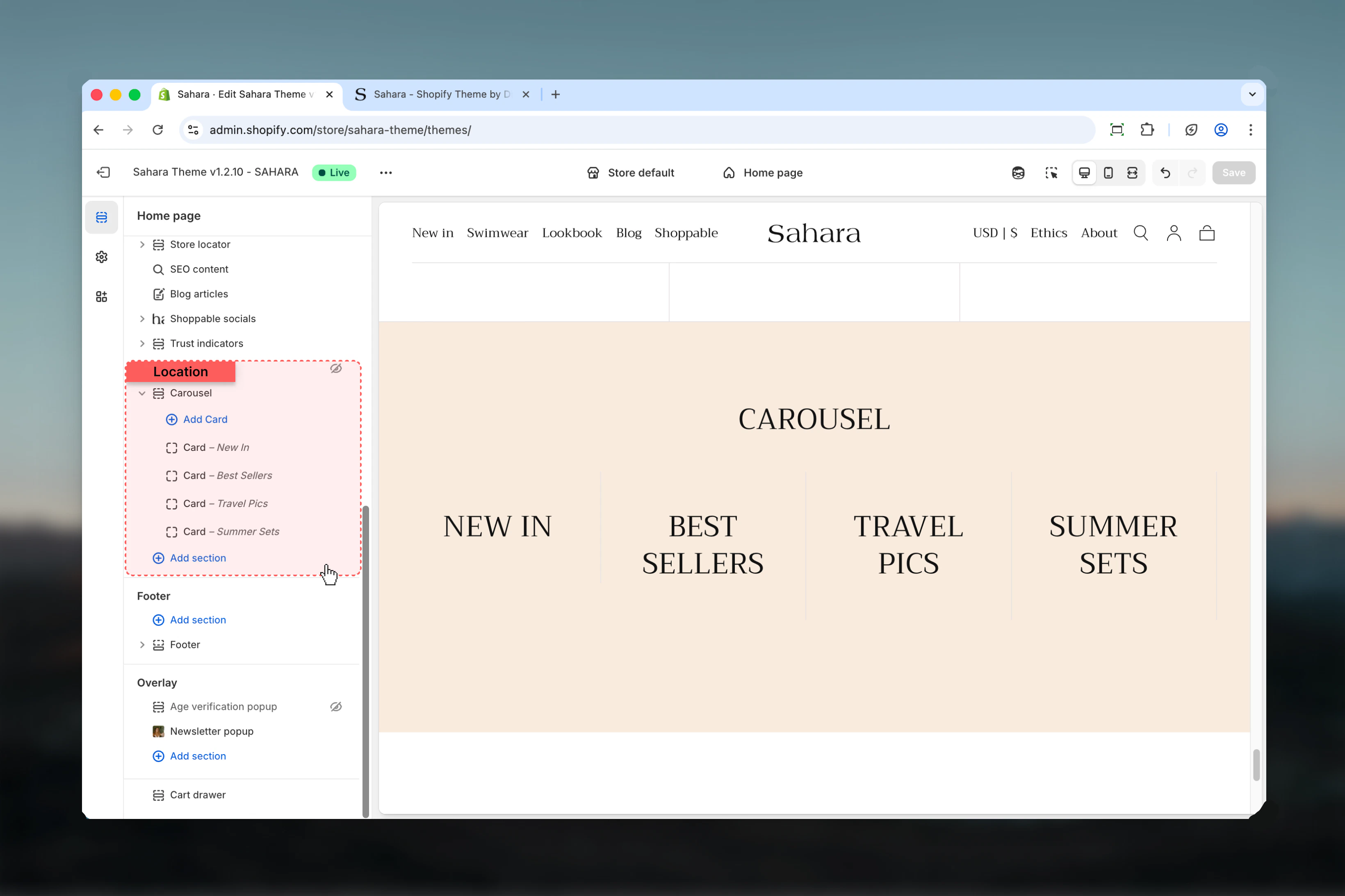
Controls the overall visual style of carousel cards.
Standard card layout with visible card containers, borders, and padding.
**Best for:**
* Text-heavy content
* Product highlights with descriptions
* Multi-element cards (heading + text + button)
Cards have clear separation with background and borders.
Streamlined layout emphasizing media without visible card containers.
**Best for:**
* Image galleries
* Product showcases
* Visual-first designs with minimal text
Cards appear seamless with focus on imagery.
## Section settings
### Section layout
Controls the overall visual style of carousel cards.
Standard card layout with visible card containers, borders, and padding.
**Best for:**
* Text-heavy content
* Product highlights with descriptions
* Multi-element cards (heading + text + button)
Cards have clear separation with background and borders.
Streamlined layout emphasizing media without visible card containers.
**Best for:**
* Image galleries
* Product showcases
* Visual-first designs with minimal text
Cards appear seamless with focus on imagery.
 ### Show card border
Adds visible borders to individual cards.
**Default:** False (hidden)
Only applies when section layout is set to "Plain."
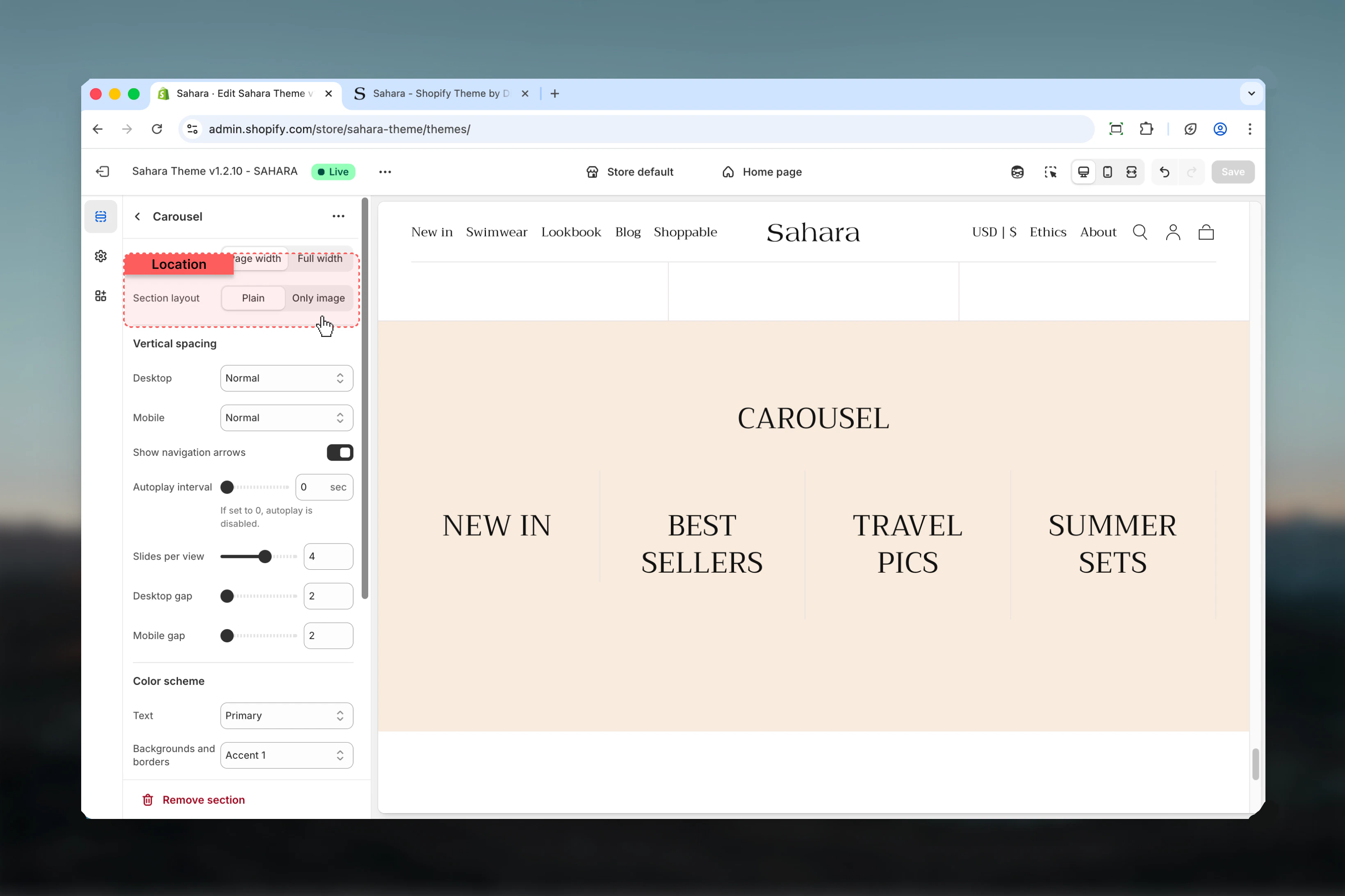
### Show navigation arrows
Displays previous/next navigation arrows for manual slide control.
**Default:** True
Keep arrows enabled for better user control, especially when autoplay is off.
### Slideshow autoplay interval
Controls automatic slide advancement timing.
**Range:** 0 – 10 seconds (in 1-second increments)\
**Default:** 0 (autoplay disabled)
**0 seconds:**
* Manual navigation only
* Best for text-heavy content
* Recommended for accessibility
**3-5 seconds:**
* Quick browsing
* Image-focused carousels
* Marketing highlights
**7-10 seconds:**
* Detailed content
* Longer text blocks
* Video-inclusive slides
Use autoplay sparingly. It can reduce accessibility and user control.
### Show card border
Adds visible borders to individual cards.
**Default:** False (hidden)
Only applies when section layout is set to "Plain."
### Show navigation arrows
Displays previous/next navigation arrows for manual slide control.
**Default:** True
Keep arrows enabled for better user control, especially when autoplay is off.
### Slideshow autoplay interval
Controls automatic slide advancement timing.
**Range:** 0 – 10 seconds (in 1-second increments)\
**Default:** 0 (autoplay disabled)
**0 seconds:**
* Manual navigation only
* Best for text-heavy content
* Recommended for accessibility
**3-5 seconds:**
* Quick browsing
* Image-focused carousels
* Marketing highlights
**7-10 seconds:**
* Detailed content
* Longer text blocks
* Video-inclusive slides
Use autoplay sparingly. It can reduce accessibility and user control.
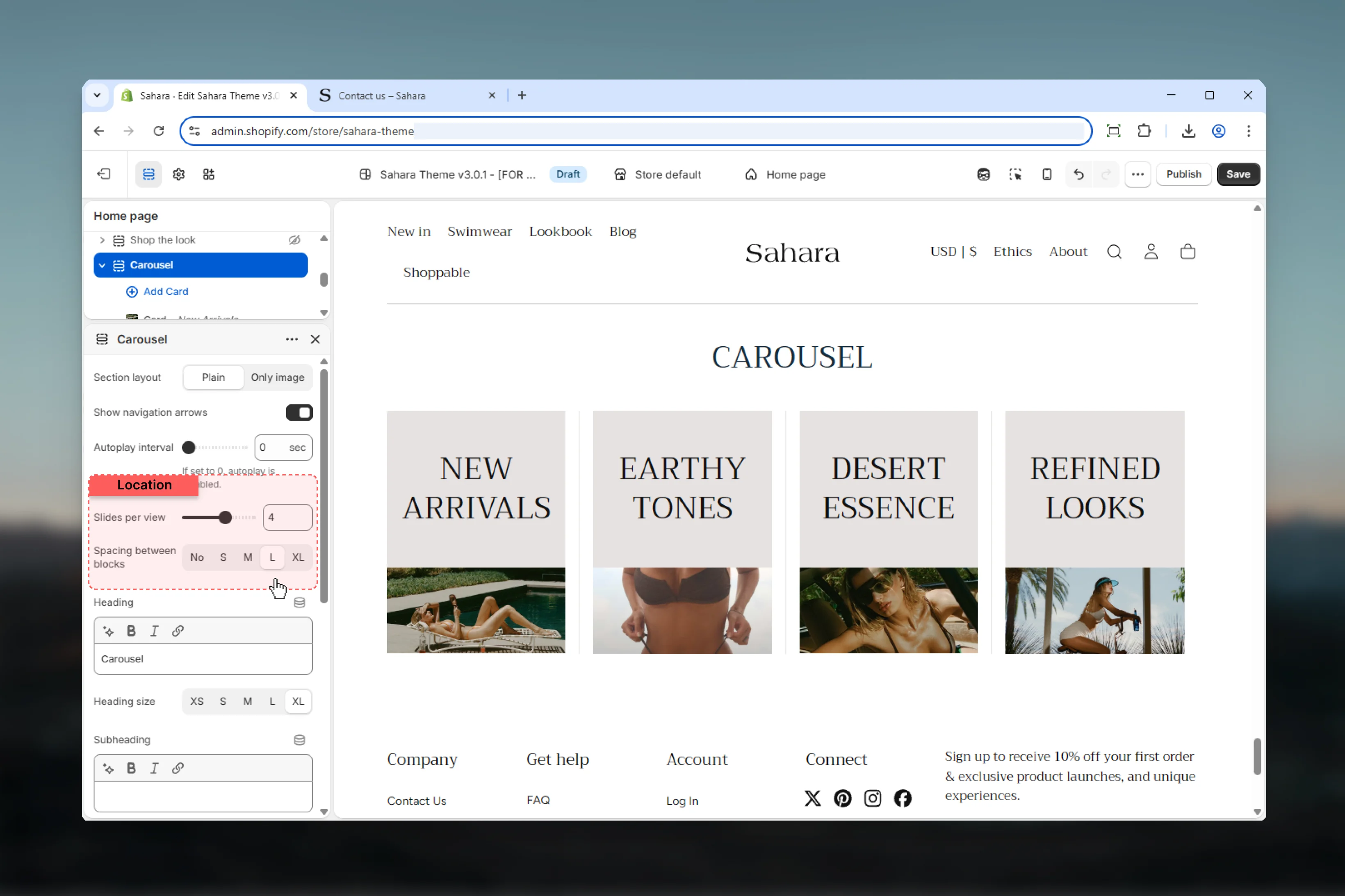
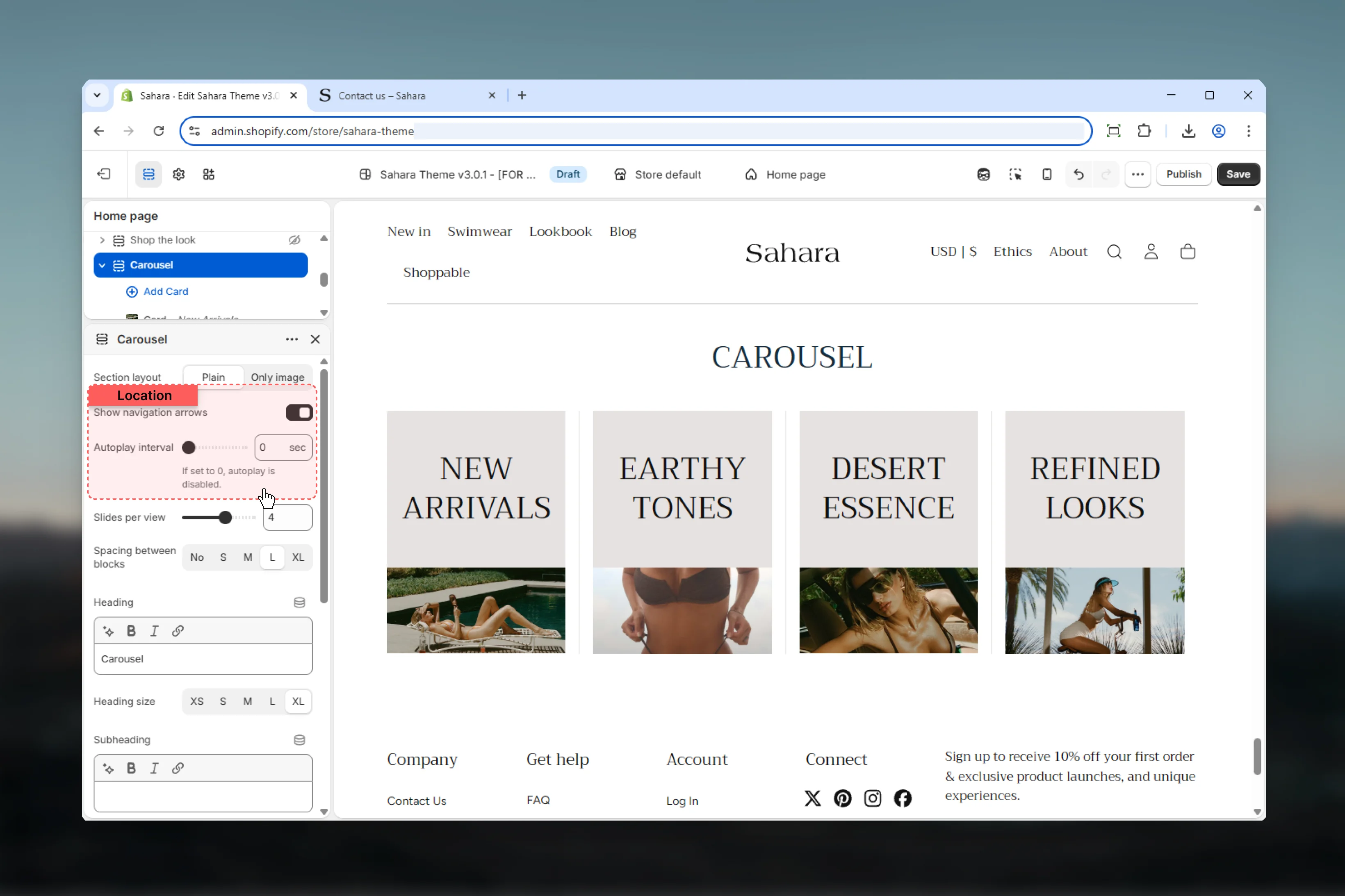 ### Slides per view
Number of cards visible simultaneously on desktop.
**Range:** 1 – 6 slides\
**Default:** 4
**1 slide:**
* Full-width hero carousels
* Large featured content
* Video-heavy slides
**2-3 slides:**
* Balanced visibility
* Product categories
* Featured collections
**4-6 slides:**
* Compact cards (recommended: 4)
* Icon features
* Small product highlights
Mobile automatically adjusts to show fewer slides regardless of this setting.
### Spacing between blocks (Desktop)
Controls horizontal spacing between cards on desktop.
**Options:** No spacing, S, M, L, XL\
**Default:** L
### Spacing between blocks (Mobile)
Controls horizontal spacing between cards on mobile independently.
**Options:** No spacing, S, M, L, XL
Separate mobile spacing allows tighter layouts on small screens for better card visibility.
### Slides per view
Number of cards visible simultaneously on desktop.
**Range:** 1 – 6 slides\
**Default:** 4
**1 slide:**
* Full-width hero carousels
* Large featured content
* Video-heavy slides
**2-3 slides:**
* Balanced visibility
* Product categories
* Featured collections
**4-6 slides:**
* Compact cards (recommended: 4)
* Icon features
* Small product highlights
Mobile automatically adjusts to show fewer slides regardless of this setting.
### Spacing between blocks (Desktop)
Controls horizontal spacing between cards on desktop.
**Options:** No spacing, S, M, L, XL\
**Default:** L
### Spacing between blocks (Mobile)
Controls horizontal spacing between cards on mobile independently.
**Options:** No spacing, S, M, L, XL
Separate mobile spacing allows tighter layouts on small screens for better card visibility.
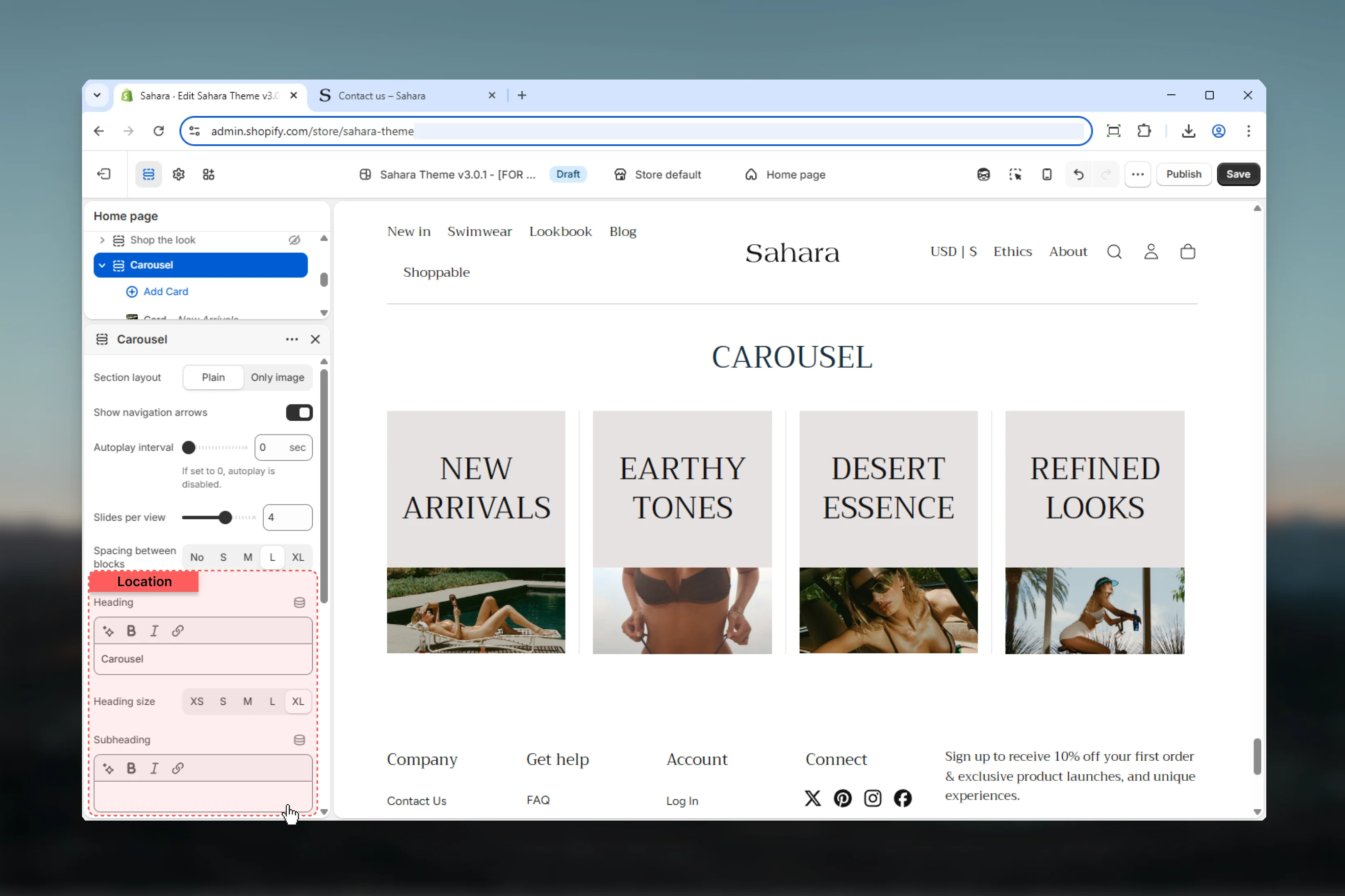
 ### Heading
Main title text for the section.
* Inline rich text supported (bold, italic, links)
* **Default:** "Carousel"
### Heading size
Controls the size of section heading.
**Options:** XS, S, M, L, XL\
**Default:** XL
### Subheading
Optional descriptive text displayed above the heading.
* Inline rich text supported
* Leave empty to hide
### Heading
Main title text for the section.
* Inline rich text supported (bold, italic, links)
* **Default:** "Carousel"
### Heading size
Controls the size of section heading.
**Options:** XS, S, M, L, XL\
**Default:** XL
### Subheading
Optional descriptive text displayed above the heading.
* Inline rich text supported
* Leave empty to hide
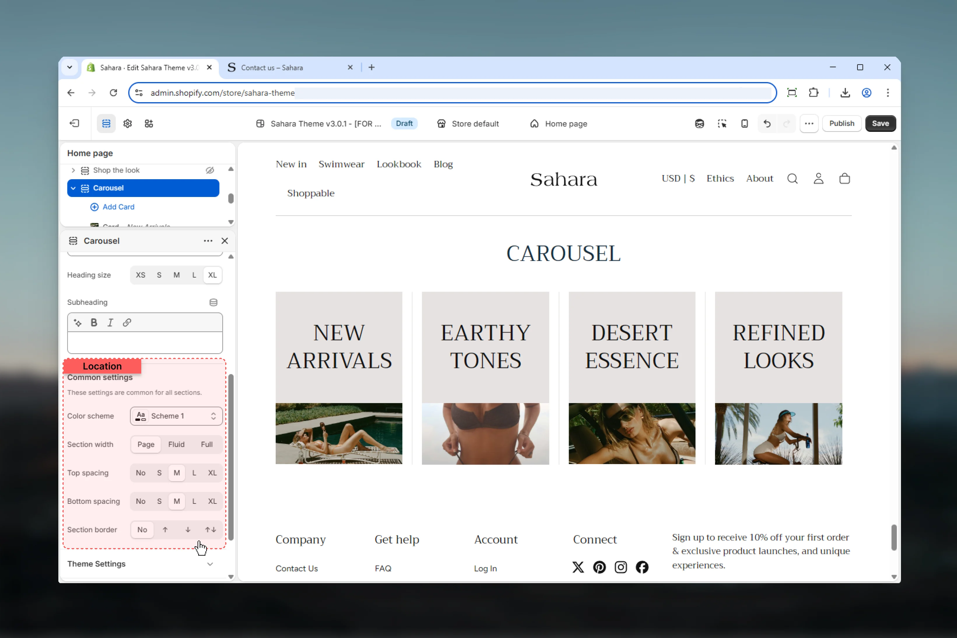
 ### Color scheme
Select the color scheme for section background and text.
### Section width
Controls horizontal width of the section.
**Options:**
* **Page** - Standard container width (default)
* **Fluid** - Wider, more spacious layout
* **Full** - Edge-to-edge full width
### Spacing
Control vertical spacing around the section:
* **Spacing top** - Margin above (None, S, M, L, XL)
* **Spacing bottom** - Margin below (None, S, M, L, XL)
Both default to M.
### Section border
Add decorative borders: None (default), Top, Bottom, Both
### Color scheme
Select the color scheme for section background and text.
### Section width
Controls horizontal width of the section.
**Options:**
* **Page** - Standard container width (default)
* **Fluid** - Wider, more spacious layout
* **Full** - Edge-to-edge full width
### Spacing
Control vertical spacing around the section:
* **Spacing top** - Margin above (None, S, M, L, XL)
* **Spacing bottom** - Margin below (None, S, M, L, XL)
Both default to M.
### Section border
Add decorative borders: None (default), Top, Bottom, Both
 ## Block settings
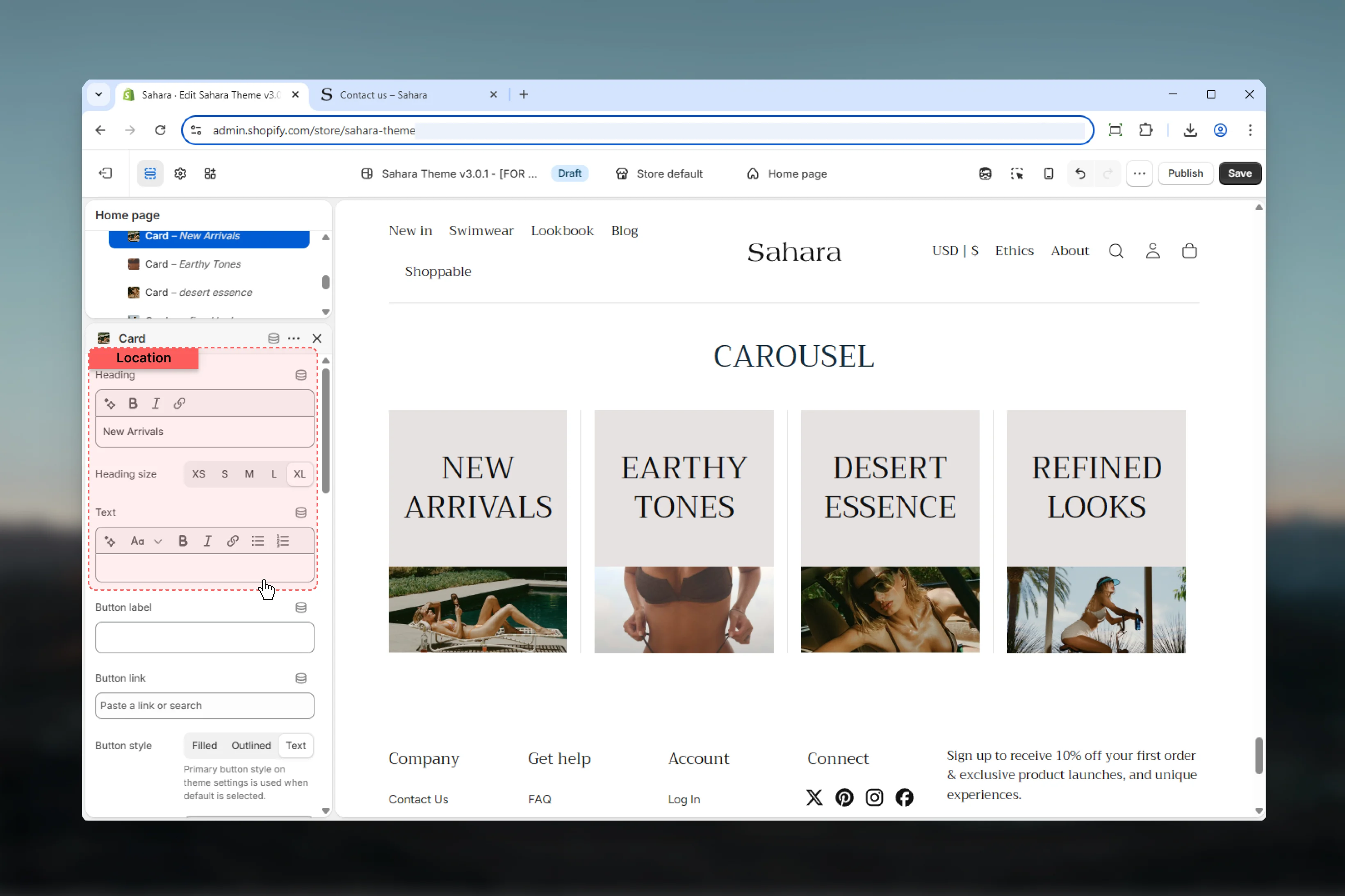
Each Card block becomes a carousel slide with independent media, content, and styling.
### Heading
Title text for the card.
* Inline rich text supported
* Leave empty to hide heading
### Heading size
Controls the size of card heading.
**Options:** XS, S, M, L, XL\
**Default:** XL
### Text
Body content displayed below the heading.
* Rich text editor with formatting support
* **Supports:**
* Bold, italic, underline
* Lists (bulleted, numbered)
* Links
* Leave empty to hide
Keep text concise (20-30 words) for carousel readability.
## Block settings
Each Card block becomes a carousel slide with independent media, content, and styling.
### Heading
Title text for the card.
* Inline rich text supported
* Leave empty to hide heading
### Heading size
Controls the size of card heading.
**Options:** XS, S, M, L, XL\
**Default:** XL
### Text
Body content displayed below the heading.
* Rich text editor with formatting support
* **Supports:**
* Bold, italic, underline
* Lists (bulleted, numbered)
* Links
* Leave empty to hide
Keep text concise (20-30 words) for carousel readability.
 ### Button label
Text displayed on the call-to-action button.
* Leave empty to hide button
### Button link
Destination URL when button is clicked.
### Button style
Visual style of the button.
Solid background with contrasting text.
**Best for:** Primary actions, strong CTAs
Border-only style with transparent background.
**Best for:** Secondary actions, subtle CTAs
Minimal styling as underlined text (default).
**Best for:** Tertiary actions, "Learn more" links
### Button label
Text displayed on the call-to-action button.
* Leave empty to hide button
### Button link
Destination URL when button is clicked.
### Button style
Visual style of the button.
Solid background with contrasting text.
**Best for:** Primary actions, strong CTAs
Border-only style with transparent background.
**Best for:** Secondary actions, subtle CTAs
Minimal styling as underlined text (default).
**Best for:** Tertiary actions, "Learn more" links
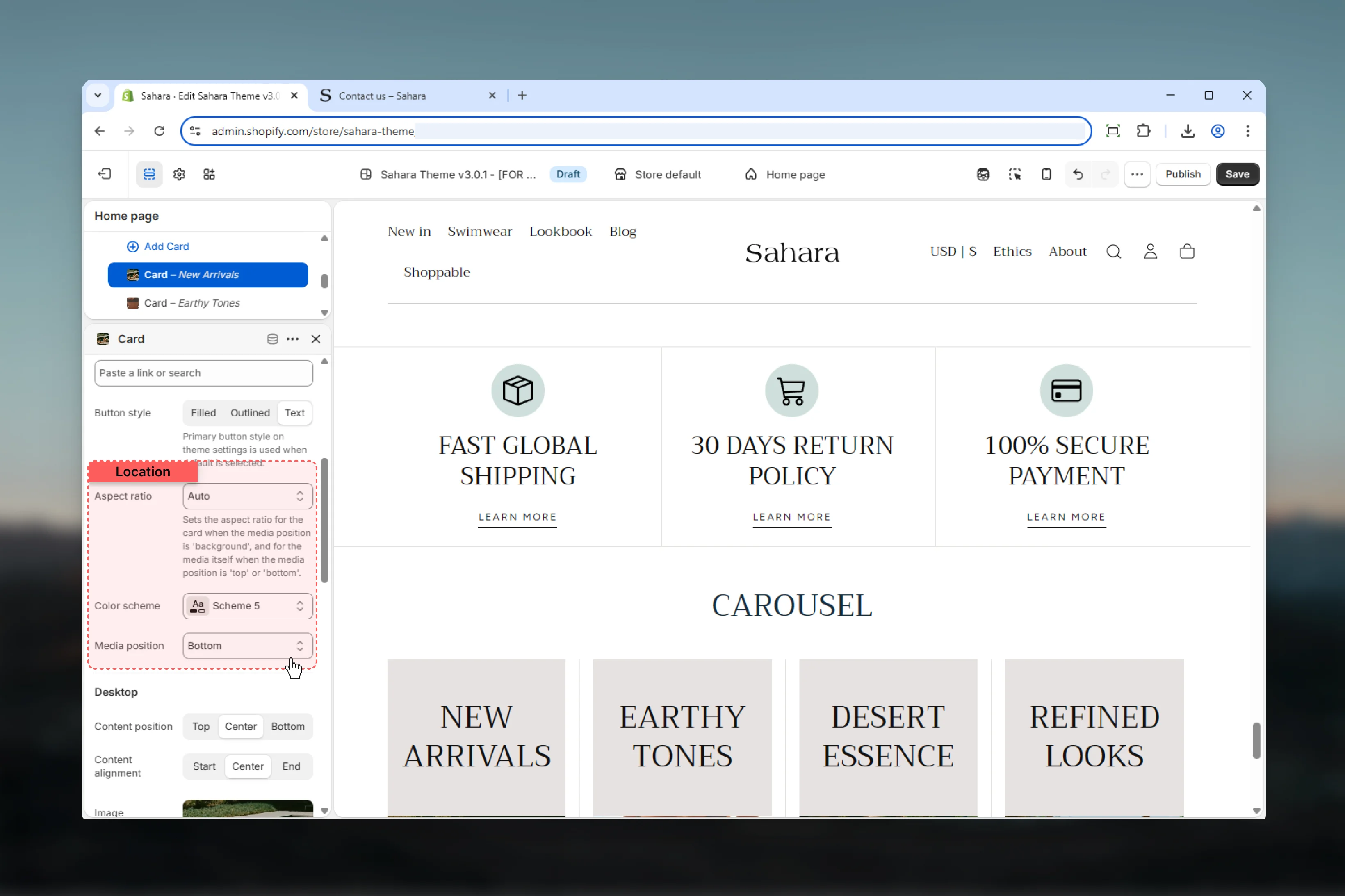
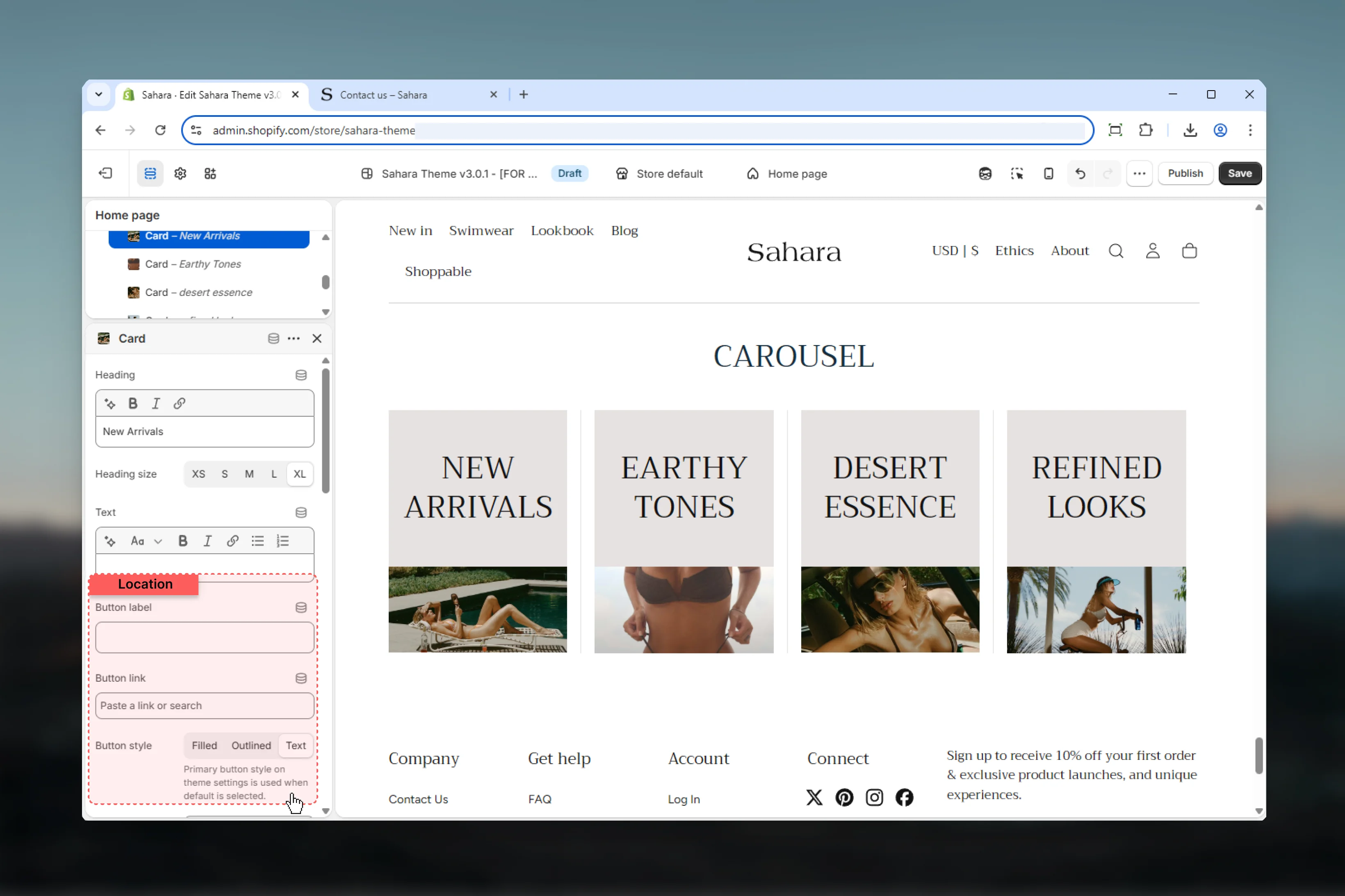 ### Aspect ratio
Controls the height-to-width ratio of card media.
**Options:**
* **Auto** - Uses natural image dimensions (default)
* **Square:** 1:1
* **Landscape:** 4:3, 3:2, 5:4, 16:9, 2:1, 4:1, 8:1
* **Portrait:** 3:4, 2:3, 4:5, 9:16, 1:2
All cards in a carousel should use the same aspect ratio for visual consistency.
### Media position
Controls how media relates to text content.
Media displays above text content.
**Best for:** Standard card layouts
Media displays below text content (default).
**Best for:** Text-priority designs
Media serves as background with text overlay.
**Best for:** Image-heavy designs, hero-style cards
Ensure sufficient contrast between media and text when using background position.
### Aspect ratio
Controls the height-to-width ratio of card media.
**Options:**
* **Auto** - Uses natural image dimensions (default)
* **Square:** 1:1
* **Landscape:** 4:3, 3:2, 5:4, 16:9, 2:1, 4:1, 8:1
* **Portrait:** 3:4, 2:3, 4:5, 9:16, 1:2
All cards in a carousel should use the same aspect ratio for visual consistency.
### Media position
Controls how media relates to text content.
Media displays above text content.
**Best for:** Standard card layouts
Media displays below text content (default).
**Best for:** Text-priority designs
Media serves as background with text overlay.
**Best for:** Image-heavy designs, hero-style cards
Ensure sufficient contrast between media and text when using background position.
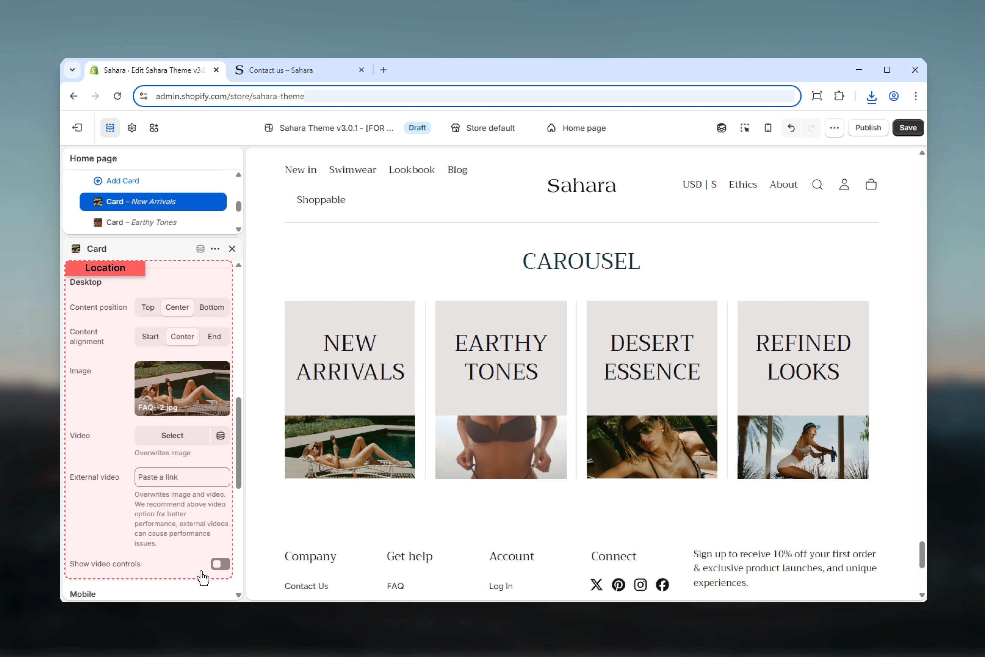
 ### Content position
Controls vertical alignment of text content on desktop.
**Options:** Top, Center (default), Bottom
### Content alignment
Controls horizontal alignment of text content on desktop.
**Options:** Start, Center (default), End
### Image (Desktop)
Upload image for desktop display.
**Recommended:** 800-1200px width depending on slides per view
### Video (Desktop)
Upload Shopify-hosted video file.
Shopify-hosted videos offer better performance than external embeds.
### External video (Desktop)
Embed YouTube or Vimeo video. Takes priority if set.
### Show video controls (Desktop)
Displays play/pause and volume controls on desktop videos.
**Default:** False
### Content position
Controls vertical alignment of text content on desktop.
**Options:** Top, Center (default), Bottom
### Content alignment
Controls horizontal alignment of text content on desktop.
**Options:** Start, Center (default), End
### Image (Desktop)
Upload image for desktop display.
**Recommended:** 800-1200px width depending on slides per view
### Video (Desktop)
Upload Shopify-hosted video file.
Shopify-hosted videos offer better performance than external embeds.
### External video (Desktop)
Embed YouTube or Vimeo video. Takes priority if set.
### Show video controls (Desktop)
Displays play/pause and volume controls on desktop videos.
**Default:** False
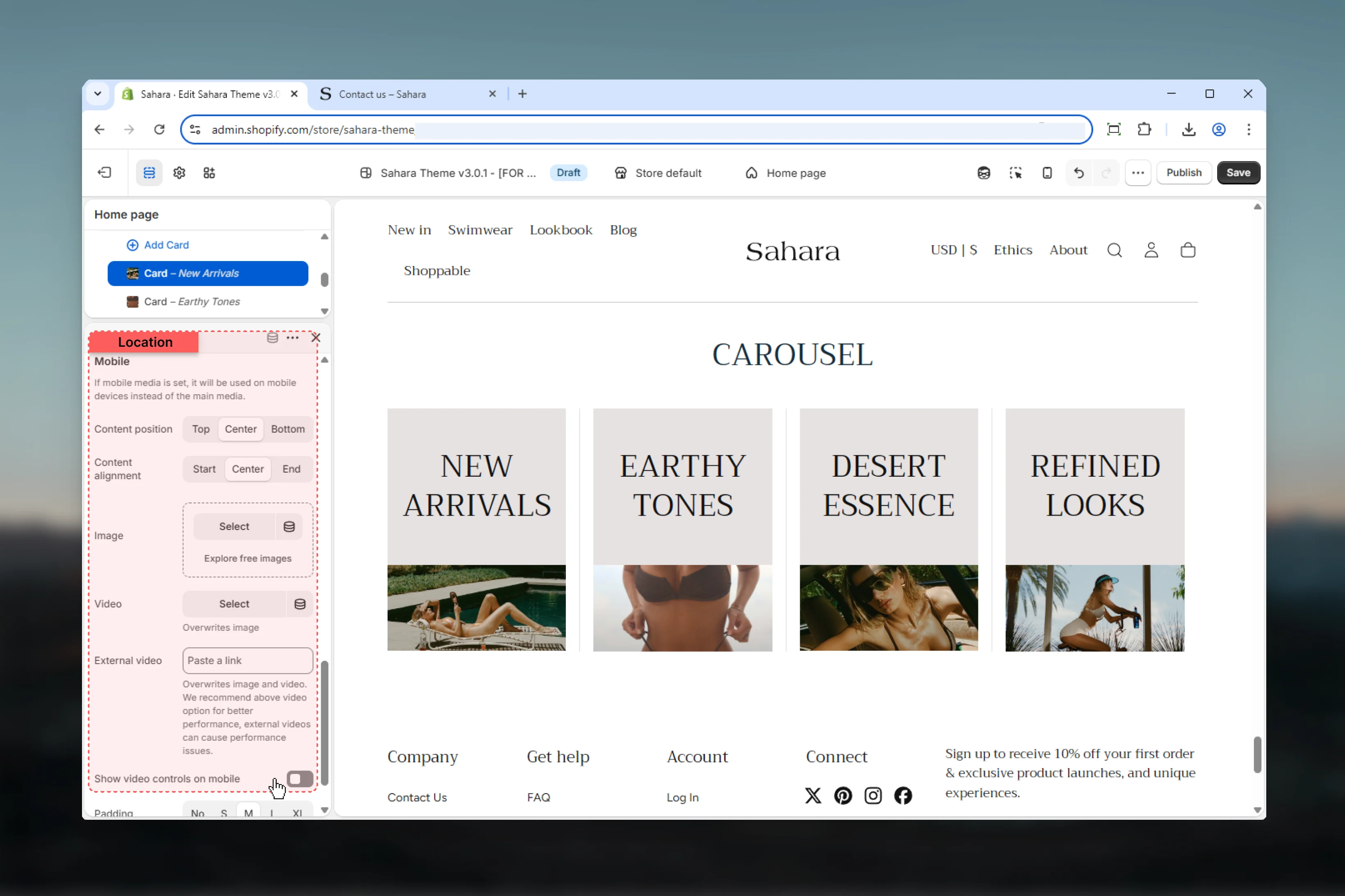
 ### Content position (Mobile)
Controls vertical alignment of text content on mobile independently.
**Options:** Top, Center (default), Bottom
### Content alignment (Mobile)
Controls horizontal alignment of text content on mobile independently.
**Options:** Start, Center (default), End
### Image (Mobile)
Upload mobile-optimized image.
**Recommended:** 600-800px width, portrait orientation
Mobile media overrides desktop media on small screens when provided.
### Video (Mobile)
Shopify-hosted video for mobile devices.
### External video (Mobile)
YouTube or Vimeo video for mobile.
Videos on mobile can impact performance and data usage. Use sparingly.
### Show video controls (Mobile)
Displays play/pause and volume controls on mobile videos.
**Default:** False
### Content position (Mobile)
Controls vertical alignment of text content on mobile independently.
**Options:** Top, Center (default), Bottom
### Content alignment (Mobile)
Controls horizontal alignment of text content on mobile independently.
**Options:** Start, Center (default), End
### Image (Mobile)
Upload mobile-optimized image.
**Recommended:** 600-800px width, portrait orientation
Mobile media overrides desktop media on small screens when provided.
### Video (Mobile)
Shopify-hosted video for mobile devices.
### External video (Mobile)
YouTube or Vimeo video for mobile.
Videos on mobile can impact performance and data usage. Use sparingly.
### Show video controls (Mobile)
Displays play/pause and volume controls on mobile videos.
**Default:** False
 ### Color scheme
Select color scheme for individual card background and text.
Each card can have its own color scheme for visual variety.
### Spacing inner
Controls internal padding within the card.
**Options:** No spacing, S, M (default), L, XL
Reduce inner spacing for compact layouts or increase for breathing room around content.
### Color scheme
Select color scheme for individual card background and text.
Each card can have its own color scheme for visual variety.
### Spacing inner
Controls internal padding within the card.
**Options:** No spacing, S, M (default), L, XL
Reduce inner spacing for compact layouts or increase for breathing room around content.
 ## Best practices
Use the same aspect ratio across all cards for uniform height and professional appearance.
Use 3-4 slides for desktop. More than 5 can make cards too small to be effective.
Avoid autoplay for text-heavy content. If used, set 5+ seconds for readability.
Provide portrait-oriented images for mobile to maximize card visibility on vertical screens.
Keep heading to 5-7 words and text to 20-30 words maximum per card.
Use "Only image" layout for visual galleries, "Plain" layout for content-rich cards.
Keep arrows enabled when autoplay is off to ensure users can browse slides.
Use different color schemes per card to create visual interest and highlight categories.
## Common use cases
Use 4-5 slides per view with "Plain" layout. Each card contains product image (4:3 aspect ratio), feature heading, brief description, and "Learn more" text link button. Center-aligned content with M inner spacing.
Use 3 slides per view with "Plain" layout. Background media position with customer photos. Include quote text, customer name as heading, and optional link to case study. Varied color schemes per card.
Use "Only image" layout with 4 slides per view. Category images with 1:1 aspect ratio, minimal text (category name as heading only), filled button linking to collection. Tight spacing between blocks.
Use 3 slides per view with "Plain" layout. Article featured image on top (16:9 ratio), article title as heading, excerpt as text, "Read more" outlined button. Navigation arrows enabled, no autoplay.
Use "Only image" layout with 5-6 slides per view. Images only (no text), auto aspect ratio, navigation arrows enabled. Mobile shows 2-3 slides with portrait images. Background media position on mobile for immersive feel.
Use 4 slides per view with "Plain" layout. Icon or illustration as image (1:1 ratio), service name as heading, 2-sentence description, text link button. Each card with different color scheme matching service category.
## Related sections
Multi-slide full-width banners with carousel
Collection cards with custom images
Customer reviews with carousel option
## Best practices
Use the same aspect ratio across all cards for uniform height and professional appearance.
Use 3-4 slides for desktop. More than 5 can make cards too small to be effective.
Avoid autoplay for text-heavy content. If used, set 5+ seconds for readability.
Provide portrait-oriented images for mobile to maximize card visibility on vertical screens.
Keep heading to 5-7 words and text to 20-30 words maximum per card.
Use "Only image" layout for visual galleries, "Plain" layout for content-rich cards.
Keep arrows enabled when autoplay is off to ensure users can browse slides.
Use different color schemes per card to create visual interest and highlight categories.
## Common use cases
Use 4-5 slides per view with "Plain" layout. Each card contains product image (4:3 aspect ratio), feature heading, brief description, and "Learn more" text link button. Center-aligned content with M inner spacing.
Use 3 slides per view with "Plain" layout. Background media position with customer photos. Include quote text, customer name as heading, and optional link to case study. Varied color schemes per card.
Use "Only image" layout with 4 slides per view. Category images with 1:1 aspect ratio, minimal text (category name as heading only), filled button linking to collection. Tight spacing between blocks.
Use 3 slides per view with "Plain" layout. Article featured image on top (16:9 ratio), article title as heading, excerpt as text, "Read more" outlined button. Navigation arrows enabled, no autoplay.
Use "Only image" layout with 5-6 slides per view. Images only (no text), auto aspect ratio, navigation arrows enabled. Mobile shows 2-3 slides with portrait images. Background media position on mobile for immersive feel.
Use 4 slides per view with "Plain" layout. Icon or illustration as image (1:1 ratio), service name as heading, 2-sentence description, text link button. Each card with different color scheme matching service category.
## Related sections
Multi-slide full-width banners with carousel
Collection cards with custom images
Customer reviews with carousel option