> ## Documentation Index
> Fetch the complete documentation index at: https://docs.digifist.com/llms.txt
> Use this file to discover all available pages before exploring further.
# Dual tiles
> Display two side-by-side content tiles with flexible sizing, independent media, rich text, and customizable spacing.
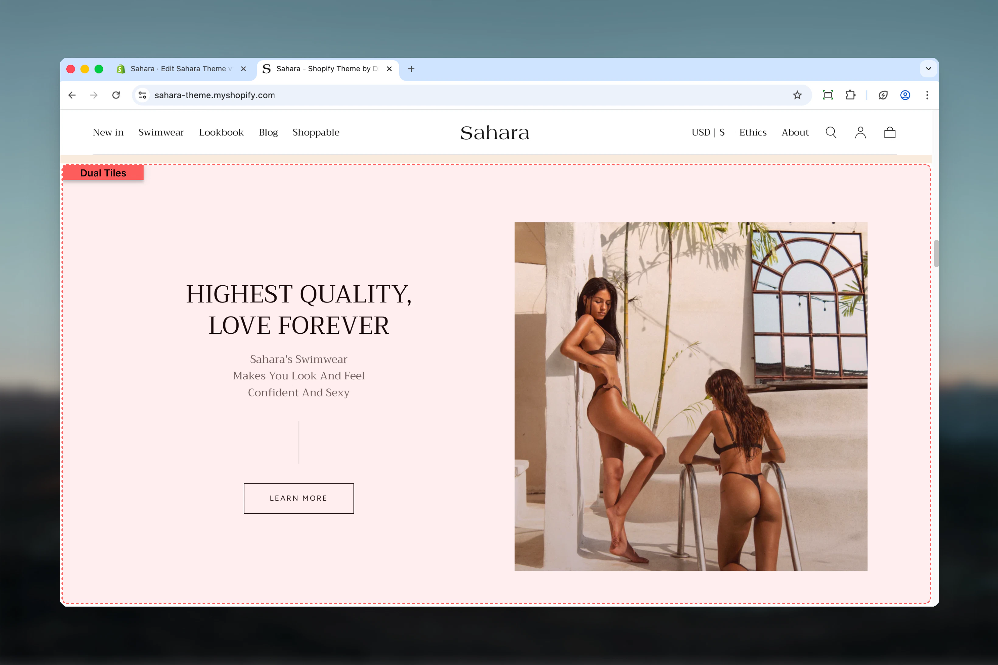
The Dual tiles section creates two side-by-side content areas perfect for highlighting complementary content, campaigns, or product stories. Each tile can contain independent media, text, buttons, and has separate desktop/mobile configurations for maximum flexibility.
Dual tiles help create balanced, visually engaging layouts that showcase parallel narratives, split campaigns, or contrasting product offerings in a structured format.
 ## What this section controls
This section controls dual-tile layouts with the following capabilities:
* Two side-by-side content tiles (maximum 2 blocks)
* Flexible tile sizing (full, half, large, small)
* Configurable gap spacing between tiles
* Desktop and mobile-specific media and positioning
* Independent content alignment per tile
* Rich text, buttons, and video support
* Per-tile color schemes and padding controls
## How Dual tiles works
The Dual tiles section uses a block-based system:
* Section supports **maximum 2 Tile blocks**
* First tile size determines layout proportions
* Second tile automatically adjusts to complement first
* Each tile configured independently with its own media, text, and styling
* Responsive behavior with mobile-specific ordering and sizing
## Getting started
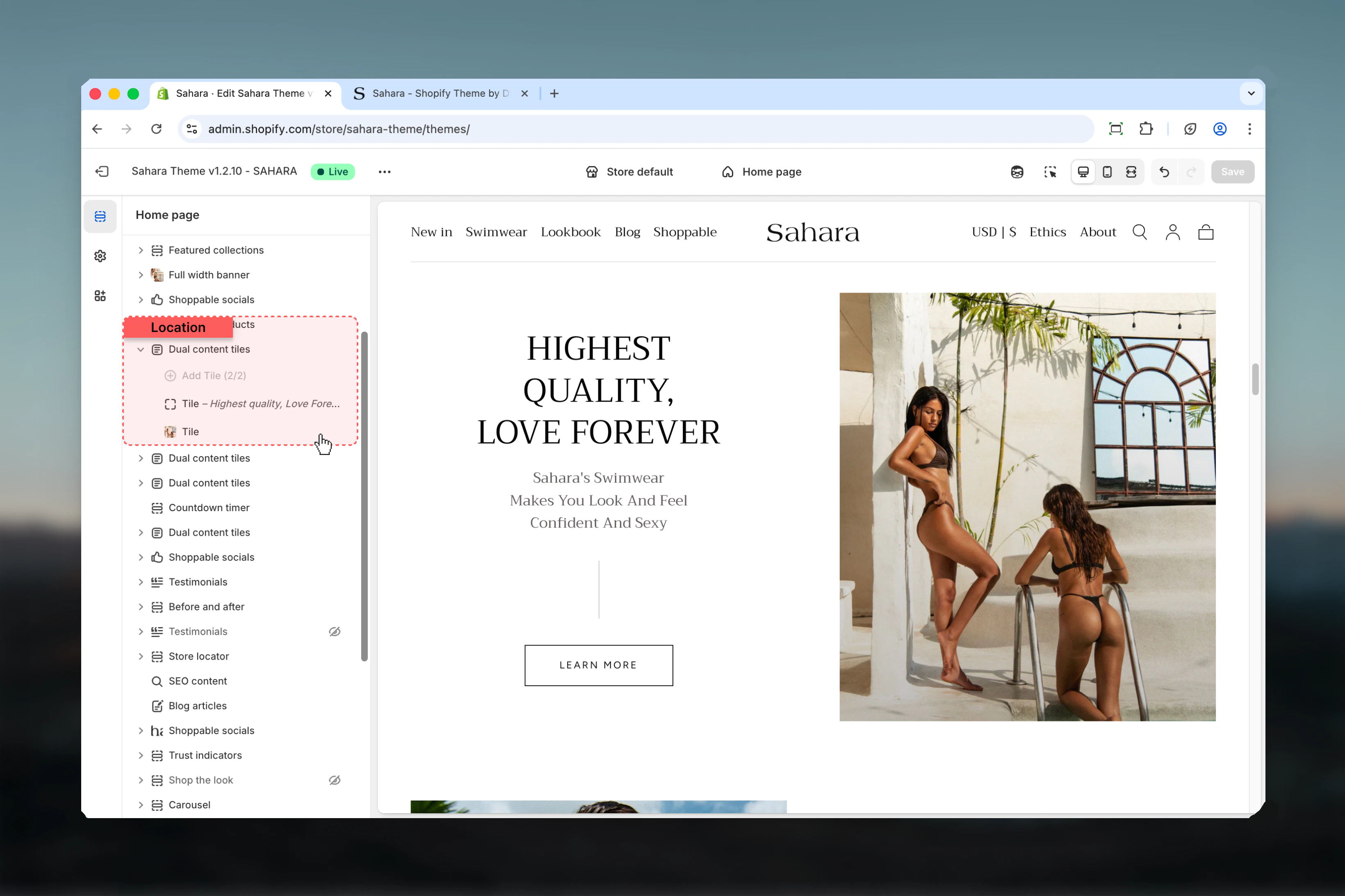
From Shopify admin, access the Theme Customizer.
Add the section to your page or template.
Click "Add block" and select "Tile" to create content areas (add 2 tiles).
Set first block size to control tile proportions (half, large, small, full).
For each tile, add heading, text, media, and optional button.
## What this section controls
This section controls dual-tile layouts with the following capabilities:
* Two side-by-side content tiles (maximum 2 blocks)
* Flexible tile sizing (full, half, large, small)
* Configurable gap spacing between tiles
* Desktop and mobile-specific media and positioning
* Independent content alignment per tile
* Rich text, buttons, and video support
* Per-tile color schemes and padding controls
## How Dual tiles works
The Dual tiles section uses a block-based system:
* Section supports **maximum 2 Tile blocks**
* First tile size determines layout proportions
* Second tile automatically adjusts to complement first
* Each tile configured independently with its own media, text, and styling
* Responsive behavior with mobile-specific ordering and sizing
## Getting started
From Shopify admin, access the Theme Customizer.
Add the section to your page or template.
Click "Add block" and select "Tile" to create content areas (add 2 tiles).
Set first block size to control tile proportions (half, large, small, full).
For each tile, add heading, text, media, and optional button.
 ## Section settings
### Block size
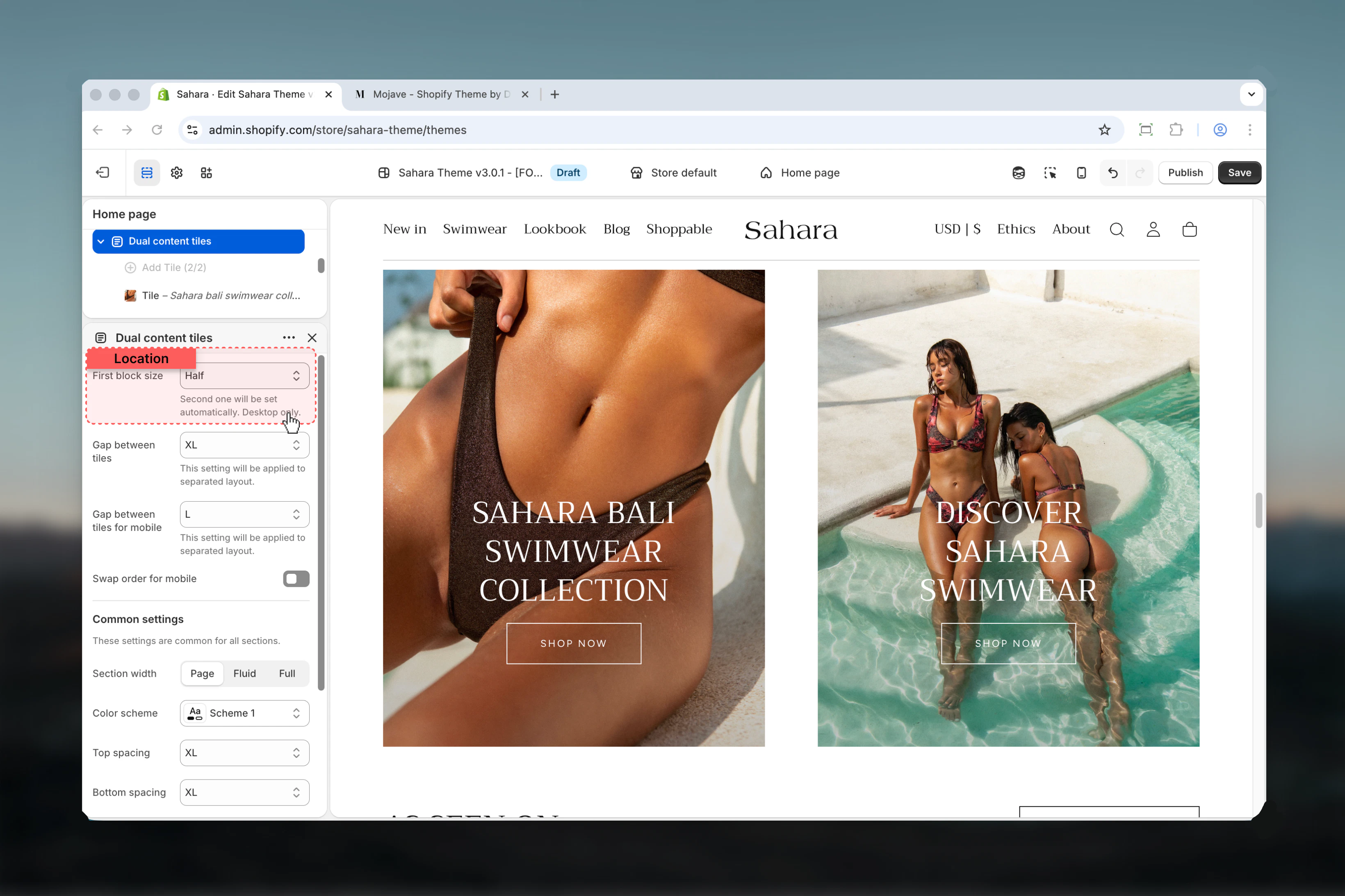
Controls the width proportions of the two tiles.
First tile takes full width, second tile full width below.
**Best for:**
* Stacked layout
* Vertical storytelling
* Mobile-first designs
**Result:** Tiles stack vertically on both desktop and mobile.
Both tiles equal width, 50/50 split (default).
**Best for:**
* Balanced content
* Equal emphasis
* Symmetrical layouts
**Result:** Tiles side-by-side on desktop, stacked on mobile.
First tile takes approximately 66%, second tile 33%.
**Best for:**
* Primary/secondary content
* Featured content + supporting info
* Text-heavy + compact layout
**Result:** Unequal split emphasizing first tile.
First tile takes approximately 33%, second tile 66%.
**Best for:**
* Supporting info + primary content
* Compact accent + featured content
* Reverse emphasis
**Result:** Unequal split emphasizing second tile.
## Section settings
### Block size
Controls the width proportions of the two tiles.
First tile takes full width, second tile full width below.
**Best for:**
* Stacked layout
* Vertical storytelling
* Mobile-first designs
**Result:** Tiles stack vertically on both desktop and mobile.
Both tiles equal width, 50/50 split (default).
**Best for:**
* Balanced content
* Equal emphasis
* Symmetrical layouts
**Result:** Tiles side-by-side on desktop, stacked on mobile.
First tile takes approximately 66%, second tile 33%.
**Best for:**
* Primary/secondary content
* Featured content + supporting info
* Text-heavy + compact layout
**Result:** Unequal split emphasizing first tile.
First tile takes approximately 33%, second tile 66%.
**Best for:**
* Supporting info + primary content
* Compact accent + featured content
* Reverse emphasis
**Result:** Unequal split emphasizing second tile.
 ### Gap between tiles (Desktop)
Controls horizontal and vertical spacing between tiles on desktop.
**Options:** No spacing, S, M (default), L, XL
### Gap between tiles (Mobile)
Controls spacing between tiles on mobile devices independently.
**Options:** No spacing, S, M (default), L, XL
Use no spacing or small gaps for seamless, edge-to-edge tile layouts. Increase gaps for clearly separated content areas.
### Reverse on mobile
Swaps tile order on mobile devices.
**Default:** False
**Disabled (False - default):**
* Tiles maintain desktop order on mobile
* First tile displays first
* Standard top-to-bottom flow
**Enabled (True):**
* Reverses order on mobile only
* Second tile displays first
* Useful when second tile is more important on mobile
### Gap between tiles (Desktop)
Controls horizontal and vertical spacing between tiles on desktop.
**Options:** No spacing, S, M (default), L, XL
### Gap between tiles (Mobile)
Controls spacing between tiles on mobile devices independently.
**Options:** No spacing, S, M (default), L, XL
Use no spacing or small gaps for seamless, edge-to-edge tile layouts. Increase gaps for clearly separated content areas.
### Reverse on mobile
Swaps tile order on mobile devices.
**Default:** False
**Disabled (False - default):**
* Tiles maintain desktop order on mobile
* First tile displays first
* Standard top-to-bottom flow
**Enabled (True):**
* Reverses order on mobile only
* Second tile displays first
* Useful when second tile is more important on mobile
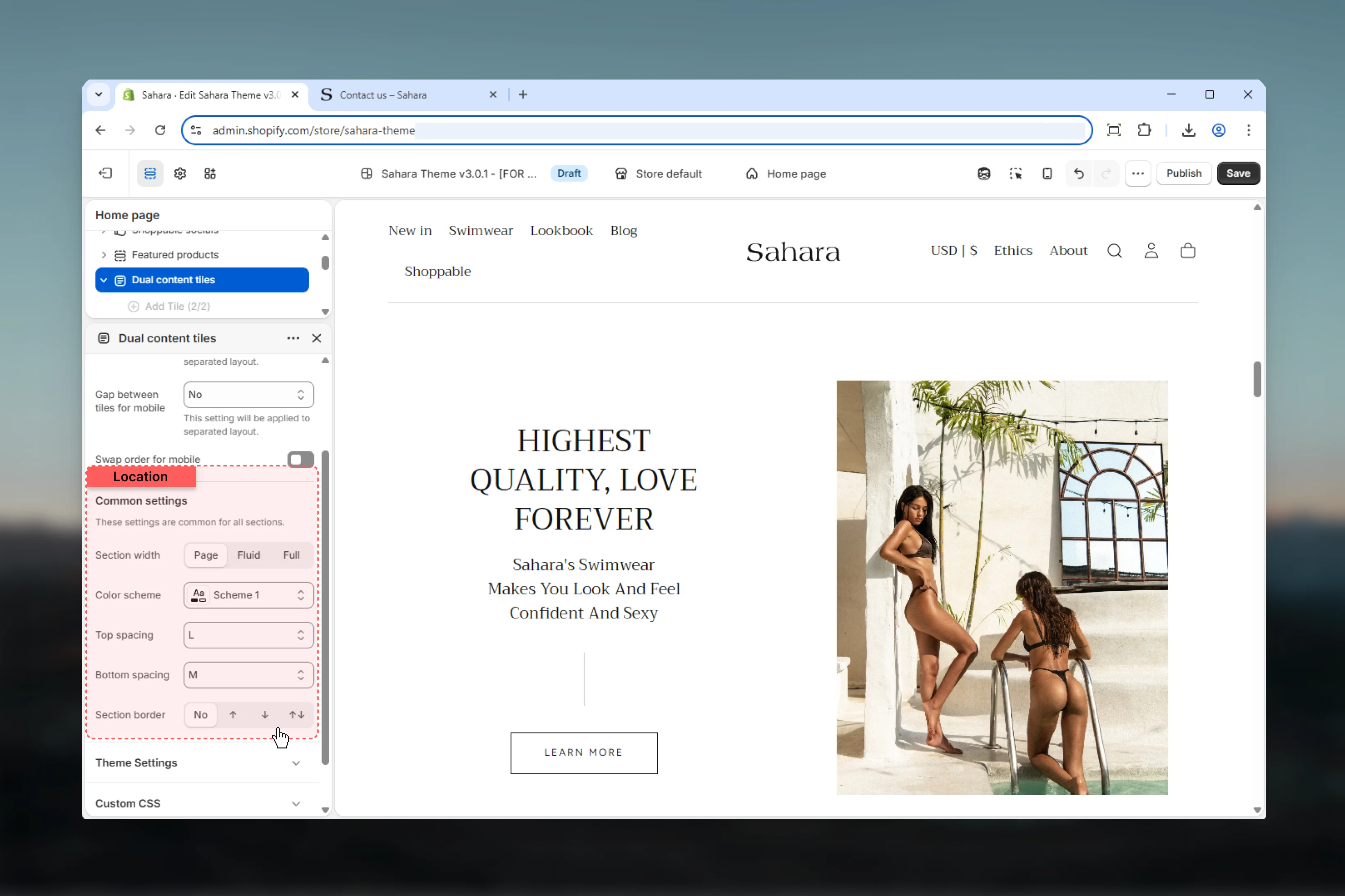
 ### Section width
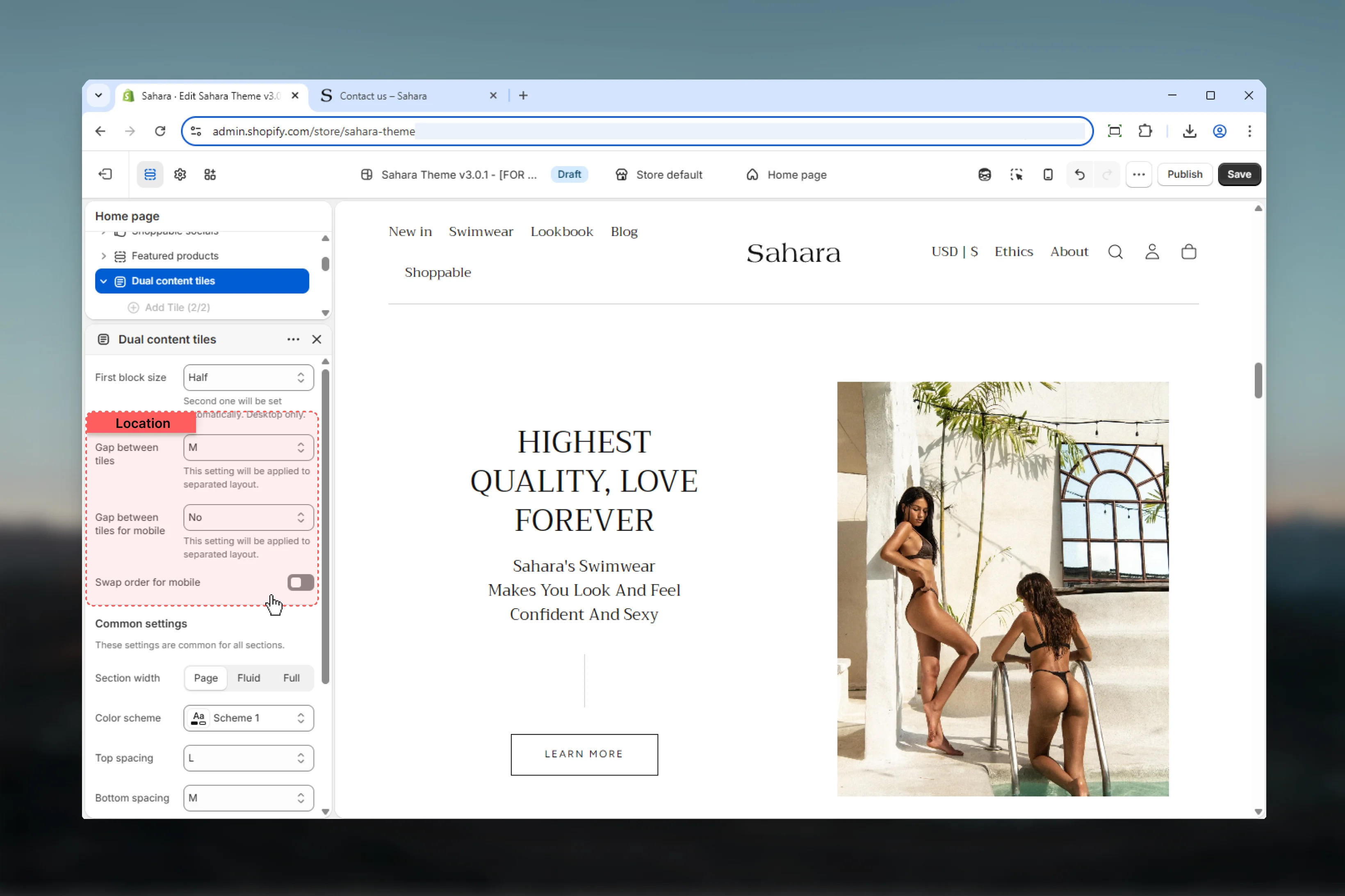
Controls horizontal width of the section.
**Options:**
* **Page** - Standard container width (default)
* **Fluid** - Wider layout
* **Full** - Edge-to-edge full width
Full width works well for immersive dual tile layouts with background images.
### Color scheme
Select default color scheme for section background.
Individual tiles can override section color scheme with their own settings.
### Spacing
Control vertical spacing around the section:
* **Spacing top** - Margin above (None, S, M, L, XL)
* **Spacing bottom** - Margin below (None, S, M, L, XL)
Both default to M.
### Section border
Add decorative borders: None (default), Top, Bottom, Both
### Section width
Controls horizontal width of the section.
**Options:**
* **Page** - Standard container width (default)
* **Fluid** - Wider layout
* **Full** - Edge-to-edge full width
Full width works well for immersive dual tile layouts with background images.
### Color scheme
Select default color scheme for section background.
Individual tiles can override section color scheme with their own settings.
### Spacing
Control vertical spacing around the section:
* **Spacing top** - Margin above (None, S, M, L, XL)
* **Spacing bottom** - Margin below (None, S, M, L, XL)
Both default to M.
### Section border
Add decorative borders: None (default), Top, Bottom, Both
 ## Block settings
Each Tile block represents one of the two content areas. Configure them independently for maximum flexibility.
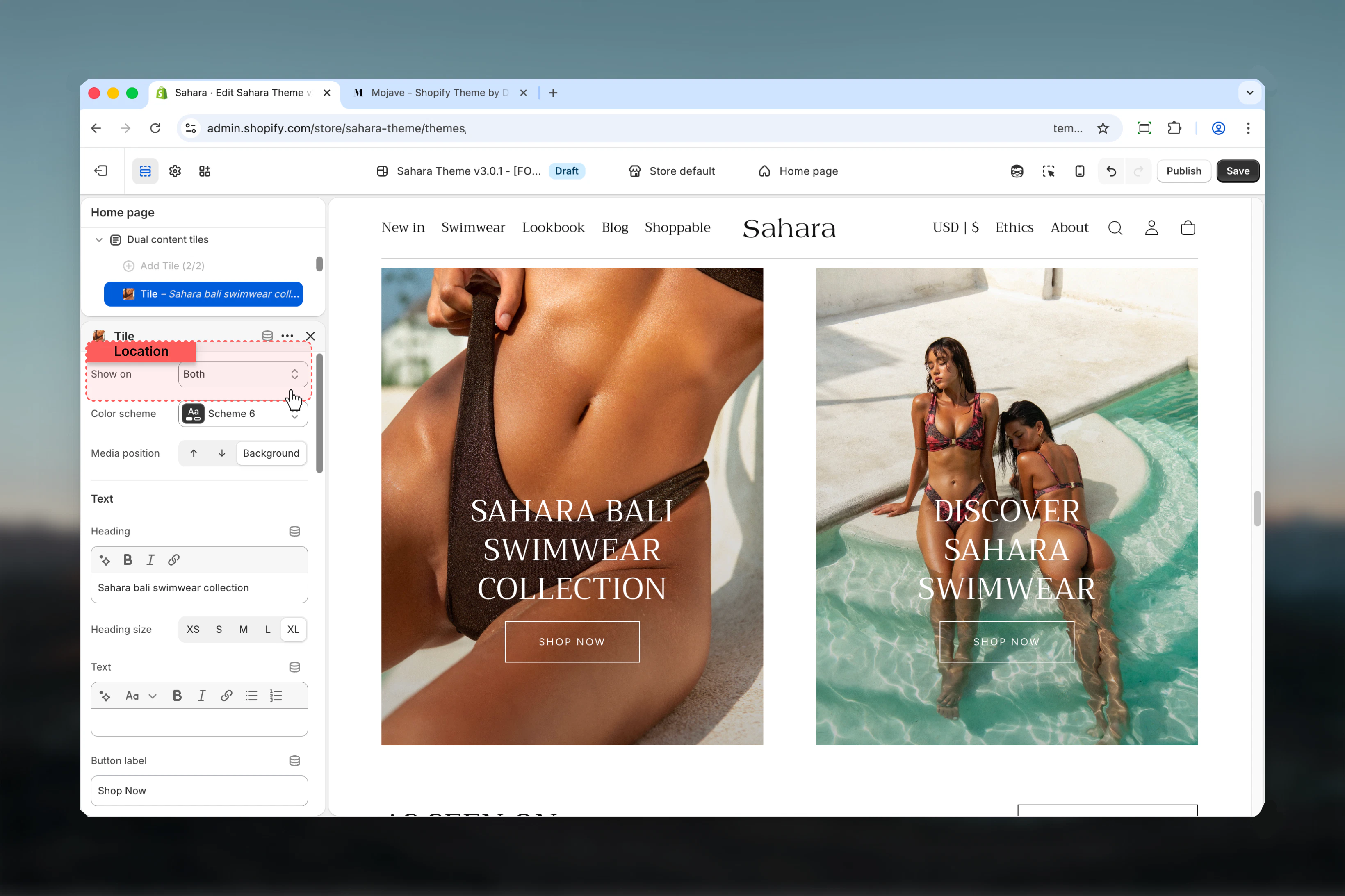
### Show on
Controls which devices the tile is visible on.
**Options:**
* **Desktop** - Desktop only
* **Mobile** - Mobile only
* **Both** - All devices (default)
**Use cases for selective visibility:**
* Different messaging for mobile vs desktop
* Desktop-only detailed content
* Mobile-only app promotions
* A/B testing across devices
## Block settings
Each Tile block represents one of the two content areas. Configure them independently for maximum flexibility.
### Show on
Controls which devices the tile is visible on.
**Options:**
* **Desktop** - Desktop only
* **Mobile** - Mobile only
* **Both** - All devices (default)
**Use cases for selective visibility:**
* Different messaging for mobile vs desktop
* Desktop-only detailed content
* Mobile-only app promotions
* A/B testing across devices
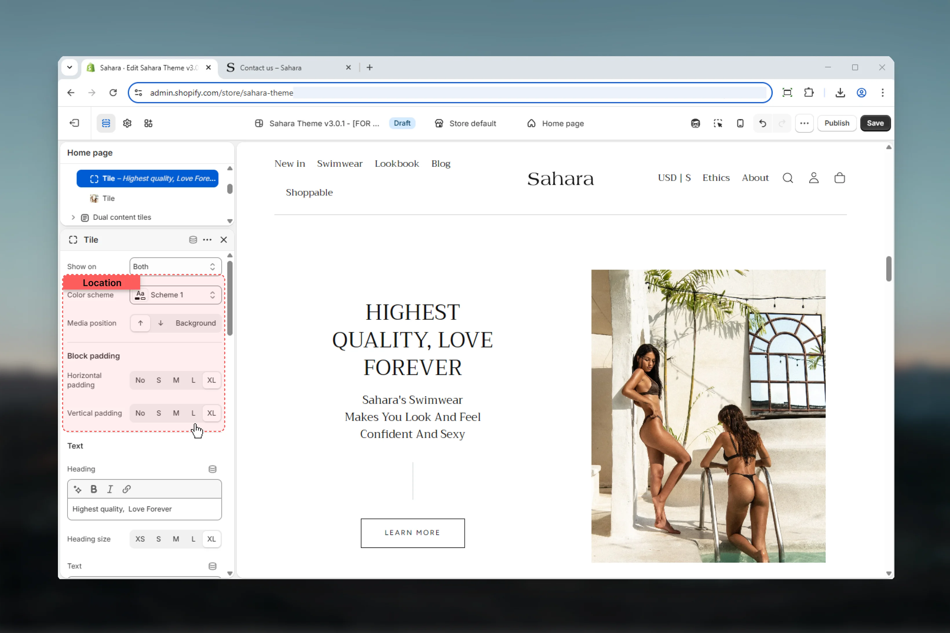
 ### Color scheme
Select color scheme for individual tile background and text.
Overrides section-level color scheme for this specific tile.
### Media position
Controls where media appears relative to text content.
Media displays above text content (default).
**Best for:** Standard card layouts, image-first designs
Media displays below text content.
**Best for:** Text-priority designs, inverted layouts
Media serves as background with text overlay.
**Best for:** Hero-style tiles, immersive imagery, full-bleed designs
### Inner padding (Horizontal)
Controls left and right padding inside the tile.
**Options:** No padding, S, M (default), L, XL
Only applies when media position is Top or Bottom (not Background).
### Inner padding (Vertical)
Controls top and bottom padding inside the tile.
**Options:** No padding, S, M (default), L, XL
Only applies when media position is Top or Bottom (not Background).
### Color scheme
Select color scheme for individual tile background and text.
Overrides section-level color scheme for this specific tile.
### Media position
Controls where media appears relative to text content.
Media displays above text content (default).
**Best for:** Standard card layouts, image-first designs
Media displays below text content.
**Best for:** Text-priority designs, inverted layouts
Media serves as background with text overlay.
**Best for:** Hero-style tiles, immersive imagery, full-bleed designs
### Inner padding (Horizontal)
Controls left and right padding inside the tile.
**Options:** No padding, S, M (default), L, XL
Only applies when media position is Top or Bottom (not Background).
### Inner padding (Vertical)
Controls top and bottom padding inside the tile.
**Options:** No padding, S, M (default), L, XL
Only applies when media position is Top or Bottom (not Background).
 ### Heading
Tile heading text.
* Inline rich text supported (bold, italic, links)
* **Default:** "Heading for Dual Content Tiles"
### Heading size
Controls the size of tile heading.
**Options:** XS, S, M, L, XL\
**Default:** XL
### Text
Main body content of the tile.
* Rich text editor with formatting support
* **Supports:**
* Bold, italic, underline
* Lists (bulleted, numbered)
* Links
* Leave empty to show heading and button only
Keep text concise (30-50 words) for tile readability. Use tiles for highlights, not long-form content.
### Heading
Tile heading text.
* Inline rich text supported (bold, italic, links)
* **Default:** "Heading for Dual Content Tiles"
### Heading size
Controls the size of tile heading.
**Options:** XS, S, M, L, XL\
**Default:** XL
### Text
Main body content of the tile.
* Rich text editor with formatting support
* **Supports:**
* Bold, italic, underline
* Lists (bulleted, numbered)
* Links
* Leave empty to show heading and button only
Keep text concise (30-50 words) for tile readability. Use tiles for highlights, not long-form content.
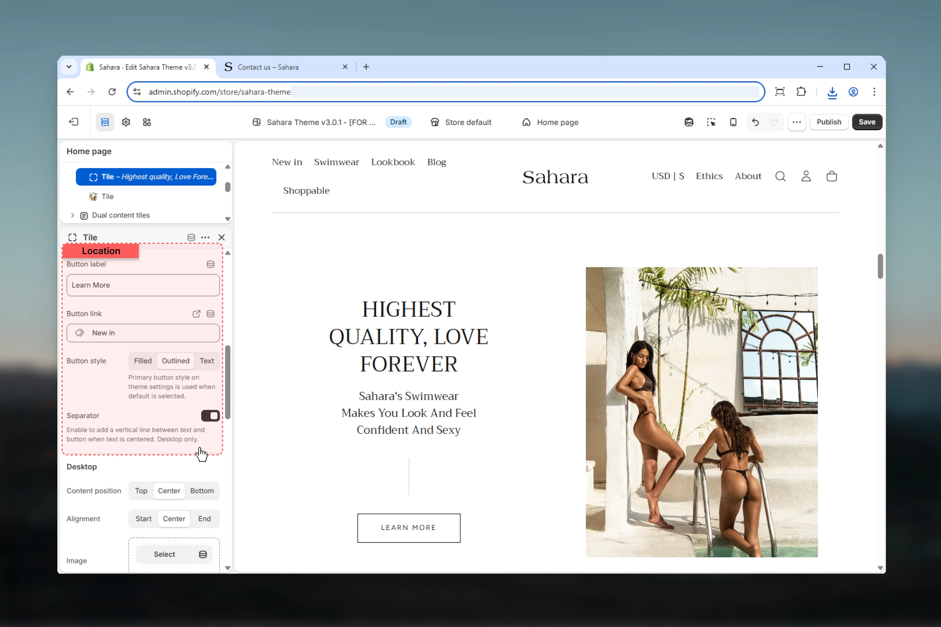
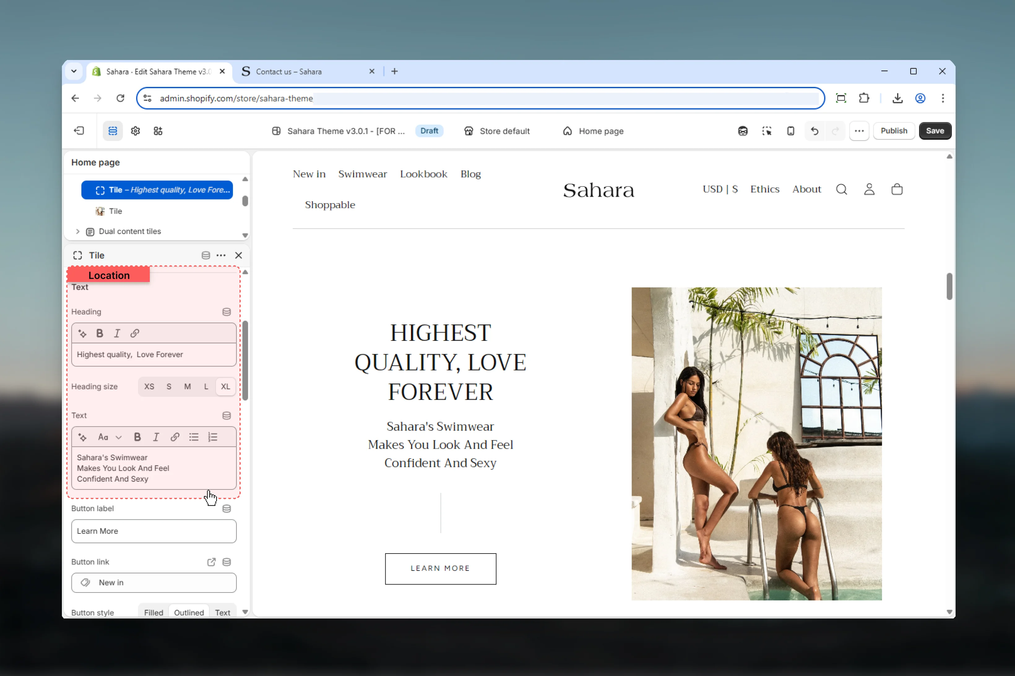 ### Button text
Label displayed on the call-to-action button.
* Plain text
* Leave empty to hide button
### Button URL
Destination link when button is clicked.
### Button style
Visual style of the button.
Solid background with contrasting text (default).
**Best for:** Primary CTAs, strong visibility
Border-only style with transparent background.
**Best for:** Secondary actions, subtle CTAs
Minimal text link styling.
**Best for:** Tertiary actions, minimal designs
### Button separator
Adds a visual separator (line) above the button.
**Default:** False
Separator creates visual hierarchy separating button from content above.
### Button text
Label displayed on the call-to-action button.
* Plain text
* Leave empty to hide button
### Button URL
Destination link when button is clicked.
### Button style
Visual style of the button.
Solid background with contrasting text (default).
**Best for:** Primary CTAs, strong visibility
Border-only style with transparent background.
**Best for:** Secondary actions, subtle CTAs
Minimal text link styling.
**Best for:** Tertiary actions, minimal designs
### Button separator
Adds a visual separator (line) above the button.
**Default:** False
Separator creates visual hierarchy separating button from content above.
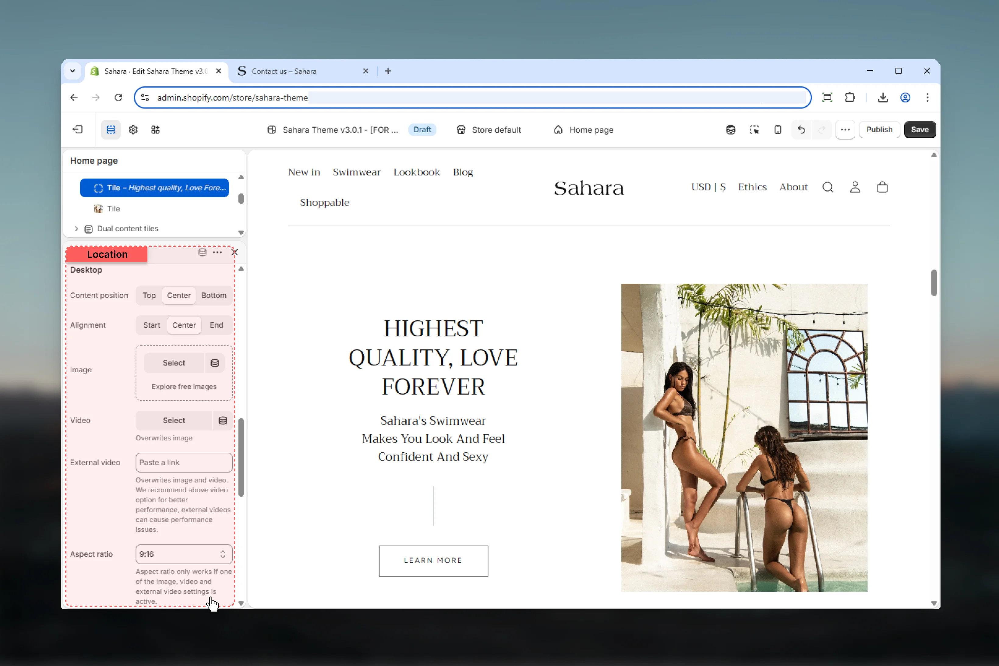
 ### Content position
Controls vertical alignment of text content on desktop.
**Options:** Start (top), Center (default), End (bottom)
### Content alignment
Controls horizontal alignment of text content on desktop.
**Options:** Start (left), Center (default), End (right)
### Image (Desktop)
Upload image for desktop display.
**Recommended:** 1200px+ width, aspect ratio matching tile size
### Video (Desktop)
Upload Shopify-hosted video file. Overwrites image when set.
### External video (Desktop)
Embed YouTube or Vimeo video. Takes priority over image and video.
**Accepts:** YouTube, Vimeo URLs
External videos may impact page load performance.
### Aspect ratio (Desktop)
Controls the height-to-width ratio of tile media.
**Options:**
* **Auto** - Uses natural image dimensions (default)
* **Square:** 1:1
* **Landscape:** 4:3, 3:2, 5:4, 16:9, 2:1, 4:1, 8:1
* **Portrait:** 3:4, 2:3, 4:5, 9:16, 1:2
Use Auto for varied content heights or fixed ratios for uniform tile dimensions.
### Content position
Controls vertical alignment of text content on desktop.
**Options:** Start (top), Center (default), End (bottom)
### Content alignment
Controls horizontal alignment of text content on desktop.
**Options:** Start (left), Center (default), End (right)
### Image (Desktop)
Upload image for desktop display.
**Recommended:** 1200px+ width, aspect ratio matching tile size
### Video (Desktop)
Upload Shopify-hosted video file. Overwrites image when set.
### External video (Desktop)
Embed YouTube or Vimeo video. Takes priority over image and video.
**Accepts:** YouTube, Vimeo URLs
External videos may impact page load performance.
### Aspect ratio (Desktop)
Controls the height-to-width ratio of tile media.
**Options:**
* **Auto** - Uses natural image dimensions (default)
* **Square:** 1:1
* **Landscape:** 4:3, 3:2, 5:4, 16:9, 2:1, 4:1, 8:1
* **Portrait:** 3:4, 2:3, 4:5, 9:16, 1:2
Use Auto for varied content heights or fixed ratios for uniform tile dimensions.
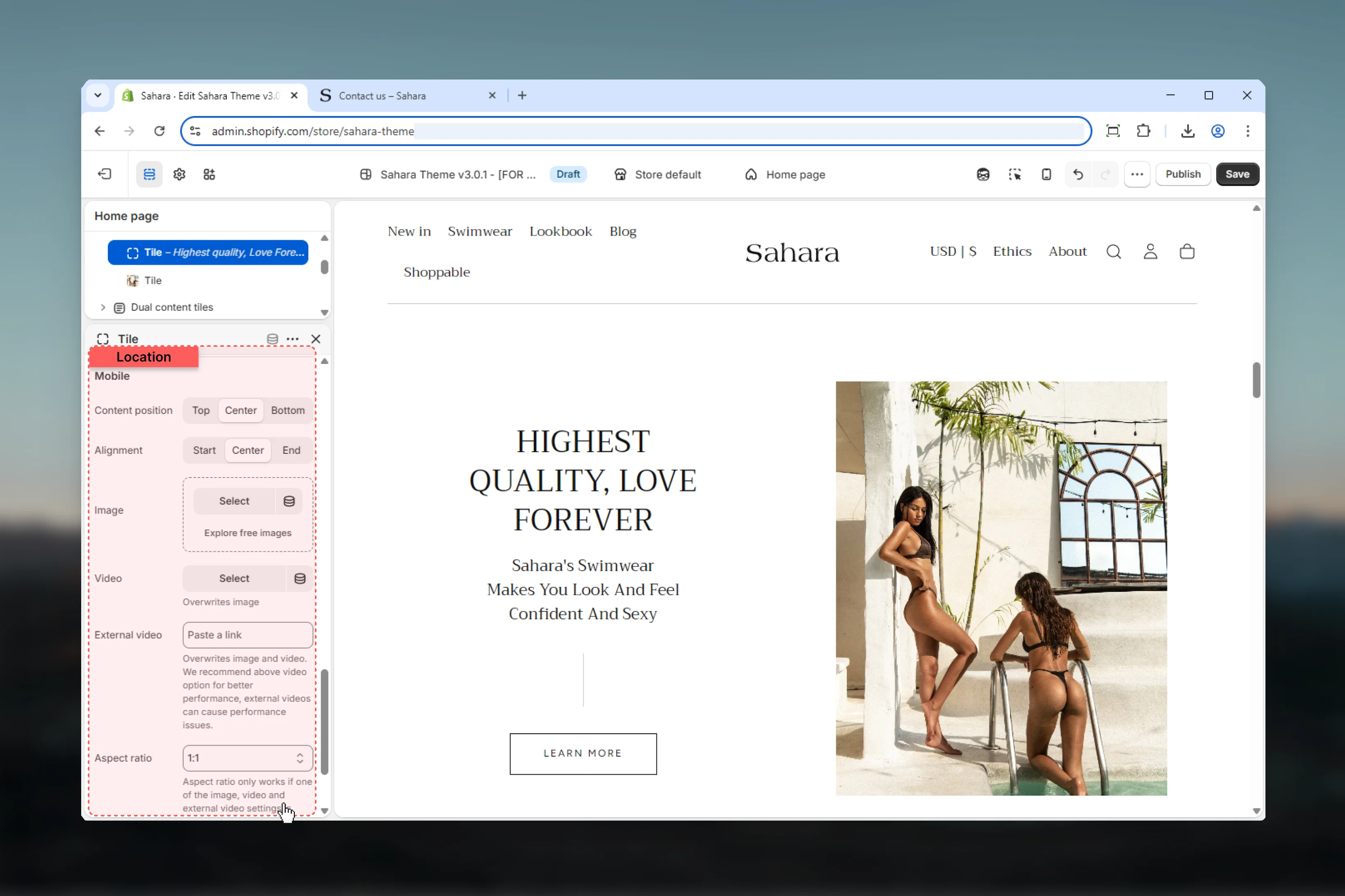
 ### Content position (Mobile)
Controls vertical alignment of text content on mobile independently.
**Options:** Start (top), Center (default), End (bottom)
### Content alignment (Mobile)
Controls horizontal alignment of text content on mobile independently.
**Options:** Start (left), Center (default), End (right)
### Image (Mobile)
Upload mobile-optimized image.
**Recommended:** 800-1200px width, portrait orientation
Mobile media overrides desktop media on small screens when provided.
### Video (Mobile)
Shopify-hosted video for mobile devices. Overwrites mobile image.
### External video (Mobile)
YouTube or Vimeo video for mobile. Takes priority.
### Aspect ratio (Mobile)
Controls media aspect ratio on mobile devices independently.
**Options:** Same as desktop\
**Default:** 1:1 (Square)
### Video mobile compact
Reduces video padding on mobile for more compact display.
**Default:** False
### Content position (Mobile)
Controls vertical alignment of text content on mobile independently.
**Options:** Start (top), Center (default), End (bottom)
### Content alignment (Mobile)
Controls horizontal alignment of text content on mobile independently.
**Options:** Start (left), Center (default), End (right)
### Image (Mobile)
Upload mobile-optimized image.
**Recommended:** 800-1200px width, portrait orientation
Mobile media overrides desktop media on small screens when provided.
### Video (Mobile)
Shopify-hosted video for mobile devices. Overwrites mobile image.
### External video (Mobile)
YouTube or Vimeo video for mobile. Takes priority.
### Aspect ratio (Mobile)
Controls media aspect ratio on mobile devices independently.
**Options:** Same as desktop\
**Default:** 1:1 (Square)
### Video mobile compact
Reduces video padding on mobile for more compact display.
**Default:** False
 ## Best practices
Use Half (50/50) block size for equal emphasis, Large/Small for primary/secondary content hierarchy.
Use matching aspect ratios across both tiles for visual harmony and professional appearance.
Provide portrait-oriented mobile images and consider reversing tile order if second tile is more important on mobile.
Use larger gaps (L, XL) for clearly separated tiles, no gap for seamless edge-to-edge layouts.
Keep text concise (30-50 words per tile) for readability. Tiles are for highlights, not essays.
Add buttons to both tiles for balanced CTAs or just one tile to create visual hierarchy.
Use different color schemes per tile to create visual interest and differentiate content types.
When using background media position, ensure sufficient text-to-image contrast for readability.
## Common use cases
Half (50/50) block size. Tile 1: "Men's Sale" with background image. Tile 2: "Women's Sale" with background image. Both with filled buttons. Center content alignment. Different color schemes per tile.
Large (66/33) block size. Tile 1: Featured collection with background video, heading, text, outlined button. Tile 2: Newsletter signup with top media, heading, form description, filled button.
Half (50/50) block size, small gap. Both tiles: product images (top position), product names as headings, brief descriptions, "Shop now" outlined buttons. Matching color schemes for cohesion.
Large (66/33) block size. Tile 1: Brand story with background image, heading, 3-4 sentence text, "Learn more" text link. Tile 2: Customer testimonial with top portrait image, quote as text, customer name as heading.
Full width section. Half (50/50) block size, no gap. Both tiles: background holiday images, seasonal headings, promotional text, filled buttons. Reverse on mobile to prioritize primary campaign.
## Related sections
Multiple sliding content cards
Collection showcase with custom styling
Multi-tile grid layouts
## Best practices
Use Half (50/50) block size for equal emphasis, Large/Small for primary/secondary content hierarchy.
Use matching aspect ratios across both tiles for visual harmony and professional appearance.
Provide portrait-oriented mobile images and consider reversing tile order if second tile is more important on mobile.
Use larger gaps (L, XL) for clearly separated tiles, no gap for seamless edge-to-edge layouts.
Keep text concise (30-50 words per tile) for readability. Tiles are for highlights, not essays.
Add buttons to both tiles for balanced CTAs or just one tile to create visual hierarchy.
Use different color schemes per tile to create visual interest and differentiate content types.
When using background media position, ensure sufficient text-to-image contrast for readability.
## Common use cases
Half (50/50) block size. Tile 1: "Men's Sale" with background image. Tile 2: "Women's Sale" with background image. Both with filled buttons. Center content alignment. Different color schemes per tile.
Large (66/33) block size. Tile 1: Featured collection with background video, heading, text, outlined button. Tile 2: Newsletter signup with top media, heading, form description, filled button.
Half (50/50) block size, small gap. Both tiles: product images (top position), product names as headings, brief descriptions, "Shop now" outlined buttons. Matching color schemes for cohesion.
Large (66/33) block size. Tile 1: Brand story with background image, heading, 3-4 sentence text, "Learn more" text link. Tile 2: Customer testimonial with top portrait image, quote as text, customer name as heading.
Full width section. Half (50/50) block size, no gap. Both tiles: background holiday images, seasonal headings, promotional text, filled buttons. Reverse on mobile to prioritize primary campaign.
## Related sections
Multiple sliding content cards
Collection showcase with custom styling
Multi-tile grid layouts