> ## Documentation Index
> Fetch the complete documentation index at: https://docs.digifist.com/llms.txt
> Use this file to discover all available pages before exploring further.
# Featured collections
> Showcase multiple collections with flexible layouts, card styles, and customizable presentation options.
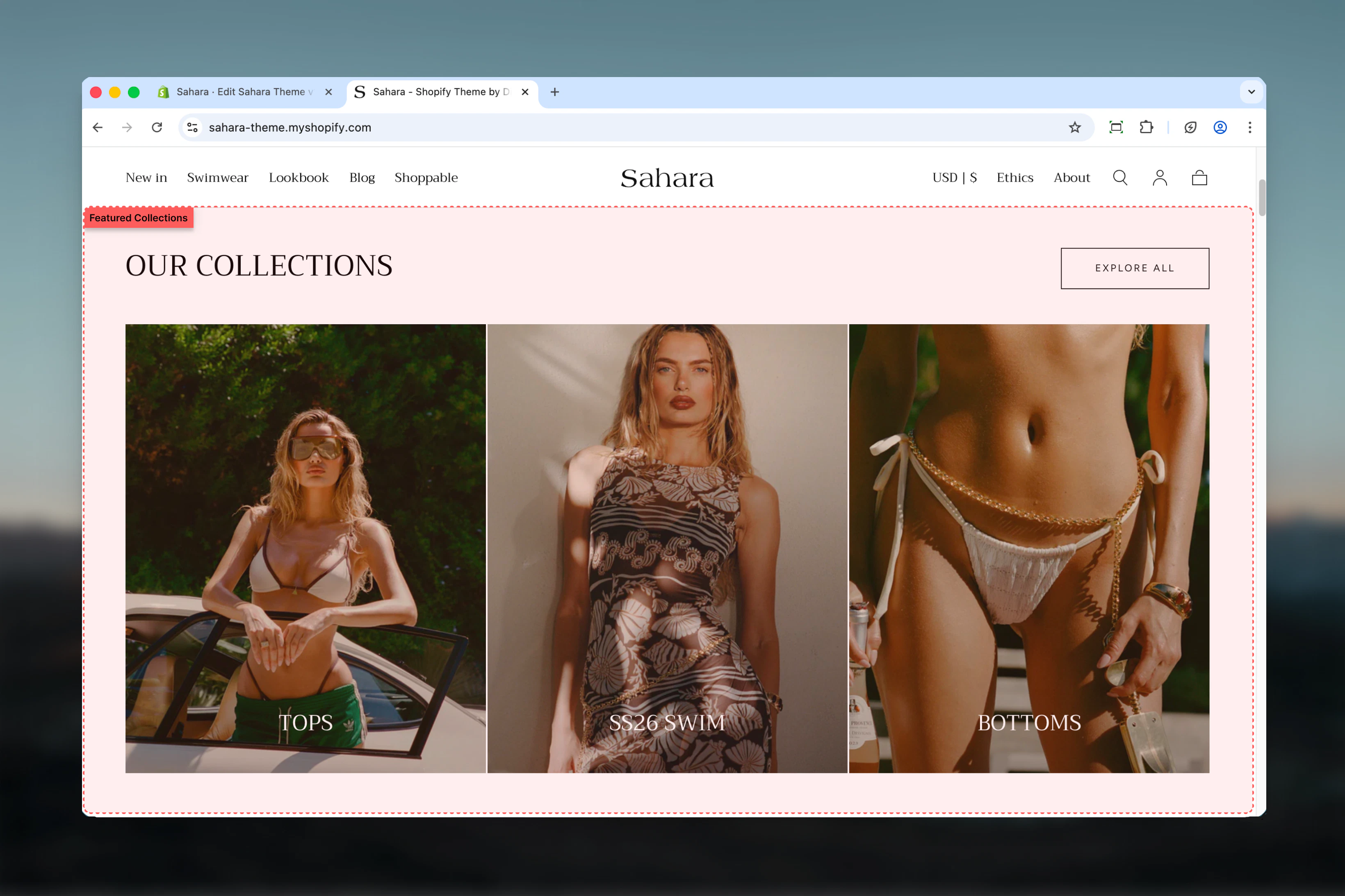
The Featured collections section displays multiple collections in an organized, visually appealing format. It allows you to highlight different product categories, seasonal collections, or themed groups with flexible styling and layout options.
 ## What this section controls
This section controls collection showcase displays with the following capabilities:
* Multiple collection cards with custom images and headings
* Two layout options for heading and button positioning
* Normal or compact card styling
* Individual color schemes per collection
* Section-level button for viewing all collections
## How the Featured collections section works
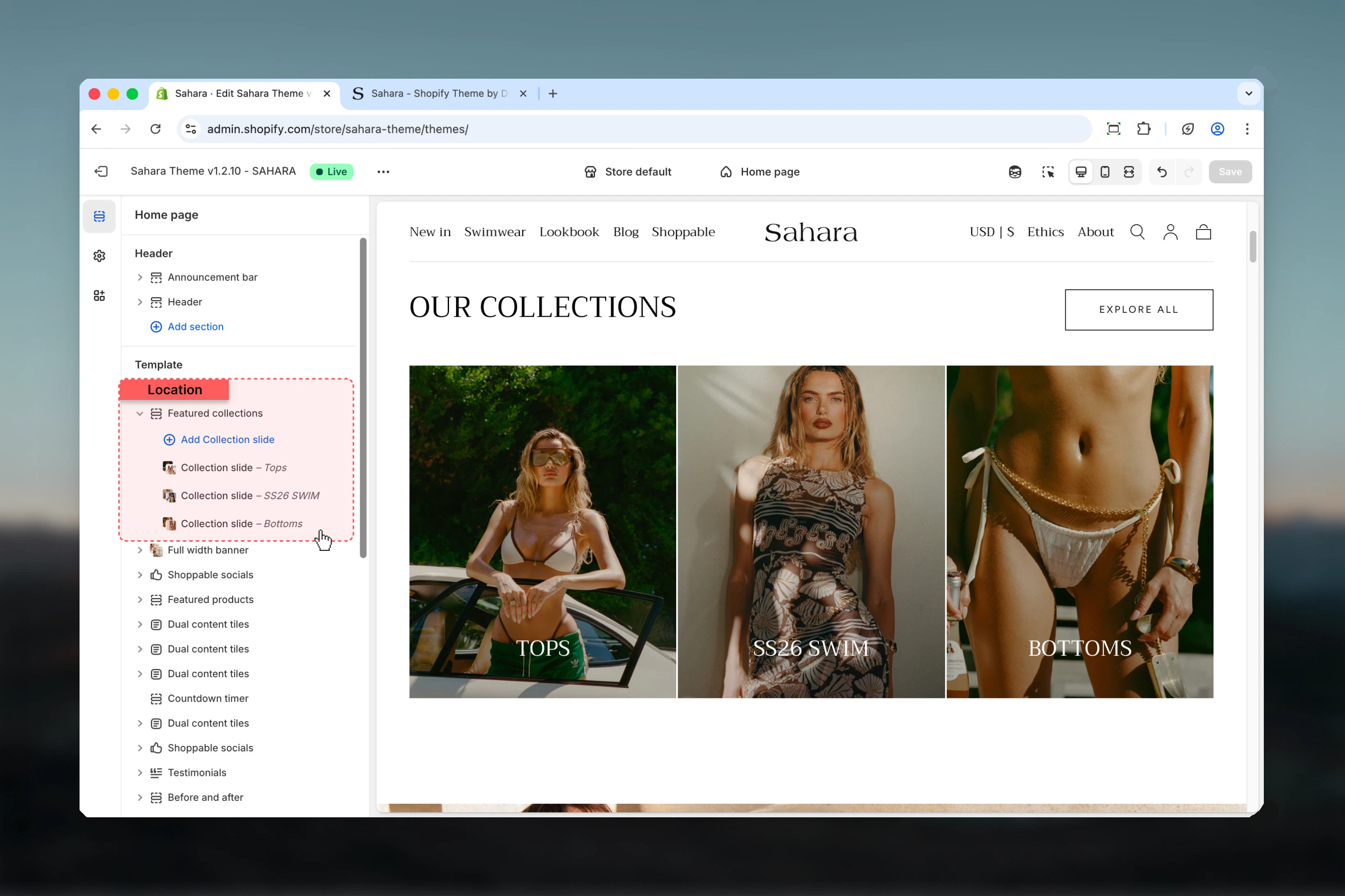
The section uses collection-slide blocks where each block represents one collection card. You can add custom images to override collection defaults, write custom headings, and apply individual styling to each collection card.
## Getting started
From Shopify admin, access the Theme Customizer.
Add the Featured collections section to your page or template.
Click "Add block" and select "Collection slide" to add collections.
Choose a Shopify collection for each slide and customize as needed.
## What this section controls
This section controls collection showcase displays with the following capabilities:
* Multiple collection cards with custom images and headings
* Two layout options for heading and button positioning
* Normal or compact card styling
* Individual color schemes per collection
* Section-level button for viewing all collections
## How the Featured collections section works
The section uses collection-slide blocks where each block represents one collection card. You can add custom images to override collection defaults, write custom headings, and apply individual styling to each collection card.
## Getting started
From Shopify admin, access the Theme Customizer.
Add the Featured collections section to your page or template.
Click "Add block" and select "Collection slide" to add collections.
Choose a Shopify collection for each slide and customize as needed.
 ## Section settings
### Layout
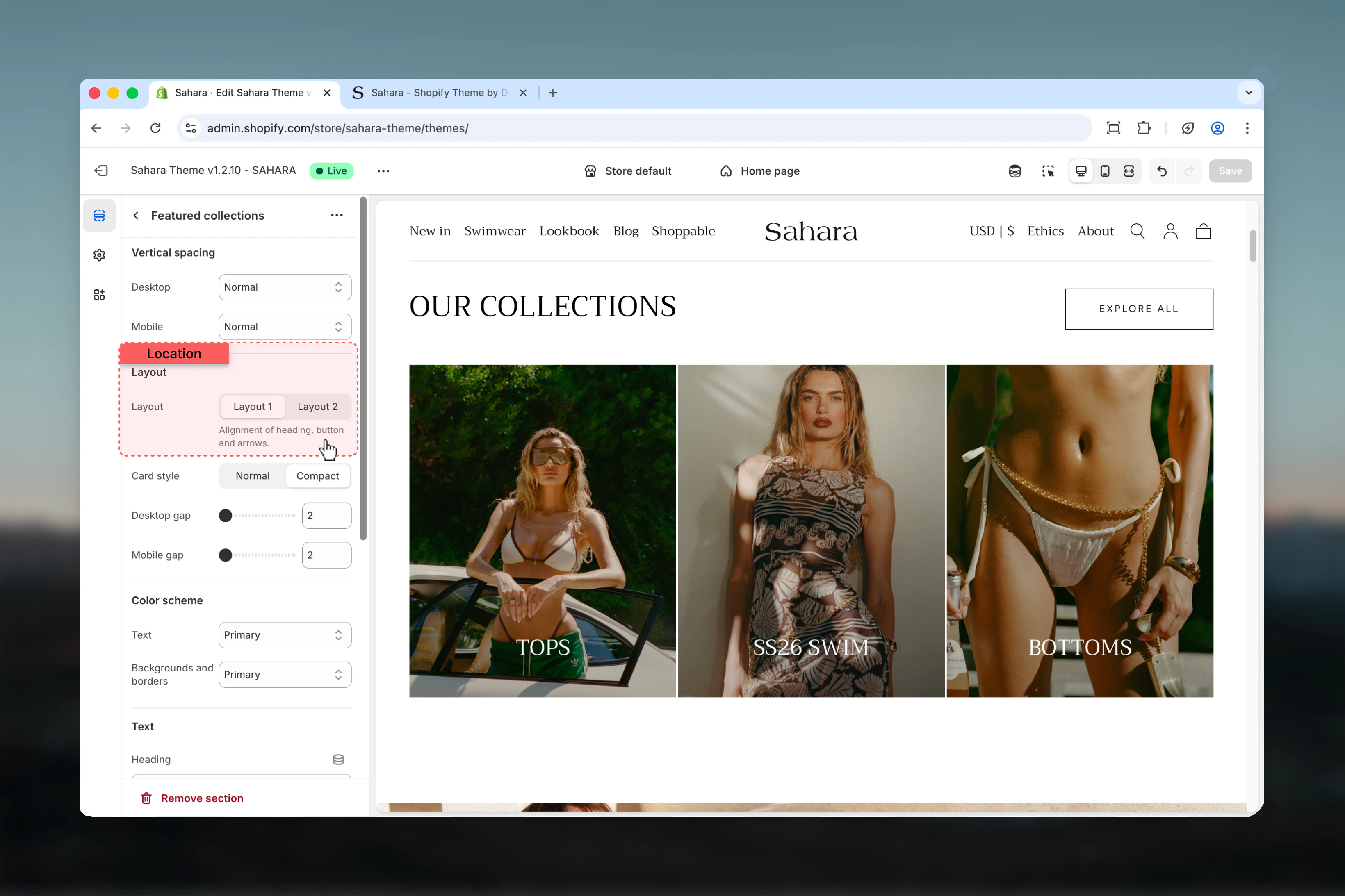
Controls the positioning of the section heading and button.
Heading aligned to the start (left), button aligned to the end (right).
**When to use:**
* Standard collection sections
* When button is secondary to heading
* Horizontal balance in content layout
Heading and button both centered, with button displayed at the section bottom.
**When to use:**
* Centered page designs
* Promotional collection showcases
* Creating visual symmetry
## Section settings
### Layout
Controls the positioning of the section heading and button.
Heading aligned to the start (left), button aligned to the end (right).
**When to use:**
* Standard collection sections
* When button is secondary to heading
* Horizontal balance in content layout
Heading and button both centered, with button displayed at the section bottom.
**When to use:**
* Centered page designs
* Promotional collection showcases
* Creating visual symmetry
 ### Heading
Main section heading text supporting rich text formatting (bold, italic, links).
**Default:** "Heading for Featured Collections"
### Heading size
Controls the visual size of the heading.
**Available options:** XS, S, M, L, XL (default)
### Button settings
Text displayed on the section button. Default is "Explore all".
Leave empty to hide the button if not needed.
Destination URL when the button is clicked. Default is "/collections" (all collections page).
Visual styling of the button.
**Available options:**
* **Filled** - Solid background (default, highest emphasis)
* **Outlined** - Border with transparent background
* **Text link** - Minimal styling, text only
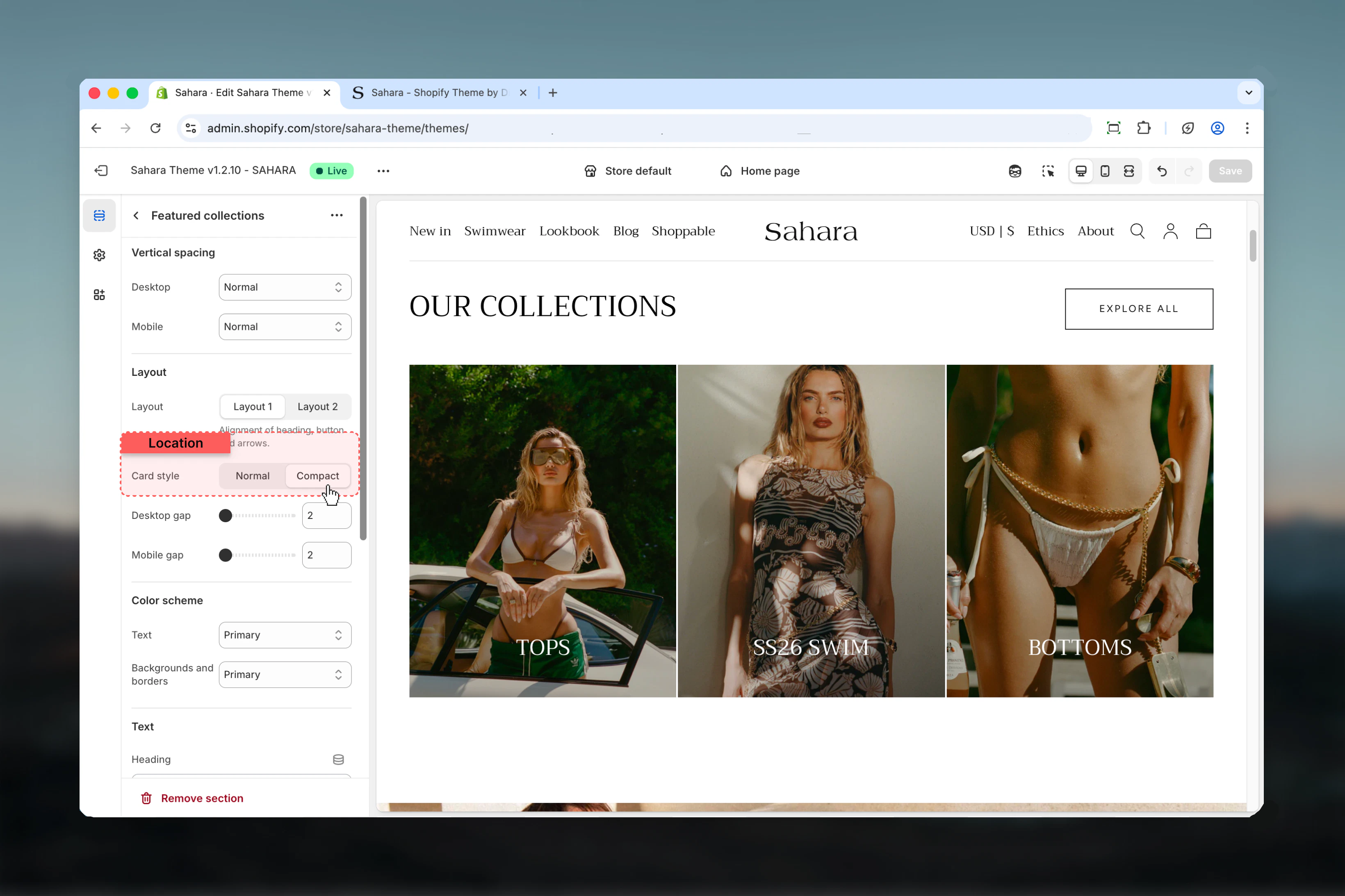
### Card style
Controls the visual density and presentation of collection cards.
Standard card presentation with full spacing and padding.
**When to use:**
* When emphasizing collection images
* For larger, more prominent displays
* When you have high-quality collection imagery
Reduced spacing and tighter layout (default).
**When to use:**
* Displaying many collections in limited space
* Cleaner, more minimal designs
* When collection names are more important than images
### Heading
Main section heading text supporting rich text formatting (bold, italic, links).
**Default:** "Heading for Featured Collections"
### Heading size
Controls the visual size of the heading.
**Available options:** XS, S, M, L, XL (default)
### Button settings
Text displayed on the section button. Default is "Explore all".
Leave empty to hide the button if not needed.
Destination URL when the button is clicked. Default is "/collections" (all collections page).
Visual styling of the button.
**Available options:**
* **Filled** - Solid background (default, highest emphasis)
* **Outlined** - Border with transparent background
* **Text link** - Minimal styling, text only
### Card style
Controls the visual density and presentation of collection cards.
Standard card presentation with full spacing and padding.
**When to use:**
* When emphasizing collection images
* For larger, more prominent displays
* When you have high-quality collection imagery
Reduced spacing and tighter layout (default).
**When to use:**
* Displaying many collections in limited space
* Cleaner, more minimal designs
* When collection names are more important than images
 ### Section width
Controls the maximum width of the section container.
Content limited to theme's page width (default).
**When to use:** Standard sections that align with other page content.
Content extends to full browser width.
**When to use:** Edge-to-edge designs, maximizing collection visibility.
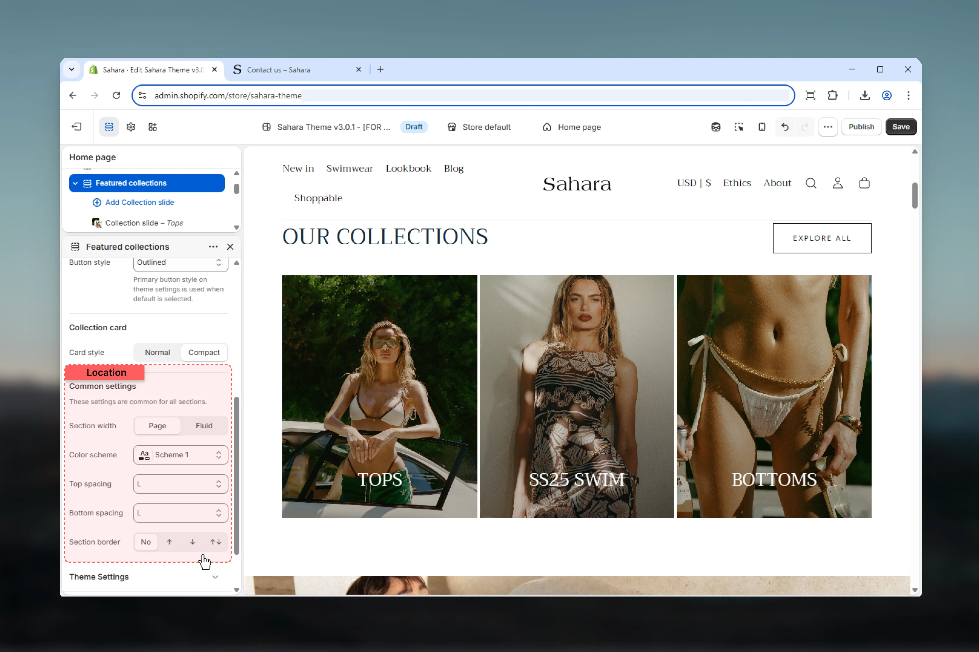
### Color scheme
Select the background and text color scheme for the entire section.
### Spacing
Control vertical spacing around the section:
* **Spacing top** - Margin above the section (None, S, M, L, XL)
* **Spacing bottom** - Margin below the section (None, S, M, L, XL)
Both default to M (medium spacing).
### Section border
Add decorative borders to the section.
**Available options:**
* **None** - No borders (default)
* **Top** - Border on top edge only
* **Bottom** - Border on bottom edge only
* **Both** - Borders on top and bottom edges
### Section width
Controls the maximum width of the section container.
Content limited to theme's page width (default).
**When to use:** Standard sections that align with other page content.
Content extends to full browser width.
**When to use:** Edge-to-edge designs, maximizing collection visibility.
### Color scheme
Select the background and text color scheme for the entire section.
### Spacing
Control vertical spacing around the section:
* **Spacing top** - Margin above the section (None, S, M, L, XL)
* **Spacing bottom** - Margin below the section (None, S, M, L, XL)
Both default to M (medium spacing).
### Section border
Add decorative borders to the section.
**Available options:**
* **None** - No borders (default)
* **Top** - Border on top edge only
* **Bottom** - Border on bottom edge only
* **Both** - Borders on top and bottom edges
 ## Block settings
Each collection-slide block represents one collection card in the display.
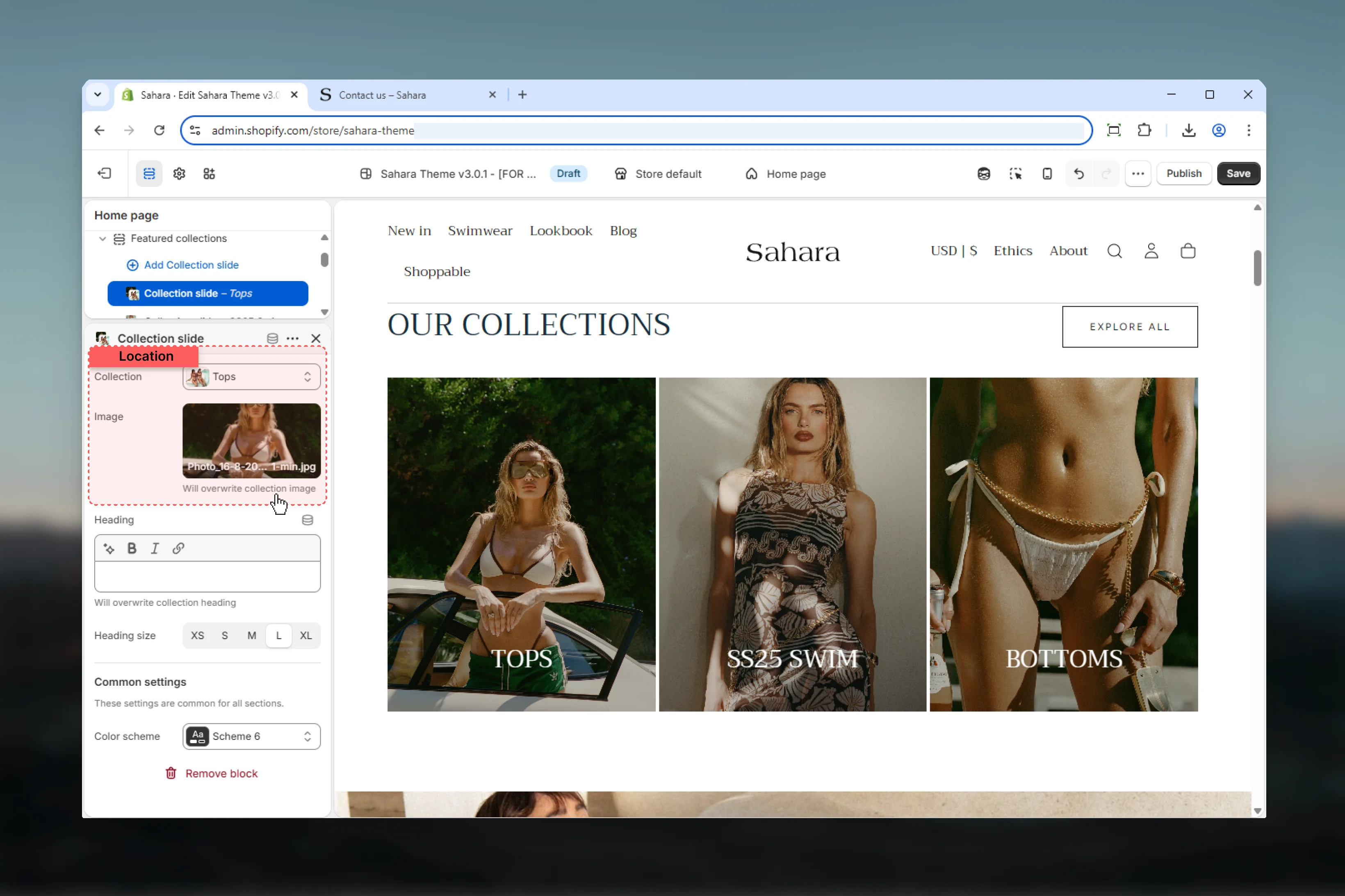
### Collection selection
Select a Shopify collection to display.
The selected collection determines:
* Default collection image (if custom image not set)
* Collection link destination
* Default heading (if custom heading not provided)
* Product count and availability
Collections update automatically when products are added or removed.
### Custom image
Upload a custom image to override the collection's default image.
**Use custom images when:**
* Collection default image doesn't match your design
* Creating seasonal or promotional variants
* Maintaining visual consistency across all cards
* Collection has no default image set
**Image recommendations:**
* High resolution (at least 800px width)
* Consistent aspect ratios across all collection cards
* Clear focal points that work at different sizes
* Optimized file sizes for web performance
## Block settings
Each collection-slide block represents one collection card in the display.
### Collection selection
Select a Shopify collection to display.
The selected collection determines:
* Default collection image (if custom image not set)
* Collection link destination
* Default heading (if custom heading not provided)
* Product count and availability
Collections update automatically when products are added or removed.
### Custom image
Upload a custom image to override the collection's default image.
**Use custom images when:**
* Collection default image doesn't match your design
* Creating seasonal or promotional variants
* Maintaining visual consistency across all cards
* Collection has no default image set
**Image recommendations:**
* High resolution (at least 800px width)
* Consistent aspect ratios across all collection cards
* Clear focal points that work at different sizes
* Optimized file sizes for web performance
 ### Heading (Title)
Custom heading text for this collection card.
If no custom heading is provided, the collection name will be used automatically.
**When to customize:**
* Create marketing-friendly names ("Shop Summer Styles" vs. "summer-2024")
* Add promotional context or urgency
* Maintain consistent heading style
* Include specific calls-to-action
**When to leave empty:**
* Collection name is already clear and customer-friendly
* Reducing manual maintenance
* Letting collection metadata control display
### Heading size
Controls the visual size of the collection heading.
**Available options:** XS, S, M, L (default), XL
Typically use L or M for consistency across all collection cards.
Use the same heading size across all collection slides for visual harmony.
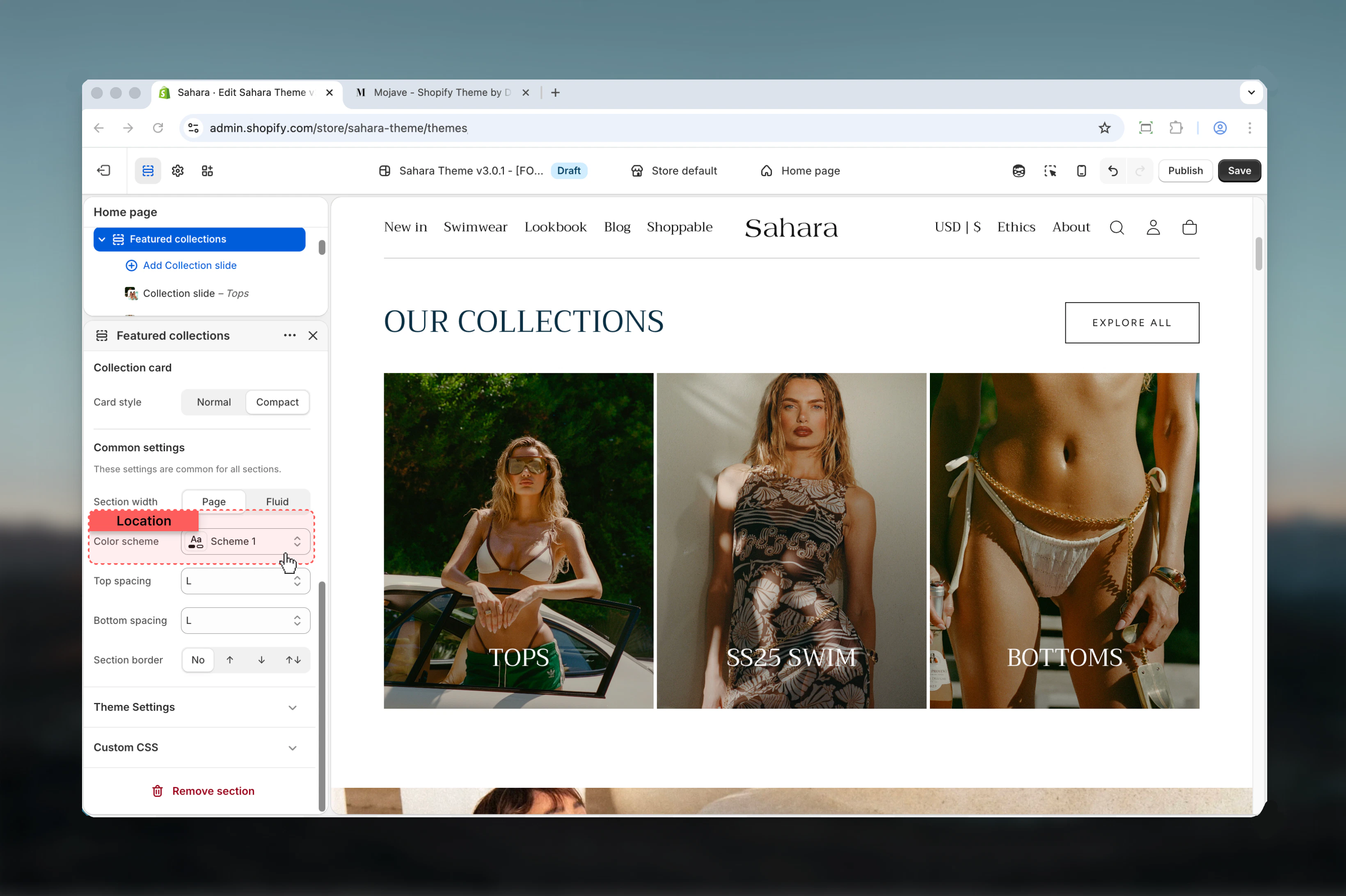
### Color scheme
Select an individual color scheme for this specific collection card.
Each collection card can have its own color scheme, independent from the section's overall color scheme.
**When to use different colors:**
* Seasonal collection differentiation
* Brand-specific collections (multi-brand stores)
* Creating visual hierarchy or emphasis
* Thematic categorization (e.g., warm colors for summer, cool for winter)
**When to use uniform colors:**
* Maintaining clean, consistent design
* Professional, minimalist aesthetics
* When collection images provide enough visual variety
### Heading (Title)
Custom heading text for this collection card.
If no custom heading is provided, the collection name will be used automatically.
**When to customize:**
* Create marketing-friendly names ("Shop Summer Styles" vs. "summer-2024")
* Add promotional context or urgency
* Maintain consistent heading style
* Include specific calls-to-action
**When to leave empty:**
* Collection name is already clear and customer-friendly
* Reducing manual maintenance
* Letting collection metadata control display
### Heading size
Controls the visual size of the collection heading.
**Available options:** XS, S, M, L (default), XL
Typically use L or M for consistency across all collection cards.
Use the same heading size across all collection slides for visual harmony.
### Color scheme
Select an individual color scheme for this specific collection card.
Each collection card can have its own color scheme, independent from the section's overall color scheme.
**When to use different colors:**
* Seasonal collection differentiation
* Brand-specific collections (multi-brand stores)
* Creating visual hierarchy or emphasis
* Thematic categorization (e.g., warm colors for summer, cool for winter)
**When to use uniform colors:**
* Maintaining clean, consistent design
* Professional, minimalist aesthetics
* When collection images provide enough visual variety
 ## Best practices
Use similar aspect ratios and image styles across all collection cards for professional appearance.
Use descriptive, action-oriented headings that explain what customers will find in each collection.
Display 3-6 collections for optimal browsing. Too many collections overwhelm customers.
Use compact card style when displaying 5+ collections to save space and reduce scrolling.
Use individual color schemes sparingly. Too many colors create visual chaos.
Refresh collection selections and custom images seasonally to keep content relevant.
## Common use cases
Display 4-6 main product categories using Layout 1 with compact cards. Use collection default images and names. Link button to "/collections" for full catalog access.
Use 3 collection slides with custom seasonal images. Apply individual color schemes matching seasonal themes (warm/cool tones). Use custom headings like "Winter Essentials 2024".
Create 4-8 style-based collections with Layout 2 (centered). Use normal card style for prominent imagery. Add custom images showing lifestyle shots of each style.
For multi-brand stores, display brand collections with their logos as custom images. Use compact cards to fit more brands. Apply individual color schemes matching brand colors.
Simple 2-3 collection setup (Men's, Women's, Kids) with large normal cards and Layout 2. Use high-impact lifestyle images and filled button style for strong CTAs.
## Related sections
Display individual products instead of collections
Learn about the all-collections page template
## Best practices
Use similar aspect ratios and image styles across all collection cards for professional appearance.
Use descriptive, action-oriented headings that explain what customers will find in each collection.
Display 3-6 collections for optimal browsing. Too many collections overwhelm customers.
Use compact card style when displaying 5+ collections to save space and reduce scrolling.
Use individual color schemes sparingly. Too many colors create visual chaos.
Refresh collection selections and custom images seasonally to keep content relevant.
## Common use cases
Display 4-6 main product categories using Layout 1 with compact cards. Use collection default images and names. Link button to "/collections" for full catalog access.
Use 3 collection slides with custom seasonal images. Apply individual color schemes matching seasonal themes (warm/cool tones). Use custom headings like "Winter Essentials 2024".
Create 4-8 style-based collections with Layout 2 (centered). Use normal card style for prominent imagery. Add custom images showing lifestyle shots of each style.
For multi-brand stores, display brand collections with their logos as custom images. Use compact cards to fit more brands. Apply individual color schemes matching brand colors.
Simple 2-3 collection setup (Men's, Women's, Kids) with large normal cards and Layout 2. Use high-impact lifestyle images and filled button style for strong CTAs.
## Related sections
Display individual products instead of collections
Learn about the all-collections page template