> ## Documentation Index
> Fetch the complete documentation index at: https://docs.digifist.com/llms.txt
> Use this file to discover all available pages before exploring further.
# Featured products
> Showcase selected products or collections with flexible layouts and styling options.
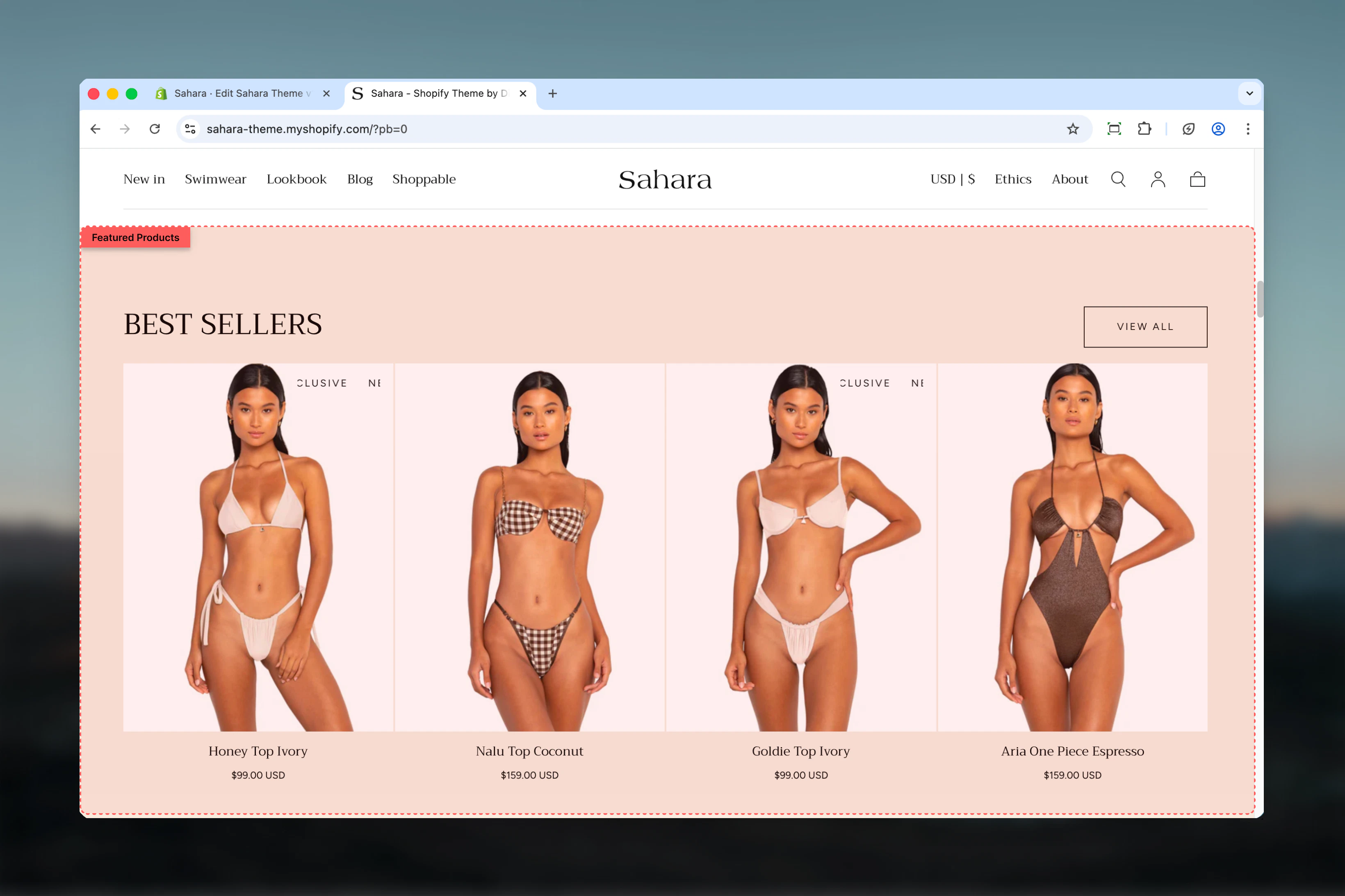
The Featured products section displays a curated selection of products in a prominent layout. It supports manual product selection or collection-based display, making it ideal for highlighting seasonal items, bestsellers, or new arrivals.
 ## What this section controls
This section controls product showcase displays with the following capabilities:
* Manual product selection or automatic collection loading
* Two layout options for heading and button positioning
* Configurable product count from 4 to 12 items
* Section-level button for viewing full collection
* Display control for unavailable products
## How the Featured products section works
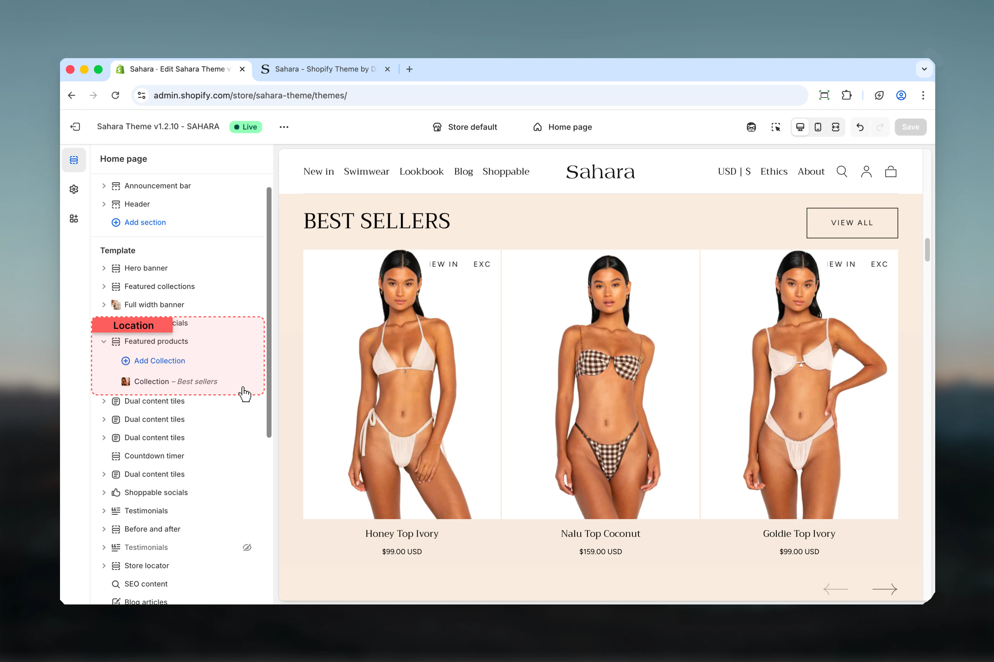
The section uses collection blocks to define product sources. You can either manually select specific products or choose a Shopify collection. When a collection is selected, it automatically overrides any manual product selections, keeping the display updated with the latest collection contents.
## Getting started
From Shopify admin, access the Theme Customizer.
Add the Featured products section to your page or template.
Click "Add block" and select "Collection" to define your product source.
Either manually select products or choose a Shopify collection.
## What this section controls
This section controls product showcase displays with the following capabilities:
* Manual product selection or automatic collection loading
* Two layout options for heading and button positioning
* Configurable product count from 4 to 12 items
* Section-level button for viewing full collection
* Display control for unavailable products
## How the Featured products section works
The section uses collection blocks to define product sources. You can either manually select specific products or choose a Shopify collection. When a collection is selected, it automatically overrides any manual product selections, keeping the display updated with the latest collection contents.
## Getting started
From Shopify admin, access the Theme Customizer.
Add the Featured products section to your page or template.
Click "Add block" and select "Collection" to define your product source.
Either manually select products or choose a Shopify collection.
 ## Section settings
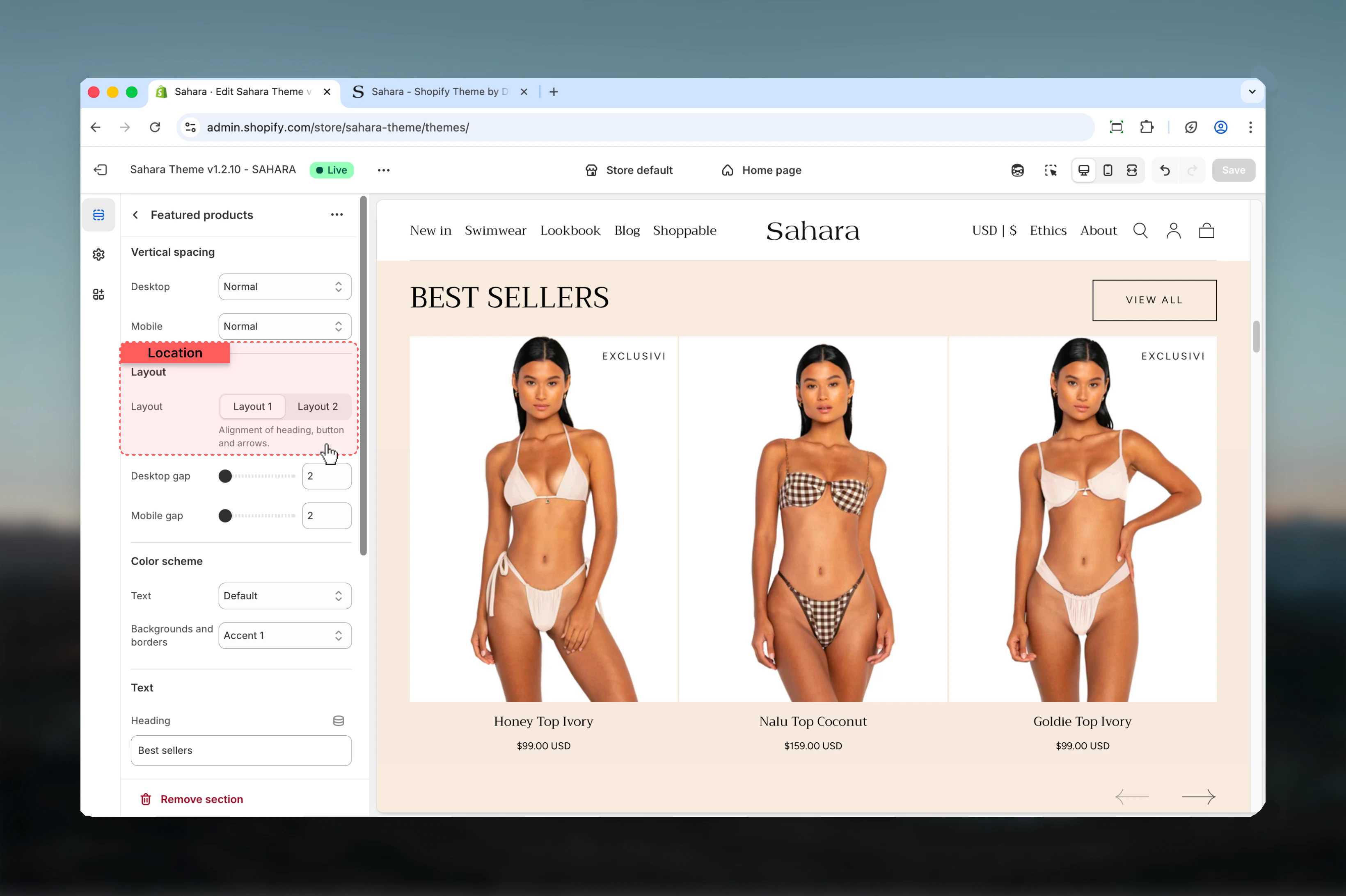
### Layout
Controls the positioning of the section heading and button.
Heading aligned to the start (left), button aligned to the end (right).
**When to use:**
* Standard product sections with clear hierarchy
* When the button is secondary to the heading
* Desktop-friendly layouts with horizontal balance
Heading and button both centered, with button displayed at the section bottom.
**When to use:**
* Centered page designs
* When creating visual symmetry
* Promotional sections with equal emphasis on heading and action
## Section settings
### Layout
Controls the positioning of the section heading and button.
Heading aligned to the start (left), button aligned to the end (right).
**When to use:**
* Standard product sections with clear hierarchy
* When the button is secondary to the heading
* Desktop-friendly layouts with horizontal balance
Heading and button both centered, with button displayed at the section bottom.
**When to use:**
* Centered page designs
* When creating visual symmetry
* Promotional sections with equal emphasis on heading and action
 ### Heading
Main section heading text supporting rich text formatting (bold, italic, links).
### Heading size
Controls the visual size of the heading.
**Available options:** XS, S, M, L, XL (default)
Choose smaller sizes for secondary sections and larger sizes for primary homepage features.
### Button settings
Text displayed on the section button. Default is "View all".
Leave empty to hide the button completely if not needed.
Destination URL when the button is clicked. Typically links to a collection page or category.
Visual styling of the button.
**Available options:**
* **Filled** - Solid background (default, highest emphasis)
* **Outlined** - Border with transparent background
* **Text link** - Minimal styling, text only
### Number of products for each group
Controls how many products are displayed from the collection or manual selection.
**Range:** 4 – 12 products (default: 8)
**When to use different counts:**
* **4 products** - Minimal showcases, sidebar sections
* **8 products** - Standard homepage display (recommended)
* **12 products** - Large collection previews, full-width sections
Consider your section width and product card size when selecting the count. More products require more scrolling on mobile devices.
For mobile optimization, we recommend 8 or fewer products to avoid excessive scrolling.
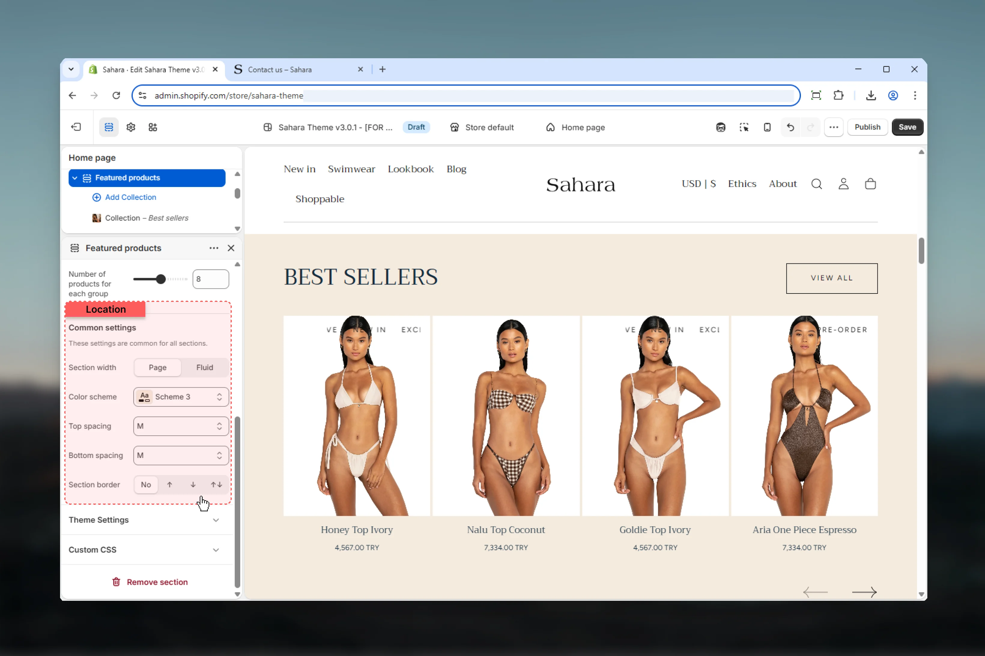
### Section width
Controls the maximum width of the section container.
Content limited to theme's page width (default).
**When to use:** Standard sections that align with other page content.
Content extends to full browser width.
**When to use:** Edge-to-edge designs, promotional sections, maximizing product visibility.
### Color scheme
Select the background and text color scheme for the section.
### Spacing
Control vertical spacing around the section:
* **Spacing top** - Margin above the section (None, S, M, L, XL)
* **Spacing bottom** - Margin below the section (None, S, M, L, XL)
Both default to M (medium spacing).
### Section border
Add decorative borders to the section.
**Available options:**
* **None** - No borders (default)
* **Top** - Border on top edge only
* **Bottom** - Border on bottom edge only
* **Both** - Borders on top and bottom edges
### Heading
Main section heading text supporting rich text formatting (bold, italic, links).
### Heading size
Controls the visual size of the heading.
**Available options:** XS, S, M, L, XL (default)
Choose smaller sizes for secondary sections and larger sizes for primary homepage features.
### Button settings
Text displayed on the section button. Default is "View all".
Leave empty to hide the button completely if not needed.
Destination URL when the button is clicked. Typically links to a collection page or category.
Visual styling of the button.
**Available options:**
* **Filled** - Solid background (default, highest emphasis)
* **Outlined** - Border with transparent background
* **Text link** - Minimal styling, text only
### Number of products for each group
Controls how many products are displayed from the collection or manual selection.
**Range:** 4 – 12 products (default: 8)
**When to use different counts:**
* **4 products** - Minimal showcases, sidebar sections
* **8 products** - Standard homepage display (recommended)
* **12 products** - Large collection previews, full-width sections
Consider your section width and product card size when selecting the count. More products require more scrolling on mobile devices.
For mobile optimization, we recommend 8 or fewer products to avoid excessive scrolling.
### Section width
Controls the maximum width of the section container.
Content limited to theme's page width (default).
**When to use:** Standard sections that align with other page content.
Content extends to full browser width.
**When to use:** Edge-to-edge designs, promotional sections, maximizing product visibility.
### Color scheme
Select the background and text color scheme for the section.
### Spacing
Control vertical spacing around the section:
* **Spacing top** - Margin above the section (None, S, M, L, XL)
* **Spacing bottom** - Margin below the section (None, S, M, L, XL)
Both default to M (medium spacing).
### Section border
Add decorative borders to the section.
**Available options:**
* **None** - No borders (default)
* **Top** - Border on top edge only
* **Bottom** - Border on bottom edge only
* **Both** - Borders on top and bottom edges
 ## Block settings
Each collection block defines a product source and configuration.
### Products (Manual selection)
Manually select up to 12 specific products to display.
**Best for:**
* Curated product sets for campaigns
* Specific product combinations (e.g., outfit bundles)
* Promotional displays with hand-picked items
* Temporary seasonal showcases
Manual selections require updating when products change. Collection selections update automatically.
### Collection
Select a Shopify collection to automatically display its products.
When a collection is selected, it **overrides** any manual product selections.
**Collection benefits:**
* Automatically updates when collection contents change
* Respects collection sorting rules
* Easier to maintain long-term
* Scales with inventory changes
**When to use collections:**
* New arrivals sections (auto-updated)
* Bestsellers (dynamic sorting)
* Seasonal categories
* Standard collection preview sections
## Block settings
Each collection block defines a product source and configuration.
### Products (Manual selection)
Manually select up to 12 specific products to display.
**Best for:**
* Curated product sets for campaigns
* Specific product combinations (e.g., outfit bundles)
* Promotional displays with hand-picked items
* Temporary seasonal showcases
Manual selections require updating when products change. Collection selections update automatically.
### Collection
Select a Shopify collection to automatically display its products.
When a collection is selected, it **overrides** any manual product selections.
**Collection benefits:**
* Automatically updates when collection contents change
* Respects collection sorting rules
* Easier to maintain long-term
* Scales with inventory changes
**When to use collections:**
* New arrivals sections (auto-updated)
* Bestsellers (dynamic sorting)
* Seasonal categories
* Standard collection preview sections
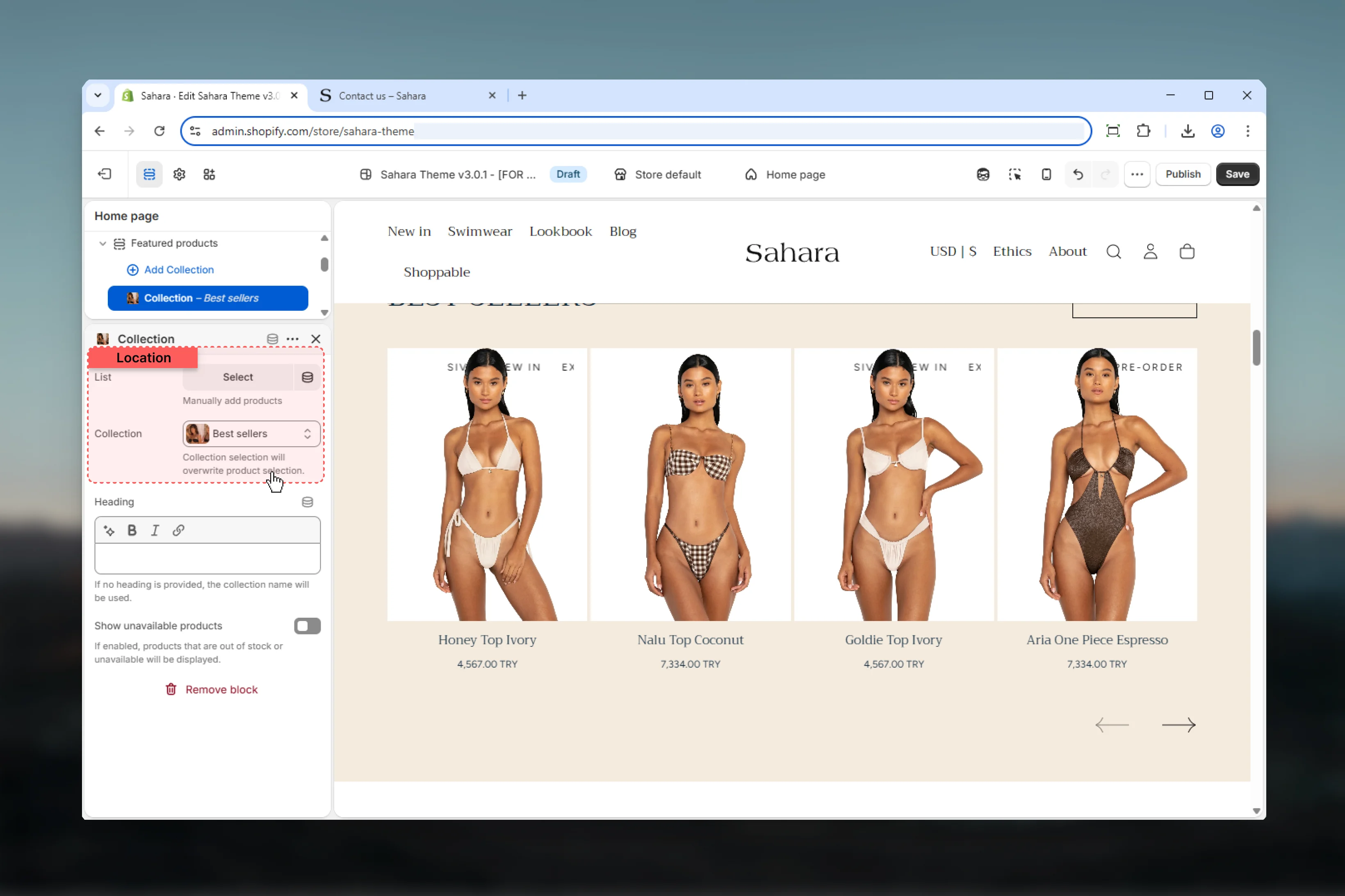 ### Title (Heading)
Optional heading for this specific collection block shown above the products.
If no heading is provided, the section will use the collection name automatically.
**When to customize:**
* Create marketing-friendly names ("Shop Our Bestsellers" vs. "bestsellers-2024")
* Add context or calls-to-action
* Maintain consistent heading style across sections
**When to leave empty:**
* Collection name is already clear and user-friendly
* Reducing visual clutter
* Letting collection metadata control display
### Show unavailable products
Controls whether out-of-stock or unavailable products are displayed.
When enabled, products marked as unavailable or out of stock will still appear in the list.
**When to enable:**
* Pre-order campaigns
* Coming soon product previews
* Maintaining consistent product count
* Showing full collection range
**When to disable (default):**
* Standard product displays
* Avoiding customer frustration
* Focusing on purchasable items
* Improving conversion rates
Unavailable products typically display with reduced opacity or an "Out of Stock" badge based on theme settings.
## Best practices
Prefer collection selection over manual picks for automatic updates and easier long-term maintenance.
Limit to 8 products or fewer on mobile-heavy stores to reduce scrolling and improve load times.
Use descriptive headings that clarify the product selection ("New This Week" vs. "Featured Products").
Place on homepage, collection pages, or landing pages for maximum visibility and engagement.
Match section color schemes with your overall theme design for visual coherence.
Use action-oriented button text ("Shop Collection", "View All") instead of generic labels.
## Common use cases
Use a "New Arrivals" collection with 8 products. Set layout to 1 (heading left, button right). Enable button linking to the full collection page. This automatically updates as new products are added.
Manually select 8-12 seasonal products. Use layout 2 (centered) for promotional emphasis. Set custom heading like "Summer Essentials 2024". Use filled button style for maximum visibility.
Select your "Bestsellers" or "Popular" collection. Set to 8 products with layout 1. Leave heading empty to use collection name. This creates a dynamic display that updates based on sales data.
On a landing page, use collection block to preview a category. Set to 4-6 products with compact layout. Add button linking to full collection for deeper browsing.
Manually select upcoming products. Enable "Show unavailable products" to display pre-order or coming soon items. Use custom heading explaining launch date or availability.
## Related sections
Display multiple collections in grid or carousel format
Show AI-powered product recommendations
### Title (Heading)
Optional heading for this specific collection block shown above the products.
If no heading is provided, the section will use the collection name automatically.
**When to customize:**
* Create marketing-friendly names ("Shop Our Bestsellers" vs. "bestsellers-2024")
* Add context or calls-to-action
* Maintain consistent heading style across sections
**When to leave empty:**
* Collection name is already clear and user-friendly
* Reducing visual clutter
* Letting collection metadata control display
### Show unavailable products
Controls whether out-of-stock or unavailable products are displayed.
When enabled, products marked as unavailable or out of stock will still appear in the list.
**When to enable:**
* Pre-order campaigns
* Coming soon product previews
* Maintaining consistent product count
* Showing full collection range
**When to disable (default):**
* Standard product displays
* Avoiding customer frustration
* Focusing on purchasable items
* Improving conversion rates
Unavailable products typically display with reduced opacity or an "Out of Stock" badge based on theme settings.
## Best practices
Prefer collection selection over manual picks for automatic updates and easier long-term maintenance.
Limit to 8 products or fewer on mobile-heavy stores to reduce scrolling and improve load times.
Use descriptive headings that clarify the product selection ("New This Week" vs. "Featured Products").
Place on homepage, collection pages, or landing pages for maximum visibility and engagement.
Match section color schemes with your overall theme design for visual coherence.
Use action-oriented button text ("Shop Collection", "View All") instead of generic labels.
## Common use cases
Use a "New Arrivals" collection with 8 products. Set layout to 1 (heading left, button right). Enable button linking to the full collection page. This automatically updates as new products are added.
Manually select 8-12 seasonal products. Use layout 2 (centered) for promotional emphasis. Set custom heading like "Summer Essentials 2024". Use filled button style for maximum visibility.
Select your "Bestsellers" or "Popular" collection. Set to 8 products with layout 1. Leave heading empty to use collection name. This creates a dynamic display that updates based on sales data.
On a landing page, use collection block to preview a category. Set to 4-6 products with compact layout. Add button linking to full collection for deeper browsing.
Manually select upcoming products. Enable "Show unavailable products" to display pre-order or coming soon items. Use custom heading explaining launch date or availability.
## Related sections
Display multiple collections in grid or carousel format
Show AI-powered product recommendations