> ## Documentation Index
> Fetch the complete documentation index at: https://docs.digifist.com/llms.txt
> Use this file to discover all available pages before exploring further.
# Contact form
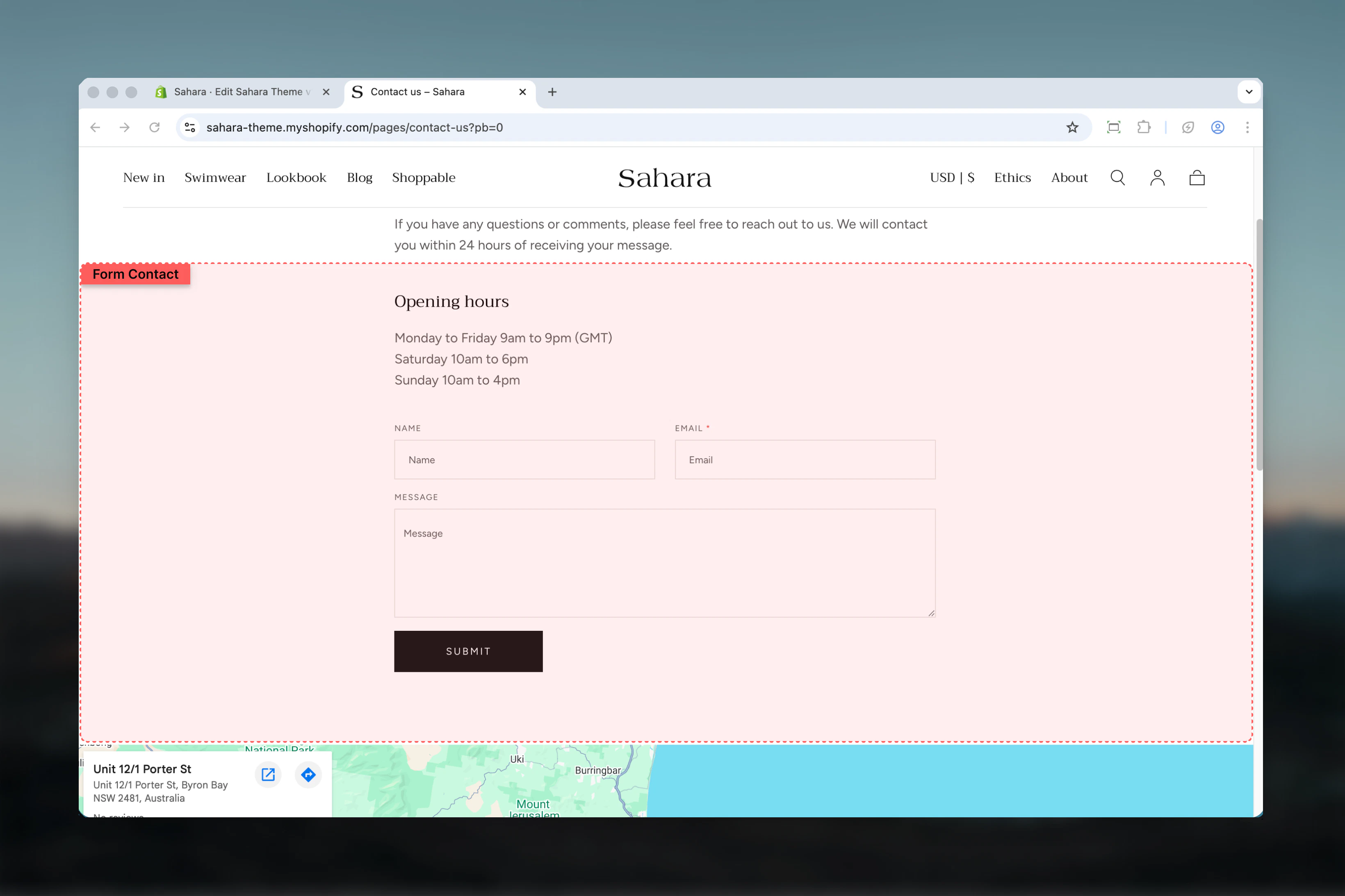
> Display a simple contact form with name, email, and message fields for customer inquiries and support requests.
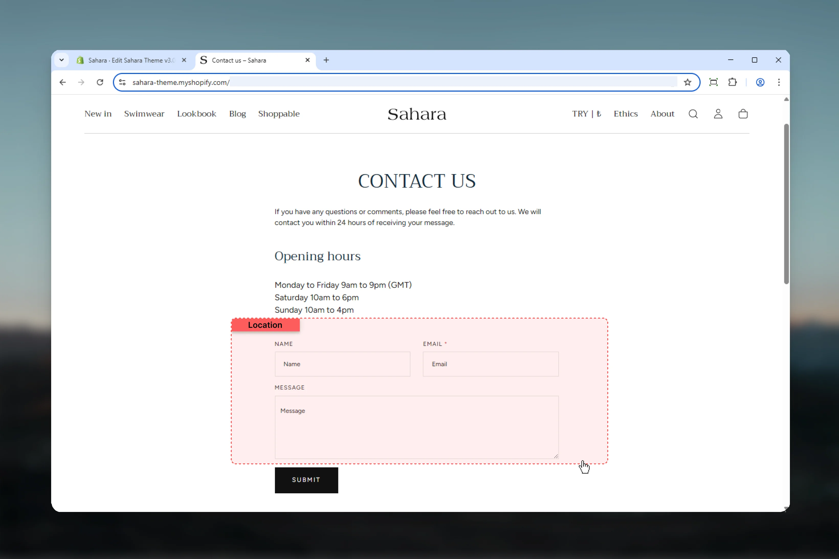
The Contact form section provides a straightforward way for customers to reach you with inquiries, support requests, or feedback. It includes three pre-configured fields (Name, Email, Message) and integrates with Shopify's contact form system for email delivery.
This section is essential for customer communication and typically used on dedicated contact pages or support pages.
 ## What this section controls
This section controls contact form displays with the following capabilities:
* Pre-configured contact form with three standard fields
* Name field (optional, auto-fills for logged-in customers)
* Email field (required, auto-fills for logged-in customers)
* Message/body field (textarea for longer messages)
* Form submission handling with success/error messaging
* Customer data auto-population for logged-in users
* Narrow, focused layout optimized for form completion
## How the Contact form works
The Contact form section uses Shopify's built-in contact form functionality:
**Form fields:**
* **Name** - Text input, optional, auto-completes with customer name if logged in
* **Email** - Required text input with email validation, auto-completes if customer logged in
* **Message** - Large textarea for customer message or inquiry
**Form submission:**
1. Customer fills out form
2. Form validates required fields (email)
3. Upon successful submission:
* Displays success message
* Sends email to store owner's notification address
* Form content sent to Shopify admin customer contact records
4. If errors occur:
* Displays error messages
* Preserves form data for correction
## Getting started
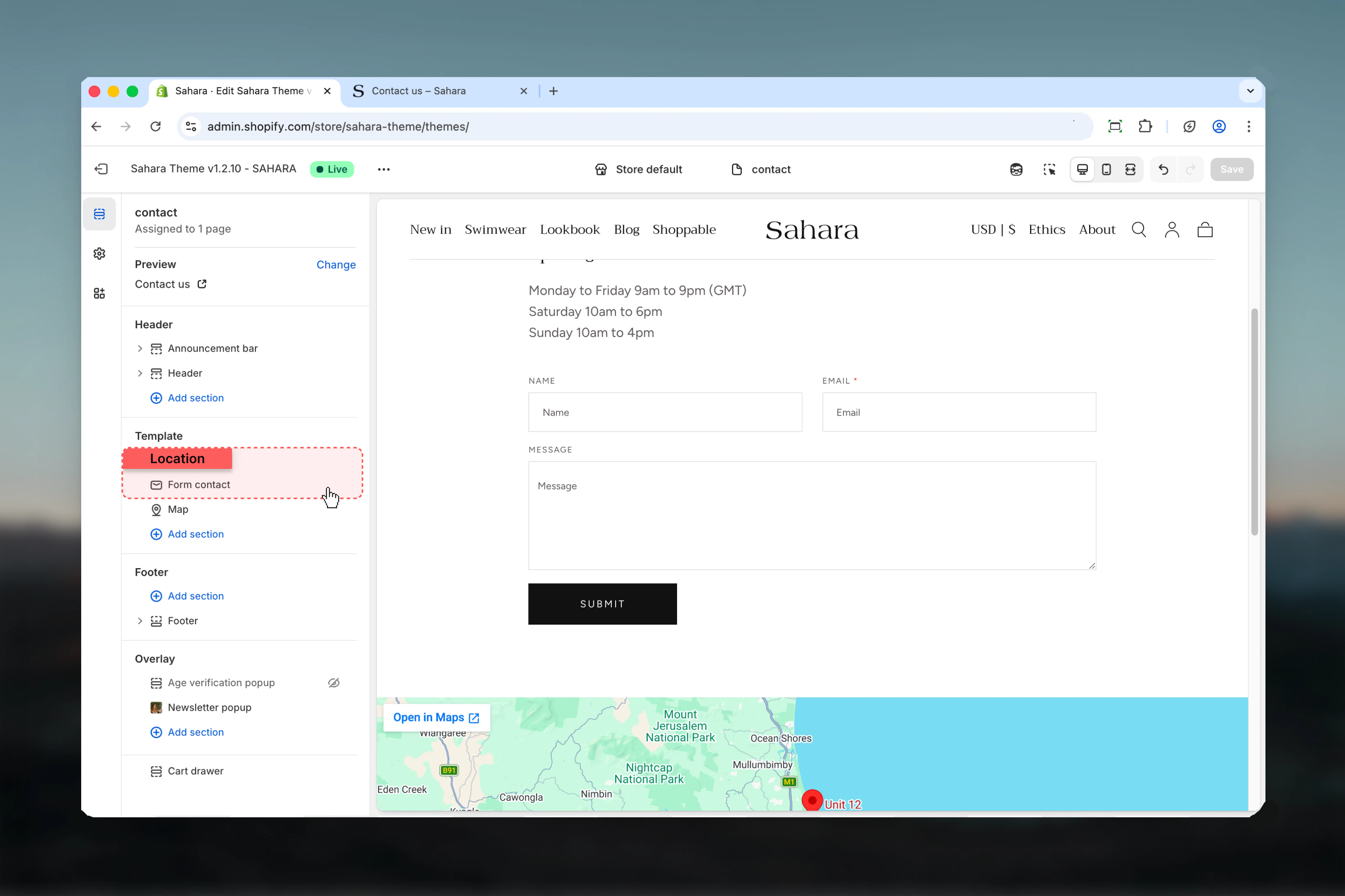
From Shopify admin, access the Theme Customizer.
In left sidebar, click **Pages** > **Contact** or add section to your contact page template.
If not already present, add the Contact form section to the page.
Adjust section width, color scheme, and spacing settings.
Preview and test form submission to verify email delivery.
## What this section controls
This section controls contact form displays with the following capabilities:
* Pre-configured contact form with three standard fields
* Name field (optional, auto-fills for logged-in customers)
* Email field (required, auto-fills for logged-in customers)
* Message/body field (textarea for longer messages)
* Form submission handling with success/error messaging
* Customer data auto-population for logged-in users
* Narrow, focused layout optimized for form completion
## How the Contact form works
The Contact form section uses Shopify's built-in contact form functionality:
**Form fields:**
* **Name** - Text input, optional, auto-completes with customer name if logged in
* **Email** - Required text input with email validation, auto-completes if customer logged in
* **Message** - Large textarea for customer message or inquiry
**Form submission:**
1. Customer fills out form
2. Form validates required fields (email)
3. Upon successful submission:
* Displays success message
* Sends email to store owner's notification address
* Form content sent to Shopify admin customer contact records
4. If errors occur:
* Displays error messages
* Preserves form data for correction
## Getting started
From Shopify admin, access the Theme Customizer.
In left sidebar, click **Pages** > **Contact** or add section to your contact page template.
If not already present, add the Contact form section to the page.
Adjust section width, color scheme, and spacing settings.
Preview and test form submission to verify email delivery.
 ## Section settings
### Section width
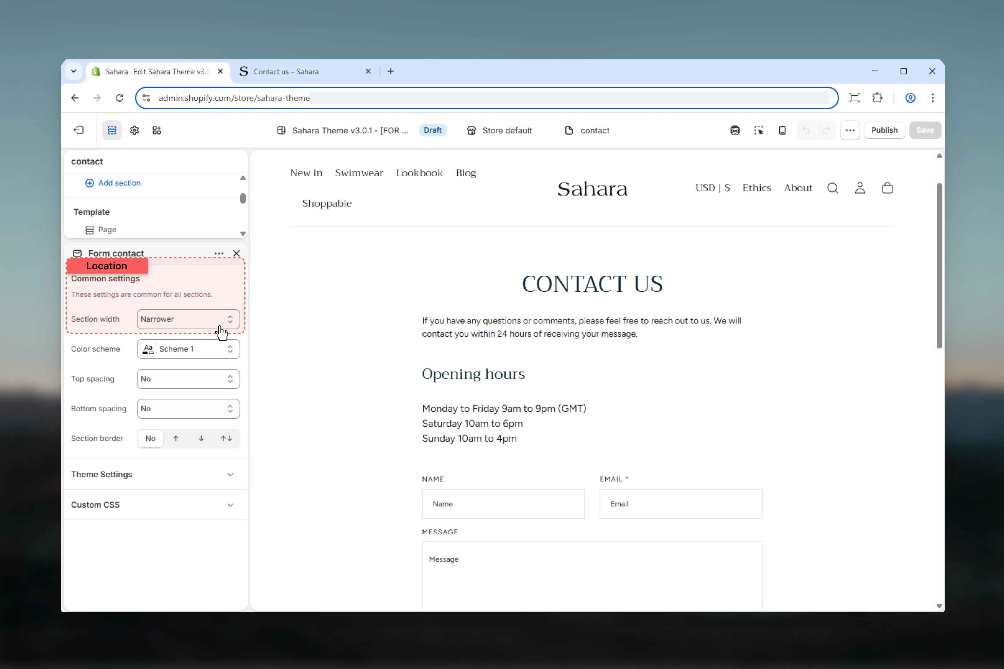
Controls the maximum width of the contact form.
Most compact width, highly focused (default).
**Best for:**
* Maximum form focus
* Minimal distractions
* Higher completion rates
* Standard contact pages
**Recommended** for most contact forms.
Moderately narrow width, balanced.
**Best for:**
* Slightly more spacious layout
* Pages with additional content
* Balanced appearance
Standard page container width.
**Best for:**
* Matching other page sections
* Multi-column layouts
* Additional context alongside form
Wider container utilizing more screen space.
**Best for:**
* Wide screen displays
* Forms with extensive content
* Custom designs
Narrower width (default) improves form readability and completion rates by reducing visual noise and focusing attention.
## Section settings
### Section width
Controls the maximum width of the contact form.
Most compact width, highly focused (default).
**Best for:**
* Maximum form focus
* Minimal distractions
* Higher completion rates
* Standard contact pages
**Recommended** for most contact forms.
Moderately narrow width, balanced.
**Best for:**
* Slightly more spacious layout
* Pages with additional content
* Balanced appearance
Standard page container width.
**Best for:**
* Matching other page sections
* Multi-column layouts
* Additional context alongside form
Wider container utilizing more screen space.
**Best for:**
* Wide screen displays
* Forms with extensive content
* Custom designs
Narrower width (default) improves form readability and completion rates by reducing visual noise and focusing attention.
 ### Color scheme
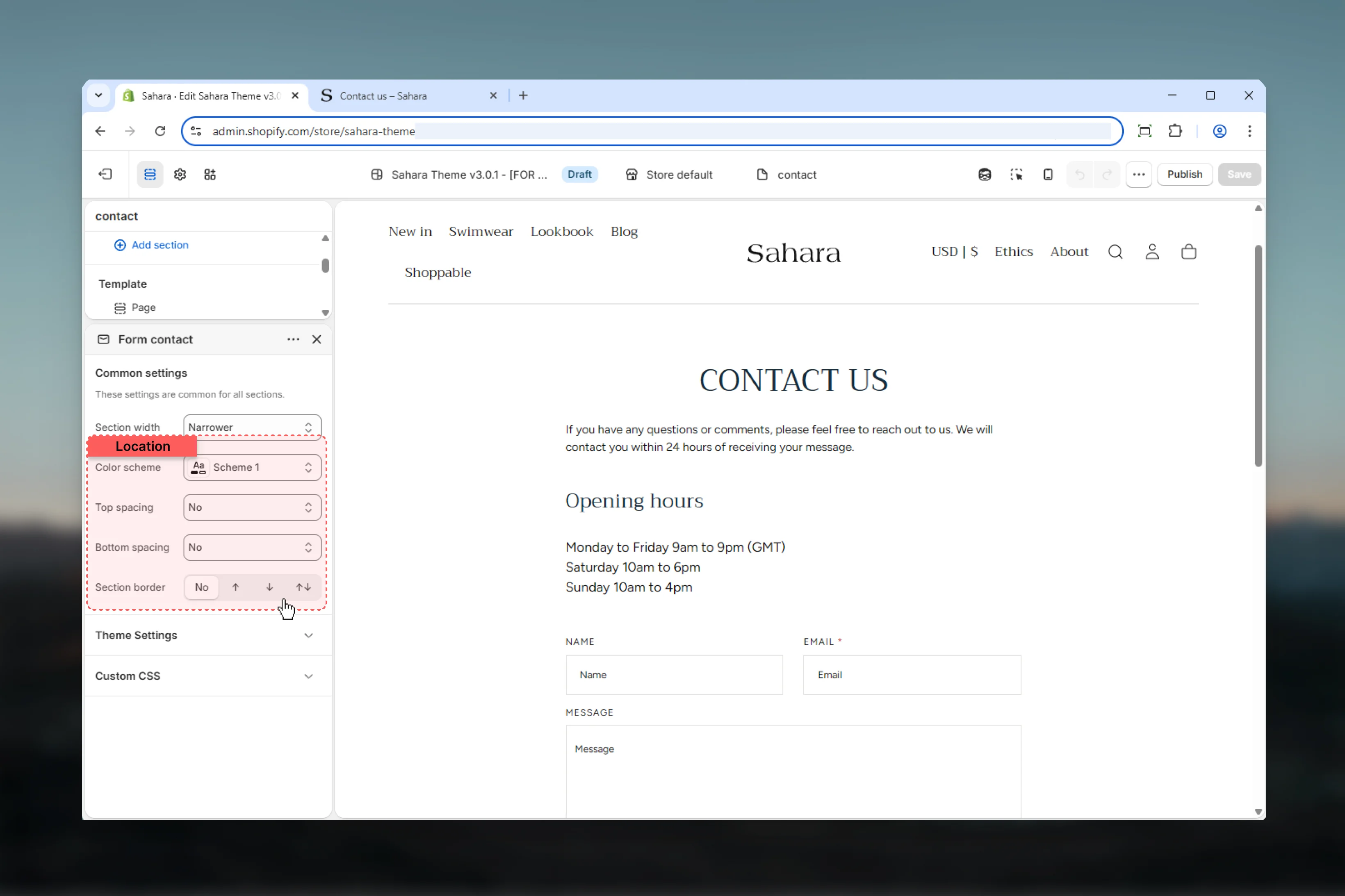
Select color scheme for form background, text, and input styling.
Color scheme affects background, text color, input borders, and submit button appearance.
### Spacing
Control vertical spacing around the section:
* **Spacing top** - Margin above (None, S, M, L, XL)
* **Spacing bottom** - Margin below (None, S, M, L, XL)
Default: Spacing top None, Spacing bottom M
Contact form sections typically use no top spacing when placed directly below a page banner.
### Section border
Add decorative borders: None (default), Top, Bottom, Both
### Color scheme
Select color scheme for form background, text, and input styling.
Color scheme affects background, text color, input borders, and submit button appearance.
### Spacing
Control vertical spacing around the section:
* **Spacing top** - Margin above (None, S, M, L, XL)
* **Spacing bottom** - Margin below (None, S, M, L, XL)
Default: Spacing top None, Spacing bottom M
Contact form sections typically use no top spacing when placed directly below a page banner.
### Section border
Add decorative borders: None (default), Top, Bottom, Both
 ## Form fields
The Contact form includes three pre-configured fields:
**Type:** Text input\
**Required:** No\
**Auto-fill:** Yes (for logged-in customers)
Customer's name. Optional field that auto-completes with `customer.name` for logged-in users.
**Input attributes:**
* `autocomplete="name"` for browser auto-fill
* Full-width on mobile, half-width on desktop (shares row with email)
**Type:** Email input (required)\
**Required:** Yes\
**Auto-fill:** Yes (for logged-in customers)\
**Validation:** Email format
Customer's email address. Required field with email validation. Auto-completes with `customer.email` for logged-in users.
**Input attributes:**
* `autocomplete="email"` for browser auto-fill
* `spellcheck="false"` to prevent unwanted corrections
* `autocapitalize="off"` for proper email formatting
* `aria-required="true"` for accessibility
**Error handling:**
* Displays validation error if email format invalid
* Shows required field error if left empty
* Preserves entered value on error for correction
**Type:** Textarea\
**Required:** No\
**Auto-fill:** No
Large text area for customer's message, inquiry, or feedback.
**Input attributes:**
* Multi-line text input (textarea)
* Full-width across all devices
* Expandable height for longer messages
## Form fields
The Contact form includes three pre-configured fields:
**Type:** Text input\
**Required:** No\
**Auto-fill:** Yes (for logged-in customers)
Customer's name. Optional field that auto-completes with `customer.name` for logged-in users.
**Input attributes:**
* `autocomplete="name"` for browser auto-fill
* Full-width on mobile, half-width on desktop (shares row with email)
**Type:** Email input (required)\
**Required:** Yes\
**Auto-fill:** Yes (for logged-in customers)\
**Validation:** Email format
Customer's email address. Required field with email validation. Auto-completes with `customer.email` for logged-in users.
**Input attributes:**
* `autocomplete="email"` for browser auto-fill
* `spellcheck="false"` to prevent unwanted corrections
* `autocapitalize="off"` for proper email formatting
* `aria-required="true"` for accessibility
**Error handling:**
* Displays validation error if email format invalid
* Shows required field error if left empty
* Preserves entered value on error for correction
**Type:** Textarea\
**Required:** No\
**Auto-fill:** No
Large text area for customer's message, inquiry, or feedback.
**Input attributes:**
* Multi-line text input (textarea)
* Full-width across all devices
* Expandable height for longer messages
 ## Form submission
### Success state
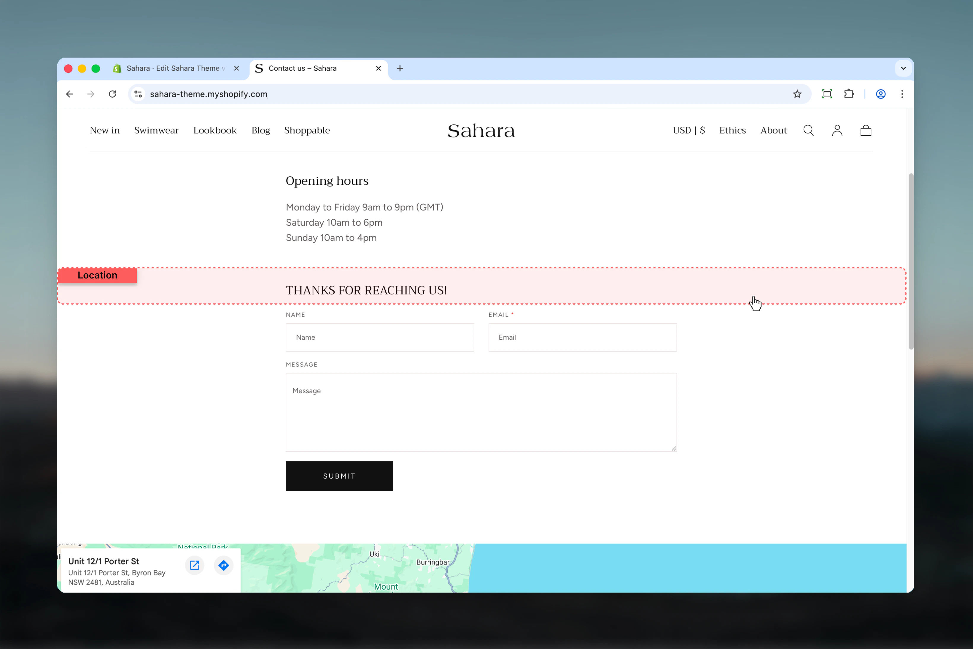
When form is submitted successfully:
* **Success message displayed:**\
"Thanks for contacting us. We'll get back to you as soon as possible."\
(Translation key: `contact.form.success`)
* **Email sent:**\
Form contents delivered to store's customer notification email address (configured in Shopify Settings > Notifications)
* **Customer record:**\
If customer logged in, inquiry added to their customer record in Shopify admin
## Form submission
### Success state
When form is submitted successfully:
* **Success message displayed:**\
"Thanks for contacting us. We'll get back to you as soon as possible."\
(Translation key: `contact.form.success`)
* **Email sent:**\
Form contents delivered to store's customer notification email address (configured in Shopify Settings > Notifications)
* **Customer record:**\
If customer logged in, inquiry added to their customer record in Shopify admin
 ### Error handling
When form submission fails or validation errors occur:
* **Error display:**\
Red error message shown above form
* **Field preservation:**\
Customer's entered data preserved for correction
* **Common errors:**
* "Email address is required"
* "Email is invalid"
* Connection/server errors
Ensure your Shopify store's notification email is correctly configured to receive contact form submissions.
## Best practices
Use Narrower (default) or Narrow width for better form completion rates and reduced distractions.
Place directly below Page banner section with no top spacing for cohesive contact page layout.
Use Page banner section heading to introduce the form: "Get in Touch", "Contact Us", "How Can We Help?".
Test form submission to verify emails arrive at your notification address before going live.
Consider adding text in Page banner description setting customer expectations: "We typically respond within 24 hours."
Form automatically stacks fields vertically on mobile for optimal usability on small screens.
Email field includes proper ARIA attributes and required field indicators (\*) for screen readers.
Ensure color scheme provides sufficient contrast for input fields and text readability.
## Common use cases
Page banner with heading "Contact Us" and description "Have questions? We're here to help." Contact form below with Narrower width, default color scheme, no top spacing.
Page banner heading "Customer Support" with FAQ search enabled. Contact form below with Narrow width for balance with search functionality. Message placeholder guidance: "Describe your issue..."
Page banner heading "Custom Order Inquiry" with description explaining custom order process. Contact form with Page width to accommodate additional content. Clear call-to-action in banner.
Page banner heading "Partner With Us" with business partnership description. Contact form with Narrower width, professional color scheme (scheme-2 or scheme-3), standard spacing.
Page banner heading "Get In Touch" with multi-channel contact info (email, phone, hours). Contact form below as primary method with Narrower width and M bottom spacing.
## Related sections
Page header banners for contact pages
Additional contact information and policy text
## Email configuration
Contact form submissions are sent to your store's customer notification email address.
**To configure:**
1. Go to Shopify Admin > **Settings** > **Notifications**
2. Scroll to **Staff notification email** section
3. Set **Customer contact** email address
4. Save changes
This email address receives all contact form submissions from your store.
Email includes:
* Customer's name (if provided)
* Customer's email address
* Message content
* Submission timestamp
* Customer information (if logged in)
Set up email filters or labels to organize contact form submissions in your inbox.
### Error handling
When form submission fails or validation errors occur:
* **Error display:**\
Red error message shown above form
* **Field preservation:**\
Customer's entered data preserved for correction
* **Common errors:**
* "Email address is required"
* "Email is invalid"
* Connection/server errors
Ensure your Shopify store's notification email is correctly configured to receive contact form submissions.
## Best practices
Use Narrower (default) or Narrow width for better form completion rates and reduced distractions.
Place directly below Page banner section with no top spacing for cohesive contact page layout.
Use Page banner section heading to introduce the form: "Get in Touch", "Contact Us", "How Can We Help?".
Test form submission to verify emails arrive at your notification address before going live.
Consider adding text in Page banner description setting customer expectations: "We typically respond within 24 hours."
Form automatically stacks fields vertically on mobile for optimal usability on small screens.
Email field includes proper ARIA attributes and required field indicators (\*) for screen readers.
Ensure color scheme provides sufficient contrast for input fields and text readability.
## Common use cases
Page banner with heading "Contact Us" and description "Have questions? We're here to help." Contact form below with Narrower width, default color scheme, no top spacing.
Page banner heading "Customer Support" with FAQ search enabled. Contact form below with Narrow width for balance with search functionality. Message placeholder guidance: "Describe your issue..."
Page banner heading "Custom Order Inquiry" with description explaining custom order process. Contact form with Page width to accommodate additional content. Clear call-to-action in banner.
Page banner heading "Partner With Us" with business partnership description. Contact form with Narrower width, professional color scheme (scheme-2 or scheme-3), standard spacing.
Page banner heading "Get In Touch" with multi-channel contact info (email, phone, hours). Contact form below as primary method with Narrower width and M bottom spacing.
## Related sections
Page header banners for contact pages
Additional contact information and policy text
## Email configuration
Contact form submissions are sent to your store's customer notification email address.
**To configure:**
1. Go to Shopify Admin > **Settings** > **Notifications**
2. Scroll to **Staff notification email** section
3. Set **Customer contact** email address
4. Save changes
This email address receives all contact form submissions from your store.
Email includes:
* Customer's name (if provided)
* Customer's email address
* Message content
* Submission timestamp
* Customer information (if logged in)
Set up email filters or labels to organize contact form submissions in your inbox.