> ## Documentation Index
> Fetch the complete documentation index at: https://docs.digifist.com/llms.txt
> Use this file to discover all available pages before exploring further.
# Page banner
> Create customizable hero banners for pages, collections, products, and blogs with media, text, navigation, and FAQ search.
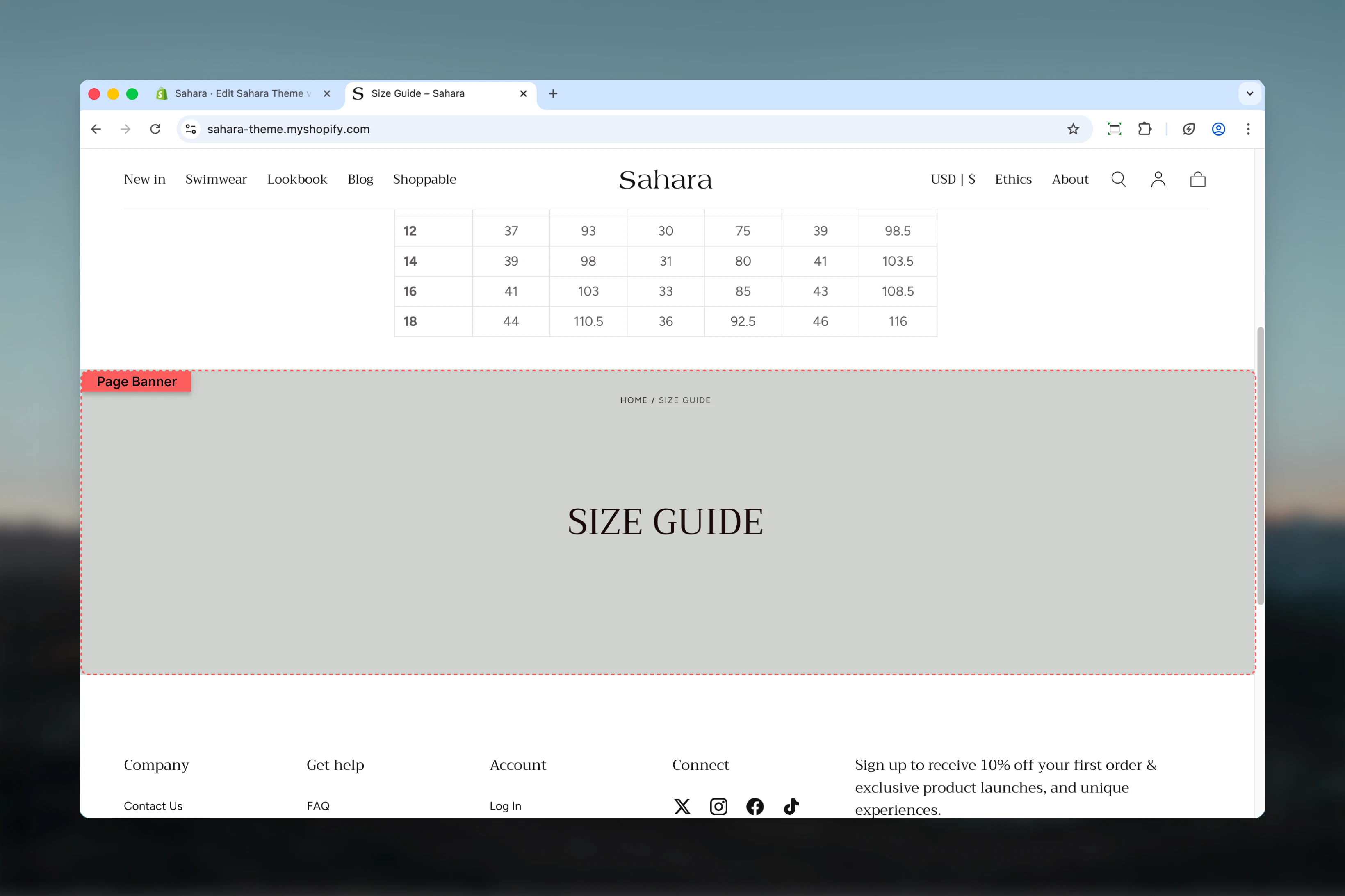
The Page banner section creates versatile hero banners that automatically adapt to different template types (pages, collections, products, blogs). It displays titles, descriptions, media backgrounds, breadcrumb navigation, optional collection menus, and an FAQ search feature.
This section is essential for creating impactful page headers that provide context, visual appeal, and wayfinding across your entire site.
 ## What this section controls
This section controls page hero banners with the following capabilities:
* Automatic page title display with custom overrides
* Optional default or custom descriptions
* Separate desktop and mobile media (images, videos)
* Transparent header integration
* Breadcrumb navigation
* Collection navigation menu
* FAQ page search functionality
* Flexible content positioning and alignment
* Multiple section height options
## How the Page banner works
The Page banner intelligently adapts to your template type:
* **Page templates:** Displays page title and description
* **Collection templates:** Shows collection title, description, and optional menu
* **Product templates:** Displays product title and description
* **Blog templates:** Shows blog title and description
Content defaults to template metadata but can be overridden with custom text. Media positioning options allow background overlays, top placement, or bottom placement with separate desktop and mobile configurations.
## Getting started
From Shopify admin, access the Theme Customizer.
Go to the page, collection, product, or blog template you want to customize.
Add the Page banner section (usually as first section) or customize existing instance.
Set custom heading/description or use template defaults.
Upload images or videos for desktop and mobile displays.
Configure content alignment, media position, and section height.
## What this section controls
This section controls page hero banners with the following capabilities:
* Automatic page title display with custom overrides
* Optional default or custom descriptions
* Separate desktop and mobile media (images, videos)
* Transparent header integration
* Breadcrumb navigation
* Collection navigation menu
* FAQ page search functionality
* Flexible content positioning and alignment
* Multiple section height options
## How the Page banner works
The Page banner intelligently adapts to your template type:
* **Page templates:** Displays page title and description
* **Collection templates:** Shows collection title, description, and optional menu
* **Product templates:** Displays product title and description
* **Blog templates:** Shows blog title and description
Content defaults to template metadata but can be overridden with custom text. Media positioning options allow background overlays, top placement, or bottom placement with separate desktop and mobile configurations.
## Getting started
From Shopify admin, access the Theme Customizer.
Go to the page, collection, product, or blog template you want to customize.
Add the Page banner section (usually as first section) or customize existing instance.
Set custom heading/description or use template defaults.
Upload images or videos for desktop and mobile displays.
Configure content alignment, media position, and section height.
 ## Section settings
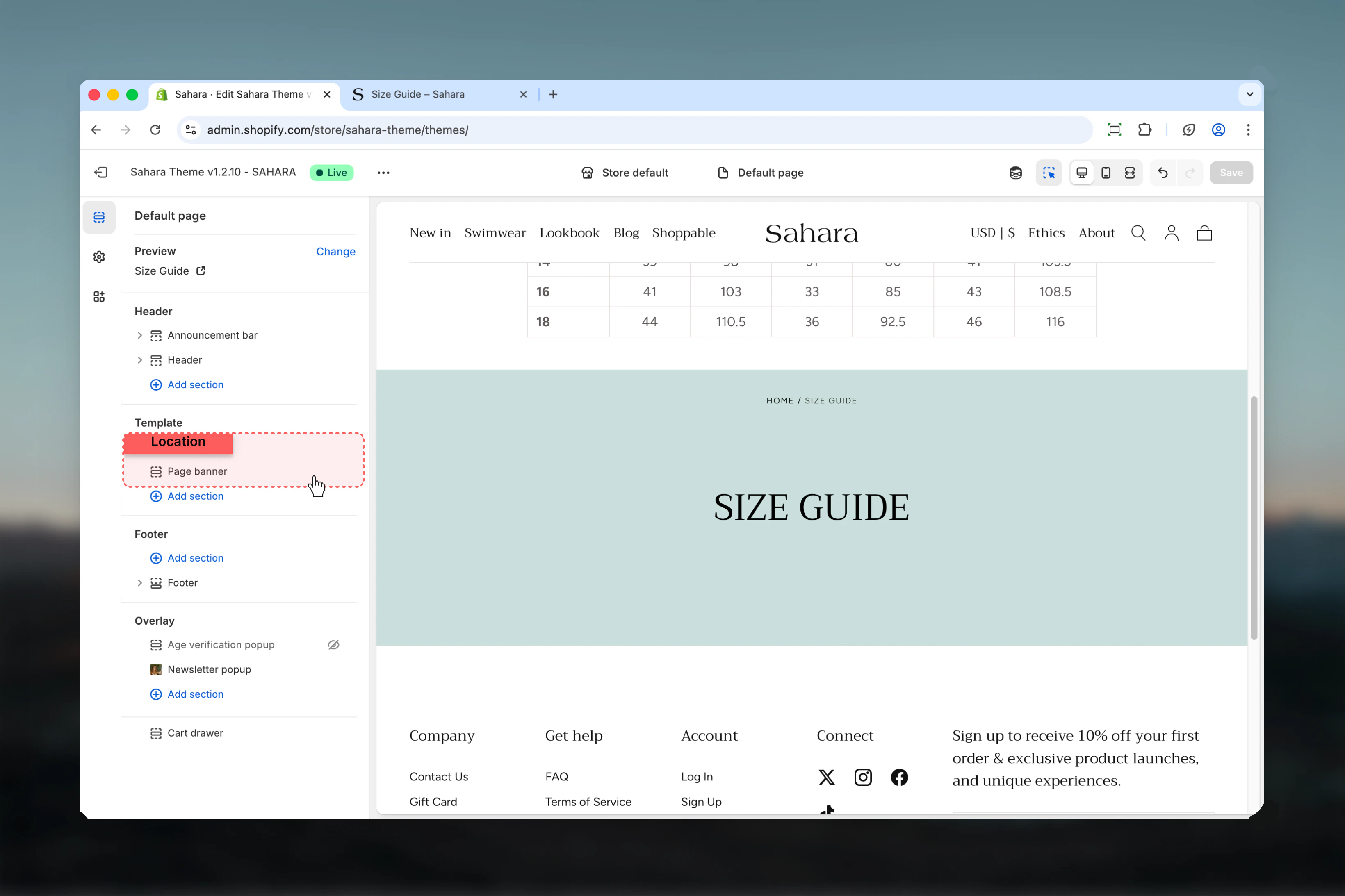
### Enable transparent header
Makes header transparent and overlay the banner when using background media.
**Default:** False
**Required conditions:**
* Media position set to "Background"
* Banner has desktop or mobile media
* Section placed as first on the page
**When it works:**
* Creates immersive full-bleed effect
* Header navigation overlays banner media
* Maximizes visual impact
**When it doesn't apply:**
* Media position set to "Top" or "Bottom"
* No media uploaded
* Section not first on page
Ensure sufficient contrast between header navigation and banner media for readability.
## Section settings
### Enable transparent header
Makes header transparent and overlay the banner when using background media.
**Default:** False
**Required conditions:**
* Media position set to "Background"
* Banner has desktop or mobile media
* Section placed as first on the page
**When it works:**
* Creates immersive full-bleed effect
* Header navigation overlays banner media
* Maximizes visual impact
**When it doesn't apply:**
* Media position set to "Top" or "Bottom"
* No media uploaded
* Section not first on page
Ensure sufficient contrast between header navigation and banner media for readability.
 ### Title
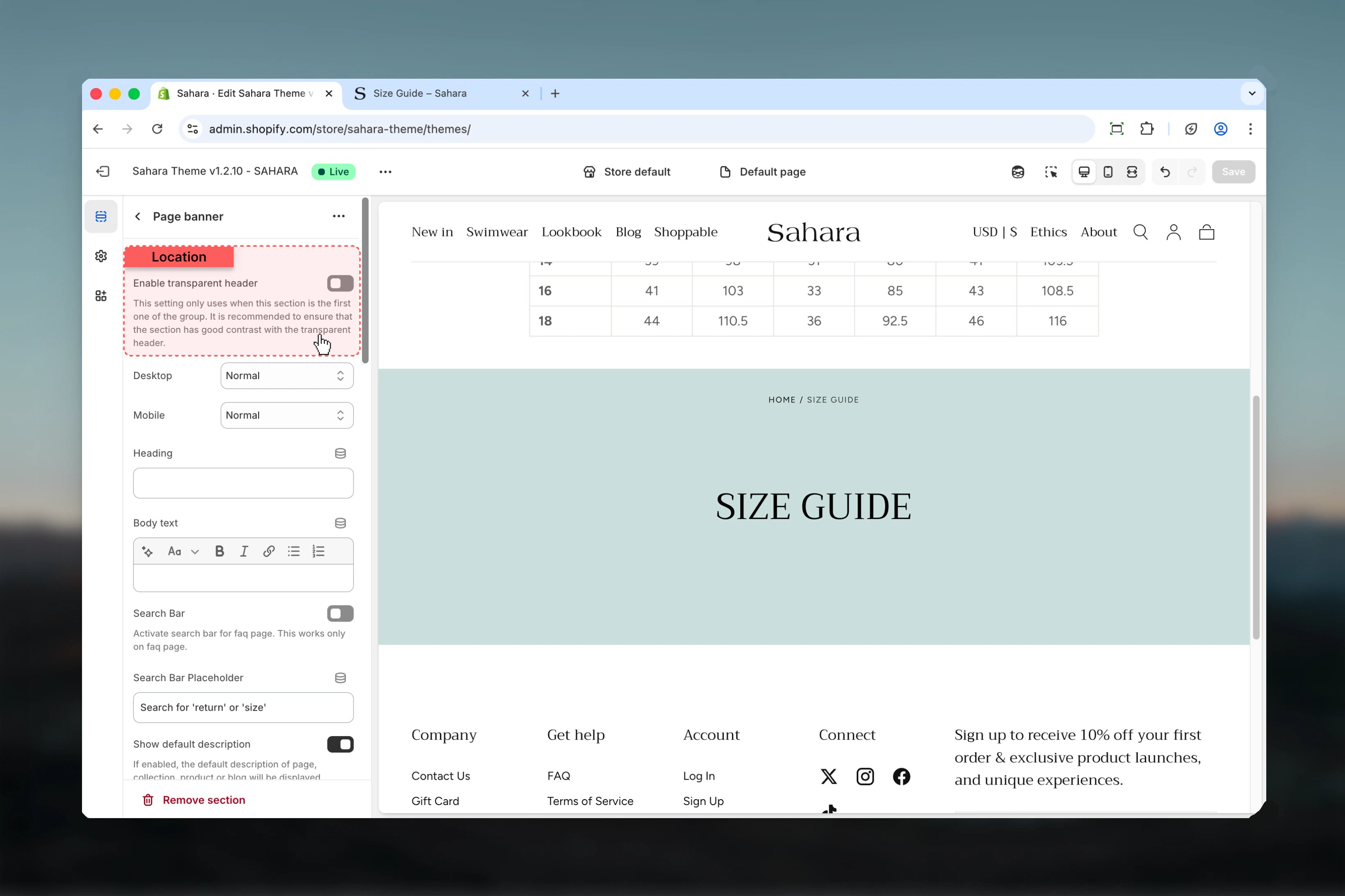
Custom heading text that overwrites the default title from template.
* Inline rich text supported (bold, italic, links)
* Leave empty to use default page/collection/product/blog title
Custom title always takes priority over template defaults when provided.
### Heading size
Controls the size of banner heading.
**Options:** XS, S, M, L, XL\
**Default:** XL
### Content
Custom descriptive text displayed below the heading.
* Rich text editor with formatting support
* Leave empty to use default description (if enabled)
### Show default description
Displays the description from the current template (page/collection/product/blog).
**Default:** True
**Enabled (True):**
* Uses page/collection/product/blog description
* Falls back to custom content if default is empty
* Automatically pulls template metadata
**Disabled (False):**
* Only shows custom content field value
* Template descriptions ignored
* Full manual control
For consistent automation, enable default descriptions. For precise control, disable and use custom content field.
### Show on description
Controls where description text is visible.
**Options:**
* **Desktop** - Desktop devices only (default)
* **Mobile** - Mobile devices only
* **Both** - All devices
Hiding descriptions on mobile conserves vertical space on small screens.
### Title
Custom heading text that overwrites the default title from template.
* Inline rich text supported (bold, italic, links)
* Leave empty to use default page/collection/product/blog title
Custom title always takes priority over template defaults when provided.
### Heading size
Controls the size of banner heading.
**Options:** XS, S, M, L, XL\
**Default:** XL
### Content
Custom descriptive text displayed below the heading.
* Rich text editor with formatting support
* Leave empty to use default description (if enabled)
### Show default description
Displays the description from the current template (page/collection/product/blog).
**Default:** True
**Enabled (True):**
* Uses page/collection/product/blog description
* Falls back to custom content if default is empty
* Automatically pulls template metadata
**Disabled (False):**
* Only shows custom content field value
* Template descriptions ignored
* Full manual control
For consistent automation, enable default descriptions. For precise control, disable and use custom content field.
### Show on description
Controls where description text is visible.
**Options:**
* **Desktop** - Desktop devices only (default)
* **Mobile** - Mobile devices only
* **Both** - All devices
Hiding descriptions on mobile conserves vertical space on small screens.
 ### Content position
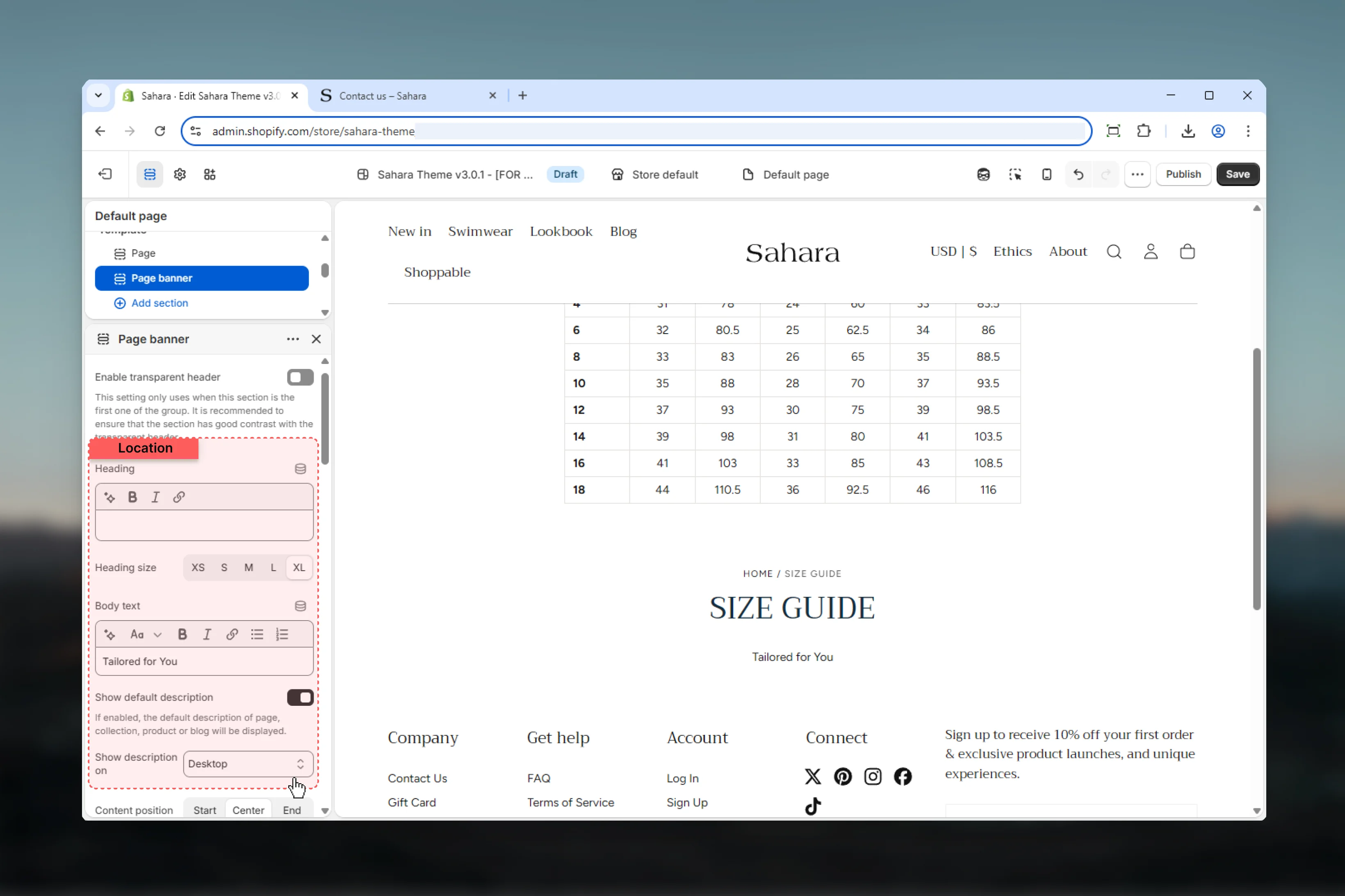
Controls vertical position of text content within the banner.
**Options:** Start (top), Center (default), End (bottom)
Not applicable when section height is set to "Auto" (height adapts to content).
### Content alignment
Controls horizontal alignment of text content.
**Options:** Start (left), Center (default), End (right)
### Media position
Controls where media appears relative to content.
Media displays above text content.
**Best for:**
* Image banners with text below
* Product category headers
* Decorative imagery
Media displays below text content.
**Best for:**
* Text-priority designs
* Minimal banners
* Secondary imagery
Media serves as background with text overlay (default).
**Best for:**
* Hero-style banners
* Full-bleed media
* Transparent header integration
* Maximum visual impact
Use Background position with fixed section heights (33svh, 50svh, 100svh) for best display. Auto height with background media calculates based on image aspect ratio.
### Content position
Controls vertical position of text content within the banner.
**Options:** Start (top), Center (default), End (bottom)
Not applicable when section height is set to "Auto" (height adapts to content).
### Content alignment
Controls horizontal alignment of text content.
**Options:** Start (left), Center (default), End (right)
### Media position
Controls where media appears relative to content.
Media displays above text content.
**Best for:**
* Image banners with text below
* Product category headers
* Decorative imagery
Media displays below text content.
**Best for:**
* Text-priority designs
* Minimal banners
* Secondary imagery
Media serves as background with text overlay (default).
**Best for:**
* Hero-style banners
* Full-bleed media
* Transparent header integration
* Maximum visual impact
Use Background position with fixed section heights (33svh, 50svh, 100svh) for best display. Auto height with background media calculates based on image aspect ratio.
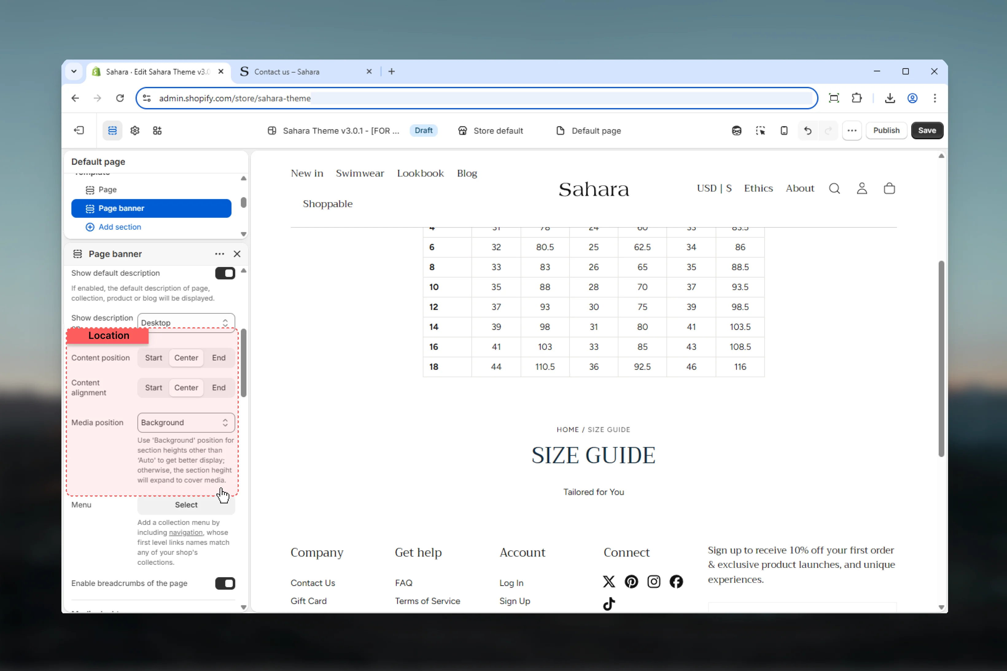 ### Page menu
Link list for collection or page navigation menu.
* Shopify link list selector
* First-level link names must match collection handles or page titles
* Leave empty to hide menu
**Setup:**
1. Create navigation in Shopify admin
2. First-level links must match collection handles or page titles
3. Add second-level links for submenus
4. Assign to Page banner
**Display:**
* Shows when current page/collection matches first-level link
* Displays second-level links as menu items
* Useful for collection filtering or page sections
Commonly used on collection pages to show category filters or subcollections.
### Enable breadcrumbs
Shows breadcrumb navigation on the page.
**Default:** True
Breadcrumbs must also be enabled in theme settings to appear. This setting acts as section-level override.
### Page menu
Link list for collection or page navigation menu.
* Shopify link list selector
* First-level link names must match collection handles or page titles
* Leave empty to hide menu
**Setup:**
1. Create navigation in Shopify admin
2. First-level links must match collection handles or page titles
3. Add second-level links for submenus
4. Assign to Page banner
**Display:**
* Shows when current page/collection matches first-level link
* Displays second-level links as menu items
* Useful for collection filtering or page sections
Commonly used on collection pages to show category filters or subcollections.
### Enable breadcrumbs
Shows breadcrumb navigation on the page.
**Default:** True
Breadcrumbs must also be enabled in theme settings to appear. This setting acts as section-level override.
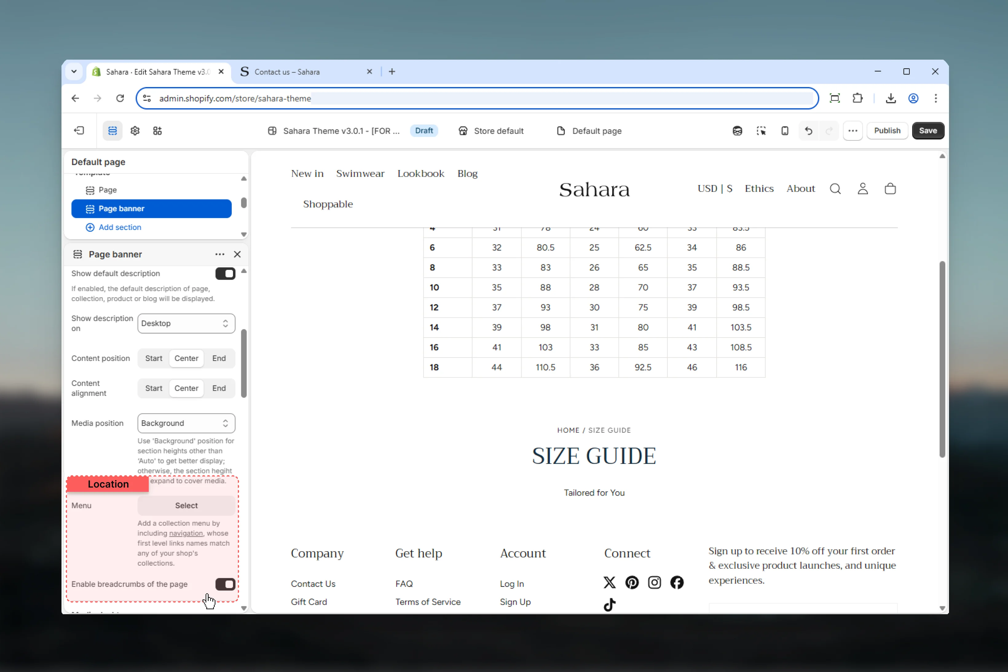 ### Section height
Height of the banner on desktop devices.
Height based on content and media.
**Best for:** Variable content lengths, text-focused banners
One-third viewport height (compact).
**Best for:** Secondary pages, minimal banners
Half viewport height (balanced) - default.
**Best for:** Most pages, standard banners
Full viewport height (immersive).
**Best for:** Homepage, major campaign pages
**Default:** Auto
### Image (Desktop)
Upload image for desktop banner background.
**Recommended:** 1920px+ width, aspect ratio matching section height
### Video (Desktop)
Upload Shopify-hosted video file. Overwrites image when set.
Shopify-hosted videos offer better performance than external embeds.
### External video (Desktop)
Embed YouTube or Vimeo video. Takes priority over image and video.
**Accepts:** YouTube, Vimeo URLs
External videos may impact page load performance. Use sparingly.
### Show controls on video
Displays play/pause and volume controls on desktop videos.
**Default:** False
### Section height
Height of the banner on desktop devices.
Height based on content and media.
**Best for:** Variable content lengths, text-focused banners
One-third viewport height (compact).
**Best for:** Secondary pages, minimal banners
Half viewport height (balanced) - default.
**Best for:** Most pages, standard banners
Full viewport height (immersive).
**Best for:** Homepage, major campaign pages
**Default:** Auto
### Image (Desktop)
Upload image for desktop banner background.
**Recommended:** 1920px+ width, aspect ratio matching section height
### Video (Desktop)
Upload Shopify-hosted video file. Overwrites image when set.
Shopify-hosted videos offer better performance than external embeds.
### External video (Desktop)
Embed YouTube or Vimeo video. Takes priority over image and video.
**Accepts:** YouTube, Vimeo URLs
External videos may impact page load performance. Use sparingly.
### Show controls on video
Displays play/pause and volume controls on desktop videos.
**Default:** False
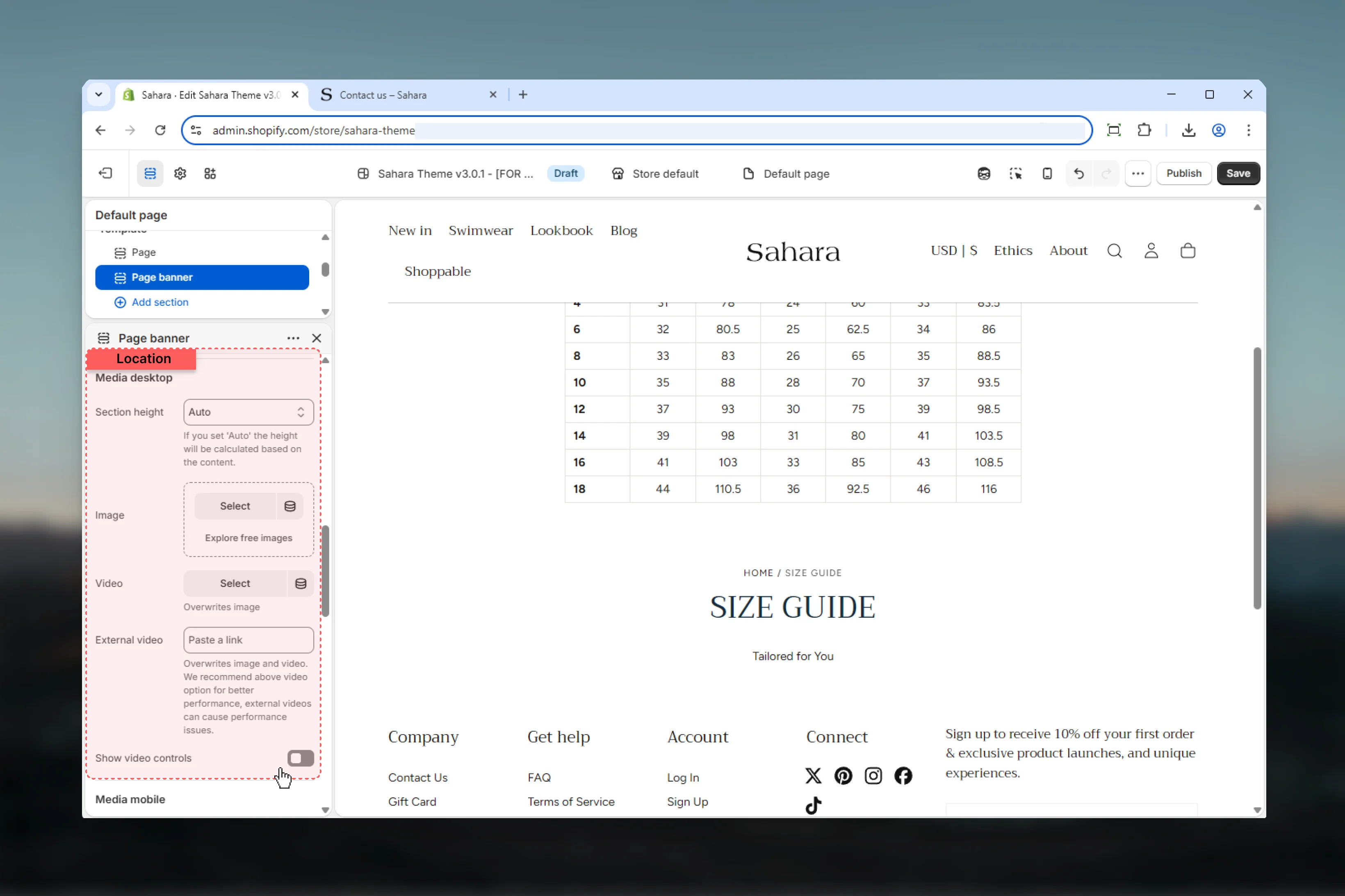 ### Section height (Mobile)
Height of the banner on mobile devices, independent of desktop.
**Options:** Auto, 33svh, 50svh (default), 100svh
Mobile defaults to 50svh for balanced visibility on vertical screens.
### Image (Mobile)
Upload mobile-optimized image.
**Recommended:** 800-1200px width, portrait orientation
Mobile media overrides desktop media on small screens when provided.
### Video (Mobile)
Shopify-hosted video for mobile devices. Overwrites mobile image.
### External video (Mobile)
YouTube or Vimeo video for mobile. Takes priority.
### Show controls on video (Mobile)
Displays video controls on mobile devices.
**Default:** False
### Section height (Mobile)
Height of the banner on mobile devices, independent of desktop.
**Options:** Auto, 33svh, 50svh (default), 100svh
Mobile defaults to 50svh for balanced visibility on vertical screens.
### Image (Mobile)
Upload mobile-optimized image.
**Recommended:** 800-1200px width, portrait orientation
Mobile media overrides desktop media on small screens when provided.
### Video (Mobile)
Shopify-hosted video for mobile devices. Overwrites mobile image.
### External video (Mobile)
YouTube or Vimeo video for mobile. Takes priority.
### Show controls on video (Mobile)
Displays video controls on mobile devices.
**Default:** False
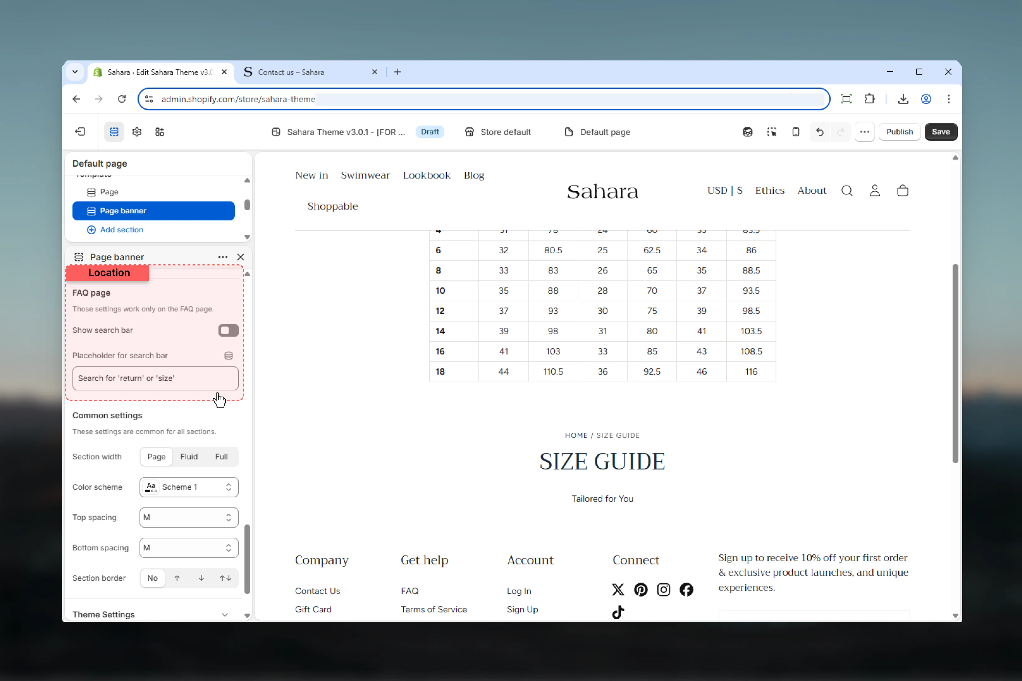
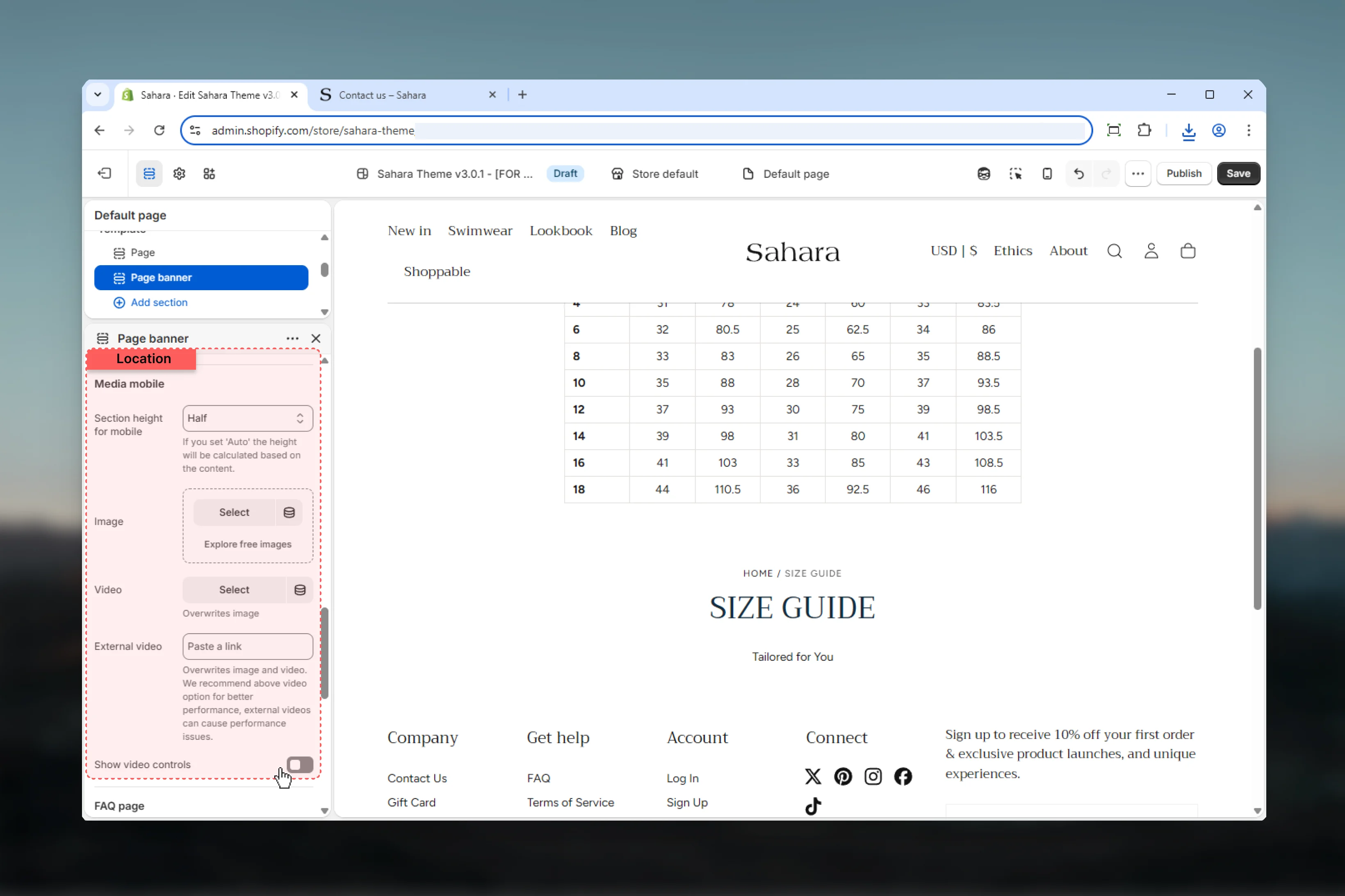 ### Search bar
Enables FAQ-specific search functionality within the banner.
**Default:** False
**Purpose:**
* Helps customers find FAQ answers quickly
* Searches page content in real-time
* Typically used on FAQ or Help pages
**Functionality:**
* Displays search input in banner
* Filters page content as user types
* Shows matching results below
**Best for:**
* FAQ pages
* Help centers
* Documentation pages
* Knowledge bases
This feature is specialized for FAQ pages. Most pages should keep this disabled.
### Search bar placeholder
Placeholder text displayed in the search input.
* Plain text
* **Default:** "Search for 'return' or 'size'"
Use example search terms relevant to your FAQ content to guide users.
### Search bar
Enables FAQ-specific search functionality within the banner.
**Default:** False
**Purpose:**
* Helps customers find FAQ answers quickly
* Searches page content in real-time
* Typically used on FAQ or Help pages
**Functionality:**
* Displays search input in banner
* Filters page content as user types
* Shows matching results below
**Best for:**
* FAQ pages
* Help centers
* Documentation pages
* Knowledge bases
This feature is specialized for FAQ pages. Most pages should keep this disabled.
### Search bar placeholder
Placeholder text displayed in the search input.
* Plain text
* **Default:** "Search for 'return' or 'size'"
Use example search terms relevant to your FAQ content to guide users.
 ### Section width
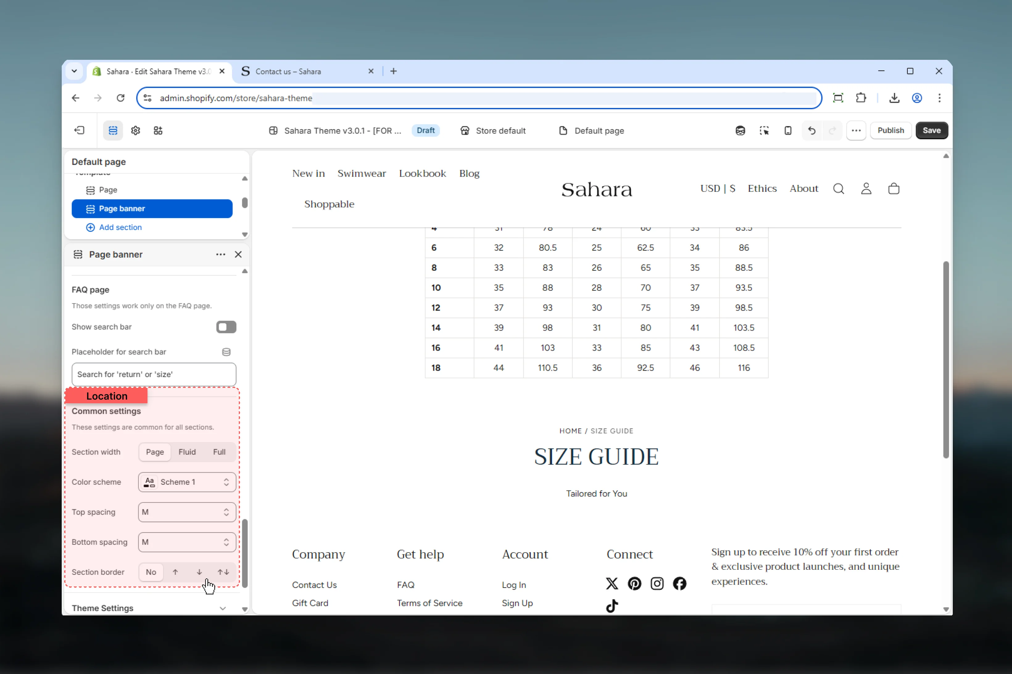
Controls horizontal width of the banner.
**Options:**
* **Page** - Standard container width (default)
* **Fluid** - Wider layout
* **Full** - Edge-to-edge full width
### Color scheme
Select color scheme for section background and text.
Applies when no media is present, or when media position is "Top" or "Bottom".
### Spacing
Control vertical spacing around the section:
* **Spacing top** - Margin above (None, S, M, L, XL)
* **Spacing bottom** - Margin below (None, S, M, L, XL)
Both default to M.
### Section border
Add decorative borders: None (default), Top, Bottom, Both
### Section width
Controls horizontal width of the banner.
**Options:**
* **Page** - Standard container width (default)
* **Fluid** - Wider layout
* **Full** - Edge-to-edge full width
### Color scheme
Select color scheme for section background and text.
Applies when no media is present, or when media position is "Top" or "Bottom".
### Spacing
Control vertical spacing around the section:
* **Spacing top** - Margin above (None, S, M, L, XL)
* **Spacing bottom** - Margin below (None, S, M, L, XL)
Both default to M.
### Section border
Add decorative borders: None (default), Top, Bottom, Both
 ## Best practices
Enable "Show default description" to automatically pull content from pages/collections/products/blogs.
Always provide portrait-oriented mobile images for optimal vertical screen display.
Use 50svh height for most pages. Reserve 100svh for homepage or major campaigns.
Enable only with background media and ensure sufficient text-to-image contrast.
Keep breadcrumbs enabled for SEO benefits and improved user navigation.
Hide descriptions on mobile (default) to conserve vertical space on small screens.
Only enable FAQ search on actual FAQ or help pages—not general pages.
Use page menu for collection subcategory filtering or related page navigation.
## Common use cases
Enable default description. Background media position. 50svh height. Upload collection banner image (desktop 1920×600px, mobile 800×1000px). Page menu with subcollections. Breadcrumbs enabled. Center alignment.
Show default description (desktop only). Background media with product lifestyle image. Auto height. Breadcrumbs enabled. No page menu. Center content position and alignment.
Custom title: "How can we help?". Enable FAQ search bar. Placeholder: "Search for 'shipping' or 'returns'". No media or background color scheme only. Auto height. Center alignment.
Custom title and content. Background media 100svh height. Transparent header enabled. Team photo background (desktop 1920×1080px, mobile 800×1200px). Bottom content position for readability.
Default blog title and description. Top media position. Auto height. Blog featured image (16:9 aspect). Breadcrumbs enabled. No page menu. Standard page width.
## Related sections
Multi-slide carousel banners with slideshow
Edge-to-edge banners with block-based content
## Best practices
Enable "Show default description" to automatically pull content from pages/collections/products/blogs.
Always provide portrait-oriented mobile images for optimal vertical screen display.
Use 50svh height for most pages. Reserve 100svh for homepage or major campaigns.
Enable only with background media and ensure sufficient text-to-image contrast.
Keep breadcrumbs enabled for SEO benefits and improved user navigation.
Hide descriptions on mobile (default) to conserve vertical space on small screens.
Only enable FAQ search on actual FAQ or help pages—not general pages.
Use page menu for collection subcategory filtering or related page navigation.
## Common use cases
Enable default description. Background media position. 50svh height. Upload collection banner image (desktop 1920×600px, mobile 800×1000px). Page menu with subcollections. Breadcrumbs enabled. Center alignment.
Show default description (desktop only). Background media with product lifestyle image. Auto height. Breadcrumbs enabled. No page menu. Center content position and alignment.
Custom title: "How can we help?". Enable FAQ search bar. Placeholder: "Search for 'shipping' or 'returns'". No media or background color scheme only. Auto height. Center alignment.
Custom title and content. Background media 100svh height. Transparent header enabled. Team photo background (desktop 1920×1080px, mobile 800×1200px). Bottom content position for readability.
Default blog title and description. Top media position. Auto height. Blog featured image (16:9 aspect). Breadcrumbs enabled. No page menu. Standard page width.
## Related sections
Multi-slide carousel banners with slideshow
Edge-to-edge banners with block-based content