> ## Documentation Index
> Fetch the complete documentation index at: https://docs.digifist.com/llms.txt
> Use this file to discover all available pages before exploring further.
# Product recommendations
> Display Shopify's AI-powered product recommendations to encourage cross-selling, upselling, and complementary purchases.
The Product recommendations section displays Shopify's AI-powered product recommendations based on the current product or cart contents. It shows personalized product suggestions to encourage cross-selling and upselling, with optional manual product fallback.
Shopify's recommendation engine analyzes purchase patterns, product relationships, and customer behavior to suggest the most relevant products, helping increase average order value and improve the shopping experience.
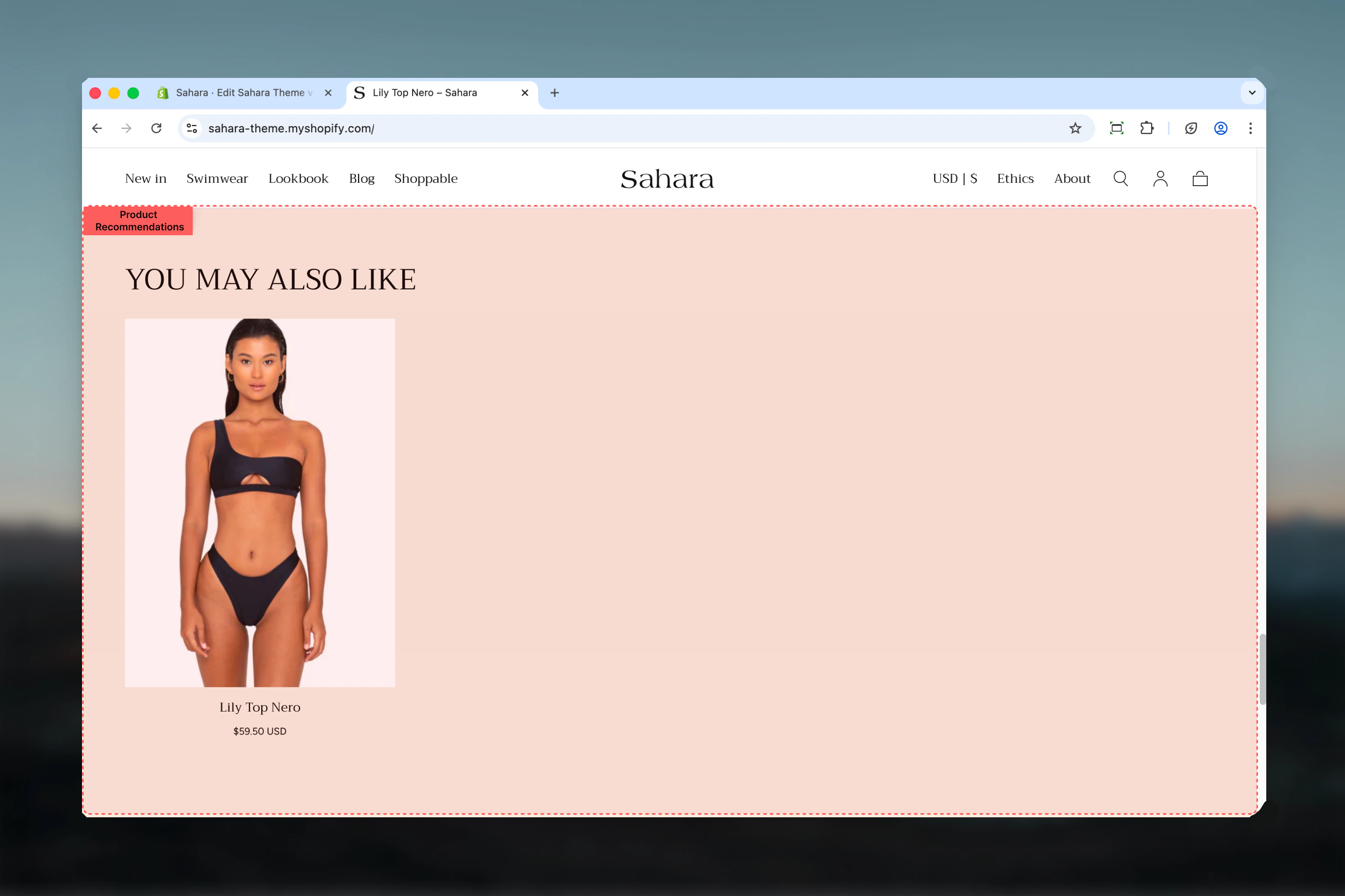 ## What this section controls
This section controls AI-powered product recommendation displays with the following capabilities:
* Shopify AI-powered recommendations (automatic)
* Manual product fallback when recommendations unavailable
* Configurable product limit (4-12 products)
* Two layout options for visual variety
* Optional section-level button
* Stock status visibility control
* Responsive grid display
## How Product recommendations works
The Product recommendations section leverages two data sources:
**Primary (Automatic):**
* Shopify's AI recommendation engine suggests products based on:
* Current product relationships
* Cart contents
* Purchase patterns across your store
* Customer behavior and browsing history
**Fallback (Manual):**
* If AI recommendations are unavailable, displays manually selected products
* Useful for new stores or products with limited data
* Provides consistent display until recommendations improve
## Getting started
From Shopify admin, access the Theme Customizer.
Add the section to a product page template or cart page.
Set descriptive heading like "You may also like" or "Complete the look".
Select manual products to display when AI recommendations are unavailable.
Configure maximum products, layout, and stock visibility.
## What this section controls
This section controls AI-powered product recommendation displays with the following capabilities:
* Shopify AI-powered recommendations (automatic)
* Manual product fallback when recommendations unavailable
* Configurable product limit (4-12 products)
* Two layout options for visual variety
* Optional section-level button
* Stock status visibility control
* Responsive grid display
## How Product recommendations works
The Product recommendations section leverages two data sources:
**Primary (Automatic):**
* Shopify's AI recommendation engine suggests products based on:
* Current product relationships
* Cart contents
* Purchase patterns across your store
* Customer behavior and browsing history
**Fallback (Manual):**
* If AI recommendations are unavailable, displays manually selected products
* Useful for new stores or products with limited data
* Provides consistent display until recommendations improve
## Getting started
From Shopify admin, access the Theme Customizer.
Add the section to a product page template or cart page.
Set descriptive heading like "You may also like" or "Complete the look".
Select manual products to display when AI recommendations are unavailable.
Configure maximum products, layout, and stock visibility.
 ## Section settings
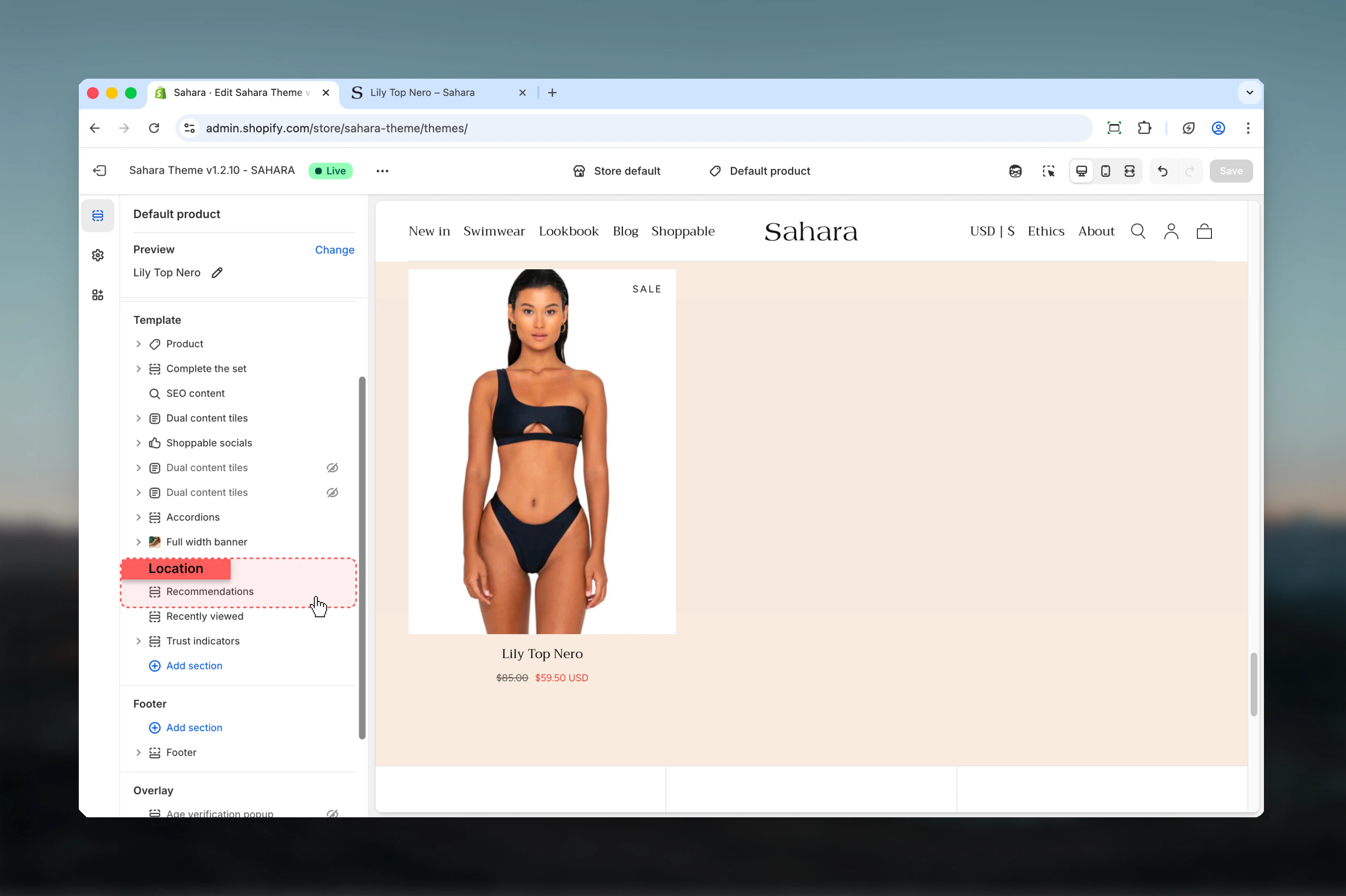
### Layout
Controls the visual style and arrangement of the product grid.
Standard grid layout with consistent product card styling.
**Best for:**
* Clean, minimal designs
* Focus on product imagery
* Standard product pages
Alternative layout with different spacing and card treatment (default).
**Best for:**
* Visual variety
* Differentiation from other product sections
* Enhanced visual hierarchy
Layout choice should match your overall theme aesthetic and other product section layouts.
## Section settings
### Layout
Controls the visual style and arrangement of the product grid.
Standard grid layout with consistent product card styling.
**Best for:**
* Clean, minimal designs
* Focus on product imagery
* Standard product pages
Alternative layout with different spacing and card treatment (default).
**Best for:**
* Visual variety
* Differentiation from other product sections
* Enhanced visual hierarchy
Layout choice should match your overall theme aesthetic and other product section layouts.
 ### Heading
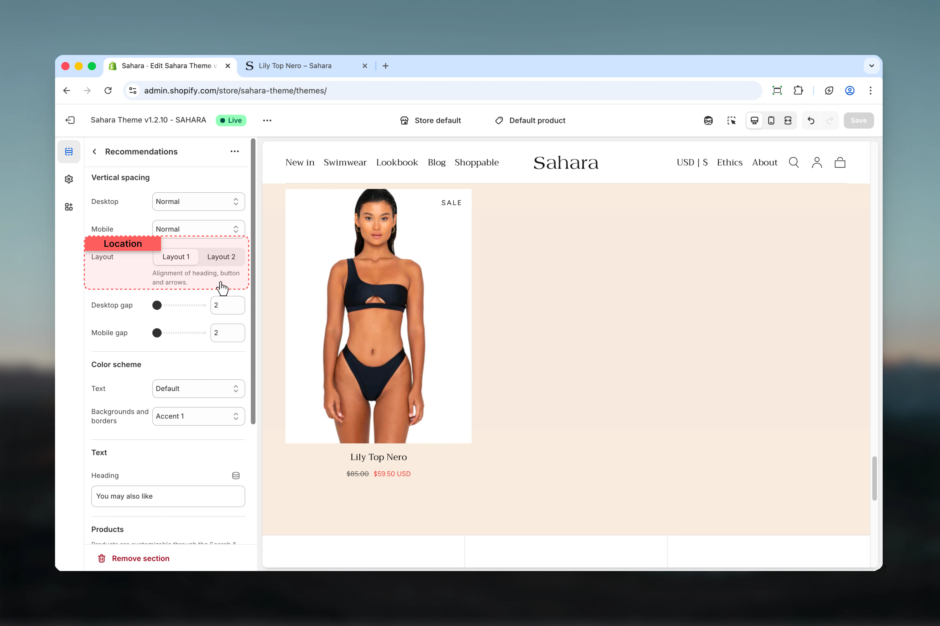
Main title text for the section.
* Inline rich text supported (bold, italic, links)
* **Default:** "Heading for Product Recommendations"
**For product pages:**
* "You may also like"
* "Complete the look"
* "Customers also bought"
* "Pairs well with"
**For cart page:**
* "Don't forget these"
* "Add to your order"
* "Recommended for you"
* "Frequently bought together"
Use action-oriented, contextual headings that encourage exploration without being pushy.
### Heading size
Controls the size of section heading.
**Options:** XS, S, M, L, XL\
**Default:** XL
### Heading
Main title text for the section.
* Inline rich text supported (bold, italic, links)
* **Default:** "Heading for Product Recommendations"
**For product pages:**
* "You may also like"
* "Complete the look"
* "Customers also bought"
* "Pairs well with"
**For cart page:**
* "Don't forget these"
* "Add to your order"
* "Recommended for you"
* "Frequently bought together"
Use action-oriented, contextual headings that encourage exploration without being pushy.
### Heading size
Controls the size of section heading.
**Options:** XS, S, M, L, XL\
**Default:** XL
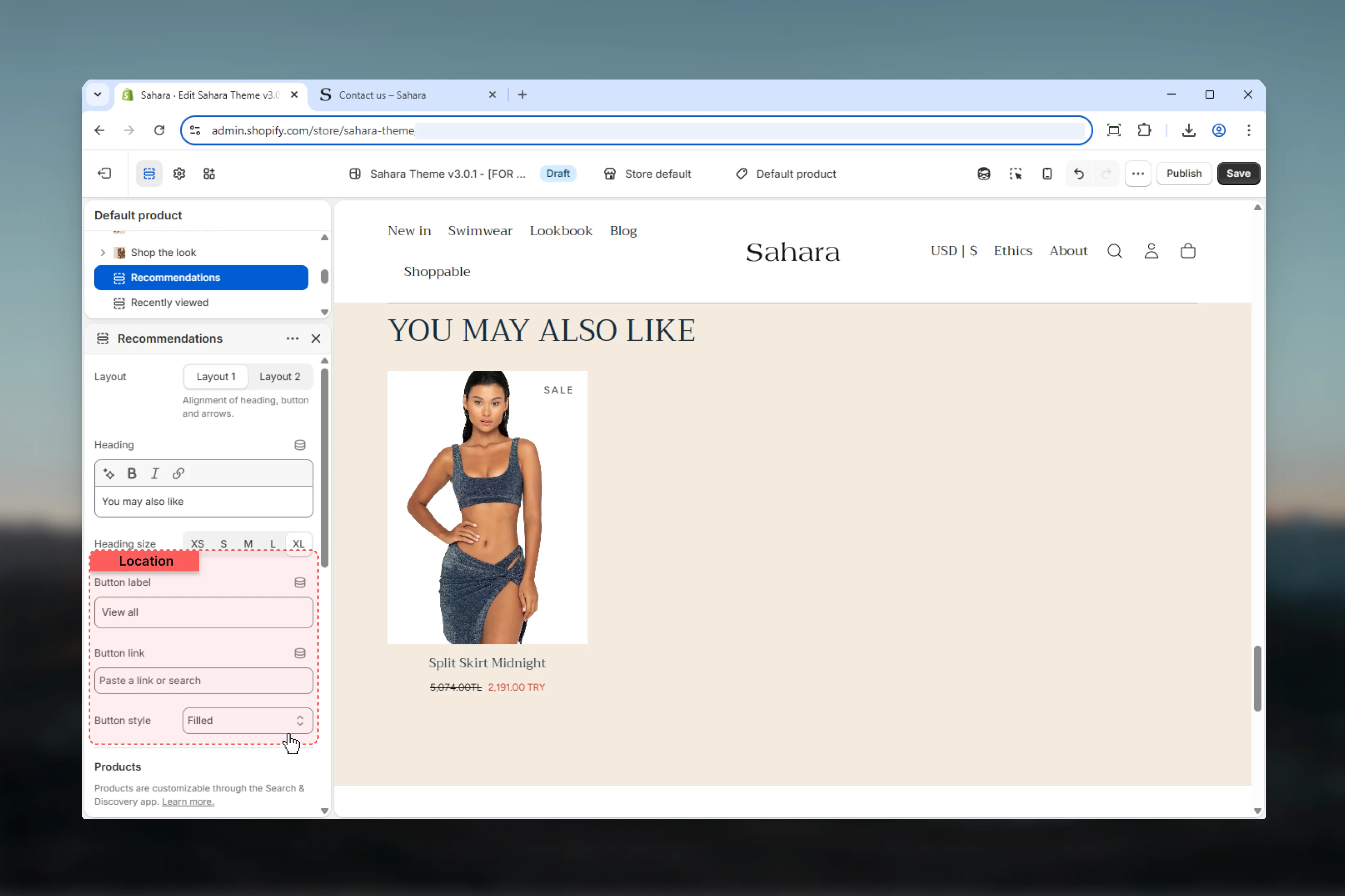
 ### Button text
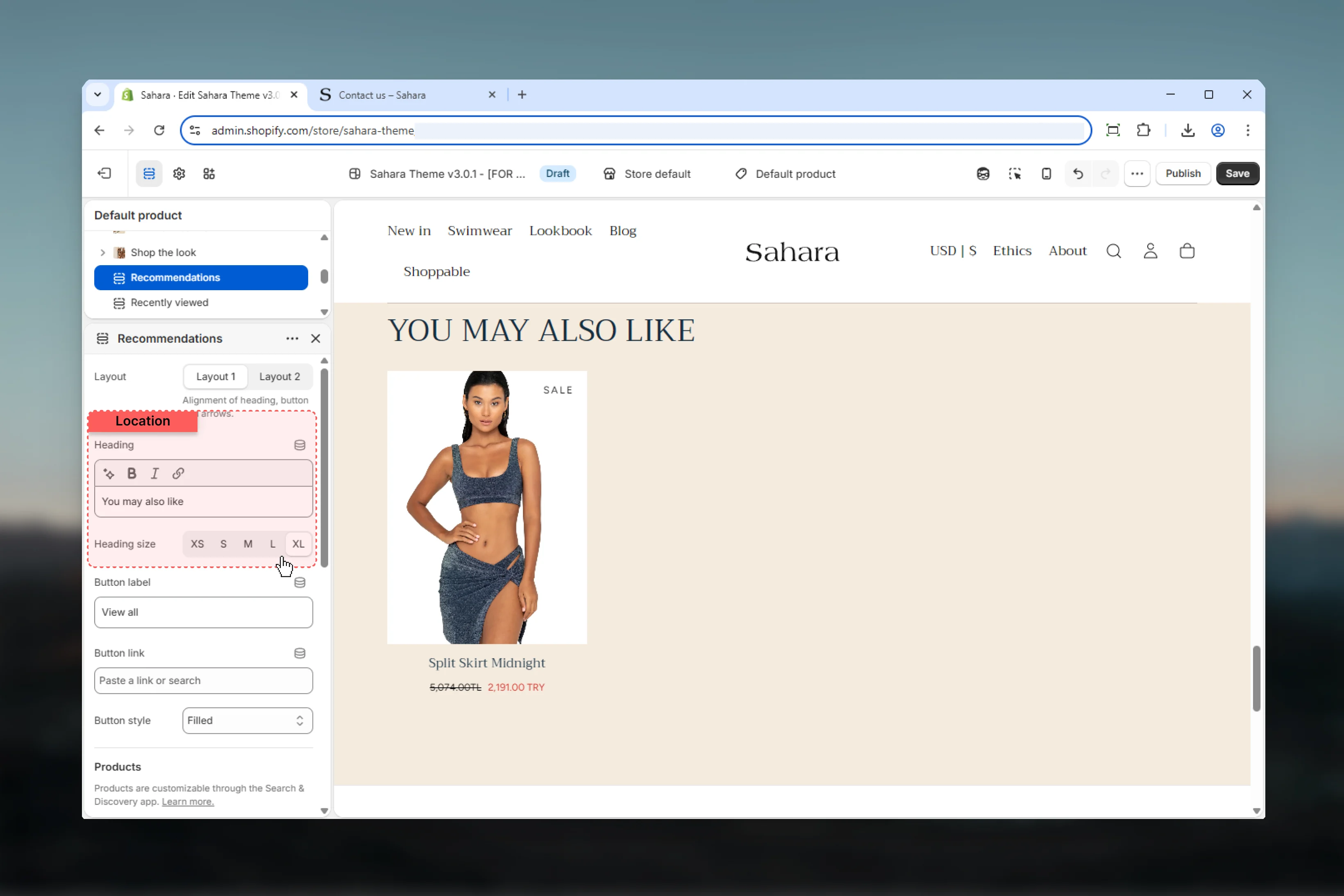
Label for optional section-level button.
* Plain text
* **Default:** "View all"
* Leave empty to hide button
### Button URL
Destination link for section button.
* Shopify URL selector
* Useful for linking to collection or shop page
### Button style
Visual style of the section button.
Solid background with contrasting text (default).
**Best for:** Primary calls-to-action, prominent visibility
Border-only style with transparent background.
**Best for:** Secondary actions, subtle CTAs
Minimal styling as underlined text.
**Best for:** Tertiary actions, non-intrusive links
Section button appears below product grid and provides an escape route to browse more products beyond recommendations.
### Button text
Label for optional section-level button.
* Plain text
* **Default:** "View all"
* Leave empty to hide button
### Button URL
Destination link for section button.
* Shopify URL selector
* Useful for linking to collection or shop page
### Button style
Visual style of the section button.
Solid background with contrasting text (default).
**Best for:** Primary calls-to-action, prominent visibility
Border-only style with transparent background.
**Best for:** Secondary actions, subtle CTAs
Minimal styling as underlined text.
**Best for:** Tertiary actions, non-intrusive links
Section button appears below product grid and provides an escape route to browse more products beyond recommendations.
 ### Products (Manual fallback)
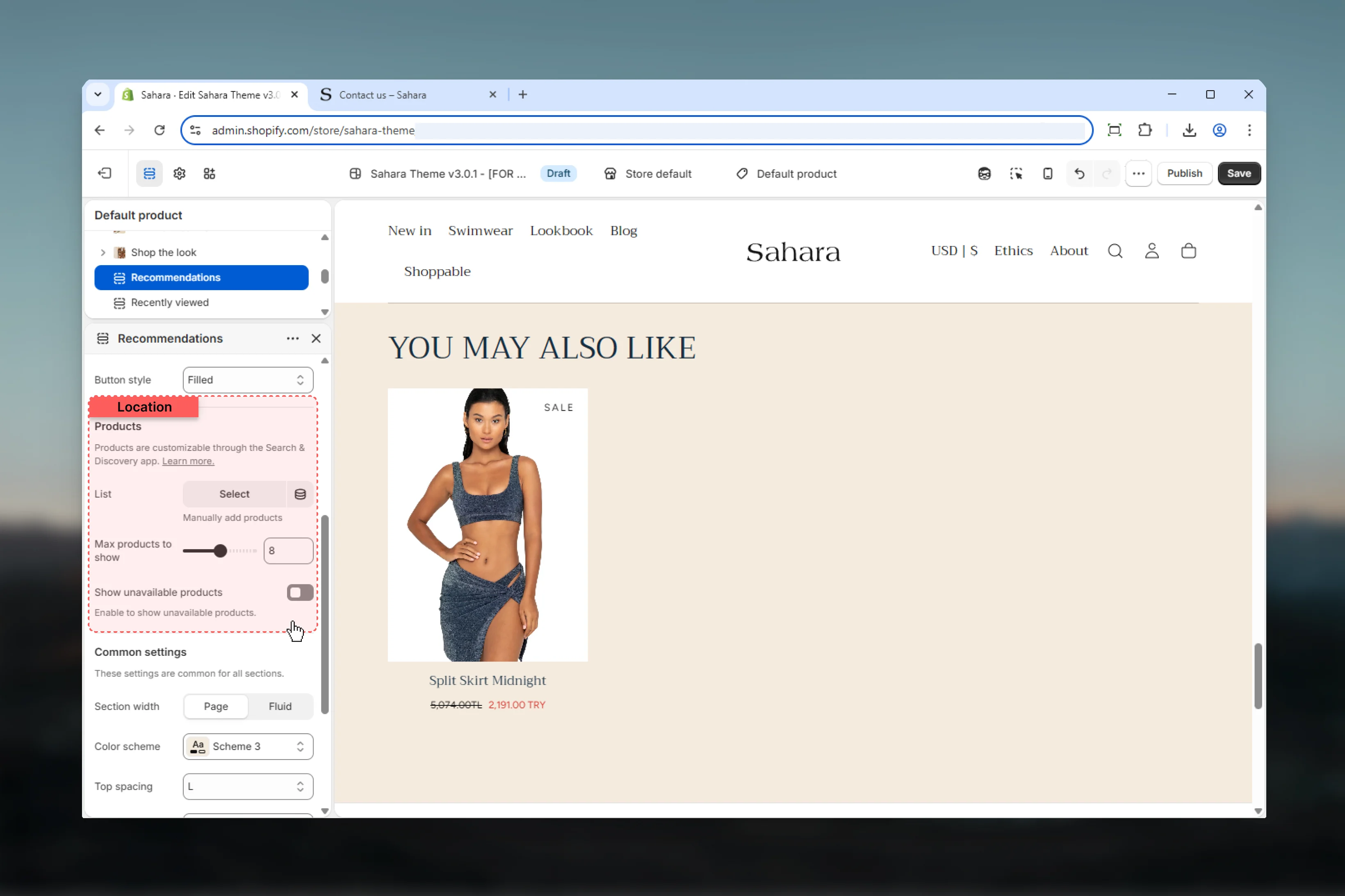
Select up to 12 products to display when AI recommendations are unavailable.
* Product list selector
* **Limit:** 12 products
* Acts as fallback only
Manual products appear in these situations:
**New stores:**
* Insufficient purchase data
* Limited product relationships
* Recently launched products
**Preview mode:**
* Theme Customizer
* Development environments
* Testing scenarios
**No recommendations:**
* Shopify API temporarily unavailable
* Product has no related items
* Recommendation algorithm returns empty set
Select best-selling, complementary, or popular products as fallbacks to ensure quality suggestions even when AI recommendations are unavailable.
### Max products
Maximum number of products to display (AI or manual).
**Range:** 4 – 12 products\
**Default:** 8
**4-6 products:**
* Minimal, focused suggestions
* Mobile-first designs
* Cart page recommendations
**7-8 products (recommended):**
* Balanced presentation
* Standard product pages
* Good variety without overwhelming
**9-12 products:**
* Maximum exposure
* Category landing pages
* Desktop-optimized layouts
Shopify's AI may return fewer products than max\_products setting if insufficient recommendations exist.
### Show unavailable products
Display products that are out of stock.
**Options:** True / False\
**Default:** False
**Hide unavailable (False - default):**
* Only show in-stock products
* Reduces customer frustration
* Focuses on actionable recommendations
* **Best for:** Most stores
**Show unavailable (True):**
* Display all recommendations regardless of stock
* Allows "Notify when available" interactions
* Shows full product range
* **Best for:** Limited inventory or pre-order products
### Products (Manual fallback)
Select up to 12 products to display when AI recommendations are unavailable.
* Product list selector
* **Limit:** 12 products
* Acts as fallback only
Manual products appear in these situations:
**New stores:**
* Insufficient purchase data
* Limited product relationships
* Recently launched products
**Preview mode:**
* Theme Customizer
* Development environments
* Testing scenarios
**No recommendations:**
* Shopify API temporarily unavailable
* Product has no related items
* Recommendation algorithm returns empty set
Select best-selling, complementary, or popular products as fallbacks to ensure quality suggestions even when AI recommendations are unavailable.
### Max products
Maximum number of products to display (AI or manual).
**Range:** 4 – 12 products\
**Default:** 8
**4-6 products:**
* Minimal, focused suggestions
* Mobile-first designs
* Cart page recommendations
**7-8 products (recommended):**
* Balanced presentation
* Standard product pages
* Good variety without overwhelming
**9-12 products:**
* Maximum exposure
* Category landing pages
* Desktop-optimized layouts
Shopify's AI may return fewer products than max\_products setting if insufficient recommendations exist.
### Show unavailable products
Display products that are out of stock.
**Options:** True / False\
**Default:** False
**Hide unavailable (False - default):**
* Only show in-stock products
* Reduces customer frustration
* Focuses on actionable recommendations
* **Best for:** Most stores
**Show unavailable (True):**
* Display all recommendations regardless of stock
* Allows "Notify when available" interactions
* Shows full product range
* **Best for:** Limited inventory or pre-order products
 ### Section width
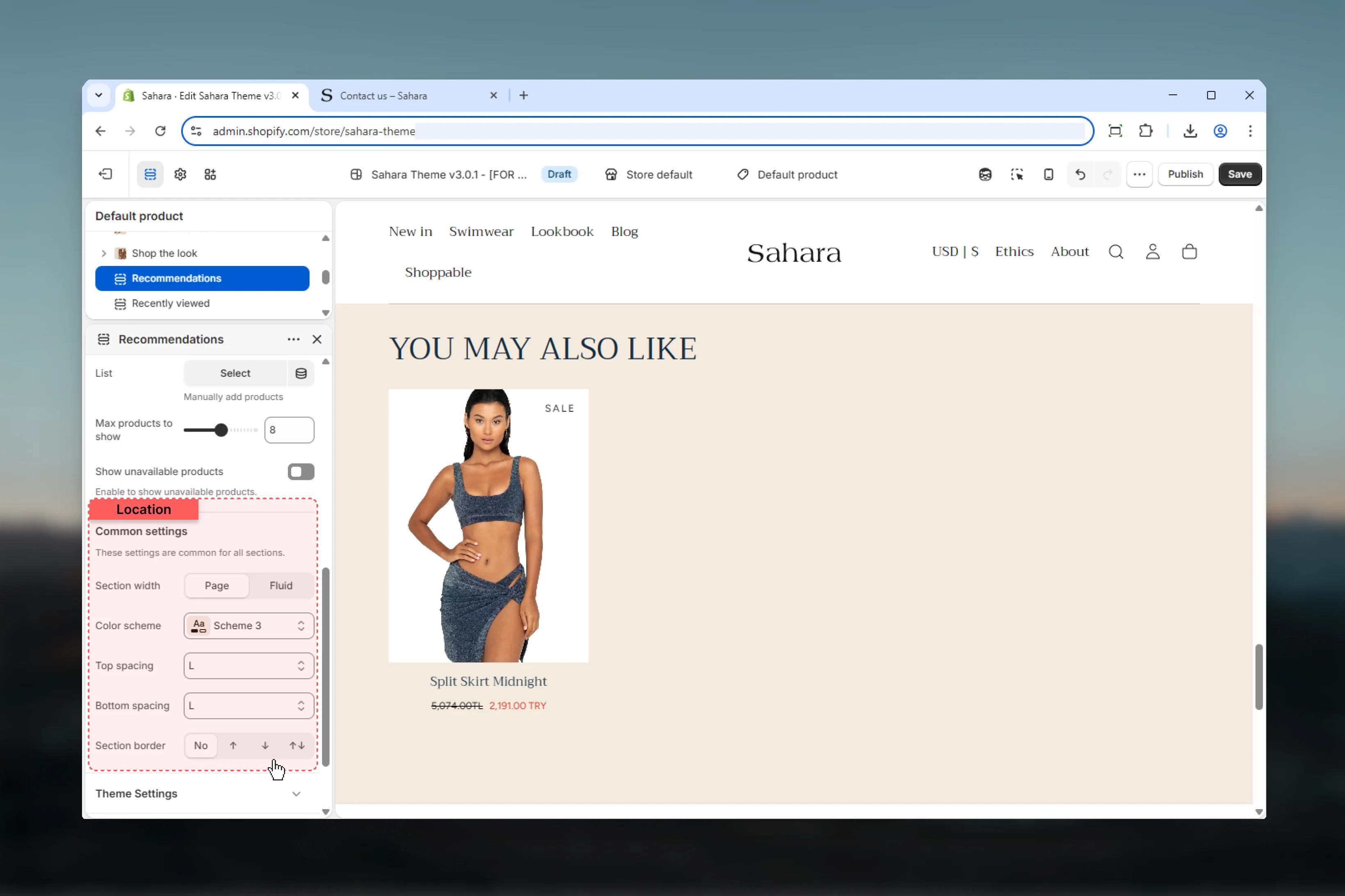
Controls horizontal width of the section.
**Options:**
* **Page** - Standard container width (default)
* **Fluid** - Wider, more spacious layout
Fluid width works well for product grids, providing more breathing room for product images.
### Color scheme
Select color scheme for section background and text.
### Spacing
Control vertical spacing around the section:
* **Spacing top** - Margin above (None, S, M, L, XL)
* **Spacing bottom** - Margin below (None, S, M, L, XL)
Both default to M.
### Section border
Add decorative borders: None (default), Top, Bottom, Both
### Section width
Controls horizontal width of the section.
**Options:**
* **Page** - Standard container width (default)
* **Fluid** - Wider, more spacious layout
Fluid width works well for product grids, providing more breathing room for product images.
### Color scheme
Select color scheme for section background and text.
### Spacing
Control vertical spacing around the section:
* **Spacing top** - Margin above (None, S, M, L, XL)
* **Spacing bottom** - Margin below (None, S, M, L, XL)
Both default to M.
### Section border
Add decorative borders: None (default), Top, Bottom, Both
 ## Best practices
Add to product pages (below description) and cart page for maximum cross-sell opportunity.
Use descriptive, action-oriented headings: "Complete the look", "You may also like", "Customers also bought".
Set max products to 6-8 for balanced variety without overwhelming customers.
Select best-selling or complementary products as manual fallbacks for new stores or products.
Keep "Show unavailable products" disabled to avoid customer frustration with unavailable items.
Add section button linking to collection or shop for customers who want more options.
Consider fluid section width for product grids to maximize space and visual impact.
Track click-through and conversion rates from recommendations to optimize placement and heading.
## Common use cases
Place below product description. Heading: "You may also like". Max products: 8. Hide unavailable products. Manual fallbacks: Best-sellers from same collection. Button: "Shop all products".
Add to cart page template. Heading: "Complete your order". Max products: 6. Show unavailable for pre-orders. Manual fallbacks: Popular accessories. Button: "Continue shopping".
Product page for apparel. Heading: "Complete the look". Max products: 6. Hide unavailable. Manual fallbacks: Matching accessories. Filled button style. Layout 2 for differentiation.
Product page in specific category. Heading: "More from this collection". Max products: 12. Fluid width. Manual fallbacks: Same-category products. Text link button: "View full collection".
Below add-to-cart button. Heading: "Customers also bought". Max products: 4. Hide unavailable. Manual fallbacks: Bundle-worthy items. Layout 1. Outlined button: "Shop more".
## Related sections
Manually curated product showcases
Sliding card displays for varied content
## Best practices
Add to product pages (below description) and cart page for maximum cross-sell opportunity.
Use descriptive, action-oriented headings: "Complete the look", "You may also like", "Customers also bought".
Set max products to 6-8 for balanced variety without overwhelming customers.
Select best-selling or complementary products as manual fallbacks for new stores or products.
Keep "Show unavailable products" disabled to avoid customer frustration with unavailable items.
Add section button linking to collection or shop for customers who want more options.
Consider fluid section width for product grids to maximize space and visual impact.
Track click-through and conversion rates from recommendations to optimize placement and heading.
## Common use cases
Place below product description. Heading: "You may also like". Max products: 8. Hide unavailable products. Manual fallbacks: Best-sellers from same collection. Button: "Shop all products".
Add to cart page template. Heading: "Complete your order". Max products: 6. Show unavailable for pre-orders. Manual fallbacks: Popular accessories. Button: "Continue shopping".
Product page for apparel. Heading: "Complete the look". Max products: 6. Hide unavailable. Manual fallbacks: Matching accessories. Filled button style. Layout 2 for differentiation.
Product page in specific category. Heading: "More from this collection". Max products: 12. Fluid width. Manual fallbacks: Same-category products. Text link button: "View full collection".
Below add-to-cart button. Heading: "Customers also bought". Max products: 4. Hide unavailable. Manual fallbacks: Bundle-worthy items. Layout 1. Outlined button: "Shop more".
## Related sections
Manually curated product showcases
Sliding card displays for varied content