> ## Documentation Index
> Fetch the complete documentation index at: https://docs.digifist.com/llms.txt
> Use this file to discover all available pages before exploring further.
# Trust indicators
> Build customer confidence with trust badges, guarantees, and service highlights in customizable layouts.
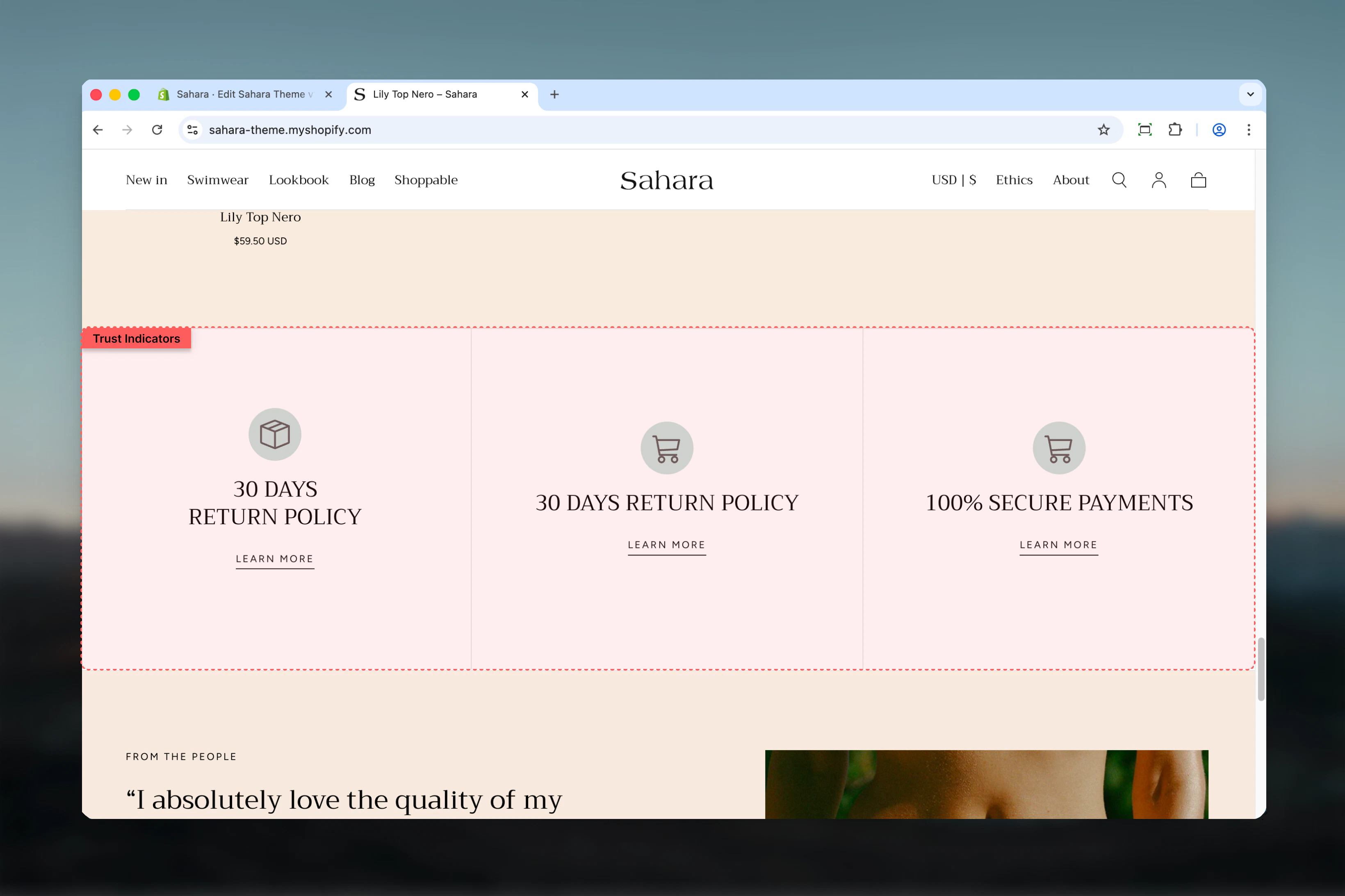
The Trust indicators section displays key brand promises, service highlights, or trust-building messages with icons and text in a flexible layout. It helps reduce purchase anxiety and build credibility by showcasing guarantees like free shipping, secure checkout, or quality certifications.
 ## What this section controls
This section controls trust indicator displays with the following capabilities:
* Up to 3 customizable indicator blocks
* Icon or image support for each indicator
* Horizontal or vertical layout options
* Mobile carousel functionality
* Individual color schemes per indicator
* Adjustable spacing and separators
## How the Trust indicators section works
The section uses indicator blocks where each block represents one trust message (like "Free Shipping" or "Money-Back Guarantee"). You can add custom icons, headings, and optional links. On desktop, indicators display side by side, while on mobile they can optionally transform into a carousel slideshow.
## Getting started
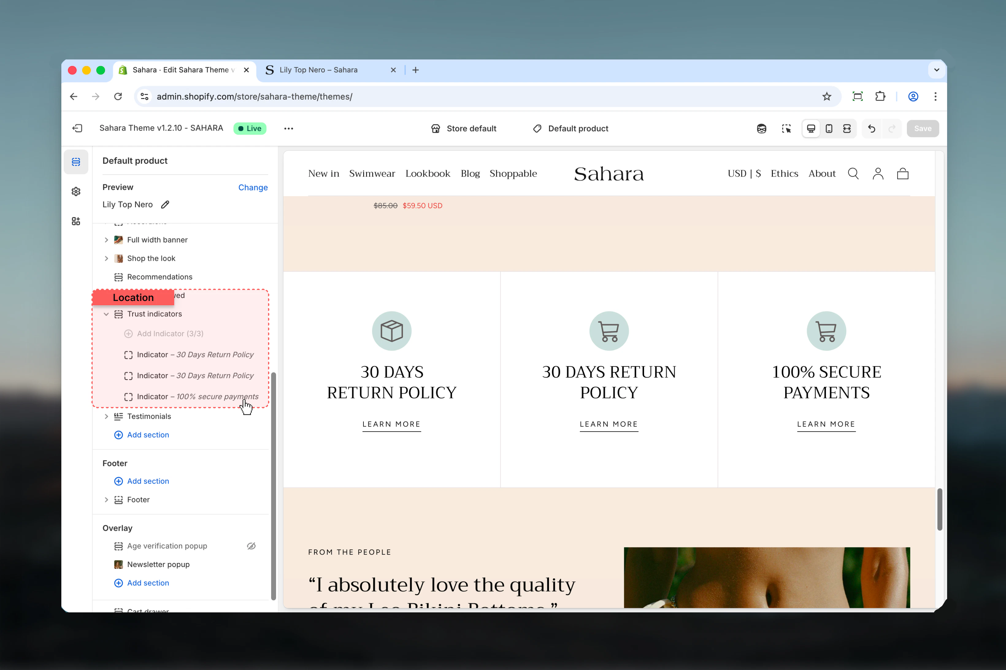
From Shopify admin, access the Theme Customizer.
Add the Trust indicators section to your page or template.
Click "Add block" and select "Indicator" to create trust messages.
Add icon, heading, and optional link for each indicator.
## What this section controls
This section controls trust indicator displays with the following capabilities:
* Up to 3 customizable indicator blocks
* Icon or image support for each indicator
* Horizontal or vertical layout options
* Mobile carousel functionality
* Individual color schemes per indicator
* Adjustable spacing and separators
## How the Trust indicators section works
The section uses indicator blocks where each block represents one trust message (like "Free Shipping" or "Money-Back Guarantee"). You can add custom icons, headings, and optional links. On desktop, indicators display side by side, while on mobile they can optionally transform into a carousel slideshow.
## Getting started
From Shopify admin, access the Theme Customizer.
Add the Trust indicators section to your page or template.
Click "Add block" and select "Indicator" to create trust messages.
Add icon, heading, and optional link for each indicator.
 ## Section settings
### Layout
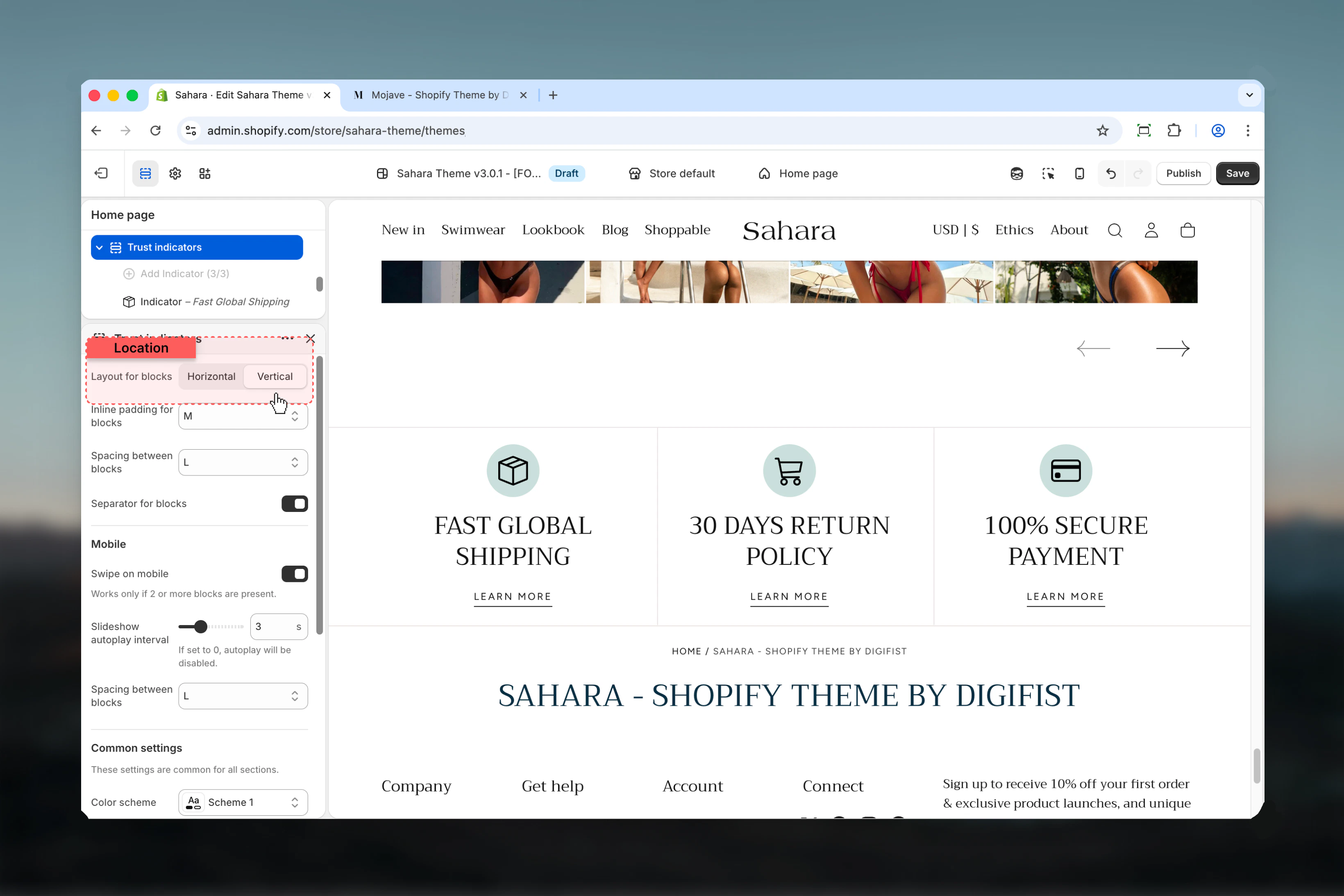
Controls the orientation of icon and text within each indicator.
Icon and text appear side by side in a row.
**When to use:**
* When you have brief, concise text
* Compact horizontal layouts
* Desktop-optimized displays
* Professional, streamlined appearance
Icon appears above the text in a column (default).
**When to use:**
* Centered, symmetrical designs
* When icons are primary focus
* Better mobile presentation
* More prominent indicator display
## Section settings
### Layout
Controls the orientation of icon and text within each indicator.
Icon and text appear side by side in a row.
**When to use:**
* When you have brief, concise text
* Compact horizontal layouts
* Desktop-optimized displays
* Professional, streamlined appearance
Icon appears above the text in a column (default).
**When to use:**
* Centered, symmetrical designs
* When icons are primary focus
* Better mobile presentation
* More prominent indicator display
 ### Inner spacing
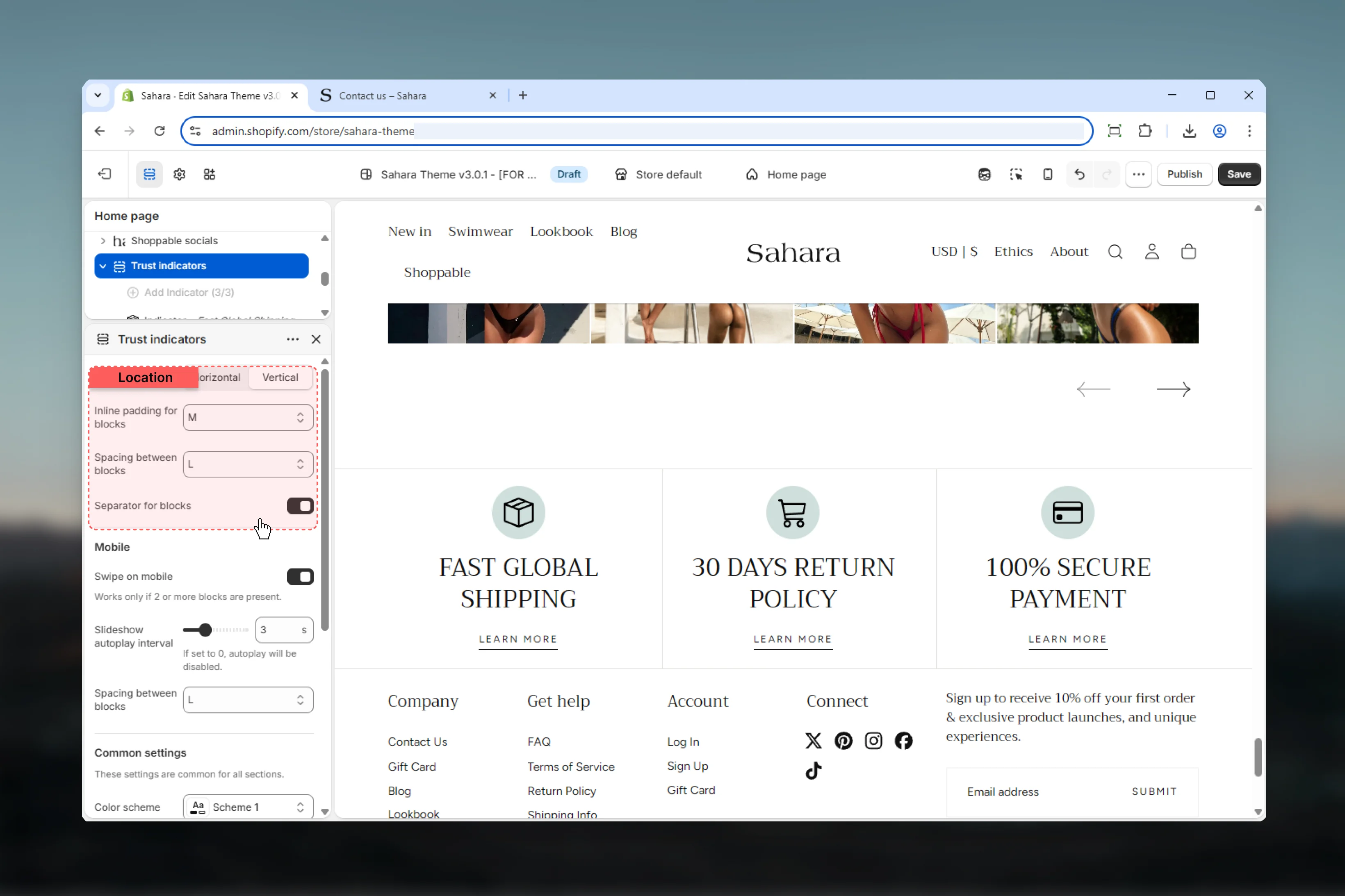
Controls padding inside each indicator block.
**Available options:** No, S, M (default), L, XL
Use M or L inner spacing to give indicators breathing room and improve readability.
### Spacing between blocks
Controls the gap between indicator blocks on desktop.
**Available options:** No, S, M, L (default), XL
### Spacing between blocks (Mobile)
Controls the gap between indicators on mobile devices.
**Available options:** No, S, M, L (default), XL
**Tight spacing (No, S):**
* Compact designs
* Many indicators (3+)
* When screen space is limited
**Medium spacing (M, L - recommended):**
* Balanced, professional appearance
* Standard 2-3 indicators
* Better visual separation
**Loose spacing (XL):**
* Emphasis on each indicator
* Limited indicators (2)
* Full-width sections
### Separator for blocks
Displays visual dividing lines between indicators.
**Default:** Enabled
### Inner spacing
Controls padding inside each indicator block.
**Available options:** No, S, M (default), L, XL
Use M or L inner spacing to give indicators breathing room and improve readability.
### Spacing between blocks
Controls the gap between indicator blocks on desktop.
**Available options:** No, S, M, L (default), XL
### Spacing between blocks (Mobile)
Controls the gap between indicators on mobile devices.
**Available options:** No, S, M, L (default), XL
**Tight spacing (No, S):**
* Compact designs
* Many indicators (3+)
* When screen space is limited
**Medium spacing (M, L - recommended):**
* Balanced, professional appearance
* Standard 2-3 indicators
* Better visual separation
**Loose spacing (XL):**
* Emphasis on each indicator
* Limited indicators (2)
* Full-width sections
### Separator for blocks
Displays visual dividing lines between indicators.
**Default:** Enabled
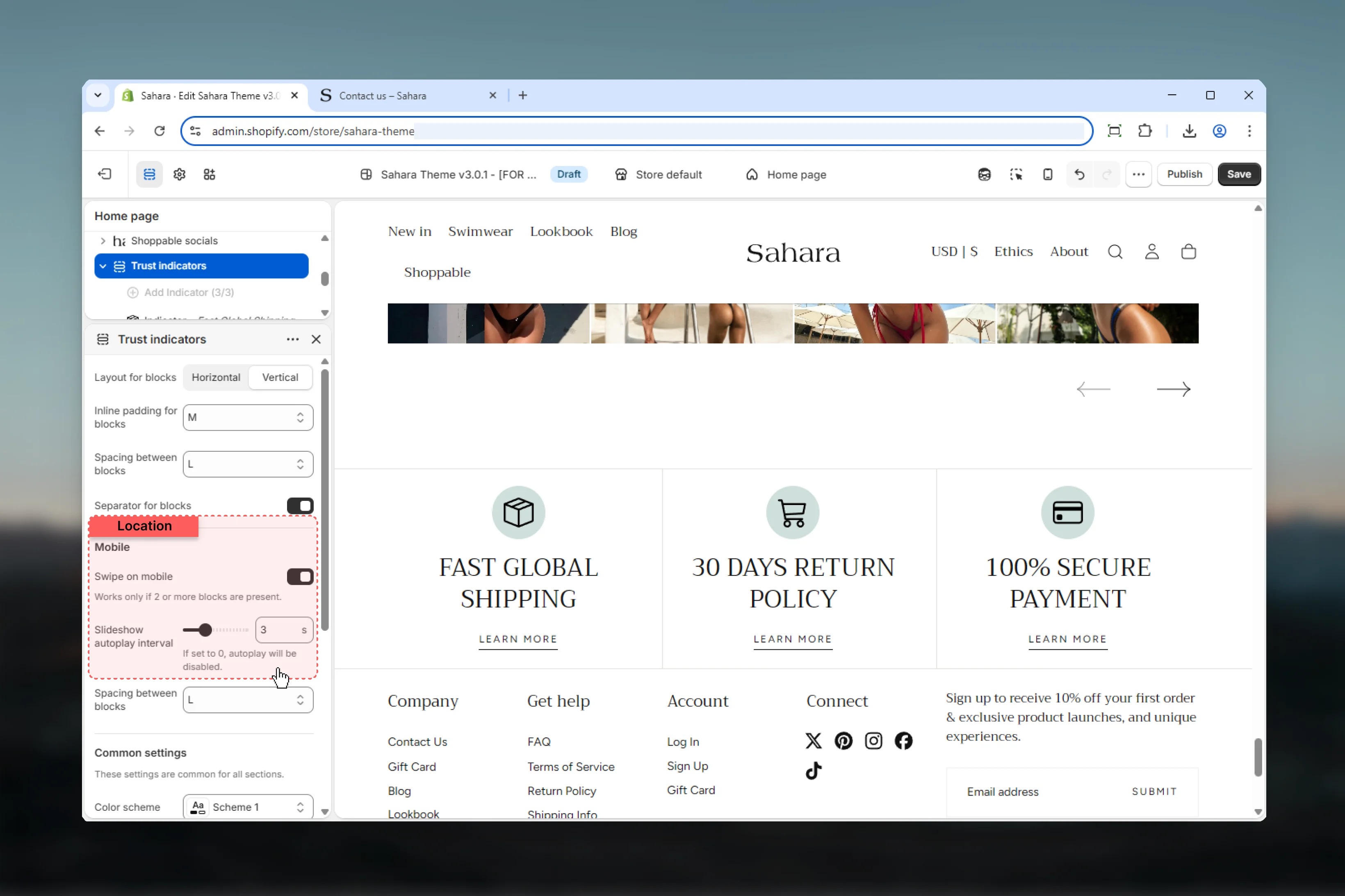
 ### Enable mobile slider
Converts indicators into a carousel on mobile devices (default: enabled).
When enabled, indicators become swipeable slides on mobile instead of stacking vertically.
**Benefits of mobile slider:**
* Saves vertical screen space
* Creates interactive experience
* Better for 3+ indicators
* Reduces mobile scroll length
**When to disable:**
* Only 1-2 indicators present
* Text content is very brief
* Prefer showing all indicators simultaneously
### Autoplay interval
Controls automatic slide advancement on mobile carousel.
**Range:** 0 – 10 seconds (default: 3)
* **0 seconds** - Disables autoplay (manual swipe only)
* **3-5 seconds** - Recommended for brief text
* **6-10 seconds** - Better for detailed content
Autoplay only works when mobile slider is enabled.
### Enable mobile slider
Converts indicators into a carousel on mobile devices (default: enabled).
When enabled, indicators become swipeable slides on mobile instead of stacking vertically.
**Benefits of mobile slider:**
* Saves vertical screen space
* Creates interactive experience
* Better for 3+ indicators
* Reduces mobile scroll length
**When to disable:**
* Only 1-2 indicators present
* Text content is very brief
* Prefer showing all indicators simultaneously
### Autoplay interval
Controls automatic slide advancement on mobile carousel.
**Range:** 0 – 10 seconds (default: 3)
* **0 seconds** - Disables autoplay (manual swipe only)
* **3-5 seconds** - Recommended for brief text
* **6-10 seconds** - Better for detailed content
Autoplay only works when mobile slider is enabled.
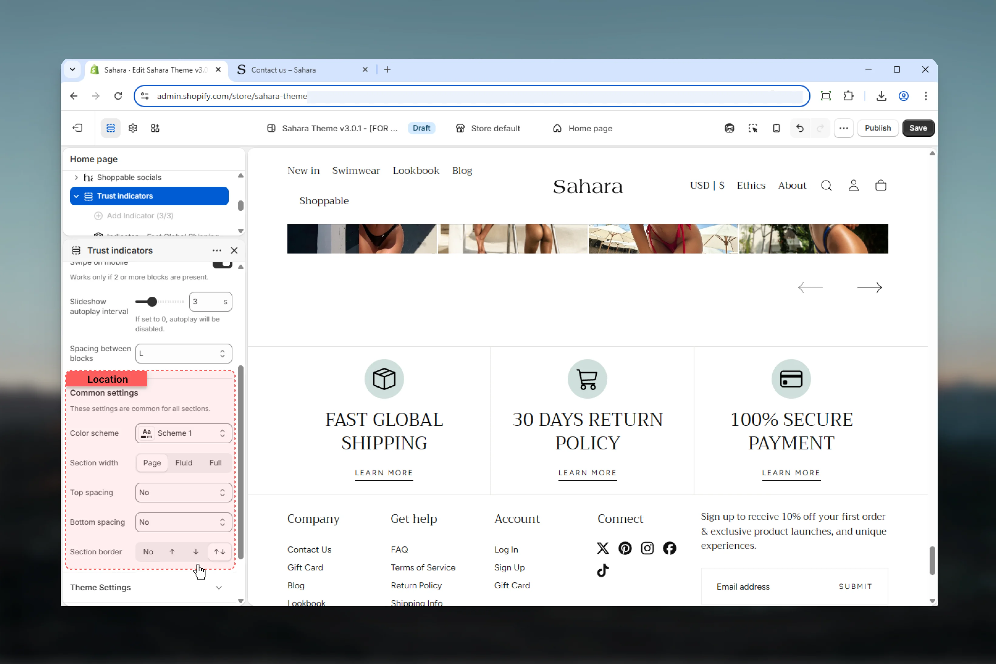
 ### Color scheme (Section)
Select the background and text color scheme for the entire section container.
### Section width
Controls the maximum width of the section.
Content limited to theme's page width (default).
**When to use:** Standard sections aligned with other content.
Content extends wider with some padding.
**When to use:** Emphasizing trust indicators with more space.
Content extends to full browser width.
**When to use:** Edge-to-edge designs, banner-style indicator bars.
### Spacing
Control vertical spacing around the section:
* **Spacing top** - Margin above the section (None, S, M, L, XL)
* **Spacing bottom** - Margin below the section (None, S, M, L, XL)
Both default to M (medium spacing).
### Section border
Add decorative borders to the section.
**Available options:** None (default), Top, Bottom, Both
### Color scheme (Section)
Select the background and text color scheme for the entire section container.
### Section width
Controls the maximum width of the section.
Content limited to theme's page width (default).
**When to use:** Standard sections aligned with other content.
Content extends wider with some padding.
**When to use:** Emphasizing trust indicators with more space.
Content extends to full browser width.
**When to use:** Edge-to-edge designs, banner-style indicator bars.
### Spacing
Control vertical spacing around the section:
* **Spacing top** - Margin above the section (None, S, M, L, XL)
* **Spacing bottom** - Margin below the section (None, S, M, L, XL)
Both default to M (medium spacing).
### Section border
Add decorative borders to the section.
**Available options:** None (default), Top, Bottom, Both
 ## Block settings
Each indicator block represents one trust message or guarantee. Maximum of 3 blocks allowed.
### Heading
Main text for the trust indicator.
**Best practices:**
* Keep it brief (2-5 words)
* Be specific and clear
* Focus on customer benefit
* Use active, confident language
**Good examples:**
* "Free Shipping Over \$50"
* "30-Day Money Back"
* "Secure Checkout"
* "24/7 Customer Support"
**Avoid:**
* Vague promises ("Great Service")
* Too much detail ("We ship your order using...")
* All caps (unless part of brand)
**Default:** "Heading goes here"
Supports rich text formatting (bold, italic, links).
### Heading size
Controls the visual size of the indicator heading.
**Available options:** XS, S, M, L (default), XL
Use consistent heading sizes across all indicators for visual harmony. L or M work best for most trust indicators.
### Link label
Optional button or link text displayed with the indicator.
**Use links to:**
* Explain guarantee or policy details
* Link to shipping information page
* Connect to return policy
* Show security certifications
**Link text examples:**
* "Learn more"
* "View details"
* "See policy"
* "Read more"
**Leave empty if:**
* Indicator is self-explanatory
* No supporting page exists
* Keeping design minimal
**Default:** "Learn more"
### Link URL
Destination URL for the link.
**Default:** "/"
If link URL is set but link label is empty, no link will display.
### Icon (Custom image)
Upload a custom icon or badge image.
**Custom icon recommendations:**
* Square or circular shapes work best
* Minimum 100x100px, recommended 200x200px
* PNG format with transparent background
* Simple, recognizable designs
* Consistent style across all indicators
**Common icon types:**
* Shipping truck for delivery
* Shield for security/guarantee
* Credit card for payment options
* Return/refresh for money-back
* Lock for secure checkout
* Star for quality guarantee
Use SVG icons when possible for crisp display at any size.
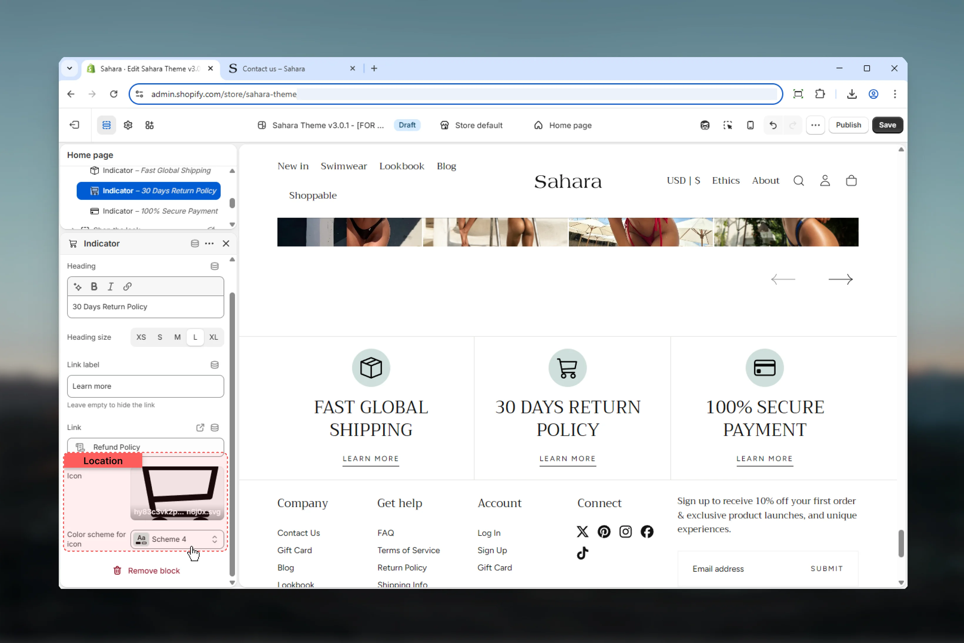
### Icon color scheme
Select a color scheme specifically for the icon area.
This allows the icon to have a different background/color than the rest of the indicator block.
## Block settings
Each indicator block represents one trust message or guarantee. Maximum of 3 blocks allowed.
### Heading
Main text for the trust indicator.
**Best practices:**
* Keep it brief (2-5 words)
* Be specific and clear
* Focus on customer benefit
* Use active, confident language
**Good examples:**
* "Free Shipping Over \$50"
* "30-Day Money Back"
* "Secure Checkout"
* "24/7 Customer Support"
**Avoid:**
* Vague promises ("Great Service")
* Too much detail ("We ship your order using...")
* All caps (unless part of brand)
**Default:** "Heading goes here"
Supports rich text formatting (bold, italic, links).
### Heading size
Controls the visual size of the indicator heading.
**Available options:** XS, S, M, L (default), XL
Use consistent heading sizes across all indicators for visual harmony. L or M work best for most trust indicators.
### Link label
Optional button or link text displayed with the indicator.
**Use links to:**
* Explain guarantee or policy details
* Link to shipping information page
* Connect to return policy
* Show security certifications
**Link text examples:**
* "Learn more"
* "View details"
* "See policy"
* "Read more"
**Leave empty if:**
* Indicator is self-explanatory
* No supporting page exists
* Keeping design minimal
**Default:** "Learn more"
### Link URL
Destination URL for the link.
**Default:** "/"
If link URL is set but link label is empty, no link will display.
### Icon (Custom image)
Upload a custom icon or badge image.
**Custom icon recommendations:**
* Square or circular shapes work best
* Minimum 100x100px, recommended 200x200px
* PNG format with transparent background
* Simple, recognizable designs
* Consistent style across all indicators
**Common icon types:**
* Shipping truck for delivery
* Shield for security/guarantee
* Credit card for payment options
* Return/refresh for money-back
* Lock for secure checkout
* Star for quality guarantee
Use SVG icons when possible for crisp display at any size.
### Icon color scheme
Select a color scheme specifically for the icon area.
This allows the icon to have a different background/color than the rest of the indicator block.
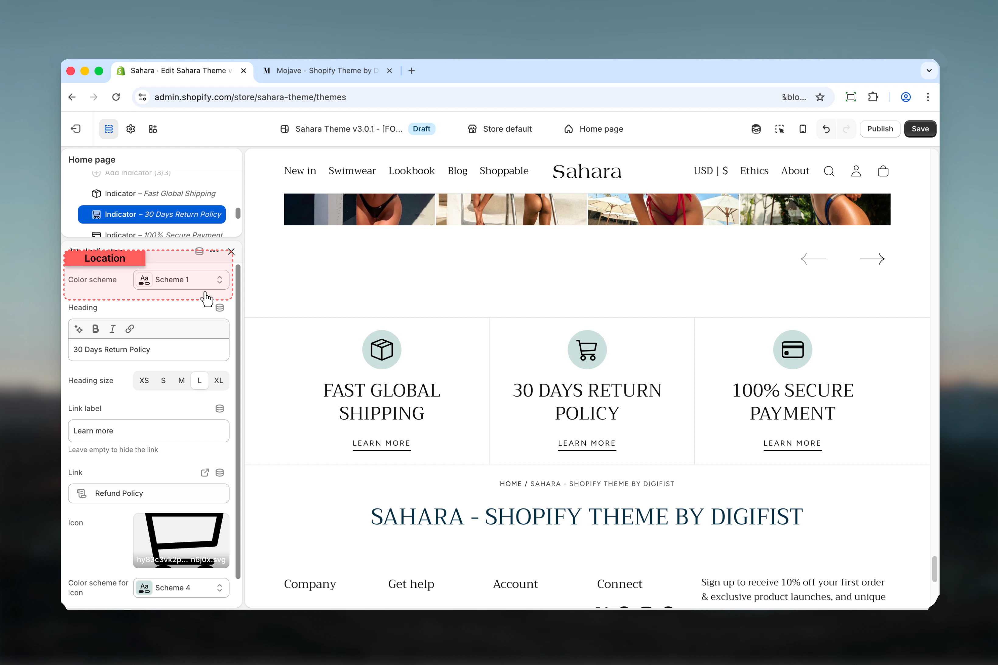
 ### Color scheme (Block)
Select an individual color scheme for this specific indicator block.
Each indicator can have its own color scheme separate from the section.
**When to use different colors:**
* Creating visual variety
* Emphasizing specific indicators
* Matching brand colors to message type
* Differentiating indicator categories
**When to use uniform colors:**
* Professional, cohesive design
* Minimalist aesthetics
* When icons provide enough visual variety
### Color scheme (Block)
Select an individual color scheme for this specific indicator block.
Each indicator can have its own color scheme separate from the section.
**When to use different colors:**
* Creating visual variety
* Emphasizing specific indicators
* Matching brand colors to message type
* Differentiating indicator categories
**When to use uniform colors:**
* Professional, cohesive design
* Minimalist aesthetics
* When icons provide enough visual variety
 ## Best practices
Use 2-3 indicators maximum. Too many dilute impact and reduce credibility.
Use concrete details ("Free shipping over \$50") instead of vague promises ("Great service").
Use similar icon styles (all line art or all filled) for cohesive appearance.
Place near conversion points: below product descriptions, above add-to-cart, or in footer.
Only display guarantees you actually honor. False promises damage trust severely.
Enable mobile slider for 3 indicators to save screen space and improve navigation.
## Common use cases
Display 3 core value props: "Free Shipping \$50+", "Easy Returns", "Secure Checkout". Use horizontal layout with shipping/return/lock icons. Place below header or above footer on all pages.
Show 2-3 product-specific guarantees: "Quality Guaranteed", "30-Day Returns", "Lifetime Warranty". Use vertical layout below product description. Link to detailed policy pages.
Display security indicators: "Secure Checkout", "Encrypted Payment", "Money-Back Guarantee". Horizontal layout, minimal spacing. Place above payment form to reduce cart abandonment.
Showcase brand promises: "Est. 2010", "50k+ Happy Customers", "24/7 Support". Vertical layout with custom badge icons. Place after hero section or before testimonials.
Display operational details: "Free Shipping", "Call Us: XXX", "Chat Support". Horizontal layout, full-width section. Enable separators between blocks for clear division.
## Related sections
Display customer reviews for social proof
Add detailed policy or guarantee explanations
## Best practices
Use 2-3 indicators maximum. Too many dilute impact and reduce credibility.
Use concrete details ("Free shipping over \$50") instead of vague promises ("Great service").
Use similar icon styles (all line art or all filled) for cohesive appearance.
Place near conversion points: below product descriptions, above add-to-cart, or in footer.
Only display guarantees you actually honor. False promises damage trust severely.
Enable mobile slider for 3 indicators to save screen space and improve navigation.
## Common use cases
Display 3 core value props: "Free Shipping \$50+", "Easy Returns", "Secure Checkout". Use horizontal layout with shipping/return/lock icons. Place below header or above footer on all pages.
Show 2-3 product-specific guarantees: "Quality Guaranteed", "30-Day Returns", "Lifetime Warranty". Use vertical layout below product description. Link to detailed policy pages.
Display security indicators: "Secure Checkout", "Encrypted Payment", "Money-Back Guarantee". Horizontal layout, minimal spacing. Place above payment form to reduce cart abandonment.
Showcase brand promises: "Est. 2010", "50k+ Happy Customers", "24/7 Support". Vertical layout with custom badge icons. Place after hero section or before testimonials.
Display operational details: "Free Shipping", "Call Us: XXX", "Chat Support". Horizontal layout, full-width section. Enable separators between blocks for clear division.
## Related sections
Display customer reviews for social proof
Add detailed policy or guarantee explanations