> ## Documentation Index
> Fetch the complete documentation index at: https://docs.digifist.com/llms.txt
> Use this file to discover all available pages before exploring further.
# Colors
> Create and manage color schemes that define your store's visual identity
Color settings define the visual identity of your entire store through reusable color schemes containing coordinated colors for backgrounds, text, buttons, and UI elements. Color schemes are powerful - changing a single scheme's colors instantly updates all sections using it throughout your store. Create and configure color schemes at the start of theme setup to establish your brand's visual foundation and ensure consistent design across all pages and sections.
## What this controls
Color settings define the visual identity of your entire store through reusable color schemes. Each scheme contains coordinated colors for backgrounds, text, buttons, and UI elements that sections can inherit and apply consistently.
Color schemes are powerful - changing a scheme's colors updates all sections using it simultaneously.
## How it works
Sahara uses Shopify's **color scheme system**:
1. **Define color schemes:** Create multiple schemes (light, dark, accent, etc.)
2. **Sections inherit schemes:** Each section chooses which scheme to use
3. **Global updates:** Changing a scheme's colors updates all sections using it
4. **Section overrides:** Individual sections can override specific colors when needed
This system ensures visual consistency while maintaining flexibility.
Most stores use 2-4 color schemes: a light scheme for main content, a dark scheme for hero sections, and 1-2 accent schemes for emphasis.
## Getting started
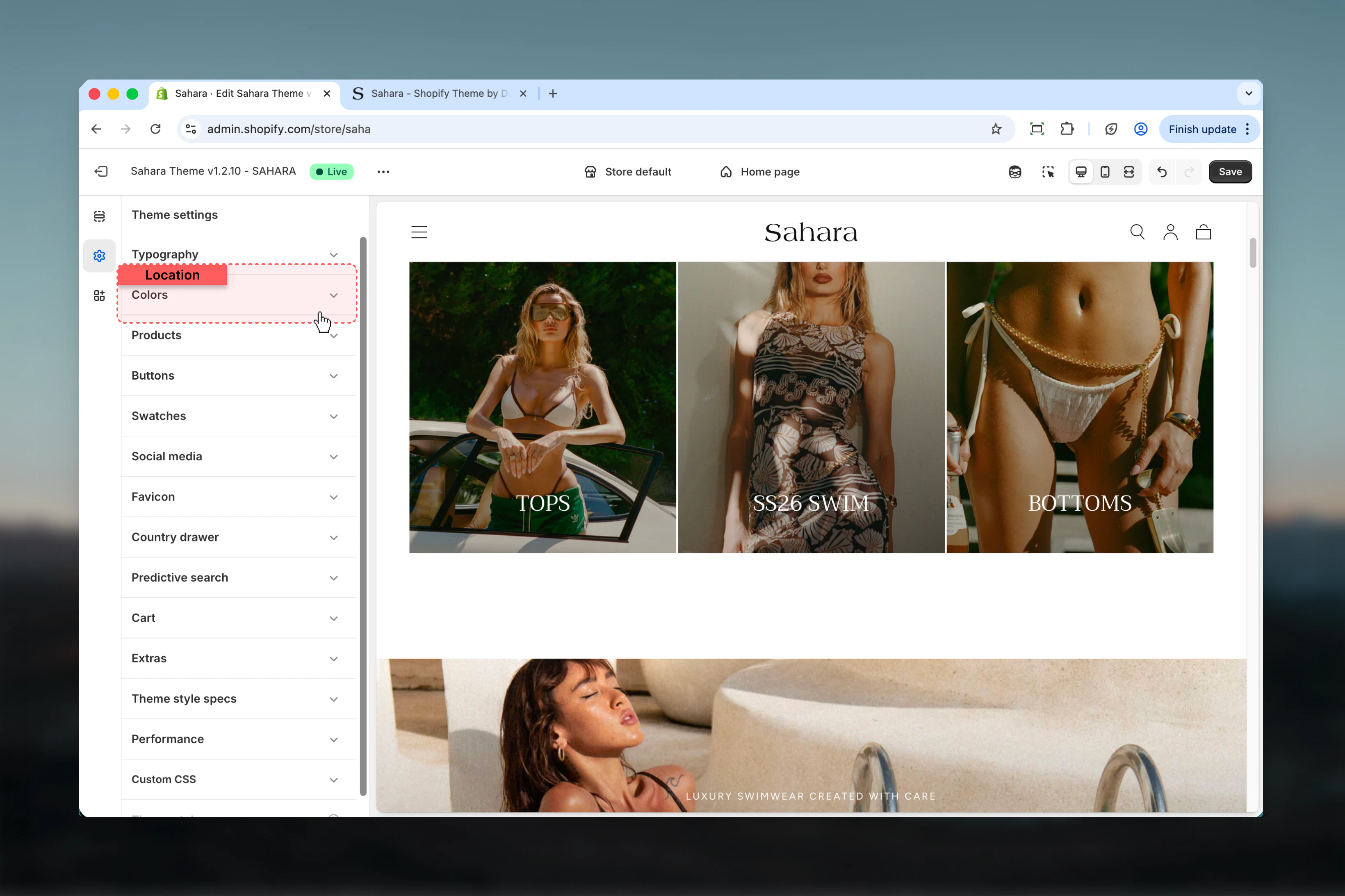
From Shopify admin → **Online Store** → **Themes** → **Customize**
Click **Theme settings** (gear icon in sidebar) → Select **Colors**
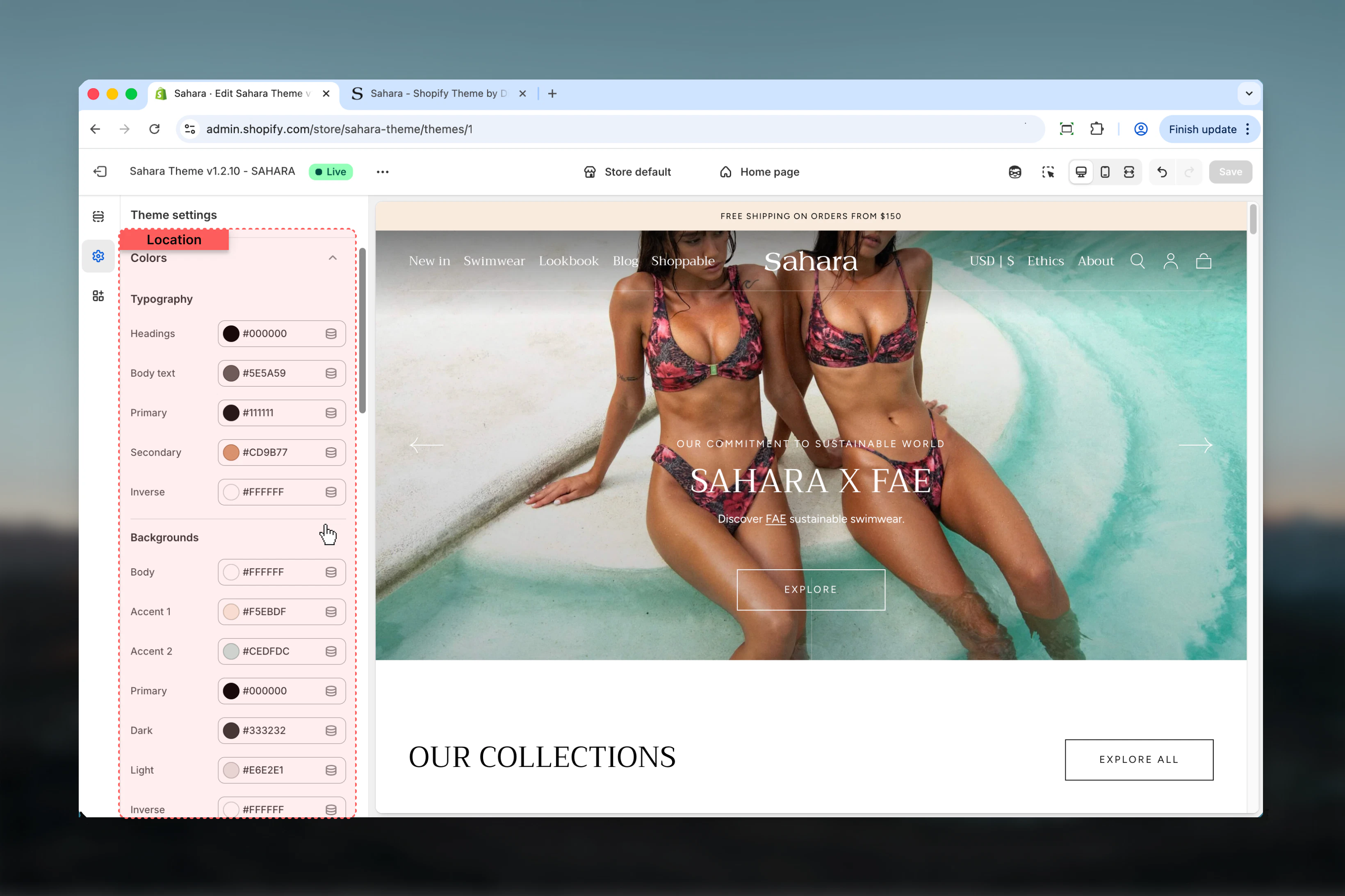
Click on "Scheme 1", "Scheme 2", etc. to expand color options
Adjust background, text, button, and element colors within the scheme
Ensure text has sufficient contrast against backgrounds (4.5:1 minimum)
## Location
**Path:** Theme settings → Colors
 ## Settings
### Understanding Color Schemes
Color schemes are collections of coordinated colors that work together harmoniously. Sahara includes multiple pre-configured schemes that you can customize.
**Available Schemes:**
* **Scheme 1:** Primary color scheme for main content
* **Scheme 2:** Alternative scheme for visual variety
* **Scheme 3:** Additional variation for special sections
* **Inverse:** High-contrast scheme (typically dark)
**Global Definition:**
* Define color schemes in Theme Settings → Colors
* Each scheme contains all necessary colors
* Schemes are reusable across sections
**Section Application:**
* Sections choose which scheme to use
* Changing section's scheme changes all its colors
* Sections inherit scheme colors automatically
**Update Behavior:**
* Editing a scheme updates ALL sections using it
* Provides instant visual consistency
* Test changes across multiple sections before saving
**Example:**
If 10 sections use "Scheme 1" and you change its background from white to cream, all 10 sections update automatically.
**Minimal Approach (2 schemes):**
* **Scheme 1 (Light):** White/light background, dark text
* **Scheme 2 (Dark):** Dark background, light text
* Use: Simple, consistent stores
**Standard Approach (3 schemes):**
* **Scheme 1 (Light):** Primary content scheme
* **Scheme 2 (Accent):** Brand color emphasis
* **Scheme 3 (Inverse):** Dark sections/footer
* Use: Most e-commerce stores
**Advanced Approach (4+ schemes):**
* **Scheme 1:** Main content (white)
* **Scheme 2:** Light accent (cream/beige)
* **Scheme 3:** Brand color emphasis
* **Scheme 4:** Dark/inverse
* Use: Complex stores with varied visual sections
**Best Practice:** Start with 2-3 schemes. Add more only if needed for specific design requirements.
### Background Color
The foundation color for sections using this scheme.
**Default (Scheme 1):** #FFFFFF (white)
Choose background colors that provide sufficient contrast with text. Light backgrounds need dark text, dark backgrounds need light text.
**Light Backgrounds:**
* White (#FFFFFF) - Clean, minimal
* Off-white (#F9F9F9) - Softer than pure white
* Cream (#FFF8F0) - Warm, inviting
* Light gray (#F5F5F5) - Neutral, professional
**Dark Backgrounds:**
* Near-black (#1A1A1A) - Modern, sleek
* Dark gray (#2D2D2D) - Less harsh than pure black
* Dark blue (#132D40) - Sahara default, professional
* Charcoal (#333333) - Versatile neutral
**Colored Backgrounds:**
* Use sparingly (accent sections only)
* Keep saturation low (10-20%)
* Ensure text contrast remains WCAG compliant
* Test on multiple devices
**Never use:**
* Pure black (#000000) - Too harsh, poor readability
* High saturation colors - Strain eyes
* Similar colors for adjacent sections - Creates confusion
**WCAG 2.1 Standards:**
**Level AA (Minimum - Required):**
* Body text (14-18px): **4.5:1** contrast ratio
* Large text (18px+ or 14px+ bold): **3.0:1** contrast ratio
* UI elements: **3.0:1** minimum
**Level AAA (Enhanced - Recommended):**
* Body text: **7.0:1** contrast ratio
* Large text: **4.5:1** contrast ratio
**Testing Tools:**
* WebAIM Contrast Checker: [https://webaim.org/resources/contrastchecker/](https://webaim.org/resources/contrastchecker/)
* Chrome DevTools: Lighthouse accessibility audit
* Shopify Theme Customizer: Built-in contrast warnings
**Common Failures:**
* Light gray text on white: Often fails (2:1 ratio)
* Medium gray on light gray: Insufficient contrast
* Colored text on colored background: Needs careful testing
### Background Gradient
Optional gradient overlay on top of the solid background color.
**Default:** None
Use gradients sparingly. Subtle gradients (5-10% opacity) work best. Strong gradients can reduce text readability.
**Good Use Cases:**
* Subtle depth on hero sections (5-10% opacity)
* Directional emphasis (dark to light, top to bottom)
* Brand differentiation (using brand colors subtly)
* Image overlays (darken bottom for text readability)
**Avoid Gradients:**
* Text-heavy sections (reduces readability)
* Product grids (distracting)
* Navigation areas (needs clarity)
* Forms and inputs (functional areas)
**Gradient Best Practices:**
* Keep opacity low (5-15% maximum)
* Use gradual transitions (avoid harsh stops)
* Match gradient direction to content flow
* Test on mobile (gradients affect small screens differently)
* Ensure text remains readable over entire gradient
### Primary Text
Main body text color - used for paragraphs, product descriptions, and general content.
**Default (Scheme 1):** #132D40 (dark blue-gray)
**Requirement:** Must have **4.5:1** contrast against background for body text.
### Secondary Text
Supporting text color - used for metadata, captions, less prominent information.
**Default (Scheme 1):** #367CAC (medium blue)
Secondary text should be visually distinct from primary text but still maintain adequate contrast (3.0:1 minimum).
### Heading Text
Color for all heading elements (H1 through H6).
**Default (Scheme 1):** #132D40 (same as primary text)
**Monochromatic (Recommended):**
* Primary text: Dark (#132D40)
* Secondary text: Medium gray (#65706E)
* Headings: Same as primary or slightly darker
* Links: Same as primary with underline
**Why it works:** Maximum readability, professional appearance, easy to maintain.
**Brand Color Emphasis:**
* Primary text: Neutral dark (#111111)
* Secondary text: Medium gray
* Headings: Brand color (#367CAC)
* Links: Brand color
**Why it works:** Brand personality while maintaining readability for body content.
**Contrast Variation:**
* Primary text: Near-black (#1A1A1A)
* Secondary text: Medium gray (#666666)
* Headings: Pure black (#000000)
* Links: Brand accent
**Why it works:** Strong hierarchy, clear visual distinction between content types.
**Link Requirements:**
1. **Contrast:** 4.5:1 minimum against background
2. **Distinction:** Visually different from body text
3. **Consistency:** Same color throughout section
4. **States:** Clear hover/focus/visited states
**Good Link Colors:**
* **Brand color** - Reinforces identity
* **Blue shades** - Universal link convention
* **Underlined text** - Clearest indicator
**Avoid:**
* Red links (looks like errors)
* Same color as body text without underline
* Low contrast colors
* Colors that clash with brand
**Link States:**
* Default: Brand color or blue
* Hover: Slightly darker or underlined
* Visited: Slightly muted (optional)
* Focus: Outlined for keyboard navigation
### Filled Button Background
Background color for primary action buttons.
**Default (Scheme 1):** #132D40 (dark blue-gray)
### Filled Button Label
Text color on filled buttons.
**Default (Scheme 1):** #FFFFFF (white)
**Requirement:** Must have **4.5:1** contrast against button background.
Filled buttons should be your primary call-to-action. Use brand colors here for maximum impact.
### Outlined Button Label
Text and border color for outlined (secondary) buttons.
**Default (Scheme 1):** #132D40 (dark blue-gray)
**Primary/Secondary Pattern (Recommended):**
* **Filled (Primary):** Brand color background, white text
* **Outlined (Secondary):** Transparent background, brand color text/border
* **Usage:** Clear visual hierarchy between actions
**Example:**
* Primary: "Add to Cart" (brand color, bold)
* Secondary: "View Details" (outlined, subtle)
**High Contrast Pattern:**
* **Filled:** Dark background (#132D40), white text
* **Outlined:** White background, dark border/text
* **Usage:** Maximum visibility, accessibility focus
**Monochromatic Pattern:**
* **Filled:** Dark gray, white text
* **Outlined:** Light gray, dark text
* **Usage:** Minimal, professional aesthetic
**Multi-Color Pattern:**
* **Filled:** Brand primary color
* **Outlined:** Brand secondary color
* **Usage:** Multiple CTAs with different emphasis
**Contrast Requirements:**
* Button text vs button background: **4.5:1** minimum
* Button vs section background: **3.0:1** minimum (for outlined buttons)
* Focus indicator: **3.0:1** minimum
**Size Requirements:**
* Minimum touch target: 44×44px (mobile)
* Minimum spacing between buttons: 8px
* Clear focus states for keyboard navigation
**State Indicators:**
* **Default:** Base colors
* **Hover:** Slightly darker or lighter (10-15%)
* **Active/Pressed:** Even more contrast (20-30%)
* **Disabled:** Reduced opacity (40-60%)
* **Focus:** Visible outline (3px minimum)
**Testing Checklist:**
Test on light and dark backgrounds
Verify hover states are visible
Check keyboard focus indicators
Test with screen readers
Validate on mobile devices
**Use Filled Buttons For:**
* Primary actions (Add to Cart, Checkout, Subscribe)
* Single most important action on screen
* Final step in a process
* Conversion-focused CTAs
**Use Outlined Buttons For:**
* Secondary actions (View Details, Learn More)
* Multiple buttons in same area
* Less critical actions
* Navigation to supporting content
**Button Hierarchy Example:**
**Product Page:**
* Filled: "Add to Cart" (primary conversion)
* Outlined: "View Size Guide" (supporting info)
**Cart Page:**
* Filled: "Checkout" (primary goal)
* Outlined: "Continue Shopping" (secondary)
**Homepage Hero:**
* Filled: "Shop Now" (main CTA)
* Outlined: "Learn More" (exploratory)
### Borders and Elements
Color for borders, dividers, card outlines, and decorative lines.
**Default (Scheme 1):** #EBEBEB (light gray)
Borders should be subtle. Use 10-20% opacity or light grays to avoid overwhelming content.
### Badges Background
Background color for product badges and tags (Sale, New, Limited, etc.).
**Default (Scheme 1):** #111111 (near black)
### Badges Text
Text color on product badges.
**Default (Scheme 1):** #FFFFFF (white)
Use high-contrast badge colors for maximum visibility. Black badges with white text or brand color badges work well.
### Progress Bar
Color for progress indicators (cart goals, quantity limits, etc.).
**Default (Scheme 1):** #65706E (medium gray)
### Image Placeholder Background
Background color shown when product images are missing or loading.
**Default (Scheme 1):** #F2F3F7 (very light gray)
### Shadows
Color used for box shadows and drop shadows (typically used with opacity).
**Default (Scheme 1):** #000000 (black)
**Subtle Borders (Recommended):**
* Light backgrounds: #EBEBEB to #F0F0F0 (5-10% opacity)
* Dark backgrounds: #333333 to #444444 (10-15% opacity)
* Purpose: Define areas without dominating
**Strong Borders:**
* Light backgrounds: #CCCCCC (20-30% opacity)
* Dark backgrounds: #666666 (30-40% opacity)
* Purpose: Clear separation, formal appearance
**Colored Borders:**
* Use brand color at low opacity (5-10%)
* Only for emphasis sections
* Ensure doesn't clash with content
**When to Use Borders:**
* Card separation in grids
* Form input fields
* Section dividers
* Header/footer separation
**When to Avoid Borders:**
* Already using box shadows
* Sufficient whitespace exists
* Minimal/clean design aesthetic
* Dark mode (use subtle lines instead)
**High Impact (Recommended):**
* Background: Black (#111111) or brand color
* Text: White (#FFFFFF)
* Purpose: Maximum visibility, urgency
**Subtle Accent:**
* Background: Light gray (#F5F5F5)
* Text: Dark gray (#333333)
* Purpose: Informative without dominating
**Status-Based Colors:**
* **Sale:** Red background, white text
* **New:** Blue/brand color, white text
* **Limited:** Orange/yellow, dark text
* **Sold Out:** Gray, white text
**Badge Placement:**
* Top-left corner (standard)
* Top-right corner (alternative)
* Avoid bottom (less visible)
**Badge Size:**
* Small: Subtle, non-intrusive
* Medium: Standard visibility (recommended)
* Large: High emphasis (use sparingly)
**Shadow Types:**
**Subtle Elevation (Recommended):**
* Opacity: 5-10%
* Blur: 8-16px
* Y-offset: 2-4px
* Purpose: Card separation, hover states
**Medium Elevation:**
* Opacity: 10-20%
* Blur: 16-32px
* Y-offset: 4-8px
* Purpose: Modals, dropdowns, important cards
**Strong Elevation:**
* Opacity: 20-30%
* Blur: 32-48px
* Y-offset: 8-16px
* Purpose: Overlays, critical modals
**When to Use Shadows:**
* Card elevation in grids
* Button hover states
* Dropdown menus
* Modal overlays
* Floating elements
**When to Avoid Shadows:**
* Flat/minimal design
* Dark mode (use borders instead)
* High-performance needs
* Text elements
**Shadow Performance:**
* Use sparingly (CSS performance)
* Prefer on hover, not permanent
* Consider box-shadow alternatives
* Test on mobile devices
## Settings
### Understanding Color Schemes
Color schemes are collections of coordinated colors that work together harmoniously. Sahara includes multiple pre-configured schemes that you can customize.
**Available Schemes:**
* **Scheme 1:** Primary color scheme for main content
* **Scheme 2:** Alternative scheme for visual variety
* **Scheme 3:** Additional variation for special sections
* **Inverse:** High-contrast scheme (typically dark)
**Global Definition:**
* Define color schemes in Theme Settings → Colors
* Each scheme contains all necessary colors
* Schemes are reusable across sections
**Section Application:**
* Sections choose which scheme to use
* Changing section's scheme changes all its colors
* Sections inherit scheme colors automatically
**Update Behavior:**
* Editing a scheme updates ALL sections using it
* Provides instant visual consistency
* Test changes across multiple sections before saving
**Example:**
If 10 sections use "Scheme 1" and you change its background from white to cream, all 10 sections update automatically.
**Minimal Approach (2 schemes):**
* **Scheme 1 (Light):** White/light background, dark text
* **Scheme 2 (Dark):** Dark background, light text
* Use: Simple, consistent stores
**Standard Approach (3 schemes):**
* **Scheme 1 (Light):** Primary content scheme
* **Scheme 2 (Accent):** Brand color emphasis
* **Scheme 3 (Inverse):** Dark sections/footer
* Use: Most e-commerce stores
**Advanced Approach (4+ schemes):**
* **Scheme 1:** Main content (white)
* **Scheme 2:** Light accent (cream/beige)
* **Scheme 3:** Brand color emphasis
* **Scheme 4:** Dark/inverse
* Use: Complex stores with varied visual sections
**Best Practice:** Start with 2-3 schemes. Add more only if needed for specific design requirements.
### Background Color
The foundation color for sections using this scheme.
**Default (Scheme 1):** #FFFFFF (white)
Choose background colors that provide sufficient contrast with text. Light backgrounds need dark text, dark backgrounds need light text.
**Light Backgrounds:**
* White (#FFFFFF) - Clean, minimal
* Off-white (#F9F9F9) - Softer than pure white
* Cream (#FFF8F0) - Warm, inviting
* Light gray (#F5F5F5) - Neutral, professional
**Dark Backgrounds:**
* Near-black (#1A1A1A) - Modern, sleek
* Dark gray (#2D2D2D) - Less harsh than pure black
* Dark blue (#132D40) - Sahara default, professional
* Charcoal (#333333) - Versatile neutral
**Colored Backgrounds:**
* Use sparingly (accent sections only)
* Keep saturation low (10-20%)
* Ensure text contrast remains WCAG compliant
* Test on multiple devices
**Never use:**
* Pure black (#000000) - Too harsh, poor readability
* High saturation colors - Strain eyes
* Similar colors for adjacent sections - Creates confusion
**WCAG 2.1 Standards:**
**Level AA (Minimum - Required):**
* Body text (14-18px): **4.5:1** contrast ratio
* Large text (18px+ or 14px+ bold): **3.0:1** contrast ratio
* UI elements: **3.0:1** minimum
**Level AAA (Enhanced - Recommended):**
* Body text: **7.0:1** contrast ratio
* Large text: **4.5:1** contrast ratio
**Testing Tools:**
* WebAIM Contrast Checker: [https://webaim.org/resources/contrastchecker/](https://webaim.org/resources/contrastchecker/)
* Chrome DevTools: Lighthouse accessibility audit
* Shopify Theme Customizer: Built-in contrast warnings
**Common Failures:**
* Light gray text on white: Often fails (2:1 ratio)
* Medium gray on light gray: Insufficient contrast
* Colored text on colored background: Needs careful testing
### Background Gradient
Optional gradient overlay on top of the solid background color.
**Default:** None
Use gradients sparingly. Subtle gradients (5-10% opacity) work best. Strong gradients can reduce text readability.
**Good Use Cases:**
* Subtle depth on hero sections (5-10% opacity)
* Directional emphasis (dark to light, top to bottom)
* Brand differentiation (using brand colors subtly)
* Image overlays (darken bottom for text readability)
**Avoid Gradients:**
* Text-heavy sections (reduces readability)
* Product grids (distracting)
* Navigation areas (needs clarity)
* Forms and inputs (functional areas)
**Gradient Best Practices:**
* Keep opacity low (5-15% maximum)
* Use gradual transitions (avoid harsh stops)
* Match gradient direction to content flow
* Test on mobile (gradients affect small screens differently)
* Ensure text remains readable over entire gradient
### Primary Text
Main body text color - used for paragraphs, product descriptions, and general content.
**Default (Scheme 1):** #132D40 (dark blue-gray)
**Requirement:** Must have **4.5:1** contrast against background for body text.
### Secondary Text
Supporting text color - used for metadata, captions, less prominent information.
**Default (Scheme 1):** #367CAC (medium blue)
Secondary text should be visually distinct from primary text but still maintain adequate contrast (3.0:1 minimum).
### Heading Text
Color for all heading elements (H1 through H6).
**Default (Scheme 1):** #132D40 (same as primary text)
**Monochromatic (Recommended):**
* Primary text: Dark (#132D40)
* Secondary text: Medium gray (#65706E)
* Headings: Same as primary or slightly darker
* Links: Same as primary with underline
**Why it works:** Maximum readability, professional appearance, easy to maintain.
**Brand Color Emphasis:**
* Primary text: Neutral dark (#111111)
* Secondary text: Medium gray
* Headings: Brand color (#367CAC)
* Links: Brand color
**Why it works:** Brand personality while maintaining readability for body content.
**Contrast Variation:**
* Primary text: Near-black (#1A1A1A)
* Secondary text: Medium gray (#666666)
* Headings: Pure black (#000000)
* Links: Brand accent
**Why it works:** Strong hierarchy, clear visual distinction between content types.
**Link Requirements:**
1. **Contrast:** 4.5:1 minimum against background
2. **Distinction:** Visually different from body text
3. **Consistency:** Same color throughout section
4. **States:** Clear hover/focus/visited states
**Good Link Colors:**
* **Brand color** - Reinforces identity
* **Blue shades** - Universal link convention
* **Underlined text** - Clearest indicator
**Avoid:**
* Red links (looks like errors)
* Same color as body text without underline
* Low contrast colors
* Colors that clash with brand
**Link States:**
* Default: Brand color or blue
* Hover: Slightly darker or underlined
* Visited: Slightly muted (optional)
* Focus: Outlined for keyboard navigation
### Filled Button Background
Background color for primary action buttons.
**Default (Scheme 1):** #132D40 (dark blue-gray)
### Filled Button Label
Text color on filled buttons.
**Default (Scheme 1):** #FFFFFF (white)
**Requirement:** Must have **4.5:1** contrast against button background.
Filled buttons should be your primary call-to-action. Use brand colors here for maximum impact.
### Outlined Button Label
Text and border color for outlined (secondary) buttons.
**Default (Scheme 1):** #132D40 (dark blue-gray)
**Primary/Secondary Pattern (Recommended):**
* **Filled (Primary):** Brand color background, white text
* **Outlined (Secondary):** Transparent background, brand color text/border
* **Usage:** Clear visual hierarchy between actions
**Example:**
* Primary: "Add to Cart" (brand color, bold)
* Secondary: "View Details" (outlined, subtle)
**High Contrast Pattern:**
* **Filled:** Dark background (#132D40), white text
* **Outlined:** White background, dark border/text
* **Usage:** Maximum visibility, accessibility focus
**Monochromatic Pattern:**
* **Filled:** Dark gray, white text
* **Outlined:** Light gray, dark text
* **Usage:** Minimal, professional aesthetic
**Multi-Color Pattern:**
* **Filled:** Brand primary color
* **Outlined:** Brand secondary color
* **Usage:** Multiple CTAs with different emphasis
**Contrast Requirements:**
* Button text vs button background: **4.5:1** minimum
* Button vs section background: **3.0:1** minimum (for outlined buttons)
* Focus indicator: **3.0:1** minimum
**Size Requirements:**
* Minimum touch target: 44×44px (mobile)
* Minimum spacing between buttons: 8px
* Clear focus states for keyboard navigation
**State Indicators:**
* **Default:** Base colors
* **Hover:** Slightly darker or lighter (10-15%)
* **Active/Pressed:** Even more contrast (20-30%)
* **Disabled:** Reduced opacity (40-60%)
* **Focus:** Visible outline (3px minimum)
**Testing Checklist:**
Test on light and dark backgrounds
Verify hover states are visible
Check keyboard focus indicators
Test with screen readers
Validate on mobile devices
**Use Filled Buttons For:**
* Primary actions (Add to Cart, Checkout, Subscribe)
* Single most important action on screen
* Final step in a process
* Conversion-focused CTAs
**Use Outlined Buttons For:**
* Secondary actions (View Details, Learn More)
* Multiple buttons in same area
* Less critical actions
* Navigation to supporting content
**Button Hierarchy Example:**
**Product Page:**
* Filled: "Add to Cart" (primary conversion)
* Outlined: "View Size Guide" (supporting info)
**Cart Page:**
* Filled: "Checkout" (primary goal)
* Outlined: "Continue Shopping" (secondary)
**Homepage Hero:**
* Filled: "Shop Now" (main CTA)
* Outlined: "Learn More" (exploratory)
### Borders and Elements
Color for borders, dividers, card outlines, and decorative lines.
**Default (Scheme 1):** #EBEBEB (light gray)
Borders should be subtle. Use 10-20% opacity or light grays to avoid overwhelming content.
### Badges Background
Background color for product badges and tags (Sale, New, Limited, etc.).
**Default (Scheme 1):** #111111 (near black)
### Badges Text
Text color on product badges.
**Default (Scheme 1):** #FFFFFF (white)
Use high-contrast badge colors for maximum visibility. Black badges with white text or brand color badges work well.
### Progress Bar
Color for progress indicators (cart goals, quantity limits, etc.).
**Default (Scheme 1):** #65706E (medium gray)
### Image Placeholder Background
Background color shown when product images are missing or loading.
**Default (Scheme 1):** #F2F3F7 (very light gray)
### Shadows
Color used for box shadows and drop shadows (typically used with opacity).
**Default (Scheme 1):** #000000 (black)
**Subtle Borders (Recommended):**
* Light backgrounds: #EBEBEB to #F0F0F0 (5-10% opacity)
* Dark backgrounds: #333333 to #444444 (10-15% opacity)
* Purpose: Define areas without dominating
**Strong Borders:**
* Light backgrounds: #CCCCCC (20-30% opacity)
* Dark backgrounds: #666666 (30-40% opacity)
* Purpose: Clear separation, formal appearance
**Colored Borders:**
* Use brand color at low opacity (5-10%)
* Only for emphasis sections
* Ensure doesn't clash with content
**When to Use Borders:**
* Card separation in grids
* Form input fields
* Section dividers
* Header/footer separation
**When to Avoid Borders:**
* Already using box shadows
* Sufficient whitespace exists
* Minimal/clean design aesthetic
* Dark mode (use subtle lines instead)
**High Impact (Recommended):**
* Background: Black (#111111) or brand color
* Text: White (#FFFFFF)
* Purpose: Maximum visibility, urgency
**Subtle Accent:**
* Background: Light gray (#F5F5F5)
* Text: Dark gray (#333333)
* Purpose: Informative without dominating
**Status-Based Colors:**
* **Sale:** Red background, white text
* **New:** Blue/brand color, white text
* **Limited:** Orange/yellow, dark text
* **Sold Out:** Gray, white text
**Badge Placement:**
* Top-left corner (standard)
* Top-right corner (alternative)
* Avoid bottom (less visible)
**Badge Size:**
* Small: Subtle, non-intrusive
* Medium: Standard visibility (recommended)
* Large: High emphasis (use sparingly)
**Shadow Types:**
**Subtle Elevation (Recommended):**
* Opacity: 5-10%
* Blur: 8-16px
* Y-offset: 2-4px
* Purpose: Card separation, hover states
**Medium Elevation:**
* Opacity: 10-20%
* Blur: 16-32px
* Y-offset: 4-8px
* Purpose: Modals, dropdowns, important cards
**Strong Elevation:**
* Opacity: 20-30%
* Blur: 32-48px
* Y-offset: 8-16px
* Purpose: Overlays, critical modals
**When to Use Shadows:**
* Card elevation in grids
* Button hover states
* Dropdown menus
* Modal overlays
* Floating elements
**When to Avoid Shadows:**
* Flat/minimal design
* Dark mode (use borders instead)
* High-performance needs
* Text elements
**Shadow Performance:**
* Use sparingly (CSS performance)
* Prefer on hover, not permanent
* Consider box-shadow alternatives
* Test on mobile devices
 ## Best practices
More schemes create inconsistency and confusion. Most stores need only light, dark, and 1-2 accent schemes.
Body text needs 4.5:1 minimum, large text needs 3.0:1. Use WebAIM Contrast Checker or browser DevTools.
Ensure WCAG compliance first, then refine colors for brand expression.
Apply brand colors to buttons, headings, or backgrounds. Keep body text neutral for readability.
Buttons and text should work on all scheme backgrounds. Test light schemes with images.
5-10% opacity maximum. Strong gradients reduce readability and look dated.
Color scheme changes affect multiple sections. Preview homepage, product pages, cart before saving.
Create an inverse/dark scheme for night mode or high-contrast sections.
Note accessibility tests, brand color hex values, and scheme purposes for future reference.
Colors appear differently on phones, tablets, and monitors. Test on real hardware, not just browser preview.
## Common use cases
**Goal:** Clean, professional appearance with good readability
**Scheme 1 (Light - Primary):**
* Background: White (#FFFFFF)
* Primary text: Dark gray (#1A1A1A)
* Headings: Near-black (#111111)
* Filled button: Brand color or dark (#132D40)
* Filled button text: White (#FFFFFF)
* Outlined button: Dark (#132D40)
* Border: Light gray (#EBEBEB)
**Scheme 2 (Dark - Accent):**
* Background: Dark blue-gray (#132D40)
* Primary text: White (#FFFFFF)
* Headings: White (#FFFFFF)
* Filled button: White (#FFFFFF)
* Filled button text: Dark (#132D40)
* Outlined button: White (#FFFFFF)
* Border: Medium gray (#444444)
**Usage:**
* Scheme 1: Product grids, product pages, most sections
* Scheme 2: Hero sections, footer, announcement bar
**Goal:** Strong brand identity with color-rich experience
**Scheme 1 (Light - Default):**
* Background: Off-white (#F9F9F9)
* Primary text: Charcoal (#333333)
* Headings: Brand primary (#132D40)
* Filled button: Brand primary (#132D40)
* Buttons text: White (#FFFFFF)
* Links: Brand secondary (#367CAC)
**Scheme 2 (Accent - Brand):**
* Background: Brand light tint (#F0F7FB)
* Primary text: Dark (#1A1A1A)
* Headings: Brand primary (#132D40)
* Filled button: Brand accent (#367CAC)
* Button text: White (#FFFFFF)
**Scheme 3 (Dark - Contrast):**
* Background: Near-black (#1A1A1A)
* Primary text: Off-white (#F9F9F9)
* Headings: White (#FFFFFF)
* Filled button: Brand accent (#367CAC)
* Button text: White (#FFFFFF)
**Usage:**
* Scheme 1: Product pages, collections, blog
* Scheme 2: Featured collections, promotions, highlights
* Scheme 3: Hero, footer, special announcements
**Goal:** Sophisticated, minimal aesthetic with maximum readability
**Scheme 1 (Light - Ultra Minimal):**
* Background: Pure white (#FFFFFF)
* Primary text: Pure black (#000000)
* Headings: Black (#000000)
* Filled button: Black (#000000)
* Filled button text: White (#FFFFFF)
* Outlined button: Black (#000000)
* Border: Light gray (#E5E5E5)
* Gradient: None
**Scheme 2 (Inverse):**
* Background: Pure black (#000000)
* Primary text: White (#FFFFFF)
* Headings: White (#FFFFFF)
* Filled button: White (#FFFFFF)
* Filled button text: Black (#000000)
* Outlined button: White (#FFFFFF)
* Border: Dark gray (#333333)
**Usage:**
* Scheme 1: All content sections, product pages
* Scheme 2: Hero only, footer
**Style Notes:**
* No gradients, no shadows
* Maximum whitespace
* Large typography
* Minimal color variation
**Goal:** Dynamic, colorful experience with strong visual variety
**Scheme 1 (White - Clean):**
* Background: White (#FFFFFF)
* Primary text: Black (#111111)
* Filled button: Brand primary (e.g., #FF6B6B)
* Button text: White (#FFFFFF)
**Scheme 2 (Cream - Warm):**
* Background: Warm cream (#FFF8F0)
* Primary text: Dark brown (#2D2520)
* Filled button: Terracotta (#E07856)
* Button text: White (#FFFFFF)
**Scheme 3 (Colored - Bold):**
* Background: Light brand tint (#FFF0F5)
* Primary text: Dark (#1A1A1A)
* Filled button: Bold brand color (#FF1493)
* Button text: White (#FFFFFF)
**Scheme 4 (Dark - Drama):**
* Background: Navy (#0A1128)
* Primary text: Off-white (#F5F5F5)
* Filled button: Bright accent (#FFD700)
* Button text: Dark (#0A1128)
**Usage:**
* Rotate schemes across sections
* Create visual rhythm
* High energy, fashion-forward
## Related settings
* [Typography](/themes/sahara/theme-settings/typography) - Text colors work with typography settings
* [Buttons](/themes/sahara/theme-settings/buttons) - Button shapes complement button colors
* [Layout](/themes/sahara/theme-settings/layout) - Section widths affect color application
* [Common Settings](/themes/sahara/common-settings) - Apply color schemes to individual sections
***
**Need help?** See [Shopify's color accessibility guide](https://help.shopify.com/manual/online-store/themes/customize/color) or use [WebAIM Contrast Checker](https://webaim.org/resources/contrastchecker/).
## Best practices
More schemes create inconsistency and confusion. Most stores need only light, dark, and 1-2 accent schemes.
Body text needs 4.5:1 minimum, large text needs 3.0:1. Use WebAIM Contrast Checker or browser DevTools.
Ensure WCAG compliance first, then refine colors for brand expression.
Apply brand colors to buttons, headings, or backgrounds. Keep body text neutral for readability.
Buttons and text should work on all scheme backgrounds. Test light schemes with images.
5-10% opacity maximum. Strong gradients reduce readability and look dated.
Color scheme changes affect multiple sections. Preview homepage, product pages, cart before saving.
Create an inverse/dark scheme for night mode or high-contrast sections.
Note accessibility tests, brand color hex values, and scheme purposes for future reference.
Colors appear differently on phones, tablets, and monitors. Test on real hardware, not just browser preview.
## Common use cases
**Goal:** Clean, professional appearance with good readability
**Scheme 1 (Light - Primary):**
* Background: White (#FFFFFF)
* Primary text: Dark gray (#1A1A1A)
* Headings: Near-black (#111111)
* Filled button: Brand color or dark (#132D40)
* Filled button text: White (#FFFFFF)
* Outlined button: Dark (#132D40)
* Border: Light gray (#EBEBEB)
**Scheme 2 (Dark - Accent):**
* Background: Dark blue-gray (#132D40)
* Primary text: White (#FFFFFF)
* Headings: White (#FFFFFF)
* Filled button: White (#FFFFFF)
* Filled button text: Dark (#132D40)
* Outlined button: White (#FFFFFF)
* Border: Medium gray (#444444)
**Usage:**
* Scheme 1: Product grids, product pages, most sections
* Scheme 2: Hero sections, footer, announcement bar
**Goal:** Strong brand identity with color-rich experience
**Scheme 1 (Light - Default):**
* Background: Off-white (#F9F9F9)
* Primary text: Charcoal (#333333)
* Headings: Brand primary (#132D40)
* Filled button: Brand primary (#132D40)
* Buttons text: White (#FFFFFF)
* Links: Brand secondary (#367CAC)
**Scheme 2 (Accent - Brand):**
* Background: Brand light tint (#F0F7FB)
* Primary text: Dark (#1A1A1A)
* Headings: Brand primary (#132D40)
* Filled button: Brand accent (#367CAC)
* Button text: White (#FFFFFF)
**Scheme 3 (Dark - Contrast):**
* Background: Near-black (#1A1A1A)
* Primary text: Off-white (#F9F9F9)
* Headings: White (#FFFFFF)
* Filled button: Brand accent (#367CAC)
* Button text: White (#FFFFFF)
**Usage:**
* Scheme 1: Product pages, collections, blog
* Scheme 2: Featured collections, promotions, highlights
* Scheme 3: Hero, footer, special announcements
**Goal:** Sophisticated, minimal aesthetic with maximum readability
**Scheme 1 (Light - Ultra Minimal):**
* Background: Pure white (#FFFFFF)
* Primary text: Pure black (#000000)
* Headings: Black (#000000)
* Filled button: Black (#000000)
* Filled button text: White (#FFFFFF)
* Outlined button: Black (#000000)
* Border: Light gray (#E5E5E5)
* Gradient: None
**Scheme 2 (Inverse):**
* Background: Pure black (#000000)
* Primary text: White (#FFFFFF)
* Headings: White (#FFFFFF)
* Filled button: White (#FFFFFF)
* Filled button text: Black (#000000)
* Outlined button: White (#FFFFFF)
* Border: Dark gray (#333333)
**Usage:**
* Scheme 1: All content sections, product pages
* Scheme 2: Hero only, footer
**Style Notes:**
* No gradients, no shadows
* Maximum whitespace
* Large typography
* Minimal color variation
**Goal:** Dynamic, colorful experience with strong visual variety
**Scheme 1 (White - Clean):**
* Background: White (#FFFFFF)
* Primary text: Black (#111111)
* Filled button: Brand primary (e.g., #FF6B6B)
* Button text: White (#FFFFFF)
**Scheme 2 (Cream - Warm):**
* Background: Warm cream (#FFF8F0)
* Primary text: Dark brown (#2D2520)
* Filled button: Terracotta (#E07856)
* Button text: White (#FFFFFF)
**Scheme 3 (Colored - Bold):**
* Background: Light brand tint (#FFF0F5)
* Primary text: Dark (#1A1A1A)
* Filled button: Bold brand color (#FF1493)
* Button text: White (#FFFFFF)
**Scheme 4 (Dark - Drama):**
* Background: Navy (#0A1128)
* Primary text: Off-white (#F5F5F5)
* Filled button: Bright accent (#FFD700)
* Button text: Dark (#0A1128)
**Usage:**
* Rotate schemes across sections
* Create visual rhythm
* High energy, fashion-forward
## Related settings
* [Typography](/themes/sahara/theme-settings/typography) - Text colors work with typography settings
* [Buttons](/themes/sahara/theme-settings/buttons) - Button shapes complement button colors
* [Layout](/themes/sahara/theme-settings/layout) - Section widths affect color application
* [Common Settings](/themes/sahara/common-settings) - Apply color schemes to individual sections
***
**Need help?** See [Shopify's color accessibility guide](https://help.shopify.com/manual/online-store/themes/customize/color) or use [WebAIM Contrast Checker](https://webaim.org/resources/contrastchecker/).