> ## Documentation Index
> Fetch the complete documentation index at: https://docs.digifist.com/llms.txt
> Use this file to discover all available pages before exploring further.
# Icons
> Configure icon appearance with stroke width and corner shape settings
Icon settings control the visual appearance of ALL icon elements throughout your Sahara theme with global stroke width and corner shape settings. These settings apply universally to navigation icons, cart icons, wishlist, social media, and UI indicators, creating a cohesive visual language across your entire store. Configure icon styling to coordinate with your typography weight and button styling for a harmonious, professional design system.
## What this controls
Icon settings control the visual appearance of ALL icon elements throughout your Sahara theme, including navigation icons, cart icons, wishlist, social media, and UI indicators. These global settings ensure consistent icon styling across your entire store.
Despite appearing in theme settings, these controls affect icons everywhere - not just buttons. Every icon in your theme follows these settings.
## How it works
Sahara uses SVG stroke-based icons that adapt to two key properties:
1. **Stroke Width:** Controls icon thickness (Light/Medium/Bold)
2. **Corner Shape:** Controls whether icon corners are rounded or sharp
These settings apply universally to all icons, creating a cohesive visual language.
Coordinate icon settings with your typography weight and button styling for a harmonious design.
## Getting started
From Shopify admin → **Online Store** → **Themes** → **Customize**
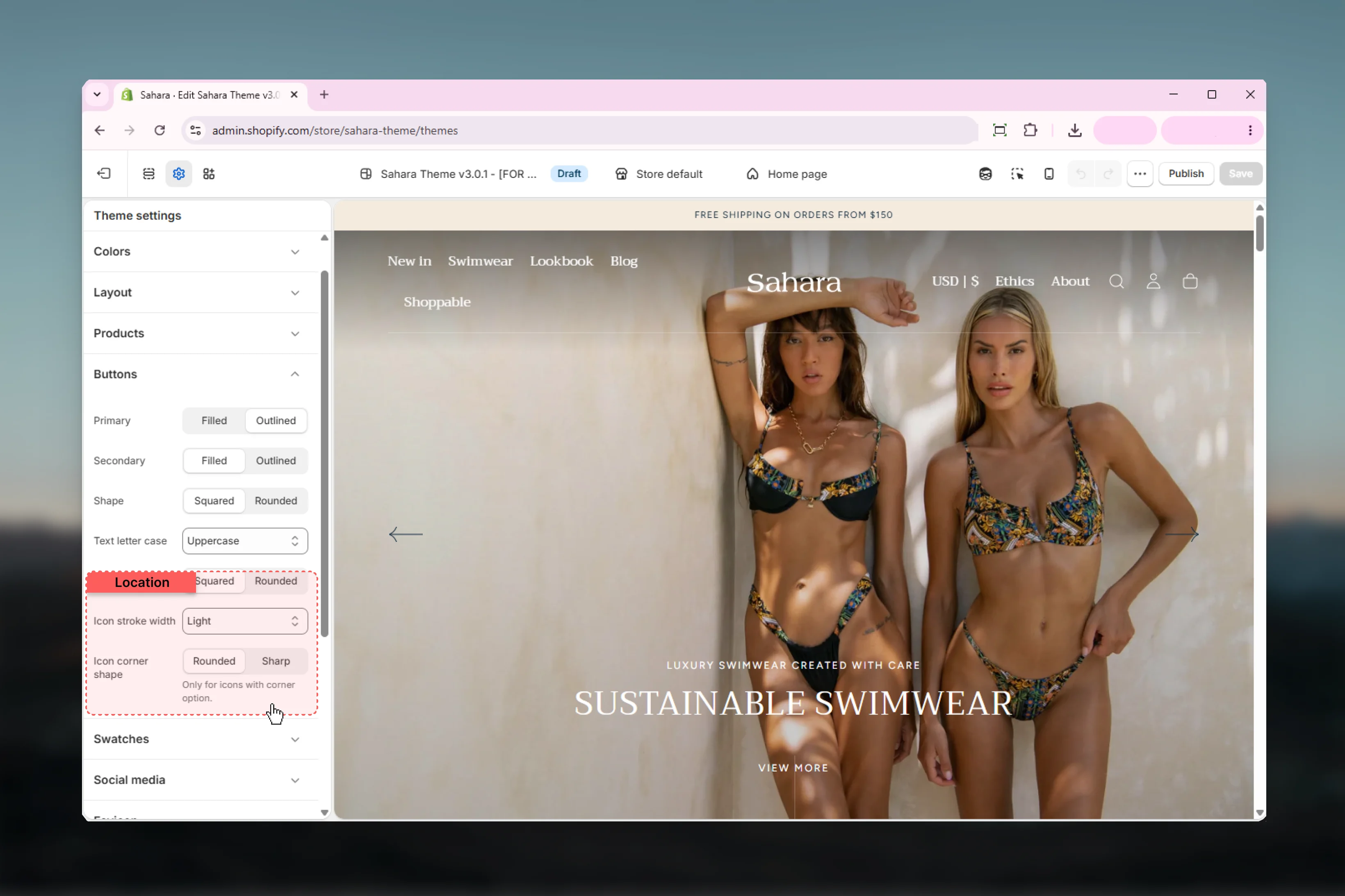
Click **Theme settings** → Select **Buttons** (icons settings are here)
Find **Icon stroke width** and **Icon corner shape** near bottom
Choose Light (minimal), Medium (balanced), or Bold (prominent)
Choose Rounded (soft) or Sharp (modern)
## Location
**Path:** Theme settings → Buttons → Icon settings (bottom section)
 ## Settings
### Icon Stroke Width
Controls the thickness of icon strokes throughout your theme.
**Options:**
* **Light:** Thin strokes (1px) - minimal, delicate
* **Medium:** Balanced strokes (1.5px) - default, versatile
* **Bold:** Thick strokes (2.5px) - prominent, accessible
**Default:** Light
Stroke width affects ALL icons: navigation menu, cart, search, wishlist, arrows, social media, and UI indicators. Changing this setting updates your entire icon system.
**Light Stroke (1px):**
* **Aesthetic:** Minimal, elegant, refined
* **Best for:** Luxury brands, minimal designs, spacious layouts
* **Pairs with:** Light typography (font-weight 300-400), generous white space
* **Visibility:** Lower contrast, subtle presence
* **Caution:** May be hard to see on small screens or for users with visual impairments
**Medium Stroke (1.5px):**
* **Aesthetic:** Balanced, versatile, professional
* **Best for:** Most stores, general e-commerce, balanced designs
* **Pairs with:** Medium typography (font-weight 400-500), standard layouts
* **Visibility:** Good balance of subtlety and clarity
* **Recommended:** Safe default for most brands
**Bold Stroke (2.5px):**
* **Aesthetic:** Strong, dynamic, high-impact
* **Best for:** Energetic brands, accessibility-focused sites, bold designs
* **Pairs with:** Bold typography (font-weight 600-700), high-contrast designs
* **Visibility:** Maximum clarity, excellent accessibility
* **Accessibility:** Better for users with low vision
**Luxury/Premium Brands:**
* Recommended: **Light**
* Examples: Jewelry, high-end fashion, luxury goods
* Goal: Refined, understated elegance
**Lifestyle/Fashion:**
* Recommended: **Light** or **Medium**
* Examples: Apparel, accessories, beauty
* Goal: Modern, approachable style
**General E-commerce:**
* Recommended: **Medium**
* Examples: Multi-category stores, marketplace sites
* Goal: Clear, professional, versatile
**Sports/Active:**
* Recommended: **Medium** or **Bold**
* Examples: Sportswear, outdoor gear, fitness
* Goal: Dynamic, energetic presence
**Accessibility-First:**
* Recommended: **Bold**
* Any store prioritizing maximum visibility
* Goal: Clear, easy-to-see icons for all users
**Match Icon Weight to Font Weight:**
**Light Typography (300-400):**
* Use: **Light** icon stroke
* Creates cohesive minimal aesthetic
* Example: "Garamond 300" font → Light icons
**Medium Typography (400-500):**
* Use: **Medium** icon stroke
* Balanced, professional appearance
* Example: "Figtree 400" font → Medium icons
**Bold Typography (600-700):**
* Use: **Bold** icon stroke
* Strong, impactful design
* Example: "Montserrat 700" headings → Bold icons
**Mixed Typography:**
If using light body + bold headings:
* Use **Medium** icons (compromise)
* Or match icons to your primary content font weight
### Icon Corner Shape
Controls whether icon corners and line endings are rounded or sharp.
**Options:**
* **Rounded:** Soft, friendly corners
* **Sharp:** Angular, modern corners
**Default:** Rounded
This setting only affects icons with corner elements (menu bars, close X, arrows, cart). Circular icons (search, some social media) aren't affected.
**Rounded Corners:**
* **Visual effect:** Softer, friendlier, more approachable
* **Technical:** Uses `stroke-linecap: round` and `stroke-linejoin: round`
* **Best for:** Friendly brands, lifestyle stores, approachable aesthetic
* **Coordinates with:** Rounded buttons (border-radius: 5rem)
* **Examples:** Fashion, beauty, home goods, family brands
**Sharp Corners:**
* **Visual effect:** Modern, minimal, geometric, professional
* **Technical:** Uses `stroke-linecap: square` and `stroke-linejoin: miter`
* **Best for:** Tech, professional services, minimal designs
* **Coordinates with:** Square buttons (border-radius: 0)
* **Examples:** Tech products, B2B, corporate, modern minimal
**Icons with Corners (Affected):**
* **Menu icon:** Hamburger bars (3 lines)
* **Close icon:** X shape
* **Arrow icons:** Right arrow, left arrow, up arrow, down arrow
* **Shopping bag:** Cart/bag icon with handles and base
* **Accordion indicators:** Expand/collapse icons
* **Plus/Minus icons:** Add to cart, quantity selectors
**Icons WITHOUT Corners (Not Affected):**
* **Search icon:** Circular magnifying glass
* **Heart icon:** Wishlist (curved lines only)
* **User/Profile icon:** Usually circular
* **Some social icons:** Circular platforms
**How to Test:**
Change setting and check menu icon, cart icon, and arrow icons - these show the difference most clearly.
**Match Icons to Buttons for Cohesion:**
**Rounded Buttons (border-radius: 5rem):**
* Use: **Rounded** icon corners
* Creates consistent soft aesthetic
* Everything flows together
**Square Buttons (border-radius: 0):**
* Use: **Sharp** icon corners
* Geometric consistency
* Modern, angular feel throughout
**Why This Matters:**
Mixing sharp icons with rounded buttons (or vice versa) creates visual dissonance. Consistent geometry throughout your design creates a more professional, intentional appearance.
**Quick Check:**
* Sahara default buttons: border-radius 0 (square)
* Sahara default icons: Rounded
* Consider: Changing icons to Sharp for full geometric consistency
## Best practices
1. **Coordinate with typography weight**\
Light fonts → Light icons. Bold fonts → Bold icons. Medium is safe default.
2. **Match button corner radius**\
Rounded buttons → Rounded icons. Square buttons → Sharp icons. Consistency matters.
3. **Consider accessibility**\
Bold stroke width improves visibility for users with visual impairments. Consider for inclusive design.
4. **Test across all locations**\
Check icons in navigation, cart, product cards, footer. Ensure they work everywhere.
5. **Mobile visibility check**\
Light icons may be hard to see on mobile. Test on actual devices.
6. **Don't mix icon styles arbitrarily**\
Choose one stroke width and stick to it. Consistency creates professional appearance.
7. **Brand alignment**\
Luxury = Light + Rounded. Modern = Medium + Sharp. Bold = Bold + Sharp.
8. **Color contrast matters**\
Light stroke icons need good color contrast. Test with your color schemes.
9. **Coordinate with Sahara defaults**\
Sahara defaults: Light stroke + Rounded. If changing buttons to rounded, keep rounded icons.
10. **Preview before committing**\
Change settings in Theme Customizer, browse several pages, check all icon locations before saving.
## Common use cases
**Settings:**
* Stroke width: **Light**
* Corner shape: **Rounded**
**Typography pairing:**
* Heading: Garamond, weight 300-400
* Body: Thin sans-serif, weight 300-400
**Button settings:**
* Primary: Outlined
* Border radius: 5rem (rounded)
* Text transform: None (sentence case)
**Why:** Creates refined, elegant, understated aesthetic. Soft rounded corners feel approachable yet premium. Light strokes don't overwhelm minimal design.
**Brand examples:** Jewelry stores, high-end fashion, luxury goods
**Settings:**
* Stroke width: **Medium**
* Corner shape: **Sharp**
**Typography pairing:**
* Heading: Sans-serif, weight 500-600
* Body: Sans-serif, weight 400
**Button settings:**
* Primary: Filled or Outlined
* Border radius: 0 (square)
* Text transform: Uppercase
**Why:** Geometric consistency. Sharp angles throughout create cohesive modern aesthetic. Medium stroke provides clarity without being heavy.
**Brand examples:** Tech products, software, electronics, B2B stores
**Settings:**
* Stroke width: **Bold**
* Corner shape: **Sharp**
**Typography pairing:**
* Heading: Bold sans-serif, weight 700-800
* Body: Medium sans-serif, weight 500
**Button settings:**
* Primary: Filled
* Border radius: 0 or 5rem
* Text transform: Uppercase
**Why:** Maximum impact and visibility. Bold strokes command attention. Sharp corners add energy. Strong visual hierarchy.
**Brand examples:** Sports gear, streetwear, energy drinks, youth-focused brands
**Settings:**
* Stroke width: **Medium**
* Corner shape: **Rounded**
**Typography pairing:**
* Heading: Friendly sans-serif, weight 500
* Body: Readable sans-serif, weight 400
**Button settings:**
* Primary: Filled
* Border radius: 5rem (rounded)
* Text transform: Capitalize or None
**Why:** Balanced and approachable. Rounded corners feel friendly. Medium stroke provides good visibility without aggression. Works for broad audiences.
**Brand examples:** Home goods, family products, wellness, general lifestyle
**Settings:**
* Stroke width: **Bold**
* Corner shape: **Rounded** (softer for dyslexia)
**Typography pairing:**
* Heading: Clear sans-serif, weight 600
* Body: Readable sans-serif, weight 500 (heavier than normal)
**Button settings:**
* Primary: Filled (high contrast)
* Border radius: 5rem
* Large button size
**Why:** Prioritizes visibility and clarity. Bold icons easier to see for low vision users. Rounded shapes easier to process. High contrast throughout.
**Compliance:** Helps meet WCAG AA standards for visual clarity
## Related settings
* [Buttons](/themes/sahara/theme-settings/buttons) - Icon settings located within button settings
* [Typography](/themes/sahara/theme-settings/typography) - Coordinate icon weight with font weight
* [Colors](/themes/sahara/theme-settings/colors) - Icon colors come from color schemes
* [Layout](/themes/sahara/theme-settings/layout) - Icon visibility affected by spacing
***
**Need help?** Change icon settings and browse your entire site to see the effect. Icons appear everywhere - navigation, cart, product cards, footer - so check all locations before finalizing.
## Settings
### Icon Stroke Width
Controls the thickness of icon strokes throughout your theme.
**Options:**
* **Light:** Thin strokes (1px) - minimal, delicate
* **Medium:** Balanced strokes (1.5px) - default, versatile
* **Bold:** Thick strokes (2.5px) - prominent, accessible
**Default:** Light
Stroke width affects ALL icons: navigation menu, cart, search, wishlist, arrows, social media, and UI indicators. Changing this setting updates your entire icon system.
**Light Stroke (1px):**
* **Aesthetic:** Minimal, elegant, refined
* **Best for:** Luxury brands, minimal designs, spacious layouts
* **Pairs with:** Light typography (font-weight 300-400), generous white space
* **Visibility:** Lower contrast, subtle presence
* **Caution:** May be hard to see on small screens or for users with visual impairments
**Medium Stroke (1.5px):**
* **Aesthetic:** Balanced, versatile, professional
* **Best for:** Most stores, general e-commerce, balanced designs
* **Pairs with:** Medium typography (font-weight 400-500), standard layouts
* **Visibility:** Good balance of subtlety and clarity
* **Recommended:** Safe default for most brands
**Bold Stroke (2.5px):**
* **Aesthetic:** Strong, dynamic, high-impact
* **Best for:** Energetic brands, accessibility-focused sites, bold designs
* **Pairs with:** Bold typography (font-weight 600-700), high-contrast designs
* **Visibility:** Maximum clarity, excellent accessibility
* **Accessibility:** Better for users with low vision
**Luxury/Premium Brands:**
* Recommended: **Light**
* Examples: Jewelry, high-end fashion, luxury goods
* Goal: Refined, understated elegance
**Lifestyle/Fashion:**
* Recommended: **Light** or **Medium**
* Examples: Apparel, accessories, beauty
* Goal: Modern, approachable style
**General E-commerce:**
* Recommended: **Medium**
* Examples: Multi-category stores, marketplace sites
* Goal: Clear, professional, versatile
**Sports/Active:**
* Recommended: **Medium** or **Bold**
* Examples: Sportswear, outdoor gear, fitness
* Goal: Dynamic, energetic presence
**Accessibility-First:**
* Recommended: **Bold**
* Any store prioritizing maximum visibility
* Goal: Clear, easy-to-see icons for all users
**Match Icon Weight to Font Weight:**
**Light Typography (300-400):**
* Use: **Light** icon stroke
* Creates cohesive minimal aesthetic
* Example: "Garamond 300" font → Light icons
**Medium Typography (400-500):**
* Use: **Medium** icon stroke
* Balanced, professional appearance
* Example: "Figtree 400" font → Medium icons
**Bold Typography (600-700):**
* Use: **Bold** icon stroke
* Strong, impactful design
* Example: "Montserrat 700" headings → Bold icons
**Mixed Typography:**
If using light body + bold headings:
* Use **Medium** icons (compromise)
* Or match icons to your primary content font weight
### Icon Corner Shape
Controls whether icon corners and line endings are rounded or sharp.
**Options:**
* **Rounded:** Soft, friendly corners
* **Sharp:** Angular, modern corners
**Default:** Rounded
This setting only affects icons with corner elements (menu bars, close X, arrows, cart). Circular icons (search, some social media) aren't affected.
**Rounded Corners:**
* **Visual effect:** Softer, friendlier, more approachable
* **Technical:** Uses `stroke-linecap: round` and `stroke-linejoin: round`
* **Best for:** Friendly brands, lifestyle stores, approachable aesthetic
* **Coordinates with:** Rounded buttons (border-radius: 5rem)
* **Examples:** Fashion, beauty, home goods, family brands
**Sharp Corners:**
* **Visual effect:** Modern, minimal, geometric, professional
* **Technical:** Uses `stroke-linecap: square` and `stroke-linejoin: miter`
* **Best for:** Tech, professional services, minimal designs
* **Coordinates with:** Square buttons (border-radius: 0)
* **Examples:** Tech products, B2B, corporate, modern minimal
**Icons with Corners (Affected):**
* **Menu icon:** Hamburger bars (3 lines)
* **Close icon:** X shape
* **Arrow icons:** Right arrow, left arrow, up arrow, down arrow
* **Shopping bag:** Cart/bag icon with handles and base
* **Accordion indicators:** Expand/collapse icons
* **Plus/Minus icons:** Add to cart, quantity selectors
**Icons WITHOUT Corners (Not Affected):**
* **Search icon:** Circular magnifying glass
* **Heart icon:** Wishlist (curved lines only)
* **User/Profile icon:** Usually circular
* **Some social icons:** Circular platforms
**How to Test:**
Change setting and check menu icon, cart icon, and arrow icons - these show the difference most clearly.
**Match Icons to Buttons for Cohesion:**
**Rounded Buttons (border-radius: 5rem):**
* Use: **Rounded** icon corners
* Creates consistent soft aesthetic
* Everything flows together
**Square Buttons (border-radius: 0):**
* Use: **Sharp** icon corners
* Geometric consistency
* Modern, angular feel throughout
**Why This Matters:**
Mixing sharp icons with rounded buttons (or vice versa) creates visual dissonance. Consistent geometry throughout your design creates a more professional, intentional appearance.
**Quick Check:**
* Sahara default buttons: border-radius 0 (square)
* Sahara default icons: Rounded
* Consider: Changing icons to Sharp for full geometric consistency
## Best practices
1. **Coordinate with typography weight**\
Light fonts → Light icons. Bold fonts → Bold icons. Medium is safe default.
2. **Match button corner radius**\
Rounded buttons → Rounded icons. Square buttons → Sharp icons. Consistency matters.
3. **Consider accessibility**\
Bold stroke width improves visibility for users with visual impairments. Consider for inclusive design.
4. **Test across all locations**\
Check icons in navigation, cart, product cards, footer. Ensure they work everywhere.
5. **Mobile visibility check**\
Light icons may be hard to see on mobile. Test on actual devices.
6. **Don't mix icon styles arbitrarily**\
Choose one stroke width and stick to it. Consistency creates professional appearance.
7. **Brand alignment**\
Luxury = Light + Rounded. Modern = Medium + Sharp. Bold = Bold + Sharp.
8. **Color contrast matters**\
Light stroke icons need good color contrast. Test with your color schemes.
9. **Coordinate with Sahara defaults**\
Sahara defaults: Light stroke + Rounded. If changing buttons to rounded, keep rounded icons.
10. **Preview before committing**\
Change settings in Theme Customizer, browse several pages, check all icon locations before saving.
## Common use cases
**Settings:**
* Stroke width: **Light**
* Corner shape: **Rounded**
**Typography pairing:**
* Heading: Garamond, weight 300-400
* Body: Thin sans-serif, weight 300-400
**Button settings:**
* Primary: Outlined
* Border radius: 5rem (rounded)
* Text transform: None (sentence case)
**Why:** Creates refined, elegant, understated aesthetic. Soft rounded corners feel approachable yet premium. Light strokes don't overwhelm minimal design.
**Brand examples:** Jewelry stores, high-end fashion, luxury goods
**Settings:**
* Stroke width: **Medium**
* Corner shape: **Sharp**
**Typography pairing:**
* Heading: Sans-serif, weight 500-600
* Body: Sans-serif, weight 400
**Button settings:**
* Primary: Filled or Outlined
* Border radius: 0 (square)
* Text transform: Uppercase
**Why:** Geometric consistency. Sharp angles throughout create cohesive modern aesthetic. Medium stroke provides clarity without being heavy.
**Brand examples:** Tech products, software, electronics, B2B stores
**Settings:**
* Stroke width: **Bold**
* Corner shape: **Sharp**
**Typography pairing:**
* Heading: Bold sans-serif, weight 700-800
* Body: Medium sans-serif, weight 500
**Button settings:**
* Primary: Filled
* Border radius: 0 or 5rem
* Text transform: Uppercase
**Why:** Maximum impact and visibility. Bold strokes command attention. Sharp corners add energy. Strong visual hierarchy.
**Brand examples:** Sports gear, streetwear, energy drinks, youth-focused brands
**Settings:**
* Stroke width: **Medium**
* Corner shape: **Rounded**
**Typography pairing:**
* Heading: Friendly sans-serif, weight 500
* Body: Readable sans-serif, weight 400
**Button settings:**
* Primary: Filled
* Border radius: 5rem (rounded)
* Text transform: Capitalize or None
**Why:** Balanced and approachable. Rounded corners feel friendly. Medium stroke provides good visibility without aggression. Works for broad audiences.
**Brand examples:** Home goods, family products, wellness, general lifestyle
**Settings:**
* Stroke width: **Bold**
* Corner shape: **Rounded** (softer for dyslexia)
**Typography pairing:**
* Heading: Clear sans-serif, weight 600
* Body: Readable sans-serif, weight 500 (heavier than normal)
**Button settings:**
* Primary: Filled (high contrast)
* Border radius: 5rem
* Large button size
**Why:** Prioritizes visibility and clarity. Bold icons easier to see for low vision users. Rounded shapes easier to process. High contrast throughout.
**Compliance:** Helps meet WCAG AA standards for visual clarity
## Related settings
* [Buttons](/themes/sahara/theme-settings/buttons) - Icon settings located within button settings
* [Typography](/themes/sahara/theme-settings/typography) - Coordinate icon weight with font weight
* [Colors](/themes/sahara/theme-settings/colors) - Icon colors come from color schemes
* [Layout](/themes/sahara/theme-settings/layout) - Icon visibility affected by spacing
***
**Need help?** Change icon settings and browse your entire site to see the effect. Icons appear everywhere - navigation, cart, product cards, footer - so check all locations before finalizing.