> ## Documentation Index
> Fetch the complete documentation index at: https://docs.digifist.com/llms.txt
> Use this file to discover all available pages before exploring further.
# Products
> Configure product card display, swatches, quick add functionality, and badge styling
Product settings determine how products appear on collection pages, search results, and product grids throughout your store with global controls for card layout, swatches, quick add functionality, and badge styling. Optimized product card design significantly impacts browse-to-purchase conversion and can increase add-to-cart rates by 20-30% through better visual presentation and reduced friction. Configure these product settings to create an effective, consistent browsing experience across your entire catalog.
## What this controls
Product settings determine how products appear on collection pages, search results, and product grids throughout your store. These global settings ensure consistent presentation while allowing flexibility for different product types.
Product card design significantly impacts browse-to-purchase conversion. Optimized settings can increase add-to-cart rates by 20-30%.
## How it works
Sahara's product system has four main components:
1. **Product Cards:** Layout and image display settings
2. **Swatches:** Color/variant visualization on cards
3. **Quick Add:** Add to cart directly from collection pages
4. **Badges:** Visual indicators (Sale, New, etc.)
These work together to create an effective product browsing experience.
Settings here apply to product cards globally. Individual sections may have additional card-specific options.
## Getting started
From Shopify admin → **Online Store** → **Themes** → **Customize**
Click **Theme settings** → Select **Products**
Choose image ratio and layout density
Turn on color swatches for variant visualization
Choose how customers add products from collections
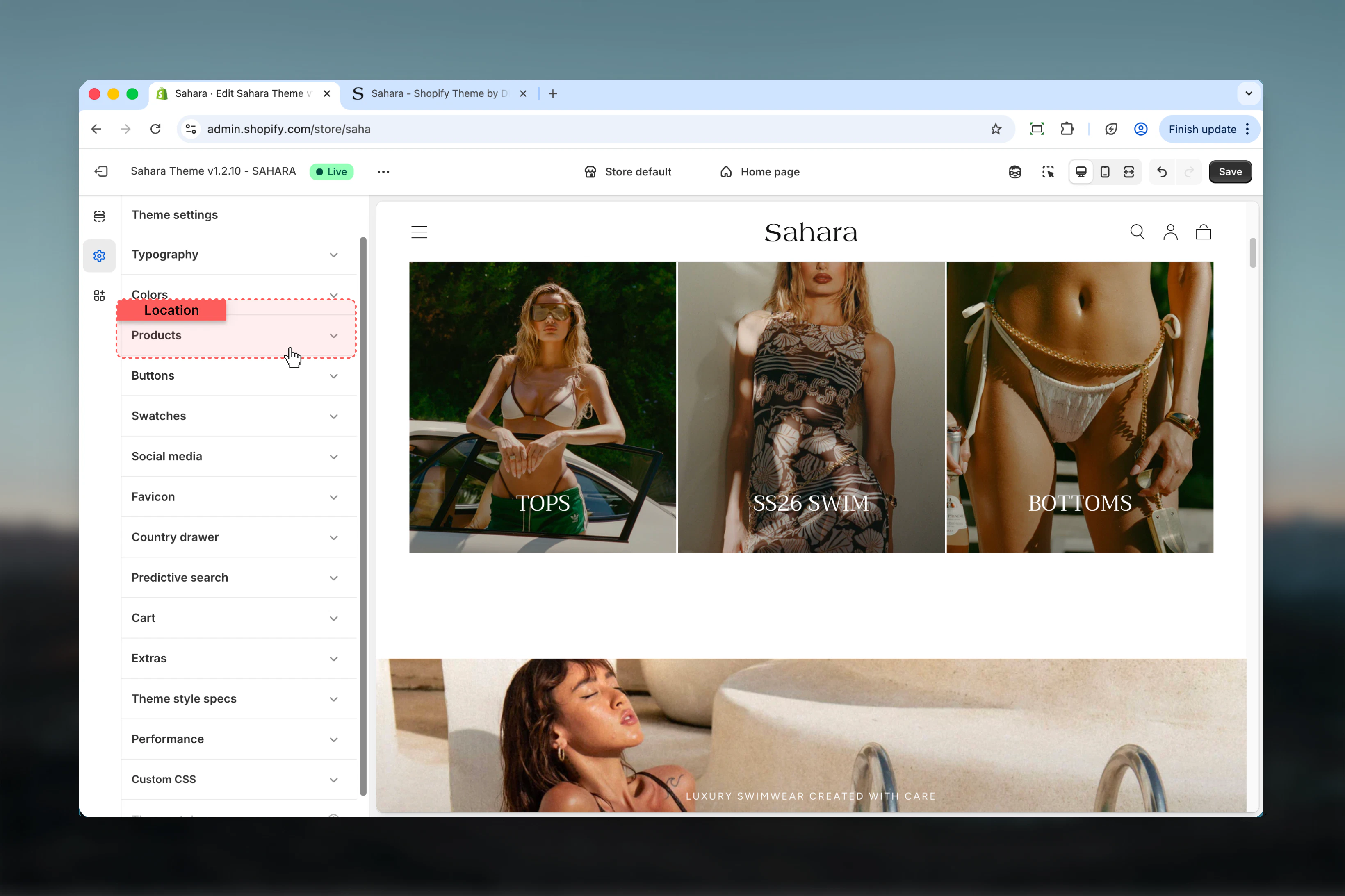
## Location
**Path:** Theme settings → Products
 ## Settings
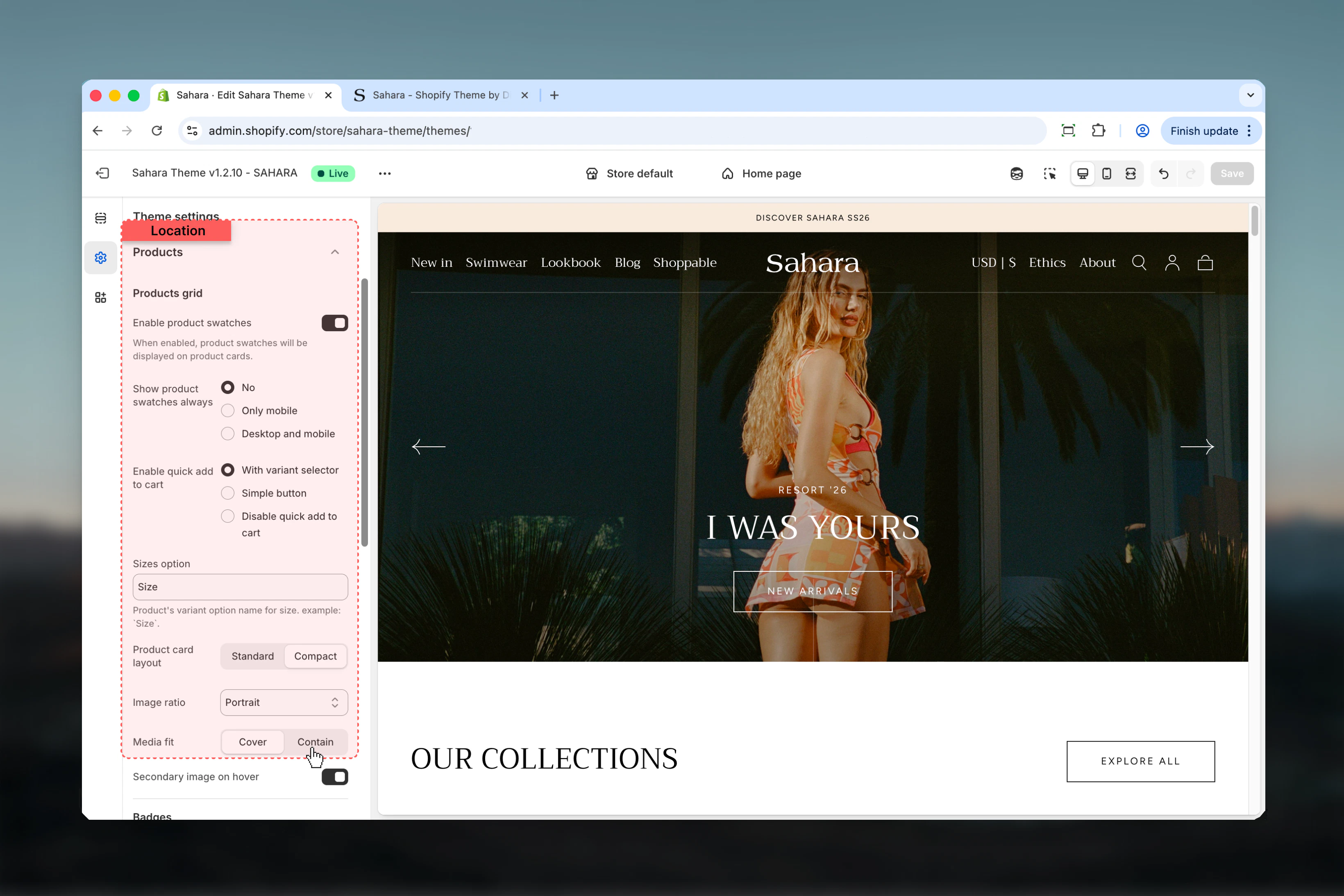
### Card Product Layout
Controls spacing and density of content within product cards.
**Options:**
* **Standard:** Comfortable spacing, full product information
* **Compact:** Tighter spacing, shows more products per screen
**Default:** Standard
**Standard Layout:**
* Generous padding around content
* Larger product titles
* More breathing room
* Better for premium/luxury positioning
* Shows 3-4 products per row (desktop)
**Compact Layout:**
* Reduced padding
* Smaller text elements
* Maximizes products visible
* Better for large catalogs
* Shows 4-5 products per row (desktop)
**Choose Standard If:**
* Premium or luxury brand
* Detailed product information needed
* Products have long titles
* Want spacious, uncluttered feel
**Choose Compact If:**
* Large product catalog (100+ products)
* Need to show many products per screen
* Minimal product information
* Fashion/fast-fashion store
### Card Product Image Ratio
Forces consistent aspect ratio across all product card images.
**Options:**
* **Adapt to image:** Uses original image proportions (auto height)
* **Square:** 1:1 ratio (100%)
* **Portrait:** 3:4 ratio (136.54%) - Default
**Default:** Portrait
Consistent image ratios create cleaner grids. Portrait (3:4) works well for most fashion, accessories, and packaged products.
**Adapt to Image (Auto):**
* **Pros:** Shows entire image, no cropping
* **Cons:** Inconsistent grid, ragged bottom edges
* **Best for:** Mixed product types, editorial stores
* **Requires:** Consistent photography across products
**Square (1:1):**
* **Pros:** Clean, modern grid; works on Instagram-style feeds
* **Cons:** May crop tall products
* **Best for:** Products that photograph well from above
* **Examples:** Jewelry, watches, shoes (top-down), food
**Portrait (3:4) - Default:**
* **Pros:** Fits most product photography; vertical space for tall items
* **Cons:** May crop very wide products
* **Best for:** Apparel, accessories, bottles, packaged goods
* **Examples:** Clothing, cosmetics, electronics, books
**Image Requirements:**
* Square: Minimum 1000×1000px
* Portrait: Minimum 1000×1365px
* Always upload 2× resolution for retina displays
**Fashion/Apparel:**
* Recommended: Portrait (3:4)
* Shows full garment
* Allows model shots
**Jewelry/Accessories:**
* Recommended: Square (1:1)
* Clean, Instagram-ready
* Product centered
**Home Goods:**
* Recommended: Adapt to image
* Mixed product sizes
* Lifestyle photography varies
**Electronics:**
* Recommended: Square (1:1)
* Product-focused shots
* Consistent sizing
**Beauty/Cosmetics:**
* Recommended: Portrait (3:4)
* Bottle/package oriented
* Vertical emphasis
### Card Product Media Object Fit
Controls how images fill the aspect ratio container.
**Options:**
* **Cover:** Fills entire space, may crop edges
* **Contain:** Shows entire image, may have empty space
**Default:** Cover
Cover crops images to fill space. Ensure important product details (faces, logos) are centered in photos.
**Cover (Default):**
* **Behavior:** Image fills entire container, crops overflow
* **Effect:** No white space, full-bleed images
* **Best when:** Images slightly taller/wider than ratio
* **Caution:** May cut off text or important details
**Contain:**
* **Behavior:** Shows entire image, adds space if needed
* **Effect:** White/background-color bars (letterboxing)
* **Best when:** Exact image ratio match is critical
* **Caution:** Creates empty space on cards
**Photography Tips:**
* For Cover: Center important elements, leave crop margin
* For Contain: Ensure consistent aspect ratios in photography
* Test both settings with your actual product photos
### Card Product Image Hover
Shows secondary product image on hover.
**Default:** Disabled (false)
Hover images increase engagement and reduce product page visits for quick browsing. Use meaningful second images (back view, alternate angle, in-use shot).
**Effective Second Images:**
* **Back view:** If first is front (apparel)
* **Alternate angle:** Side or detail shot
* **In-use shot:** Product being worn/used
* **Color variant:** Show different colorway
* **Close-up:** Detail of texture/material
**Avoid:**
* Random unrelated image
* Same image from slightly different angle
* Lower quality than primary image
* Different product entirely
**Technical Requirements:**
* Upload as 2nd image in product media
* Same aspect ratio as primary
* Consistent across all products (or disable feature)
**When to Enable:**
* Apparel stores (front/back views)
* Products with interesting details
* Multiple angles add value
**When to Disable:**
* Single-angle products
* Inconsistent photography
* Mobile-first audience (hover doesn't work)
### Enable Product Swatches
Displays color/variant swatches on product cards.
**Default:** Enabled (true)
Swatches only appear for products with color variants. Variant option name must include "color" or "colour" (case-insensitive).
### Show Product Swatches Always
Controls swatch visibility behavior.
**Options:**
* **No:** Swatches appear on hover only (default)
* **Only mobile:** Always visible on mobile, hover on desktop
* **Desktop and mobile:** Always visible on all devices
**Default:** No (hover only)
**Hover Only (Default):**
* **Pros:** Cleaner cards, less visual clutter
* **Cons:** Discoverability lower, requires interaction
* **Best for:** Minimal design, few color options per product
**Always Visible (Mobile Only):**
* **Pros:** Touch-friendly, no hover on mobile
* **Cons:** Inconsistent between devices
* **Best for:** Mobile-first stores
**Always Visible (All Devices):**
* **Pros:** Maximum discoverability, immediate color selection
* **Cons:** Can clutter cards, distracting if many colors
* **Best for:** Fashion stores, products where color is primary decision factor
**Recommendation:**
* **1-3 colors per product:** Hover only (clean)
* **4-6 colors:** Always visible mobile, hover desktop
* **7+ colors:** Always visible all devices (or redesign - too many options)
**Requirements:**
1. Product must have variant option named "Color" or "Colour"
2. Variant values become swatch names
3. Sahara uses automatic color matching
**Color Name Matching:**
* **Standard names work automatically:** Black, White, Red, Blue, Green, Yellow, etc.
* **Common shades recognized:** Navy, Burgundy, Forest Green, Sky Blue
* **Custom colors:** Add swatch images in theme settings (advanced)
**Best Practices:**
* Use consistent color names across products
* Capitalize color names ("Navy Blue" not "navy blue")
* Avoid ambiguous names ("Color 1", "Option A")
* Test swatches after setup
**Swatch Configuration:**
* Location: Theme settings → Swatches
* Define custom color mappings if needed
* Upload custom swatch images (16×16px minimum)
### Swatch Shape
Visual style of color swatches.
**Options:**
* **Square:** Sharp corners (default)
* **Circle:** Round swatches
**Default:** Square
Match swatch shape to your overall design aesthetic. Square for modern/minimal, Circle for soft/friendly brands.
### Sizes Option
Defines which variant option represents product size.
**Default:** "Size"
This setting helps the theme identify size variants for special handling (e.g., size guides, sorting). Change if your size option has a different name (e.g., "Taille" for French stores).
### Quick Add to Cart
Allows customers to add products to cart directly from collection pages without visiting product page.
**Options:**
* **With variant selector:** Opens popup with variant options (default)
* **Simple button:** Adds default variant directly
* **Disable:** No quick add functionality
**Default:** With variant selector
**With Variant Selector (Recommended):**
* **How it works:** Clicking button opens popup with size/color options
* **Pros:** Handles multi-variant products properly, reduces errors
* **Cons:** Extra click required, popup can be dismissed
* **Best for:** Products with variants (size, color)
* **Conversion impact:** +15-25% vs visiting product page
**Simple Button:**
* **How it works:** Adds default variant instantly (usually first variant)
* **Pros:** Fastest path to cart, one-click add
* **Cons:** May add wrong size/color, confusing for multi-variant
* **Best for:** Single-variant products, pre-orders, simple items
* **Conversion impact:** +30-40% for simple products, -10% for multi-variant (wrong selection)
**Disable Quick Add:**
* **How it works:** Customer must visit product page to add
* **Pros:** Forces product page view, more information consumed
* **Cons:** Extra friction, slower purchase path
* **Best for:** Complex products, customizable items, high-consideration purchases
* **Conversion impact:** Baseline (100%)
**Use "With Variant Selector" If:**
* Most products have 2+ variants
* Size/color selection is important
* Want balance of speed and accuracy
* Fashion, apparel, accessories stores
**Use "Simple Button" If:**
* Mostly single-variant products
* Default variant is usually correct
* Speed is critical (impulse purchases)
* Digital products, subscriptions, simple items
**Use "Disable" If:**
* Products need detailed explanation
* Customization required before purchase
* Long descriptions are important
* High-value or complex products
**A/B Testing:**
Test "With Variant Selector" vs "Simple Button" for 2 weeks each
Measure: Add-to-cart rate, cart size, return rate
### Mobile Add to Cart Button Style
Separate button style control for mobile devices.
**Options:**
* **Filled:** Solid background button
* **Outlined:** Border-only button
**Default:** Outlined
Mobile conversion rates are sensitive to button visibility. Consider using Filled for higher contrast and better tap targets.
### Product Badge Style
Visual style of badges on product cards (Sale, New, Limited, etc.).
**Options:**
* **Transparent:** No background, text only (default)
* **Square:** Solid background with sharp corners
* **Round:** Solid background with rounded corners
**Default:** Transparent
**Transparent (Default):**
* **Look:** Subtle, minimal, text-only
* **Visibility:** Low to medium
* **Best for:** Minimal/luxury brands, when badges are supplementary
* **Caution:** May be hard to read over busy images
**Square:**
* **Look:** Bold, attention-grabbing, modern
* **Visibility:** High
* **Best for:** Sale emphasis, promotional stores, clear hierarchy
* **Effect:** Badges stand out strongly
**Round:**
* **Look:** Friendly, soft, casual
* **Visibility:** High
* **Best for:** Lifestyle brands, approachable aesthetic
* **Effect:** Less harsh than square, still prominent
**Automatic Badges:**
Sahara generates these automatically:
**Sale Badge:**
* Appears when compare\_at\_price > price
* Shows "Sale" or discount percentage
* Configured in: Theme settings → Products
**Sold Out Badge:**
* Appears when inventory = 0
* Shows "Sold out" text
* Automatic, cannot disable
**Custom Badges:**
Create using product tags:
**Tag Format:** `badge:Badge Text`
**Examples:**
* `badge:New` → "New" badge
* `badge:Best Seller` → "Best Seller" badge
* `badge:Limited` → "Limited" badge
* `badge:Eco-Friendly` → "Eco-Friendly" badge
**Best Practices:**
* Maximum 1-2 badge types per product
* Keep badge text short (1-2 words)
* Use consistent badge tags across products
* Test badge visibility on your product images
**Badge Colors:**
* Controlled by color schemes
* Badge background: `tag` color
* Badge text: `tag_label` color
* Configure in: Theme settings → Colors
### Product Groups (Advanced)
Advanced feature for grouping related products using Shopify metaobjects.
**Requirements:**
* Shopify Plus plan
* Custom metaobject definitions created
* Products linked via metaobjects
**Metaobject for Product Groups:**
Enter metaobject definition handle to enable product grouping.
**Show Product Groups:**
* **None:** Don't display groups
* **Product:** Show on product pages only
* **Card:** Show on product cards only
* **Both:** Show on cards and product pages
Product groups are an advanced feature requiring custom development. Most stores don't need this.
**What Are Product Groups:**
Group related products together (e.g., "Complete the Look", "Bundle Items", "Also Available In").
**Common Use Cases:**
* **Fashion:** Complete the outfit (shirt + pants + shoes)
* **Electronics:** Compatible accessories
* **Beauty:** Skincare routine sets
* **Home:** Room collections
**Setup Requirements:**
1. Create metaobject definition in Shopify admin
2. Add metaobject field to products
3. Link products through metaobject entries
4. Enter metaobject handle in theme settings
**Alternative Solutions:**
If you don't have Shopify Plus:
* Use product recommendations (built-in Shopify)
* Manually curate related products sections
* Use product tags for grouping
## Settings
### Card Product Layout
Controls spacing and density of content within product cards.
**Options:**
* **Standard:** Comfortable spacing, full product information
* **Compact:** Tighter spacing, shows more products per screen
**Default:** Standard
**Standard Layout:**
* Generous padding around content
* Larger product titles
* More breathing room
* Better for premium/luxury positioning
* Shows 3-4 products per row (desktop)
**Compact Layout:**
* Reduced padding
* Smaller text elements
* Maximizes products visible
* Better for large catalogs
* Shows 4-5 products per row (desktop)
**Choose Standard If:**
* Premium or luxury brand
* Detailed product information needed
* Products have long titles
* Want spacious, uncluttered feel
**Choose Compact If:**
* Large product catalog (100+ products)
* Need to show many products per screen
* Minimal product information
* Fashion/fast-fashion store
### Card Product Image Ratio
Forces consistent aspect ratio across all product card images.
**Options:**
* **Adapt to image:** Uses original image proportions (auto height)
* **Square:** 1:1 ratio (100%)
* **Portrait:** 3:4 ratio (136.54%) - Default
**Default:** Portrait
Consistent image ratios create cleaner grids. Portrait (3:4) works well for most fashion, accessories, and packaged products.
**Adapt to Image (Auto):**
* **Pros:** Shows entire image, no cropping
* **Cons:** Inconsistent grid, ragged bottom edges
* **Best for:** Mixed product types, editorial stores
* **Requires:** Consistent photography across products
**Square (1:1):**
* **Pros:** Clean, modern grid; works on Instagram-style feeds
* **Cons:** May crop tall products
* **Best for:** Products that photograph well from above
* **Examples:** Jewelry, watches, shoes (top-down), food
**Portrait (3:4) - Default:**
* **Pros:** Fits most product photography; vertical space for tall items
* **Cons:** May crop very wide products
* **Best for:** Apparel, accessories, bottles, packaged goods
* **Examples:** Clothing, cosmetics, electronics, books
**Image Requirements:**
* Square: Minimum 1000×1000px
* Portrait: Minimum 1000×1365px
* Always upload 2× resolution for retina displays
**Fashion/Apparel:**
* Recommended: Portrait (3:4)
* Shows full garment
* Allows model shots
**Jewelry/Accessories:**
* Recommended: Square (1:1)
* Clean, Instagram-ready
* Product centered
**Home Goods:**
* Recommended: Adapt to image
* Mixed product sizes
* Lifestyle photography varies
**Electronics:**
* Recommended: Square (1:1)
* Product-focused shots
* Consistent sizing
**Beauty/Cosmetics:**
* Recommended: Portrait (3:4)
* Bottle/package oriented
* Vertical emphasis
### Card Product Media Object Fit
Controls how images fill the aspect ratio container.
**Options:**
* **Cover:** Fills entire space, may crop edges
* **Contain:** Shows entire image, may have empty space
**Default:** Cover
Cover crops images to fill space. Ensure important product details (faces, logos) are centered in photos.
**Cover (Default):**
* **Behavior:** Image fills entire container, crops overflow
* **Effect:** No white space, full-bleed images
* **Best when:** Images slightly taller/wider than ratio
* **Caution:** May cut off text or important details
**Contain:**
* **Behavior:** Shows entire image, adds space if needed
* **Effect:** White/background-color bars (letterboxing)
* **Best when:** Exact image ratio match is critical
* **Caution:** Creates empty space on cards
**Photography Tips:**
* For Cover: Center important elements, leave crop margin
* For Contain: Ensure consistent aspect ratios in photography
* Test both settings with your actual product photos
### Card Product Image Hover
Shows secondary product image on hover.
**Default:** Disabled (false)
Hover images increase engagement and reduce product page visits for quick browsing. Use meaningful second images (back view, alternate angle, in-use shot).
**Effective Second Images:**
* **Back view:** If first is front (apparel)
* **Alternate angle:** Side or detail shot
* **In-use shot:** Product being worn/used
* **Color variant:** Show different colorway
* **Close-up:** Detail of texture/material
**Avoid:**
* Random unrelated image
* Same image from slightly different angle
* Lower quality than primary image
* Different product entirely
**Technical Requirements:**
* Upload as 2nd image in product media
* Same aspect ratio as primary
* Consistent across all products (or disable feature)
**When to Enable:**
* Apparel stores (front/back views)
* Products with interesting details
* Multiple angles add value
**When to Disable:**
* Single-angle products
* Inconsistent photography
* Mobile-first audience (hover doesn't work)
### Enable Product Swatches
Displays color/variant swatches on product cards.
**Default:** Enabled (true)
Swatches only appear for products with color variants. Variant option name must include "color" or "colour" (case-insensitive).
### Show Product Swatches Always
Controls swatch visibility behavior.
**Options:**
* **No:** Swatches appear on hover only (default)
* **Only mobile:** Always visible on mobile, hover on desktop
* **Desktop and mobile:** Always visible on all devices
**Default:** No (hover only)
**Hover Only (Default):**
* **Pros:** Cleaner cards, less visual clutter
* **Cons:** Discoverability lower, requires interaction
* **Best for:** Minimal design, few color options per product
**Always Visible (Mobile Only):**
* **Pros:** Touch-friendly, no hover on mobile
* **Cons:** Inconsistent between devices
* **Best for:** Mobile-first stores
**Always Visible (All Devices):**
* **Pros:** Maximum discoverability, immediate color selection
* **Cons:** Can clutter cards, distracting if many colors
* **Best for:** Fashion stores, products where color is primary decision factor
**Recommendation:**
* **1-3 colors per product:** Hover only (clean)
* **4-6 colors:** Always visible mobile, hover desktop
* **7+ colors:** Always visible all devices (or redesign - too many options)
**Requirements:**
1. Product must have variant option named "Color" or "Colour"
2. Variant values become swatch names
3. Sahara uses automatic color matching
**Color Name Matching:**
* **Standard names work automatically:** Black, White, Red, Blue, Green, Yellow, etc.
* **Common shades recognized:** Navy, Burgundy, Forest Green, Sky Blue
* **Custom colors:** Add swatch images in theme settings (advanced)
**Best Practices:**
* Use consistent color names across products
* Capitalize color names ("Navy Blue" not "navy blue")
* Avoid ambiguous names ("Color 1", "Option A")
* Test swatches after setup
**Swatch Configuration:**
* Location: Theme settings → Swatches
* Define custom color mappings if needed
* Upload custom swatch images (16×16px minimum)
### Swatch Shape
Visual style of color swatches.
**Options:**
* **Square:** Sharp corners (default)
* **Circle:** Round swatches
**Default:** Square
Match swatch shape to your overall design aesthetic. Square for modern/minimal, Circle for soft/friendly brands.
### Sizes Option
Defines which variant option represents product size.
**Default:** "Size"
This setting helps the theme identify size variants for special handling (e.g., size guides, sorting). Change if your size option has a different name (e.g., "Taille" for French stores).
### Quick Add to Cart
Allows customers to add products to cart directly from collection pages without visiting product page.
**Options:**
* **With variant selector:** Opens popup with variant options (default)
* **Simple button:** Adds default variant directly
* **Disable:** No quick add functionality
**Default:** With variant selector
**With Variant Selector (Recommended):**
* **How it works:** Clicking button opens popup with size/color options
* **Pros:** Handles multi-variant products properly, reduces errors
* **Cons:** Extra click required, popup can be dismissed
* **Best for:** Products with variants (size, color)
* **Conversion impact:** +15-25% vs visiting product page
**Simple Button:**
* **How it works:** Adds default variant instantly (usually first variant)
* **Pros:** Fastest path to cart, one-click add
* **Cons:** May add wrong size/color, confusing for multi-variant
* **Best for:** Single-variant products, pre-orders, simple items
* **Conversion impact:** +30-40% for simple products, -10% for multi-variant (wrong selection)
**Disable Quick Add:**
* **How it works:** Customer must visit product page to add
* **Pros:** Forces product page view, more information consumed
* **Cons:** Extra friction, slower purchase path
* **Best for:** Complex products, customizable items, high-consideration purchases
* **Conversion impact:** Baseline (100%)
**Use "With Variant Selector" If:**
* Most products have 2+ variants
* Size/color selection is important
* Want balance of speed and accuracy
* Fashion, apparel, accessories stores
**Use "Simple Button" If:**
* Mostly single-variant products
* Default variant is usually correct
* Speed is critical (impulse purchases)
* Digital products, subscriptions, simple items
**Use "Disable" If:**
* Products need detailed explanation
* Customization required before purchase
* Long descriptions are important
* High-value or complex products
**A/B Testing:**
Test "With Variant Selector" vs "Simple Button" for 2 weeks each
Measure: Add-to-cart rate, cart size, return rate
### Mobile Add to Cart Button Style
Separate button style control for mobile devices.
**Options:**
* **Filled:** Solid background button
* **Outlined:** Border-only button
**Default:** Outlined
Mobile conversion rates are sensitive to button visibility. Consider using Filled for higher contrast and better tap targets.
### Product Badge Style
Visual style of badges on product cards (Sale, New, Limited, etc.).
**Options:**
* **Transparent:** No background, text only (default)
* **Square:** Solid background with sharp corners
* **Round:** Solid background with rounded corners
**Default:** Transparent
**Transparent (Default):**
* **Look:** Subtle, minimal, text-only
* **Visibility:** Low to medium
* **Best for:** Minimal/luxury brands, when badges are supplementary
* **Caution:** May be hard to read over busy images
**Square:**
* **Look:** Bold, attention-grabbing, modern
* **Visibility:** High
* **Best for:** Sale emphasis, promotional stores, clear hierarchy
* **Effect:** Badges stand out strongly
**Round:**
* **Look:** Friendly, soft, casual
* **Visibility:** High
* **Best for:** Lifestyle brands, approachable aesthetic
* **Effect:** Less harsh than square, still prominent
**Automatic Badges:**
Sahara generates these automatically:
**Sale Badge:**
* Appears when compare\_at\_price > price
* Shows "Sale" or discount percentage
* Configured in: Theme settings → Products
**Sold Out Badge:**
* Appears when inventory = 0
* Shows "Sold out" text
* Automatic, cannot disable
**Custom Badges:**
Create using product tags:
**Tag Format:** `badge:Badge Text`
**Examples:**
* `badge:New` → "New" badge
* `badge:Best Seller` → "Best Seller" badge
* `badge:Limited` → "Limited" badge
* `badge:Eco-Friendly` → "Eco-Friendly" badge
**Best Practices:**
* Maximum 1-2 badge types per product
* Keep badge text short (1-2 words)
* Use consistent badge tags across products
* Test badge visibility on your product images
**Badge Colors:**
* Controlled by color schemes
* Badge background: `tag` color
* Badge text: `tag_label` color
* Configure in: Theme settings → Colors
### Product Groups (Advanced)
Advanced feature for grouping related products using Shopify metaobjects.
**Requirements:**
* Shopify Plus plan
* Custom metaobject definitions created
* Products linked via metaobjects
**Metaobject for Product Groups:**
Enter metaobject definition handle to enable product grouping.
**Show Product Groups:**
* **None:** Don't display groups
* **Product:** Show on product pages only
* **Card:** Show on product cards only
* **Both:** Show on cards and product pages
Product groups are an advanced feature requiring custom development. Most stores don't need this.
**What Are Product Groups:**
Group related products together (e.g., "Complete the Look", "Bundle Items", "Also Available In").
**Common Use Cases:**
* **Fashion:** Complete the outfit (shirt + pants + shoes)
* **Electronics:** Compatible accessories
* **Beauty:** Skincare routine sets
* **Home:** Room collections
**Setup Requirements:**
1. Create metaobject definition in Shopify admin
2. Add metaobject field to products
3. Link products through metaobject entries
4. Enter metaobject handle in theme settings
**Alternative Solutions:**
If you don't have Shopify Plus:
* Use product recommendations (built-in Shopify)
* Manually curate related products sections
* Use product tags for grouping
 ## Best practices
1. **Choose portrait image ratio for most stores**\
Portrait (3:4) works for 80% of product types. Square for jewelry/accessories, Auto for mixed catalogs.
2. **Enable hover images for apparel**\
Front/back views significantly reduce product page visits and increase conversion for fashion.
3. **Use "With variant selector" quick add**\
Best balance of speed and accuracy for multi-variant products. Increases add-to-cart by 15-25%.
4. **Keep swatches on hover for clean cards**\
Unless you have many color options (7+), hover-only swatches keep cards uncluttered.
5. **Match swatch shape to button shape**\
If buttons are squared, use square swatches. If rounded, use circle swatches.
6. **Limit badges to 1-2 types**\
Too many badges create visual noise. Prioritize Sale and Sold Out badges.
7. **Use transparent badges for minimal aesthetic**\
Square/Round badges for promotional emphasis. Test visibility on your product photography.
8. **Ensure consistent photography**\
Forced image ratios (Square/Portrait) require consistent product photography. Budget for reshoot if needed.
9. **Test on actual products**\
Preview settings with real product images, not placeholders. Images impact how settings look.
10. **Consider mobile-first**\
Quick add and swatches should work well on mobile - that's where most browsing happens.
## Common use cases
**Settings:**
* Card layout: **Standard**
* Image ratio: **Portrait** (3:4)
* Media fit: **Cover**
* Hover image: **Enabled**
* Swatches: **Enabled**, always visible on mobile
* Quick add: **With variant selector**
* Badge style: **Transparent** or **Round**
* Swatch shape: **Circle**
**Why:** Portrait shows full garments, hover images show back view, swatches highlight color options, variant selector handles size/color combinations.
**Settings:**
* Card layout: **Standard**
* Image ratio: **Square** (1:1)
* Media fit: **Cover**
* Hover image: **Enabled** (close-up detail)
* Swatches: **Enabled**, hover only
* Quick add: **Simple button** (single-variant often)
* Badge style: **Square** (New, Limited)
* Swatch shape: **Square**
**Why:** Square ratio for jewelry photography, clean grid, hover shows detail, simple products often single-variant.
**Settings:**
* Card layout: **Compact**
* Image ratio: **Square** (1:1)
* Media fit: **Cover**
* Hover image: **Disabled**
* Swatches: **Enabled**, always visible
* Quick add: **With variant selector**
* Badge style: **Square** (Sale emphasis)
* Swatch shape: **Square**
**Why:** Compact layout shows more products, square for consistency, always-visible swatches for quick scanning, bold sale badges drive urgency.
**Settings:**
* Card layout: **Standard**
* Image ratio: **Adapt to image**
* Media fit: **Contain**
* Hover image: **Enabled** (subtle alternate view)
* Swatches: **Disabled**
* Quick add: **Disabled**
* Badge style: **Transparent**
* Swatch shape: N/A
**Why:** Maximum image quality (Adapt + Contain), no quick add forces product page visit, subtle badges, no swatches for clean aesthetic.
## Related settings
* [Colors](/themes/sahara/theme-settings/colors) - Badge colors defined in color schemes
* [Buttons](/themes/sahara/theme-settings/buttons) - Quick add button styling
* [Layout](/themes/sahara/theme-settings/layout) - Grid spacing affects product cards
* [Common Settings](/themes/sahara/common-settings) - Section-level product grid options
***
**Need help?** Test product card settings with real products and images. What looks good with placeholders may need adjustment with actual photography.
## Best practices
1. **Choose portrait image ratio for most stores**\
Portrait (3:4) works for 80% of product types. Square for jewelry/accessories, Auto for mixed catalogs.
2. **Enable hover images for apparel**\
Front/back views significantly reduce product page visits and increase conversion for fashion.
3. **Use "With variant selector" quick add**\
Best balance of speed and accuracy for multi-variant products. Increases add-to-cart by 15-25%.
4. **Keep swatches on hover for clean cards**\
Unless you have many color options (7+), hover-only swatches keep cards uncluttered.
5. **Match swatch shape to button shape**\
If buttons are squared, use square swatches. If rounded, use circle swatches.
6. **Limit badges to 1-2 types**\
Too many badges create visual noise. Prioritize Sale and Sold Out badges.
7. **Use transparent badges for minimal aesthetic**\
Square/Round badges for promotional emphasis. Test visibility on your product photography.
8. **Ensure consistent photography**\
Forced image ratios (Square/Portrait) require consistent product photography. Budget for reshoot if needed.
9. **Test on actual products**\
Preview settings with real product images, not placeholders. Images impact how settings look.
10. **Consider mobile-first**\
Quick add and swatches should work well on mobile - that's where most browsing happens.
## Common use cases
**Settings:**
* Card layout: **Standard**
* Image ratio: **Portrait** (3:4)
* Media fit: **Cover**
* Hover image: **Enabled**
* Swatches: **Enabled**, always visible on mobile
* Quick add: **With variant selector**
* Badge style: **Transparent** or **Round**
* Swatch shape: **Circle**
**Why:** Portrait shows full garments, hover images show back view, swatches highlight color options, variant selector handles size/color combinations.
**Settings:**
* Card layout: **Standard**
* Image ratio: **Square** (1:1)
* Media fit: **Cover**
* Hover image: **Enabled** (close-up detail)
* Swatches: **Enabled**, hover only
* Quick add: **Simple button** (single-variant often)
* Badge style: **Square** (New, Limited)
* Swatch shape: **Square**
**Why:** Square ratio for jewelry photography, clean grid, hover shows detail, simple products often single-variant.
**Settings:**
* Card layout: **Compact**
* Image ratio: **Square** (1:1)
* Media fit: **Cover**
* Hover image: **Disabled**
* Swatches: **Enabled**, always visible
* Quick add: **With variant selector**
* Badge style: **Square** (Sale emphasis)
* Swatch shape: **Square**
**Why:** Compact layout shows more products, square for consistency, always-visible swatches for quick scanning, bold sale badges drive urgency.
**Settings:**
* Card layout: **Standard**
* Image ratio: **Adapt to image**
* Media fit: **Contain**
* Hover image: **Enabled** (subtle alternate view)
* Swatches: **Disabled**
* Quick add: **Disabled**
* Badge style: **Transparent**
* Swatch shape: N/A
**Why:** Maximum image quality (Adapt + Contain), no quick add forces product page visit, subtle badges, no swatches for clean aesthetic.
## Related settings
* [Colors](/themes/sahara/theme-settings/colors) - Badge colors defined in color schemes
* [Buttons](/themes/sahara/theme-settings/buttons) - Quick add button styling
* [Layout](/themes/sahara/theme-settings/layout) - Grid spacing affects product cards
* [Common Settings](/themes/sahara/common-settings) - Section-level product grid options
***
**Need help?** Test product card settings with real products and images. What looks good with placeholders may need adjustment with actual photography.