

What this section does
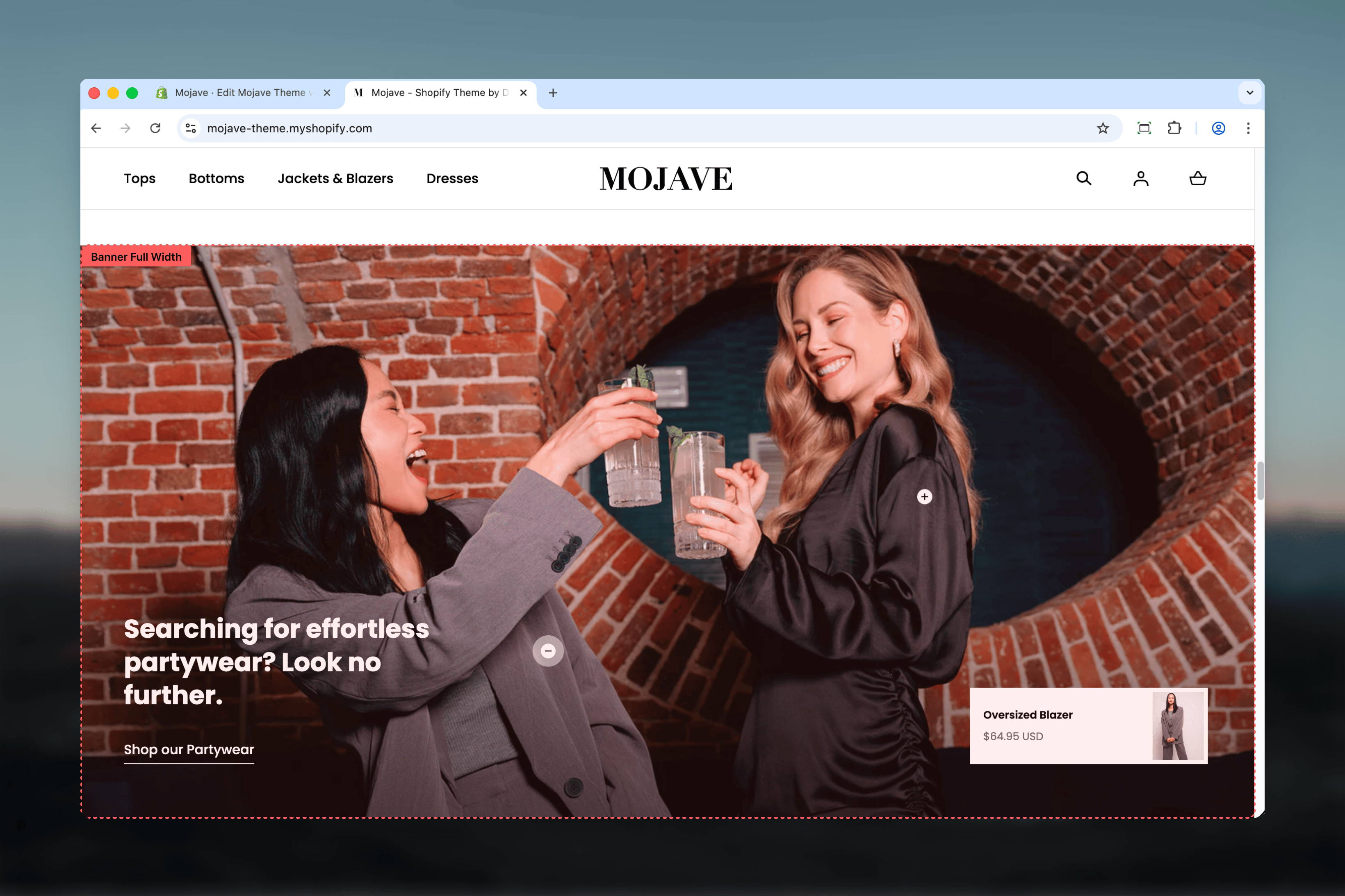
The Banner - Fullwidth section creates prominent fullwidth promotional banners perfect for campaigns, collections, or storytelling. Features include:- Edge-to-edge fullwidth design spans entire viewport
- Adjustable height: 35-100% of viewport height
- Two image styles: Background (overlay) or Aside (split-screen)
- Two layouts: Content at Top or Bottom
- Responsive images: Separate desktop (2880x1400px) and mobile (720x1140px)
- Overlay opacity control for background images (0-100%)
- Product hotspots: Up to 3 positioned product links (x/y coordinates)
- Heading, link/CTA button
- Optional primary/secondary product references
Getting started
1
Add the section
From the Theme Customizer, click Add section and select Banner - Fullwidth
2
Upload images
Add desktop (2880x1400px) and mobile (720x1140px) images for optimal quality across devices
3
Choose image style
Select Background for text overlay or Aside for split-screen layout
4
Add content
Configure heading, link text/URL, and adjust banner height, layout position, and overlay opacity
5
Optional: Add product hotspots
Add up to 3 Link product blocks to create clickable product hotspots on the image
Section settings
- Layout
- Media
- Content
Image style
Image style
Dropdown (default: Background)Controls how image relates to content:
- Background: Image fills entire banner, content overlays (default)
- Aside: Split-screen layout with image on one side, content on other
Layout
Layout
Dropdown (default: Bottom)Controls vertical position of content:
- Top: Content positioned at top of banner
- Bottom: Content positioned at bottom of banner (default)
Overlay opacity
Overlay opacity
Range: 0-100% (step: 10%, default: 50%)Controls darkness of overlay between image and content:
- 0%: No overlay (content directly on image)
- 50%: Medium overlay (default, balanced readability)
- 100%: Full black overlay (maximum contrast)
Block: Link product
Type: product_showcase (limit: 3 blocks) Create interactive product hotspots positioned anywhere on the banner image.Product
Product
Product picker (required)Select product to link from this hotspot:
- Clicking hotspot navigates to product page (PDP)
- Product info (title, price) displayed in tooltip/popup on hover
Position X & Y
Position X & Y
Position X (range: 0-100%, default: 25%)
- Horizontal position from left edge (0% = far left, 100% = far right)
- Vertical position from top edge (0% = top, 100% = bottom)
Best practices
High-res images
Use 2880x1400px desktop images minimum. Fullwidth banners display very large—low-res images look pixelated.
Mobile-specific images
Always upload mobile images (720x1140px). Desktop horizontal crops don’t work well on portrait mobile screens.
Overlay for readability
Set 40-60% overlay for Background style with busy images. Ensures text remains readable across all image areas.
Hero placement
Use 100% height for homepage hero (first section). Use 50-75% for mid-page promotional banners.
Aside for clarity
Use Aside image style when text content is lengthy (multiple paragraphs). Provides dedicated readable space.
3 hotspots maximum
Limit is 3 product hotspots. More creates clutter—use Collections or Shop the Look section for more products.
Action-oriented CTAs
Use urgent, specific link text: “Shop Spring Sale” not “Click here”. “Explore Collection” not “Learn more”.
Strategic product placement
Position hotspots directly over products in lifestyle images. Accurate placement creates intuitive “shop this item” experience.
Common use cases
Homepage hero — Height 100%, Background style, Bottom layout, prominent heading + CTA, no hotspots Collection promotion — Height 65%, Aside style, lifestyle image showing product in use + collection description + button Campaign landing — Height 75%, Background style, 60% overlay, large sale messaging with urgency (“50% Off - Today Only”) Shop the look — Height 50-75%, Background style, lifestyle image with 2-3 product hotspots positioned over featured items Seasonal announcement — Height 50%, Background style, Top layout, seasonal imagery with “New Spring Collection” messaging Editorial storytelling — Height 65%, Aside style, brand story image + multi-line text about values/mission + “About Us” linkLayout behavior
Background image style:- Image fills entire banner (edge-to-edge)
- Content overlays on image with dark overlay (configurable opacity)
- Layout determines vertical position: Top (content at top) or Bottom (content at bottom, default)
- Horizontal: Content always centered
- Split-screen layout
- Layout determines which side content appears:
- Top: Image right, content left (or vice versa based on theme defaults)
- Bottom: Image left, content right (or vice versa)
- Each side: 50% width on desktop
- No overlay (content has solid background separate from image)
- Fullwidth edge-to-edge display
- Height = Banner Height setting × viewport height
- Product hotspots displayed as interactive pins/dots
- Hover: Product title/price tooltip
- Stacks vertically (even with Aside style)
- Image at top, content below
- Uses mobile-specific image if provided, otherwise crops/scales desktop image
- Product hotspots hidden on mobile (optional theme behavior) or repositioned
Image guidelines
Desktop image (2880x1400px):- Aspect ratio: ~2:1 (landscape)
- Focal point: Center-aware composition (content may overlay anywhere)
- High resolution: 2880px width ensures sharpness on 4K displays
- File size: Optimize to < 500KB (use JPG, quality 80-85%)
- Aspect ratio: ~9:16 (portrait)
- Focal point: Top or center (content overlays bottom by default)
- Resolution: 720px width = 2x pixel density for 360px mobile screens
- File size: Optimize to < 150KB for fast mobile loading
- Avoid busy/complex backgrounds where text overlays
- Ensure even lighting—high contrast areas make overlays harder
- Test with different overlay opacities (40-70% typically works)
- Focus product/subject toward center of image half
- Less critical for text readability (content doesn’t overlay)
- Can use more complex, detailed imagery
Product hotspot behavior
When to use:- Lifestyle images showing products in context
- “Shop the Look” campaigns with 2-3 featured items
- Editorial content where specific products are highlighted
- Hotspots appear as pins/dots on image
- Hover: Tooltip with product title, price, “Shop now”
- Click: Navigate to product page (PDP)
- Place pin directly over product in image (use X/Y sliders)
- Test on different screen sizes—hotspots may shift slightly
- Space hotspots apart (not clustered)—easier to click
- Some themes hide hotspots on mobile (ambiguous touch targets)
- Other themes show hotspots but may reposition for responsive images
- Test mobile experience—consider mobile-specific product positioning
Customization tips
For homepage hero:- Height: 100%
- Image style: Background
- Layout: Bottom (default)
- Overlay: 50-60% for readability
- Heading: Large, bold claim (“Premium Quality, Affordable Prices”)
- Link: Strong CTA (“Shop Now”, “Explore”)
- Height: 50-65%
- Image style: Aside for text-heavy content, Background for succinct messaging
- Heading: Specific offer (“Free Shipping on Orders $50+”)
- Link: Relevant collection or page
- Height: 65-75%
- Image style: Background
- Overlay: 30-40% (lighter, image-focused)
- Add 2-3 product hotspots positioned over products in lifestyle shot
- Heading: “Shop This Look” or “Get The Look”
- Height: 50-75%
- Image style: Aside (provides space for longer text)
- Layout: Experiment with Top vs Bottom for visual variety
- Heading: Story-driven (“Our Commitment to Sustainability”)
- Link: “Read Our Story”, “Learn More”
Related sections
- Hero — Multi-slide carousel alternative with more layout options
- Featured Collections Links — Multi-collection grid with similar hotspot functionality
- Images with Text — Split-screen alternative without fullwidth constraint
- Content Tiles — Grid-based layouts for multiple banners/content blocks
Technical notes
Viewport height units: Height setting usesvh (viewport height). 100% = 100vh = full browser window height. Adjusts dynamically to screen size.
Fullwidth always: This section always spans edge-to-edge regardless of theme container settings. Designed for maximum visual impact.
Overlay implementation: Overlay is a semi-transparent dark layer (typically black with alpha transparency) between image and content. Improves contrast without requiring image darkening.
Product hotspot coordinates: X/Y positioning uses absolute percentage positioning within image container. X=0%, Y=0% = top-left corner. X=100%, Y=100% = bottom-right corner.
Mobile image fallback: If no mobile image provided, theme crops/scales desktop image. Cropping typically centers or uses focal point detection. Always test—provide mobile images for best results.
Product references: Primary/secondary product settings are metadata fields. Not automatically displayed but available for custom Liquid code, structured data, or future theme features.
Aside layout variance: “Aside” implementation varies by theme. Some themes flip image left/right based on Layout setting. Others use alternate methods. Test both Layout options to see behavior.