What this section does
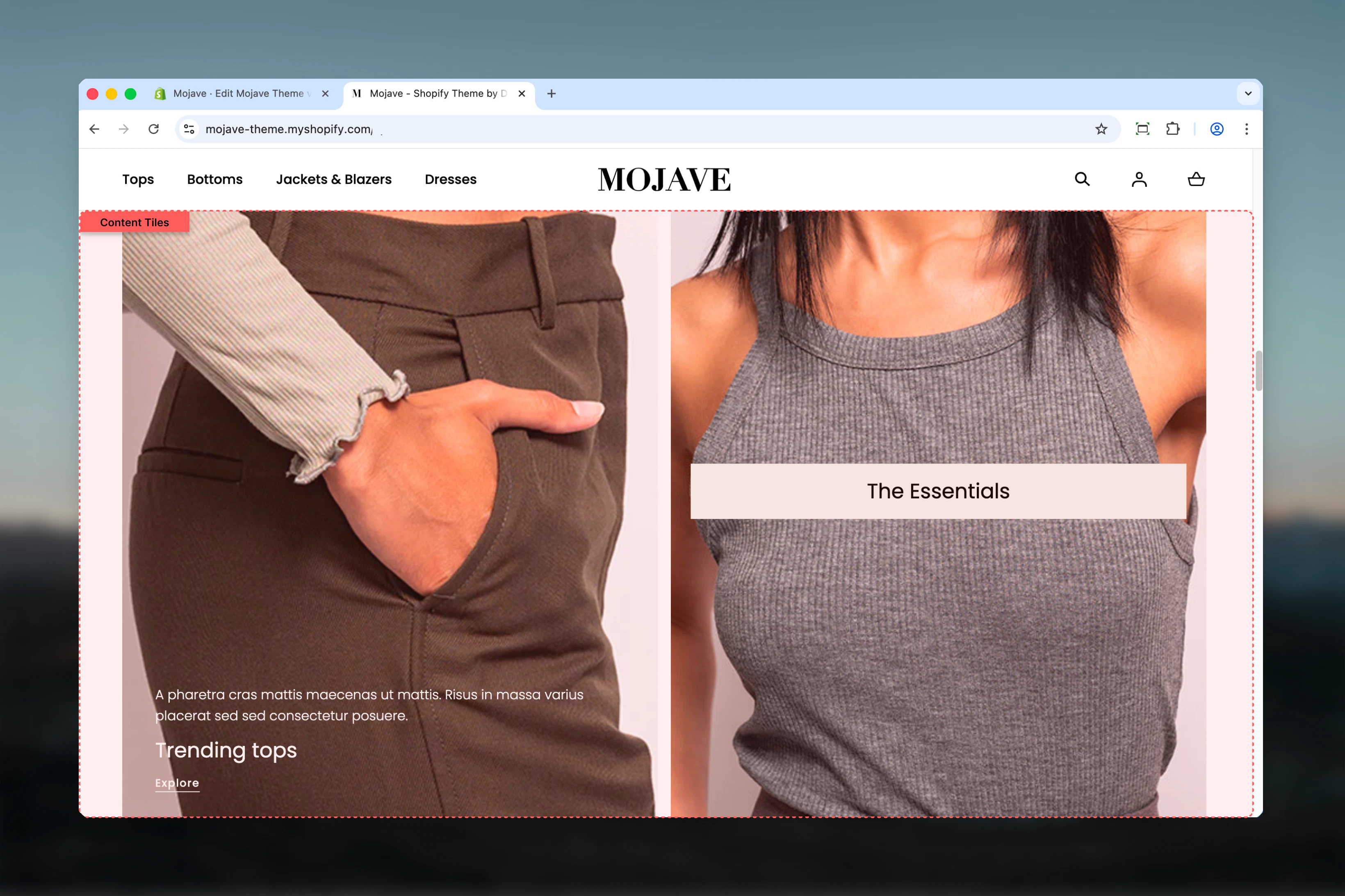
The Content tiles section creates sophisticated grid-based layouts where each tile can span multiple columns and rows, perfect for magazine-style editorial content, service showcases, or visual storytelling. Features include:- Grid layout system: Position tiles with column/row spanning (1-6 columns × 1-6 rows)
- Unlimited tile blocks with independent sizing and positioning
- Media flexibility: Images, self-hosted videos, or YouTube/Vimeo per tile
- Three media positions: Top, Bottom, or Background
- Responsive media: Separate desktop/mobile images and videos
- Content overlay: Text + heading + button over background media
- Show on control: Display tiles only on desktop, mobile, or both
- Three tile styles: Main, Accent, Transparent backgrounds
Getting started
Configure grid layout
For each tile, set Column factor (width, 1-6) and Row factor (height, 1-6) to control size and positioning
Section settings
- General
- Layout
Swap order for mobile
Swap order for mobile
Checkbox (default: unchecked)Reverses the order of tiles on mobile devices:
- Unchecked: Tiles display in the same order as desktop (first tile → last tile)
- Checked: Tiles display in reverse order (last tile → first tile)
Heading
Heading
Inline rich text (optional)Main section heading displayed above all tiles.Examples: “Featured Content”, “Our Services”, “Explore”, “Why Choose Us”Leave blank for no section heading.
Heading size
Heading size
Dropdown (default: L)Section heading size:
- XS (h6): Very small
- S (h5): Small
- M (h4): Medium
- L (h3): Large (default)
- XL (h2): Extra large
Heading alignment
Heading alignment
Dropdown (default: Start)Horizontal alignment of section heading:
- Start: Left-aligned
- Center: Centered
- End: Right-aligned
Tile spacing
Tile spacing
Dropdown (default: Default)Spacing between tiles in the grid:
- Default: Standard gap between tiles
- Compact: Reduced gap for denser layouts
Block: Tile
Type: tile (unlimited blocks) Each tile block creates one grid item with independent size, content, media, and positioning.- Grid Layout
- Content & Text
- Media
- Media Mobile
Show on
Show on
Dropdown (default: Both)Controls which devices display this tile:
- Desktop: Only visible on desktop/tablet
- Mobile: Only visible on mobile
- Both: Visible on all devices (default)
Column factor
Column factor
Range: 1-6 (default: 3)Controls tile width by setting how many columns (out of 6 total) this tile spans:
- 1 = 1/6 width (narrow)
- 2 = 1/3 width
- 3 = 1/2 width (default, half)
- 4 = 2/3 width
- 5 = 5/6 width
- 6 = Full width
Row factor
Row factor
Range: 1-6 (default: 1)Controls tile height by setting how many rows this tile spans:
- 1 = Single row height (default)
- 2 = Double height
- 3 = Triple height
- 4-6 = Increasingly tall tiles
Aspect ratio
Aspect ratio
Dropdown (default: Auto)Sets the aspect ratio for the tile or media (behavior depends on Media position):
- Media position = Top/Bottom: Aspect ratio applies to the media only
- Media position = Background: Aspect ratio applies to the entire tile
- Auto: Auto (no constraint), Media (based on media dimensions)
- Square: 1:1
- Landscape: 4:3, 3:2, 5:4, 16:9, 2:1, 4:1, 8:1
- Portrait: 3:4, 2:3, 4:5, 9:16, 1:2
Best practices
Plan your grid
Sketch the layout first. The 6-column system requires planning: which tiles span 2, 3, 4+ columns? Which are tall (row factor 2+)?
Balance column factors
Ensure column factors add up to 6 (or multiples) for clean rows: 3+3, 2+2+2, 4+2, 6 (full). Odd combinations create staggered layouts.
Hero tile prominence
Use column factor 6 (full width) + row factor 2-3 for hero tiles at top. Creates focal point before smaller tiles.
Background position for overlays
Use Background media position with Transparent style for text overlays on images. Top/Bottom for clean separation.
Mobile optimization
All tiles stack vertically on mobile. Use “Show on” to hide complex multi-column desktop tiles, show mobile-optimized alternatives.
Padding for readability
Use at least S padding when text overlays media (Background position). More padding improves readability on busy images.
Video performance
Prefer self-hosted videos over external (YouTube/Vimeo) for background videos. External videos reduce performance, especially on mobile.
Aspect ratios for consistency
Set consistent aspect ratios for tiles with Top/Bottom media position. Creates visual rhythm and grid alignment.
Common use cases
Homepage hero + features grid — First tile: column 6 × row 2 (hero), followed by 3 tiles: column 2 × row 1 (features/benefits) Editorial magazine layout — Mixed column/row factors: 4+2, 3+3, 6, 2+2+2 pattern for dynamic visual storytelling Service showcase — 3 tiles with column 2 × row 1, Background media position, centered text overlays Portfolio/Gallery — All tiles column 3 × row 1 (2-column grid on desktop), images with Top media position About page storytelling — Alternating column 4+2 and 2+4 with text + images for narrative flow Product feature highlights — 4 tiles with column 3 × row 2, large icons/images, centered contentLayout behavior
Desktop grid system:- Section divided into 6 columns
- Tiles span columns based on Column factor (1-6)
- Tiles span rows based on Row factor (1-6)
- Tiles flow left-to-right, top-to-bottom
- When column factors exceed 6, tiles wrap to next row
- Gaps between tiles controlled by Tile spacing setting
- All tiles stack vertically (one per row)
- Column/Row factors ignored on mobile
- Order: First block → Last block (or reversed if “Swap order for mobile” is checked)
- Full width per tile
- Media always stacks above text on mobile (even if Background on desktop)
- Top: Media → Text → Button (vertical stack)
- Bottom: Text → Button → Media (vertical stack)
- Background: Media fills entire tile, content overlays with positioning
- Display specific tiles only on Desktop, Mobile, or Both
- Create device-specific layouts (e.g., complex grid on desktop, simplified tiles on mobile)
Grid layout examples
Example 1: Hero + 3 featuresCustomization tips
For hero section:- First tile: Column 6, Row 3, Background media, Center alignment
- Heading XL, Button Filled, Padding L
- Following tiles: Column 3, Row 1 for split-screen effect
- All tiles: Column 3, Row 1 (2 columns) or Column 2 (3 columns)
- Media position: Top (image above)
- Aspect ratio: 1:1 (square) or 3:4 (portrait) for consistency
- Minimal padding, Compact tile spacing
- Tiles: Column 2, Row 1 (3 columns)
- Media position: Background, Style: Main or Accent
- Content alignment: Center, Heading M, Padding M
- Icons or simple graphics as media
- Mixed column factors: 4+2, 3+3, 2+4 pattern
- Alternate media position: Top, Bottom for rhythm
- Rich text with multiple paragraphs
- Row factor 2 for emphasis tiles
Related sections
- Multi Column Text — Simpler text-only columns without grid complexity
- Images with Text — Two-area split-screen layouts (Primary + Secondary)
- Featured Collections Links — Product-focused grid with collections
- Hero — Carousel-based hero sections as alternative to grid