

What this section does
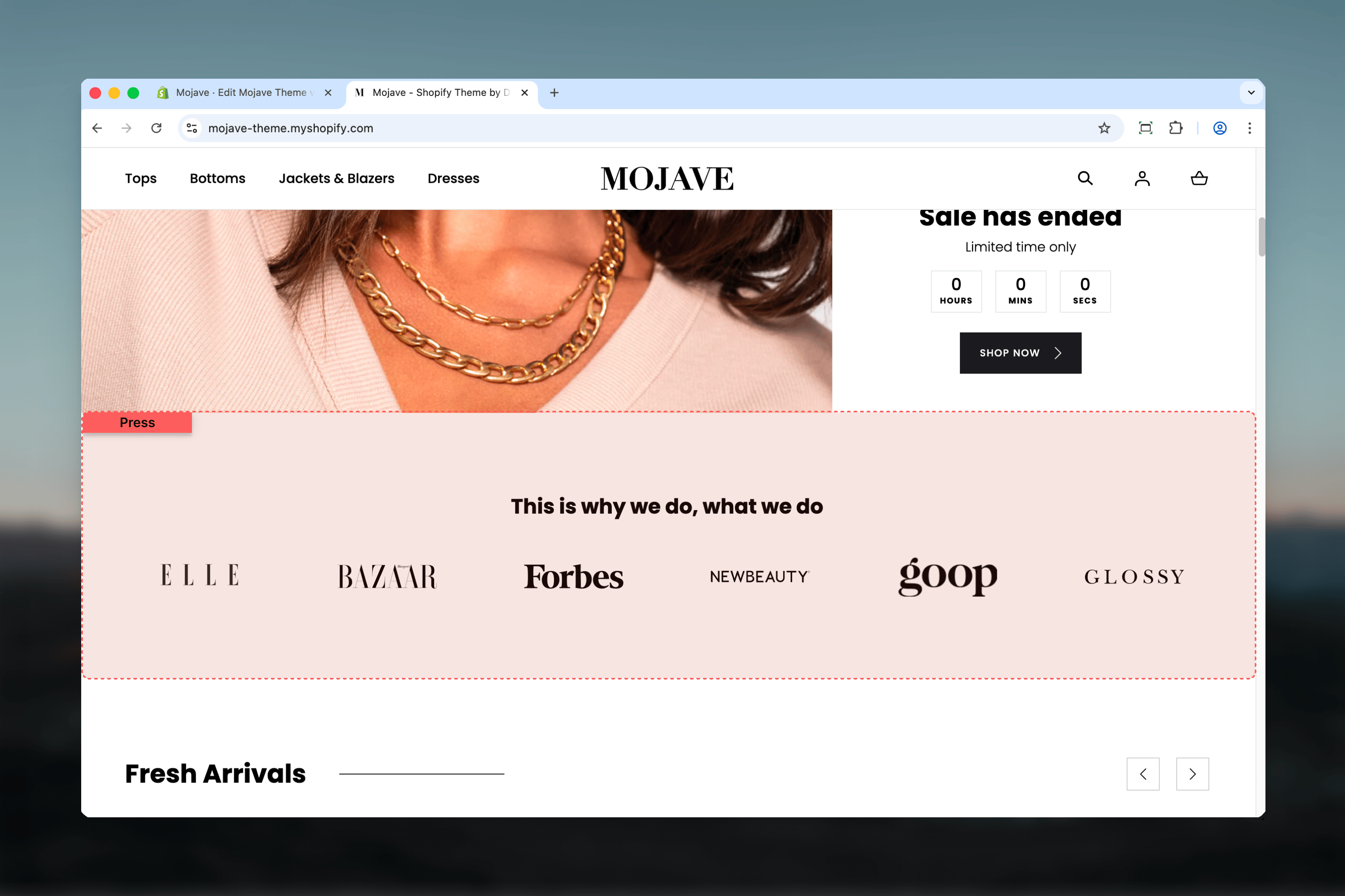
The Press section displays logos in a horizontal row or slider, perfect for showcasing media coverage, brand partnerships, certifications, or client portfolios. Features include:- Up to 6 logo blocks with images and optional testimonials
- Two display modes: Static grid or testimonial slider
- Optional control arrows for slider navigation (when testimonials enabled)
- Custom logo width per logo (120-400px)
- Heading above logos
- Narrow container default (Page or Fullwidth options)
Getting started
1
Add the section
From the Theme Customizer, click Add section and select Press
2
Add logo blocks
Click Add Logo block. Each block creates one logo. Add 3-6 logos (maximum 6 blocks).
3
Upload logo images
For each block, upload logo image. Optionally set custom width (120-400px) per logo.
4
Optional: Enable testimonials
Check “Enable testimonials” to activate slider mode. Add testimonial text to each logo block for rotation.
Section settings
Enable testimonials
Enable testimonials
Checkbox (default: unchecked)Activates testimonial slider mode:
- Unchecked: Logos display in static horizontal row (default)
- Checked: Logos become slider with testimonial text rotation
Enable control arrows
Enable control arrows
Checkbox (default: unchecked)Shows previous/next navigation arrows for slider:
- Only functional when “Enable testimonials” is checked
- Allows manual navigation between testimonials
Heading
Heading
Text field (default: “Express your brand”)Section heading above logos:
- Centered above logo row or slider
Spacing - Desktop & Mobile
Spacing - Desktop & Mobile
Desktop (default: Compact) and Mobile (default: Compact)Vertical spacing above and below section:
- Default: Standard spacing
- Medium: Moderate spacing
- Compact: Minimal spacing (default)
Section width
Section width
Dropdown (default: Narrow)Container width:
- Page: Standard page width
- Narrow: Medium width (default, optimal for logo rows)
- Fullwidth: Edge-to-edge
Block: Logo
Type: logo (maximum: 6 blocks) Each block creates one logo with optional testimonial text.Image
Image
Image picker (required)Logo image file:
- Use PNG with transparent background for flexibility
- Upload logos at 2x resolution for retina displays (e.g., if display width is 200px, upload 400px wide)
- Aspect ratio preserved—upload original logo dimensions
Set custom image width
Set custom image width
Checkbox (default: unchecked)Enables manual width control for this logo:
- Unchecked: Logo uses automatic sizing based on section layout
- Checked: Unlocks “Image width” slider below
Image width
Image width
Range: 120-400px (step: 10px, default: 240px)Controls logo display width (desktop/tablet only):
- Only active when “Set custom image width” is checked
- Info: “Affects only tablet and desktop. On mobile width is tied to the container.”
Testimonial
Testimonial
Textarea (optional)Testimonial text displayed with this logo in slider mode:
- Only shown when section setting “Enable testimonials” is checked
- Info: “Shown, if the section testimonials are enabled.”
- Press: “Best Product of 2024” — TechCrunch
- Partner: “Working with [Brand] transformed our business.” — Partner CEO
- Award: “Winner - Innovation Excellence Award 2024”
Best practices
3-6 logos optimal
Maximum is 6 blocks. Use 3-6 for balanced display. Fewer than 3 looks sparse, especially in narrow container.
Transparent PNG logos
Upload PNG files with transparent backgrounds. Adapts to any background color and looks professional.
Consistent visual weight
Balance logo sizes for visual harmony. Adjust custom widths so all logos feel similar in prominence/weight.
Grayscale for unity
Convert color logos to grayscale or single tone. Creates unified, professional look regardless of brand color variety.
Recognizable brands first
Order logos left-to-right by recognition/prestige. Most recognizable or prestigious logos leftmost (viewed first).
Static for simple trust
Use default static display (testimonials disabled) for simple “As Featured In” or partnership rows. Cleaner, faster scanning.
Testimonials for detail
Enable testimonials when you have meaningful quotes or want to highlight specific press coverage details.
Narrow width default
Keep default Narrow width. Logos centering creates focused trust indicator. Fullwidth spreads logos too thin visually.
Common use cases
Press mentions / “As Featured In” — Media outlet logos (TechCrunch, Forbes, Wired, etc.) with optional testimonials showing quotes or headlines Client/customer logos — B2B brands showcasing enterprise clients or partners (static display, no testimonials) Certifications & awards — Certification body logos (organic, fair trade, B Corp) or award badges with optional descriptions Partner brands — Retail partners, distribution partners, or brand collaborations (e.g., “Available At…”) Social proof indicators — Trust badges (Better Business Bureau, secure payment, etc.) for credibility Investor/backing logos — Startups showcasing venture capital or investment partnersLayout behavior
Static mode (testimonials disabled):- All logos display in horizontal row
- Evenly spaced, centered in container
- Logo count determines individual logo width
- Responsive: On mobile, logos stack or wrap to multiple rows
- One logo + testimonial visible at a time
- Logo centered above testimonial text
- Auto-advancing slider (timing varies by theme)
- Manual navigation: Control arrows (if enabled) or swipe/drag
- Dots/pagination indicators showing slide count
- Logos in horizontal row, centered
- Each logo respects custom width or auto-sizing
- Ample spacing between logos
- Logos stack vertically or wrap to 2 columns depending on count
- Custom width settings ignored—logos size to fit mobile container
- Maintains aspect ratios
Logo guidelines
File format:- PNG with transparency (strongly recommended)
- SVG accepted by some themes (check upload)
- Avoid JPG—white backgrounds look unprofessional on colored page backgrounds
- Upload at 2x resolution for retina displays
- Display width 240px → upload 480px wide
- Display width 200px → upload 400px wide
- Maintain original logo aspect ratio (don’t stretch/squish)
- Crop excess whitespace around logo artwork
- Monochrome recommended: Convert color logos to black, white, or gray
- Grayscale creates visual unity across diverse brand colors
- Some themes offer CSS filters to enforce monochrome styling
- Compress PNGs (TinyPNG, ImageOptim)
- Target < 50KB per logo for fast loading
- Transparency allows smaller file sizes vs. full backgrounds
Testimonial content guidelines
When to use testimonials:- You have actual quotes from press, partners, or customers
- You want to add context beyond just logo recognition
- You have 3-6 meaningful quotes (matches logo count)
- Short quotes: 1-3 sentences, 20-50 words
- Attribution: Include source/speaker name at end (”— TechCrunch” or ”— Jane Doe, CEO”)
- Specific praise: Avoid generic quotes—use specific claims
- Consistent formatting: Same structure across all testimonials
- Press: ""Best ecommerce platform we’ve tested.” — The Verge”
- Award: “Winner, Best Innovation in Retail Technology 2024 — RetailWeek Awards”
- Partner: “Our sales increased 200% after partnering with [Brand].” — Partner Company CEO”
- Customer (B2B): “Reduced operational costs by 40% within 6 months.” — Enterprise Client CTO”
Customization tips
For press mentions (homepage):- Static display (testimonials off)
- 4-6 recognizable media logos
- Heading: “As Featured In”, “Press & Media”
- Grayscale logos for professional look
- Narrow width (default)
- Static display
- 5-6 client logos
- Heading: “Trusted By”, “Our Clients”, “Partners”
- Custom widths to balance diverse logo types
- Page or Narrow width
- Testimonials enabled (show award details)
- 3-4 certification/award logos
- Heading: “Certified & Awarded”, “Recognized For Excellence”
- Testimonial: Award name, year, category
- Control arrows on for manual browsing
- Static display
- 3-5 investor/VC logos
- Heading: “Backed By”, “Supported By”
- Equal-weighted sizing
- Narrow width
Slider behavior (testimonials enabled)
Auto-advance:- Slides automatically change every 5-8 seconds (theme-dependent)
- Smooth transitions between logo/testimonial pairs
- Loops continuously (after last slide, returns to first)
- Control arrows: Previous/next buttons (if enabled)
- Swipe/drag: Touch or mouse drag on mobile/desktop
- Pagination dots: Click specific dot to jump to that slide
- Many themes pause auto-advance on hover (desktop) or tap (mobile)
- Resumes auto-advance after interaction ends
- Keyboard navigation support (arrow keys)
- Screen reader announcements for slide changes
- Descriptive alt text on logos
Related sections
- Testimonials — Dedicated customer review section with star ratings
- Marquees — Scrolling text/logo banners for continuous display
- Multi Column Text — Alternative for text-based trust indicators without logos
- Content Tiles — Grid-based layouts for more complex partner showcases