What this template controls
- Layout structure, width, alignment, and spacing
- Product, collection, or cart-related storefront behavior
- Search, filter, and sorting behavior for product discovery
- Color schemes, contrast, and shared visual styling
- The template section order and the supporting sections included by default
Template structure
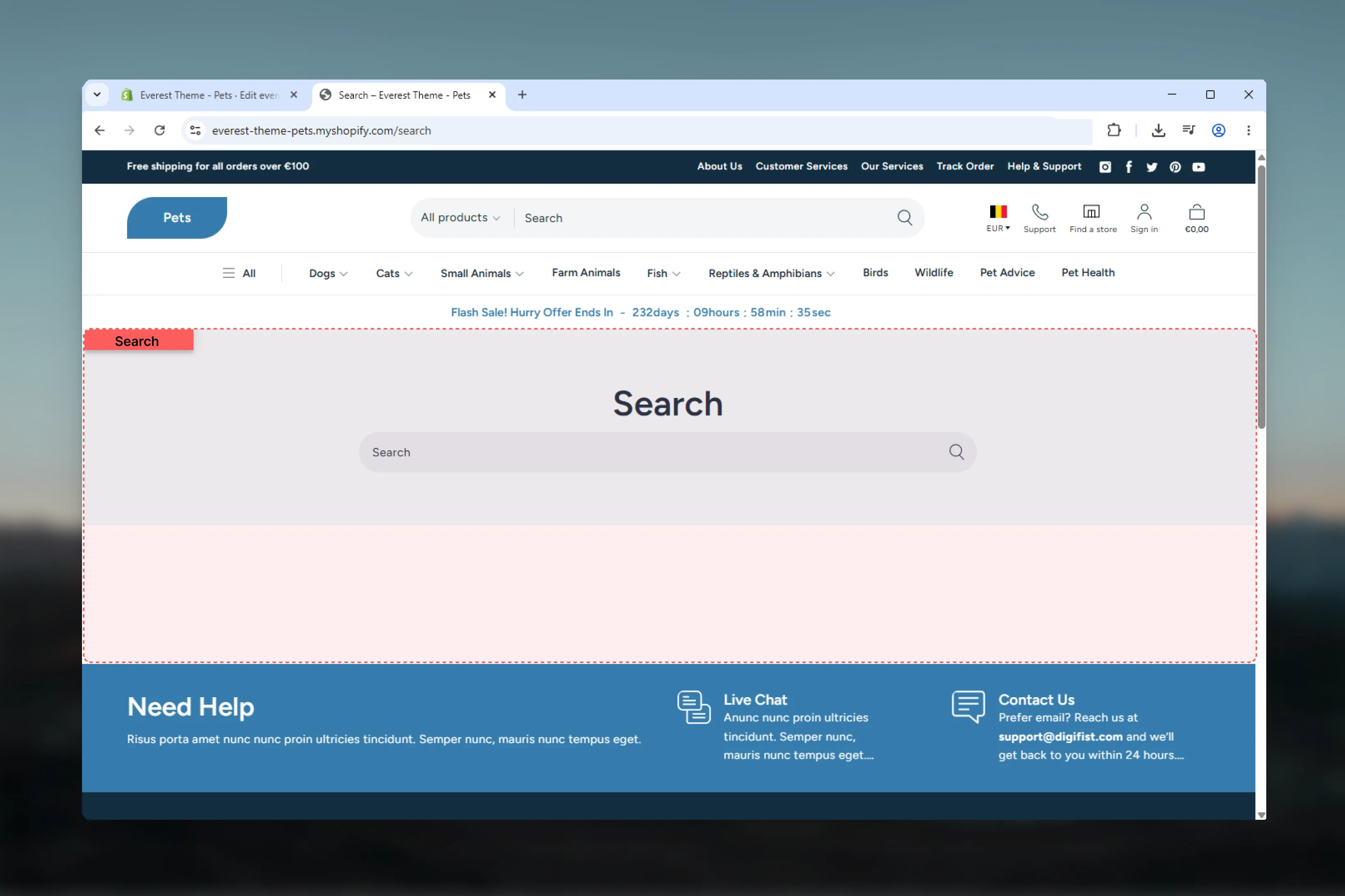
This template uses the following main sections or related theme building blocks by default:- Search
- Predictive Search
Getting started
1
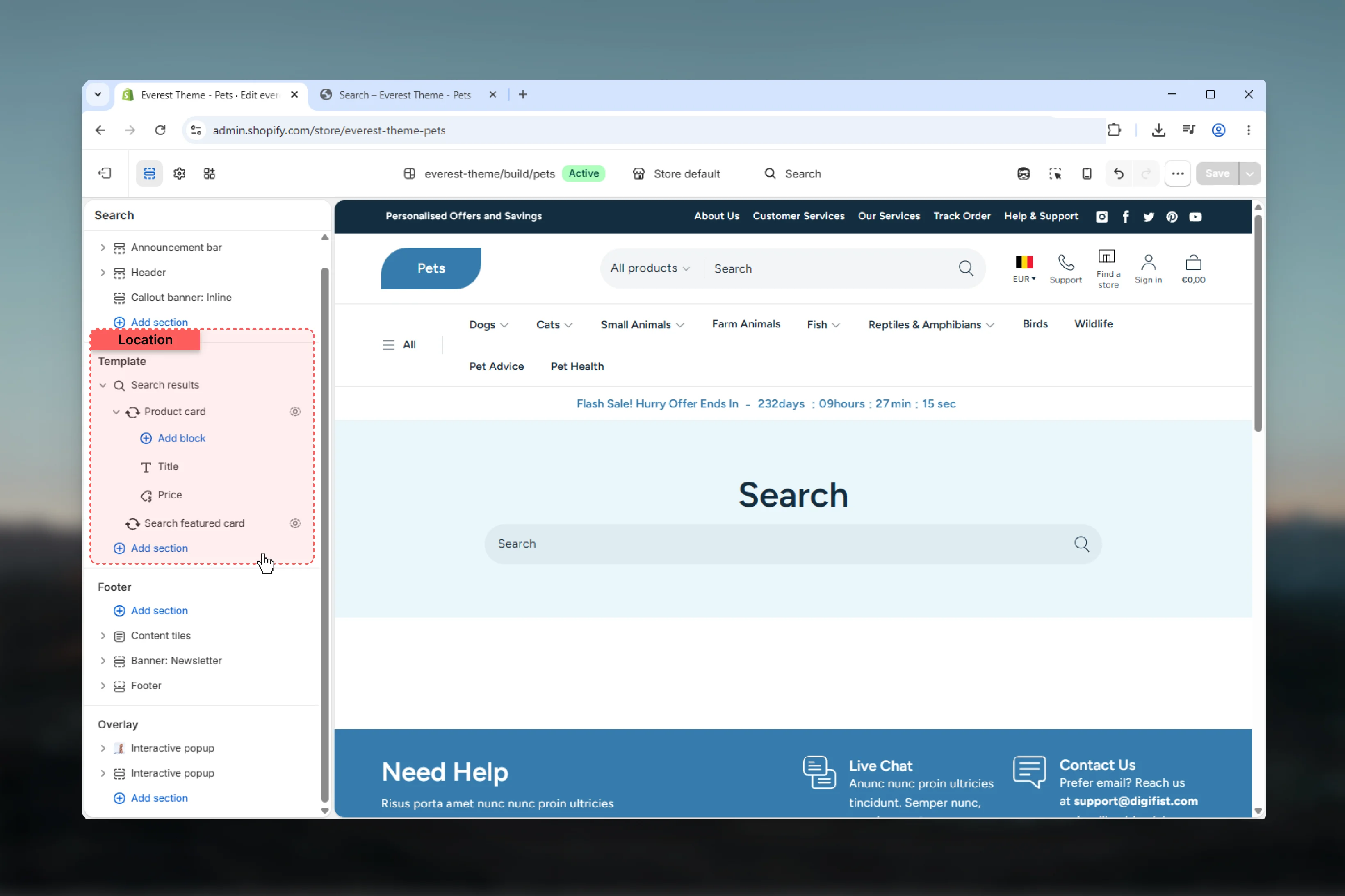
Open the template in Theme Customizer
Open the relevant page type or assign the template to a resource before customizing it.
2
Review the main section first
Start with the primary content section so layout, filtering, gallery, or page-level behavior is defined before refining supporting content.
3
Adjust supporting sections
Review any banners, content sections, or utility sections included in the template so the full page works together as a set.
Main settings
Settings
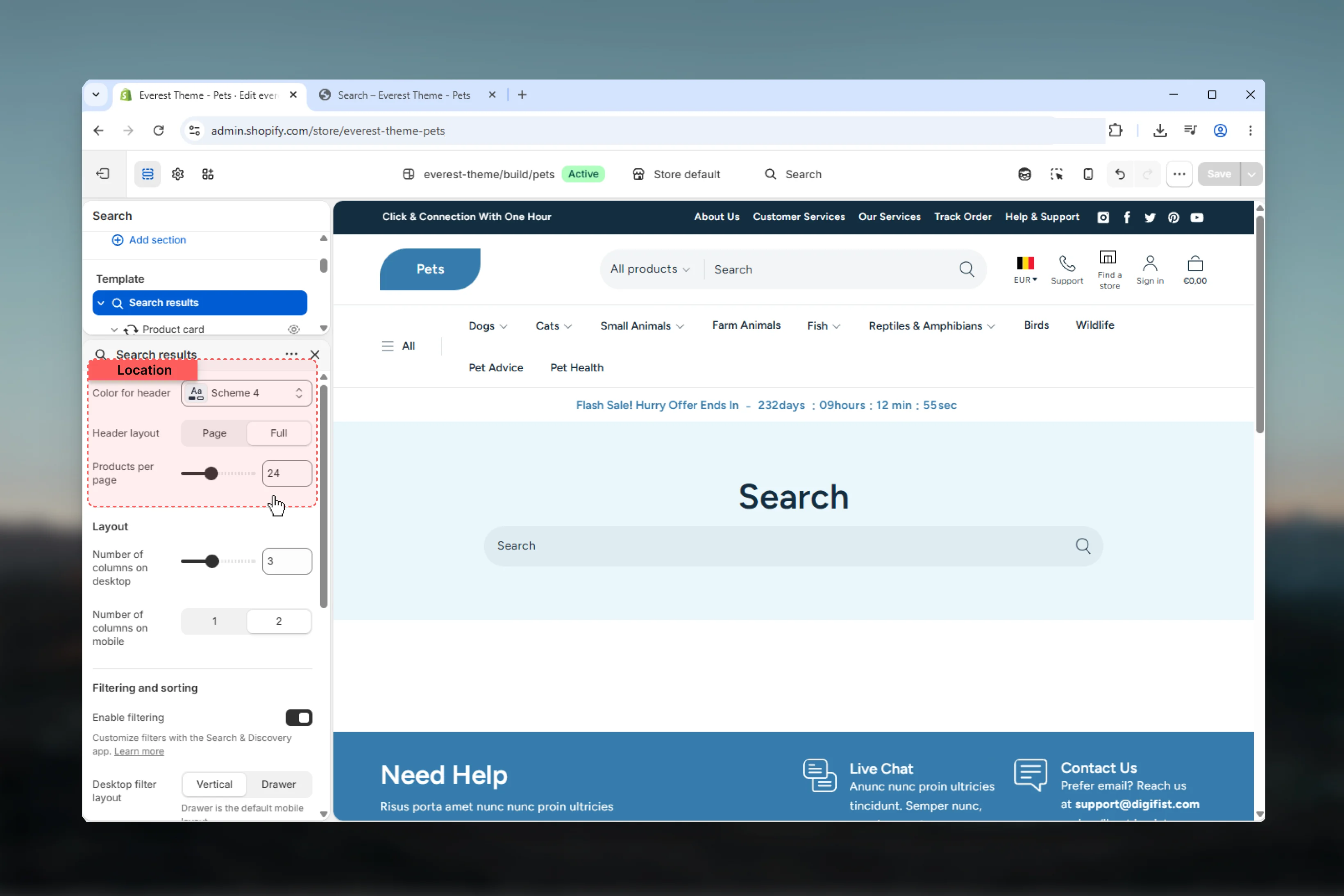
Color for header
Color for header
Select the color scheme used for color for header.Use this to keep contrast and branding consistent with the rest of the store.Default:
scheme-4Header layout
Header layout
Choose how Header layout behaves in the section.It has the strongest effect on layout balance and visual hierarchy.Available options: Page, Full.Default:
fullProducts per page
Products per page
Adjust Products per page with a slider-based control.Range:
8 to 50 Default: 24Layout
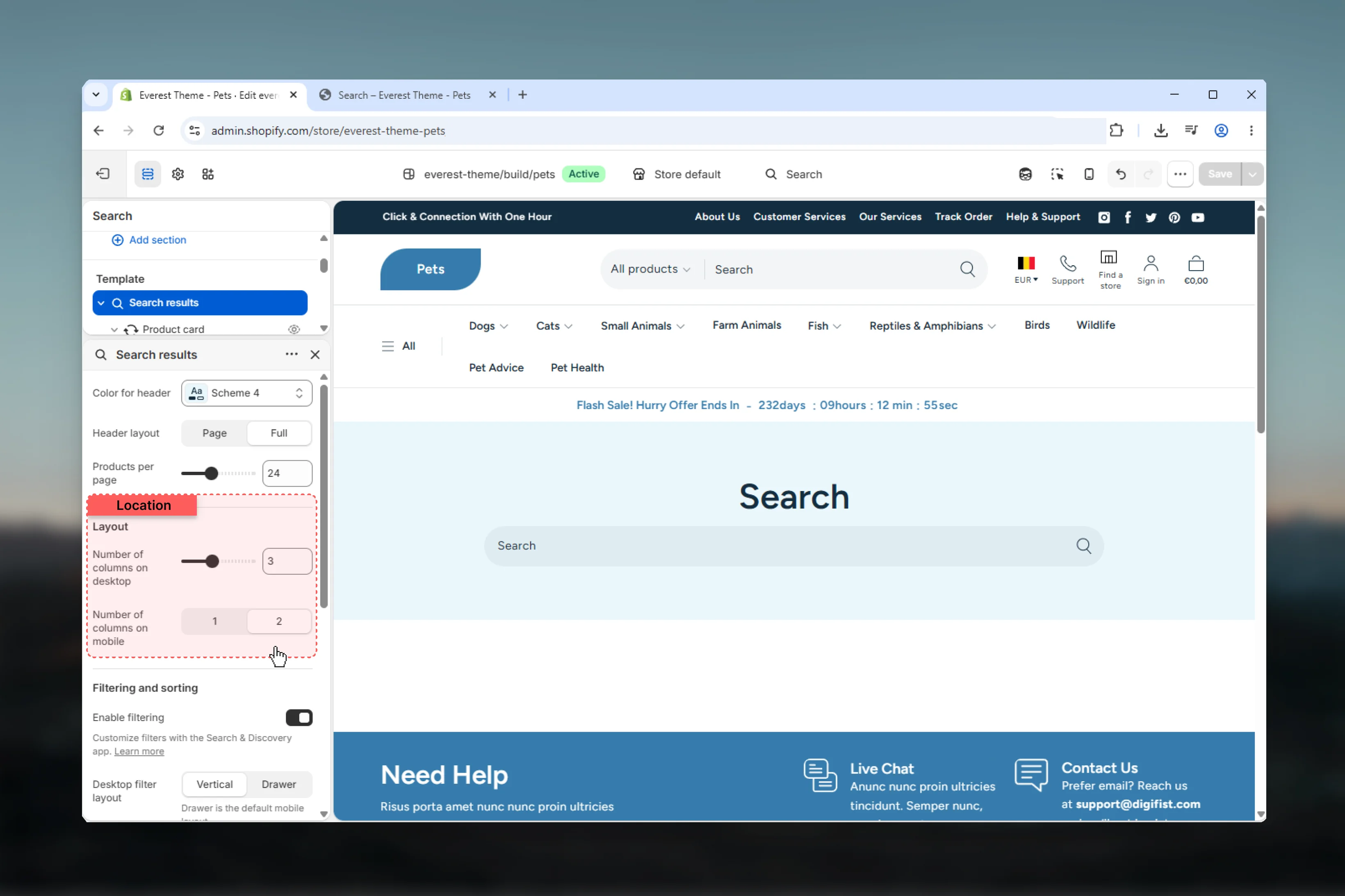
Number of columns on desktop
Number of columns on desktop
Adjust Number of columns on desktop with a slider-based control.It has the strongest effect on layout balance and visual hierarchy.Range:
1 to 6 Default: 3Number of columns on mobile
Number of columns on mobile
Choose how Number of columns on mobile behaves in the section.It has the strongest effect on layout balance and visual hierarchy.Available options: 1, 2.Default:
2Filtering and sorting
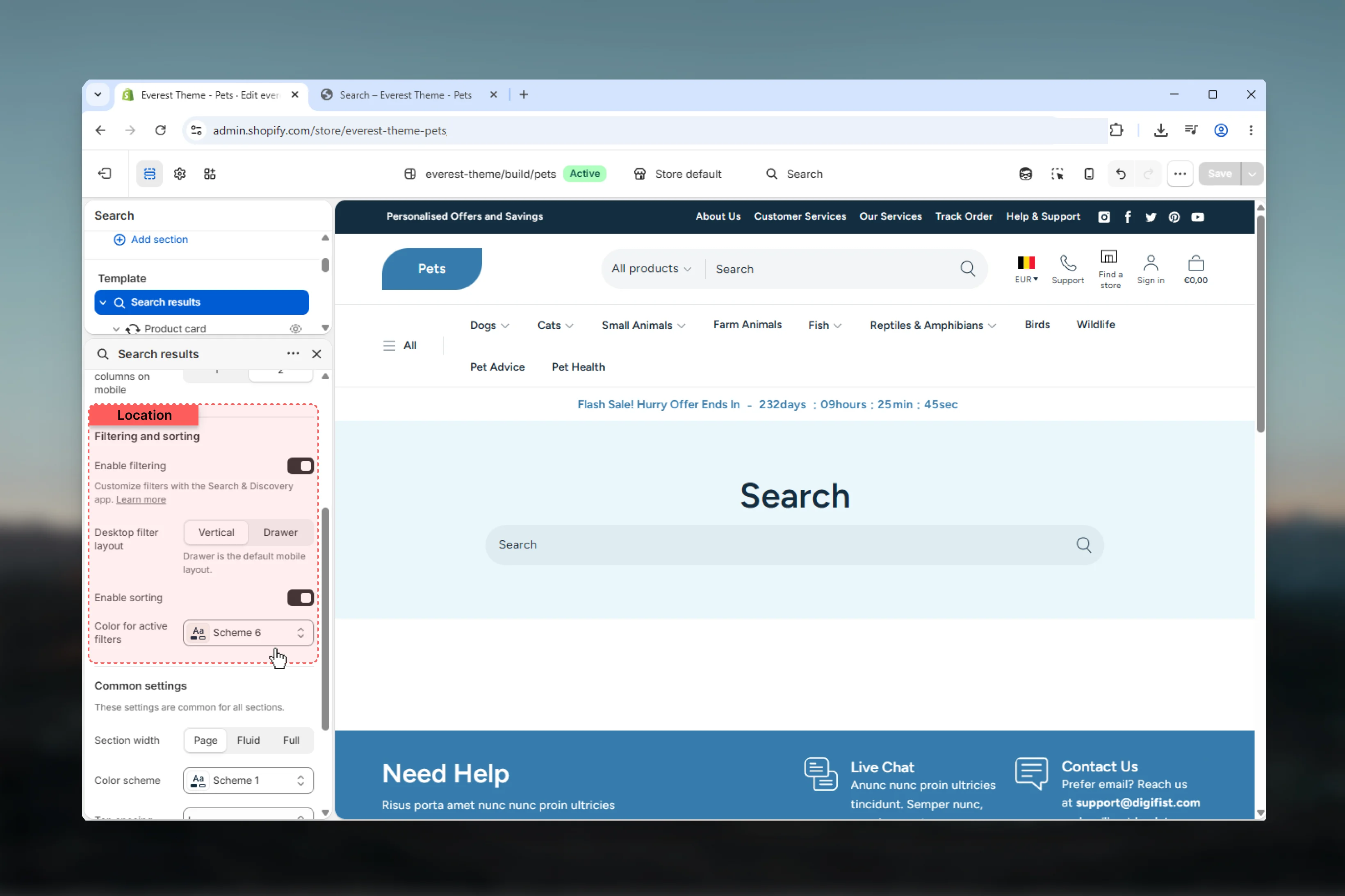
Enable filtering
Enable filtering
Enable or disable Enable filtering.Make sure the chosen option still feels easy to scan and use on smaller screens.Default:
enabledCustomize filters with the Search & Discovery app. Learn moreDesktop filter layout
Desktop filter layout
Choose how Desktop filter layout behaves in the section.Make sure the chosen option still feels easy to scan and use on smaller screens.Available options: Vertical, Drawer.Default:
verticalDrawer is the default mobile layout.Enable sorting
Enable sorting
Enable or disable Enable sorting.Make sure the chosen option still feels easy to scan and use on smaller screens.Default:
enabledColor for active filters
Color for active filters
Select the color scheme used for color for active filters.Use this to keep contrast and branding consistent with the rest of the store.Default:
scheme-6Common settings
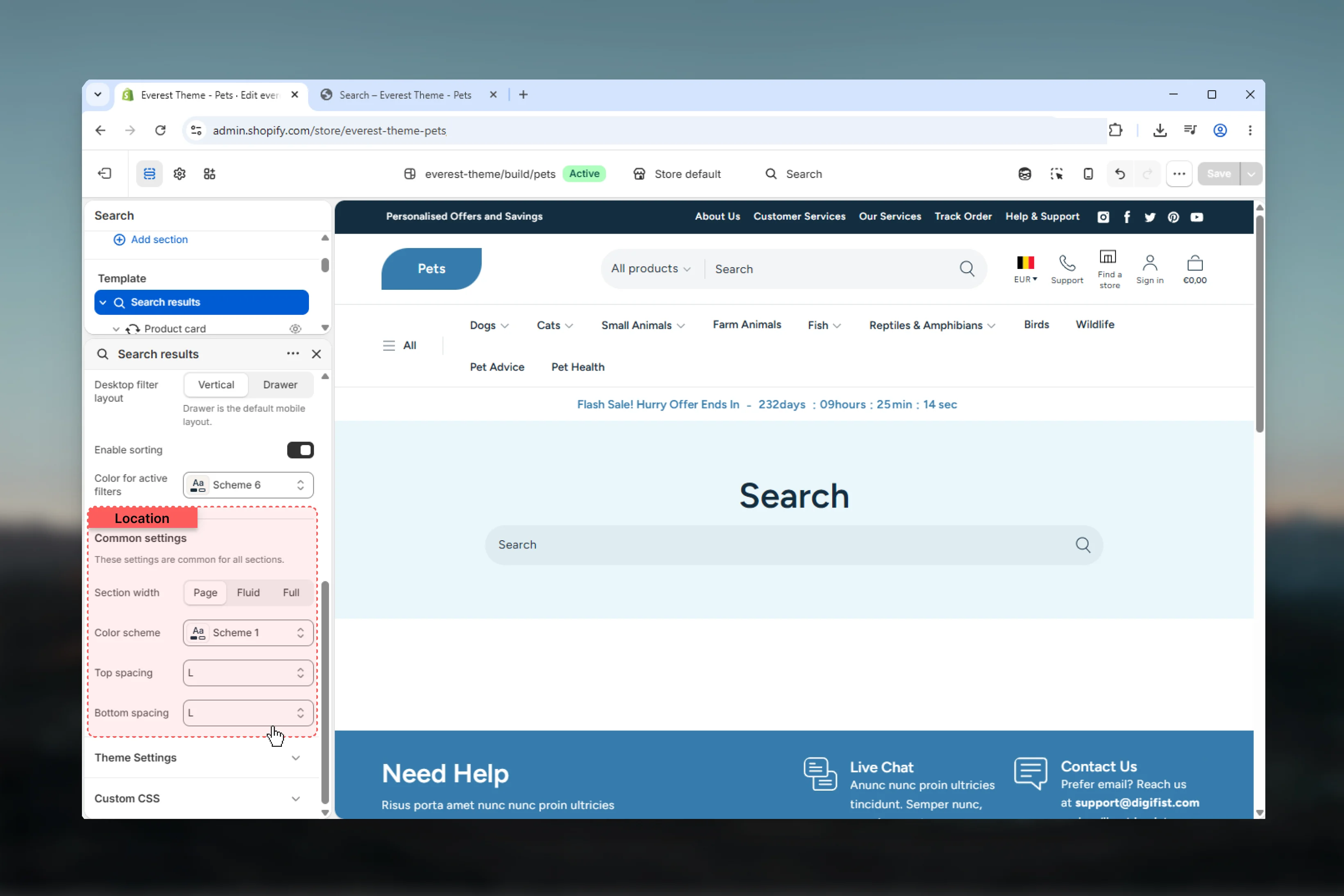
Section width
Section width
Choose how Section width behaves in the section.This setting shapes the section container and how it sits against surrounding content.Available options: Page, Fluid, Full.Default:
pageColor scheme
Color scheme
Select the color scheme used for color scheme.Use this to keep contrast and branding consistent with the rest of the store.Default:
scheme-1Top spacing
Top spacing
Choose how Top spacing behaves in the section.This setting shapes the section container and how it sits against surrounding content.Available options: No, S, M, L, XL.Default:
4Bottom spacing
Bottom spacing
Choose how Bottom spacing behaves in the section.This setting shapes the section container and how it sits against surrounding content.Available options: No, S, M, L, XL.Default:
4Best practices
- Check contrast after changing color schemes so text and controls remain easy to read.
- Adjust layout changes alongside neighboring sections so page rhythm stays consistent.
- Test this template with real content volume so headings, cards, and filters behave as expected.
- Review supporting sections together because template defaults often work as a coordinated set.