What this section controls
- Layout structure, width, alignment, and spacing
- Color schemes, contrast, and shared visual styling
Getting started
1
Open the Theme Customizer
In Shopify admin, go to Online Store -> Themes -> Customize.
2
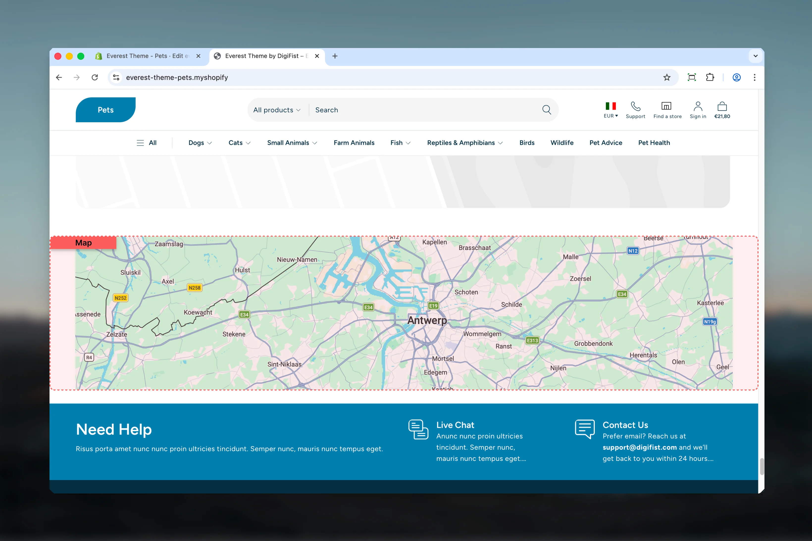
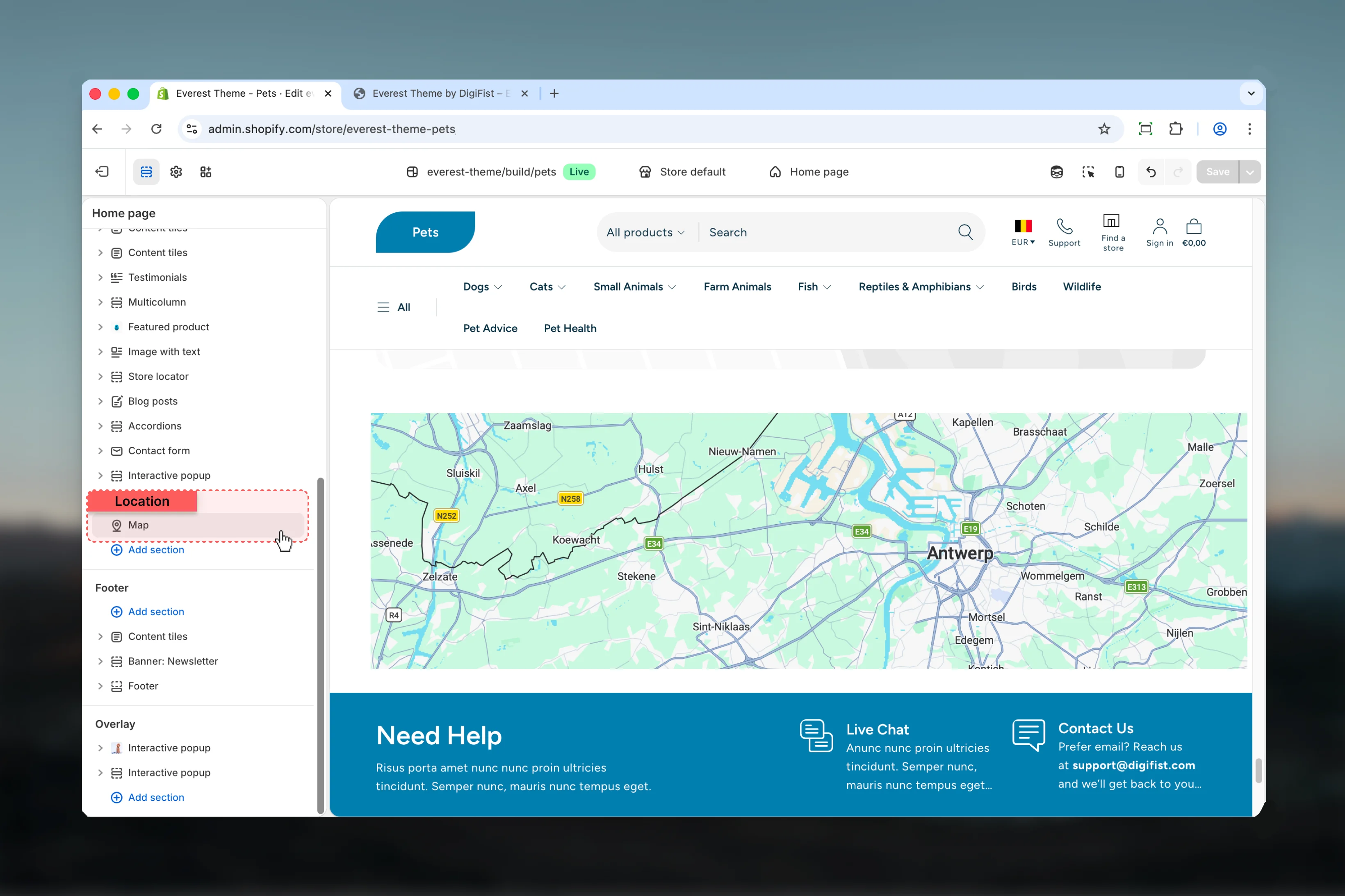
Add or open Map
Add the Map section to a compatible template or select the existing section from the left sidebar.
3
Adjust the main settings first
Start with the structural settings such as layout, width, color scheme, spacing, or content source before refining smaller details.
Section settings
Settings
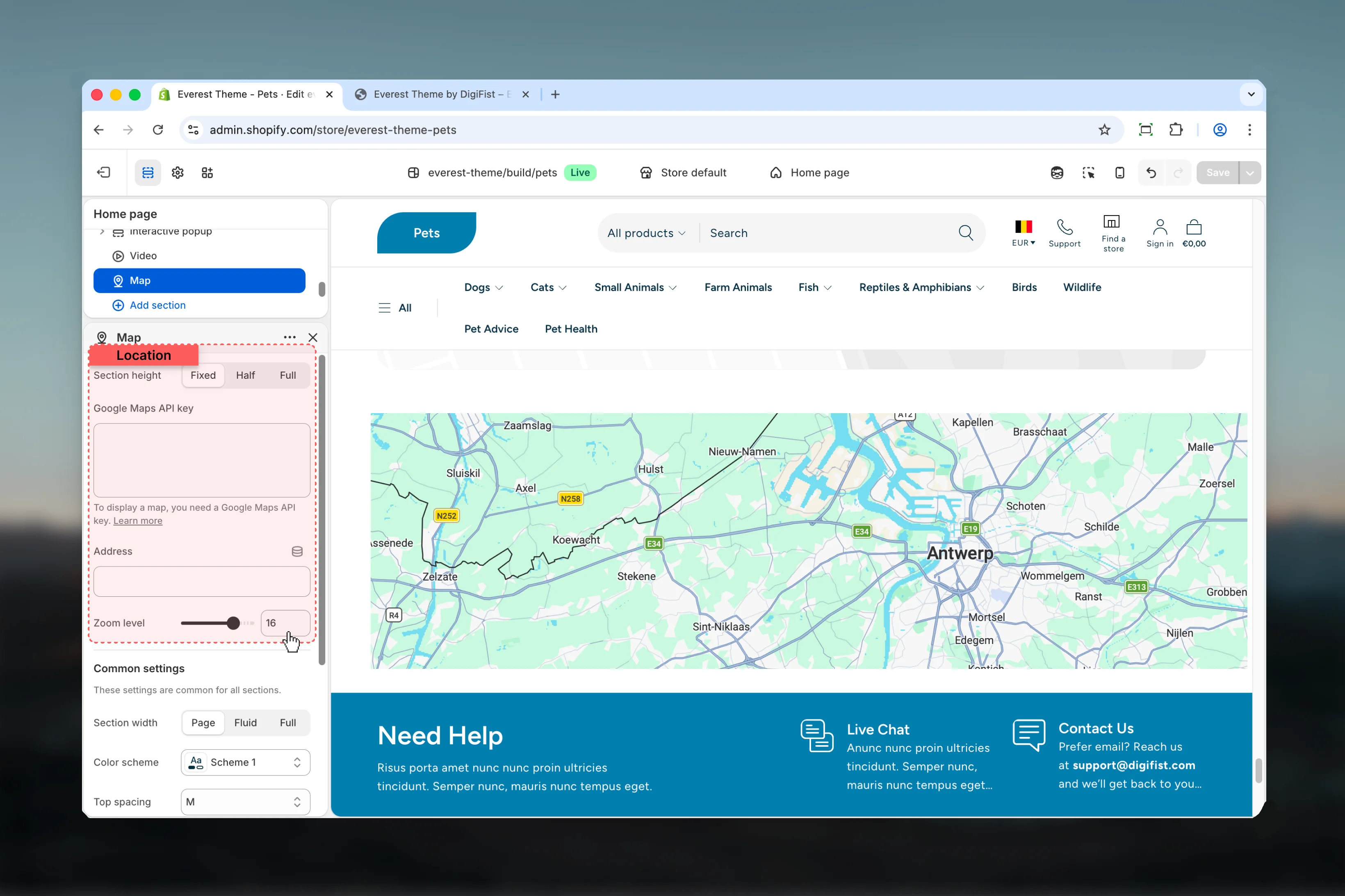
Section height
Section height
Choose how Section height behaves in the section.It has the strongest effect on layout balance and visual hierarchy.Available options: Fixed, Half, Full.Default:
36remGoogle Maps API key
Google Maps API key
Enter the content used for google maps api key.To display a map, you need a Google Maps API key. Learn more
Address
Address
Enter the content used for address.
Zoom level
Zoom level
Adjust Zoom level with a slider-based control.Range:
0 to 21 Default: 16Common settings
Section width
Section width
Choose how Section width behaves in the section.This setting shapes the section container and how it sits against surrounding content.Available options: Page, Fluid, Full.Default:
pageColor scheme
Color scheme
Select the color scheme used for color scheme.Use this to keep contrast and branding consistent with the rest of the store.Default:
scheme-1Top spacing
Top spacing
Choose how Top spacing behaves in the section.This setting shapes the section container and how it sits against surrounding content.Available options: No, S, M, L, XL.Default:
2Bottom spacing
Bottom spacing
Choose how Bottom spacing behaves in the section.This setting shapes the section container and how it sits against surrounding content.Available options: No, S, M, L, XL.Default:
2Section border
Section border
Choose how Section border behaves in the section.This setting shapes the section container and how it sits against surrounding content.Available options: None, Top, Bottom, Both.Default:
noneBest practices
- Check contrast after changing color schemes so text and controls remain easy to read.
- Adjust layout changes alongside neighboring sections so page rhythm stays consistent.
- Start with the structural settings first, then refine decorative styling after the layout feels settled.
- Preview the section with realistic content length to catch spacing and wrapping issues early.