What this section controls
- Headings, text content, and on-page messaging
- Layout structure, width, alignment, and spacing
- Color schemes, contrast, and shared visual styling
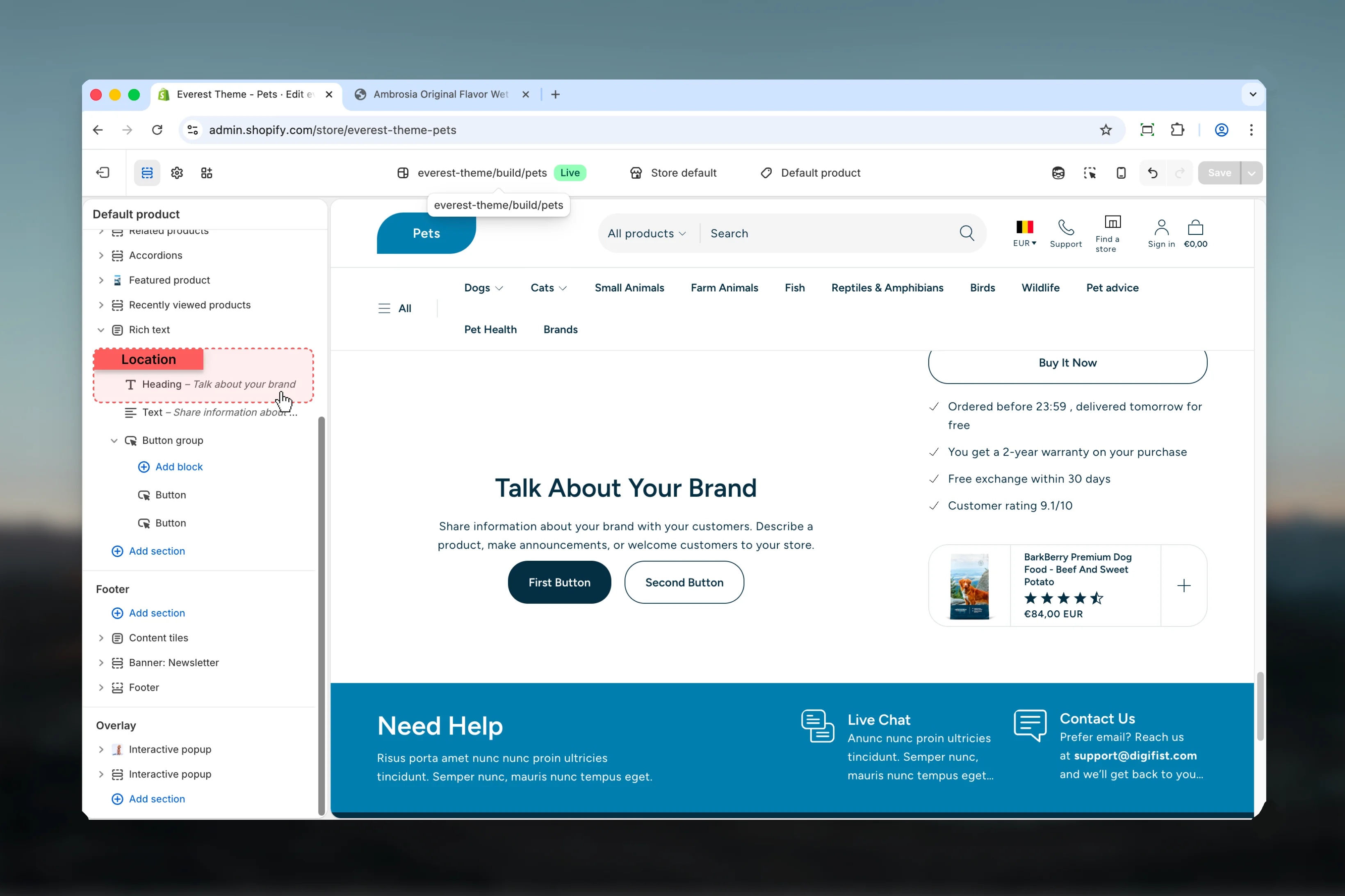
- Block types such as Heading, Text, Button Group
Getting started
1
Open the Theme Customizer
In Shopify admin, go to Online Store -> Themes -> Customize.
2
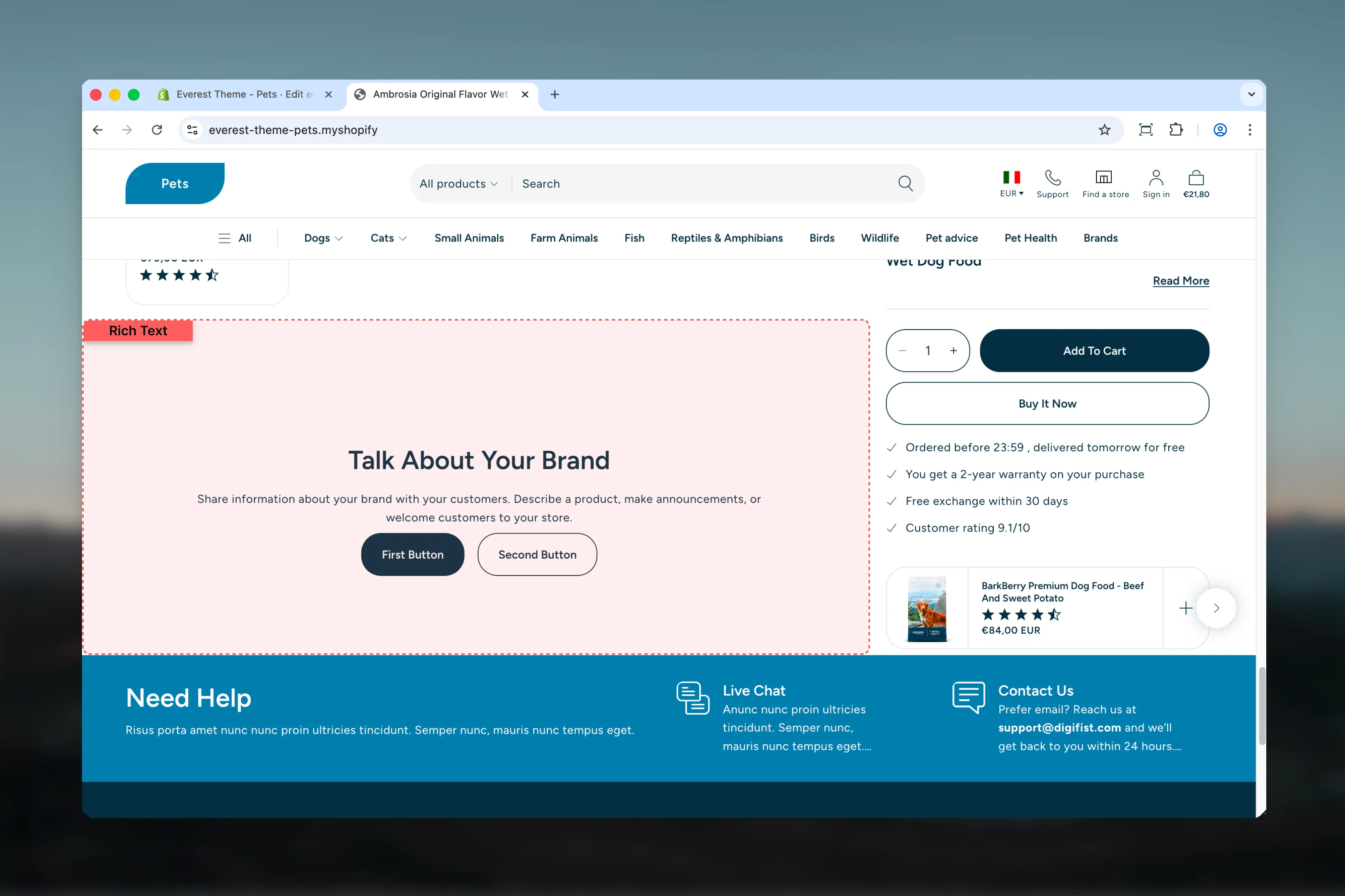
Add or open Rich Text
Add the Rich Text section to a compatible template or select the existing section from the left sidebar.
3
Adjust the main settings first
Start with the structural settings such as layout, width, color scheme, spacing, or content source before refining smaller details.
4
Review blocks and supporting content
Add, remove, or reorder blocks after the main layout feels right so content hierarchy stays easier to manage.

Section settings
Content
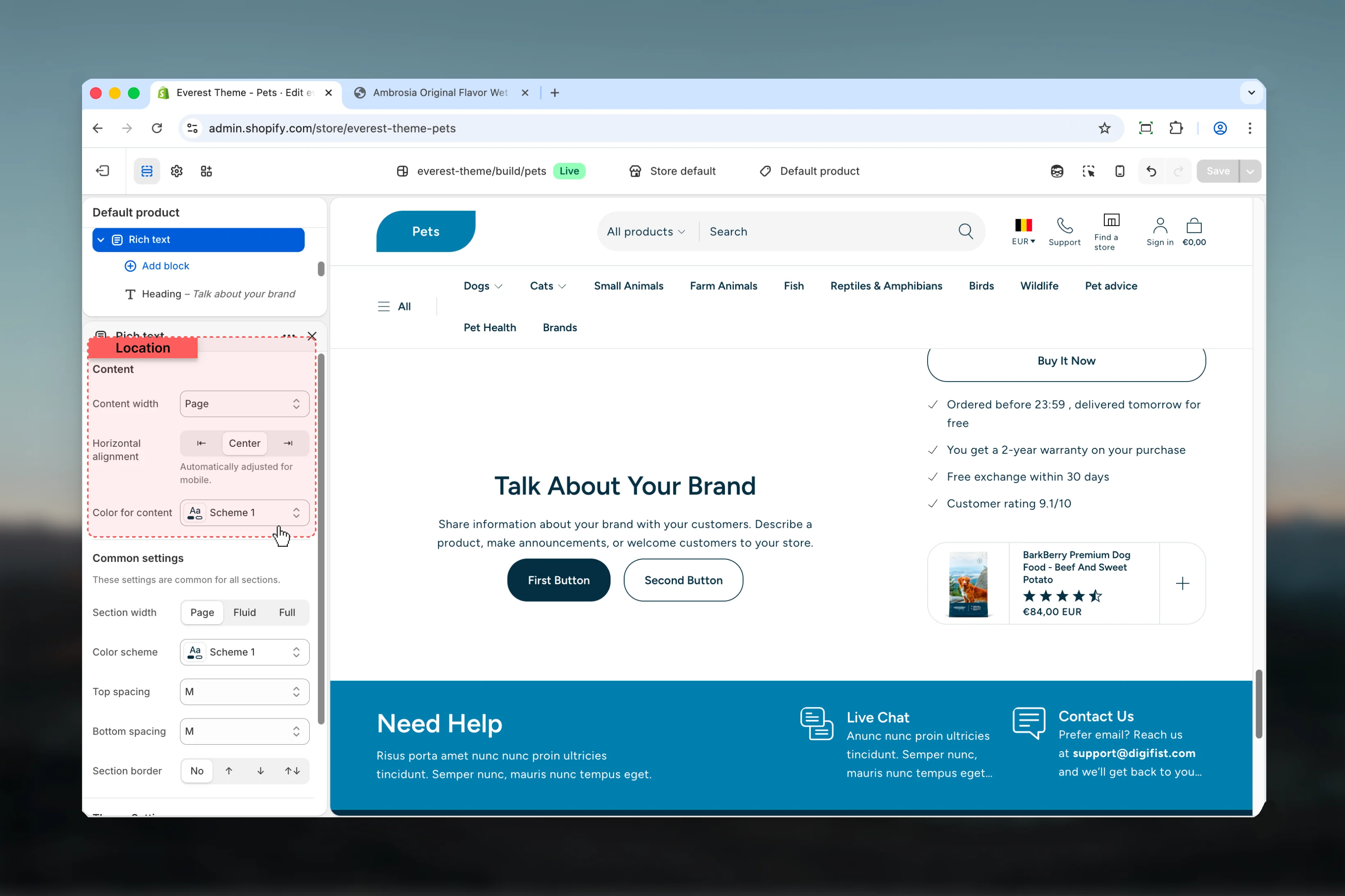
Content width
Content width
Choose how Content width behaves in the section.It has the strongest effect on layout balance and visual hierarchy.Available options: Small, Medium, Large, Page, Fluid, Full.Default:
pageHorizontal alignment
Horizontal alignment
Choose how Horizontal alignment behaves in the section.It has the strongest effect on layout balance and visual hierarchy.Available options: ⇤, Center, ⇥.Default:
centerAutomatically adjusted for mobile.Color for content
Color for content
Select the color scheme used for color for content.Use this to keep contrast and branding consistent with the rest of the store.Default:
scheme-1Common settings
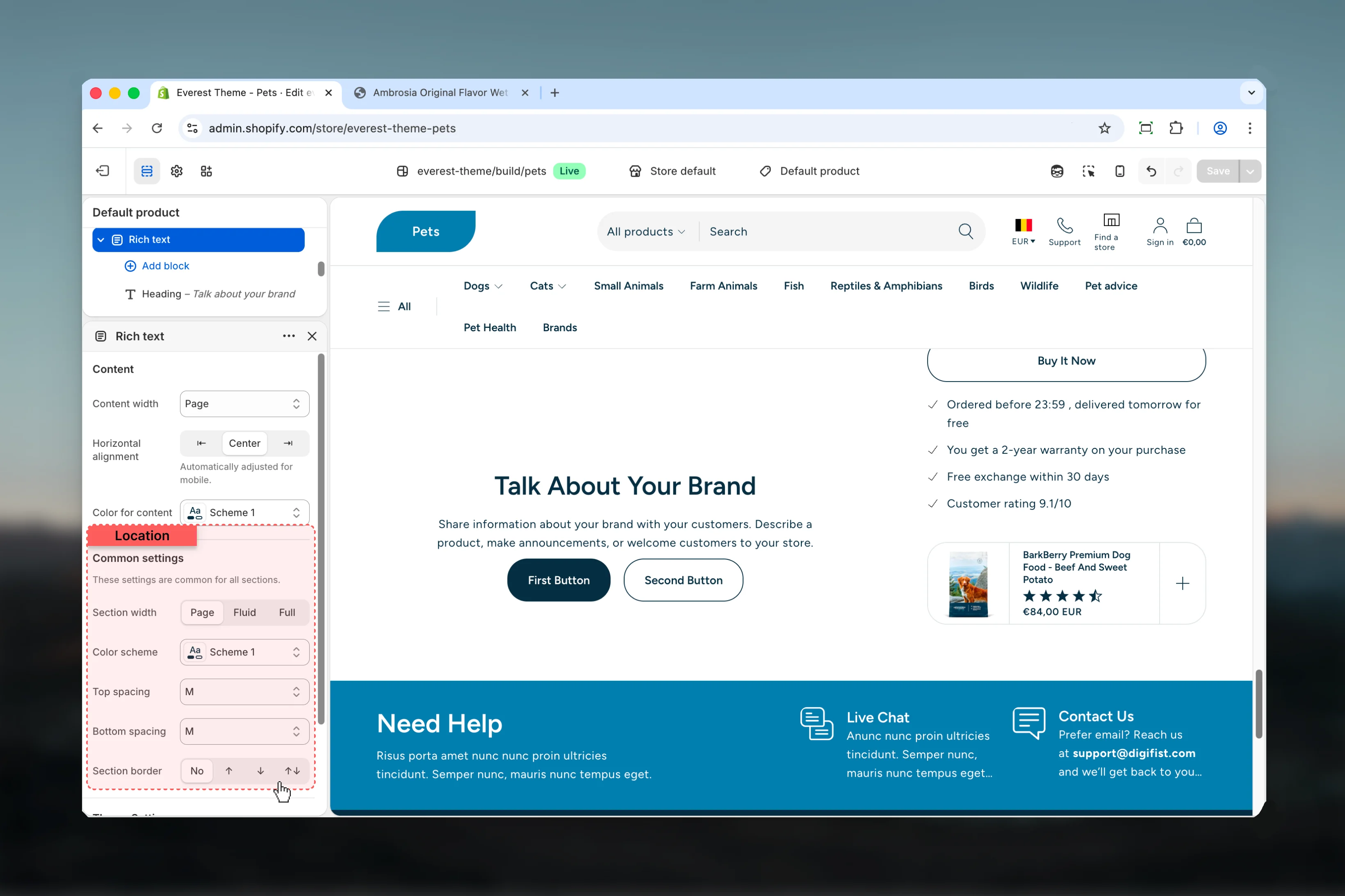
Section width
Section width
Choose how Section width behaves in the section.This setting shapes the section container and how it sits against surrounding content.Available options: Page, Fluid, Full.Default:
pageColor scheme
Color scheme
Select the color scheme used for color scheme.Use this to keep contrast and branding consistent with the rest of the store.Default:
scheme-1Top spacing
Top spacing
Choose how Top spacing behaves in the section.This setting shapes the section container and how it sits against surrounding content.Available options: No, S, M, L, XL.Default:
2Bottom spacing
Bottom spacing
Choose how Bottom spacing behaves in the section.This setting shapes the section container and how it sits against surrounding content.Available options: No, S, M, L, XL.Default:
2Section border
Section border
Choose how Section border behaves in the section.This setting shapes the section container and how it sits against surrounding content.Available options: None, Top, Bottom, Both.Default:
noneBlock settings
Heading
Settings
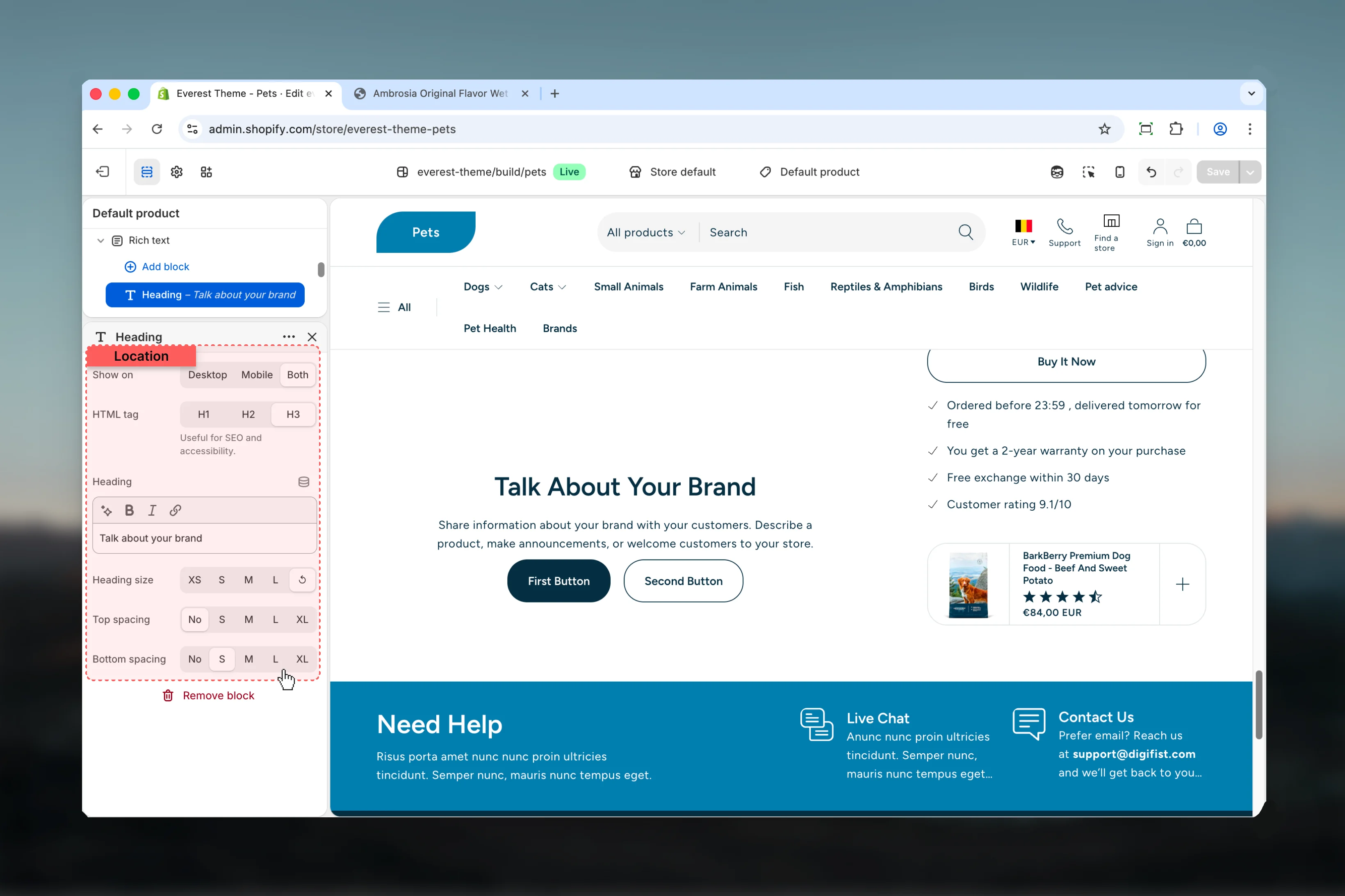
Show on
Show on
Choose how Show on behaves in the section.Available options: Desktop, Mobile, Both.Default:
bothHTML tag
HTML tag
Choose how HTML tag behaves in the section.Available options: H1, H2, H3.Default:
h3Useful for SEO and accessibility.Heading
Heading
Enter the content used for heading.
Heading size
Heading size
Choose how Heading size behaves in the section.Available options: XS, S, M, L, ↺.Default:
defaultTop spacing
Top spacing
Choose how Top spacing behaves in the section.This setting shapes the section container and how it sits against surrounding content.Available options: No, S, M, L, XL.Default:
0Bottom spacing
Bottom spacing
Choose how Bottom spacing behaves in the section.This setting shapes the section container and how it sits against surrounding content.Available options: No, S, M, L, XL.Default:
smText

Settings
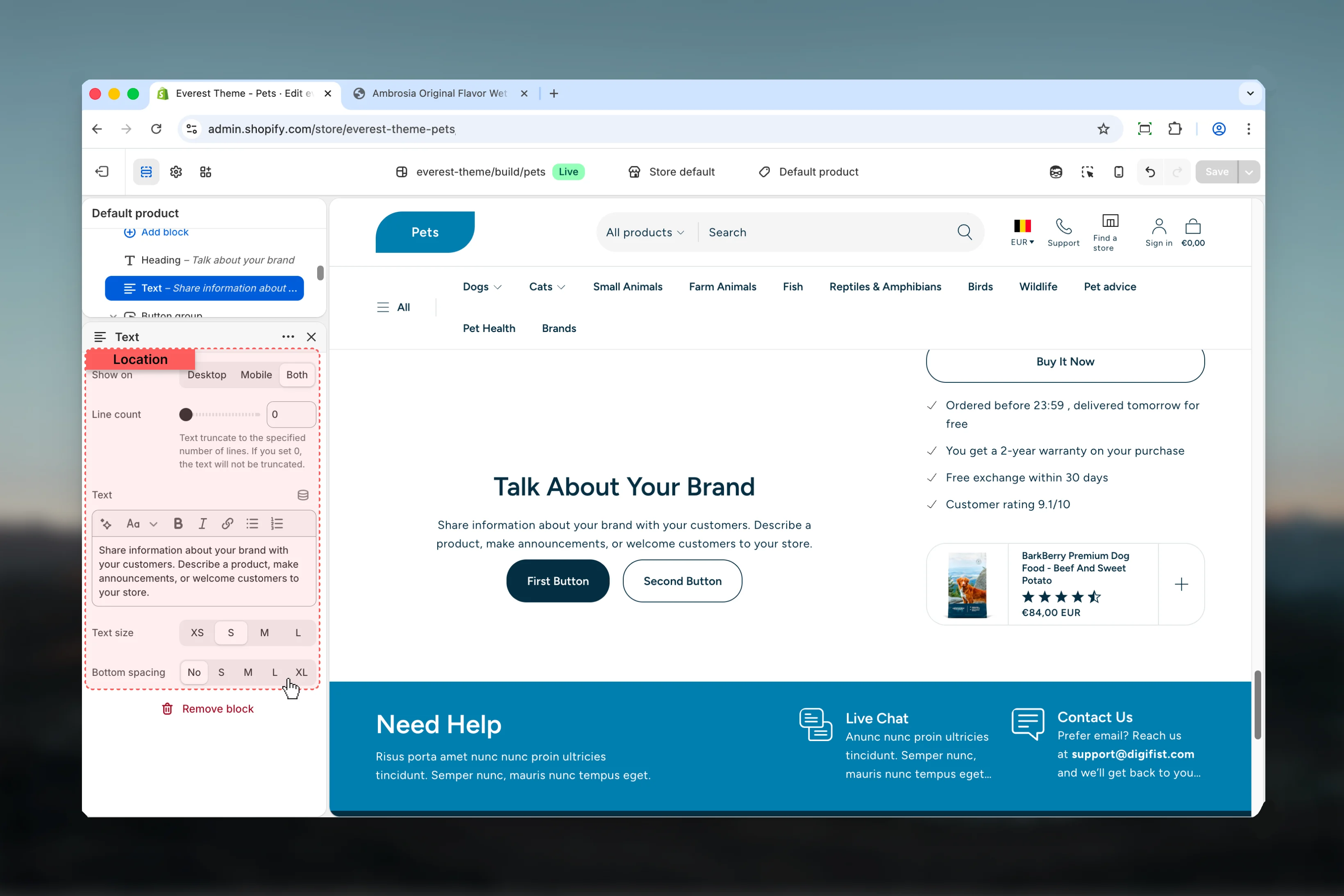
Show on
Show on
Choose how Show on behaves in the section.Available options: Desktop, Mobile, Both.Default:
bothLine count
Line count
Adjust Line count with a slider-based control.Range:
0 to 10 Default: 0Text truncate to the specified number of lines. If you set 0, the text will not be truncated.Text
Text
Enter the content used for text.
Text size
Text size
Choose how Text size behaves in the section.Available options: XS, S, M, L.Default:
smBottom spacing
Bottom spacing
Choose how Bottom spacing behaves in the section.This setting shapes the section container and how it sits against surrounding content.Available options: No, S, M, L, XL.Default:
0Button Group
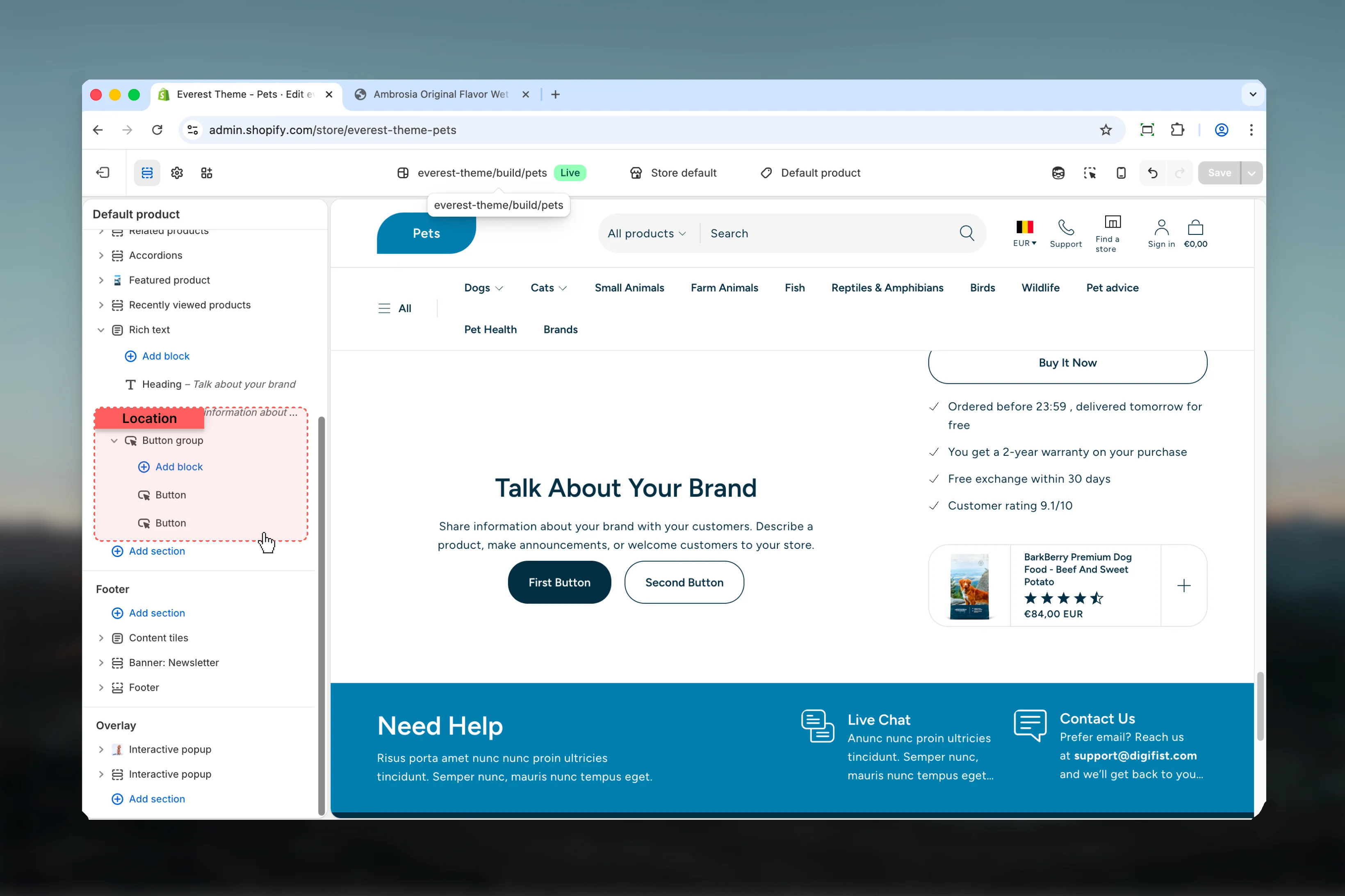
Settings

Top spacing
Top spacing
Choose how Top spacing behaves in the section.This setting shapes the section container and how it sits against surrounding content.Available options: No, S, M, L, Auto.Default:
2Bottom spacing
Bottom spacing
Choose how Bottom spacing behaves in the section.This setting shapes the section container and how it sits against surrounding content.Available options: No, S, M, L, Auto.Default:
0Space between
Space between
Choose how Space between behaves in the section.Available options: S, M, L, XL.Default:
4Space between buttons, optimized for mobile- Button for more granular content inside this block.
Best practices
- Check contrast after changing color schemes so text and controls remain easy to read.
- Adjust layout changes alongside neighboring sections so page rhythm stays consistent.
- Start with the structural settings first, then refine decorative styling after the layout feels settled.
- Preview the section with realistic content length to catch spacing and wrapping issues early.