What this section controls
- Headings, text content, and on-page messaging
- Images, videos, and other media presentation options
- Layout structure, width, alignment, and spacing
- Color schemes, contrast, and shared visual styling
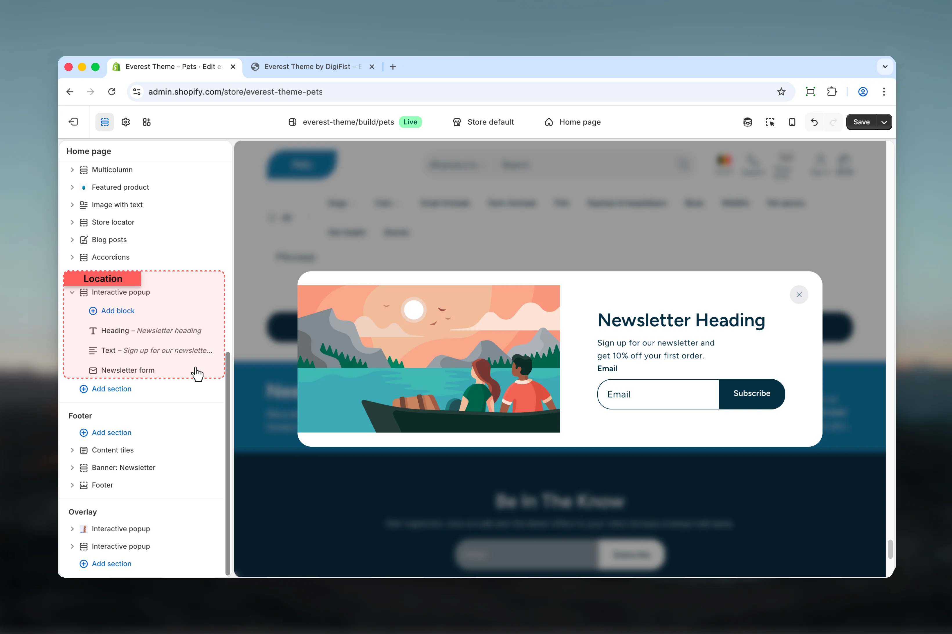
- Block types such as Heading, Text, Form Newsletter, Button Group and more
Getting started
1
Open the Theme Customizer
In Shopify admin, go to Online Store -> Themes -> Customize.
2
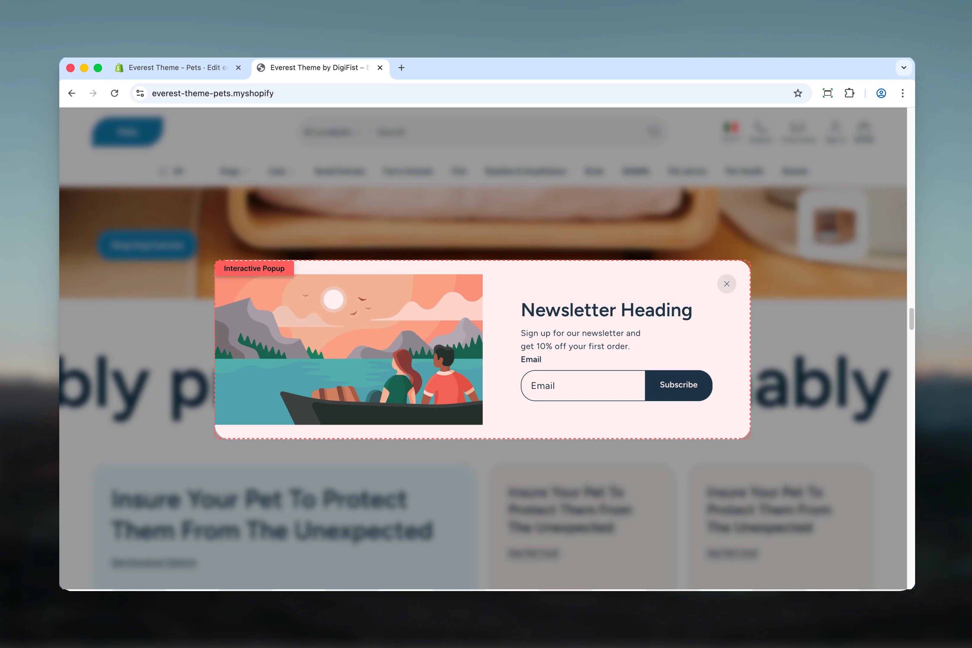
Add or open Interactive Popup
Add the Interactive Popup section to a compatible template or select the existing section from the left sidebar.
3
Adjust the main settings first
Start with the structural settings such as layout, width, color scheme, spacing, or content source before refining smaller details.
4
Review blocks and supporting content
Add, remove, or reorder blocks after the main layout feels right so content hierarchy stays easier to manage.
Section settings
Settings
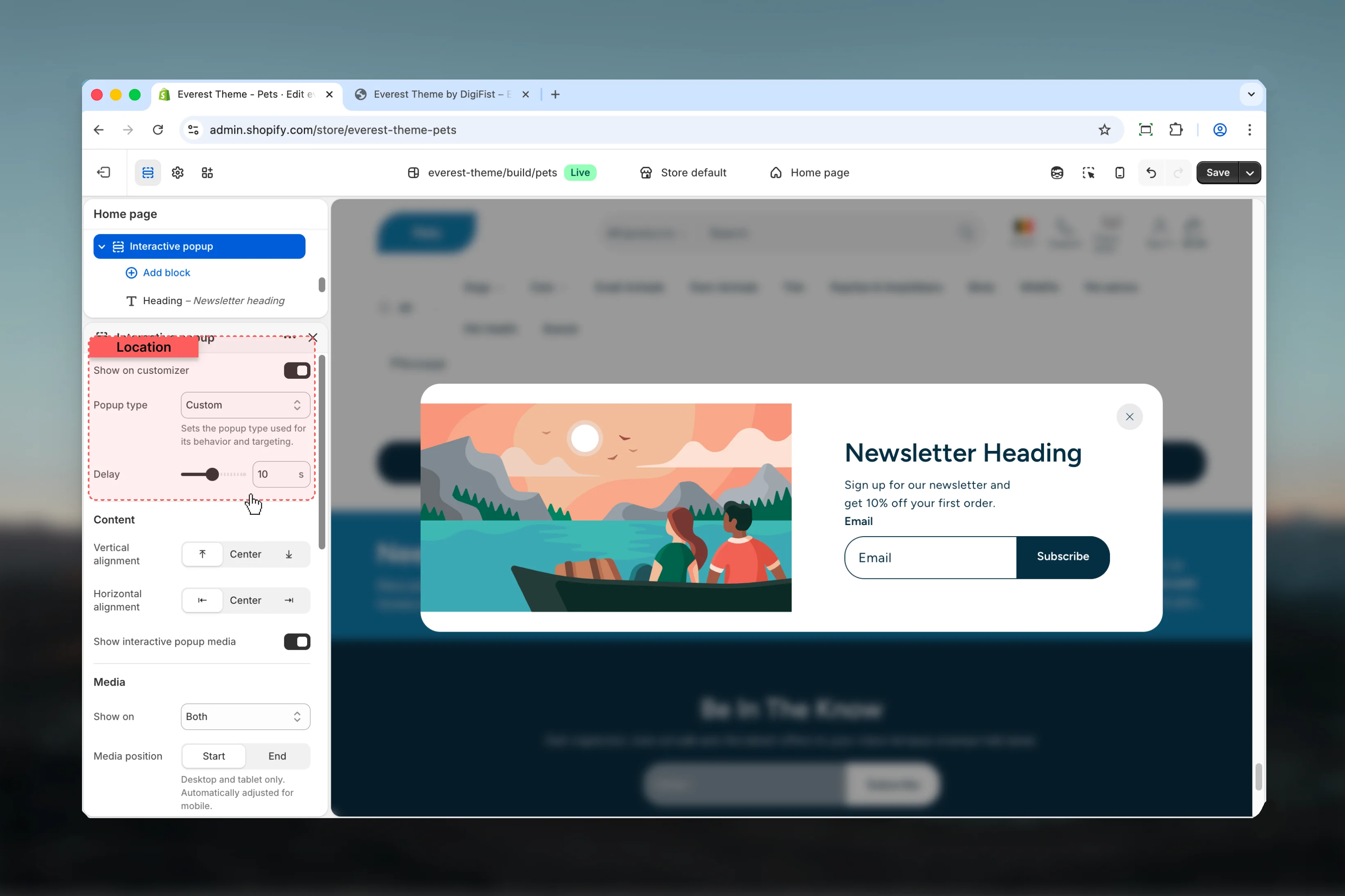
Show on customizer
Show on customizer
Enable or disable Show on customizer.Default:
disabledPopup type
Popup type
Choose how Popup type behaves in the section.Available options: Newsletter signup, Age verification, Custom.Default:
customSets the popup type used for its behavior and targeting.Delay
Delay
Adjust Delay with a slider-based control.Range:
1 to 20 Default: 10sContent

Vertical alignment
Vertical alignment
Choose how Vertical alignment behaves in the section.It has the strongest effect on layout balance and visual hierarchy.Available options: ⤒, Center, ⤓.Default:
startHorizontal alignment
Horizontal alignment
Choose how Horizontal alignment behaves in the section.It has the strongest effect on layout balance and visual hierarchy.Available options: ⇤, Center, ⇥.Default:
startShow interactive popup media
Show interactive popup media
Enable or disable Show interactive popup media.Review the result on both desktop and mobile when media changes are involved.Default:
enabledMedia
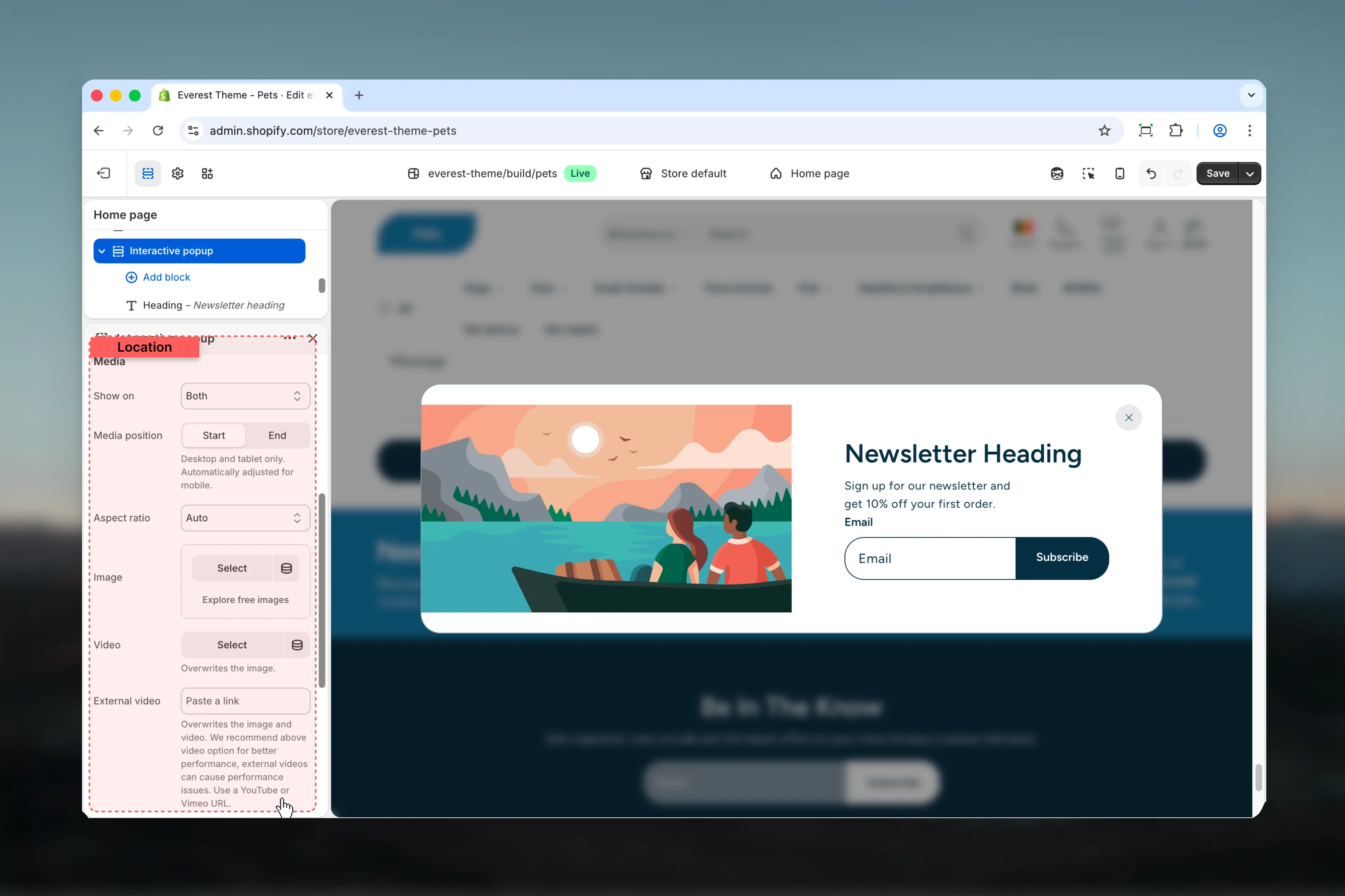
Show on
Show on
Choose how Show on behaves in the section.Review the result on both desktop and mobile when media changes are involved.Available options: Desktop, Mobile, Both.Default:
bothThis setting only appears when its related parent option is enabled.Media position
Media position
Choose how Media position behaves in the section.It has the strongest effect on layout balance and visual hierarchy.Available options: Start, End.Default:
startThis setting only appears when its related parent option is enabled.Desktop and tablet only. Automatically adjusted for mobile.Aspect ratio
Aspect ratio
Choose how Aspect ratio behaves in the section.It has the strongest effect on layout balance and visual hierarchy.Available options: Auto, Square, 4:3, 3:4, 3:2, 2:3, 5:4, 4:5, 16:9, 9:16, 2:1, 4:1, 8:1, 1:2.Default:
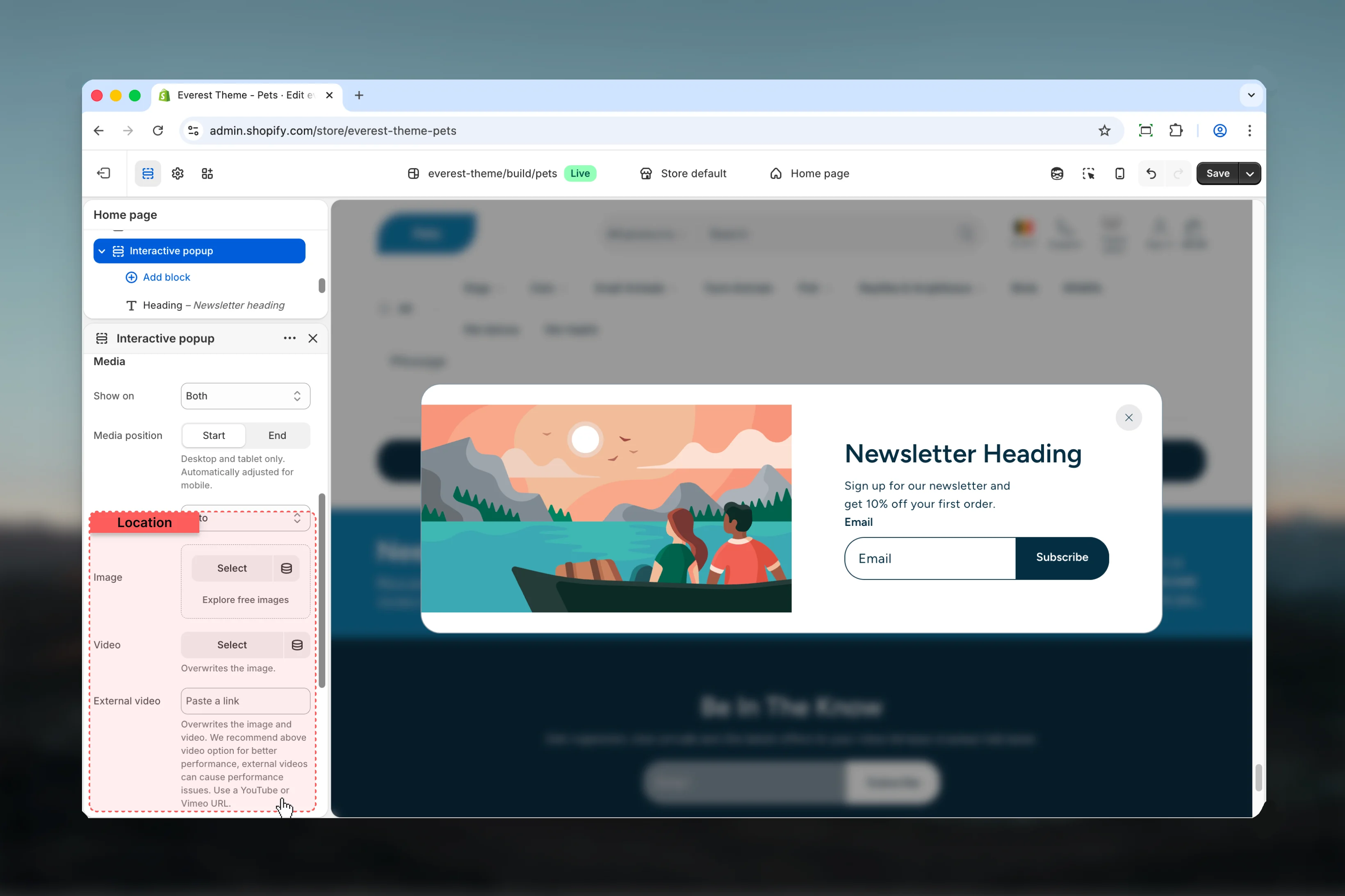
autoThis setting only appears when its related parent option is enabled.Image
Image
Upload or choose an image for image.Review the result on both desktop and mobile when media changes are involved.This setting only appears when its related parent option is enabled.
Video
Video
Choose a hosted video for video.Review the result on both desktop and mobile when media changes are involved.This setting only appears when its related parent option is enabled.Overwrites the image.
External video
External video
Paste an external video URL for external video.Review the result on both desktop and mobile when media changes are involved.This setting only appears when its related parent option is enabled.Overwrites the image and video. We recommend above video option for better performance, external videos can cause performance issues. Use a YouTube or Vimeo URL.
Enable mobile specific media
Enable mobile specific media
Enable or disable Enable mobile specific media.Review the result on both desktop and mobile when media changes are involved.Default:
disabledThis setting only appears when its related parent option is enabled.Displays mobile-specific alternative media. Add a media before setting a mobile alternative.Media for mobile
Image
Image
Upload or choose an image for image.Review the result on both desktop and mobile when media changes are involved.This setting only appears when its related parent option is enabled.
Video
Video
Choose a hosted video for video.Review the result on both desktop and mobile when media changes are involved.This setting only appears when its related parent option is enabled.Overwrites the image.
External video
External video
Paste an external video URL for external video.Review the result on both desktop and mobile when media changes are involved.This setting only appears when its related parent option is enabled.Overwrites the image and video. We recommend above video option for better performance, external videos can cause performance issues. Use a YouTube or Vimeo URL.
Common settings
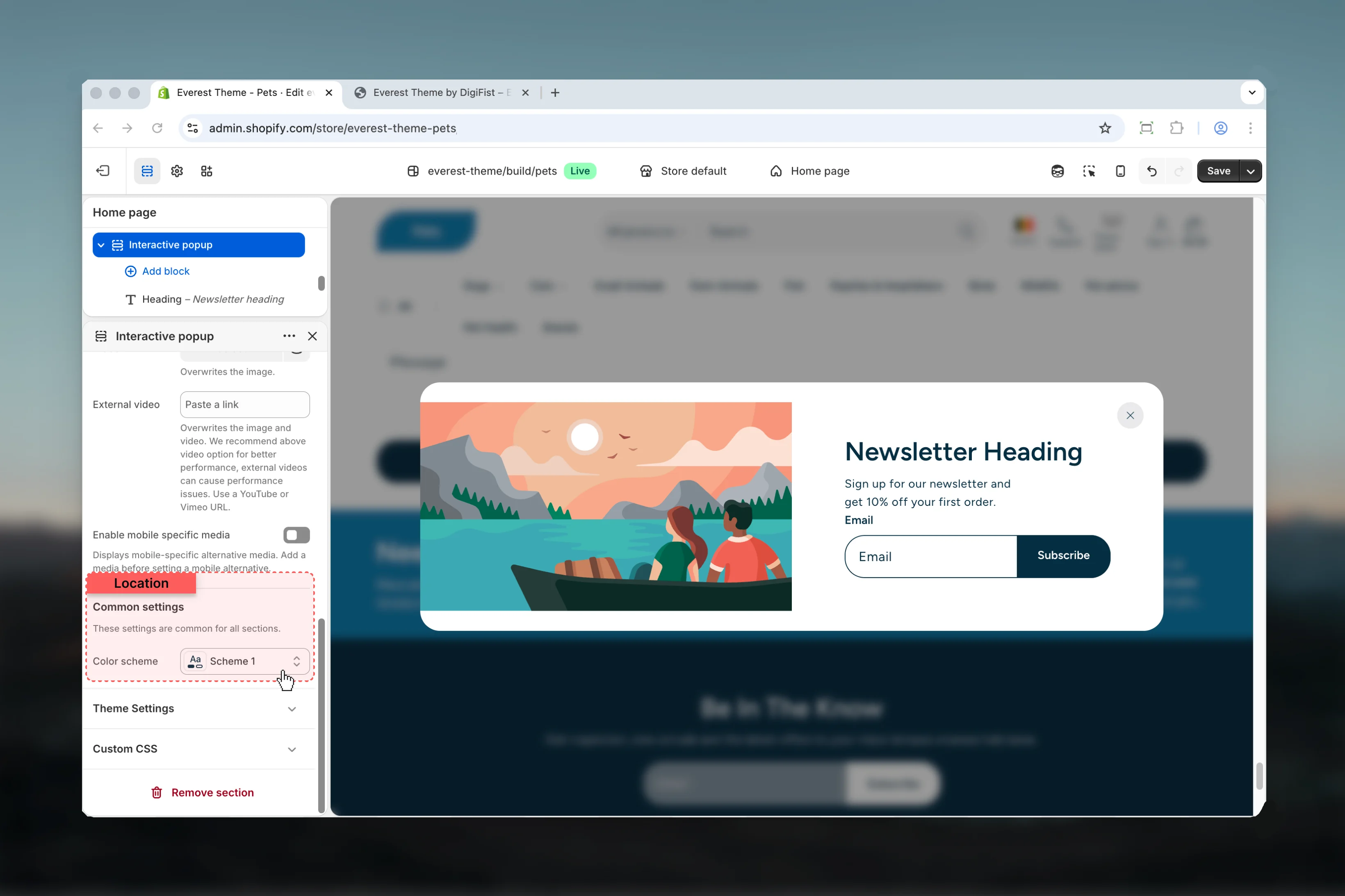
Color scheme
Color scheme
Select the color scheme used for color scheme.Use this to keep contrast and branding consistent with the rest of the store.Default:
scheme-1Block settings
Heading

Settings

Show on
Show on
Choose how Show on behaves in the section.Available options: Desktop, Mobile, Both.Default:
bothHTML tag
HTML tag
Choose how HTML tag behaves in the section.Available options: H1, H2, H3.Default:
h3Useful for SEO and accessibility.Heading
Heading
Enter the content used for heading.
Heading size
Heading size
Choose how Heading size behaves in the section.Available options: XS, S, M, L, ↺.Default:
defaultTop spacing
Top spacing
Choose how Top spacing behaves in the section.This setting shapes the section container and how it sits against surrounding content.Available options: No, S, M, L, XL.Default:
0Bottom spacing
Bottom spacing
Choose how Bottom spacing behaves in the section.This setting shapes the section container and how it sits against surrounding content.Available options: No, S, M, L, XL.Default:
smText
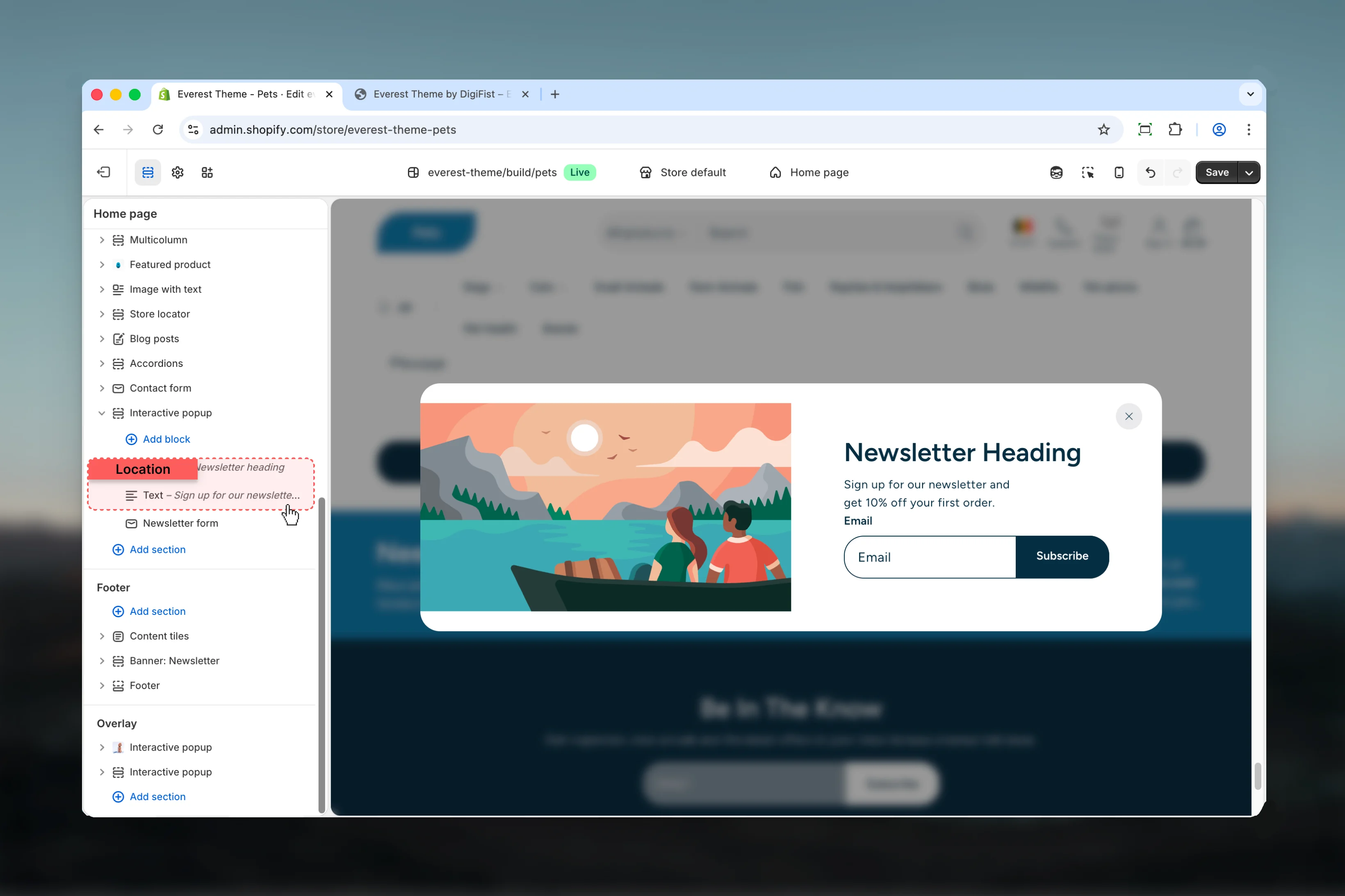
Settings
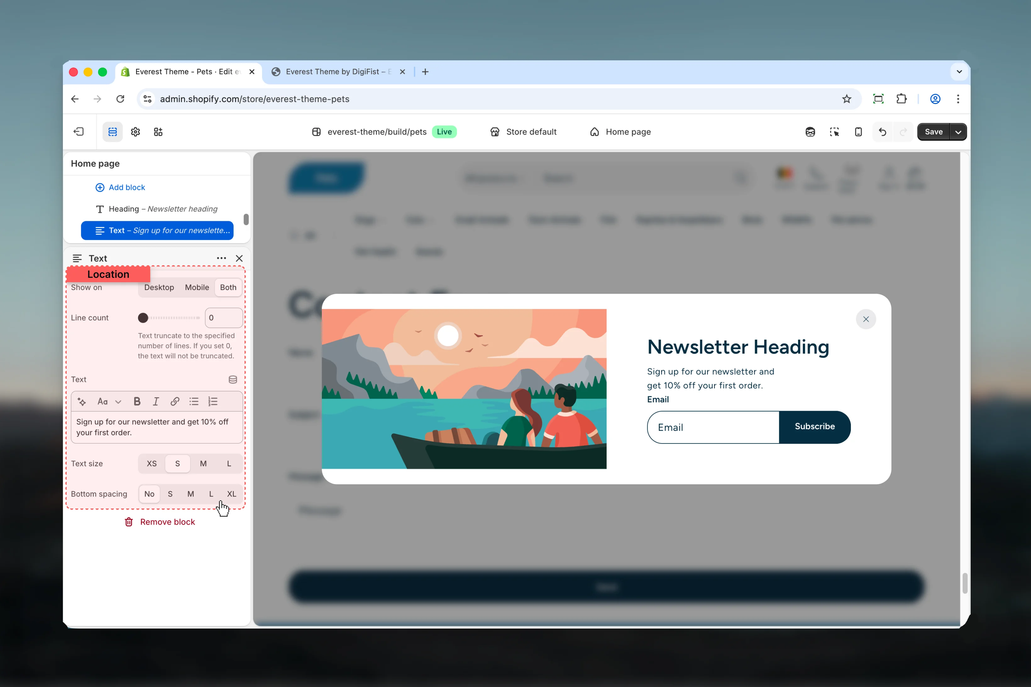
Show on
Show on
Choose how Show on behaves in the section.Available options: Desktop, Mobile, Both.Default:
bothLine count
Line count
Adjust Line count with a slider-based control.Range:
0 to 10 Default: 0Text truncate to the specified number of lines. If you set 0, the text will not be truncated.Text
Text
Enter the content used for text.
Text size
Text size
Choose how Text size behaves in the section.Available options: XS, S, M, L.Default:
smBottom spacing
Bottom spacing
Choose how Bottom spacing behaves in the section.This setting shapes the section container and how it sits against surrounding content.Available options: No, S, M, L, XL.Default:
0Form Newsletter

Settings
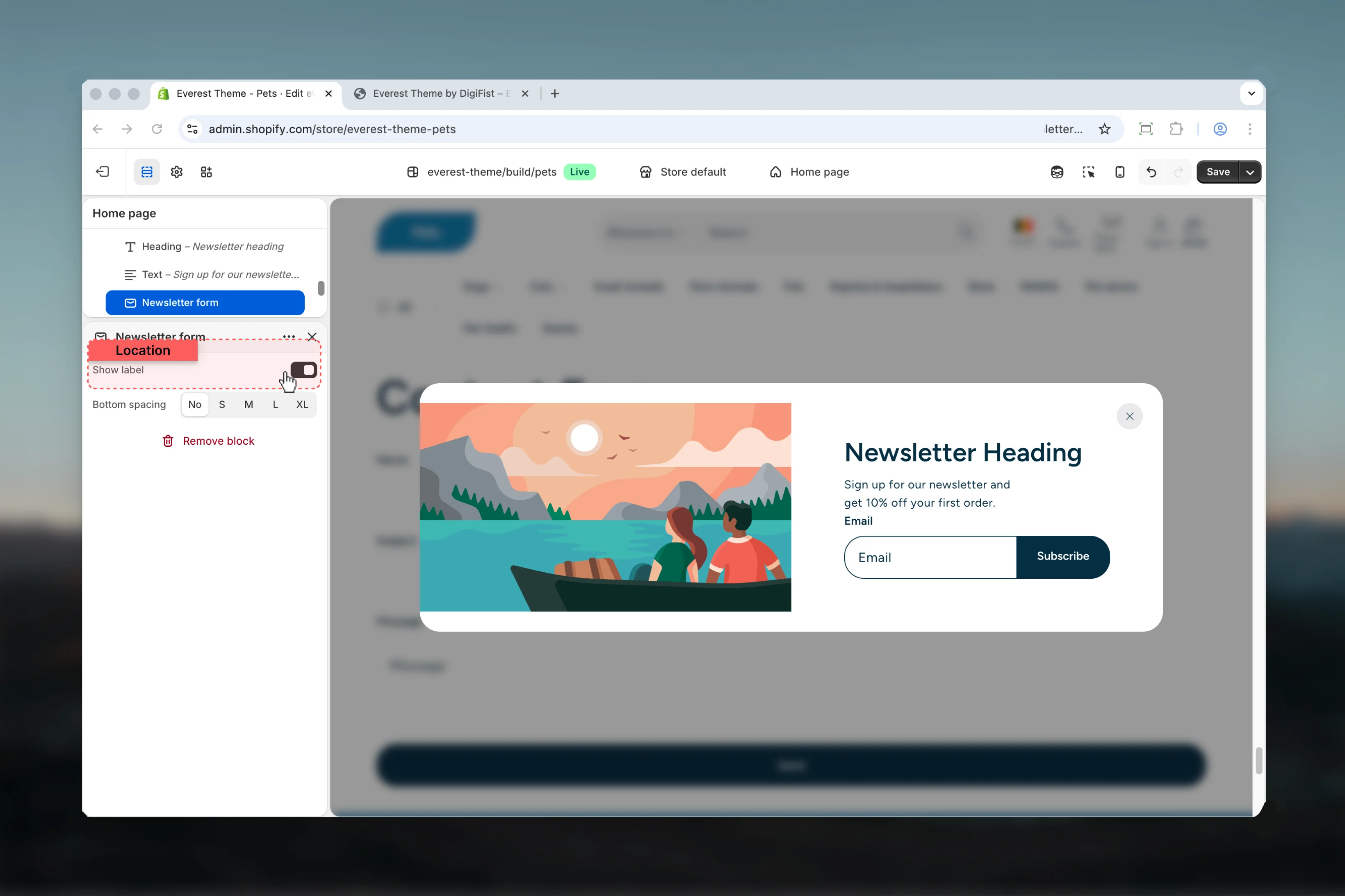
Show label
Show label
Enable or disable Show label.Default:
enabledBottom spacing
Bottom spacing
Choose how Bottom spacing behaves in the section.This setting shapes the section container and how it sits against surrounding content.Available options: No, S, M, L, XL.Default:
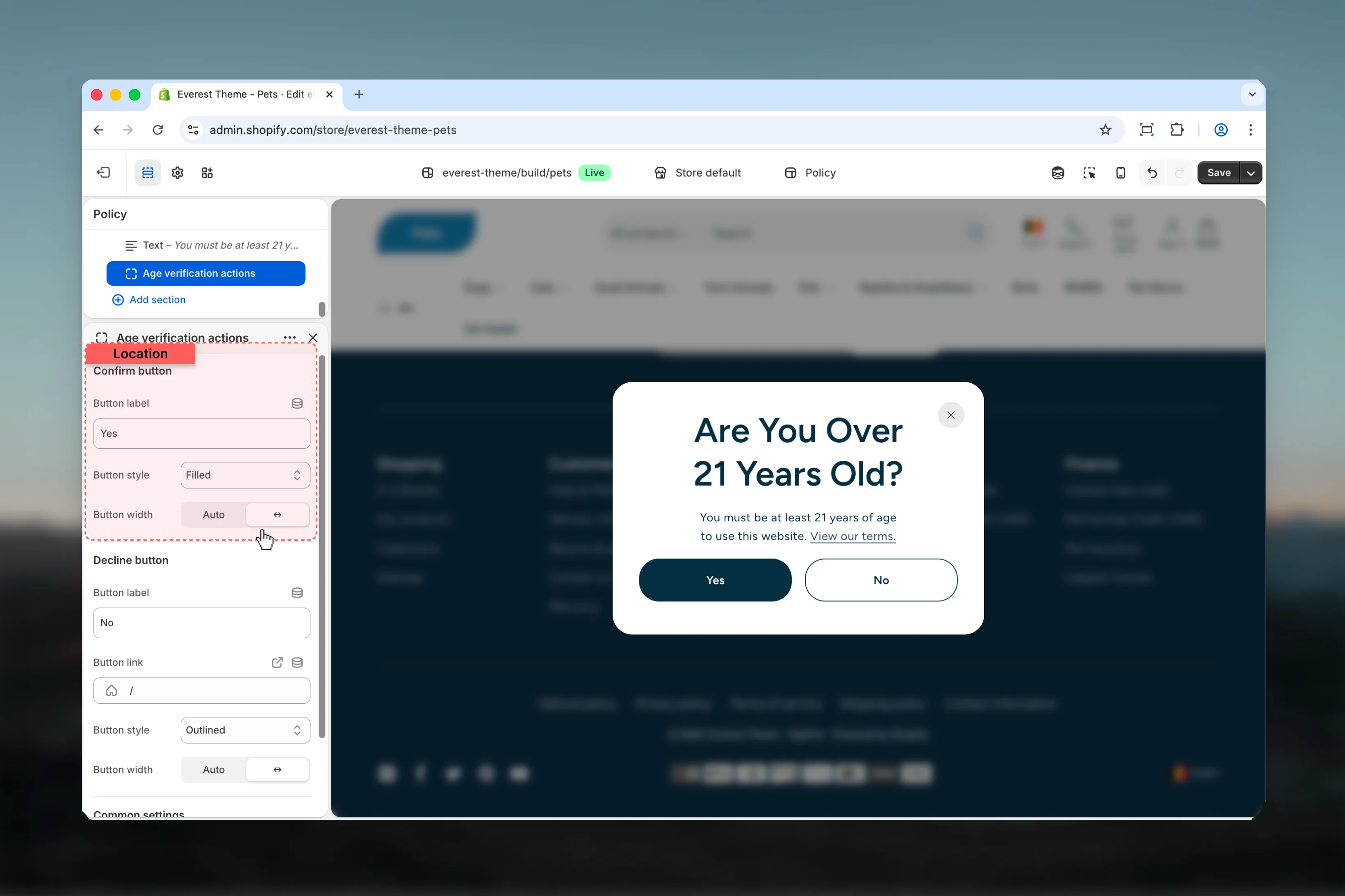
0Button Group
 This block controls the button group content used inside the Interactive Popup section.
Settings

Top spacing
Top spacing
Choose how Top spacing behaves in the section.This setting shapes the section container and how it sits against surrounding content.Available options: No, S, M, L, Auto.Default:
2Bottom spacing
Bottom spacing
Choose how Bottom spacing behaves in the section.This setting shapes the section container and how it sits against surrounding content.Available options: No, S, M, L, Auto.Default:
0Space between
Space between
Choose how Space between behaves in the section.Available options: S, M, L, XL.Default:
4Space between buttons, optimized for mobile- Button for more granular content inside this block.
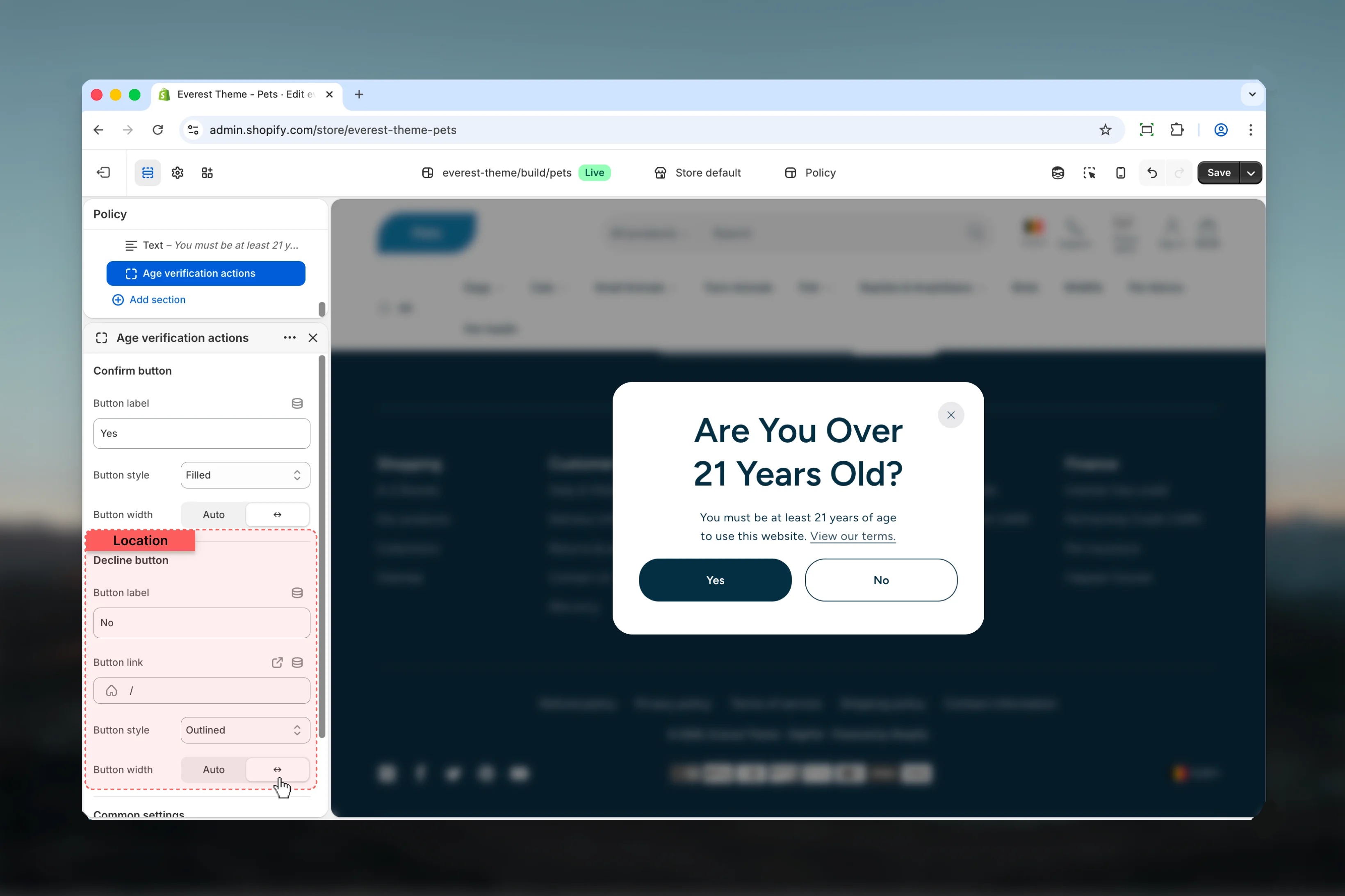
Age Verification Actions
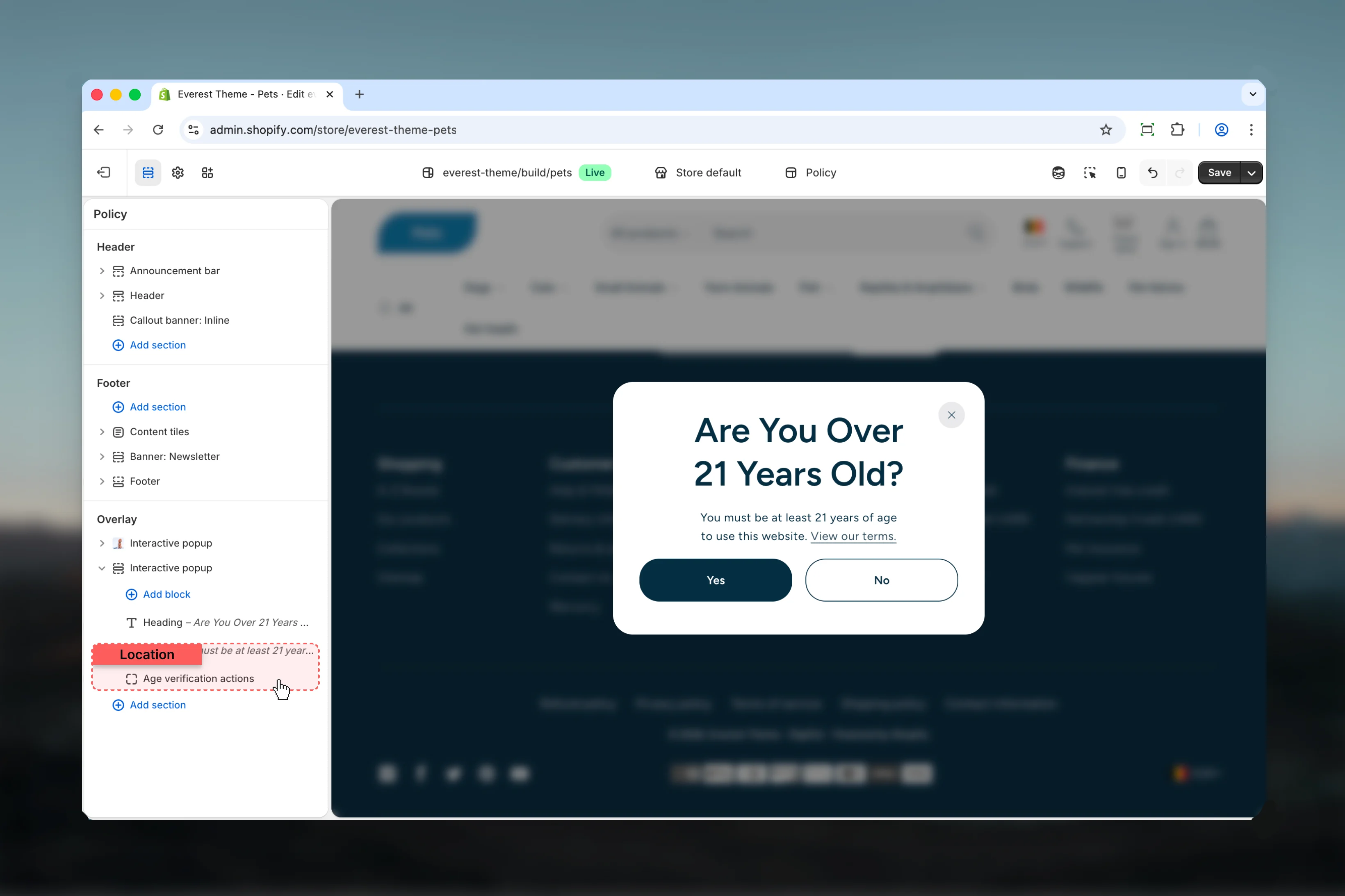
Confirm button
Decline button
Common settings
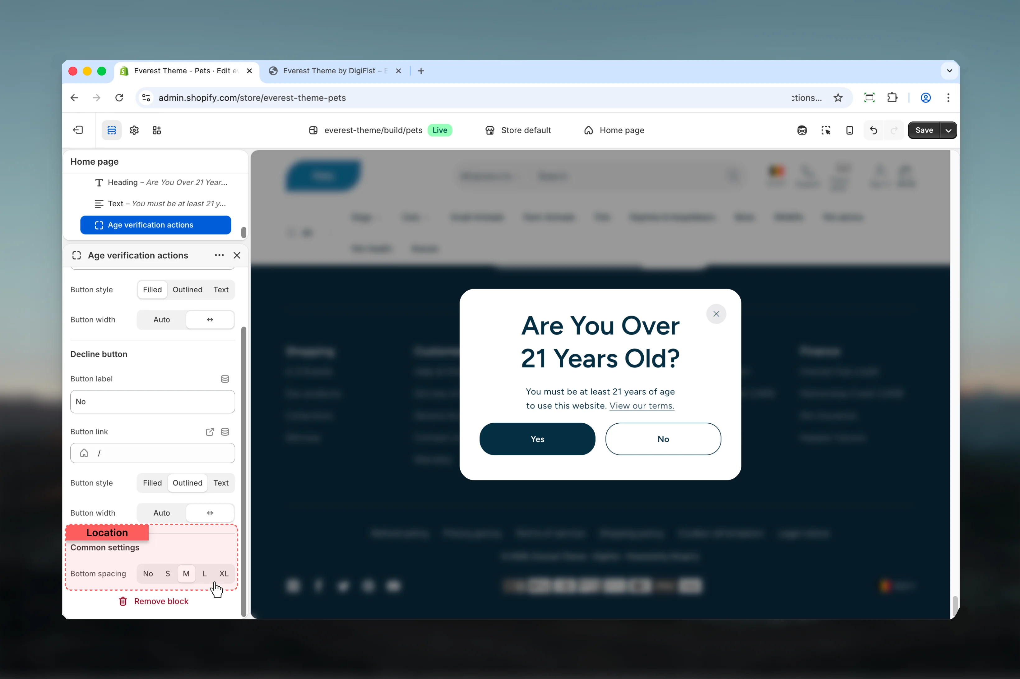
Bottom spacing
Bottom spacing
Choose how Bottom spacing behaves in the section.This setting shapes the section container and how it sits against surrounding content.Available options: No, S, M, L, XL.Default:
2Best practices
- Check contrast after changing color schemes so text and controls remain easy to read.
- Review media-heavy layouts on both desktop and mobile before publishing.
- Start with the structural settings first, then refine decorative styling after the layout feels settled.
- Preview the section with realistic content length to catch spacing and wrapping issues early.