
What these settings control
- Headings, text content, and on-page messaging
- Layout structure, width, alignment, and spacing
- Color schemes, contrast, and shared visual styling
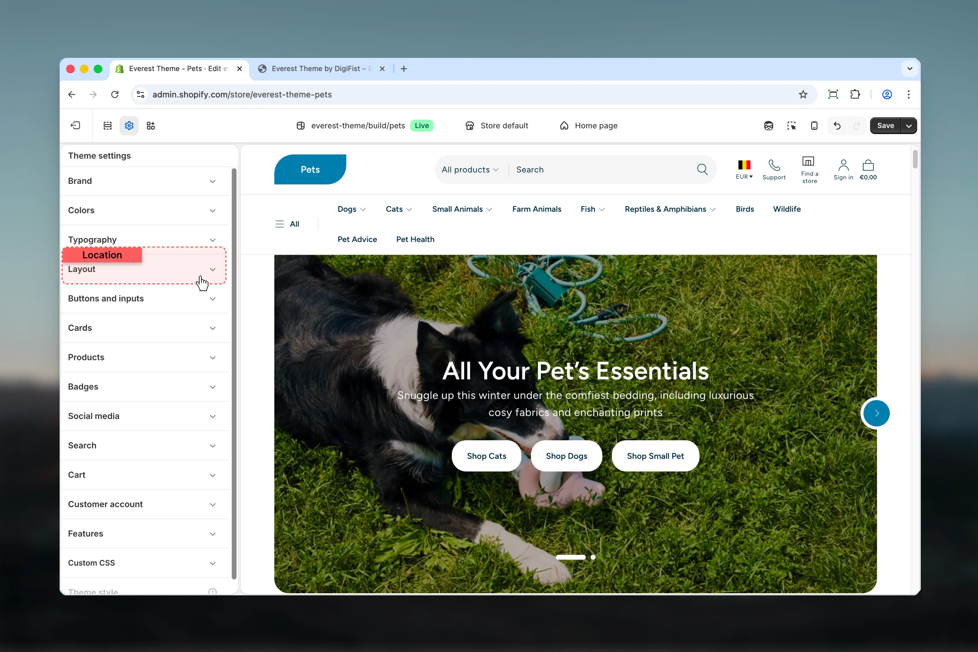
How to access
1
Open the Theme Customizer
In Shopify admin, go to Online Store -> Themes -> Customize.
2
Open Theme settings
Select Theme settings in the customizer sidebar.
3
Choose Layout
Open Layout to review and update the shared settings in this category.
Settings
Settings
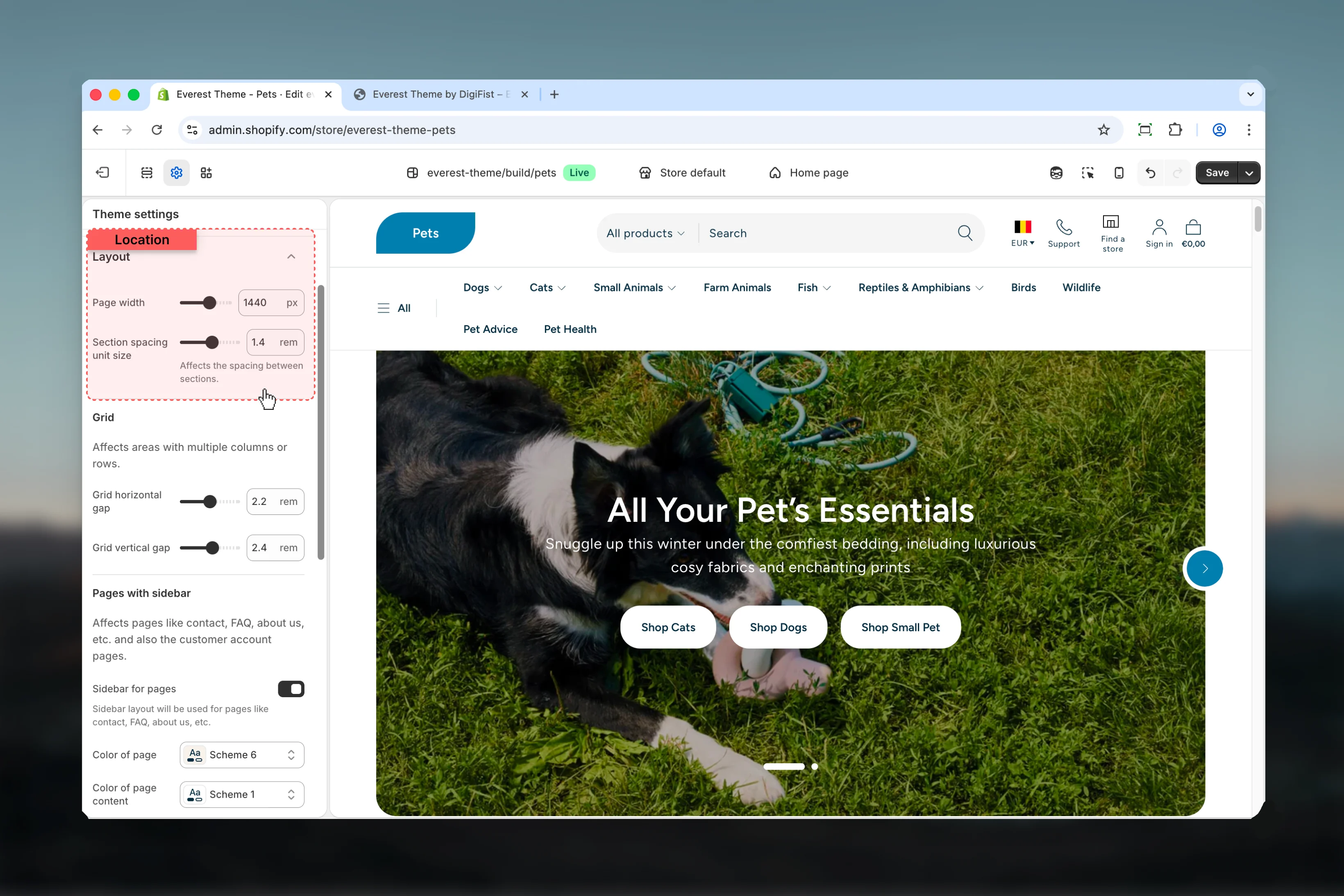
Page width
Page width
Adjust Page width with a slider-based control.It has the strongest effect on layout balance and visual hierarchy.Range:
720 to 1920 Default: 1440pxSection spacing unit size
Section spacing unit size
Adjust Section spacing unit size with a slider-based control.Range:
0.2 to 2.4 Default: 1.6remAffects the spacing between sections.Grid

Grid horizontal gap
Grid horizontal gap
Adjust Grid horizontal gap with a slider-based control.Range:
0.4 to 4.0 Default: 0.8remGrid vertical gap
Grid vertical gap
Adjust Grid vertical gap with a slider-based control.Range:
0.4 to 4.0 Default: 0.8remPages with sidebar
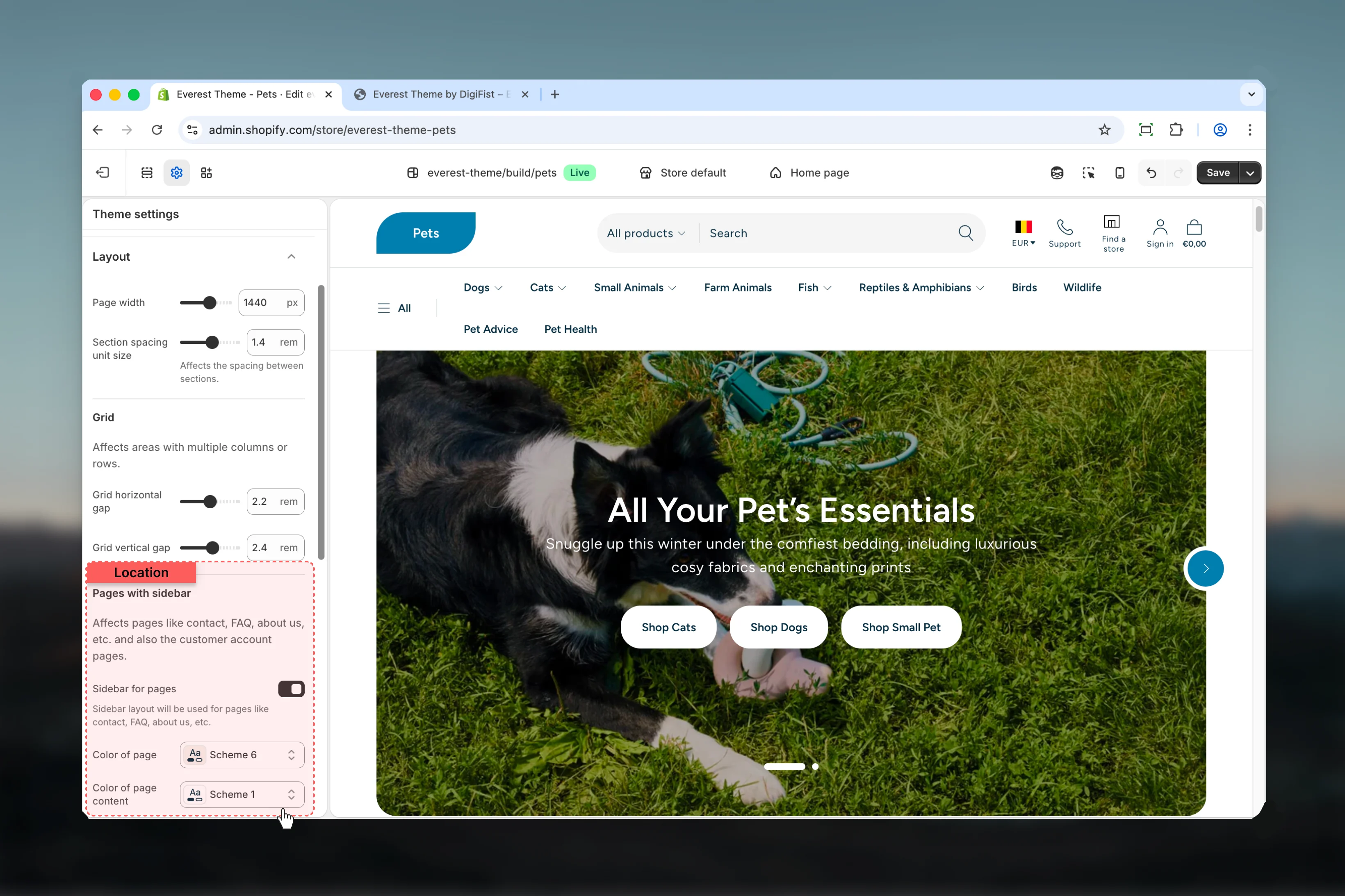
Color of page
Color of page
Select the color scheme used for color of page.Use this to keep contrast and branding consistent with the rest of the store.Default:
scheme-6Color of page content
Color of page content
Select the color scheme used for color of page content.Use this to keep contrast and branding consistent with the rest of the store.Default:
scheme-1Drawer
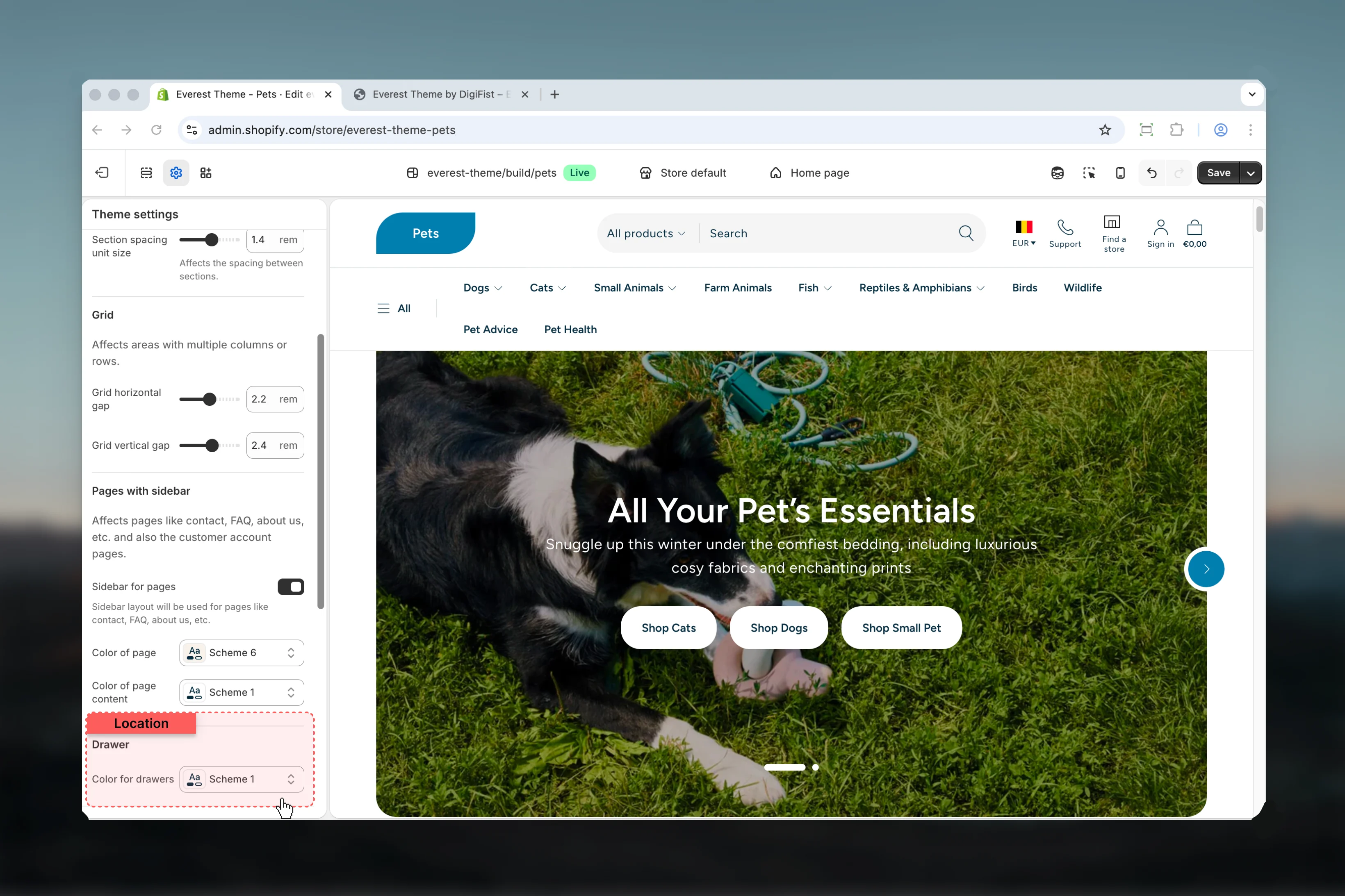
Color for drawers
Color for drawers
Select the color scheme used for color for drawers.Use this to keep contrast and branding consistent with the rest of the store.Default:
scheme-1Best practices
- Check contrast after changing color schemes so text and controls remain easy to read.
- Adjust layout changes alongside neighboring sections so page rhythm stays consistent.
- Change one global setting area at a time and preview multiple templates before publishing.
- Remember that theme settings affect many sections at once, so small adjustments can have wide impact.