What this section controls
- Headings, text content, and on-page messaging
- Layout structure, width, alignment, and spacing
- Calls to action, links, and navigation behavior
- Color schemes, contrast, and shared visual styling
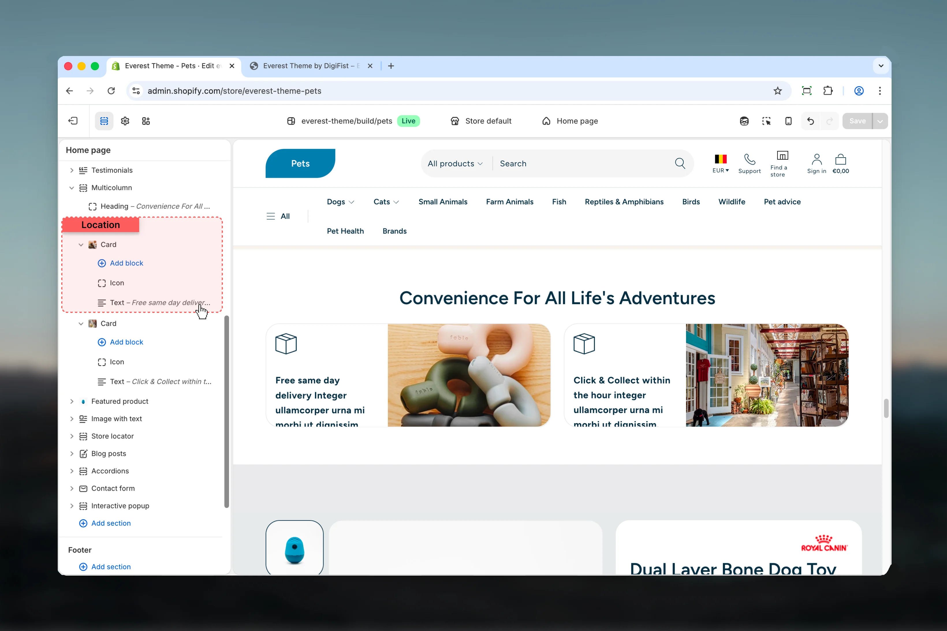
- Block types such as Card
Getting started
1
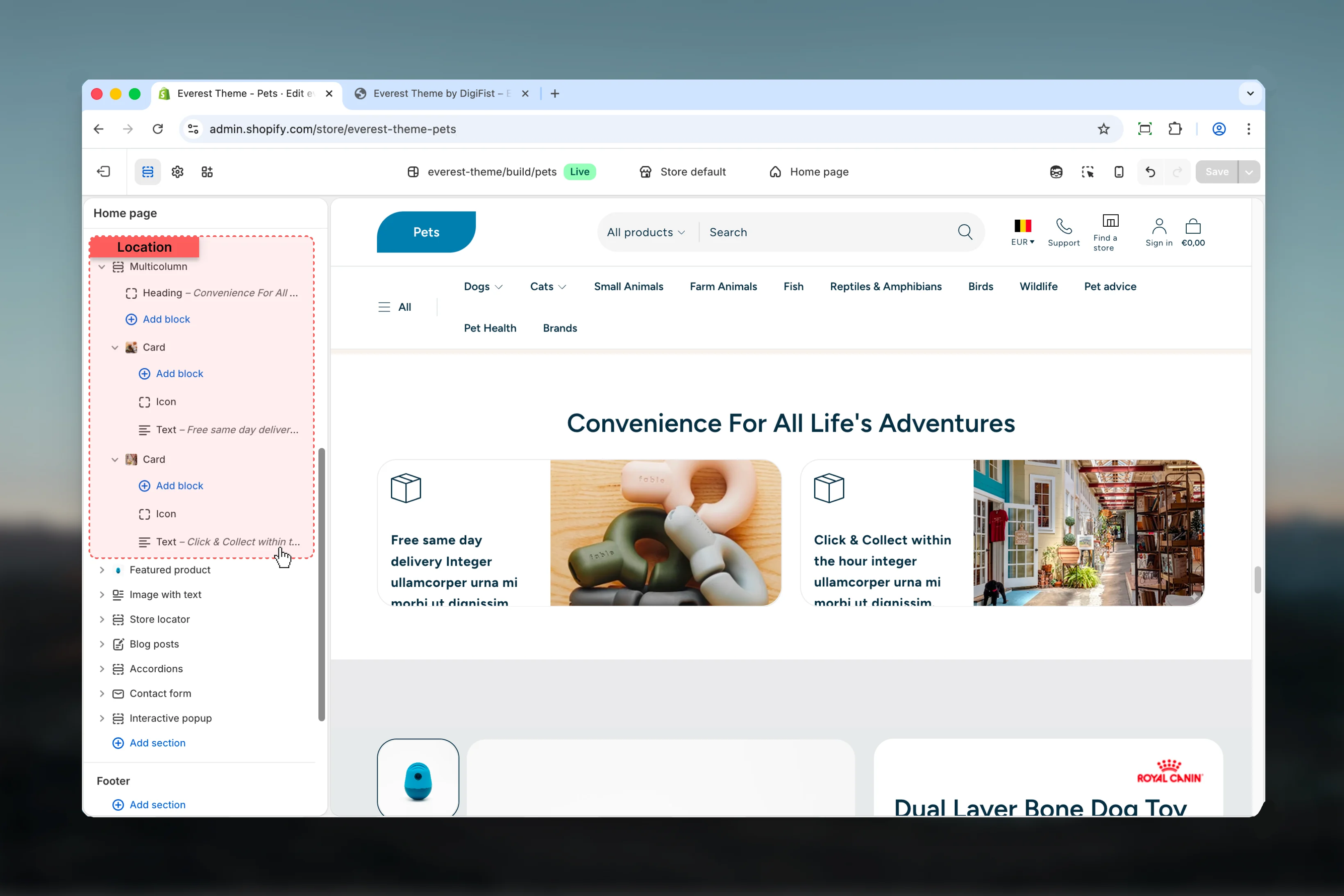
Open the Theme Customizer
In Shopify admin, go to Online Store -> Themes -> Customize.
2
Add or open Multicolumn
Add the Multicolumn section to a compatible template or select the existing section from the left sidebar.
3
Adjust the main settings first
Start with the structural settings such as layout, width, color scheme, spacing, or content source before refining smaller details.
4
Review blocks and supporting content
Add, remove, or reorder blocks after the main layout feels right so content hierarchy stays easier to manage.
Section settings
Layout

Desktop
Desktop
Choose how Desktop behaves in the section.It has the strongest effect on layout balance and visual hierarchy.Available options: Grid, Carousel.Default:
gridMobile
Mobile
Choose how Mobile behaves in the section.It has the strongest effect on layout balance and visual hierarchy.Available options: Grid, Carousel.Default:
gridNumber of columns
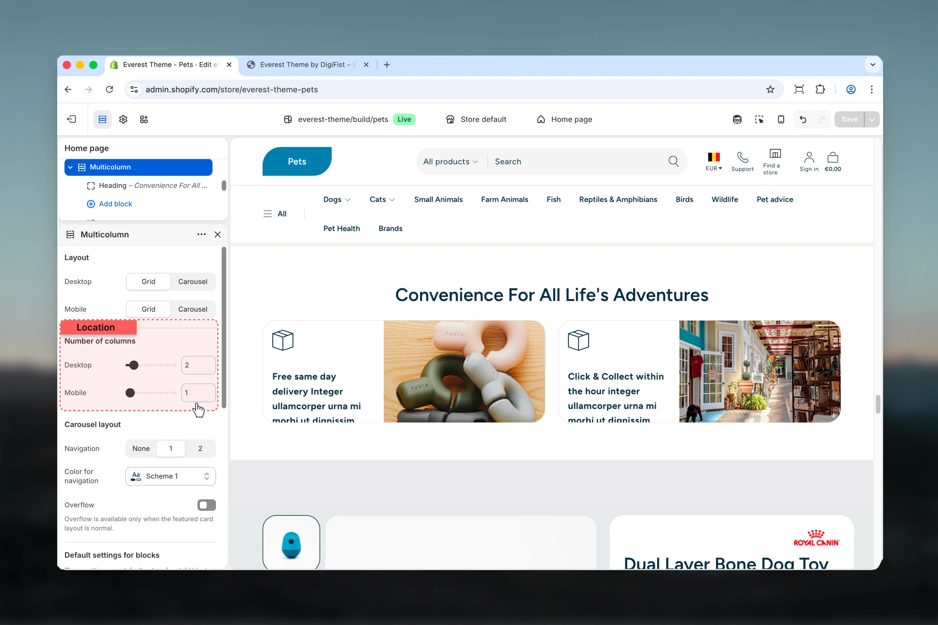
Desktop
Desktop
Adjust Desktop with a slider-based control.It has the strongest effect on layout balance and visual hierarchy.Range:
1 to 12 Default: 3Mobile
Mobile
Adjust Mobile with a slider-based control.It has the strongest effect on layout balance and visual hierarchy.Range:
1 to 2 Default: 1Carousel layout

Overflow
Overflow
Enable or disable Overflow.Default:
disabledOverflow is available only when the featured card layout is normal.Default settings for blocks

Heading size
Heading size
Choose how Heading size behaves in the section.Available options: XS, S, M, L, XL.Default:
h1Common settings
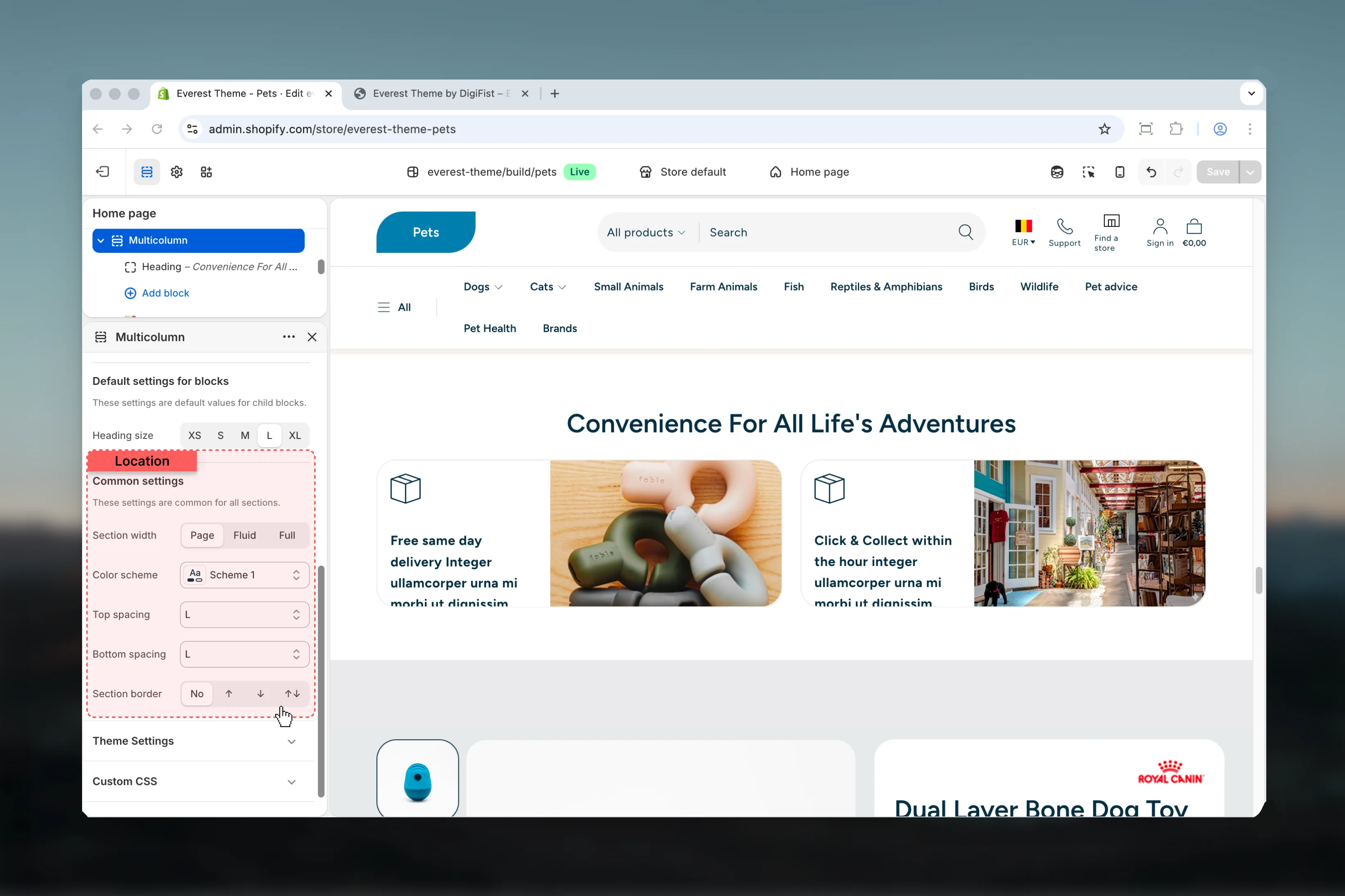
Section width
Section width
Choose how Section width behaves in the section.This setting shapes the section container and how it sits against surrounding content.Available options: Page, Fluid, Full.Default:
pageColor scheme
Color scheme
Select the color scheme used for color scheme.Use this to keep contrast and branding consistent with the rest of the store.Default:
scheme-1Top spacing
Top spacing
Choose how Top spacing behaves in the section.This setting shapes the section container and how it sits against surrounding content.Available options: No, S, M, L, XL.Default:
2Bottom spacing
Bottom spacing
Choose how Bottom spacing behaves in the section.This setting shapes the section container and how it sits against surrounding content.Available options: No, S, M, L, XL.Default:
2Section border
Section border
Choose how Section border behaves in the section.This setting shapes the section container and how it sits against surrounding content.Available options: None, Top, Bottom, Both.Default:
noneBlock settings
Card
Settings
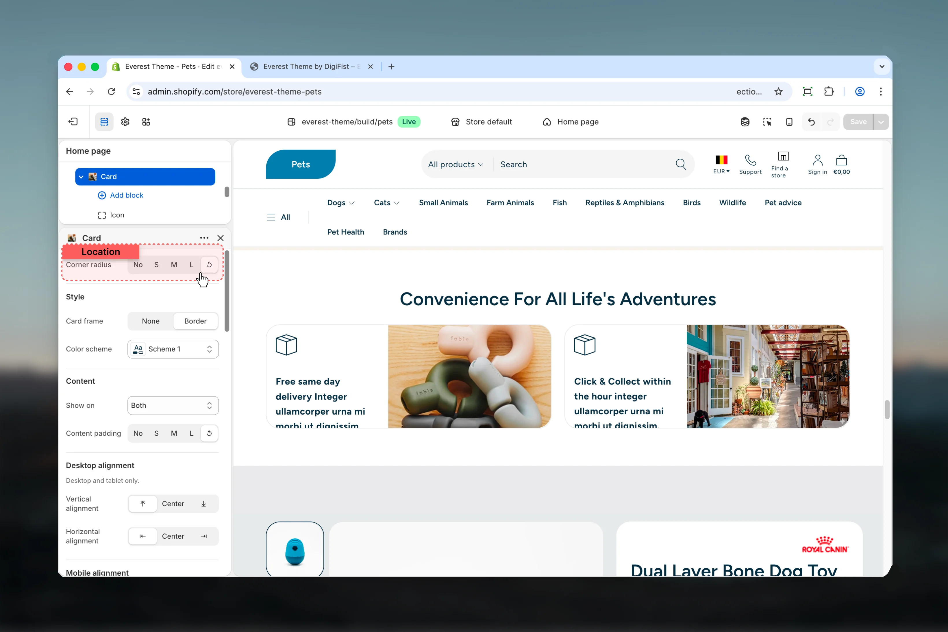
Corner radius
Corner radius
Choose how Corner radius behaves in the section.Available options: No, S, M, L, ↺.Default:
defaultStyle
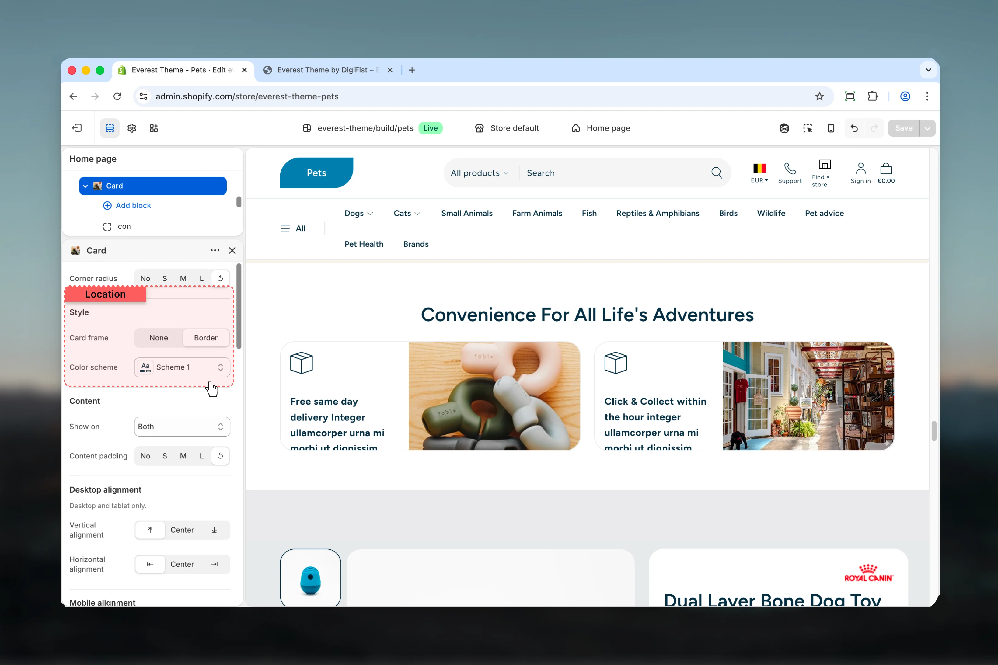
Card frame
Card frame
Choose how Card frame behaves in the section.Available options: None, Border.Default:
borderColor scheme
Color scheme
Select the color scheme used for color scheme.Use this to keep contrast and branding consistent with the rest of the store.
Content
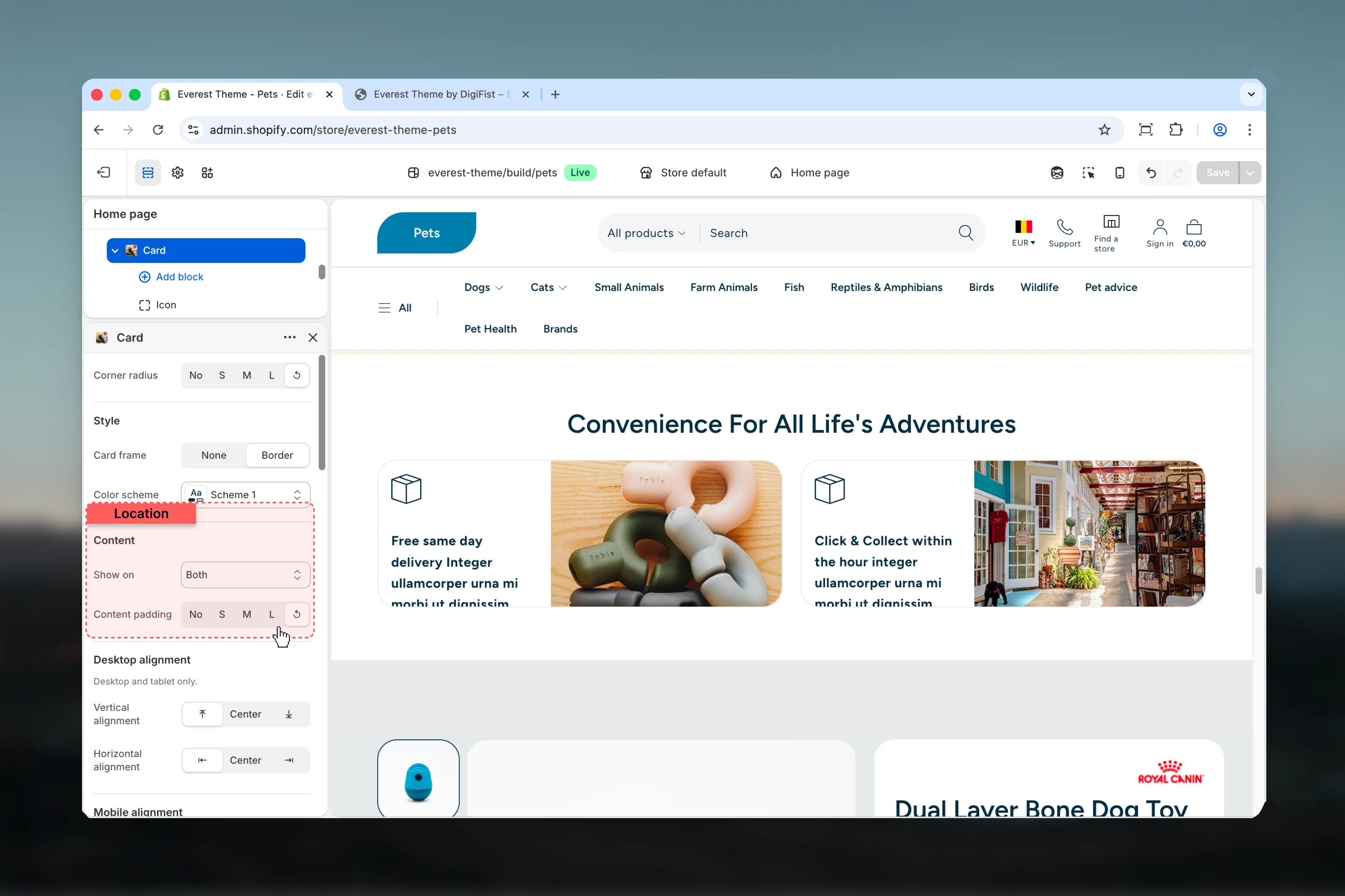
Show on
Show on
Choose how Show on behaves in the section.Available options: Desktop, Mobile, Both.Default:
bothContent padding
Content padding
Choose how Content padding behaves in the section.Available options: No, S, M, L, ↺.Default:
defaultDesktop alignment

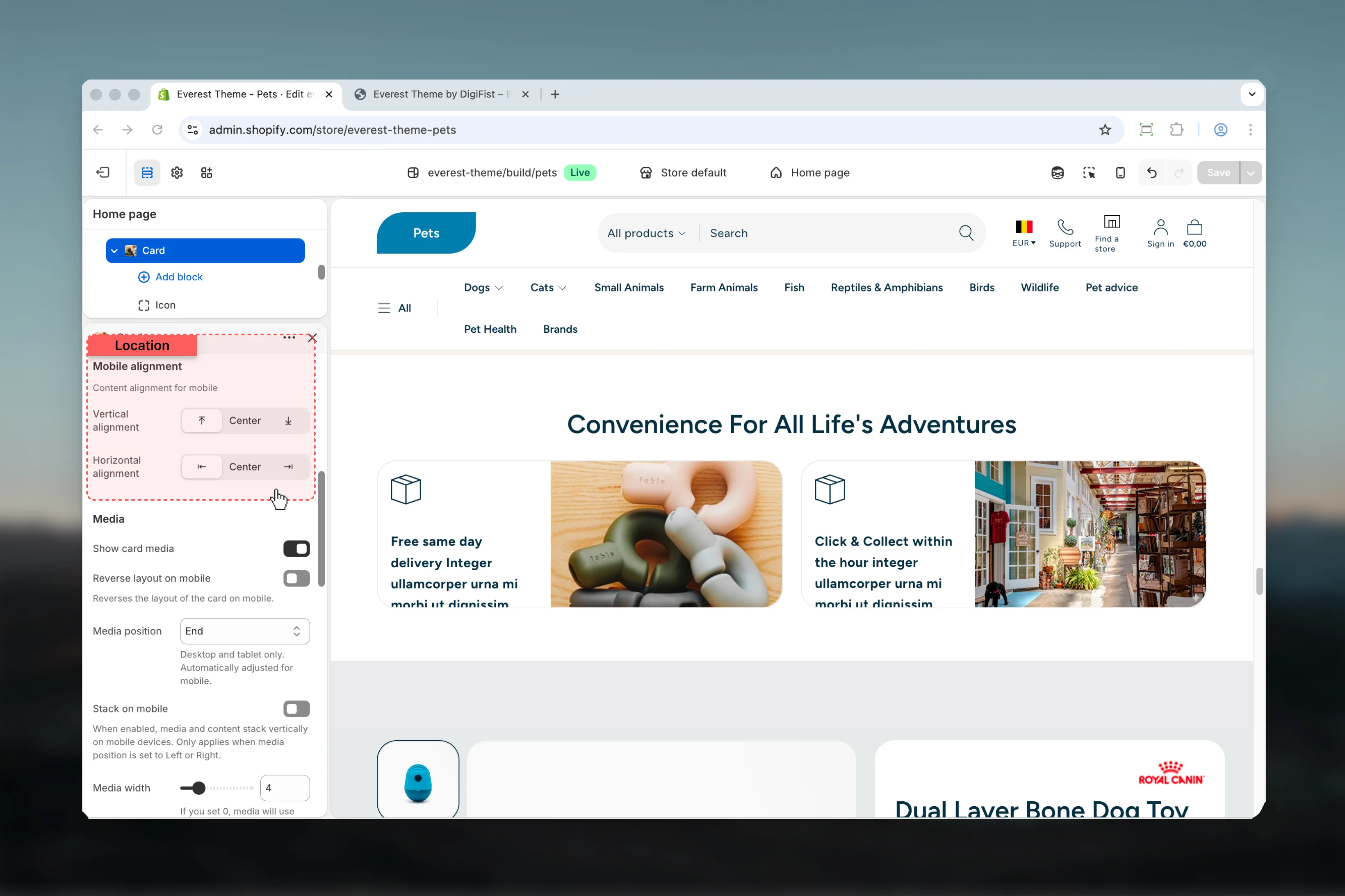
Vertical alignment
Vertical alignment
Choose how Vertical alignment behaves in the section.It has the strongest effect on layout balance and visual hierarchy.Available options: ⤒, Center, ⤓.Default:
startHorizontal alignment
Horizontal alignment
Choose how Horizontal alignment behaves in the section.It has the strongest effect on layout balance and visual hierarchy.Available options: ⇤, Center, ⇥.Default:
startMobile alignment
Vertical alignment
Vertical alignment
Choose how Vertical alignment behaves in the section.It has the strongest effect on layout balance and visual hierarchy.Available options: ⤒, Center, ⤓.Default:
startHorizontal alignment
Horizontal alignment
Choose how Horizontal alignment behaves in the section.It has the strongest effect on layout balance and visual hierarchy.Available options: ⇤, Center, ⇥.Default:
startMedia
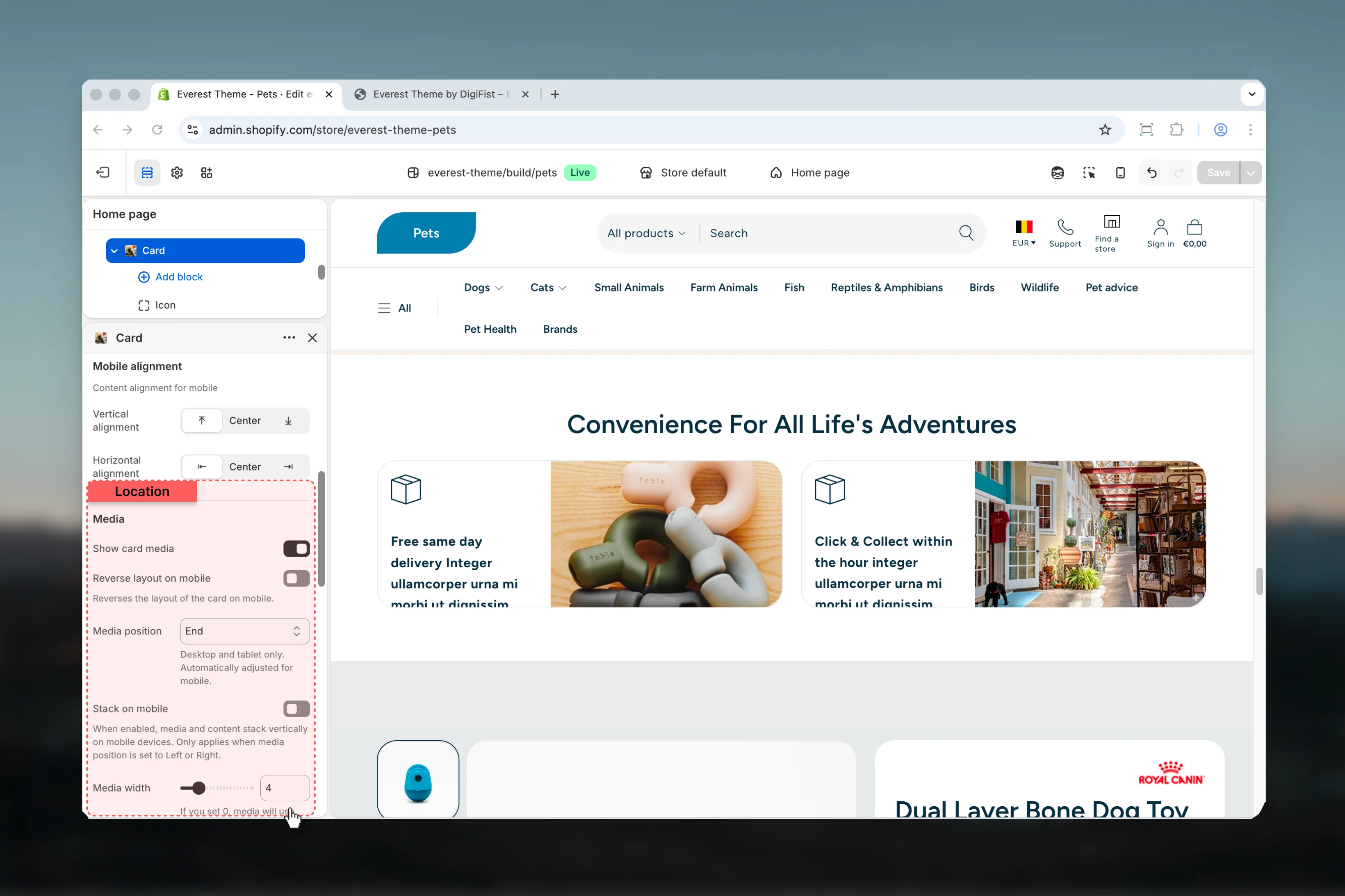
Show card media
Show card media
Enable or disable Show card media.Review the result on both desktop and mobile when media changes are involved.Default:
disabledReverse layout on mobile
Reverse layout on mobile
Enable or disable Reverse layout on mobile.It has the strongest effect on layout balance and visual hierarchy.Default:
disabledThis setting only appears when its related parent option is enabled.Reverses the layout of the card on mobile.Media position
Media position
Choose how Media position behaves in the section.It has the strongest effect on layout balance and visual hierarchy.Available options: Top, Bottom, Start, End, Background.Default:
bottomThis setting only appears when its related parent option is enabled.Desktop and tablet only. Automatically adjusted for mobile.Stack on mobile
Stack on mobile
Enable or disable Stack on mobile.Default:
enabledThis setting only appears when its related parent option is enabled.When enabled, media and content stack vertically on mobile devices. Only applies when media position is set to Left or Right.Media width
Media width
Adjust Media width with a slider-based control.It has the strongest effect on layout balance and visual hierarchy.Range:
2 to 12 Default: 6This setting only appears when its related parent option is enabled.If you set 0, media will use automatic width.Object fit
Object fit
Choose how Object fit behaves in the section.Review the result on both desktop and mobile when media changes are involved.Available options: Cover, Contain.Default:
coverThis setting only appears when its related parent option is enabled.Show on
Show on
Choose how Show on behaves in the section.Review the result on both desktop and mobile when media changes are involved.Available options: Desktop, Mobile, Both.Default:
bothThis setting only appears when its related parent option is enabled.Image
Image
Upload or choose an image for image.Review the result on both desktop and mobile when media changes are involved.This setting only appears when its related parent option is enabled.
Video
Video
Choose a hosted video for video.Review the result on both desktop and mobile when media changes are involved.This setting only appears when its related parent option is enabled.Overwrites the image.
External video
External video
Paste an external video URL for external video.Review the result on both desktop and mobile when media changes are involved.This setting only appears when its related parent option is enabled.Overwrites the image and video. We recommend above video option for better performance, external videos can cause performance issues. Use a YouTube or Vimeo URL.
Aspect ratio
Aspect ratio
Choose how Aspect ratio behaves in the section.It has the strongest effect on layout balance and visual hierarchy.Available options: Auto, Square, 4:3, 3:4, 3:2, 2:3, 5:4, 4:5, 16:9, 9:16, 2:1, 4:1, 8:1, 1:2.Default:
autoThis setting only appears when its related parent option is enabled.Enable mobile specific media
Enable mobile specific media
Enable or disable Enable mobile specific media.Review the result on both desktop and mobile when media changes are involved.Default:
disabledThis setting only appears when its related parent option is enabled.Displays mobile-specific alternative media. Add a media before setting a mobile alternative.Media for mobile
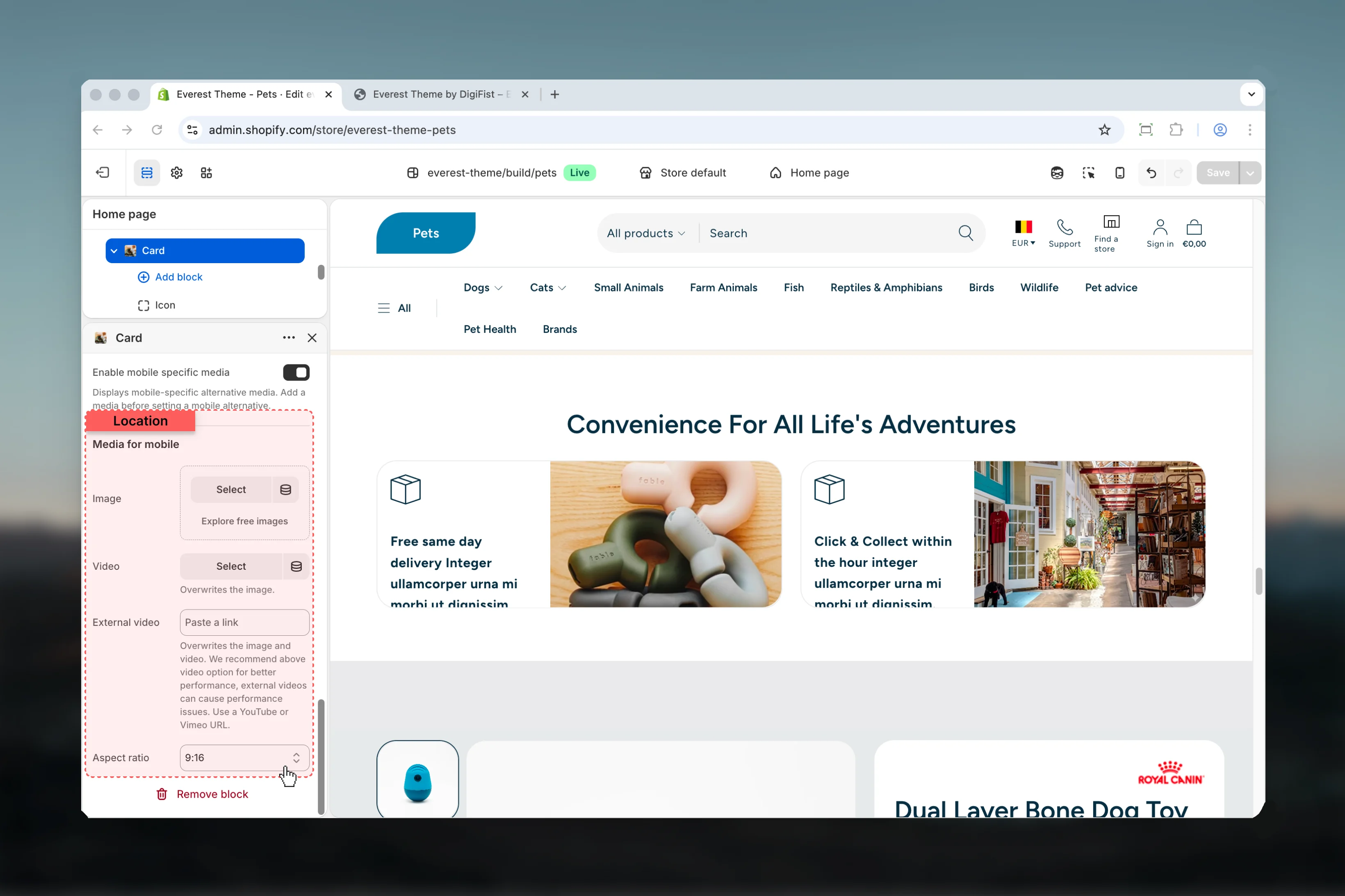
Image
Image
Upload or choose an image for image.Review the result on both desktop and mobile when media changes are involved.This setting only appears when its related parent option is enabled.
Video
Video
Choose a hosted video for video.Review the result on both desktop and mobile when media changes are involved.This setting only appears when its related parent option is enabled.Overwrites the image.
External video
External video
Paste an external video URL for external video.Review the result on both desktop and mobile when media changes are involved.This setting only appears when its related parent option is enabled.Overwrites the image and video. We recommend above video option for better performance, external videos can cause performance issues. Use a YouTube or Vimeo URL.
Aspect ratio
Aspect ratio
Choose how Aspect ratio behaves in the section.It has the strongest effect on layout balance and visual hierarchy.Available options: Auto, Square, 4:3, 3:4, 3:2, 2:3, 5:4, 4:5, 16:9, 9:16, 2:1, 4:1, 8:1, 1:2.Default:
autoThis setting only appears when its related parent option is enabled.- Icon Svg for more granular content inside this block.
- Heading for more granular content inside this block.
- Text for more granular content inside this block.
- Button for more granular content inside this block.
Best practices
- Check contrast after changing color schemes so text and controls remain easy to read.
- Keep labels short and scannable, especially in tighter layouts or utility areas.
- Adjust layout changes alongside neighboring sections so page rhythm stays consistent.
- Start with the structural settings first, then refine decorative styling after the layout feels settled.
- Preview the section with realistic content length to catch spacing and wrapping issues early.