
What these settings control
- Headings, text content, and on-page messaging
- Layout structure, width, alignment, and spacing
- Calls to action, links, and navigation behavior
- Color schemes, contrast, and shared visual styling
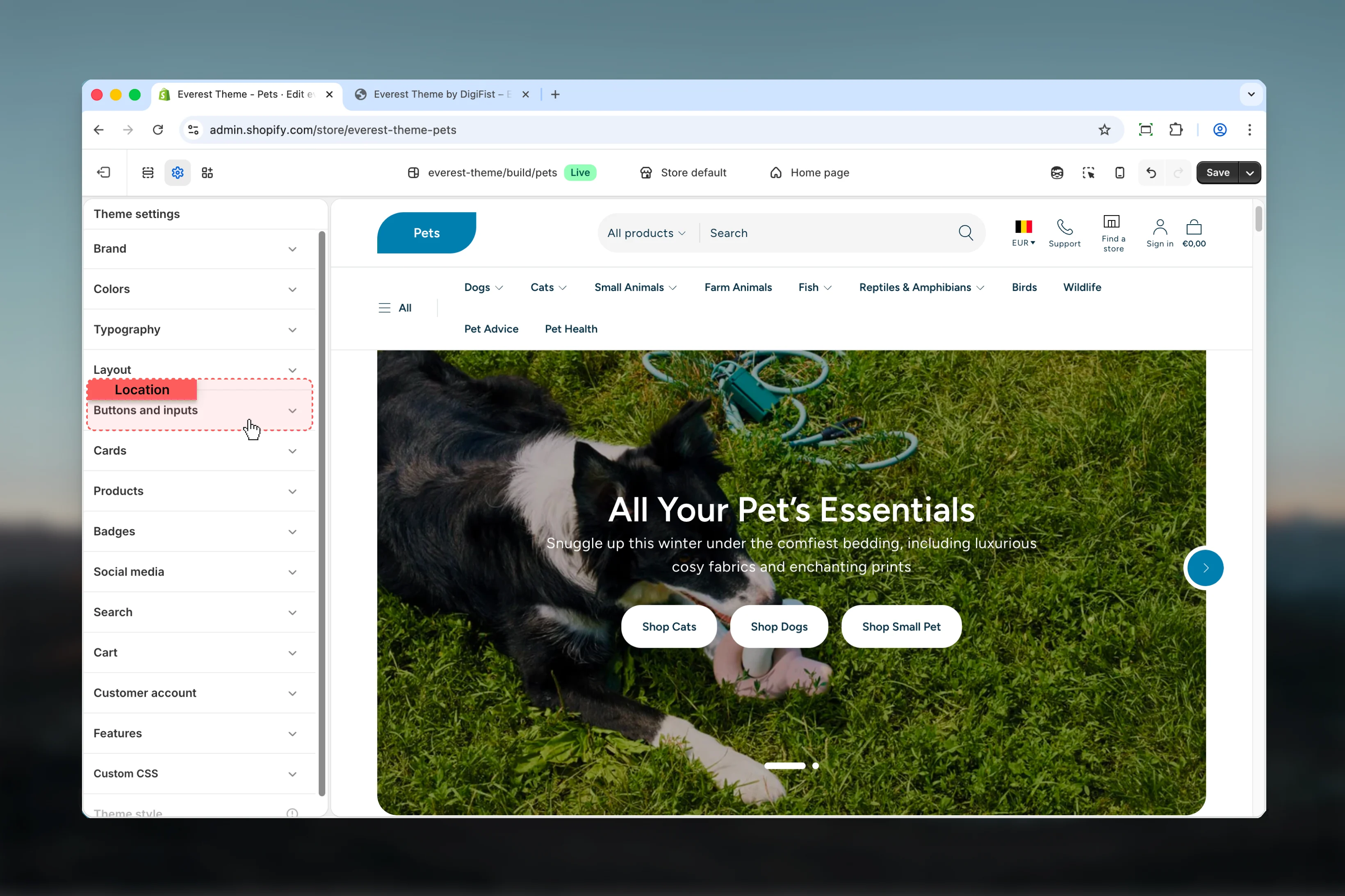
How to access
1
Open the Theme Customizer
In Shopify admin, go to Online Store -> Themes -> Customize.
2
Open Theme settings
Select Theme settings in the customizer sidebar.
3
Choose Buttons and Inputs
Open Buttons and Inputs to review and update the shared settings in this category.
Settings
Settings
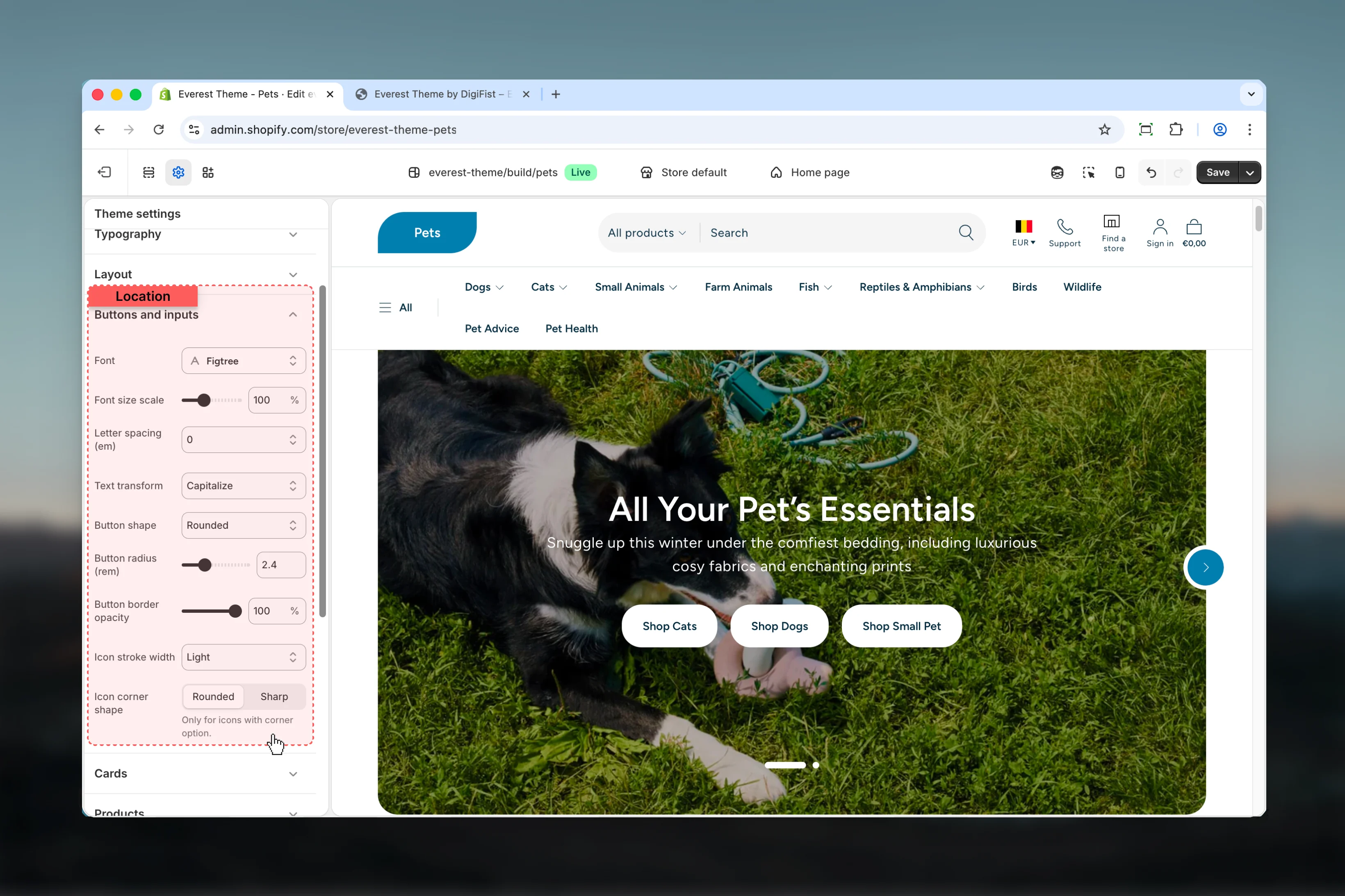
Font
Font
Controls font.Keep action labels short so they remain readable across devices.Default:
figtree_n6Font size scale
Font size scale
Adjust Font size scale with a slider-based control.Keep action labels short so they remain readable across devices.Range:
50 to 200 Default: 100%Letter spacing (em)
Letter spacing (em)
Choose how Letter spacing (em) behaves in the section.Keep action labels short so they remain readable across devices.Available options: -0.05, -0.025, 0, 0.025, 0.05.Default:
-0.025emText transform
Text transform
Choose how Text transform behaves in the section.Keep action labels short so they remain readable across devices.Available options: None, Uppercase, Capitalize.Default:
noneIcon stroke width
Icon stroke width
Choose how Icon stroke width behaves in the section.It has the strongest effect on layout balance and visual hierarchy.Available options: Light, Medium, Bold.Default:
1.5Icon corner shape
Icon corner shape
Choose how Icon corner shape behaves in the section.Available options: Rounded, Sharp.Default:
roundOnly for icons with corner option.Best practices
- Keep labels short and scannable, especially in tighter layouts or utility areas.
- Adjust layout changes alongside neighboring sections so page rhythm stays consistent.
- Change one global setting area at a time and preview multiple templates before publishing.
- Remember that theme settings affect many sections at once, so small adjustments can have wide impact.