What this section controls
- Headings, text content, and on-page messaging
- Layout structure, width, alignment, and spacing
- Color schemes, contrast, and shared visual styling
- Block types such as Collection Group, Card Group
Getting started
1
Open the Theme Customizer
In Shopify admin, go to Online Store -> Themes -> Customize.
2
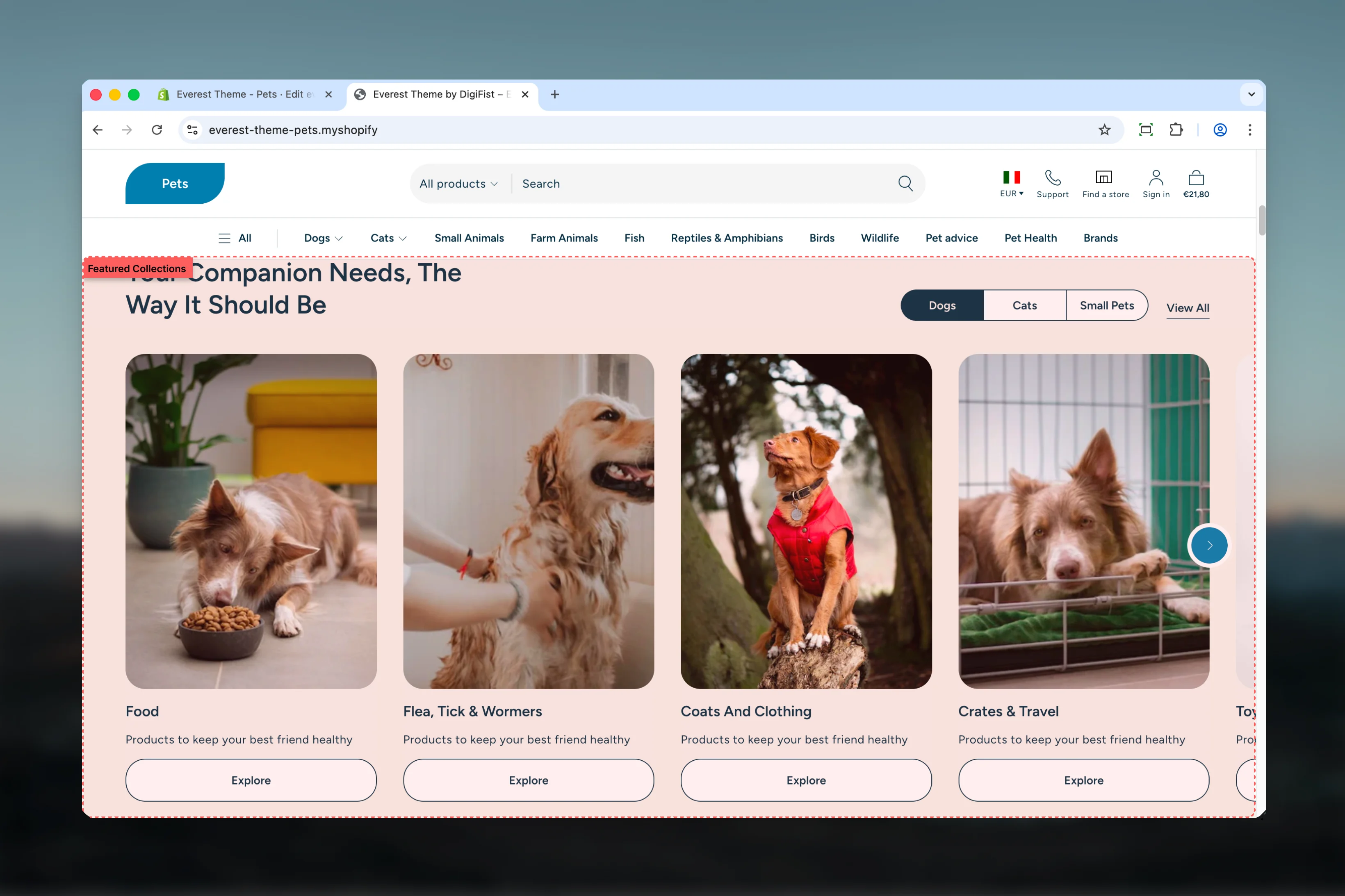
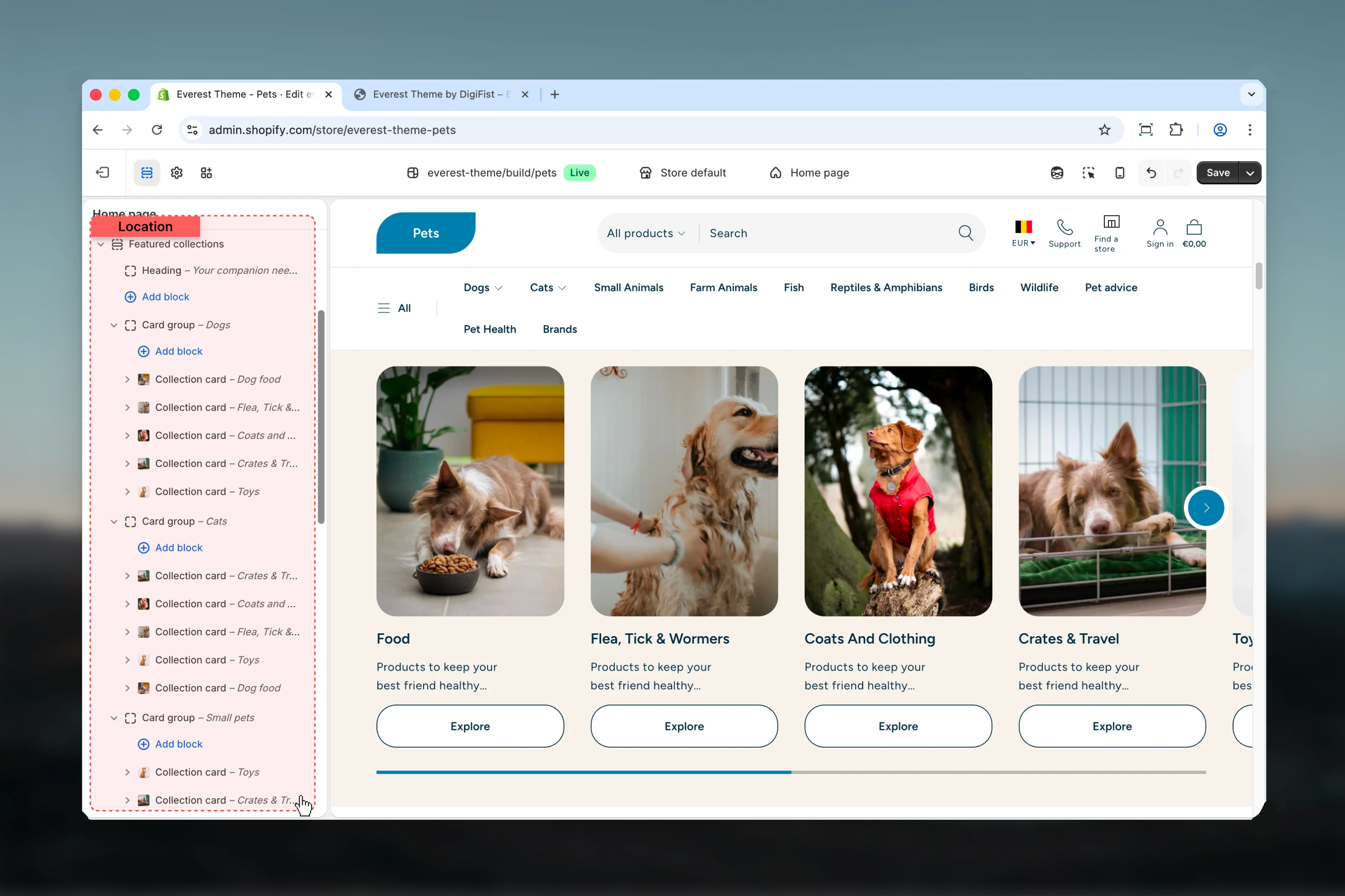
Add or open Featured Collections
Add the Featured Collections section to a compatible template or select the existing section from the left sidebar.
3
Adjust the main settings first
Start with the structural settings such as layout, width, color scheme, spacing, or content source before refining smaller details.
4
Review blocks and supporting content
Add, remove, or reorder blocks after the main layout feels right so content hierarchy stays easier to manage.
Section settings
Default settings for blocks
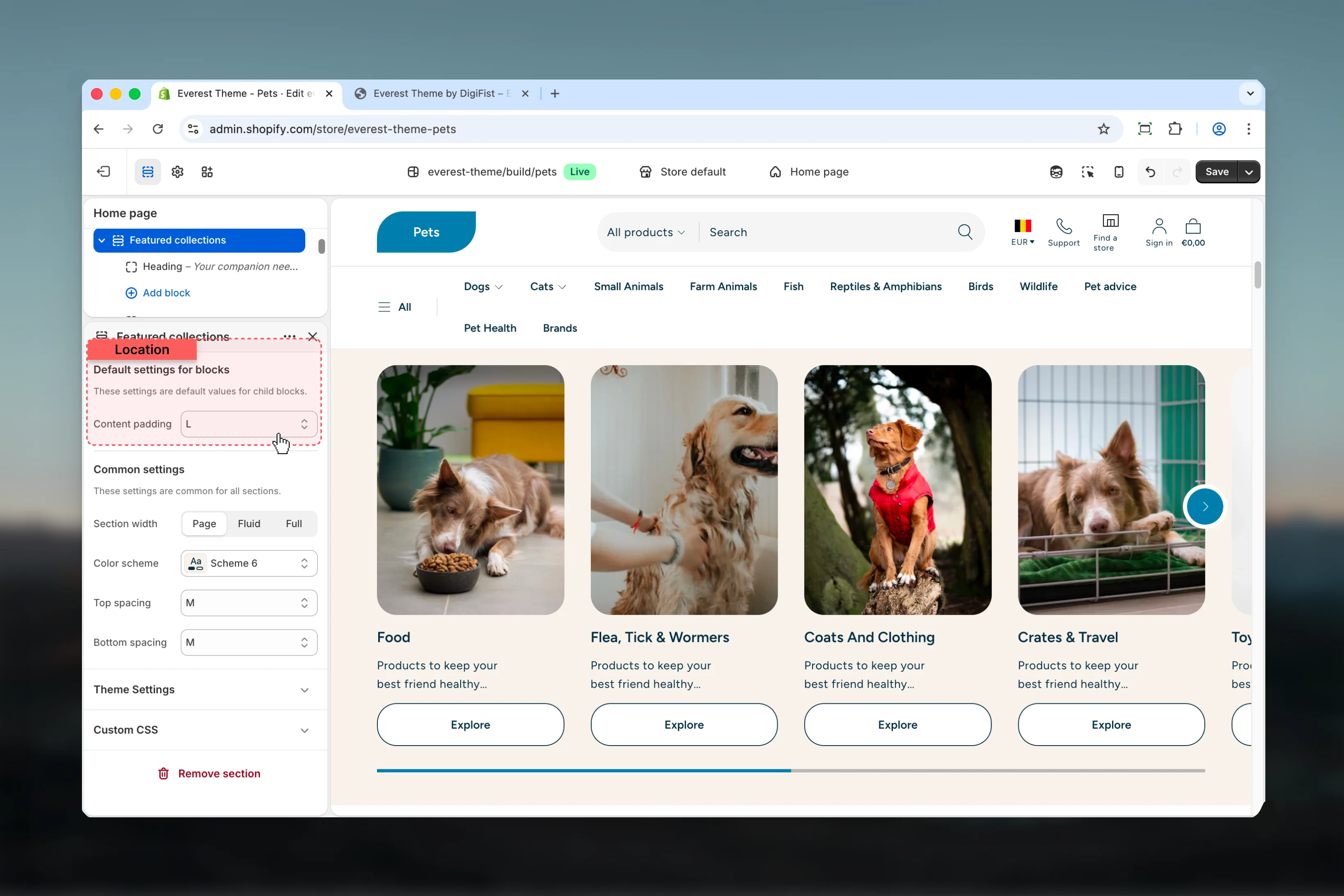
Content padding
Content padding
Choose how Content padding behaves in the section.Available options: No, S, M, L, XL.Default:
4Common settings
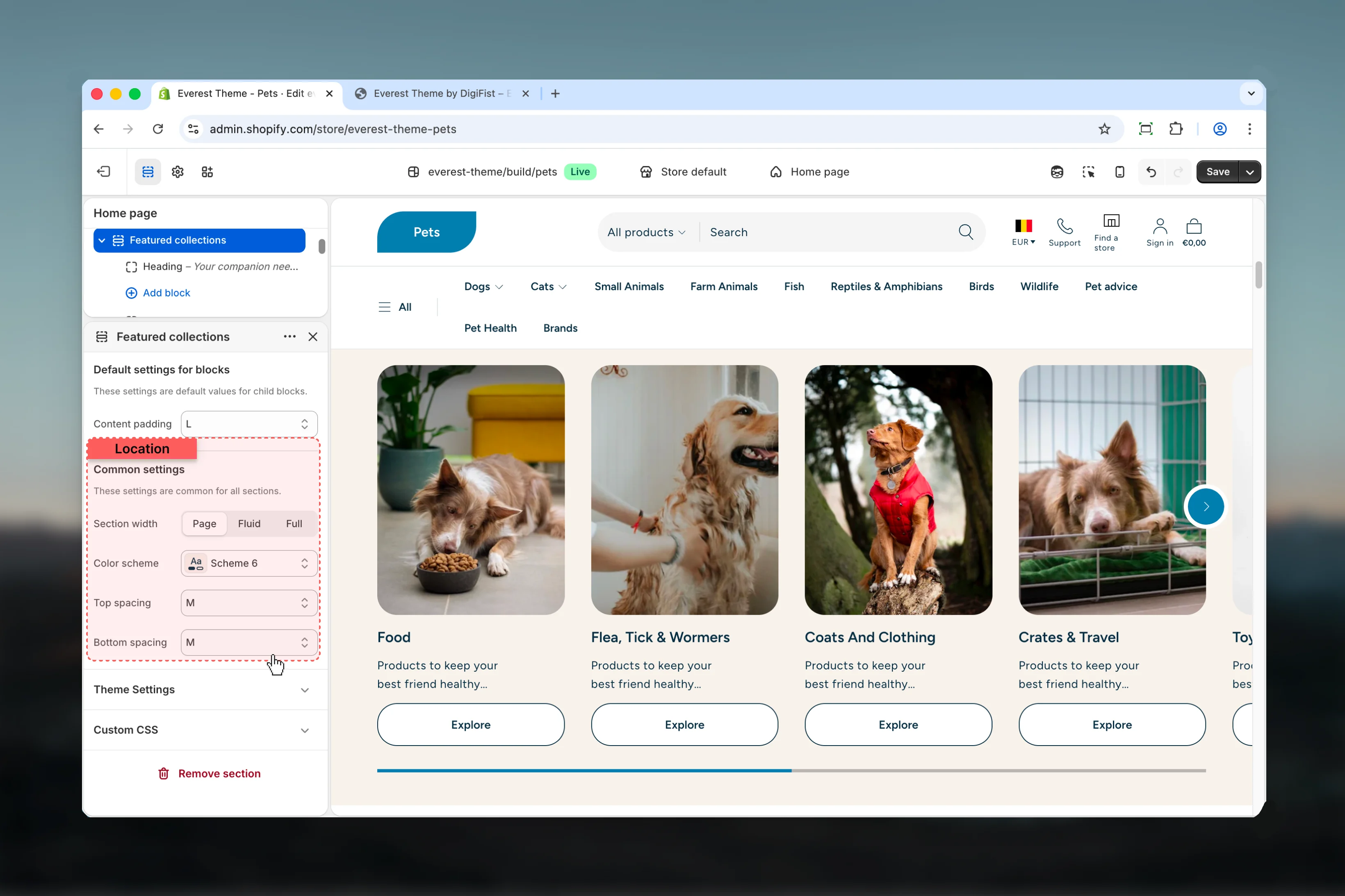
Section width
Section width
Choose how Section width behaves in the section.This setting shapes the section container and how it sits against surrounding content.Available options: Page, Fluid, Full.Default:
pageColor scheme
Color scheme
Select the color scheme used for color scheme.Use this to keep contrast and branding consistent with the rest of the store.Default:
scheme-1Top spacing
Top spacing
Choose how Top spacing behaves in the section.This setting shapes the section container and how it sits against surrounding content.Available options: No, S, M, L, XL.Default:
2Bottom spacing
Bottom spacing
Choose how Bottom spacing behaves in the section.This setting shapes the section container and how it sits against surrounding content.Available options: No, S, M, L, XL.Default:
2Block settings
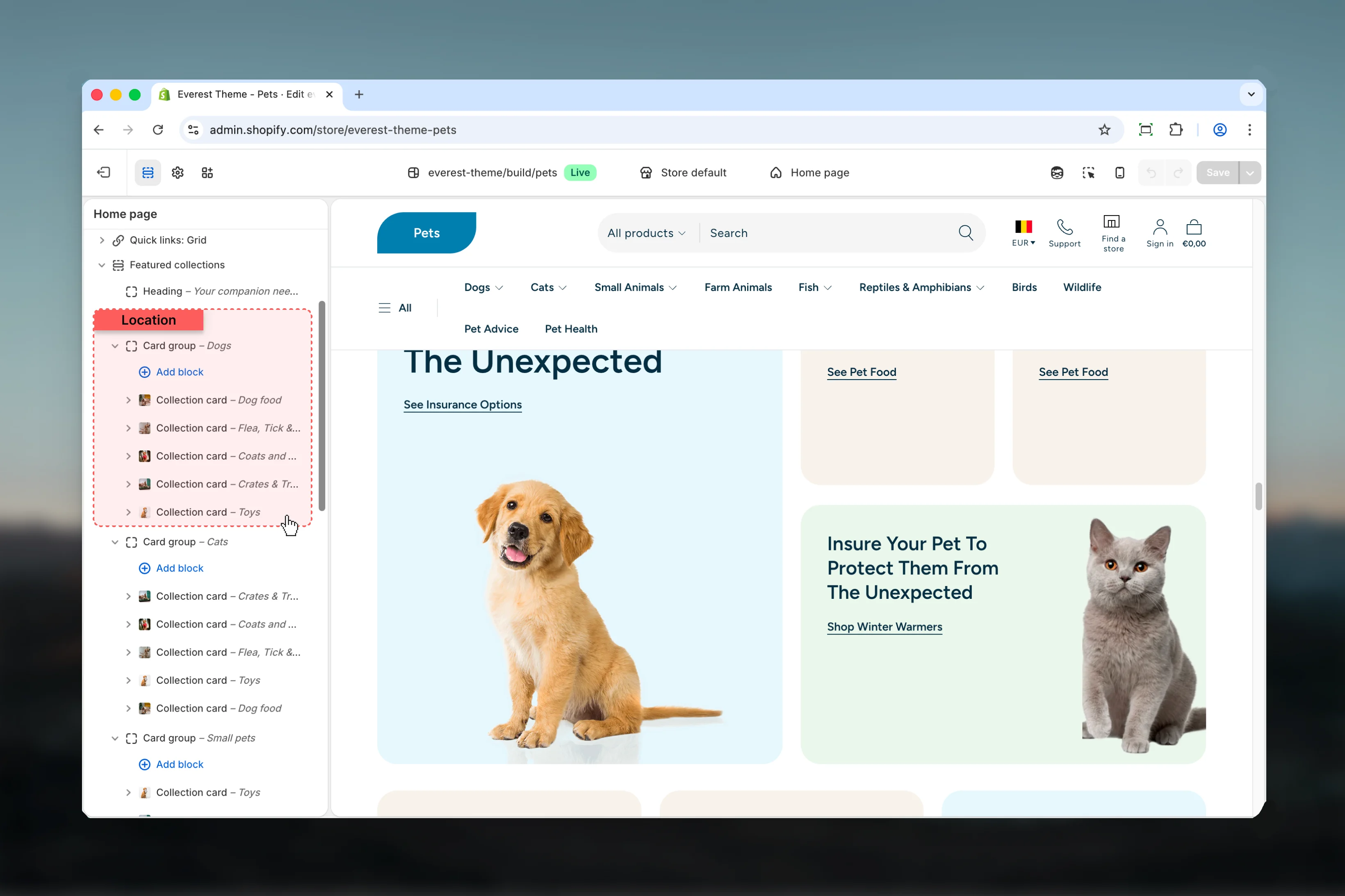
Collection Group

Settings
Label
Label
Enter the content used for label.
Collections
Collections
Select the collection source used by collections.
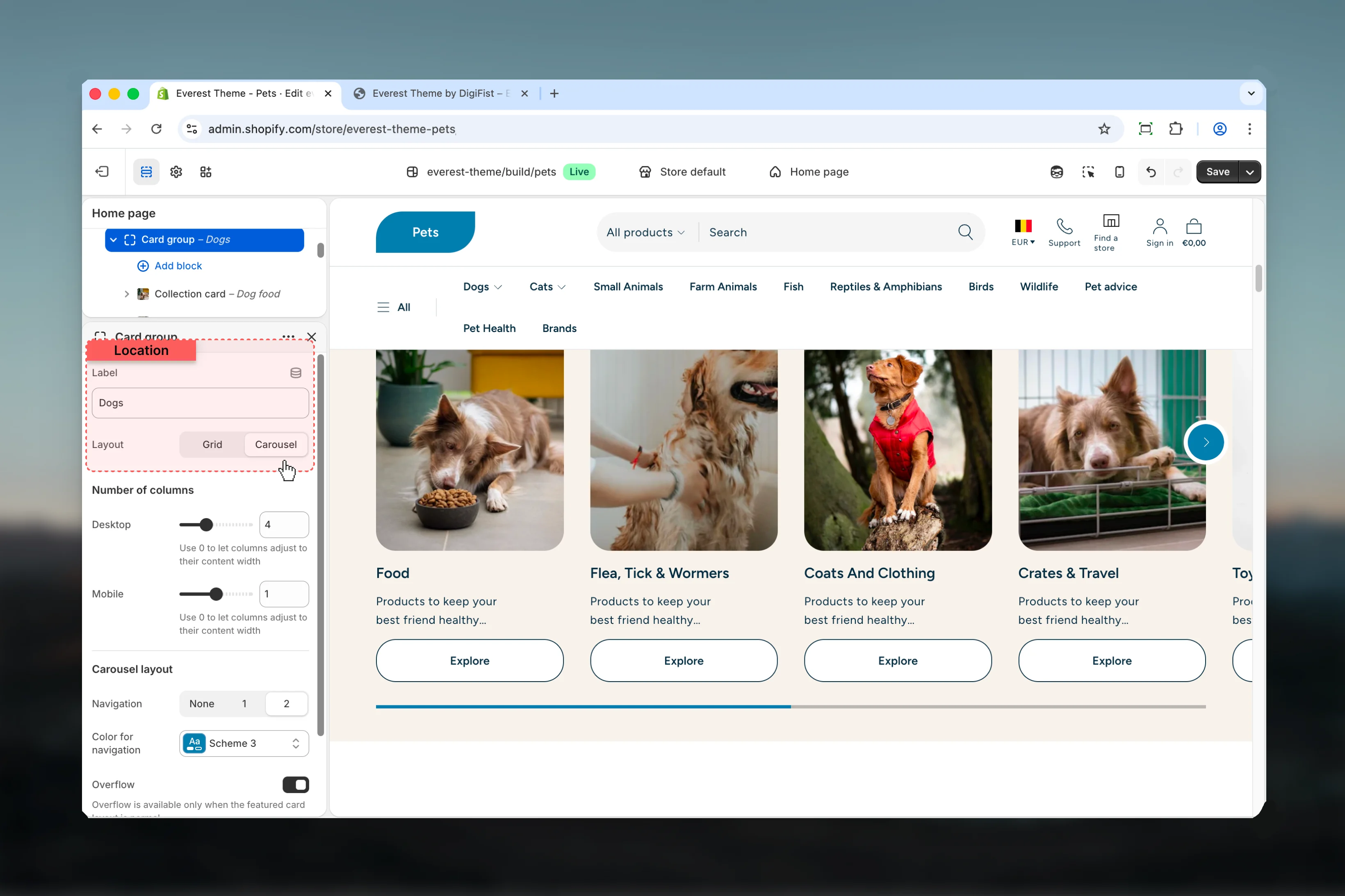
Layout
Layout
Choose how Layout behaves in the section.It has the strongest effect on layout balance and visual hierarchy.Available options: Grid, Carousel.Default:
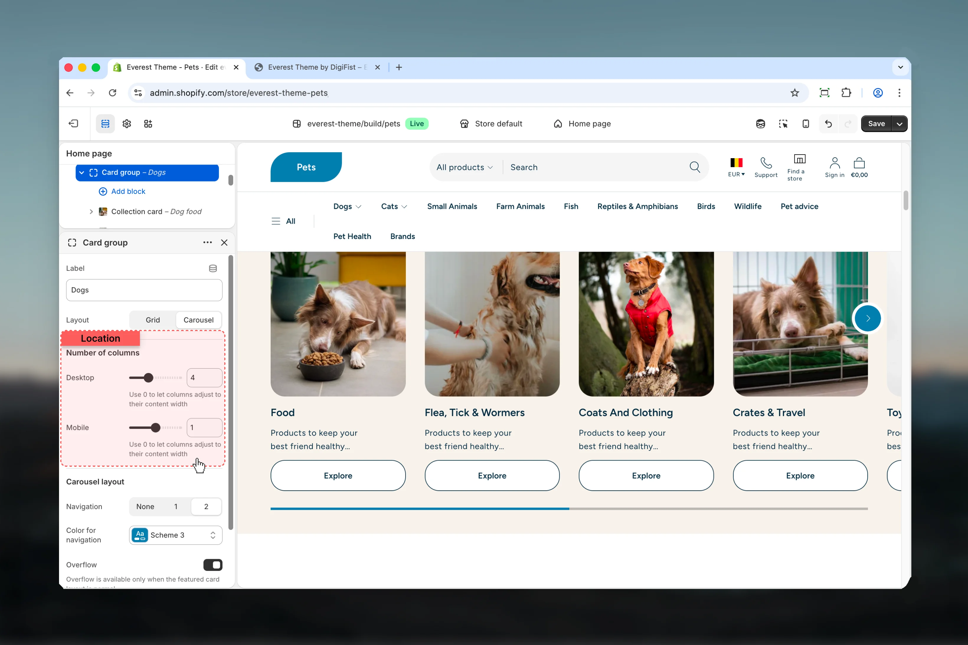
gridNumber of columns

Desktop
Desktop
Adjust Desktop with a slider-based control.It has the strongest effect on layout balance and visual hierarchy.Range:
0 to 8 Default: 4Use 0 to let columns adjust to their content widthMobile
Mobile
Adjust Mobile with a slider-based control.It has the strongest effect on layout balance and visual hierarchy.Range:
0 to 2 Default: 1Use 0 to let columns adjust to their content widthCarousel layout
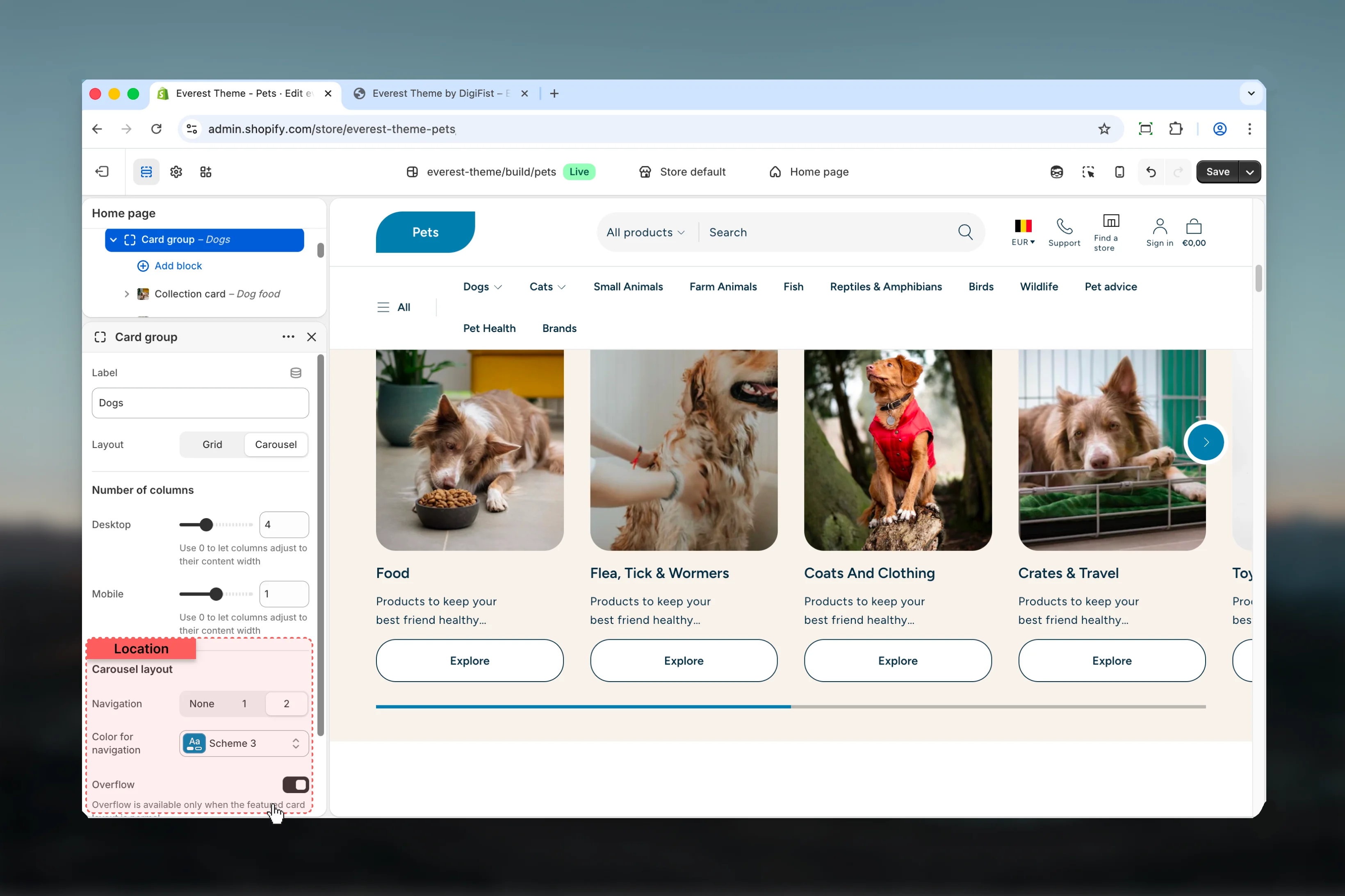
Overflow
Overflow
Enable or disable Overflow.Default:
disabledOverflow is available only when the featured card layout is normal.Card Group
Settings

Label
Label
Enter the content used for label.
Layout
Layout
Choose how Layout behaves in the section.It has the strongest effect on layout balance and visual hierarchy.Available options: Grid, Carousel.Default:
gridNumber of columns
Desktop
Desktop
Adjust Desktop with a slider-based control.It has the strongest effect on layout balance and visual hierarchy.Range:
0 to 12 Default: 4Use 0 to let columns adjust to their content widthMobile
Mobile
Adjust Mobile with a slider-based control.It has the strongest effect on layout balance and visual hierarchy.Range:
0 to 2 Default: 1Use 0 to let columns adjust to their content widthCarousel layout

Overflow
Overflow
Enable or disable Overflow.Default:
disabledOverflow is available only when the featured card layout is normal.Aspect ratio
Aspect ratio
Choose how Aspect ratio behaves in the section.It has the strongest effect on layout balance and visual hierarchy.Available options: Auto, Square, 4:3, 3:4, 3:2, 2:3, 5:4, 4:5, 16:9, 9:16, 2:1, 4:1, 8:1, 1:2.Default:
1.00- Card for more granular content inside this block.
- Collection Card for more granular content inside this block.
Best practices
- Check contrast after changing color schemes so text and controls remain easy to read.
- Adjust layout changes alongside neighboring sections so page rhythm stays consistent.
- Start with the structural settings first, then refine decorative styling after the layout feels settled.
- Preview the section with realistic content length to catch spacing and wrapping issues early.