What this template controls
- Headings, text content, and on-page messaging
- Layout structure, width, alignment, and spacing
- Calls to action, links, and navigation behavior
- Color schemes, contrast, and shared visual styling
- The template section order and the supporting sections included by default
Template structure
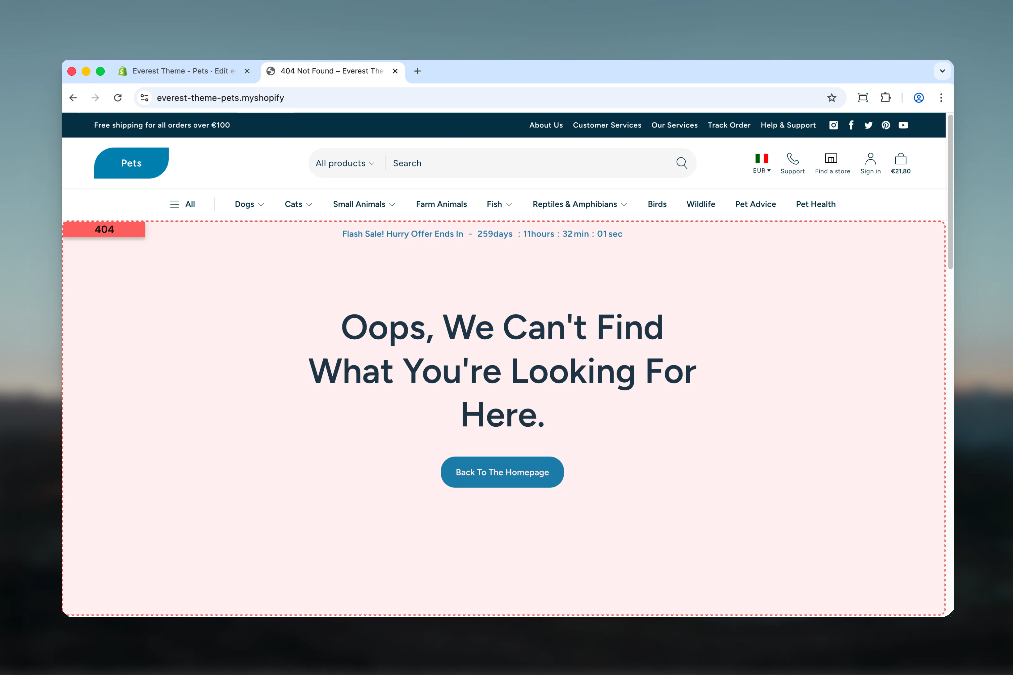
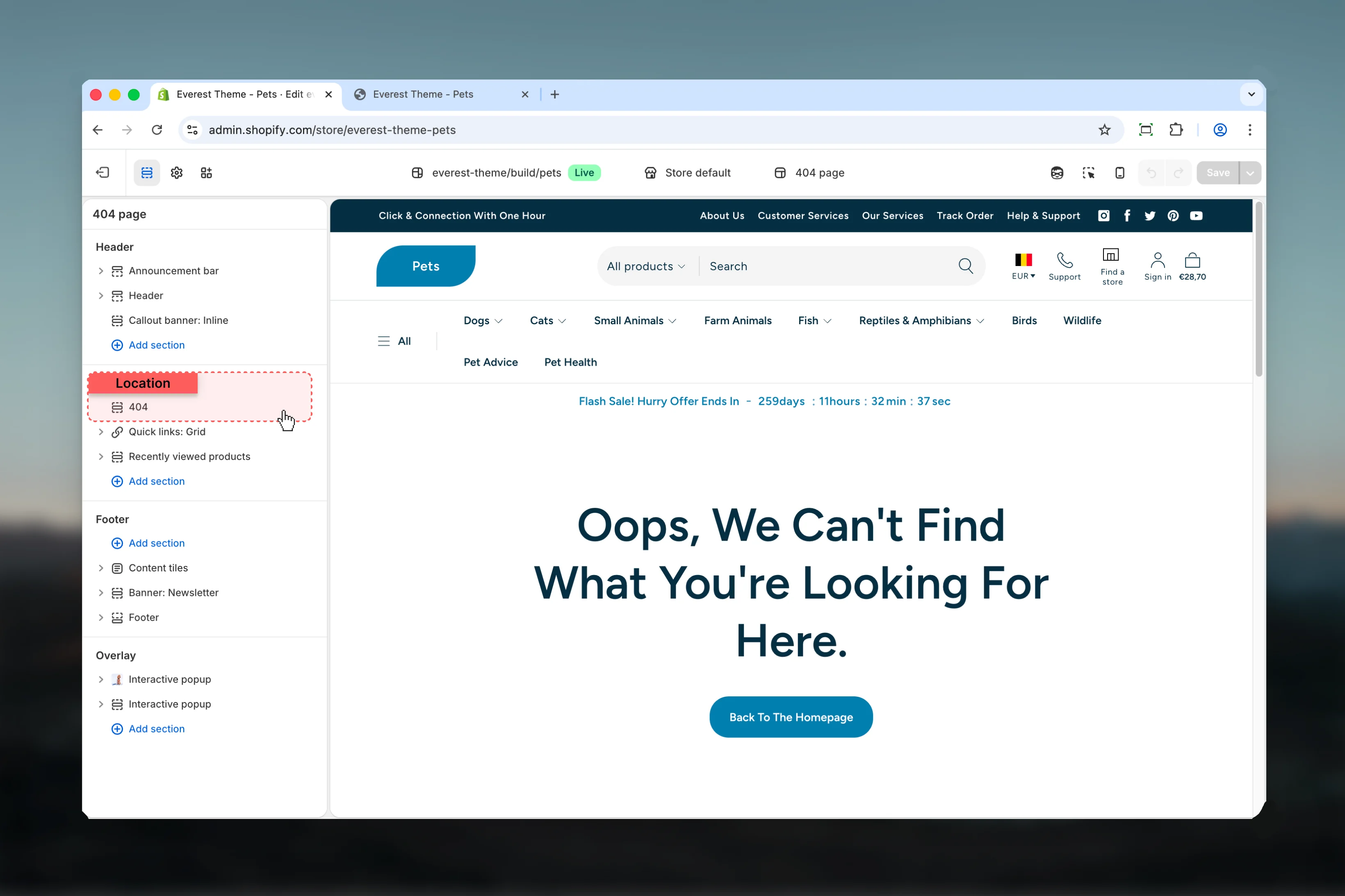
This template uses the following main sections or related theme building blocks by default:- 404
- Featured Collections
Getting started
1
Open the template in Theme Customizer
Open the relevant page type or assign the template to a resource before customizing it.
2
Review the main section first
Start with the primary content section so layout, filtering, gallery, or page-level behavior is defined before refining supporting content.
3
Adjust supporting sections
Review any banners, content sections, or utility sections included in the template so the full page works together as a set.
Main settings
Settings
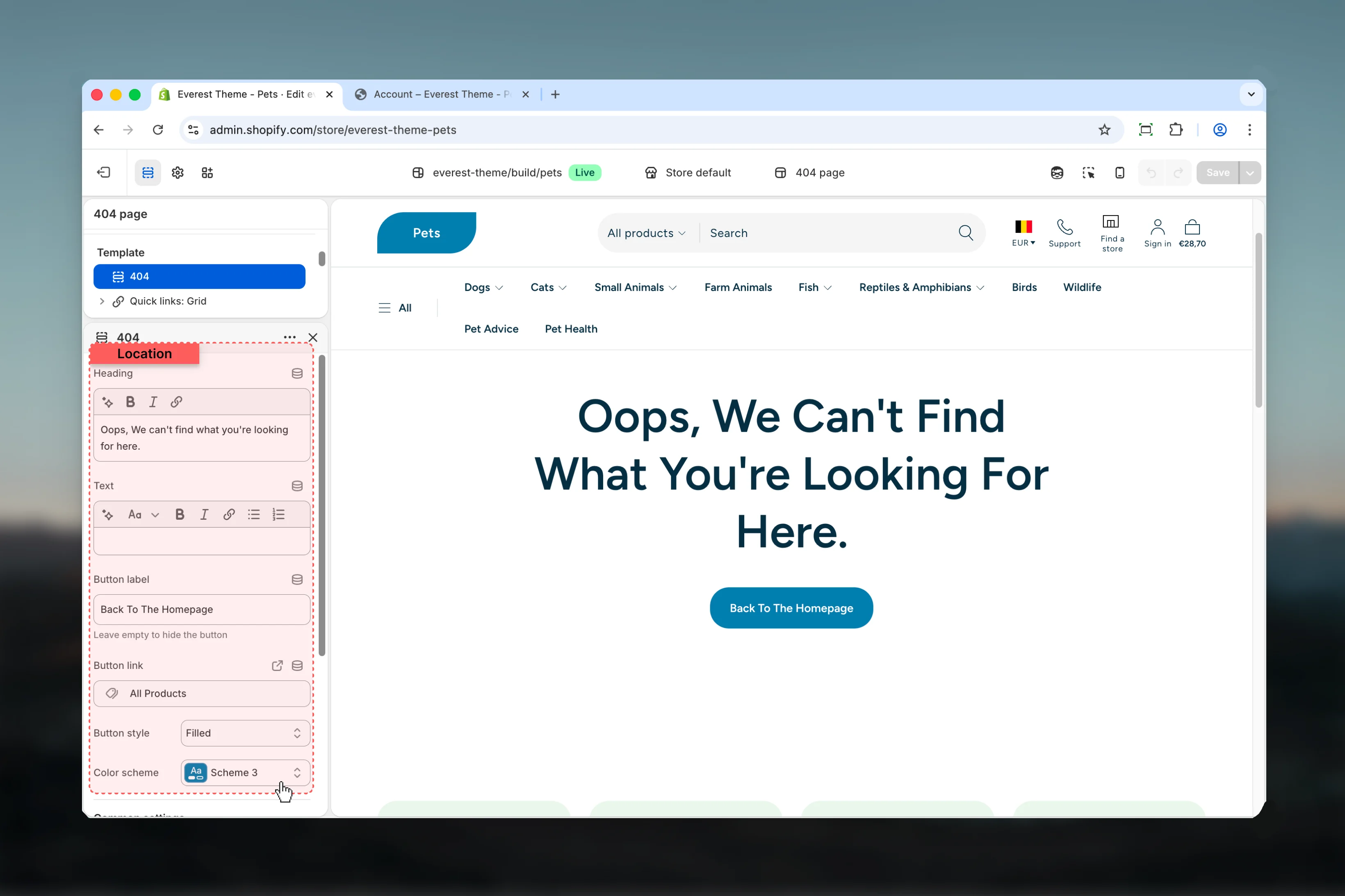
Heading
Heading
Enter the content used for heading.Default:
404 - Page not foundText
Text
Enter the content used for text.Default:
<p>Oops, We can't find what you're looking for here.</p>Color scheme
Color scheme
Select the color scheme used for color scheme.Use this to keep contrast and branding consistent with the rest of the store.Default:
scheme-1Common settings
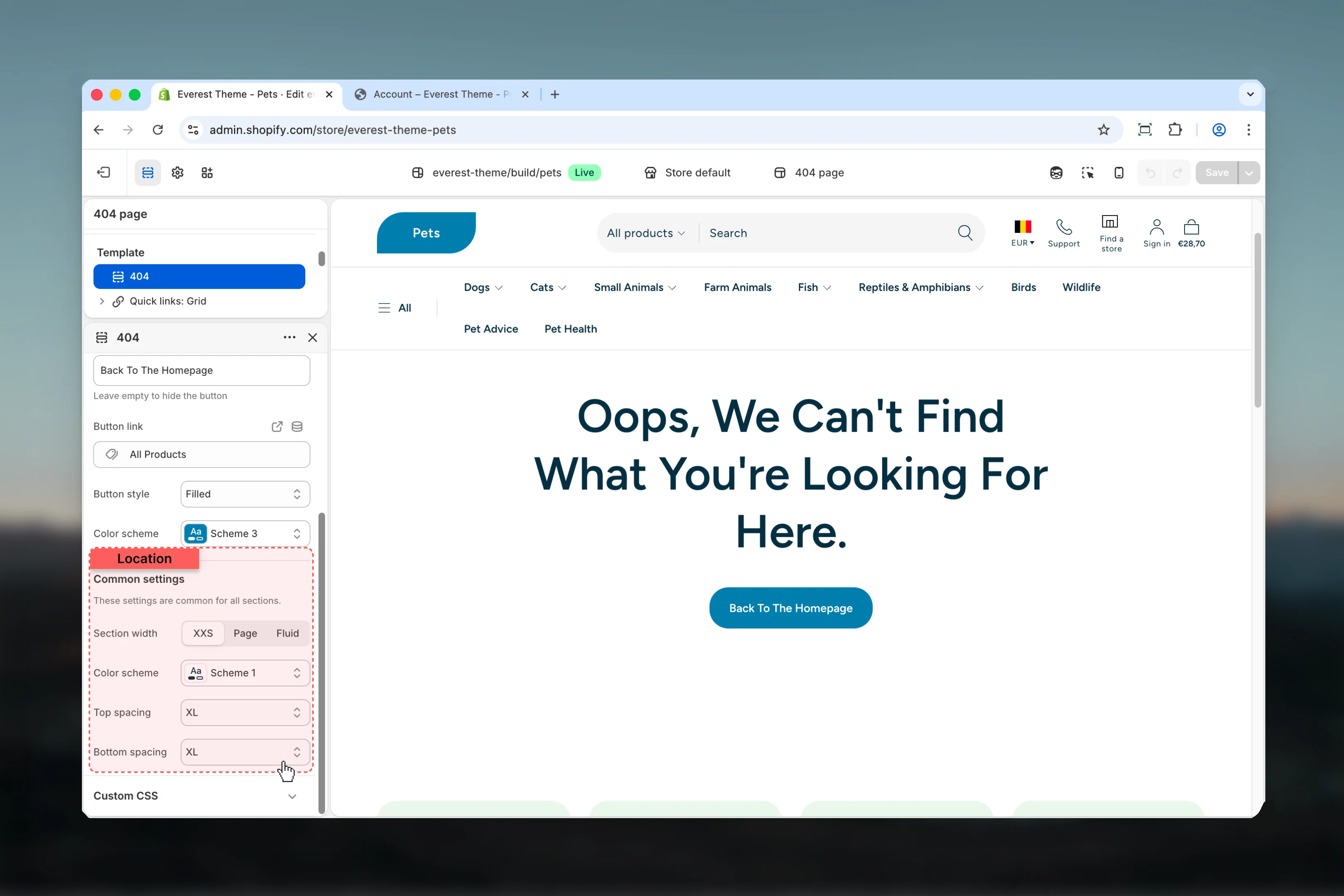
Section width
Section width
Choose how Section width behaves in the section.This setting shapes the section container and how it sits against surrounding content.Available options: XXS, Page, Fluid.Default:
xxsColor scheme
Color scheme
Select the color scheme used for color scheme.Use this to keep contrast and branding consistent with the rest of the store.Default:
scheme-1Top spacing
Top spacing
Choose how Top spacing behaves in the section.This setting shapes the section container and how it sits against surrounding content.Available options: No, S, M, L, XL.Default:
2Bottom spacing
Bottom spacing
Choose how Bottom spacing behaves in the section.This setting shapes the section container and how it sits against surrounding content.Available options: No, S, M, L, XL.Default:
2Best practices
- Check contrast after changing color schemes so text and controls remain easy to read.
- Keep labels short and scannable, especially in tighter layouts or utility areas.
- Adjust layout changes alongside neighboring sections so page rhythm stays consistent.
- Test this template with real content volume so headings, cards, and filters behave as expected.
- Review supporting sections together because template defaults often work as a coordinated set.