What these settings control
- Headings, text content, and on-page messaging
- Layout structure, width, alignment, and spacing
- Color schemes, contrast, and shared visual styling
How to access
1
Open the Theme Customizer
In Shopify admin, go to Online Store -> Themes -> Customize.
2
Open Theme settings
Select Theme settings in the customizer sidebar.
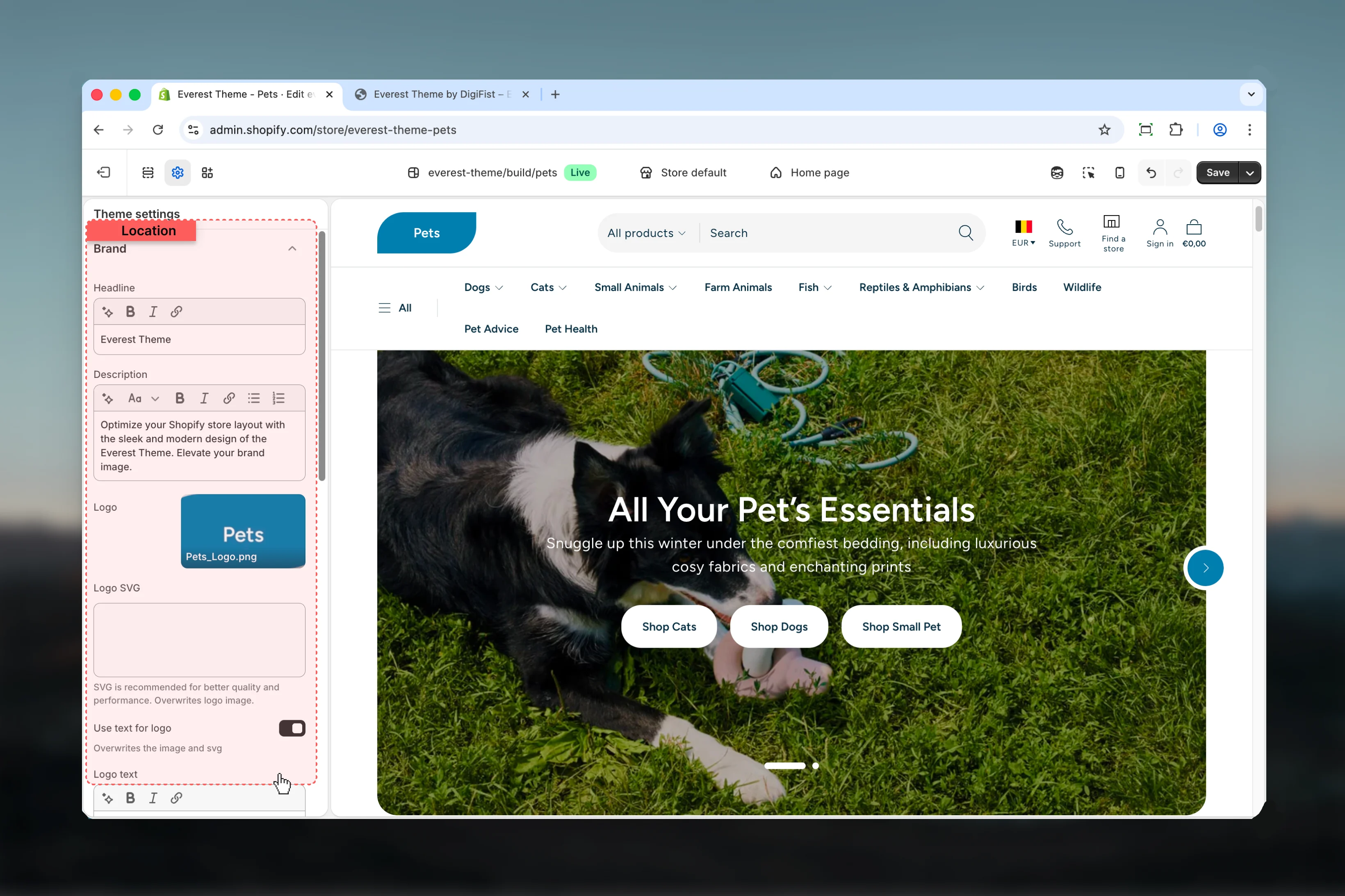
3
Choose Brand
Open Brand to review and update the shared settings in this category.
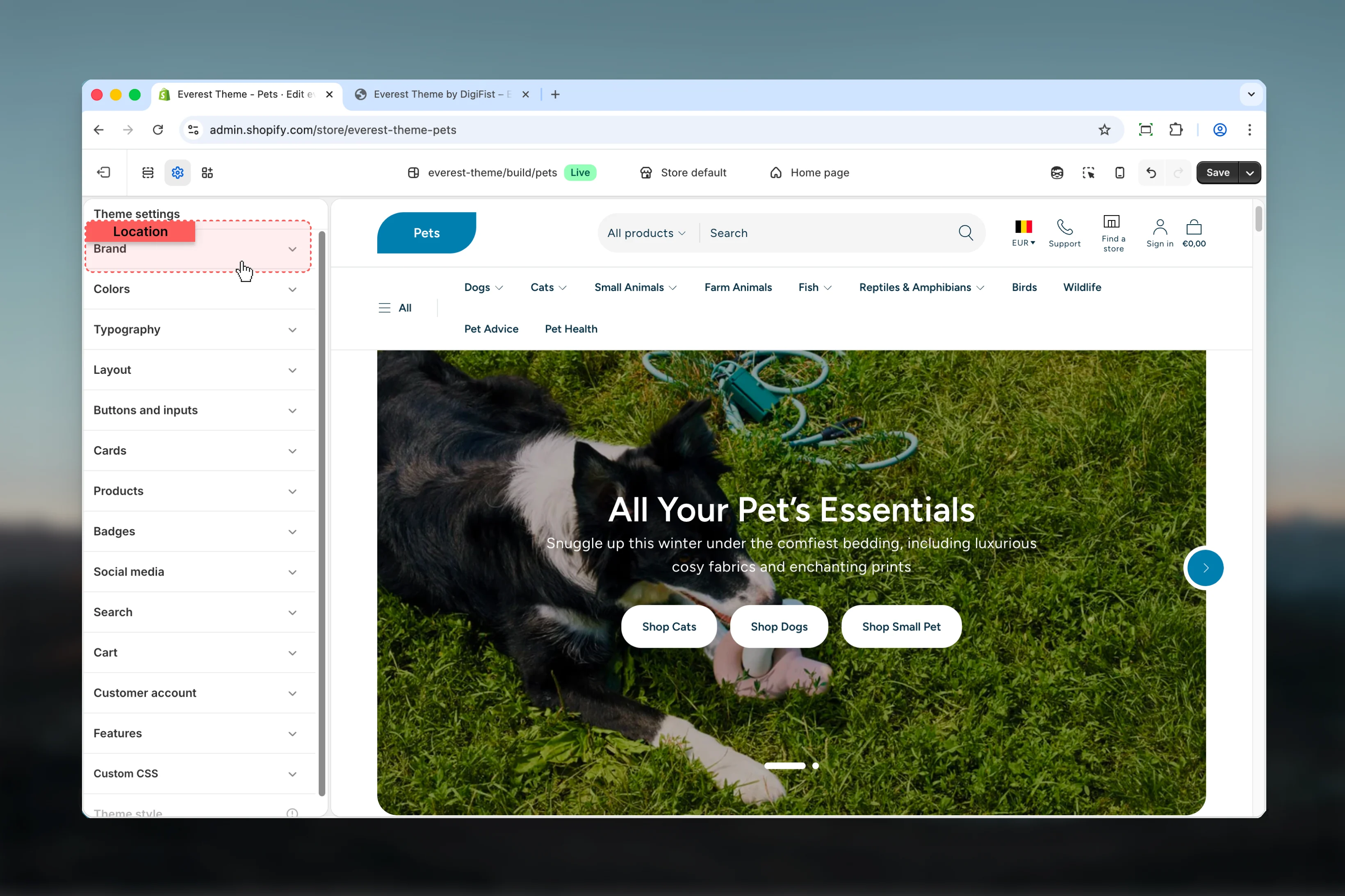
Settings
Settings

Headline
Headline
Enter the content used for headline.
Description
Description
Enter the content used for description.
Logo
Logo
Upload or choose an image for logo.
Logo SVG
Logo SVG
Paste custom HTML or SVG code for logo svg.SVG is recommended for better quality and performance. Overwrites logo image.
Use text for logo
Use text for logo
Enable or disable Use text for logo.Default:
enabledOverwrites the image and svgLogo text
Logo text
Enter the content used for logo text.Default:
EverestThis setting only appears when its related parent option is enabled.Logo color scheme
Logo color scheme
Select the color scheme used for logo color scheme.Use this to keep contrast and branding consistent with the rest of the store.Default:
scheme-3This setting only appears when its related parent option is enabled.Logo width
Logo width
Adjust Logo width with a slider-based control.It has the strongest effect on layout balance and visual hierarchy.Range:
50 to 300 Default: 100pxThis setting only appears when its related parent option is enabled.Favicon image
Favicon image
Upload or choose an image for favicon image.Review the result on both desktop and mobile when media changes are involved.Will be scaled down to 32 x 32px
Best practices
- Check contrast after changing color schemes so text and controls remain easy to read.
- Adjust layout changes alongside neighboring sections so page rhythm stays consistent.
- Change one global setting area at a time and preview multiple templates before publishing.
- Remember that theme settings affect many sections at once, so small adjustments can have wide impact.