What these settings control
- Layout structure, width, alignment, and spacing
- Color schemes, contrast, and shared visual styling
How to access
1
Open the Theme Customizer
In Shopify admin, go to Online Store -> Themes -> Customize.
2
Open Theme settings
Select Theme settings in the customizer sidebar.
3
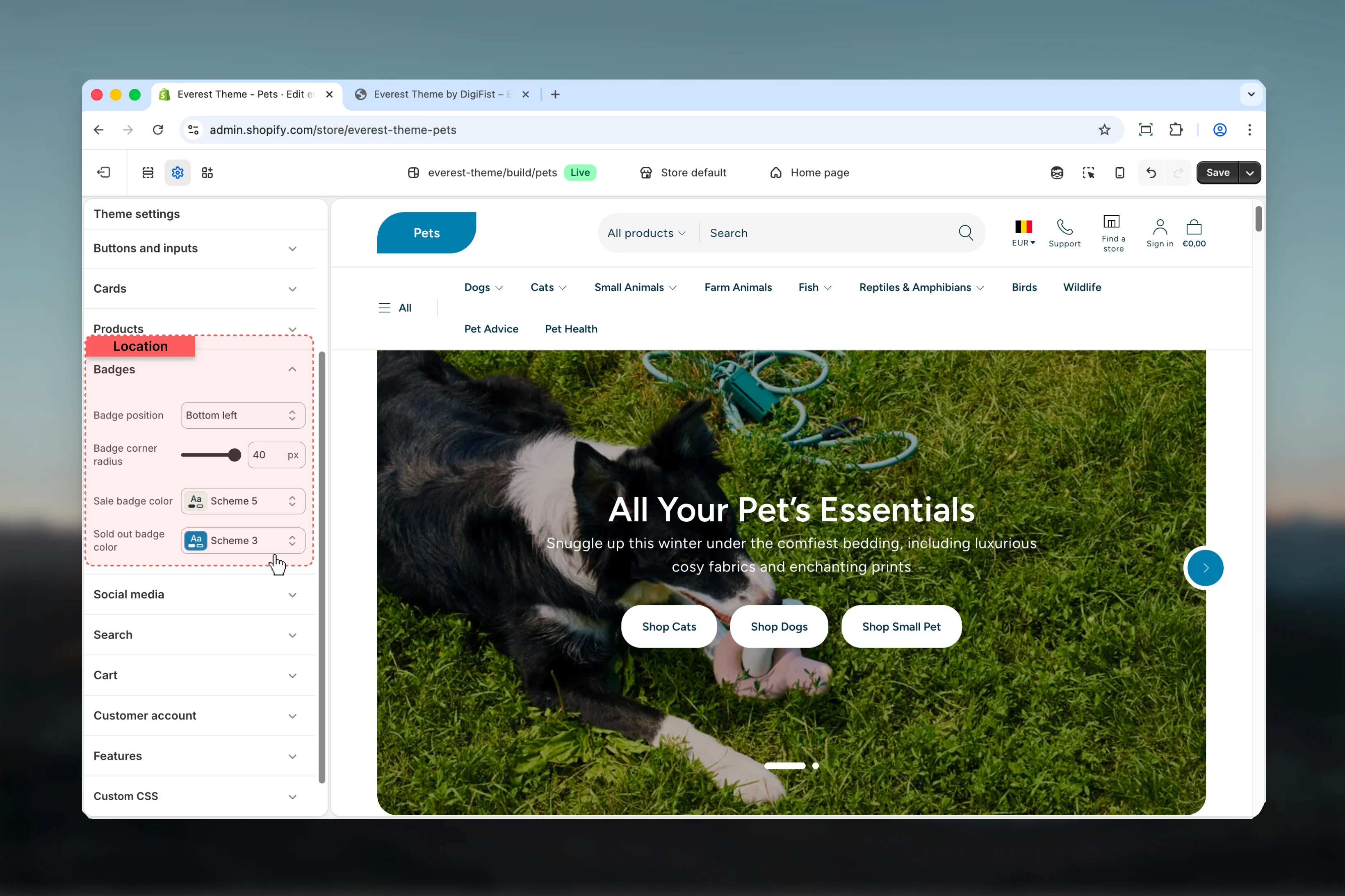
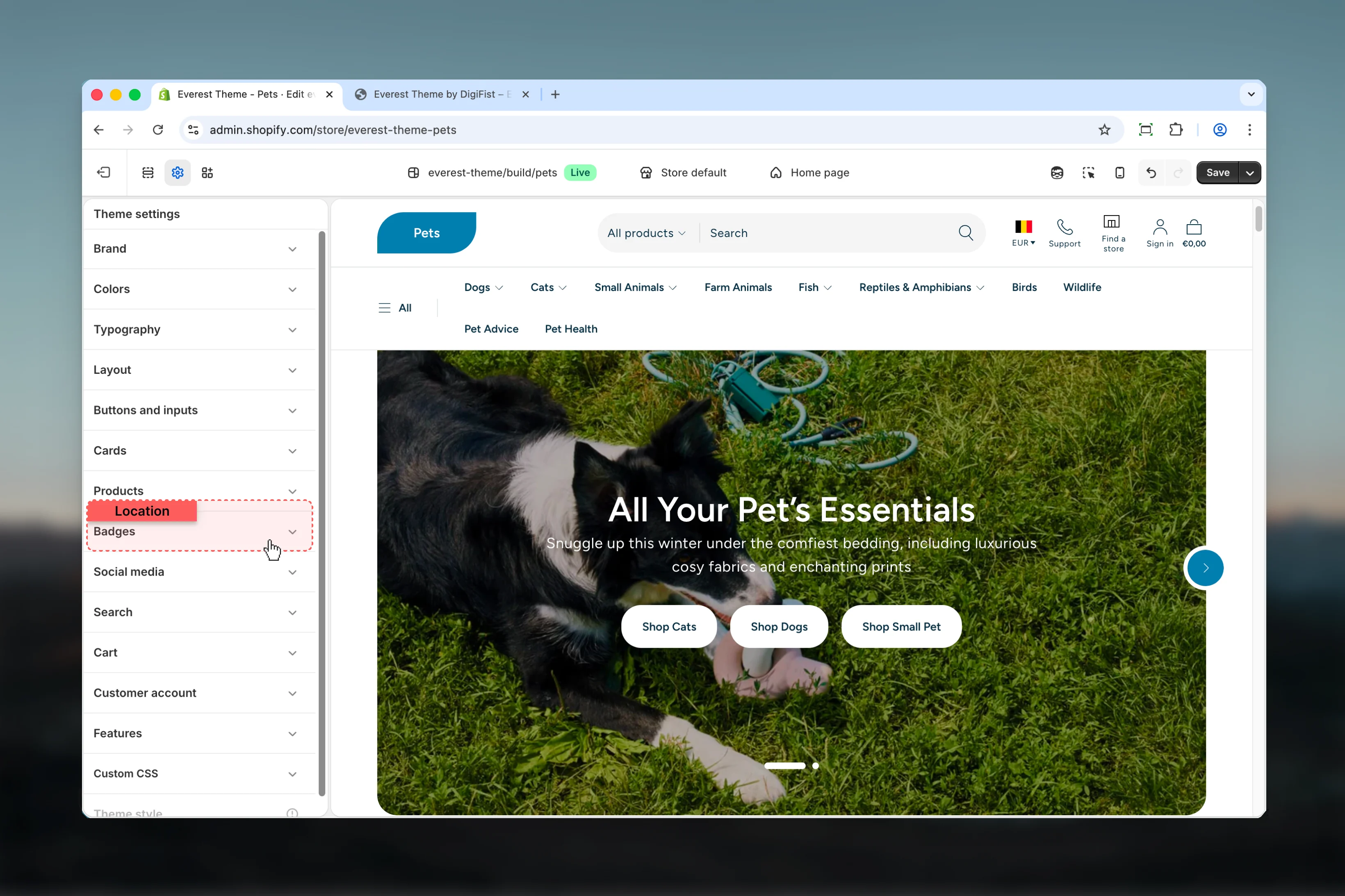
Choose Badges
Open Badges to review and update the shared settings in this category.
Settings
Settings

Badge position
Badge position
Choose how Badge position behaves in the section.It has the strongest effect on layout balance and visual hierarchy.Available options: Bottom left, Bottom right, Top left, Top right.Default:
top rightBadge corner radius
Badge corner radius
Adjust Badge corner radius with a slider-based control.Range:
0 to 40 Default: 40pxSale badge color
Sale badge color
Select the color scheme used for sale badge color.Use this to keep contrast and branding consistent with the rest of the store.Default:
scheme-5Sold out badge color
Sold out badge color
Select the color scheme used for sold out badge color.Use this to keep contrast and branding consistent with the rest of the store.Default:
scheme-3Best practices
- Check contrast after changing color schemes so text and controls remain easy to read.
- Change one global setting area at a time and preview multiple templates before publishing.
- Remember that theme settings affect many sections at once, so small adjustments can have wide impact.