What this section controls
- Announcement message content and carousel rotation
- Dropdown cards with up to 3 expandable detail cards
- Countdown timers for time-sensitive promotions
- Section borders and spacing
- Color schemes for bar and dropdown areas
Getting started
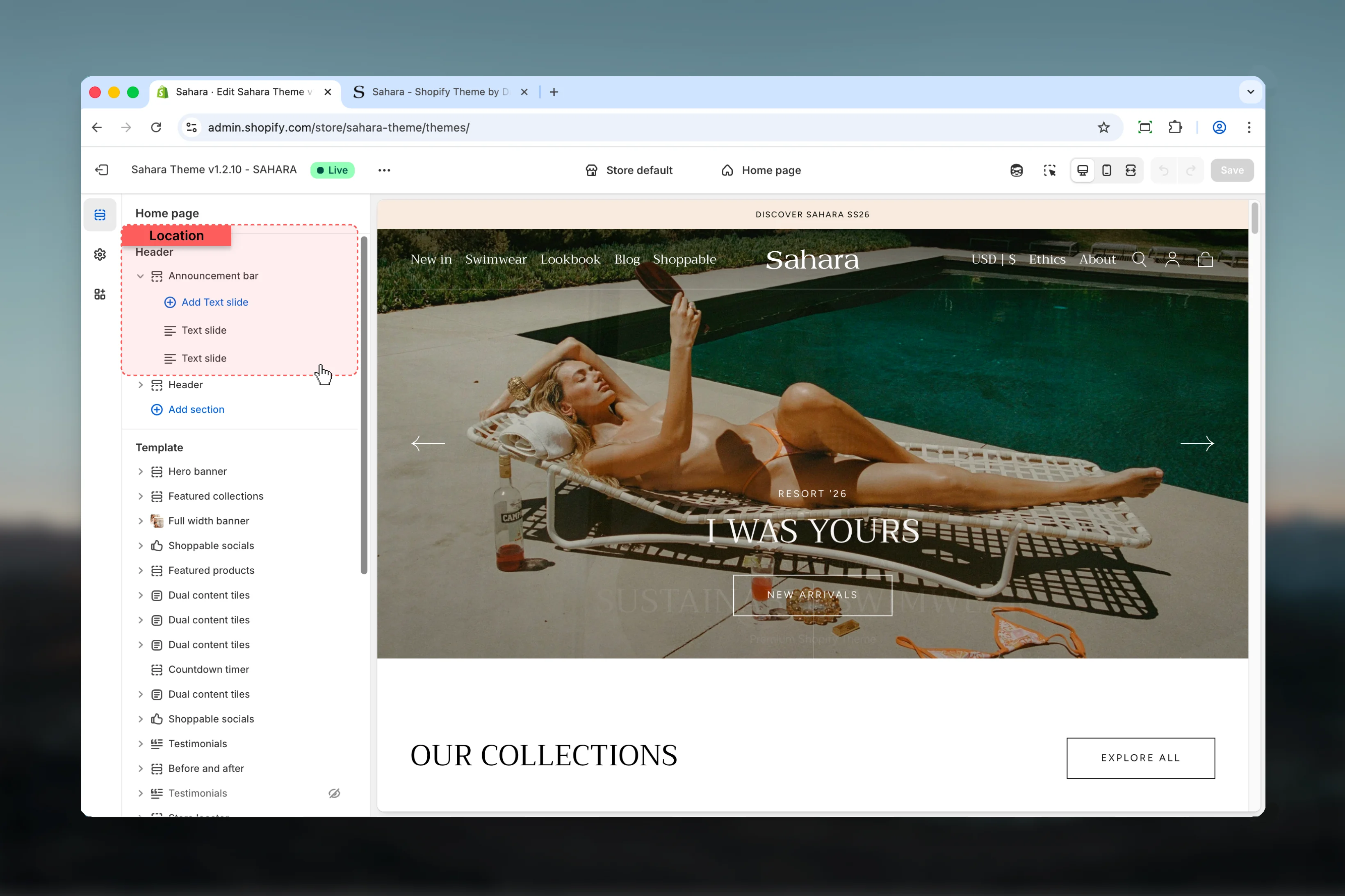
Locate Announcement bar
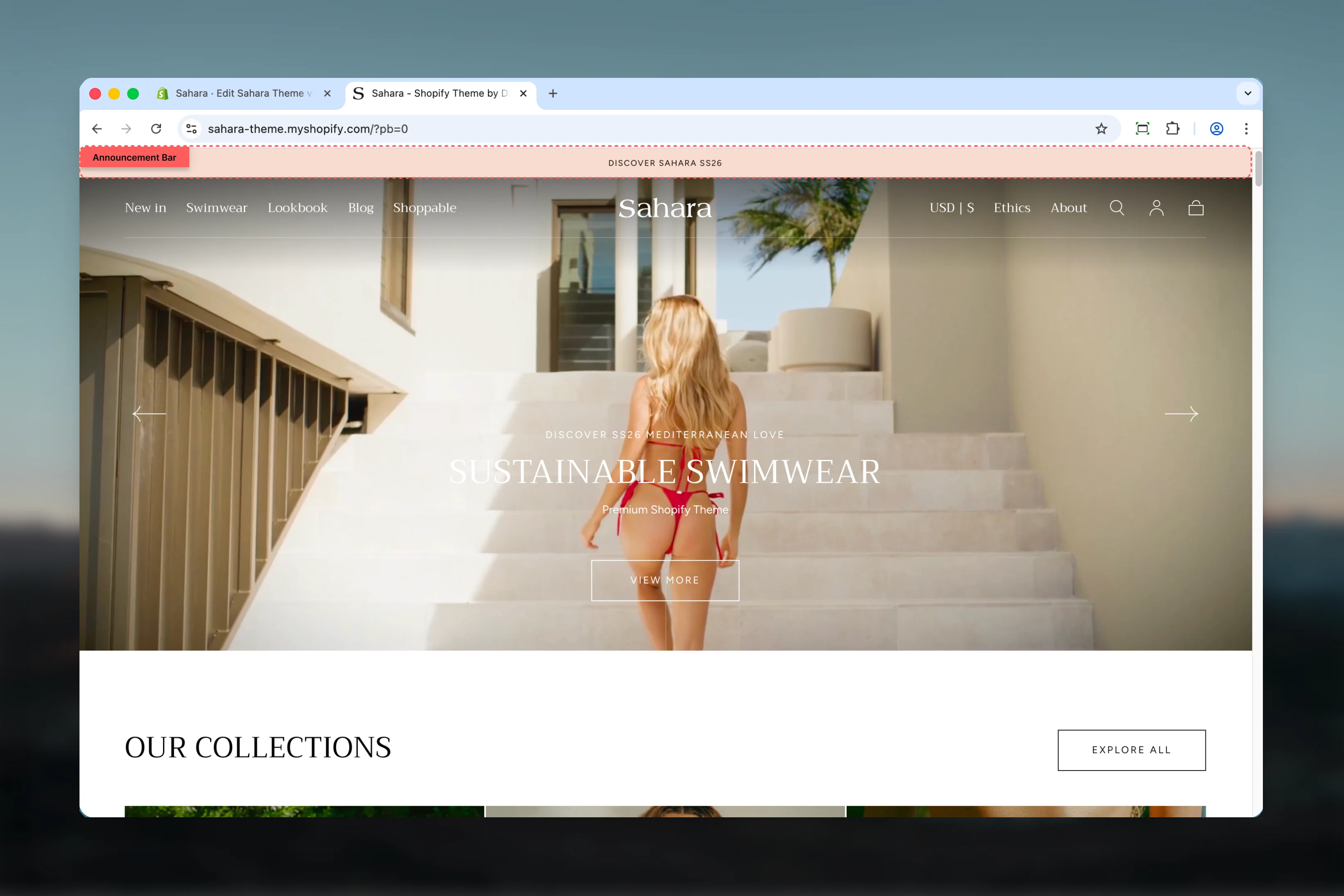
The Announcement bar section is typically positioned at the top of your store. Look for it in the sections list or add it using the “Add section” button.
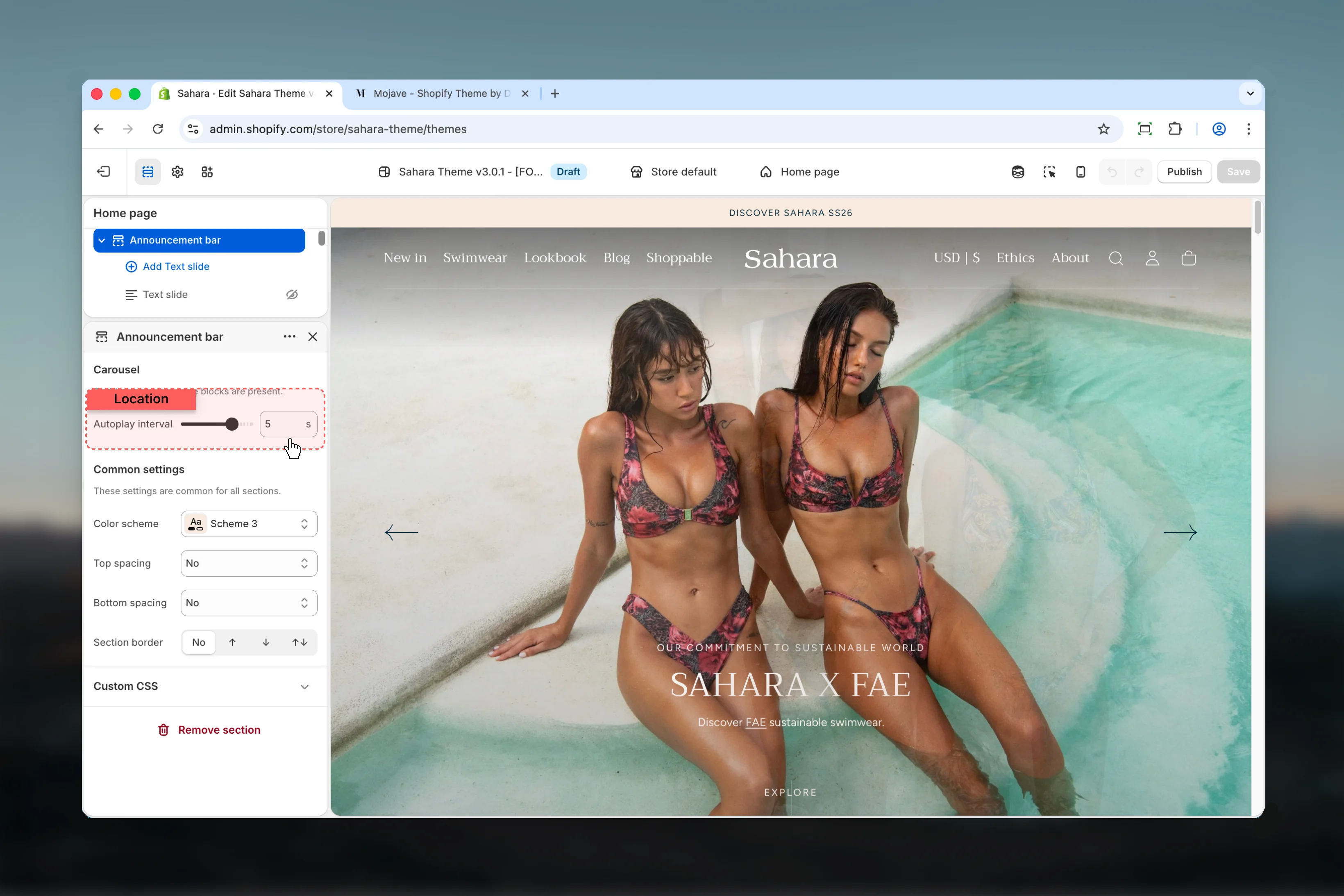
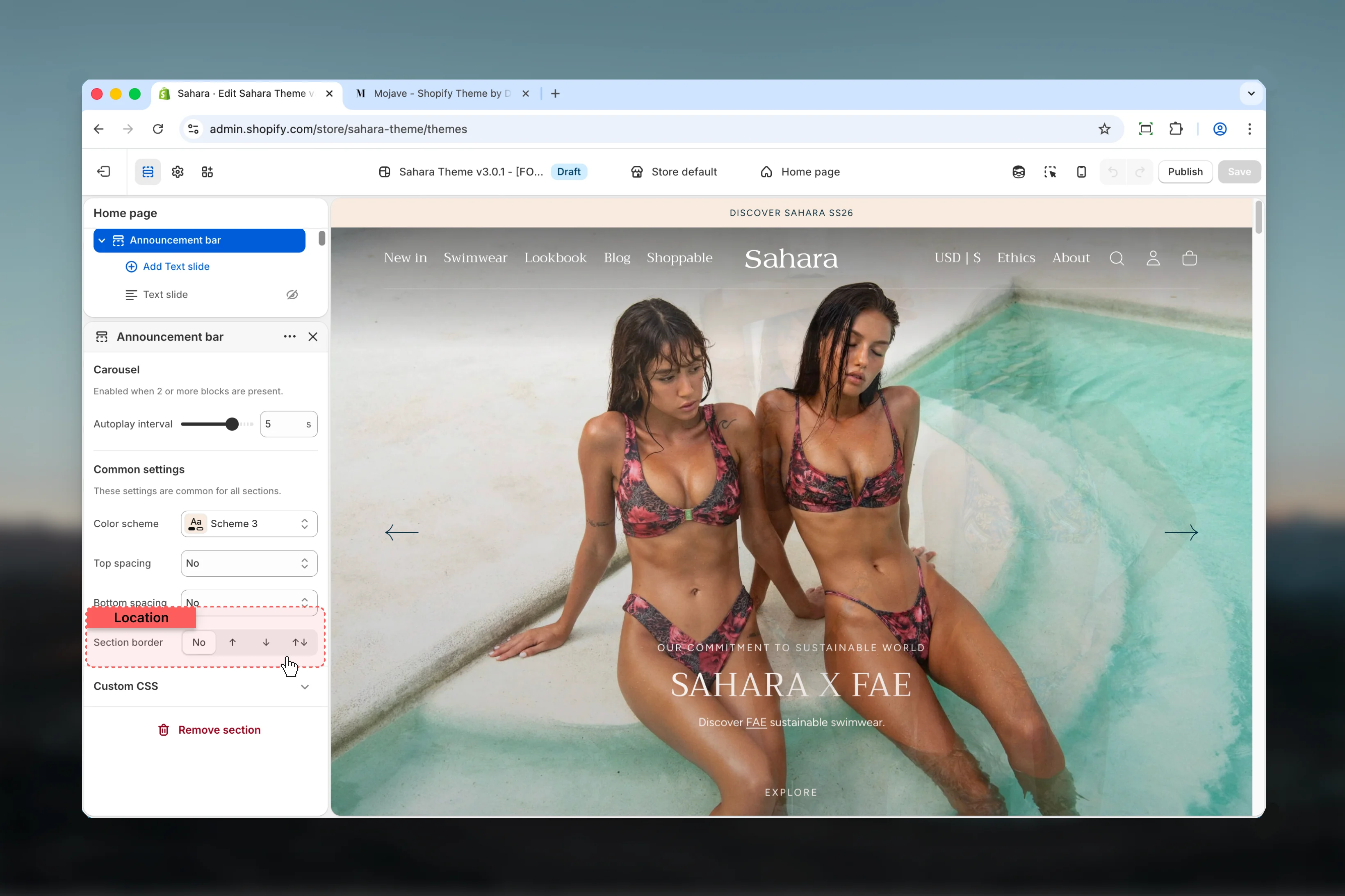
Section settings
Section settings control the overall behavior and appearance of the announcement bar.- Carousel
- Design
- Spacing
Slider autoplay interval
Controls how quickly slides rotate when multiple text slides are present.Range: 2 – 6 seconds (0.5s increments)Default: 3 secondsCarousel is automatically enabled when 2 or more text slide blocks are added. With a single block, the announcement displays as static content.
Block settings
Block settings configure individual text slides within the announcement bar. Each text slide represents one message in the carousel.- Content
- Dropdown Cards
- Countdown Timer
Body text
The main announcement message displayed to visitors.Type: Rich textDefault: “Welcome to our store”Supports text formatting including bold, italic, and links. Keep messages concise for better mobile display.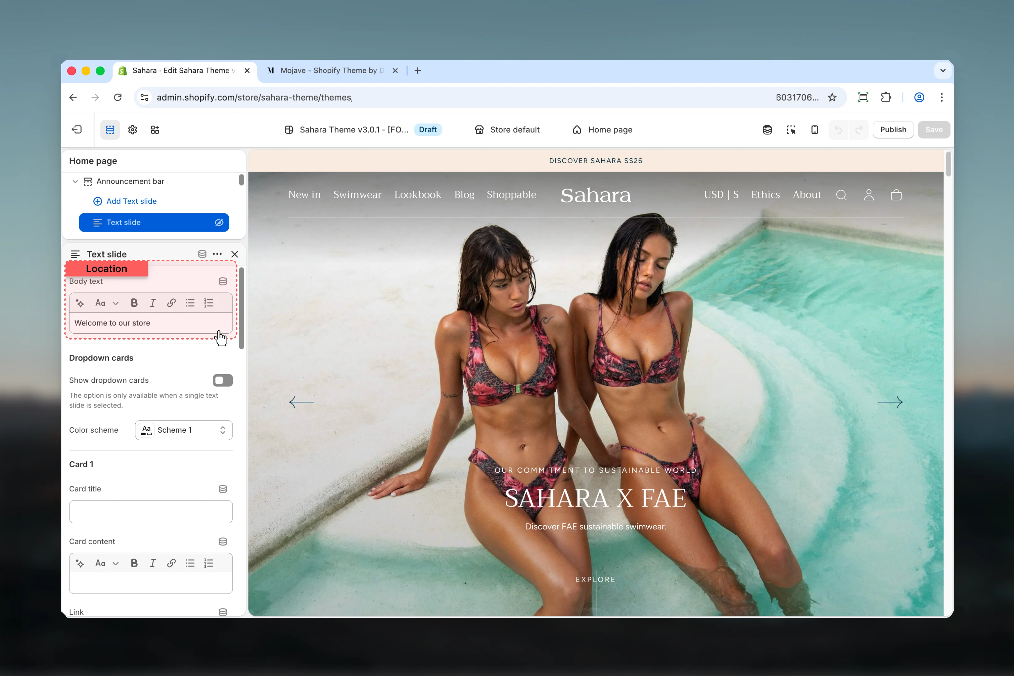


Best practices
Keep text brief
Limit announcement text to under 60 characters for optimal mobile display and quick readability.
Use dropdown cards strategically
Dropdown cards work well for regional information, detailed terms, or multiple CTAs without cluttering the main bar.
Limit carousel slides
Keep carousel to 2-3 slides maximum. More slides reduce effectiveness and split user attention.
Genuine urgency only
Enable countdown timers only for genuinely time-sensitive offers to maintain credibility and urgency impact.
Test autoplay speed
Faster intervals (2-3s) work for very short messages, slower intervals (5-6s) for detailed content or countdown timers.
Add borders for separation
Use section borders to separate announcement bar from header when using similar color schemes.
One message per slide
Avoid running multiple promotions simultaneously in carousel. Focus on one clear message per slide.
Preview on mobile
Test dropdown cards on mobile before publishing to ensure content is easily accessible and buttons are adequately sized.
Use timer extend feature
For ongoing promotions, use timer extend rather than manually updating dates each time expiration occurs.
Match color schemes
Coordinate dropdown card color scheme with your brand while maintaining sufficient contrast for readability.
Common use cases
- Flash sale announcement - Single slide with countdown timer showing hours/minutes/seconds for 24-hour sale
- Free shipping promotion - Multiple slides rotating between free shipping threshold and current promotion details
- Regional announcements - Single slide with dropdown cards showing shipping information for different countries or regions
- New collection launch - Countdown timer with days/hours leading up to product release date
- Holiday hours - Single static slide with dropdown cards detailing hours for different store locations
- Sale rotation - 2-3 slides showcasing different product categories currently on sale
- Pre-order campaign - Countdown to pre-order closing with clear end message when timer expires
- Seasonal promotion - Extended timer (7-30 days) for ongoing seasonal discounts that reset automatically