What this controls
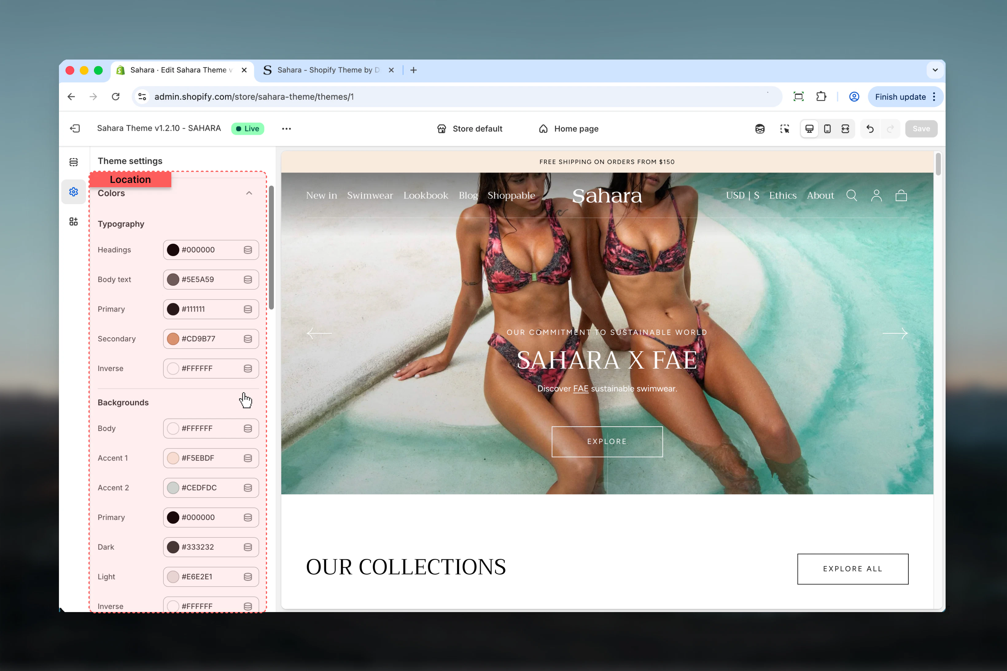
Color settings define the visual identity of your entire store through reusable color schemes. Each scheme contains coordinated colors for backgrounds, text, buttons, and UI elements that sections can inherit and apply consistently.How it works
Sahara uses Shopify’s color scheme system:- Define color schemes: Create multiple schemes (light, dark, accent, etc.)
- Sections inherit schemes: Each section chooses which scheme to use
- Global updates: Changing a scheme’s colors updates all sections using it
- Section overrides: Individual sections can override specific colors when needed
Most stores use 2-4 color schemes: a light scheme for main content, a dark scheme for hero sections, and 1-2 accent schemes for emphasis.
Getting started
Location
Path: Theme settings → Colors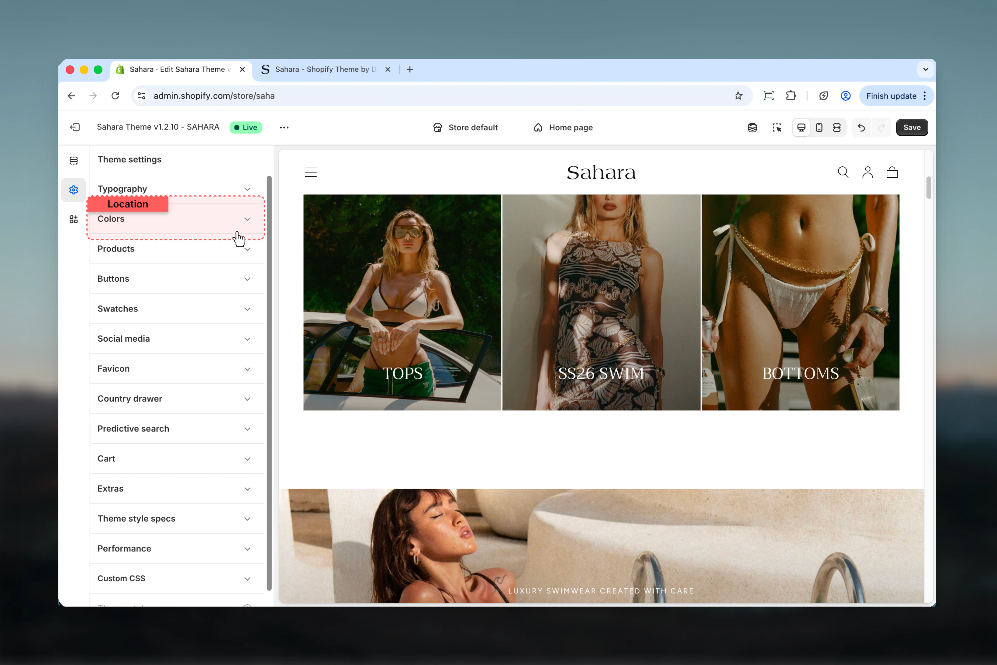
Settings
- Color Schemes
- Background
- Typography
- UI Elements
Understanding Color Schemes
Color schemes are collections of coordinated colors that work together harmoniously. Sahara includes multiple pre-configured schemes that you can customize.Available Schemes:- Scheme 1: Primary color scheme for main content
- Scheme 2: Alternative scheme for visual variety
- Scheme 3: Additional variation for special sections
- Inverse: High-contrast scheme (typically dark)
How color scheme inheritance works
How color scheme inheritance works
Global Definition:
- Define color schemes in Theme Settings → Colors
- Each scheme contains all necessary colors
- Schemes are reusable across sections
- Sections choose which scheme to use
- Changing section’s scheme changes all its colors
- Sections inherit scheme colors automatically
- Editing a scheme updates ALL sections using it
- Provides instant visual consistency
- Test changes across multiple sections before saving
Recommended color scheme strategy
Recommended color scheme strategy
Minimal Approach (2 schemes):
- Scheme 1 (Light): White/light background, dark text
- Scheme 2 (Dark): Dark background, light text
- Use: Simple, consistent stores
- Scheme 1 (Light): Primary content scheme
- Scheme 2 (Accent): Brand color emphasis
- Scheme 3 (Inverse): Dark sections/footer
- Use: Most e-commerce stores
- Scheme 1: Main content (white)
- Scheme 2: Light accent (cream/beige)
- Scheme 3: Brand color emphasis
- Scheme 4: Dark/inverse
- Use: Complex stores with varied visual sections
Best practices
Limit to 2-4 color schemes
More schemes create inconsistency and confusion. Most stores need only light, dark, and 1-2 accent schemes.
Test contrast ratios rigorously
Body text needs 4.5:1 minimum, large text needs 3.0:1. Use WebAIM Contrast Checker or browser DevTools.
Start with accessibility first
Ensure WCAG compliance first, then refine colors for brand expression.
Brand colors as accents
Apply brand colors to buttons, headings, or backgrounds. Keep body text neutral for readability.
Test on multiple backgrounds
Buttons and text should work on all scheme backgrounds. Test light schemes with images.
Keep gradients subtle
5-10% opacity maximum. Strong gradients reduce readability and look dated.
Preview across entire store
Color scheme changes affect multiple sections. Preview homepage, product pages, cart before saving.
Consider dark mode needs
Create an inverse/dark scheme for night mode or high-contrast sections.
Document your decisions
Note accessibility tests, brand color hex values, and scheme purposes for future reference.
Test on actual devices
Colors appear differently on phones, tablets, and monitors. Test on real hardware, not just browser preview.
Common use cases
Standard e-commerce store (2 schemes)
Standard e-commerce store (2 schemes)
Goal: Clean, professional appearance with good readabilityScheme 1 (Light - Primary):
- Background: White (#FFFFFF)
- Primary text: Dark gray (#1A1A1A)
- Headings: Near-black (#111111)
- Filled button: Brand color or dark (#132D40)
- Filled button text: White (#FFFFFF)
- Outlined button: Dark (#132D40)
- Border: Light gray (#EBEBEB)
- Background: Dark blue-gray (#132D40)
- Primary text: White (#FFFFFF)
- Headings: White (#FFFFFF)
- Filled button: White (#FFFFFF)
- Filled button text: Dark (#132D40)
- Outlined button: White (#FFFFFF)
- Border: Medium gray (#444444)
- Scheme 1: Product grids, product pages, most sections
- Scheme 2: Hero sections, footer, announcement bar
Brand-forward store (3 schemes)
Brand-forward store (3 schemes)
Goal: Strong brand identity with color-rich experienceScheme 1 (Light - Default):
- Background: Off-white (#F9F9F9)
- Primary text: Charcoal (#333333)
- Headings: Brand primary (#132D40)
- Filled button: Brand primary (#132D40)
- Buttons text: White (#FFFFFF)
- Links: Brand secondary (#367CAC)
- Background: Brand light tint (#F0F7FB)
- Primary text: Dark (#1A1A1A)
- Headings: Brand primary (#132D40)
- Filled button: Brand accent (#367CAC)
- Button text: White (#FFFFFF)
- Background: Near-black (#1A1A1A)
- Primary text: Off-white (#F9F9F9)
- Headings: White (#FFFFFF)
- Filled button: Brand accent (#367CAC)
- Button text: White (#FFFFFF)
- Scheme 1: Product pages, collections, blog
- Scheme 2: Featured collections, promotions, highlights
- Scheme 3: Hero, footer, special announcements
Minimal/luxury store (2 schemes, high contrast)
Minimal/luxury store (2 schemes, high contrast)
Goal: Sophisticated, minimal aesthetic with maximum readabilityScheme 1 (Light - Ultra Minimal):
- Background: Pure white (#FFFFFF)
- Primary text: Pure black (#000000)
- Headings: Black (#000000)
- Filled button: Black (#000000)
- Filled button text: White (#FFFFFF)
- Outlined button: Black (#000000)
- Border: Light gray (#E5E5E5)
- Gradient: None
- Background: Pure black (#000000)
- Primary text: White (#FFFFFF)
- Headings: White (#FFFFFF)
- Filled button: White (#FFFFFF)
- Filled button text: Black (#000000)
- Outlined button: White (#FFFFFF)
- Border: Dark gray (#333333)
- Scheme 1: All content sections, product pages
- Scheme 2: Hero only, footer
- No gradients, no shadows
- Maximum whitespace
- Large typography
- Minimal color variation
Vibrant/fashion store (4 schemes)
Vibrant/fashion store (4 schemes)
Goal: Dynamic, colorful experience with strong visual varietyScheme 1 (White - Clean):
- Background: White (#FFFFFF)
- Primary text: Black (#111111)
- Filled button: Brand primary (e.g., #FF6B6B)
- Button text: White (#FFFFFF)
- Background: Warm cream (#FFF8F0)
- Primary text: Dark brown (#2D2520)
- Filled button: Terracotta (#E07856)
- Button text: White (#FFFFFF)
- Background: Light brand tint (#FFF0F5)
- Primary text: Dark (#1A1A1A)
- Filled button: Bold brand color (#FF1493)
- Button text: White (#FFFFFF)
- Background: Navy (#0A1128)
- Primary text: Off-white (#F5F5F5)
- Filled button: Bright accent (#FFD700)
- Button text: Dark (#0A1128)
- Rotate schemes across sections
- Create visual rhythm
- High energy, fashion-forward
Related settings
- Typography - Text colors work with typography settings
- Buttons - Button shapes complement button colors
- Layout - Section widths affect color application
- Common Settings - Apply color schemes to individual sections
Need help? See Shopify’s color accessibility guide or use WebAIM Contrast Checker.