What this section controls
This section controls page hero banners with the following capabilities:- Automatic page title display with custom overrides
- Optional default or custom descriptions
- Separate desktop and mobile media (images, videos)
- Transparent header integration
- Breadcrumb navigation
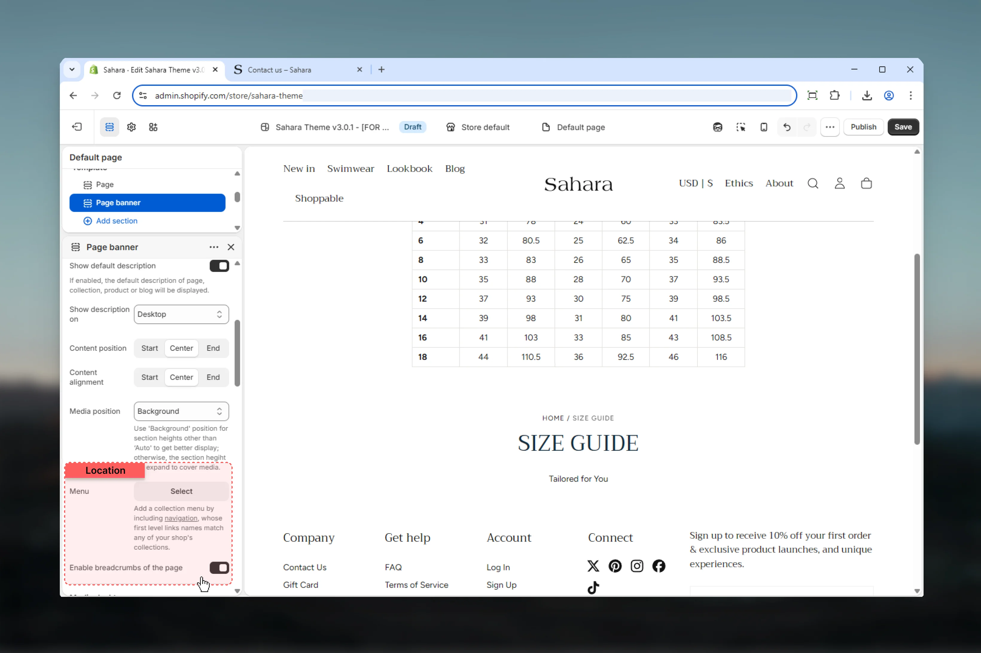
- Collection navigation menu
- FAQ page search functionality
- Flexible content positioning and alignment
- Multiple section height options
How the Page banner works
The Page banner intelligently adapts to your template type:- Page templates: Displays page title and description
- Collection templates: Shows collection title, description, and optional menu
- Product templates: Displays product title and description
- Blog templates: Shows blog title and description
Getting started
Navigate to target template
Go to the page, collection, product, or blog template you want to customize.
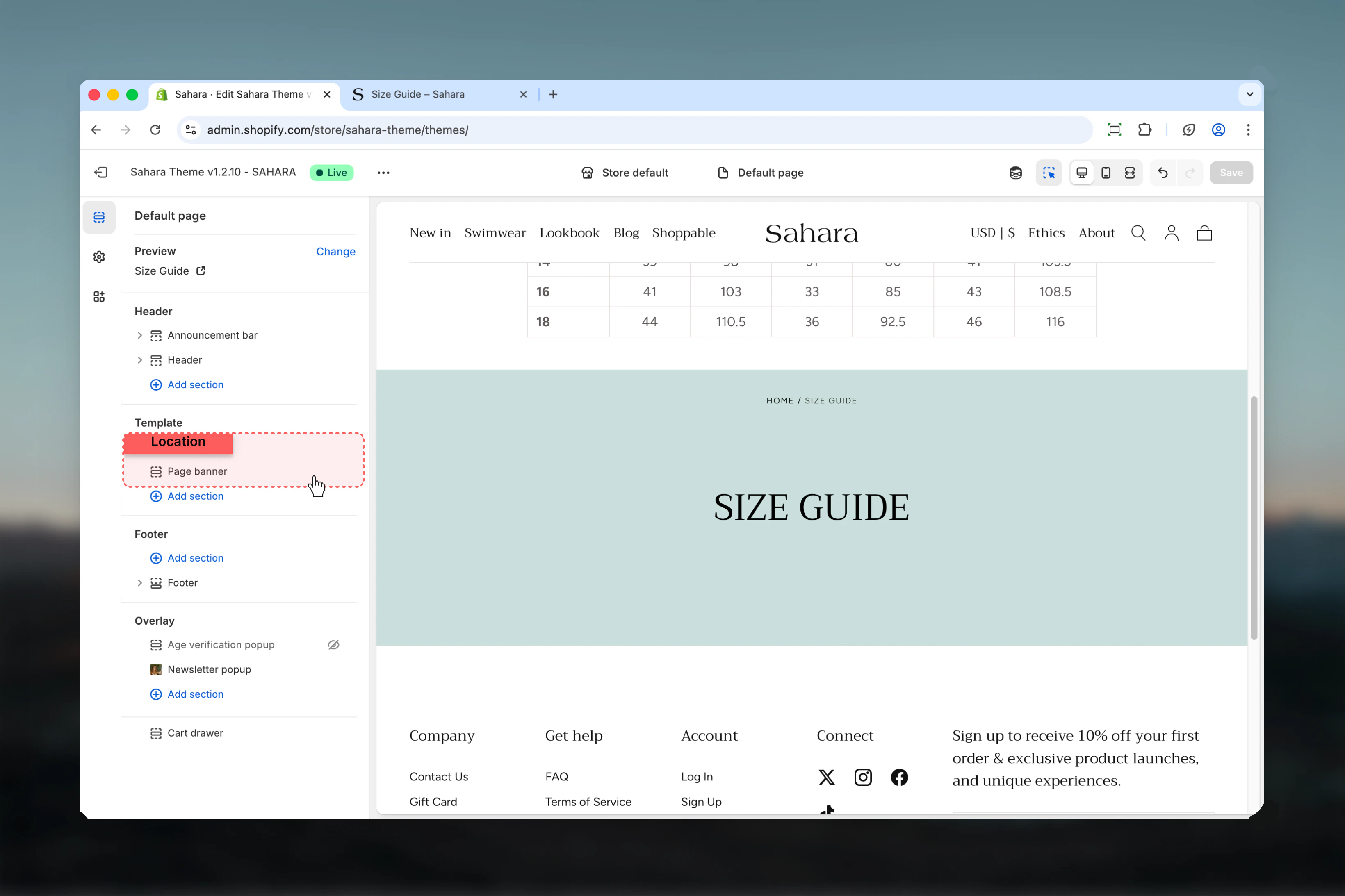
Add or customize Page banner
Add the Page banner section (usually as first section) or customize existing instance.
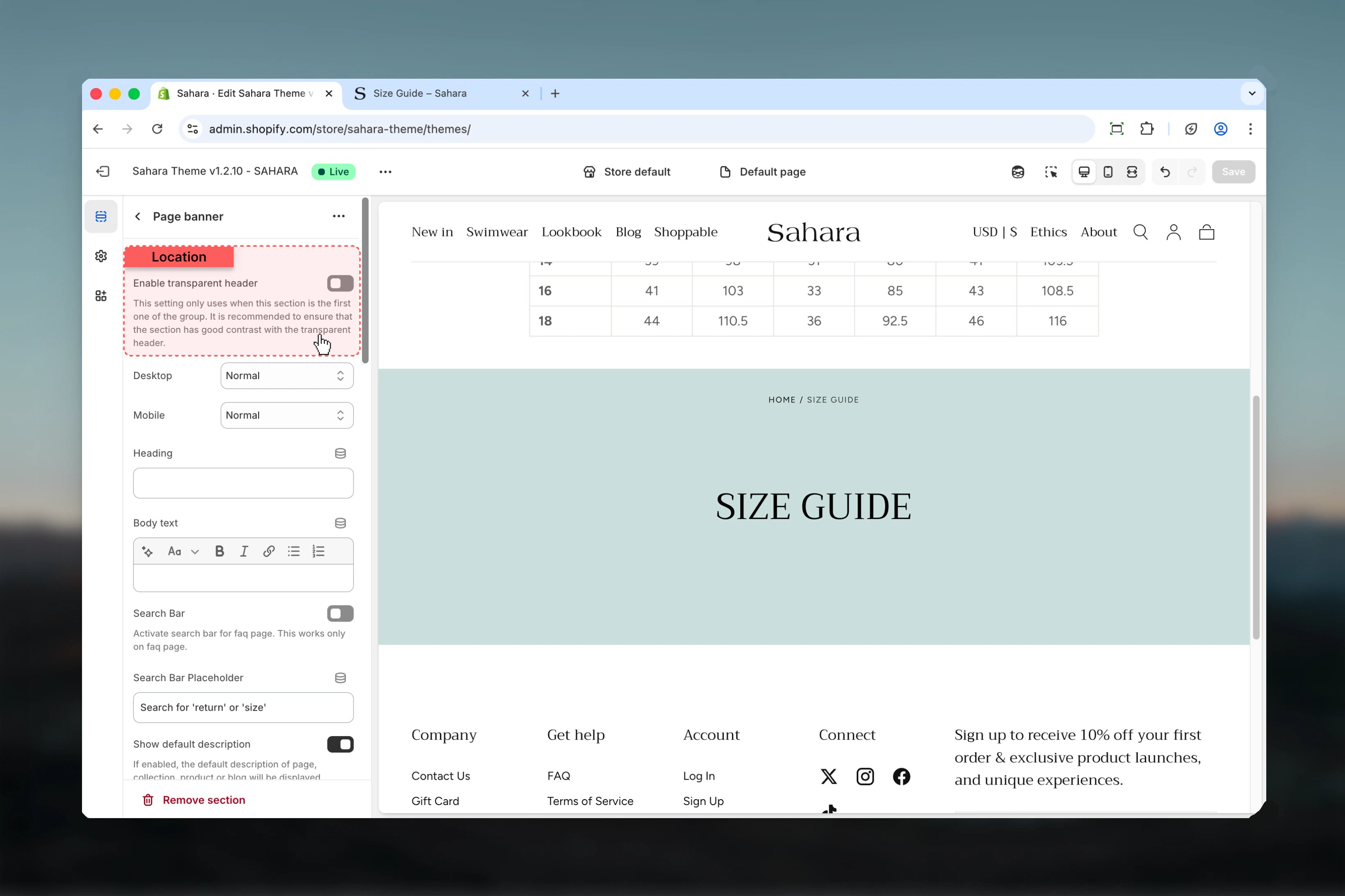
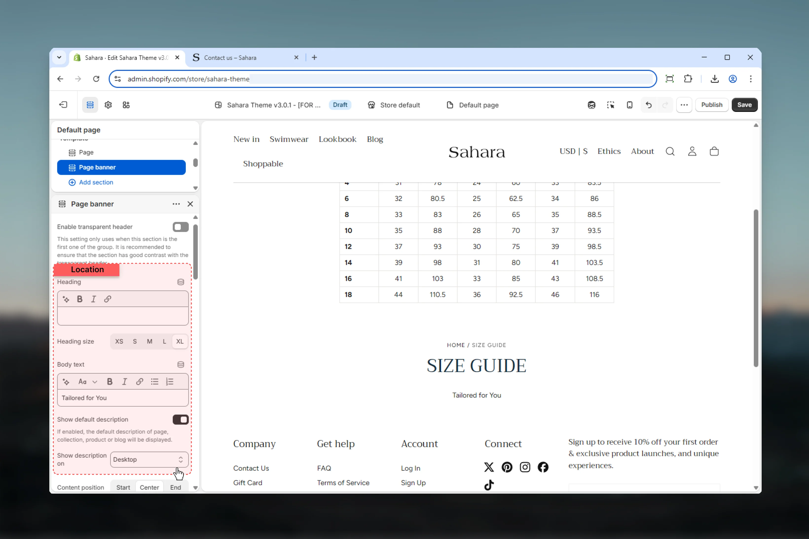
Section settings
- Header
- Content
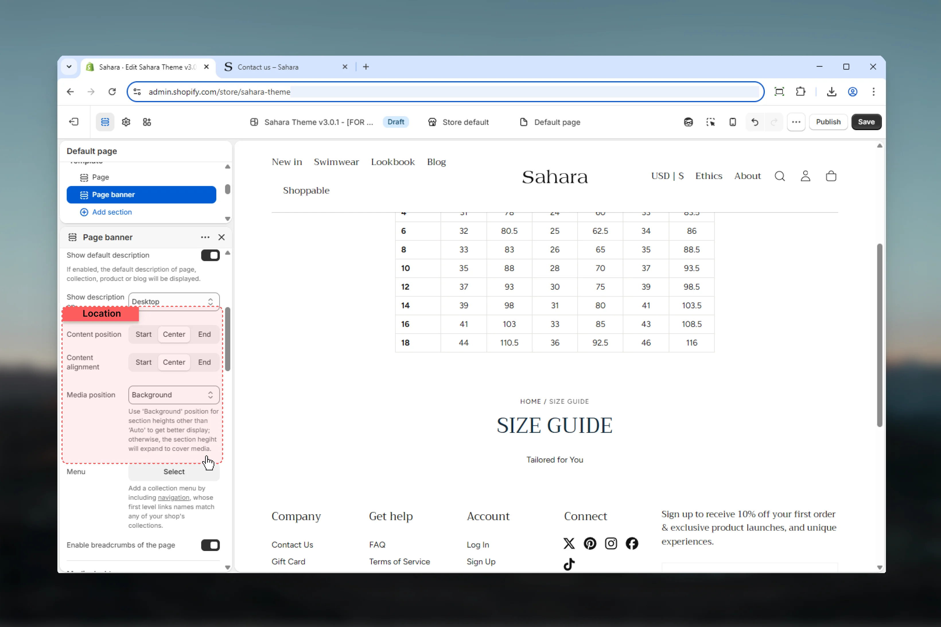
- Positioning
- Desktop
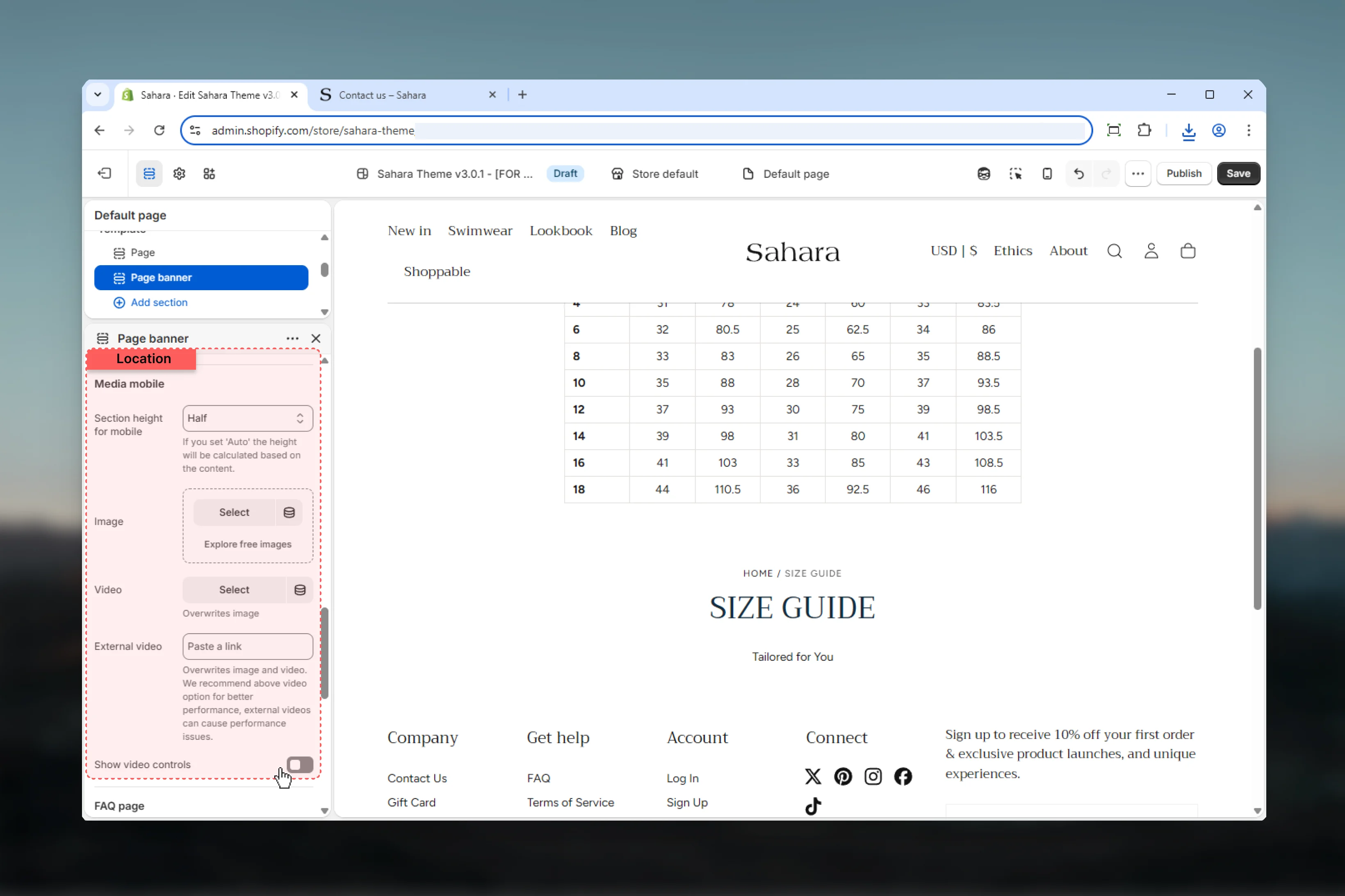
- Mobile
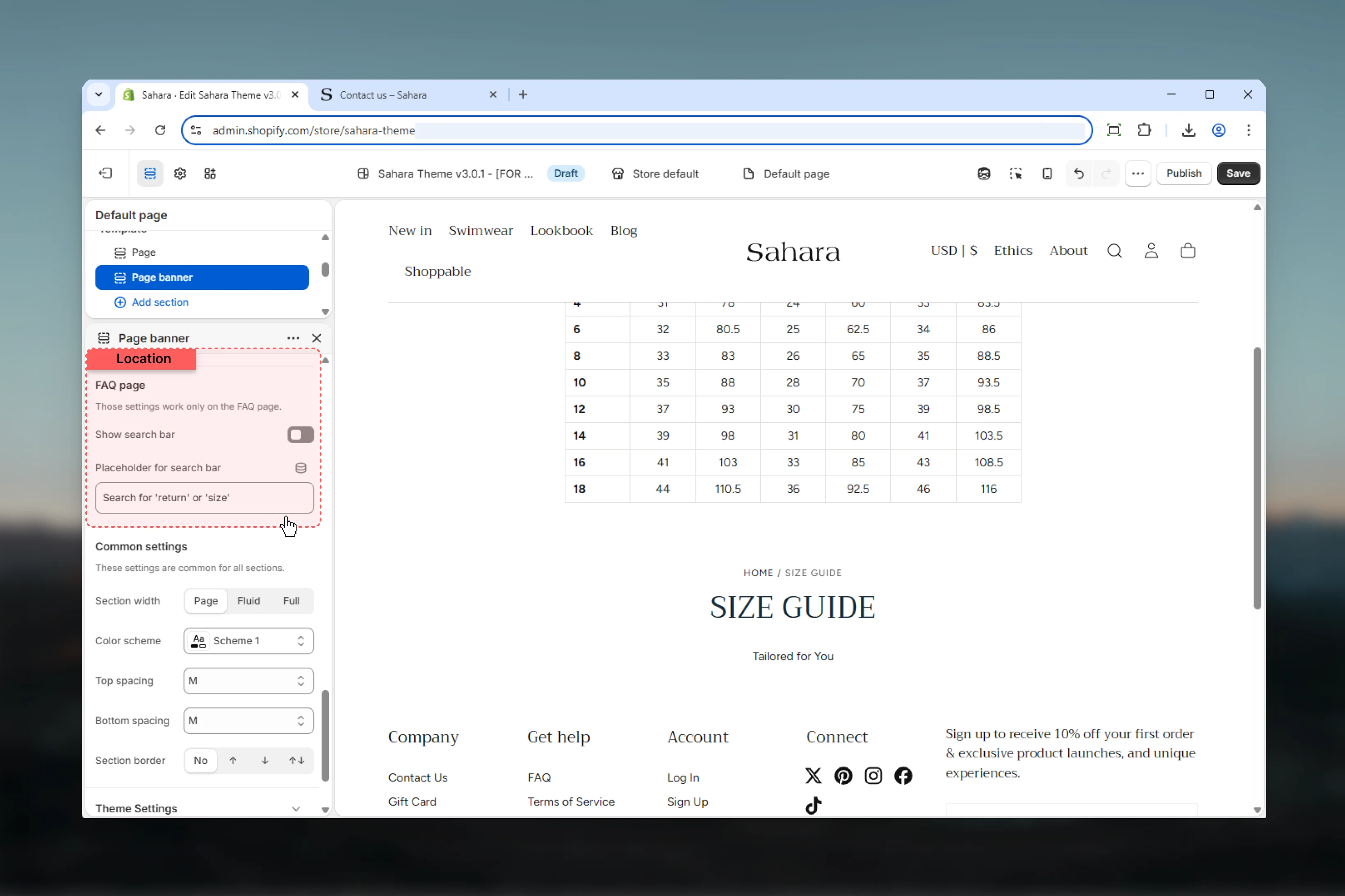
- FAQ Search
- Styling
Enable transparent header
Makes header transparent and overlay the banner when using background media.Default: FalseTransparent header requirements
Transparent header requirements
Required conditions:
- Media position set to “Background”
- Banner has desktop or mobile media
- Section placed as first on the page
- Creates immersive full-bleed effect
- Header navigation overlays banner media
- Maximizes visual impact
- Media position set to “Top” or “Bottom”
- No media uploaded
- Section not first on page

Best practices
Template defaults
Enable “Show default description” to automatically pull content from pages/collections/products/blogs.
Mobile-specific media
Always provide portrait-oriented mobile images for optimal vertical screen display.
Height balance
Use 50svh height for most pages. Reserve 100svh for homepage or major campaigns.
Transparent header
Enable only with background media and ensure sufficient text-to-image contrast.
Breadcrumb navigation
Keep breadcrumbs enabled for SEO benefits and improved user navigation.
Desktop descriptions only
Hide descriptions on mobile (default) to conserve vertical space on small screens.
FAQ search targeting
Only enable FAQ search on actual FAQ or help pages—not general pages.
Collection menus
Use page menu for collection subcategory filtering or related page navigation.
Common use cases
Collection page header
Collection page header
Enable default description. Background media position. 50svh height. Upload collection banner image (desktop 1920×600px, mobile 800×1000px). Page menu with subcollections. Breadcrumbs enabled. Center alignment.
Product page banner
Product page banner
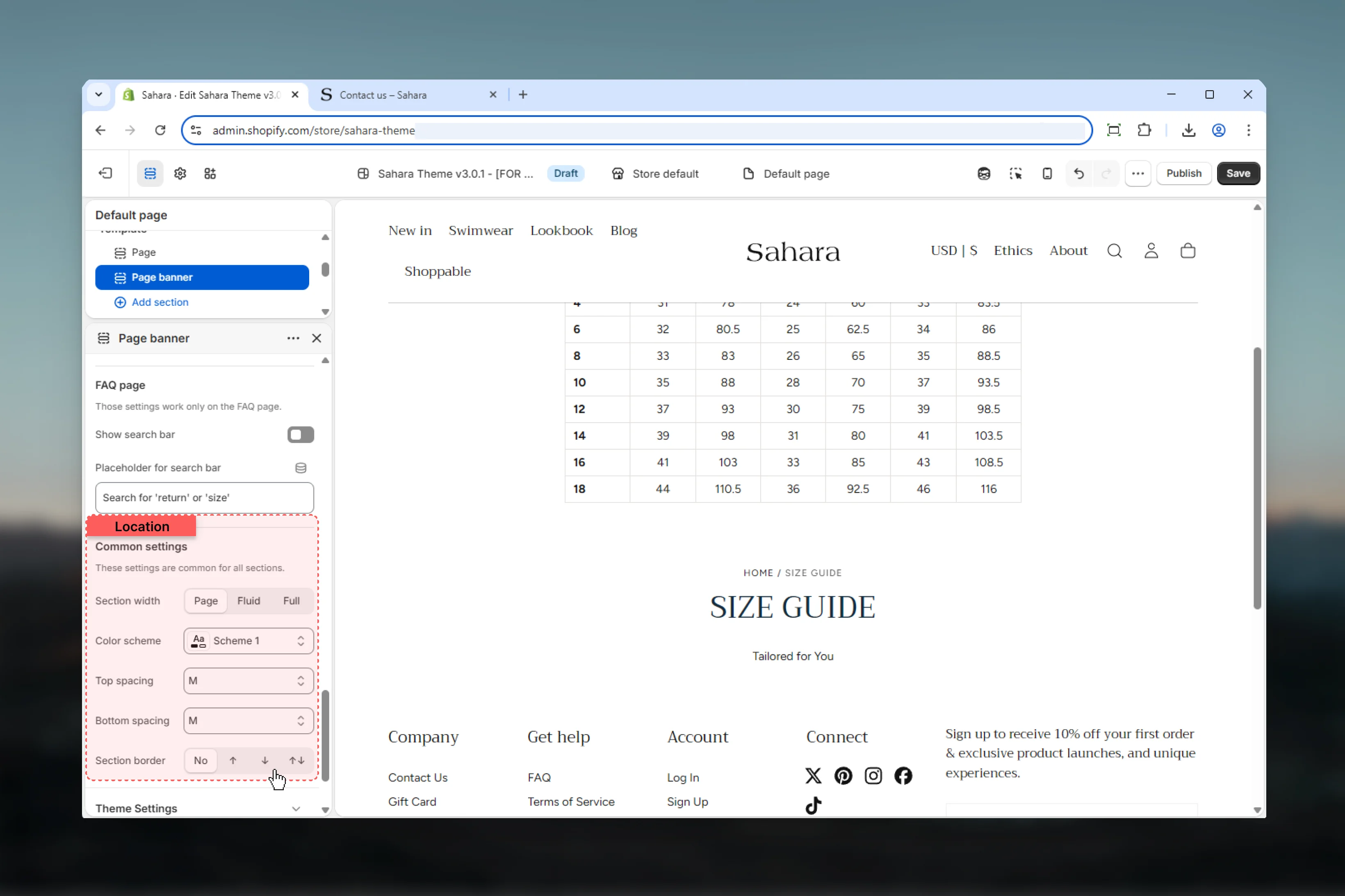
FAQ page with search
FAQ page with search
Custom title: “How can we help?”. Enable FAQ search bar. Placeholder: “Search for ‘shipping’ or ‘returns’”. No media or background color scheme only. Auto height. Center alignment.
About page hero
About page hero
Custom title and content. Background media 100svh height. Transparent header enabled. Team photo background (desktop 1920×1080px, mobile 800×1200px). Bottom content position for readability.
Blog landing banner
Blog landing banner
Related sections
Hero banner
Multi-slide carousel banners with slideshow
Full width banner
Edge-to-edge banners with block-based content