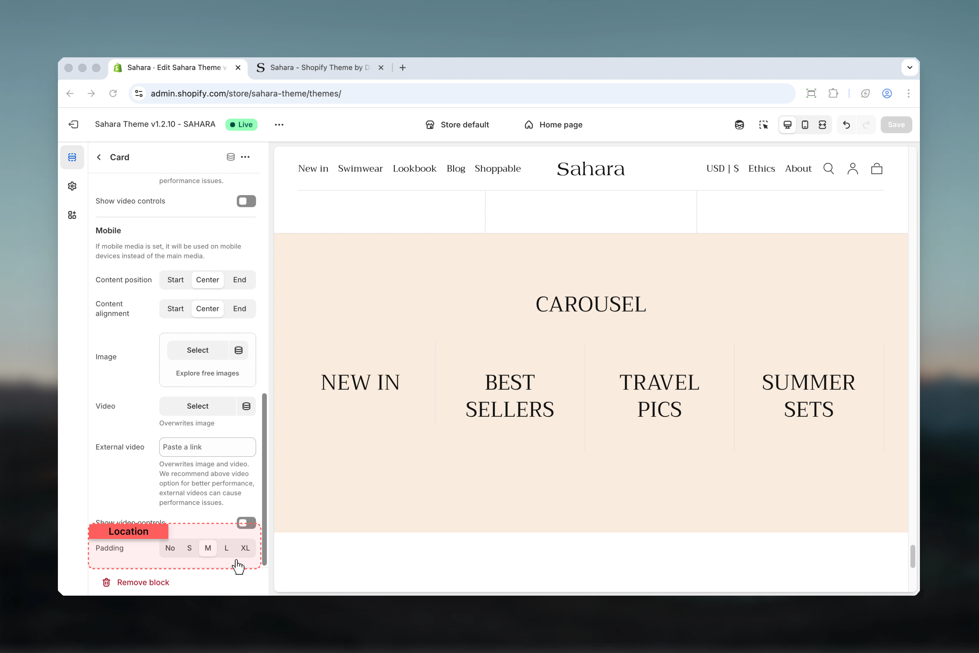
What this section controls
This section controls carousel displays with the following capabilities:- Unlimited customizable card blocks
- Two distinct layout modes (plain and image-only)
- Configurable slides per view (1-6 cards)
- Independent desktop and mobile media
- Flexible content positioning and alignment
- Per-card color schemes and aspect ratios
- Automatic or manual slide navigation
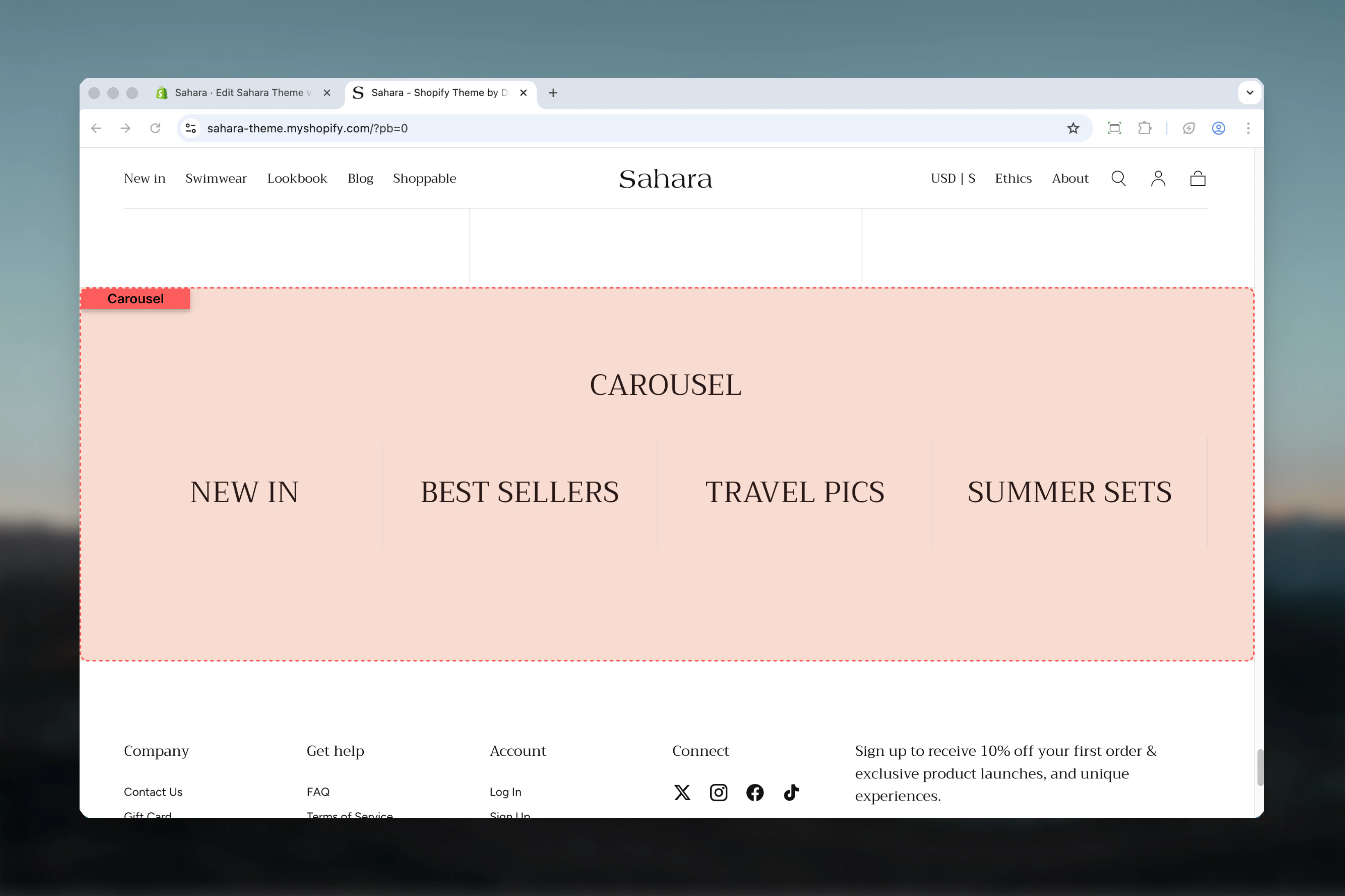
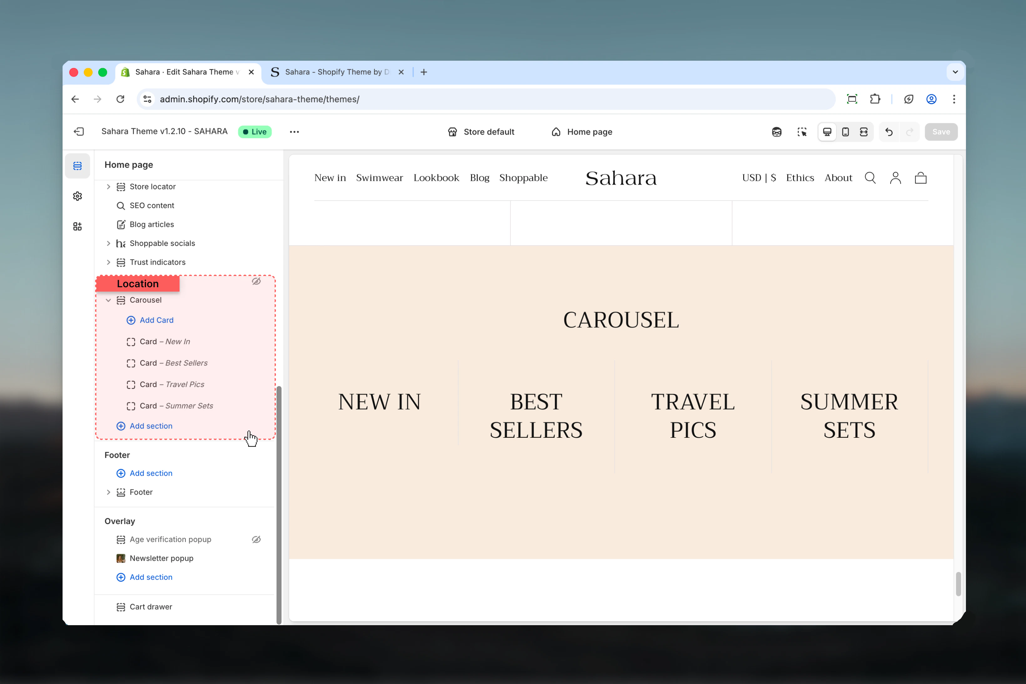
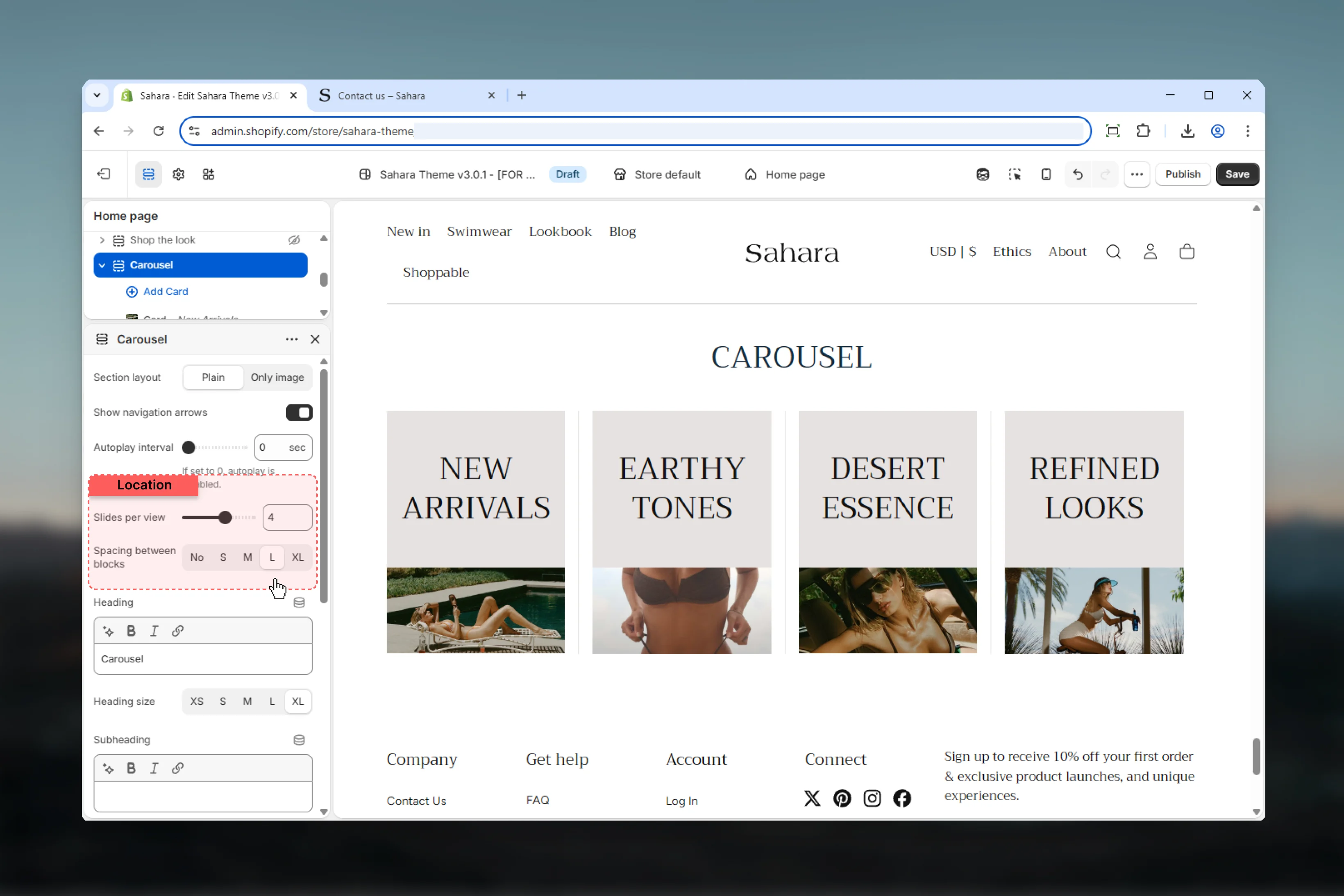
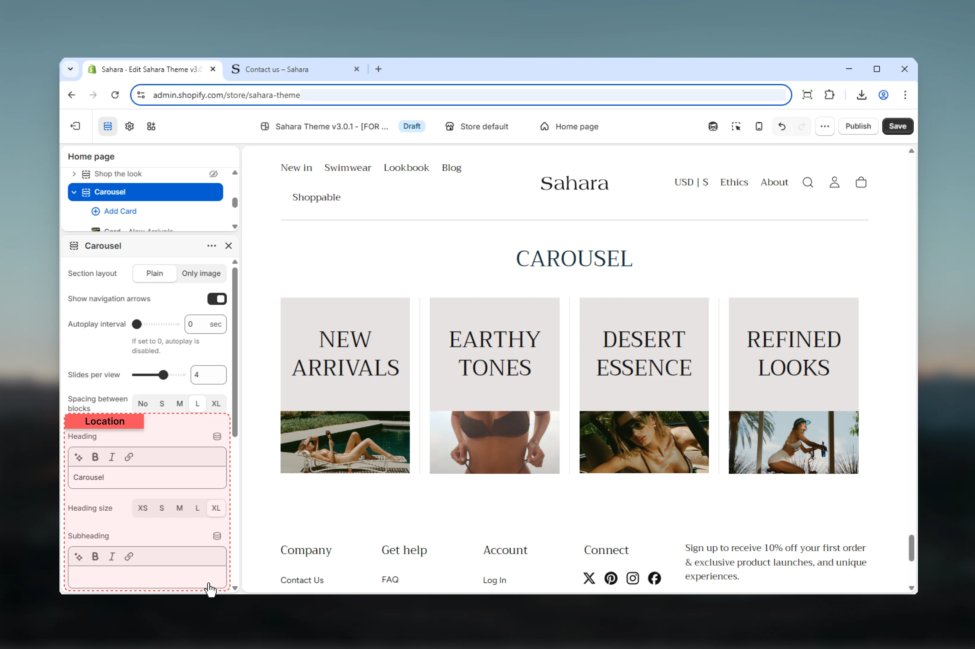
How the Carousel section works
The Carousel uses a block-based system where each “Card” block becomes a carousel slide. You can add unlimited cards, each with its own media, content, and styling. The section automatically handles responsive behavior, showing fewer slides on mobile devices while maintaining optimal viewing.Getting started
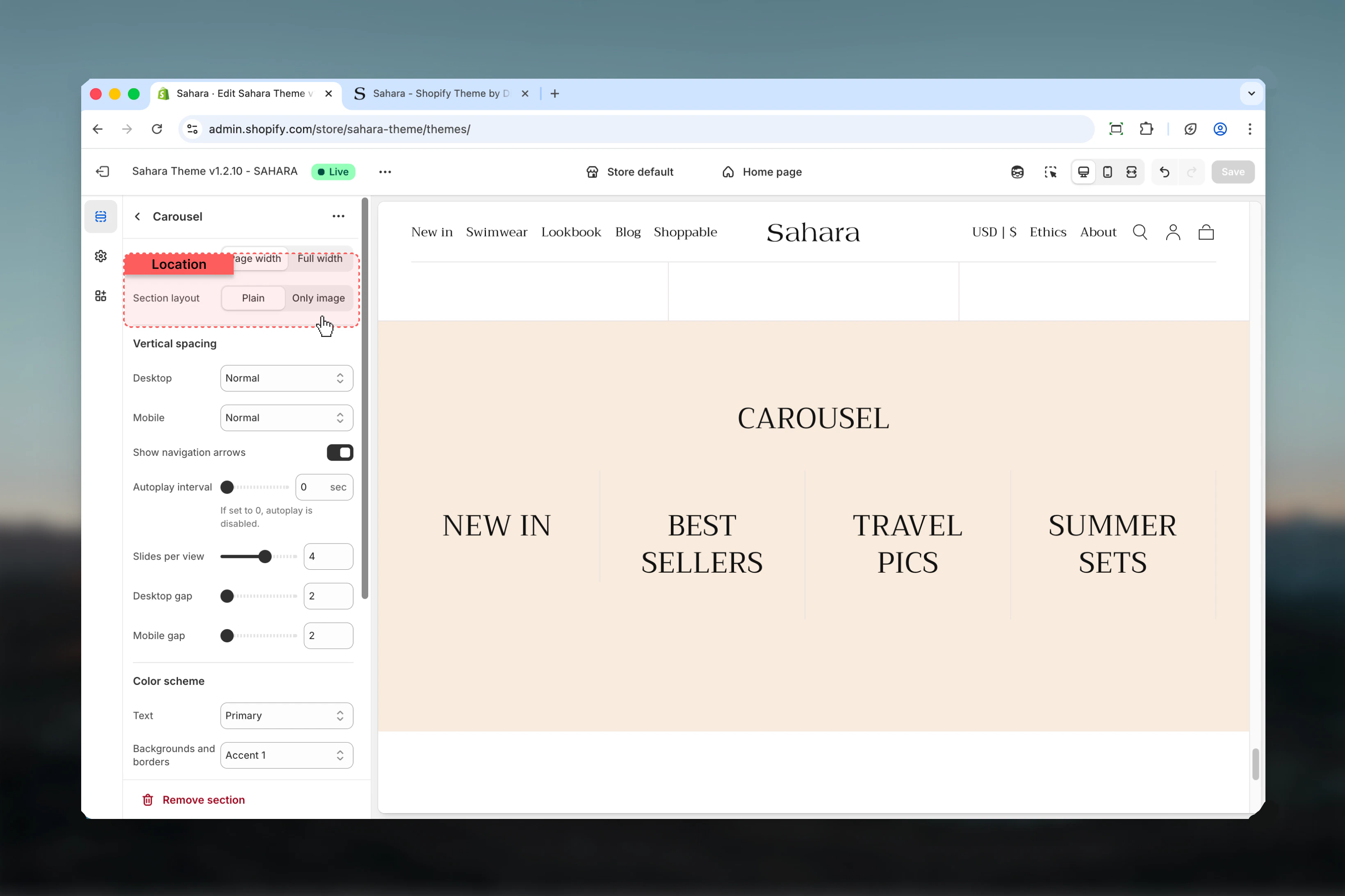
Section settings
- Layout
- Slideshow
- Display
- Content
- Styling
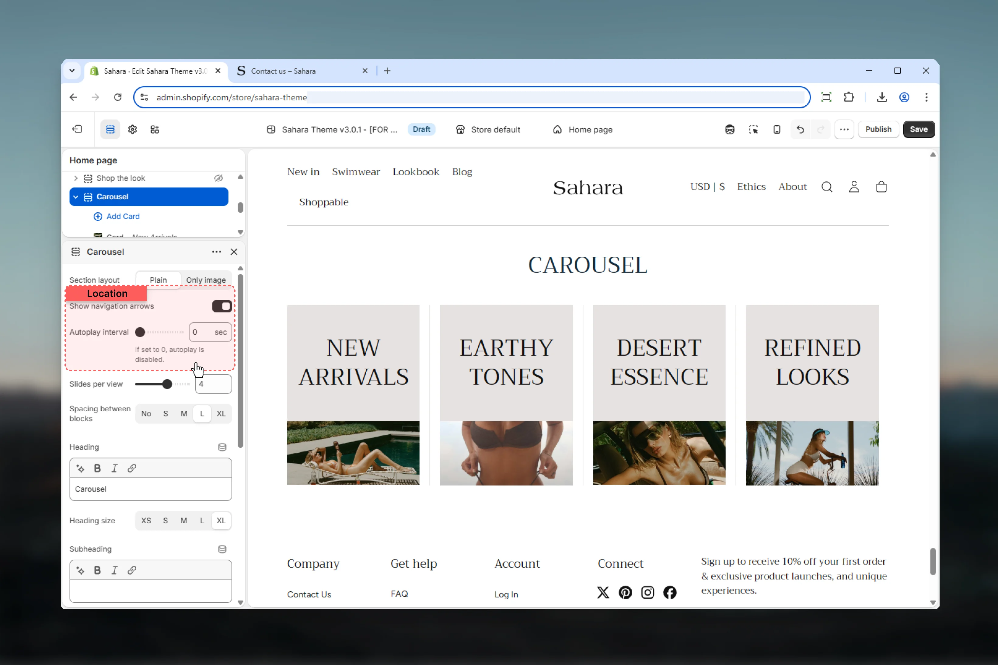
Section layout
Controls the overall visual style of carousel cards.Plain
Plain
Standard card layout with visible card containers, borders, and padding.Best for:
- Text-heavy content
- Product highlights with descriptions
- Multi-element cards (heading + text + button)
Only image
Only image
Streamlined layout emphasizing media without visible card containers.Best for:
- Image galleries
- Product showcases
- Visual-first designs with minimal text
Show card border
Adds visible borders to individual cards.Default: False (hidden)Only applies when section layout is set to “Plain.”
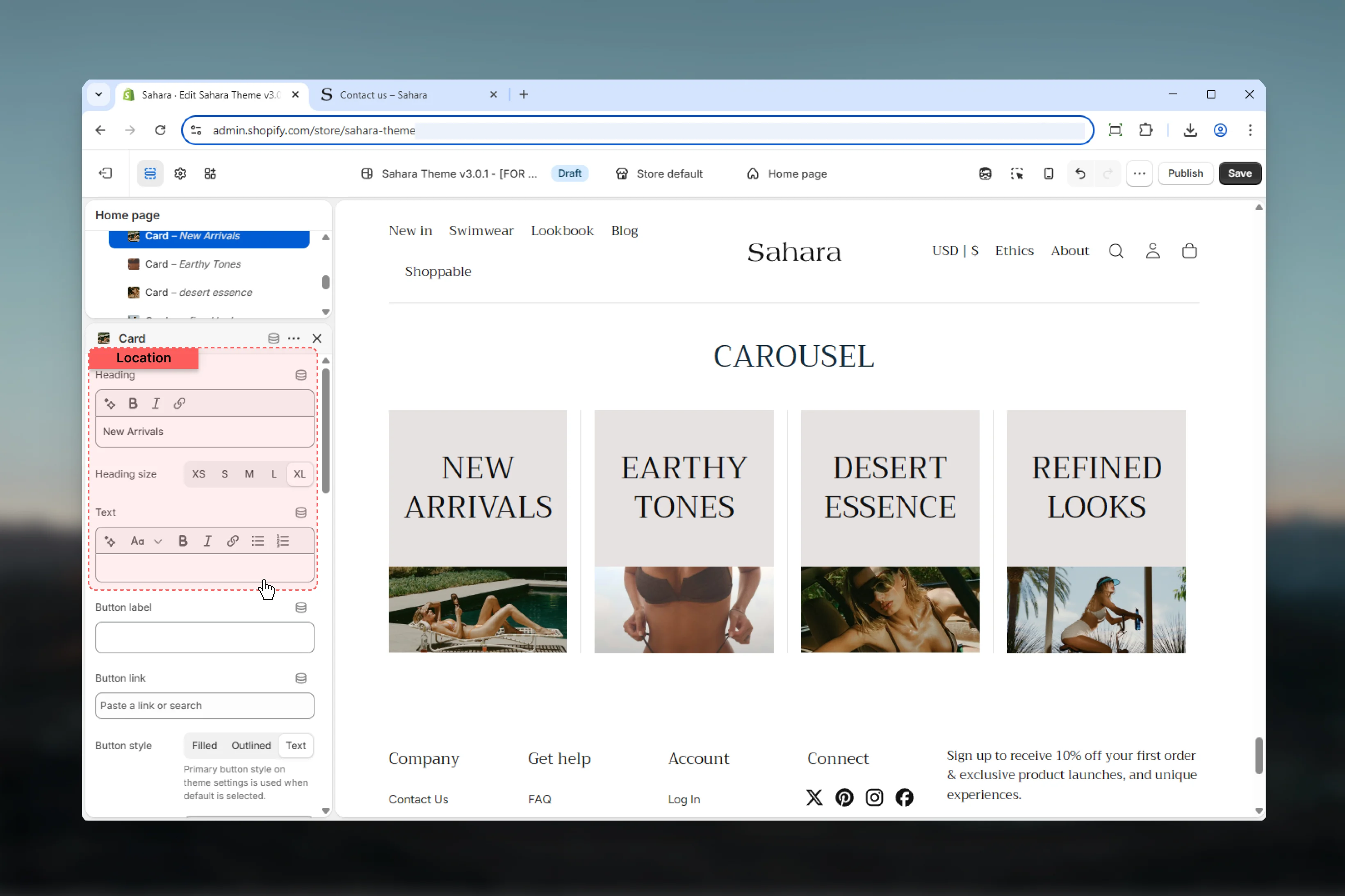
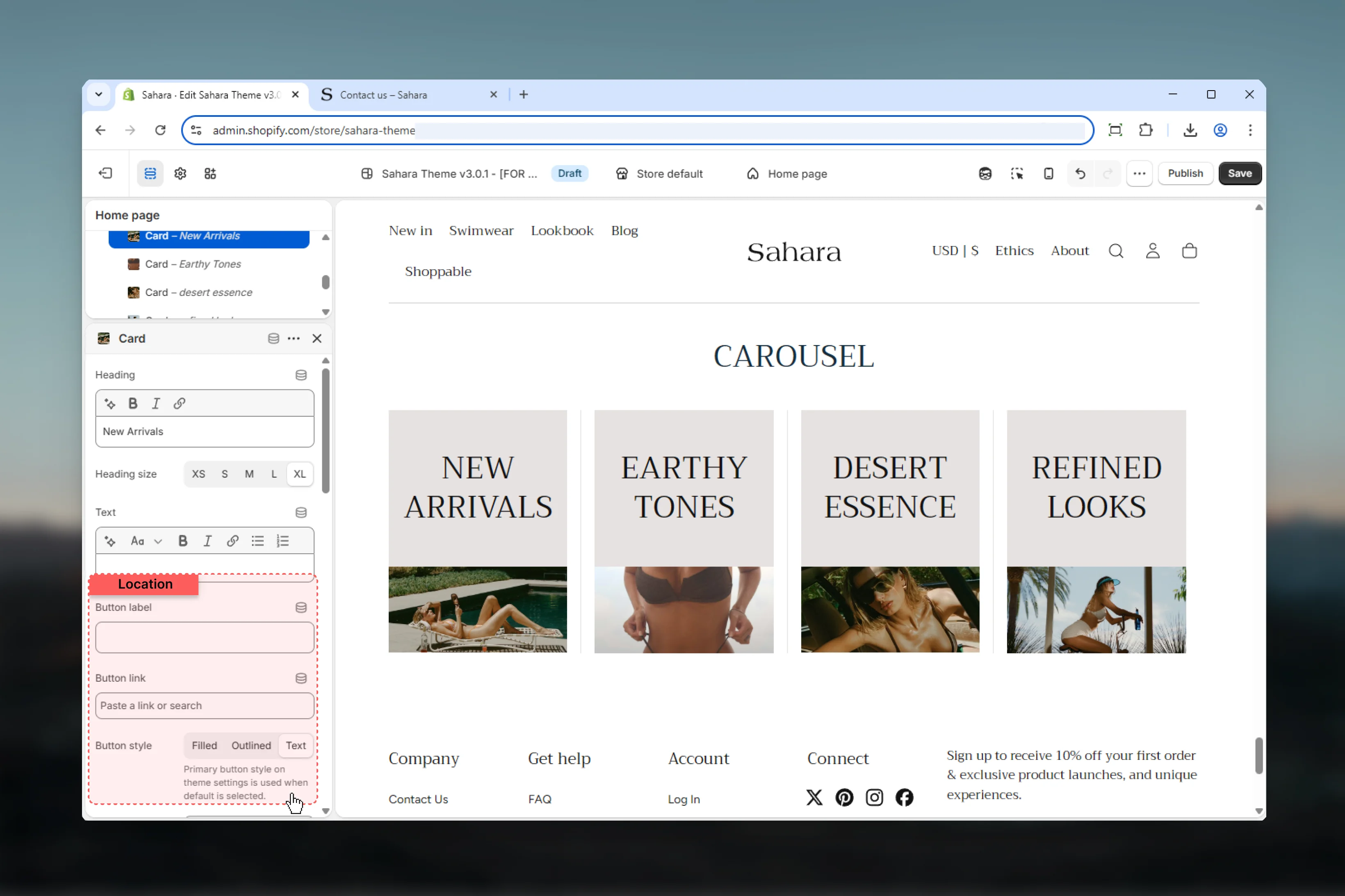
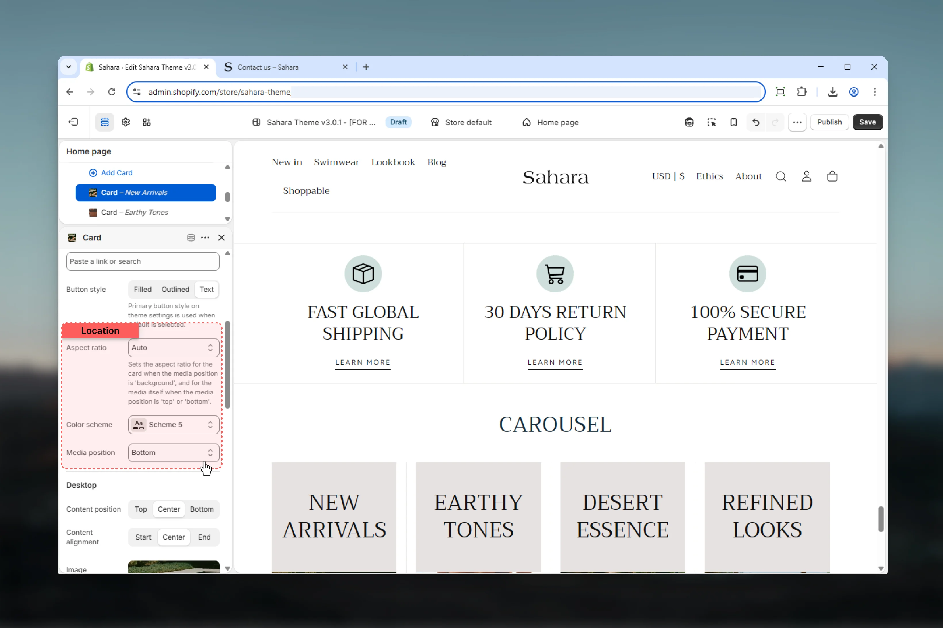
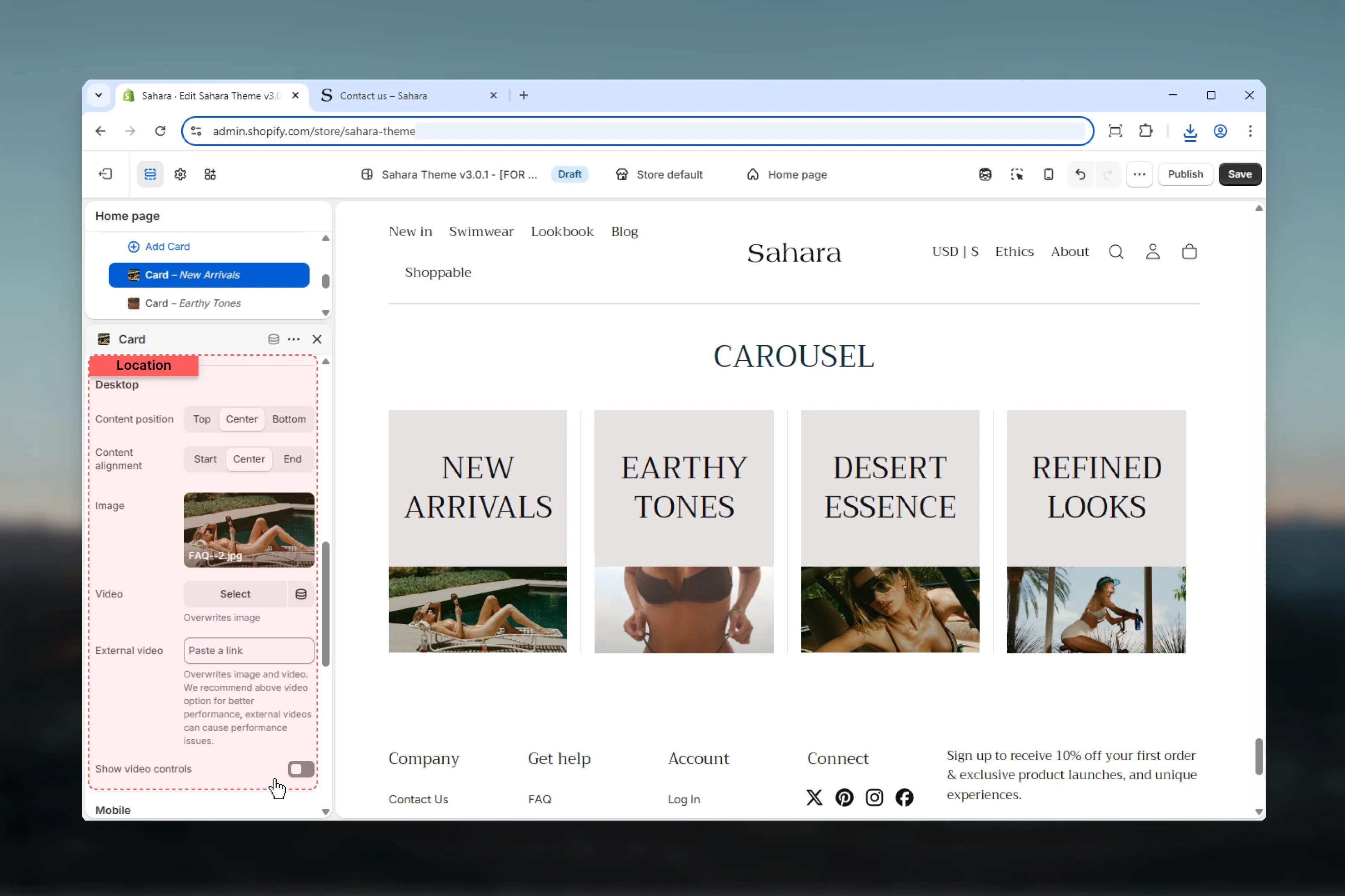
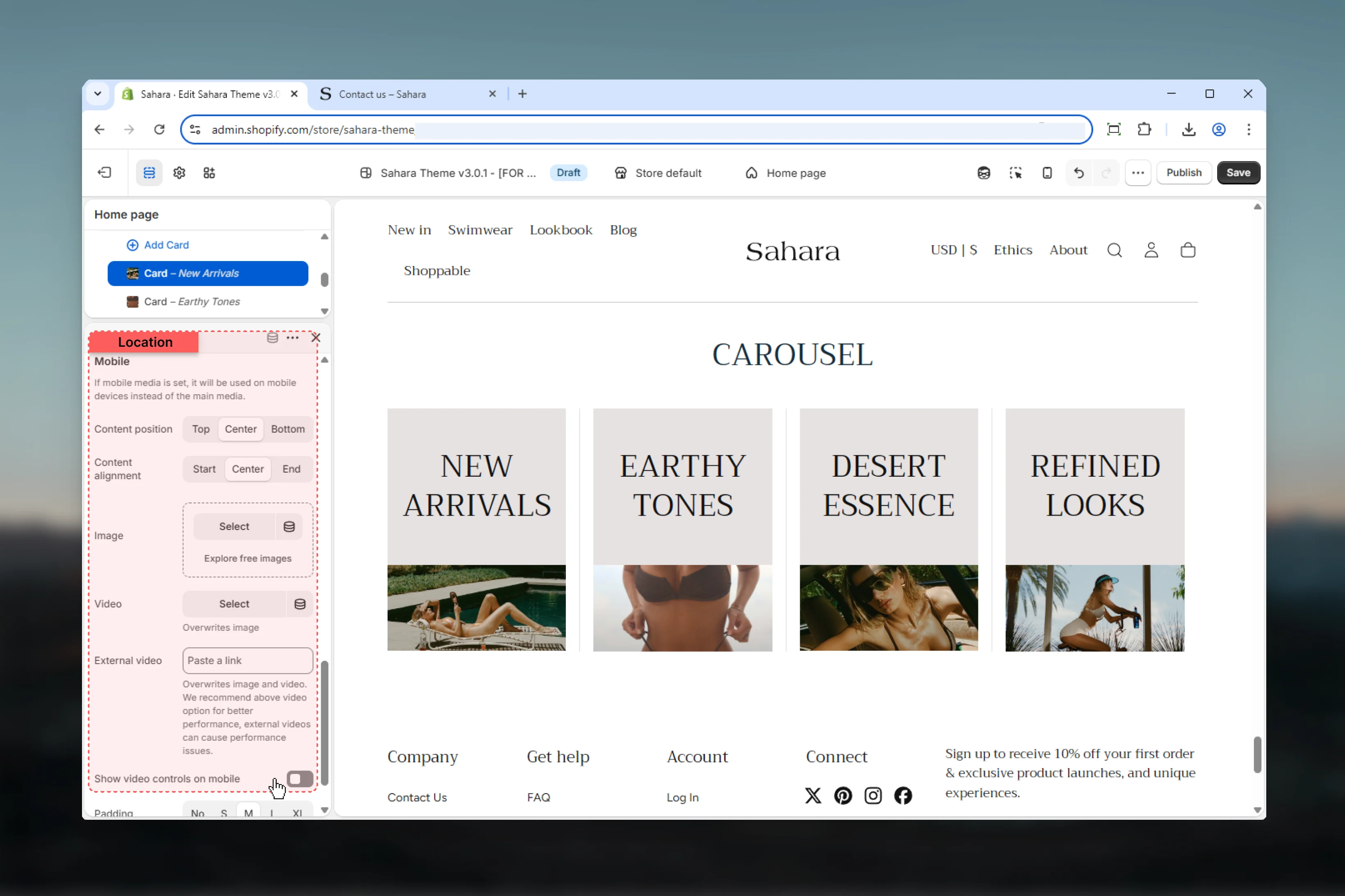
Block settings
Each Card block becomes a carousel slide with independent media, content, and styling.- Content
- Media
- Desktop
- Mobile
- Styling
Heading
Title text for the card.- Inline rich text supported
- Leave empty to hide heading
Heading size
Controls the size of card heading.Options: XS, S, M, L, XLDefault: XL
Text
Body content displayed below the heading.- Rich text editor with formatting support
- Supports:
- Bold, italic, underline
- Lists (bulleted, numbered)
- Links
- Leave empty to hide
Best practices
Consistent aspect ratios
Use the same aspect ratio across all cards for uniform height and professional appearance.
Optimal slides per view
Use 3-4 slides for desktop. More than 5 can make cards too small to be effective.
Limit autoplay
Avoid autoplay for text-heavy content. If used, set 5+ seconds for readability.
Mobile-specific media
Provide portrait-oriented images for mobile to maximize card visibility on vertical screens.
Content brevity
Keep heading to 5-7 words and text to 20-30 words maximum per card.
Layout consistency
Use “Only image” layout for visual galleries, “Plain” layout for content-rich cards.
Navigation arrows
Keep arrows enabled when autoplay is off to ensure users can browse slides.
Color variety
Use different color schemes per card to create visual interest and highlight categories.
Common use cases
Product feature highlights
Product feature highlights
Use 4-5 slides per view with “Plain” layout. Each card contains product image (4:3 aspect ratio), feature heading, brief description, and “Learn more” text link button. Center-aligned content with M inner spacing.
Customer testimonials
Customer testimonials
Use 3 slides per view with “Plain” layout. Background media position with customer photos. Include quote text, customer name as heading, and optional link to case study. Varied color schemes per card.
Category showcase
Category showcase
Use “Only image” layout with 4 slides per view. Category images with 1:1 aspect ratio, minimal text (category name as heading only), filled button linking to collection. Tight spacing between blocks.
Blog article preview
Blog article preview
Use 3 slides per view with “Plain” layout. Article featured image on top (16:9 ratio), article title as heading, excerpt as text, “Read more” outlined button. Navigation arrows enabled, no autoplay.
Image gallery
Image gallery
Use “Only image” layout with 5-6 slides per view. Images only (no text), auto aspect ratio, navigation arrows enabled. Mobile shows 2-3 slides with portrait images. Background media position on mobile for immersive feel.
Service offerings
Service offerings
Use 4 slides per view with “Plain” layout. Icon or illustration as image (1:1 ratio), service name as heading, 2-sentence description, text link button. Each card with different color scheme matching service category.
Related sections
Hero banner
Multi-slide full-width banners with carousel
Featured collections
Collection cards with custom images
Testimonials
Customer reviews with carousel option