What these settings control
- Shared brand presentation, including logos and favicon output
- Global color, typography, layout, and input styling decisions
- Product, badge, search, cart, and customer account behavior
- Feature toggles that affect multiple storefront areas at once
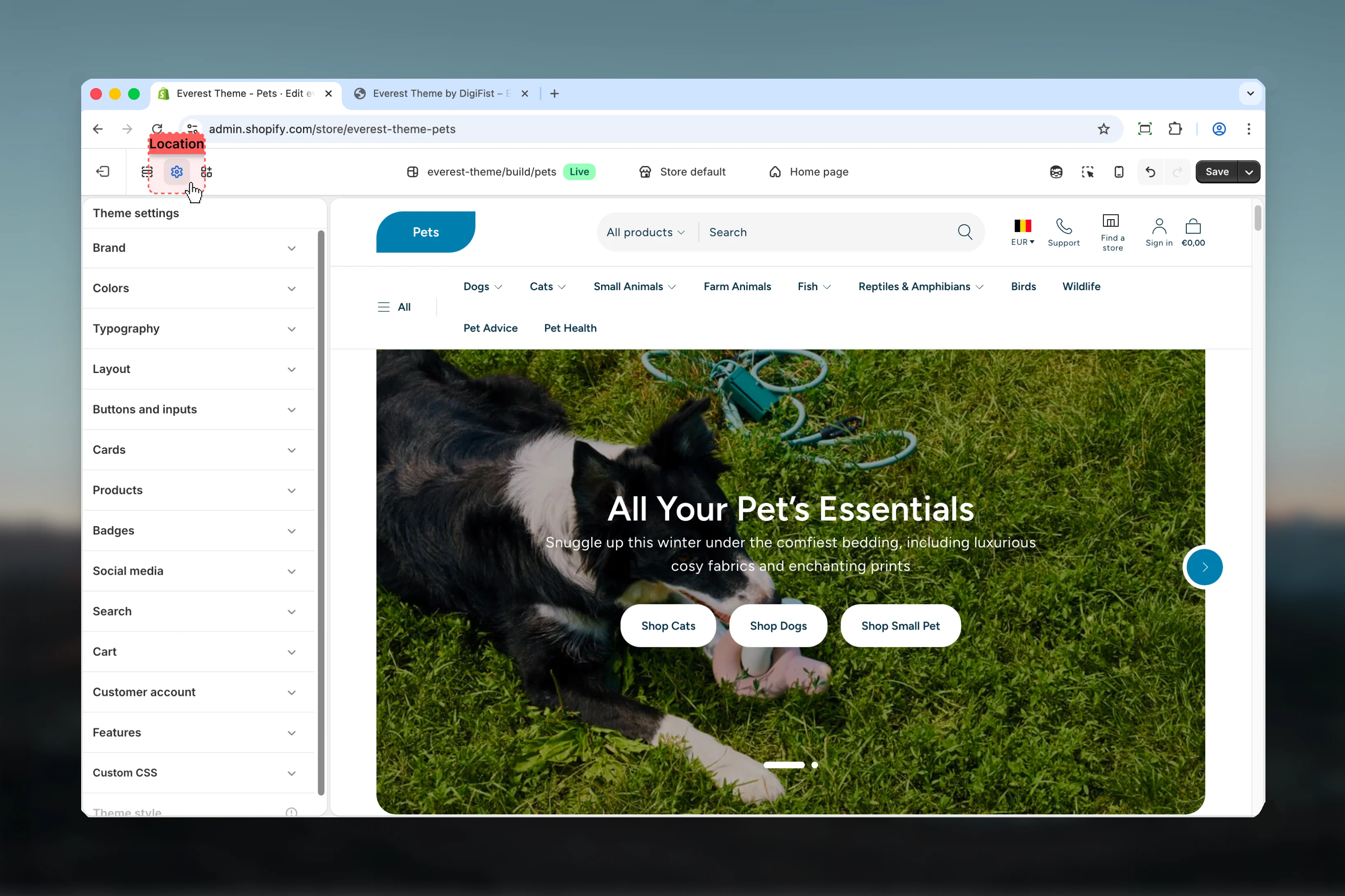
How to access
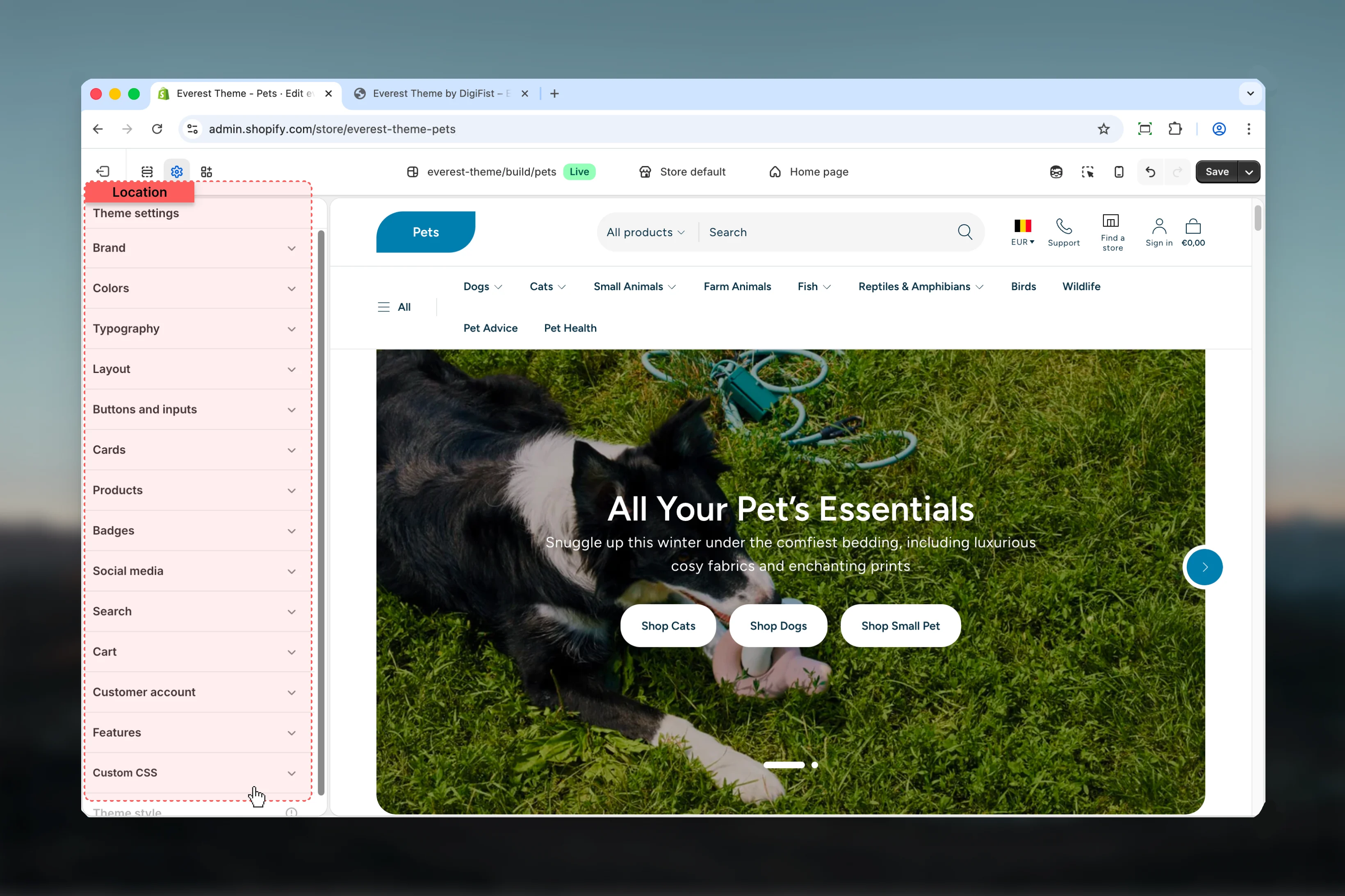
Open Theme settings
Use the Theme settings panel in the customizer sidebar to access Everest’s global controls.
Available settings

Brand
Logos, favicon, brand text, and shared brand presentation.
Colors
Shared color schemes, surfaces, and contrast choices.
Typography
Heading and body font choices, scale, and text behavior.
Layout
Shared page width, spacing, and structural layout rules.
Buttons and Inputs
Button styling, field appearance, and shared form input behavior.
Cards
Shared card surfaces, spacing, and card presentation rules.
Products
Product card and product-related global display settings.
Badges
Badge labels, badge styling, and shared product status indicators.
Social Media
Social profile links and social-sharing related settings.
Search
Search behavior and predictive search related output.
Cart
Cart behavior, cart presentation, and shared checkout-adjacent settings.
Customer Account
Shared customer account behavior and account-related storefront settings.
Features
Feature toggles and shared storefront capability settings.
Best practices
- Set global design foundations first so section-level choices stay easier to manage later.
- Preview changes on more than one template because theme settings often affect multiple storefront areas at once.
- Use brand, color, and typography settings together so the storefront feels consistent across pages.
- Duplicate the theme before large global changes if you want a safe rollback point.