What this section controls
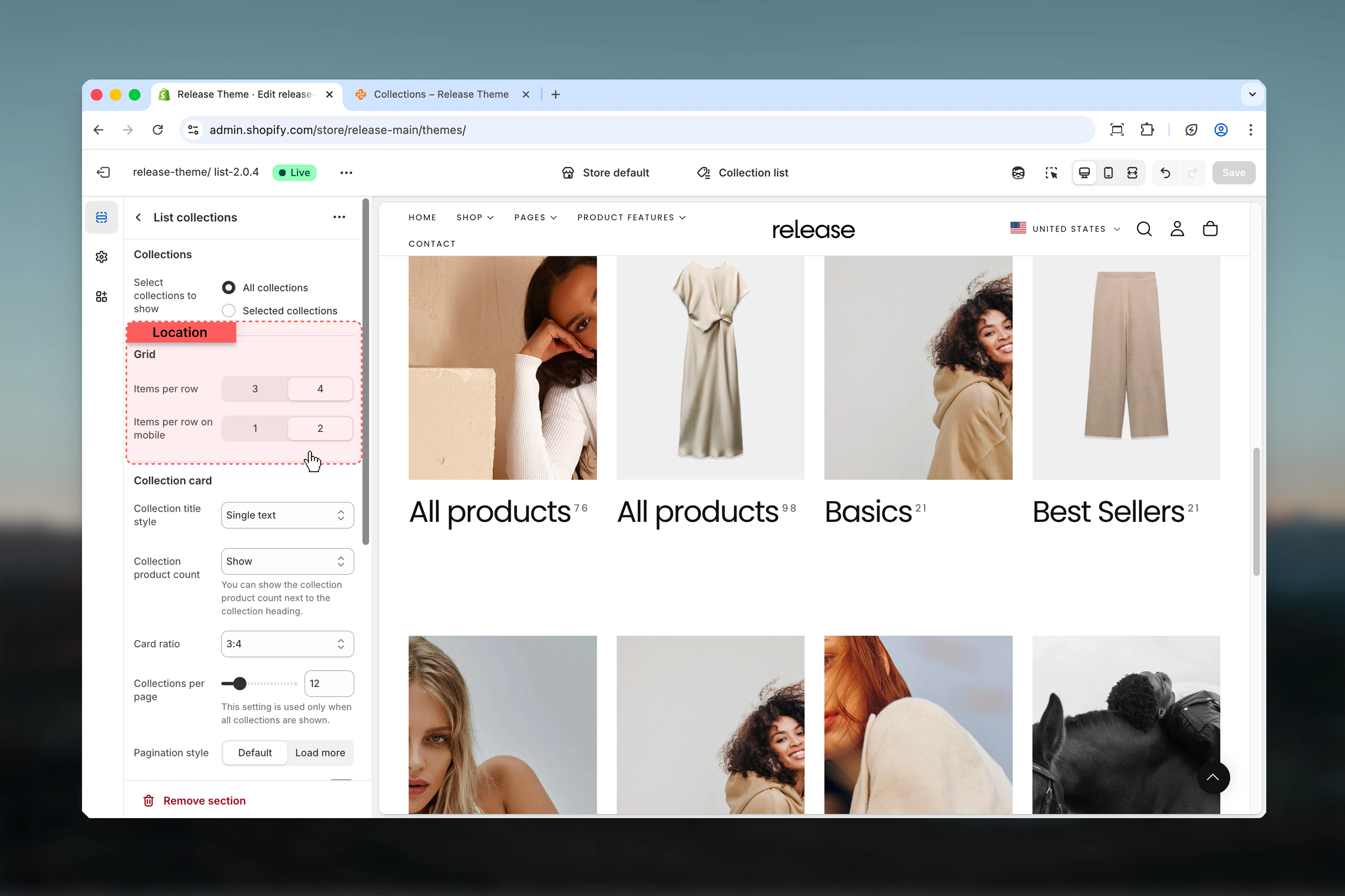
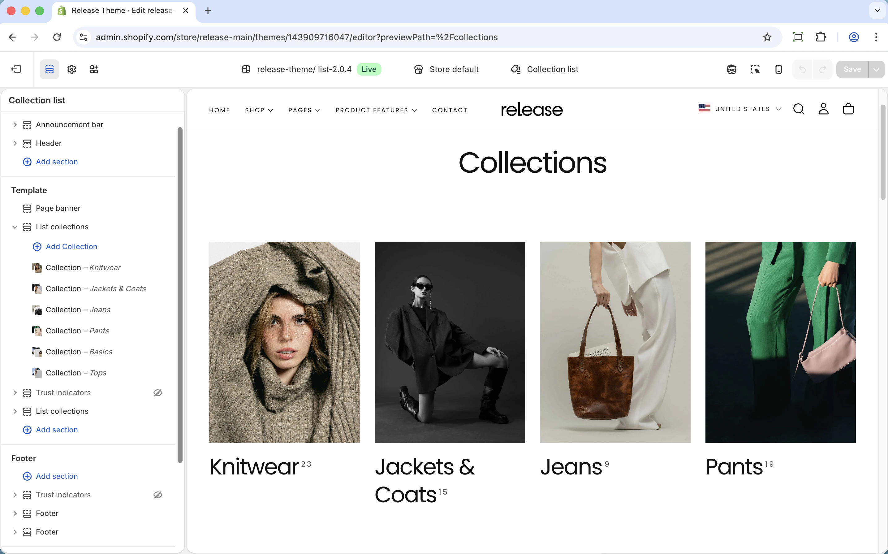
This section manages:- Collection grid layout - Set items per row for desktop and mobile displays
- Collection card styling - Control card title style, aspect ratios, and product count display
- Collection source - Choose between all collections (automatic) or selected collections (manual curation)
- Pagination - Control pagination style, load more button, and infinity scroll
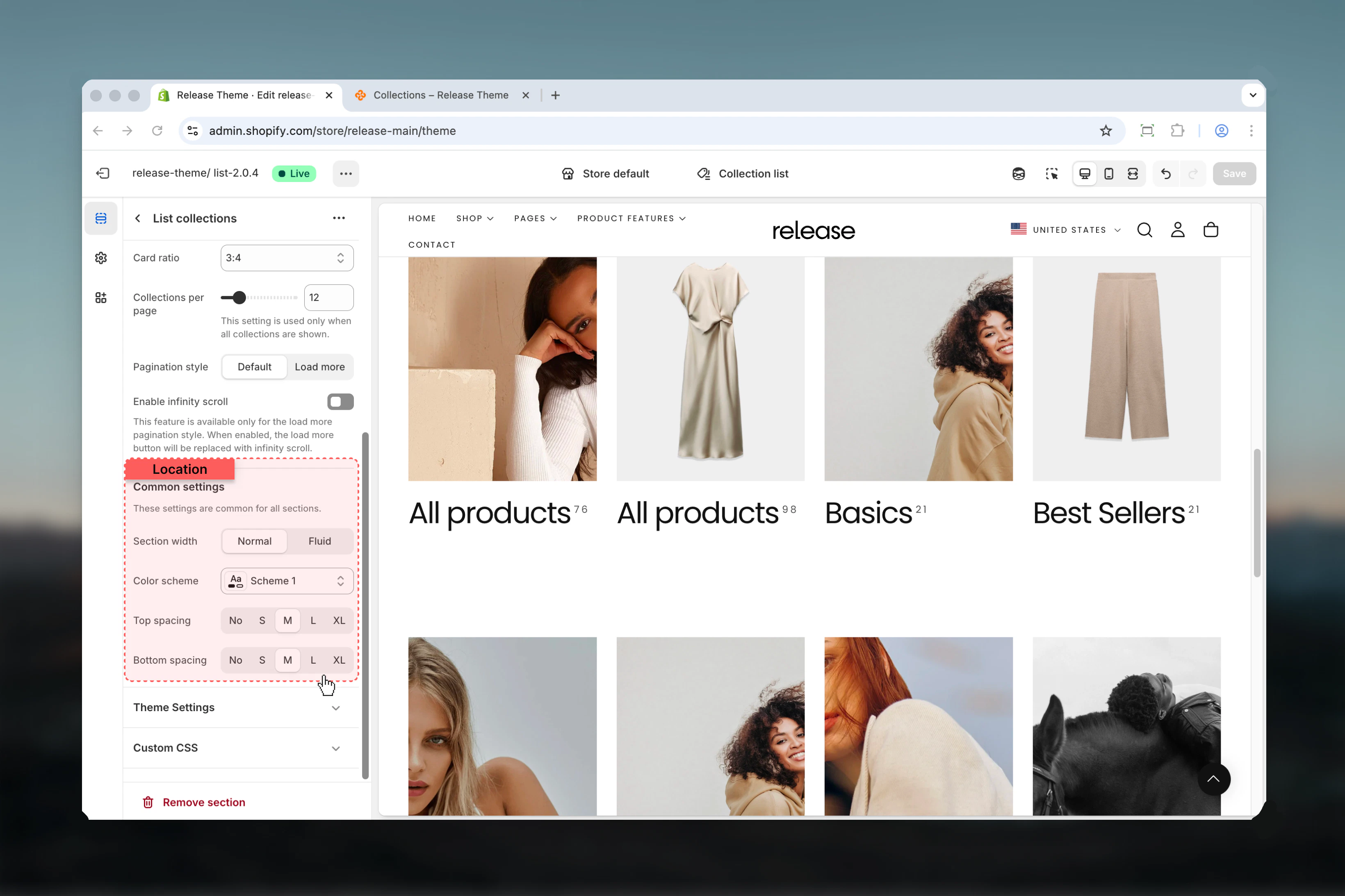
- Section layout - Adjust section width, color scheme, and spacing
- Individual collection blocks - Customize per-collection images, headings, and color schemes
Getting started
Choose collection source
Decide between All collections (automatic display) or Selected collections (manual curation)
Configure grid layout
Set items per row (3 or 4 columns) and card aspect ratio in the Grid Layout tab
Section Settings
- Collections
- Grid Layout
- Card Design
- Pagination
- Section
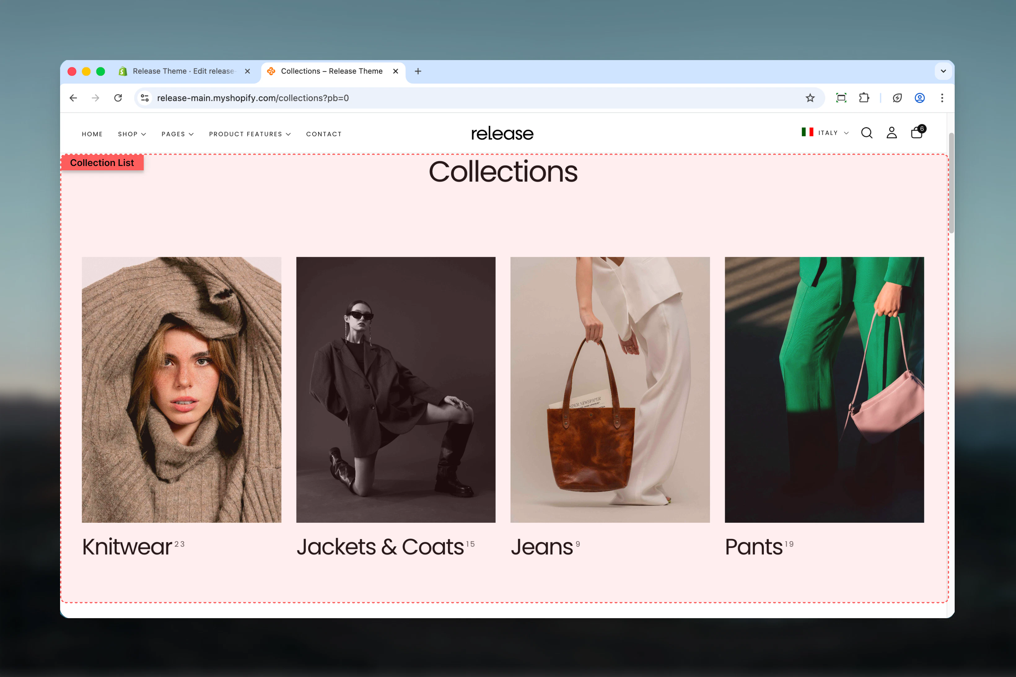
Control which collections are displayed and how many per page.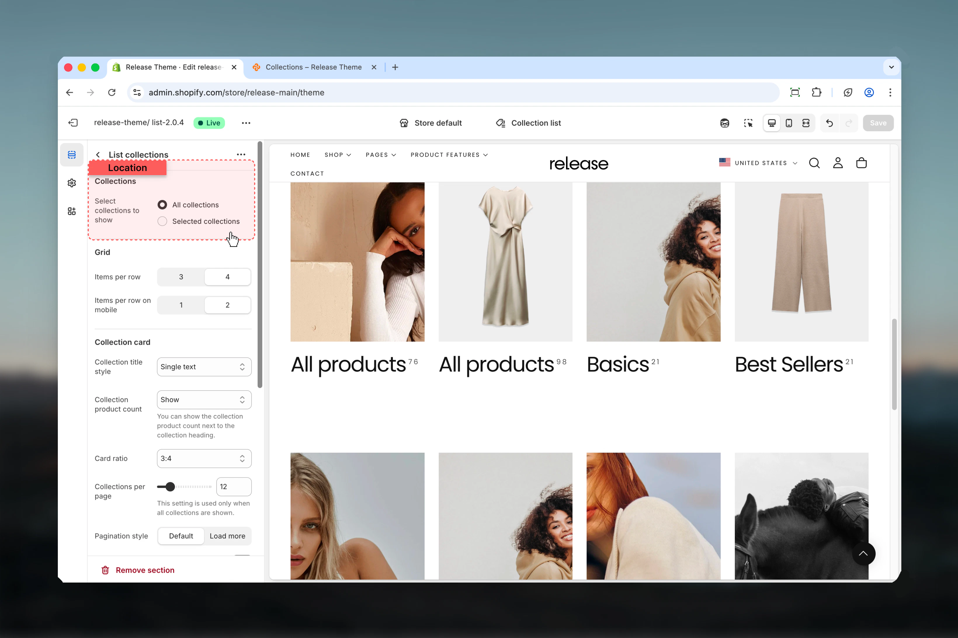
Collections to show
Collections to show
Type: Dropdown
Options: All collections, Selected collections
Default: All collectionsChoose which collections to display:
Options: All collections, Selected collections
Default: All collectionsChoose which collections to display:
- All collections - Automatically shows all store collections
- Selected collections - Only shows collections added as blocks
Collections per page
Collections per page
Type: Range
Range: 3-50
Default: 12
Availability: Only applies when “All collections” is selectedNumber of collections loaded before pagination appears. Higher values show more collections at once but may slow page loading.
Range: 3-50
Default: 12
Availability: Only applies when “All collections” is selectedNumber of collections loaded before pagination appears. Higher values show more collections at once but may slow page loading.
This setting is ignored when “Selected collections” mode is active. In selected mode, only manually added collection blocks appear.

Block Settings
Collection Block
Add individual collections with custom styling. Only used in “Selected collections” mode. Maximum 50 blocks.Collection blocks are only visible when “Selected collections” is chosen in the Collections tab.
Collection
Collection
Type: Collection picker
Required: YesSelect which collection to display in this card position. Opens the Shopify collection selector.
Required: YesSelect which collection to display in this card position. Opens the Shopify collection selector.
Image
Image
Type: Image picker
Optional: YesCustom image that overwrites the collection’s default featured image. Use this to create consistent branding or highlight specific aspects of the collection.
Optional: YesCustom image that overwrites the collection’s default featured image. Use this to create consistent branding or highlight specific aspects of the collection.
Heading
Heading
Type: Text field
Optional: YesCustom heading that overwrites the collection’s default title. Use this for marketing-friendly names or seasonal messaging.
Optional: YesCustom heading that overwrites the collection’s default title. Use this for marketing-friendly names or seasonal messaging.
Heading size
Heading size
Type: Dropdown
Options: XS (h6), S (h5), M (h4), L (h3)
Default: M (h4)Size of collection title text. Larger headings draw more attention to priority collections.
Options: XS (h6), S (h5), M (h4), L (h3)
Default: M (h4)Size of collection title text. Larger headings draw more attention to priority collections.
Subheading
Subheading
Type: Text field
Optional: YesAdditional text below the main heading. Perfect for descriptive content like “New”, “Sale”, “Limited Time”, or product count.
Optional: YesAdditional text below the main heading. Perfect for descriptive content like “New”, “Sale”, “Limited Time”, or product count.
Color scheme
Color scheme
Type: Dropdown
Default: scheme-1Per-collection color scheme. Allows individual cards to have different background and text colors for visual hierarchy.
Default: scheme-1Per-collection color scheme. Allows individual cards to have different background and text colors for visual hierarchy.
Common use cases
- All collections page
- Category pages
- Sale section
- Seasonal display
- Large catalogs
- Brand storytelling
- Department store
Display all store collections automatically in a standard grid.Configuration:
- Collections: All collections
- Items per row: 4
- Product count: Show
- Collections per page: 12
- Pagination: Page numbers
Best practices
Grid layout optimization
Use 4 columns on desktop for optimal visibility and efficient browsing. This balances card size with variety, letting customers see many options at once.
Aspect ratio consistency
3:4 portrait works well for most collection images and matches common product photography ratios. Maintain consistency across all cards for professional appearance.
Product count display
Always show product counts to help customers understand collection size and make informed browsing decisions. This is especially valuable when collection sizes vary significantly.
Selected mode strategy
Use “Selected collections” when you want to control order, visibility, or customize per-collection. Perfect for curated landing pages and seasonal campaigns.
All mode efficiency
Use “All collections” for stores with many collections that change frequently. This automates display and reduces manual maintenance.
Card style choice
Text with arrow encourages clicking and signals interactivity. Single text provides cleaner, more minimal aesthetic. Choose based on brand style.
Image consistency
Override images in blocks for consistent brand look across all collection cards, even when individual collections have varying image styles.
Mobile optimization
2 columns on mobile provides good balance between card size and scrolling length. Single column makes cards too large for quick browsing.
Pagination strategy
Enable infinity scroll for stores with 20+ collections to improve mobile experience. Traditional pagination works better for smaller collection counts where users want page-level control.
Related guides
Collection Pages
Configure individual collection page layouts and filtering
Featured Collections
Display featured collections on homepage sections