What this section controls
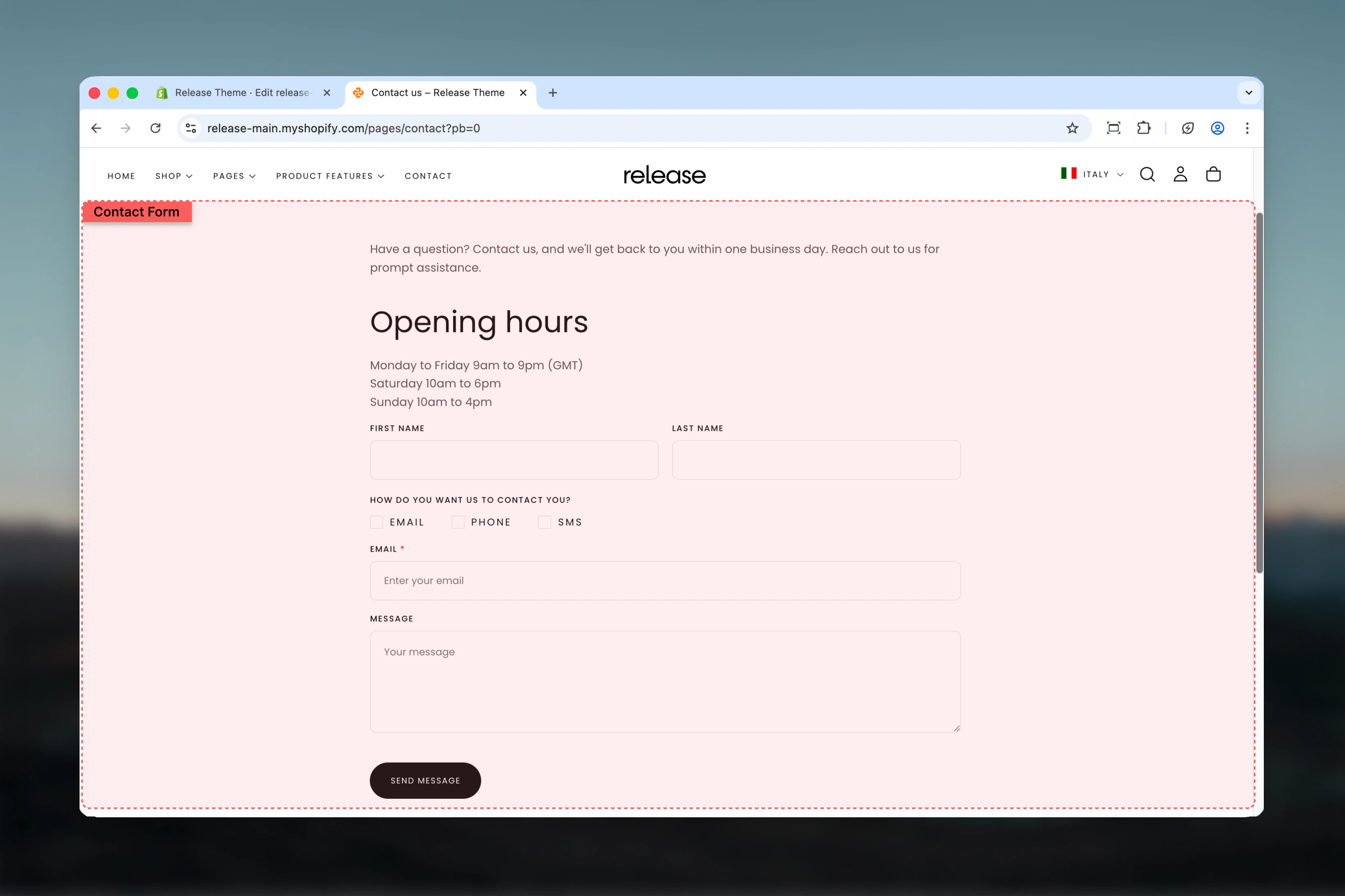
This section manages:- Contact form fields - Customizable text, email, phone, checkbox, and radio fields
- Field layout - Control field width (full or half) and column spanning
- Customer data binding - Auto-fill fields for logged-in customers
- Required field validation - Enforce mandatory field completion
- Form submission - Handle form submissions and success messaging
- Map display - Optional Google Maps integration for store location
- Section layout - Adjust section width, color scheme, and spacing
Getting started
Section Settings
- Layout
- Map
Control the overall form layout, width, and spacing.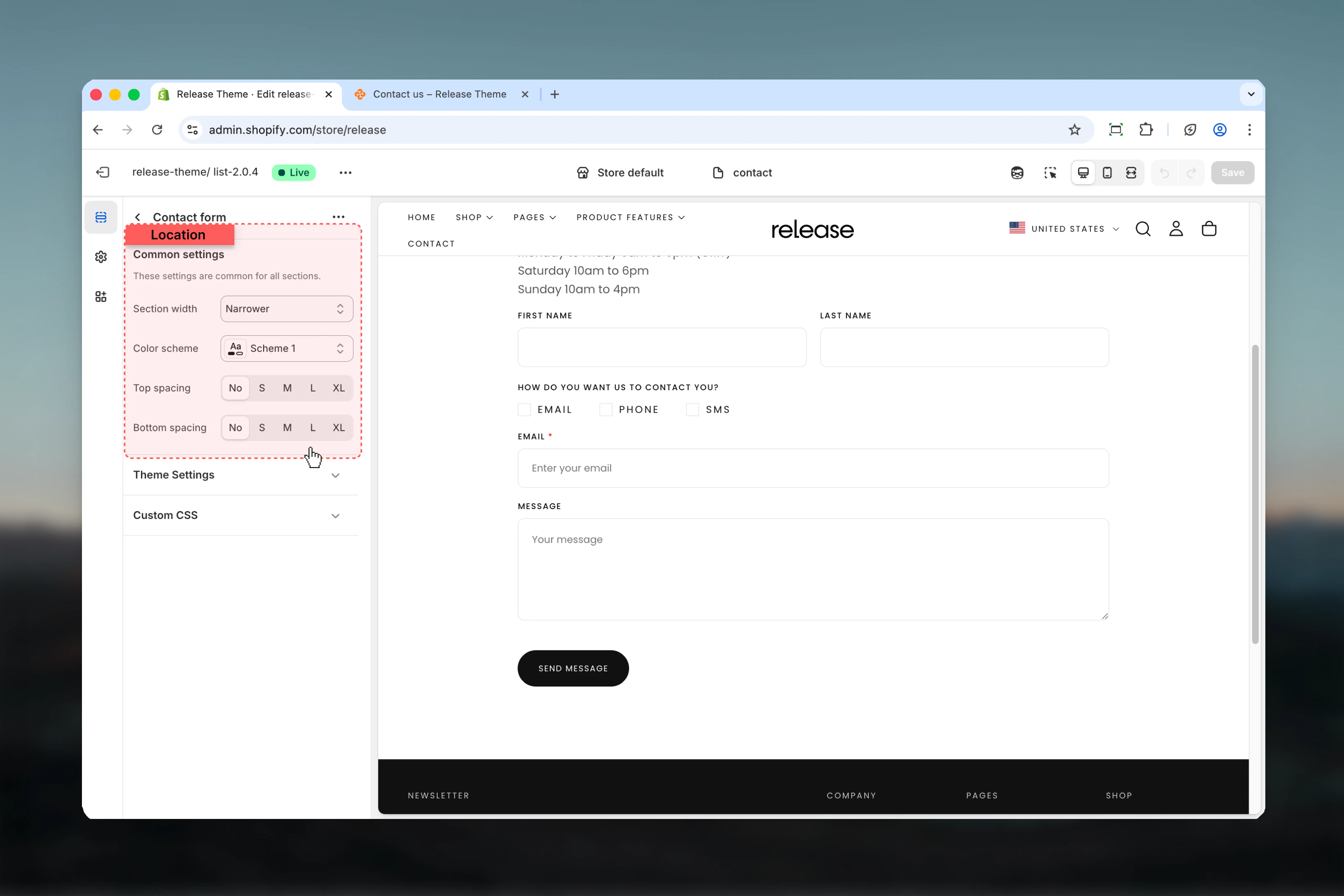
Section width
Section width
Type: Dropdown
Options: max-w-page, max-w-narrower, max-w-fluid
Default: max-w-narrowerControl the maximum width of the contact form:
Options: max-w-page, max-w-narrower, max-w-fluid
Default: max-w-narrowerControl the maximum width of the contact form:
- max-w-page - Standard container matching theme width
- max-w-narrower - Narrow focused layout for better readability
- max-w-fluid - Wider container utilizing more screen space
Color scheme
Color scheme
Type: Dropdown
Default: scheme-1Select the color scheme for the form section. Available schemes are defined in Theme settings > Colors.
Default: scheme-1Select the color scheme for the form section. Available schemes are defined in Theme settings > Colors.
Color scheme affects background, text, input borders, and button colors throughout the form.
Spacing top
Spacing top
Type: Dropdown
Options: No (0), S (1), M (2), L (4), XL (6)
Default: M (2)Adjust padding above the form section, controlling vertical space from the header.
Options: No (0), S (1), M (2), L (4), XL (6)
Default: M (2)Adjust padding above the form section, controlling vertical space from the header.
Spacing bottom
Spacing bottom
Type: Dropdown
Options: No (0), S (1), M (2), L (4), XL (6)
Default: M (2)Adjust padding below the form section, controlling vertical space to the footer.
Options: No (0), S (1), M (2), L (4), XL (6)
Default: M (2)Adjust padding below the form section, controlling vertical space to the footer.
Block Settings
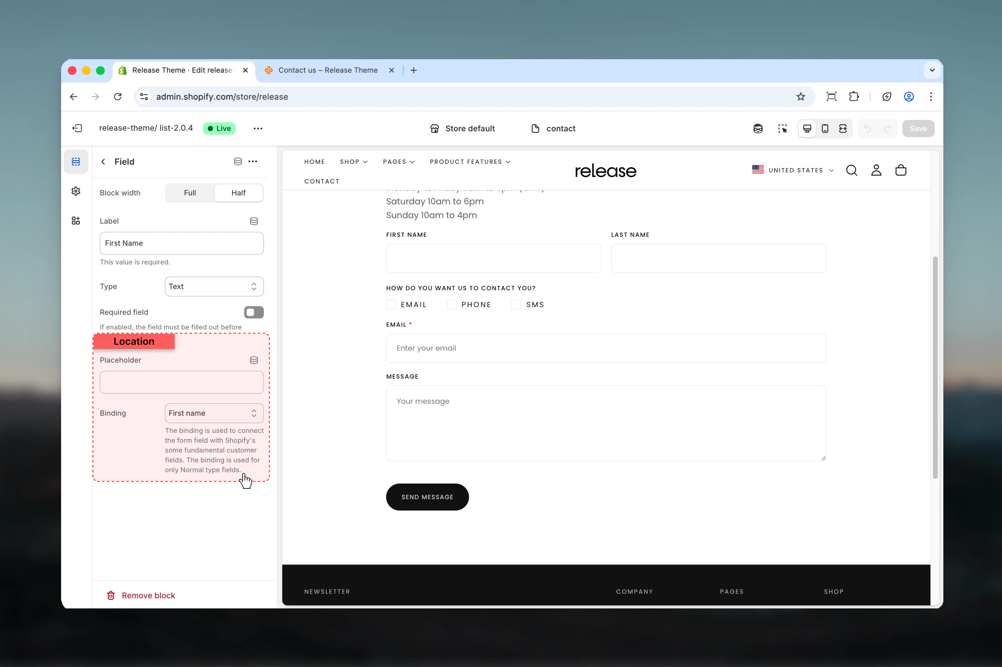
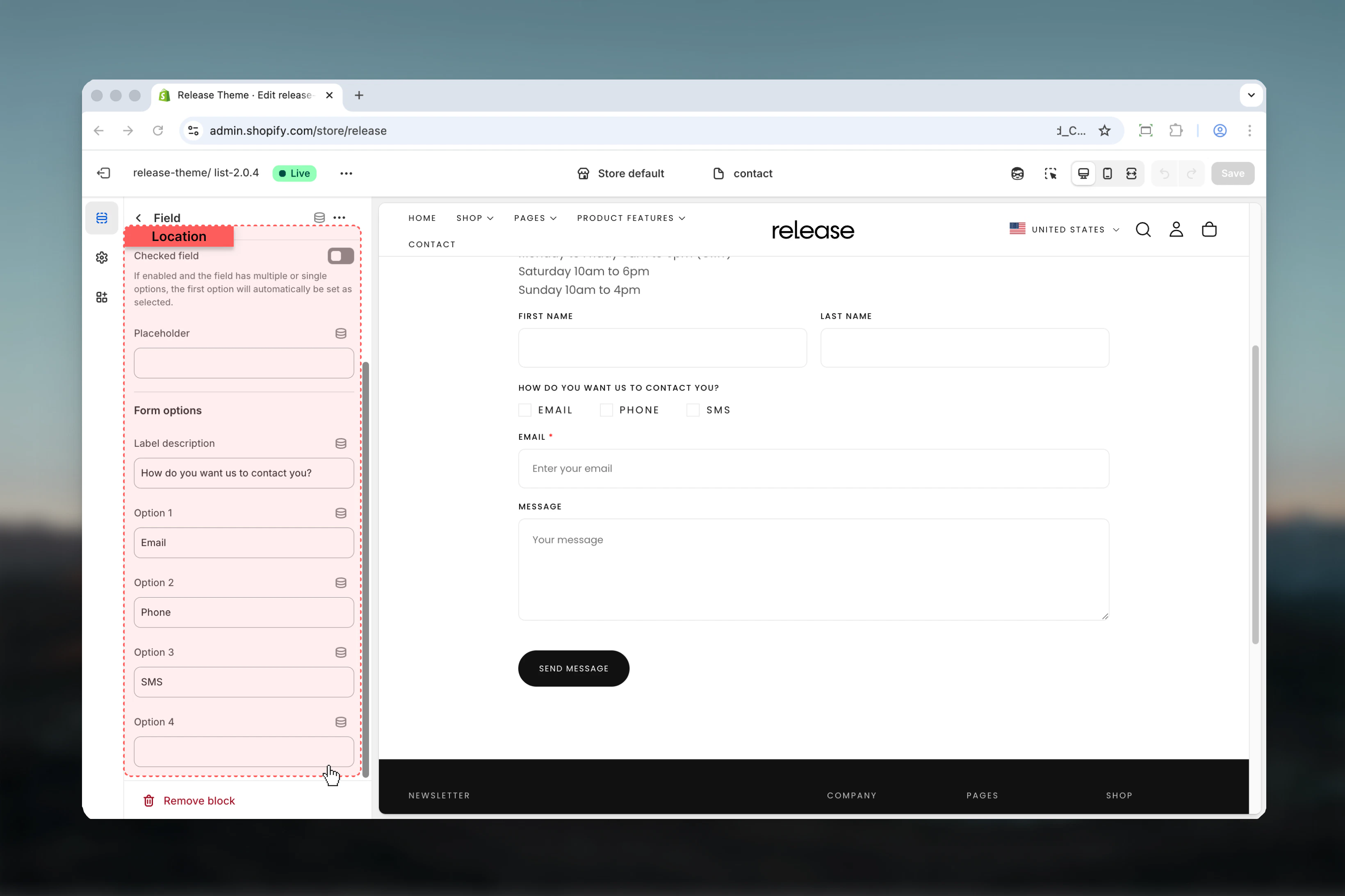
Field Block
Add customizable form fields to build your contact form. Each field can span full or half width and supports various input types.- Basic Settings
- Input Fields
- Selection Fields
Configure the fundamental properties of each form field.
Block width / Column factor
Block width / Column factor
Type: Dropdown
Options: Full width (6), Half width (3)
Default: Full widthControl the width of the field:
Options: Full width (6), Half width (3)
Default: Full widthControl the width of the field:
- Full width (6) - Spans entire form width
- Half width (3) - Takes up half the row, allowing two fields side-by-side
Label / Heading
Label / Heading
Type: Text field
Default: “Label”
Required: YesThe label text displayed above the field. This will also be used to generate the field name in form submissions.
Default: “Label”
Required: YesThe label text displayed above the field. This will also be used to generate the field name in form submissions.
Type
Type
Type: Dropdown
Default: TextChoose the field input type:Input fields:
Default: TextChoose the field input type:Input fields:
- Text - Single line text input for names, subjects, etc.
- Email - Email address input with validation
- Tel - Telephone number input
- Checkbox - Multiple choice checkboxes (allows multiple selections)
- Radio - Single choice radio buttons (allows one selection)
Checkbox fields allow multiple selections, while radio fields allow only one selection at a time.
Required field / Required
Required field / Required
Type: Toggle
Default: DisabledMark the field as required for form submission. Customers cannot submit the form without filling required fields.
Default: DisabledMark the field as required for form submission. Customers cannot submit the form without filling required fields.
Common use cases
- Basic contact
- Support inquiry
- Quote request
- Partnership inquiry
- Product inquiry
Standard contact form for general inquiries.Configuration:
- Name (Text, Full width, Required)
- Email (Email, Full width, Required, Binding: Email)
- Subject (Text, Full width)
- Message (Text, Full width, Required)
Best practices
Form width optimization
Use max-w-narrower (default) for better readability and completion rates. Narrower forms reduce visual noise and focus attention on form fields.
Required fields strategy
Mark name, email, and message as required minimum. Too many required fields (>5) can reduce completion rates by 30-40%.
Half-width pairing
Use half-width fields for related pairs like first name/last name or city/zip code to save vertical space and improve form flow.
Full-width priority
Use full-width fields for message/textarea and single important fields like email to emphasize their importance.
Email binding
Always bind email field to customer email for convenience. This improves form completion rates by 30-40% for logged-in users.
Field order logic
Follow standard flow: Name → Email → Subject/Reason → Message. Users expect this pattern and complete forms faster when it’s followed.
Placeholder hints
Use placeholders to provide format hints like “john@example.com” or “+1 (555) 123-4567” without cluttering the form.
Consent checkbox
Add required checkbox for terms/privacy acceptance if legally required. Place at the end, before submit button.
Radio for categories
Use radio buttons for predefined options like inquiry type or department. This standardizes responses and improves support routing.
Form length
Keep it short: 4-6 fields maximum for higher completion rates. Each additional field can reduce completion by 5-10%.
Related guides
Newsletter Popup
Configure newsletter signup popup for email collection
Page Settings
Create and customize additional pages