What this section controls
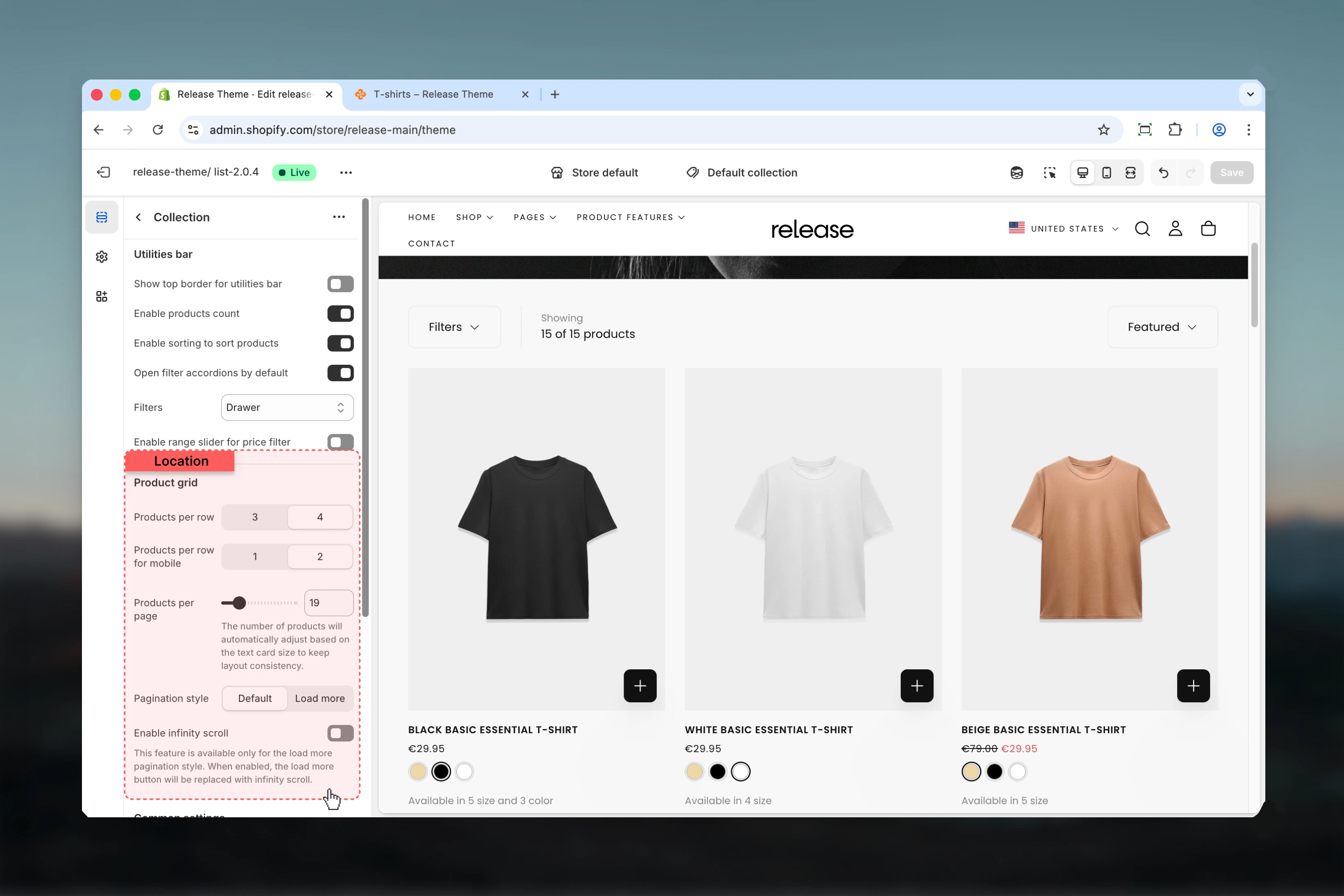
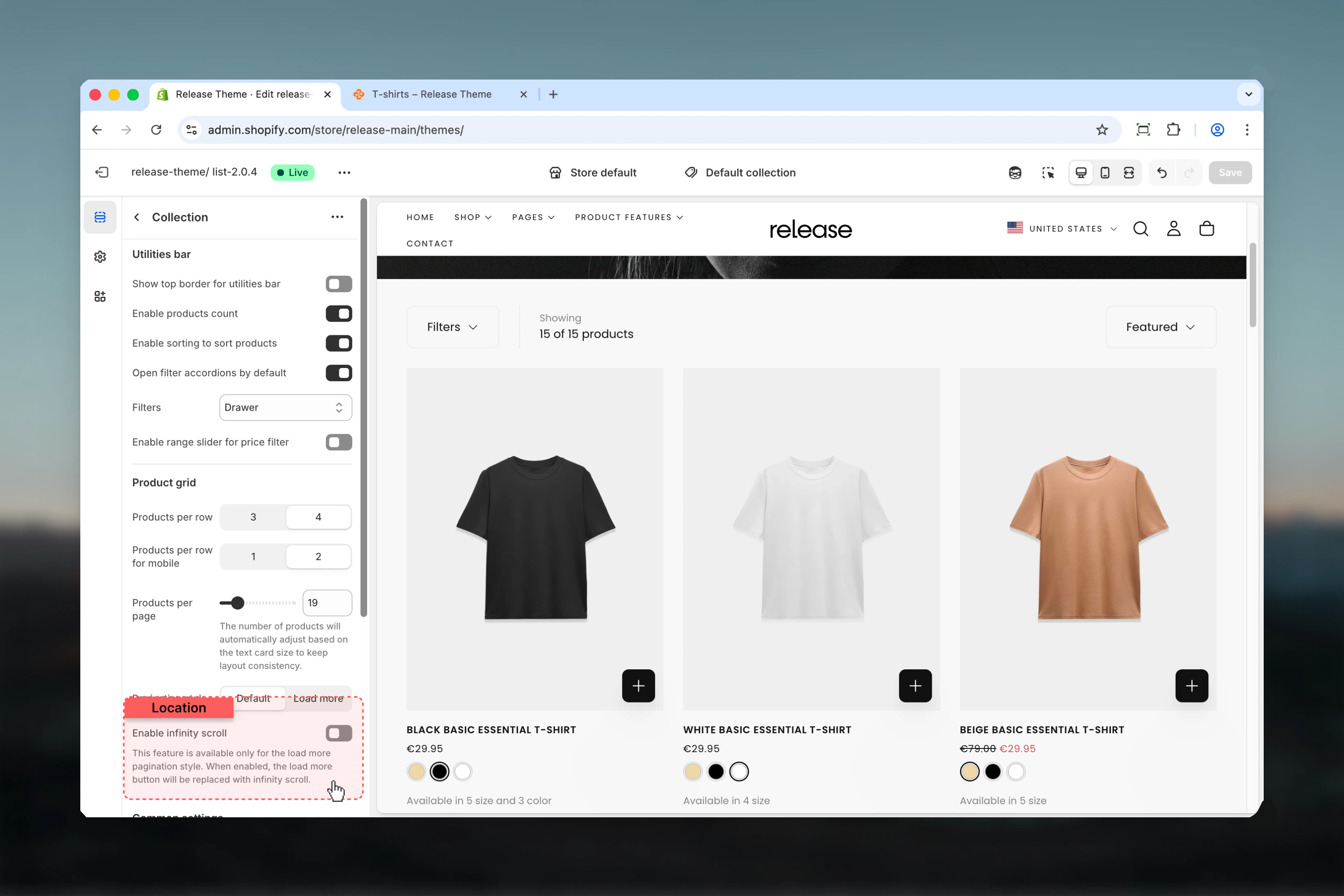
This section manages:- Product grid layout - Set products per row for desktop and mobile
- Filtering system - Control how customers filter products (drawer, sidebar, or hidden)
- Sorting capabilities - Enable/disable sorting dropdown options
- Pagination style - Choose between traditional pagination, load more button, or infinite scroll
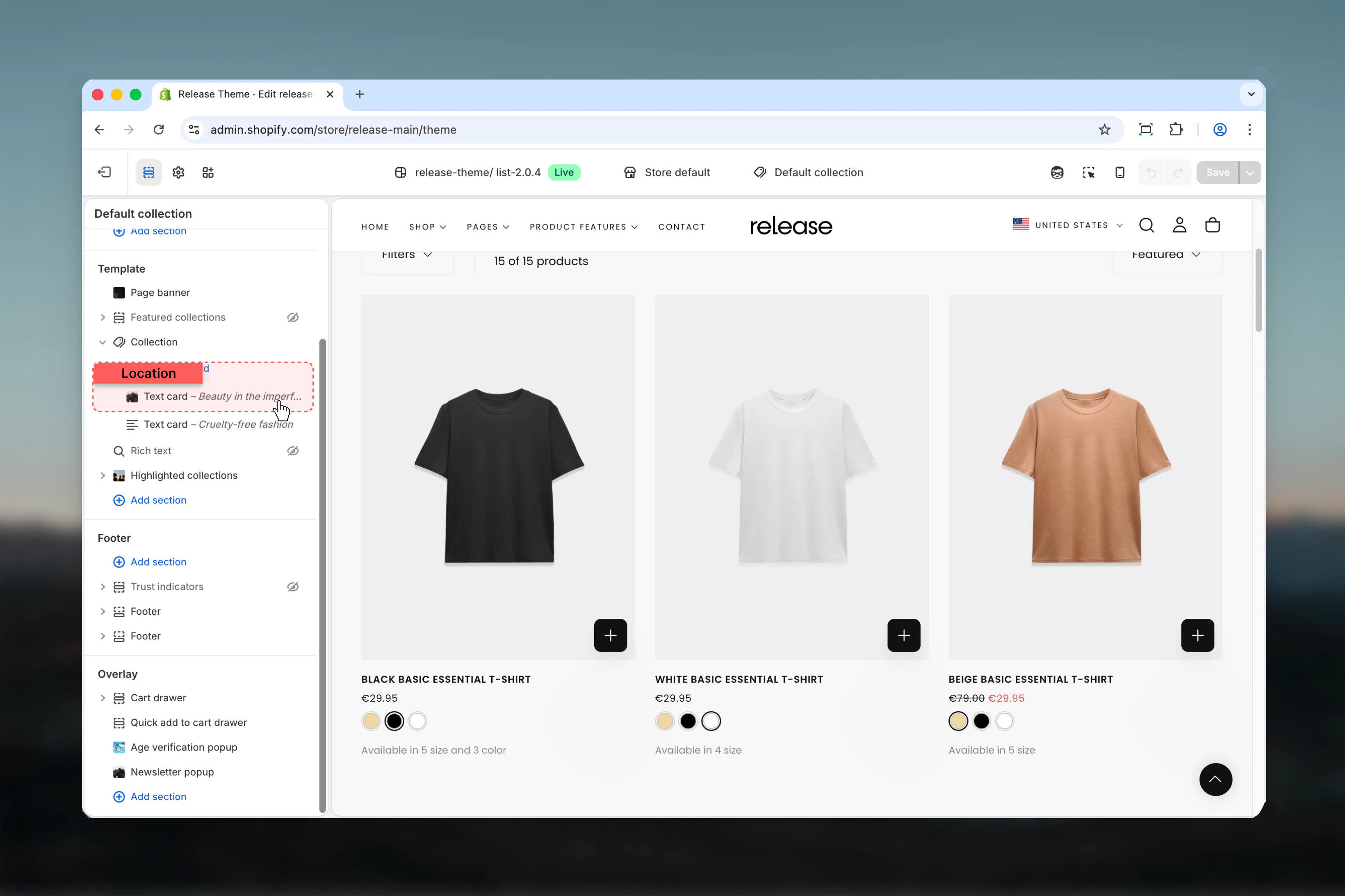
- Promotional text cards - Insert branded content within the product grid
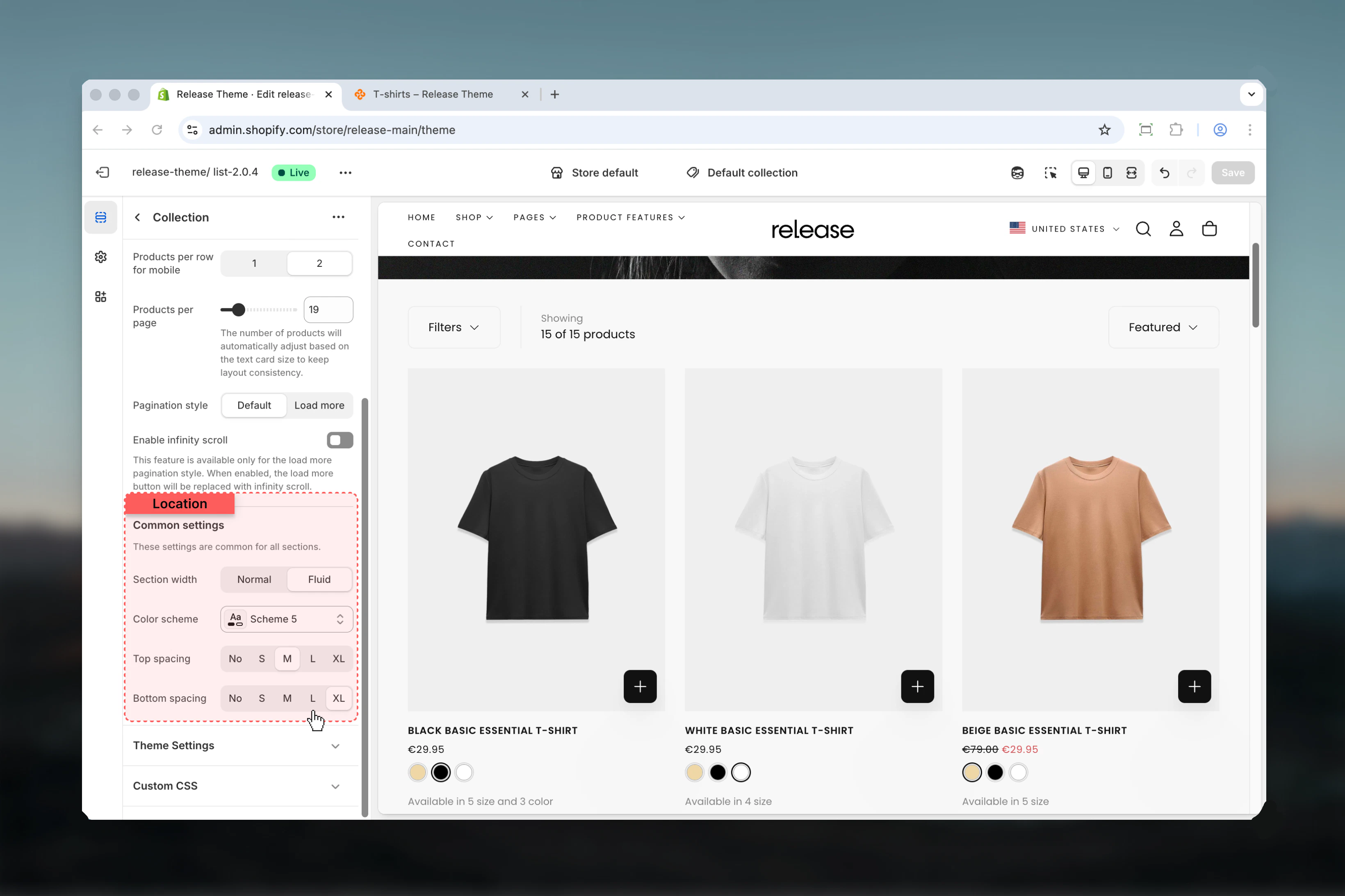
- Section spacing and colors - Adjust layout width, color scheme, and spacing
Getting started
Configure utilities bar
Adjust filter display, sorting, and product count settings in the Utilities Bar tab
Section Settings
- Utilities Bar
- Filters
- Product Grid
- Layout
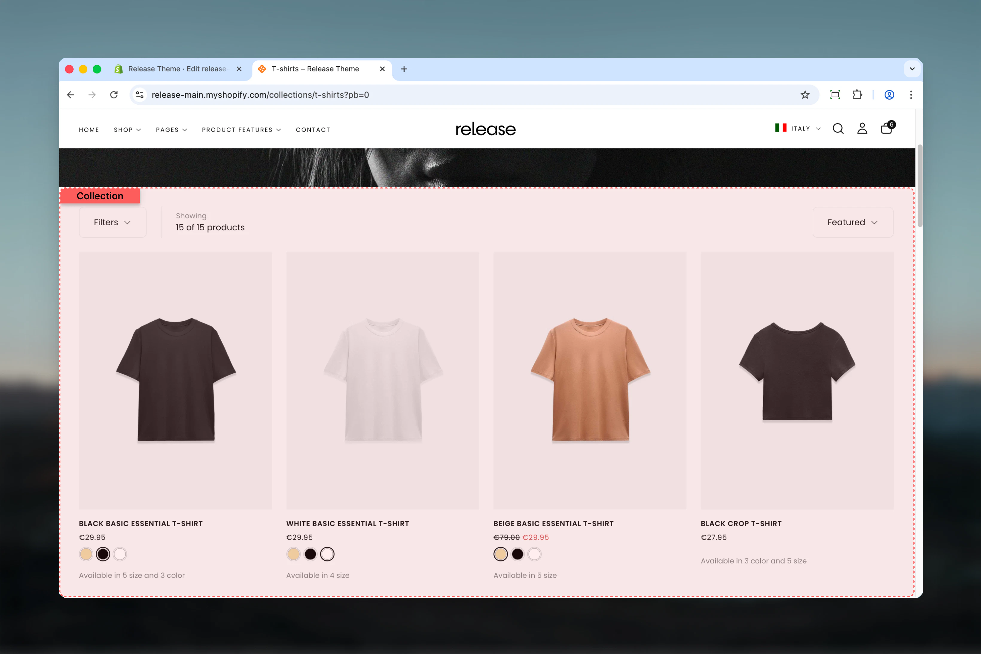
The utilities bar appears above the product grid, containing filters, sorting, and product count.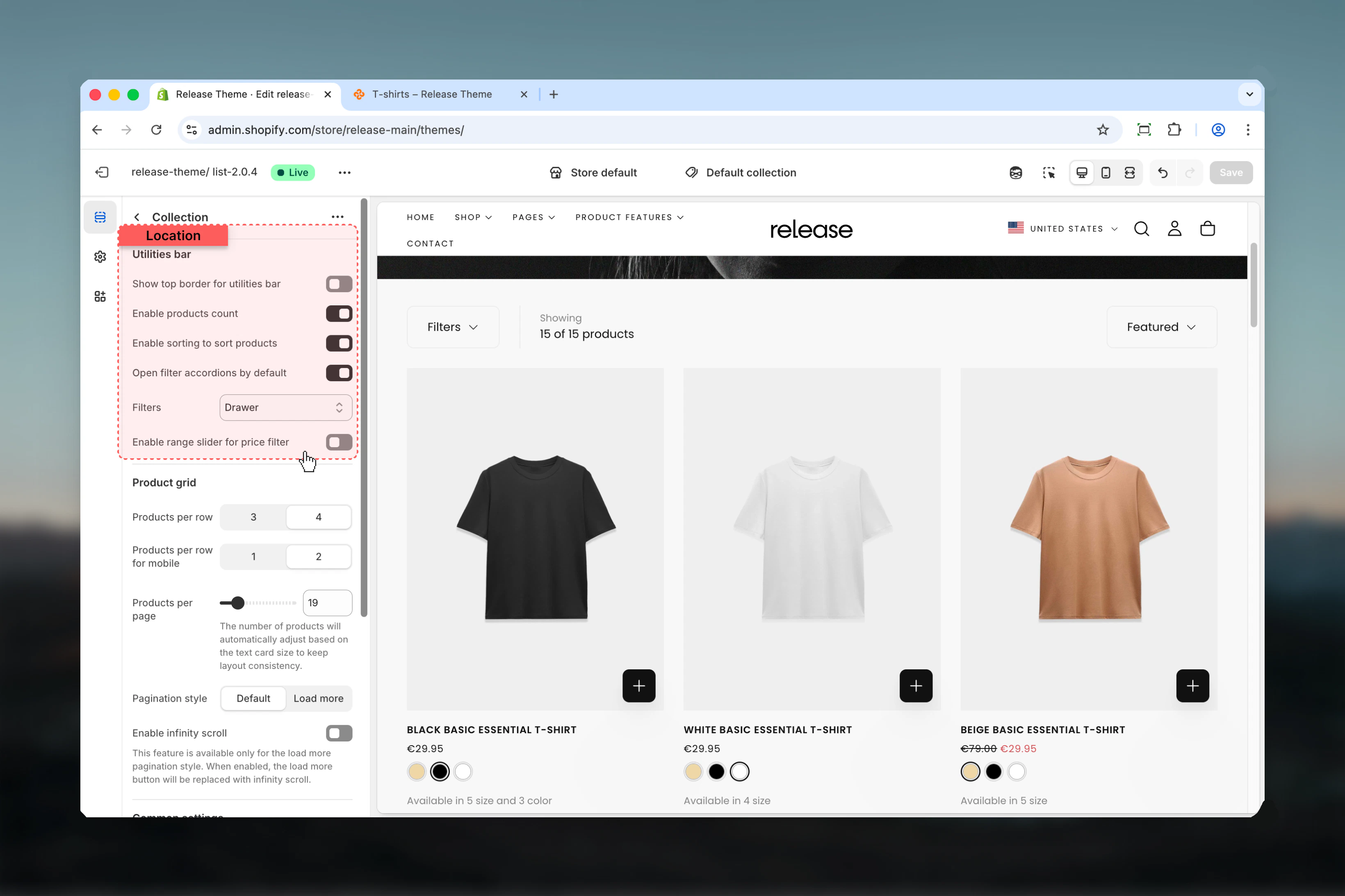
Show top border for utilities bar
Show top border for utilities bar
Type: Toggle
Default: DisabledAdds a decorative border above the utilities bar to visually separate it from the content above.
Default: DisabledAdds a decorative border above the utilities bar to visually separate it from the content above.
This border uses the theme’s border color from your color scheme settings.
Enable products count
Enable products count
Type: Toggle
Default: EnabledDisplays the total number of products in the collection (e.g., “24 products”).
Default: EnabledDisplays the total number of products in the collection (e.g., “24 products”).
Enable sorting
Enable sorting
Type: Toggle
Default: EnabledShows the sorting dropdown allowing customers to sort products by:
Default: EnabledShows the sorting dropdown allowing customers to sort products by:
- Featured
- Best selling
- Alphabetically (A-Z)
- Alphabetically (Z-A)
- Price (low to high)
- Price (high to low)
- Date (old to new)
- Date (new to old)
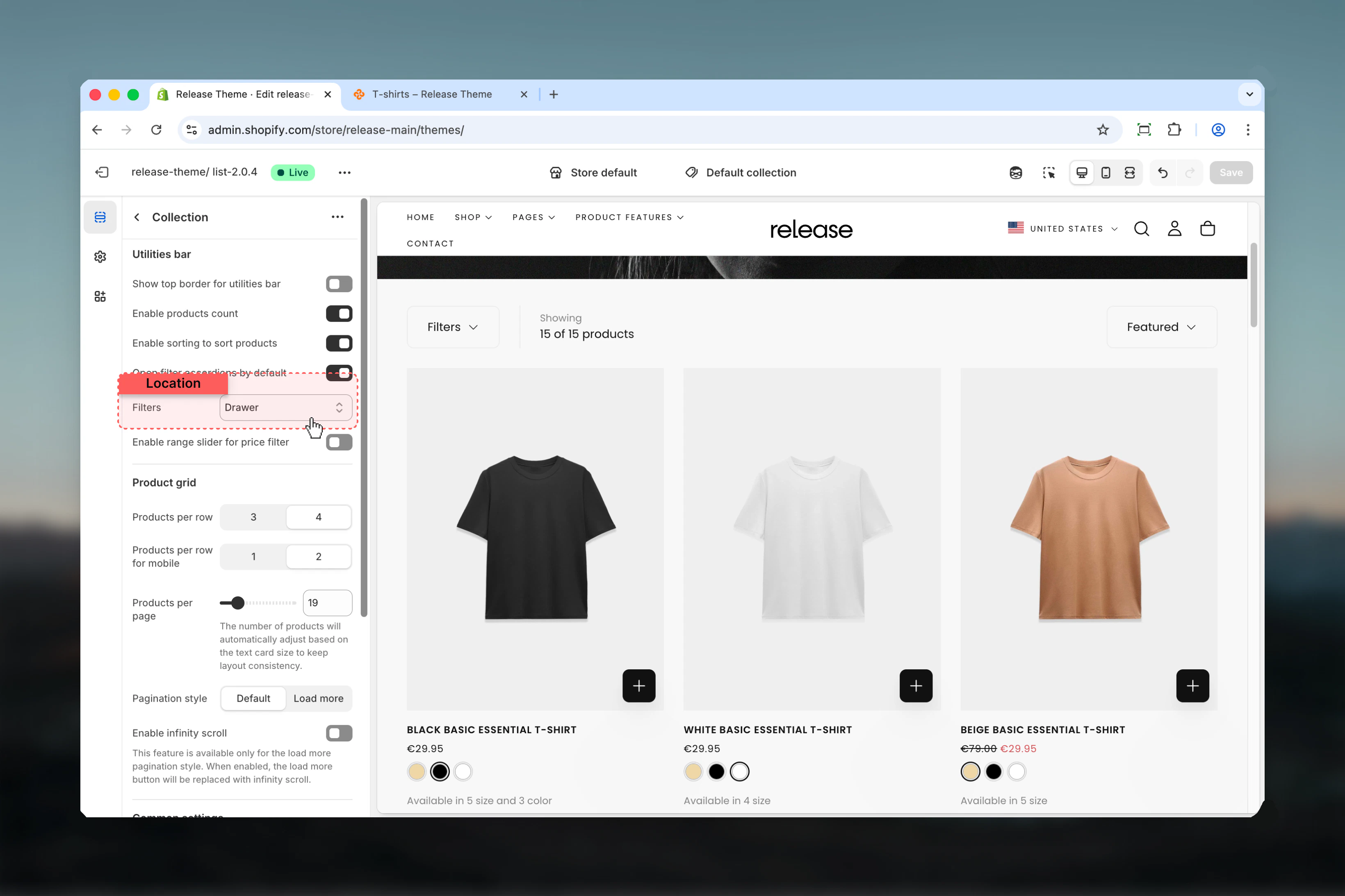
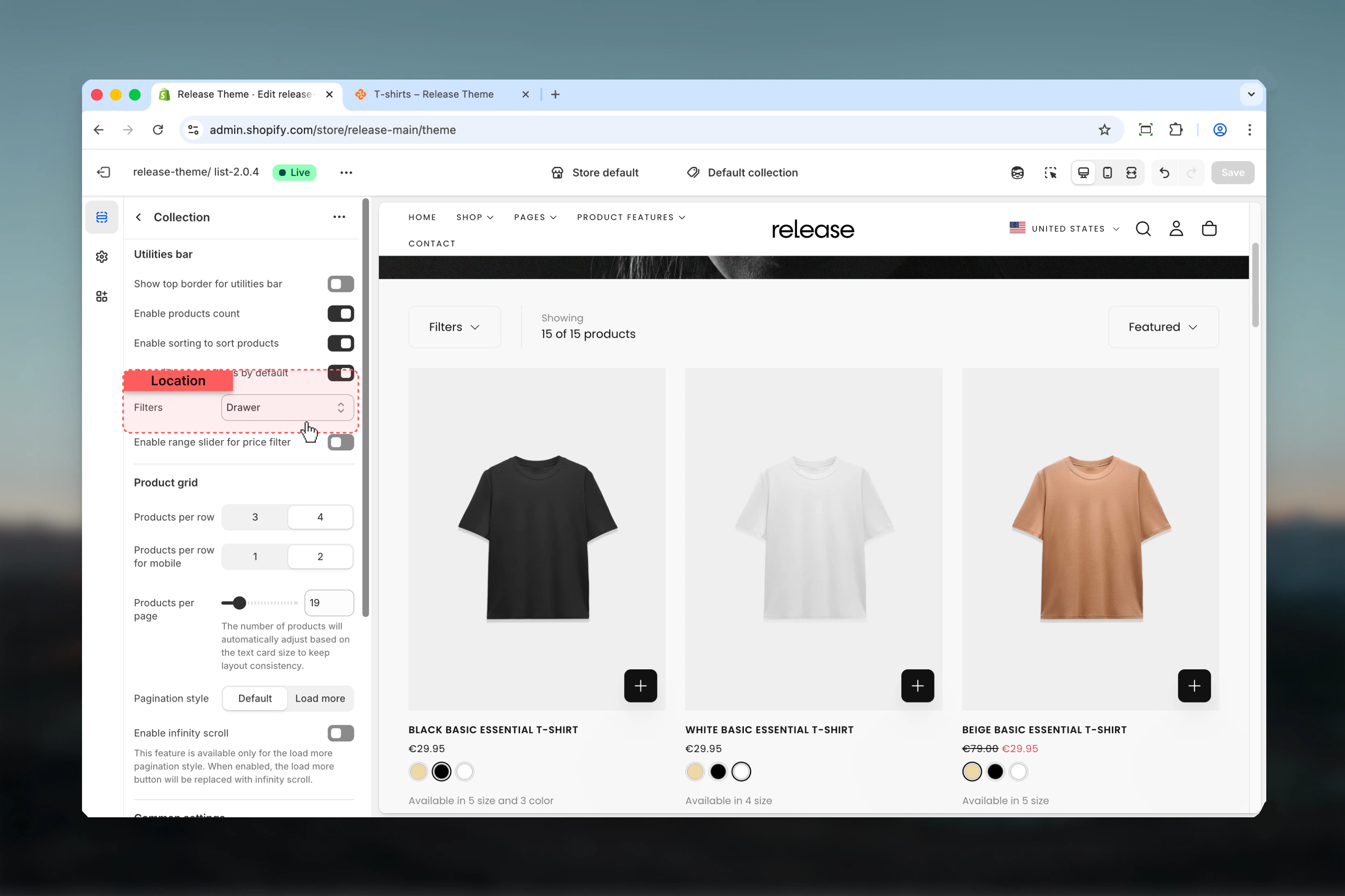
Filters
Filters
Type: Dropdown
Options: Hide, Drawer, Sidebar
Default: DrawerChoose how filters are displayed to customers:
Options: Hide, Drawer, Sidebar
Default: DrawerChoose how filters are displayed to customers:
- Hide - Removes all product filters
- Drawer - Filters slide in from the side when the “Filter” button is clicked
-
Sidebar - Filters are always visible in a left sidebar
Open filter accordions by default
Open filter accordions by default
Type: Toggle
Default: EnabledSets all filter accordions to open when the page loads, making all filter options immediately visible.
Default: EnabledSets all filter accordions to open when the page loads, making all filter options immediately visible.
This setting only affects desktop sidebar and drawer views. Mobile filters always start collapsed.
Block Settings
Text Card Block
Insert promotional or informational cards within the product grid. Text cards are perfect for highlighting sales, cross-selling, or telling your brand story.Maximum 5 text cards per collection page.
Content
Content
Text
Type: Rich text editor
Default:
Button link
Type: URL fieldDestination URL for the card button or click action.
Link type
Type: Dropdown
Options: Button, Card
Default: ButtonHow the link functions:
Button label
Type: Text fieldText displayed on the button. Leave empty to hide button entirely.
Button style
Type: Dropdown
Options: Filled, Outlined, Text
Default: TextVisual style of the button:
Type: Rich text editor
Default:
<h3>Heading goes here</h3>Rich text content for the card. Supports headings, paragraphs, bold, italic, and basic formatting.Button link
Type: URL fieldDestination URL for the card button or click action.
Link type
Type: Dropdown
Options: Button, Card
Default: ButtonHow the link functions:
- Button - Traditional button element below content
- Card - Entire card surface is clickable
Button label
Type: Text fieldText displayed on the button. Leave empty to hide button entirely.
Button style
Type: Dropdown
Options: Filled, Outlined, Text
Default: TextVisual style of the button:
- Filled - Solid background color, high contrast
- Outlined - Border with transparent background
- Text - Text-only link style, minimal
Layout
Layout
Position
Type: Number
Range: 1-50
Default: 8Where the text card appears in the product grid. Position 1 means after the first product, position 8 means after the 7th product, etc.
Column factor
Type: Range
Range: 1-4
Default: 1How many columns the card spans horizontally. 1 = single column width, 2 = double width, etc.
Row factor
Type: Range
Range: 1-4
Default: 1How many rows the card spans vertically. 1 = single row height, 2 = double height, etc.
Type: Number
Range: 1-50
Default: 8Where the text card appears in the product grid. Position 1 means after the first product, position 8 means after the 7th product, etc.
If position exceeds products per page setting, the card appears at the end of the grid.
Column factor
Type: Range
Range: 1-4
Default: 1How many columns the card spans horizontally. 1 = single column width, 2 = double width, etc.
Row factor
Type: Range
Range: 1-4
Default: 1How many rows the card spans vertically. 1 = single row height, 2 = double height, etc.
Position & Alignment
Position & Alignment
Content position
Type: Dropdown
Options: Start, Center, End
Default: CenterVertical positioning of content within the card:
Content alignment
Type: Dropdown
Options: Start, Center, End
Default: CenterHorizontal alignment of text:
Content position for mobile
Type: Dropdown
Options: Start, Center, End
Default: CenterVertical positioning on mobile devices. Same options as desktop.
Content alignment for mobile
Type: Dropdown
Options: Start, Center, End
Default: CenterHorizontal alignment on mobile. Same options as desktop.
Type: Dropdown
Options: Start, Center, End
Default: CenterVertical positioning of content within the card:
- Start - Top aligned
- Center - Vertically centered
- End - Bottom aligned
Content alignment
Type: Dropdown
Options: Start, Center, End
Default: CenterHorizontal alignment of text:
- Start - Left aligned
- Center - Center aligned
- End - Right aligned
Content position for mobile
Type: Dropdown
Options: Start, Center, End
Default: CenterVertical positioning on mobile devices. Same options as desktop.
Content alignment for mobile
Type: Dropdown
Options: Start, Center, End
Default: CenterHorizontal alignment on mobile. Same options as desktop.
Mobile alignment settings override desktop settings on screens smaller than 768px.
Visual Settings
Visual Settings
Color scheme
Type: Dropdown
Default: scheme-1Color scheme for the text card. Available schemes match your theme’s color settings.
Card image
Type: Image pickerBackground image for the text card. When set, text content overlays the image.
Type: Dropdown
Default: scheme-1Color scheme for the text card. Available schemes match your theme’s color settings.
Card image
Type: Image pickerBackground image for the text card. When set, text content overlays the image.
Common use cases
- Sale collections
- Category collections
- New arrivals
- Seasonal campaigns
- Price-sensitive
- Large inventories
- Curated collections
- Flash sales
- Brand storytelling
- Cross-sell
Insert text cards promoting “Extra 20% off” or free shipping thresholds at strategic positions (e.g., position 5 or 12) to maintain engagement throughout scrolling.
Best practices
Grid layout optimization
Use 4 products per row on desktop for balanced visibility and detail. This provides the best compromise between seeing multiple products and maintaining adequate product card size.
Mobile optimization
Use 2 columns on mobile for better product card readability. Single column makes cards too large, while 2 columns allows comparison without sacrificing detail.
Filter placement strategy
Choose drawer for minimal filter collections (1-3 filters), sidebar for extensive filtering needs (5+ filters). Drawer keeps the layout clean while sidebar provides constant filter visibility.
Text card strategy
Place cards every 8-12 products to maintain engagement without disrupting browsing flow. Too frequent placement becomes annoying, too infrequent loses impact.
Pagination performance
Enable infinite scroll or load more for collections over 50 products to improve performance. Traditional pagination works better for smaller collections where customers want page-level control.
Price filtering
Use range slider only for collections with wide, continuous price ranges (e.g., 500). For narrow or discrete price bands, checkbox filters are more intuitive.
Product count visibility
Always enable product count to set customer expectations about collection size. This is especially important for filtered results where count changes dynamically.
Text card sizing
Use column_factor 2 and row_factor 2 for promotional cards to make them stand out against standard product cards. Single-cell cards blend in too much.
Filter defaults
Keep accordions open by default for collections with 3-5 key filters. For 10+ filters, collapsed is better to prevent overwhelming customers.
Spacing consistency
Use M (2) spacing for standard collections to maintain rhythm. Reduce to S (1) for featured/minimal layouts, increase to L (4) for luxury brands.
Related guides
Product Cards
Configure product card display settings including image ratios, badges, and quick view
Filtering & Search
Advanced filtering and search configuration for collection pages
Collection List Page
Display multiple collections on a list page for easier navigation