What this section controls
- Vertical spacing above and below
- Optional background color
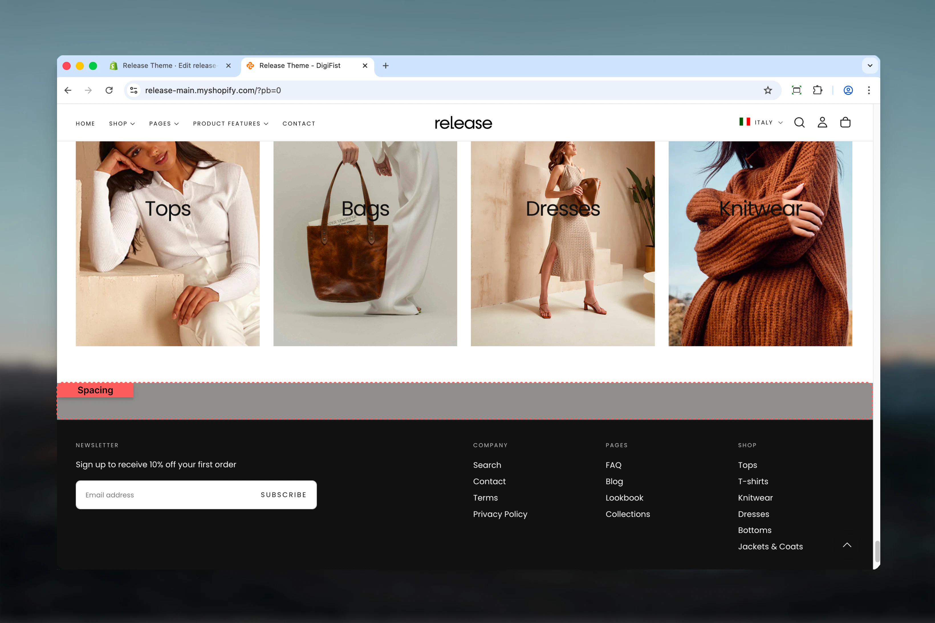
- Full-width spacing divider
Getting started
Section settings
Color scheme
Background color for the spacing section.- Shopify color scheme selector
- Default: Scheme 3
Use a matching or contrasting color scheme to create subtle visual separation.
Spacing top
Controls space above the section. Available options: No, S, M, L, XL Default: MSpacing bottom
Controls space below the section. Available options: No, S, M, L, XL Default: M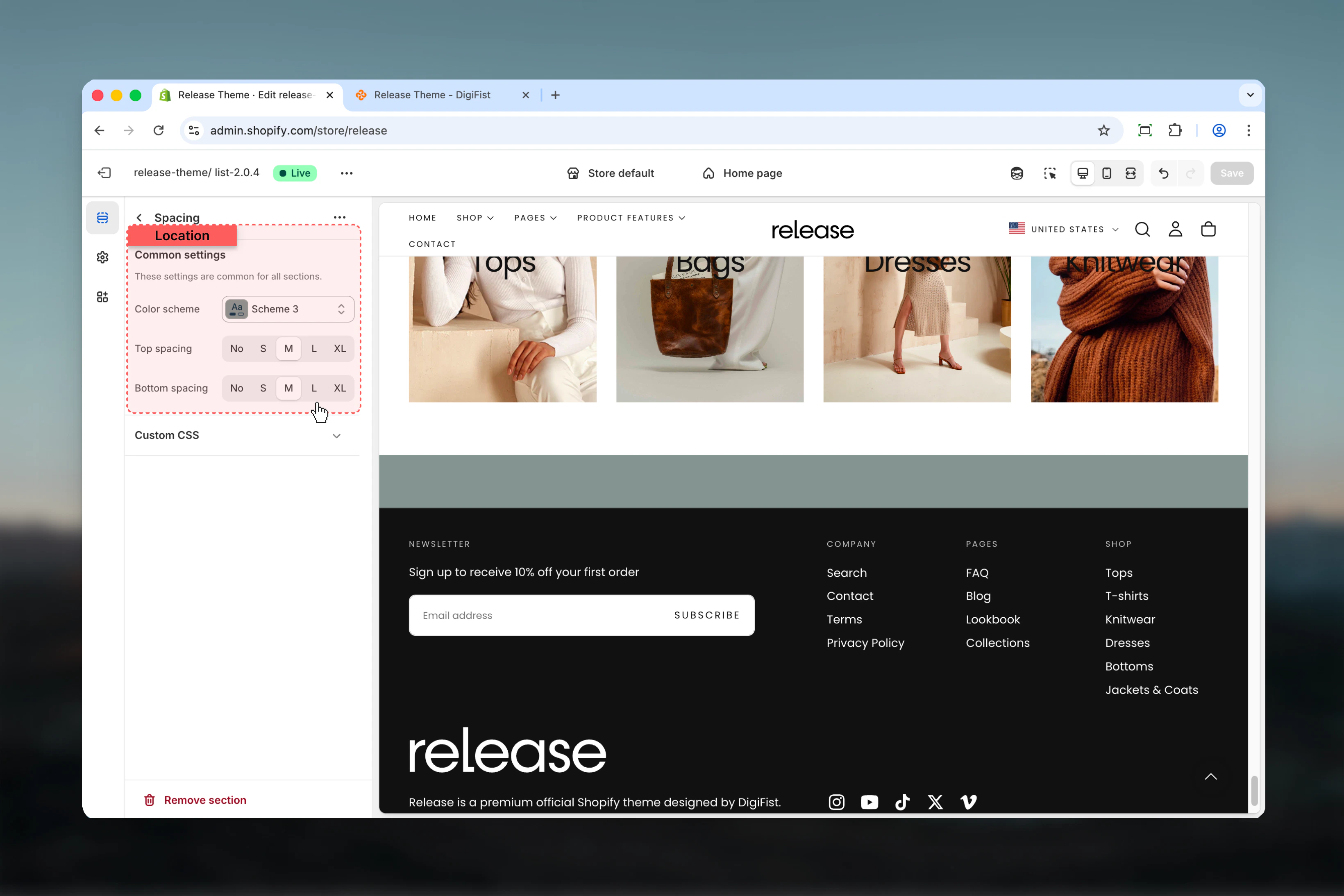
Best practices
- Use spacing sections to create visual breathing room between dense content
- Match color scheme with adjacent sections for seamless spacing
- Use contrasting color schemes to create subtle visual dividers
- Combine M or L spacing values for standard section separation
- Use XL spacing for major content breaks (e.g., between homepage sections)
- Use No spacing with different color scheme to create a colored divider line
Common use cases
- Section separation - Add space between homepage sections
- Visual dividers - Create colored separators with contrasting schemes
- Content breathing room - Improve readability by spacing dense content
- Layout balance - Adjust vertical rhythm of page layouts
- Mobile optimization - Add extra space for better mobile experience
Related guides
Common Settings
Learn about common settings shared across sections