What this section controls
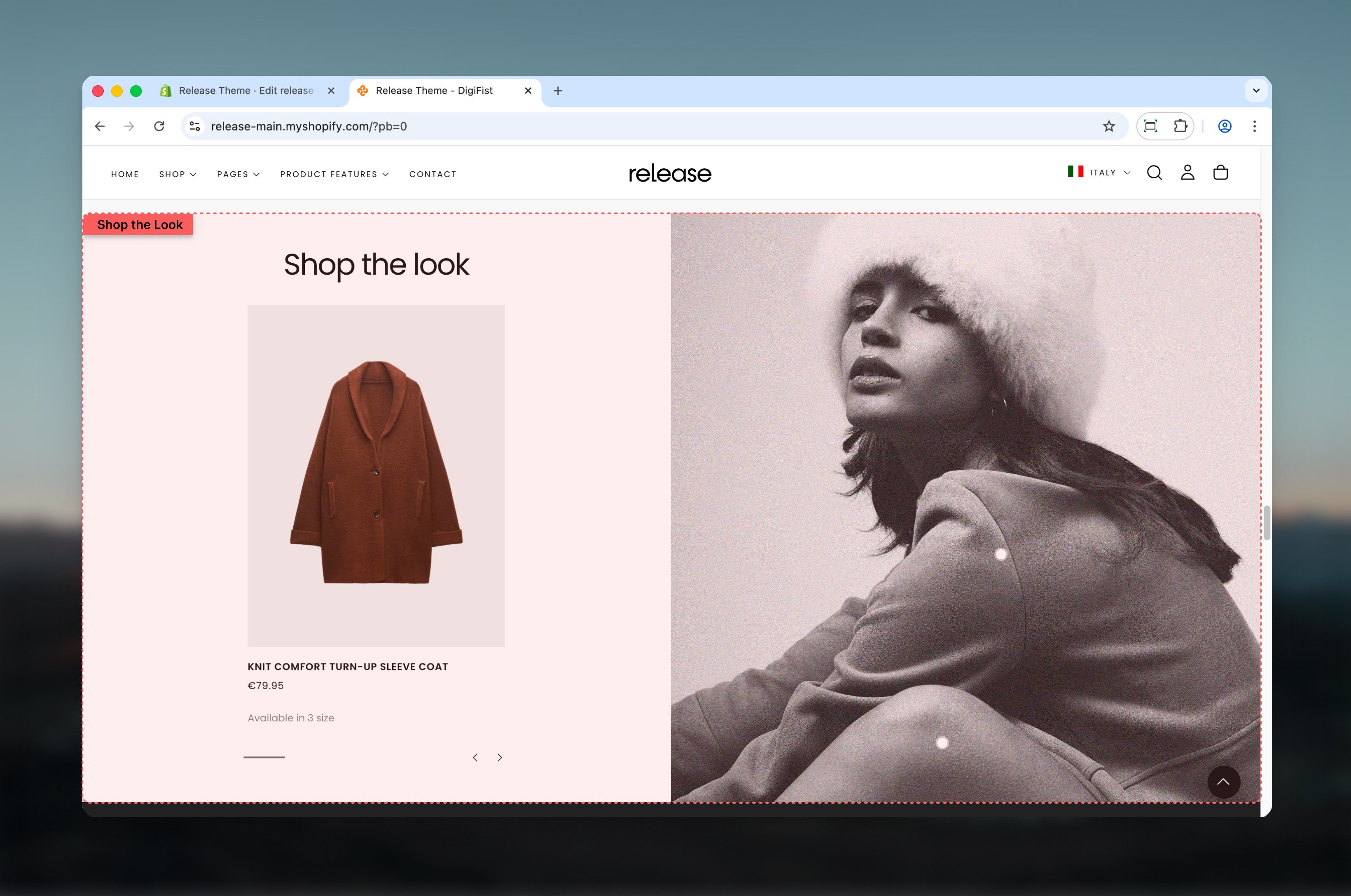
This section controls product showcases within images with the following capabilities:- Interactive product cards linked to visual imagery
- Pulse dot indicators for product discovery
- Dual content or full width layout options
- Desktop and mobile-specific image support
- Customizable product carousel positioning
How the Shop the Look works
The Shop the Look uses a block-based product system:- Products are linked to a visual using product cards or pulse dots
- Layout changes how products are displayed and interacted with
- Pulse dots allow users to discover products directly on the image
- Product slides control which products appear and where dots are placed
Getting started
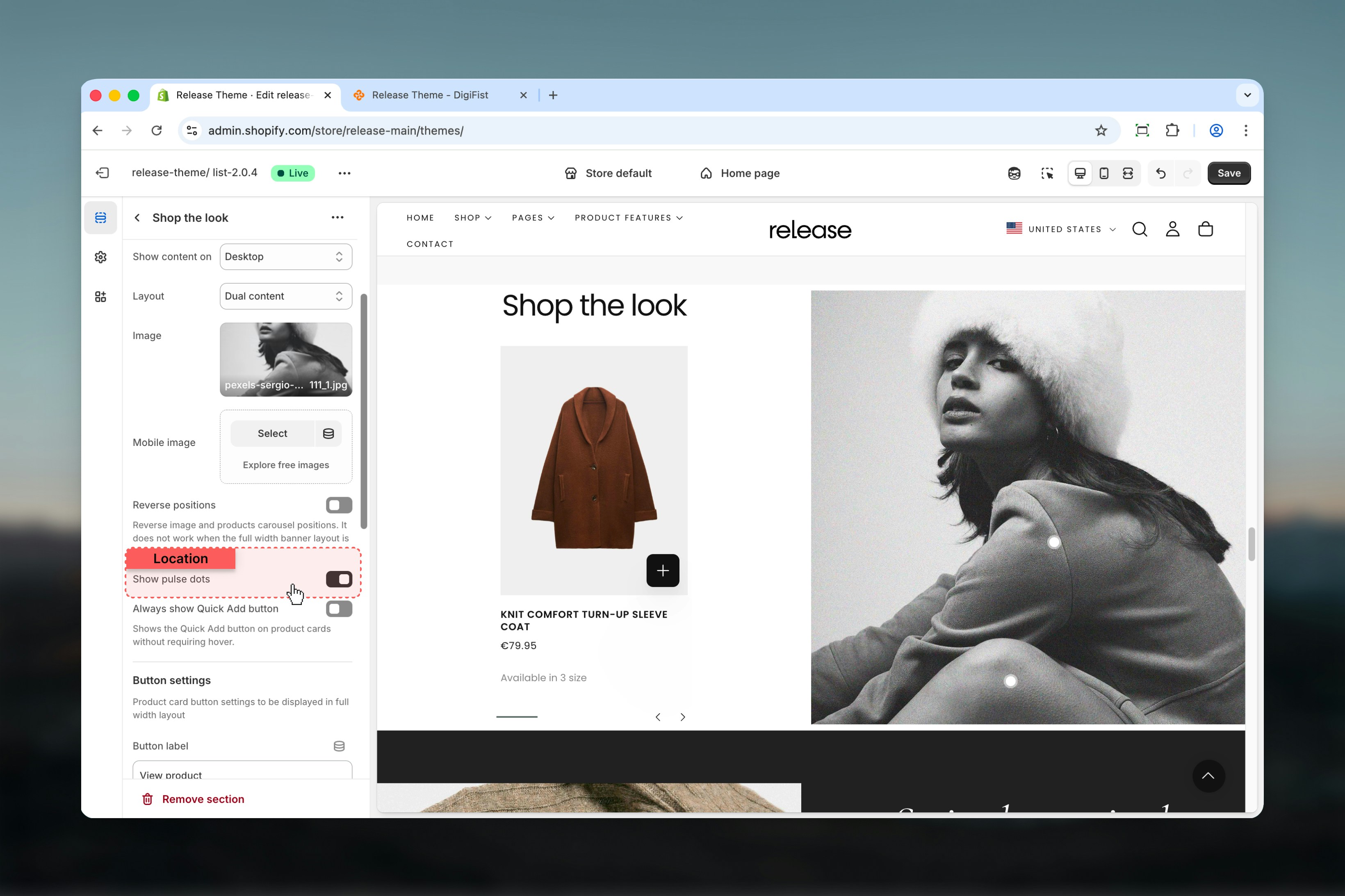
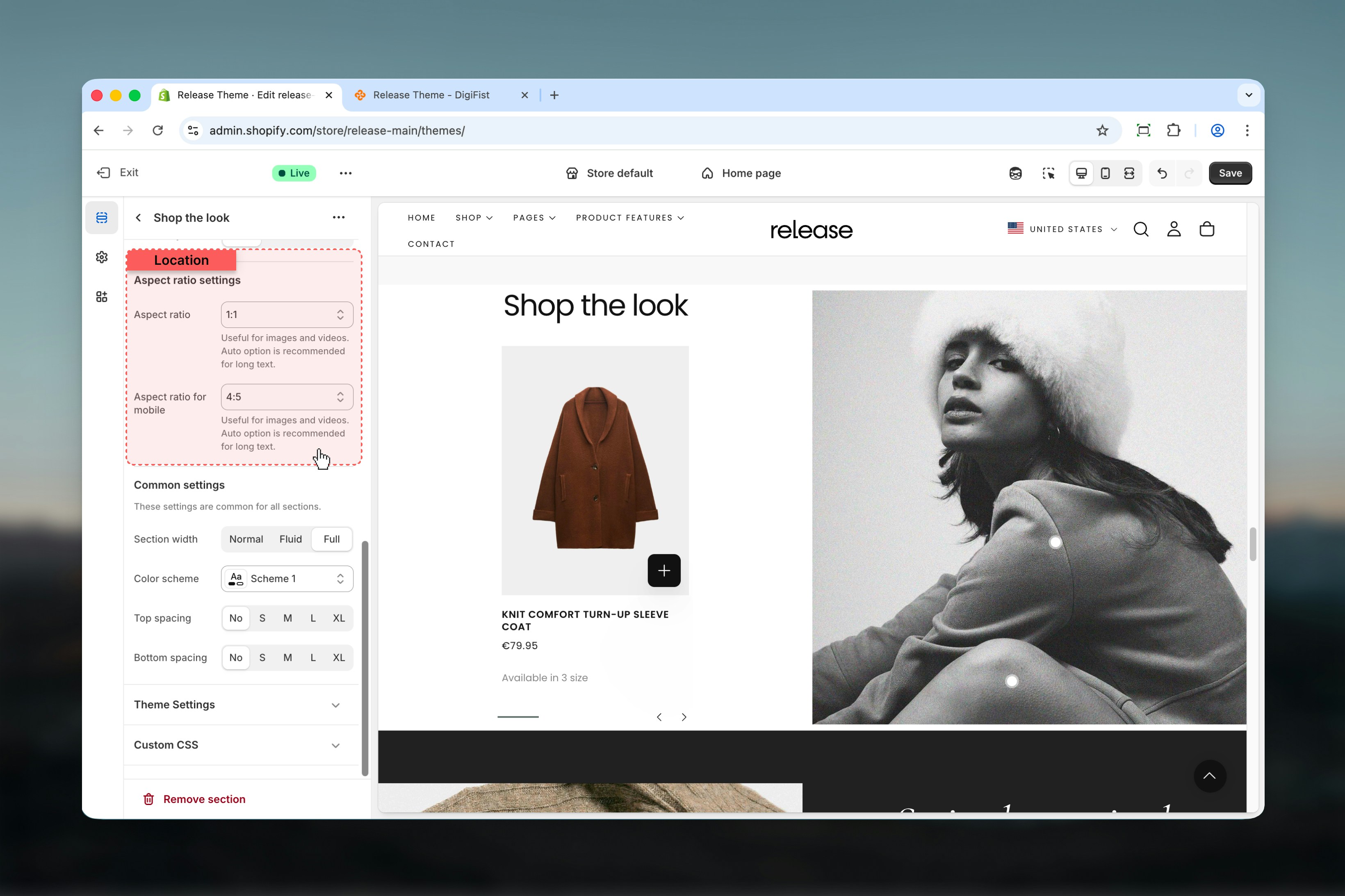
Section settings
Section settings define the content, layout behavior, and visual presentation.- Content
- Layout
- Aspect ratio

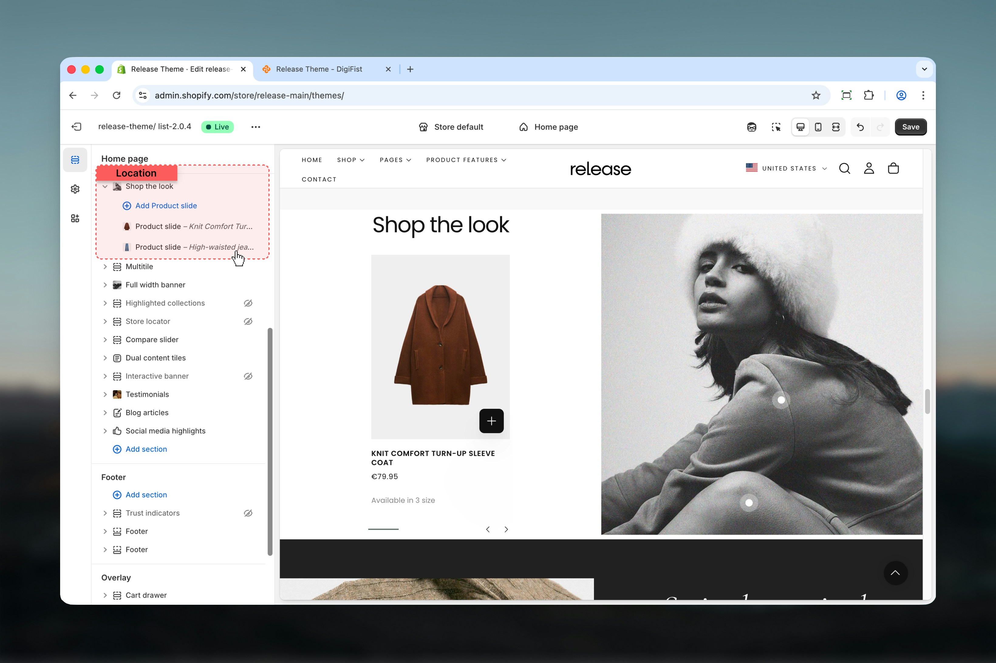
Block settings
Block settings control individual product slides. Each product slide represents a single product linked to the image.- Product
- Dot position
Product
Select a product using Shopify’s product selector.Once selected, the Shop the Look product card becomes visible.


Best practices
- Use Dual content for editorial-style layouts that showcase products alongside imagery
- Use Full width + pulse dots for immersive shopping experiences where customers discover products
- Keep pulse dots away from edges (at least 5-10% margin) for better usability and visibility
- Always test dot positions on large screens to ensure proper placement
- Limit the number of product slides to 3-5 for clarity and to avoid overwhelming users
- Use high-quality lifestyle images that naturally showcase multiple products
- Ensure pulse dots are positioned precisely on product locations in the image
- Test mobile experience as pulse dots are desktop-only
Related guides
Common Settings
Learn about common settings shared across sections