Customize the appearance and functionality of your shopping cart page.
The cart page displays customer’s selected items with prices, quantities, and checkout options. You can configure shipping notifications, terms acceptance, dynamic checkout buttons, upsell products, order notes, and layout settings to optimize the checkout experience.
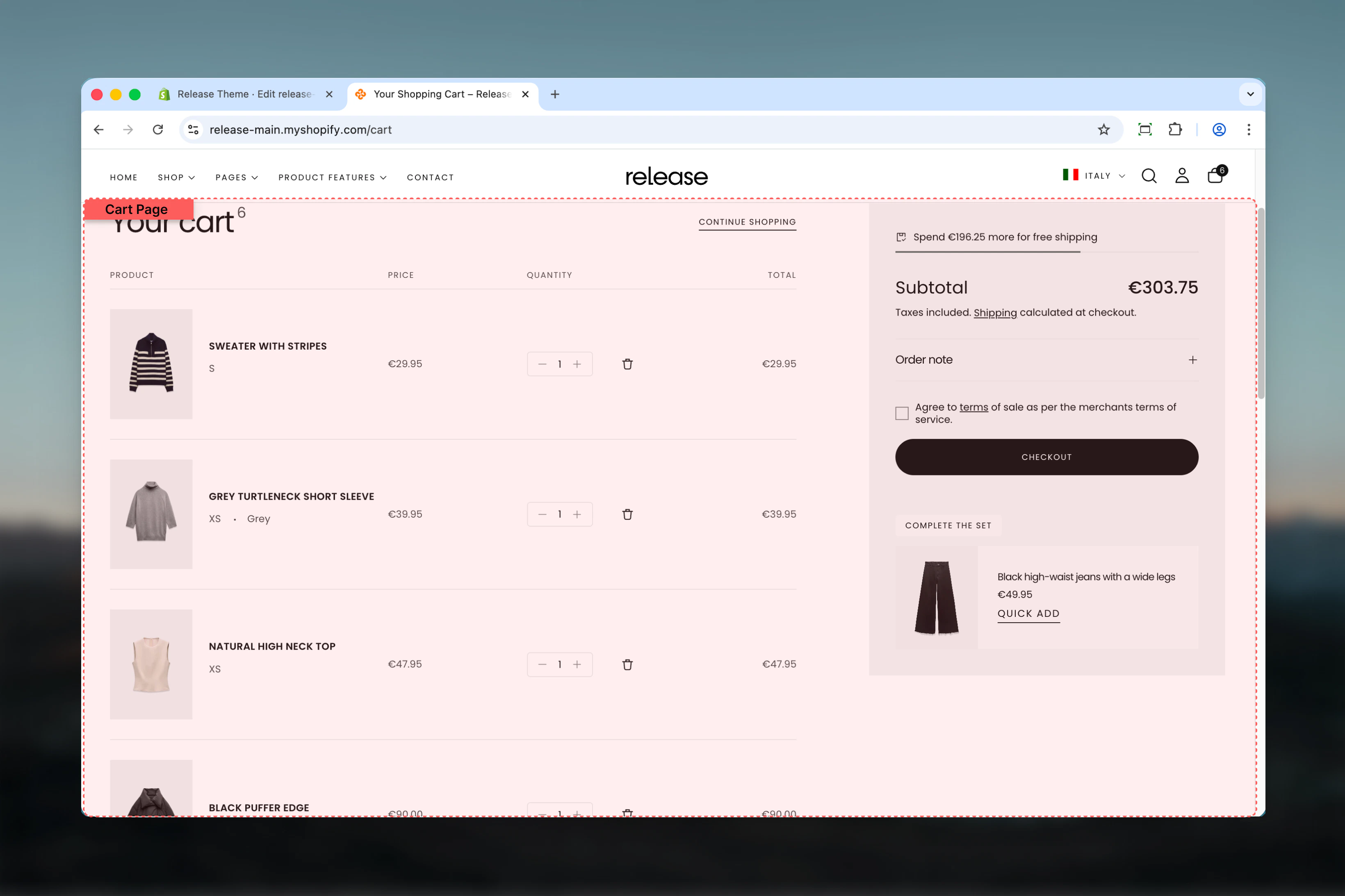
Display free shipping progress and notifications to encourage higher cart values.
Enable shipping notification
Type: Toggle Default: DisabledShow a free shipping notification based on cart price. Displays a progress bar or message showing how much more customers need to spend to qualify for free shipping.When enabled, customers see:
Progress bar showing amount remaining for free shipping
Celebratory message when threshold is reached
Real-time updates as cart value changes
Free shipping notifications can increase average order value by 10-30%. Enable this to encourage customers to add more items.
The notification appears above cart items and updates dynamically as customers adjust quantities or add products.
Threshold cart price
Type: Number input Default: 0 (always free shipping)Minimum cart price value for free delivery qualification. When cart total reaches this amount, free shipping notification shows success message.How it works:
Set to 0 or leave blank: Always shows “Free shipping available”
Set to 50: Shows progress until cart reaches $50
Set to 100: Customers see how much more to add for free shipping
Example values by store type:
Budget stores: 25−35
Mid-range stores: 50−75
Premium stores: 100−150
Set threshold slightly above your average order value to encourage customers to add one more item. If AOV is 45,trya60 threshold.
Ensure this threshold matches your actual shipping settings in Shopify. Don’t promise free shipping here if you charge shipping at checkout.
Configure cart page specific features and customer agreement options.
Terms checkbox text
Type: Text input Default: EmptyText for the terms and conditions checkbox that appears before checkout. Shows a required checkbox that customers must accept before proceeding to checkout.Example terms text:
“I agree to the terms of sale and understand the return policy”
Supports HTML links to your policy pages:
I agree to the <a href="/pages/terms">Terms of Service</a>
Include clickable links to your full terms and privacy policy pages. Use relative URLs like /pages/terms or /policies/terms-of-service.
If you add terms text but don’t specify where to show it (see next setting), the checkbox won’t appear anywhere.
Show cart terms on
Type: Dropdown Options: None, Cart page, Cart drawer, Both Default: NoneChoose where to display the terms checkbox:
None - Terms checkbox is hidden (not recommended if you have terms text)
Cart page - Shows only on full cart page
Cart drawer - Shows only in cart drawer/popup
Both - Shows on both cart page and cart drawer
Choose “Both” for consistent terms acceptance across all cart experiences. This ensures customers always agree to terms regardless of how they checkout.
When terms checkbox is required and unchecked, the checkout button is disabled until customer accepts.
Show dynamic checkout buttons
Type: Toggle Default: EnabledEnable or disable dynamic checkout buttons on the cart page. Dynamic checkout buttons provide express payment options like:
Shop Pay - Shopify’s one-click checkout
Apple Pay - For Apple device users
Google Pay - For Google account users
PayPal - Direct PayPal checkout
Amazon Pay - Amazon account checkout
When enabled:
Customers see express checkout options above standard checkout button
Can complete purchase faster with saved payment info
Typically increases conversion rates by 5-15%
When disabled:
Only standard “Checkout” button appears
Simpler, cleaner cart interface
May be preferred for wholesale or B2B stores
Keep dynamic checkout buttons enabled for most stores. They significantly improve conversion rates by reducing checkout friction.
Third-party apps can sometimes disable these buttons. If enabled but not showing, check for app conflicts.
Configure product recommendations in the cart to increase average order value.
Enable upsell products
Type: Toggle Default: DisabledEnable or disable the display of upsell product recommendations in the cart. When enabled, shows recommended products based on:
First cart product - Primary product in customer’s cart
Shopify Recommendations API - AI-powered product suggestions
Enable upsell products to increase average order value by 15-25%. Most effective for stores with diverse product catalogs and clear product relationships.
Upsell products use Shopify’s native recommendation system. No manual product selection needed - recommendations are automatic and personalized.
Upsell products title
Type: Text input Default: “You may also like”Set the heading text for the upsell products section in the cart.Example titles:
“You may also like”
“Complete your order”
“Recommended for you”
“Frequently bought together”
“Add these to your order”
“Customers also purchased”
“Don’t forget these”
Use action-oriented titles that create urgency or FOMO. “Complete your order” performs better than generic “Related products”.
Color scheme for upsell
Type: Dropdown Default: scheme-1Choose a color scheme for the upsell products section. This controls the background, text, and card styling of recommended products.Available schemes are defined in Theme settings > Colors.Best practices:
Use a contrasting scheme to make upsells stand out
Or use the same scheme as cart for cohesive experience
Test which approach drives more upsell conversions
A subtly different color scheme can draw attention to upsell products without being jarring. Try scheme-2 or scheme-3 if cart uses scheme-1.
Configure optional cart features like order notes.
Enable order notes
Type: Toggle Default: DisabledEnable or disable the order notes feature in the cart. When enabled, displays a text area where customers can add special instructions or messages with their order.Common uses for order notes:
Gift messages
Delivery instructions
Special requests
Customization details
Packaging preferences
Note field appears as:
Text area below cart items
Optional (not required)
Labeled “Order notes” or “Special instructions”
Submitted with order and visible in Shopify admin
Enable for stores selling gifts, custom products, or offering special services. Disable for streamlined checkout with fewer fields.
Order notes appear in order details in Shopify admin. They’re visible on packing slips and can be included in order notifications.
Customize what customers see when their cart is empty.
Button link
Type: URL input Default: /collectionsSet the destination URL for the call-to-action button on the empty cart page. This button helps customers navigate to products when cart is empty.Common button destinations:
/collections - All collections page
/collections/all - All products
/collections/new-arrivals - Latest products
/collections/best-sellers - Popular items
/ - Homepage
/collections/sale - Sale/discounted products
Button text is managed in theme locales under the cart section.
Link to your best-converting collection or featured products. For most stores, new arrivals or best sellers work better than generic “all products”.
Empty cart title and description text are managed via theme locales (language files), not in Theme Customizer. Edit via theme code or language settings.
Control the overall cart page layout, width, and spacing.
Section width
Type: Dropdown Options: max-w-page, max-w-narrow, max-w-fluid, max-w-full Default: max-w-pageMaximum width of the cart page section:
max-w-page - Standard container matching theme width (recommended)
max-w-narrow - Narrower width for focused checkout experience
max-w-fluid - Wider container utilizing more screen space
max-w-full - Full browser width (not recommended for cart)
Use max-w-page (default) for balanced cart layout. Use max-w-narrow for minimal, distraction-free checkout experience.
Color scheme
Type: Dropdown Default: scheme-1Select the color scheme for the cart page section. Available schemes are defined in Theme settings > Colors.
Use your primary/neutral color scheme for cart page. Avoid busy or colorful schemes that distract from checkout.
Spacing top
Type: Dropdown Options: No (0), S (1), M (2), L (4), XL (6) Default: M (2)Padding above the cart section, controlling vertical space from the header.
Medium (M) spacing works well for most stores. Increase to Large (L) for premium stores with spacious design.
Spacing bottom
Type: Dropdown Options: No (0), S (1), M (2), L (4), XL (6) Default: M (2)Padding below the cart section, controlling vertical space to the footer.