What this section controls
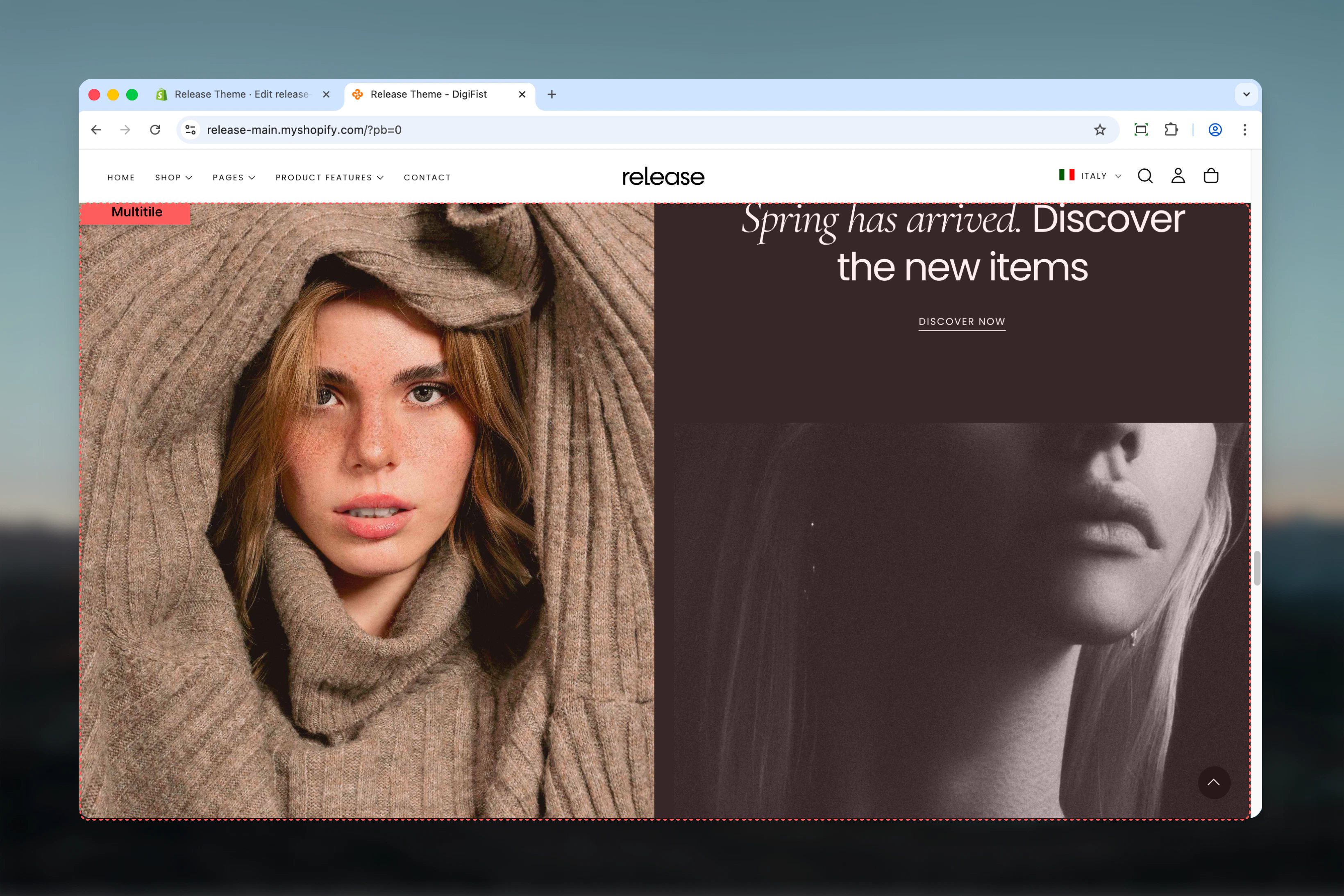
This section controls grid-based layouts with the following capabilities:- Unlimited tile or slideshow blocks
- Custom column and row spanning per tile
- Desktop and mobile-specific visibility
- Flexible aspect ratios and spacing
- Media (images, videos), text, and button support
- Metaobject-powered slideshows
- Responsive layout reordering
How the Multitile section works
The Multitile section uses a flexible grid system:- Add unlimited tile or slideshow blocks
- Control column and row span for each tile
- Set custom aspect ratios and spacing
- Desktop and mobile-specific visibility
- Supports images, videos, products, and slideshows
- Reverse block order on mobile option
Getting started
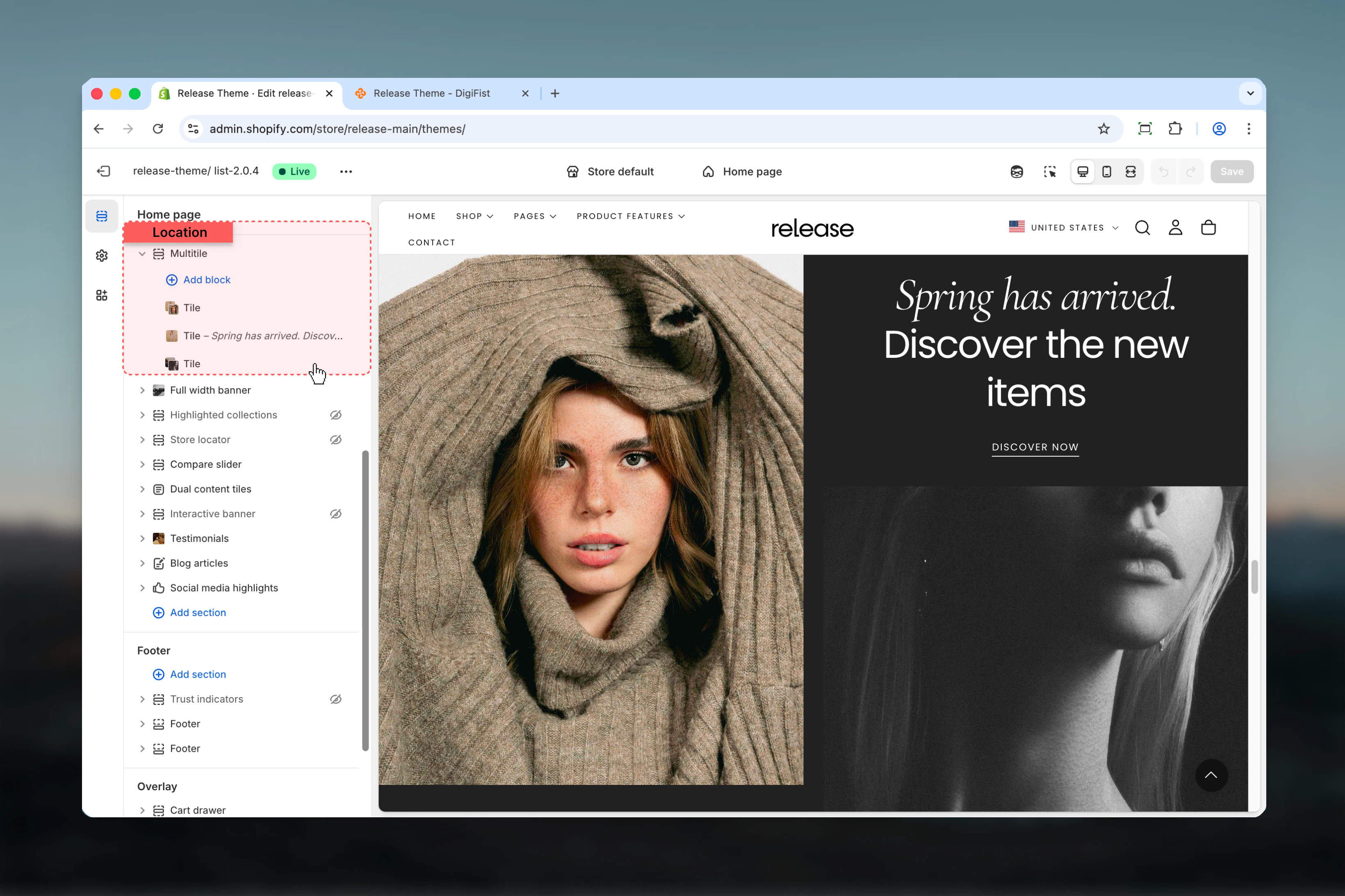
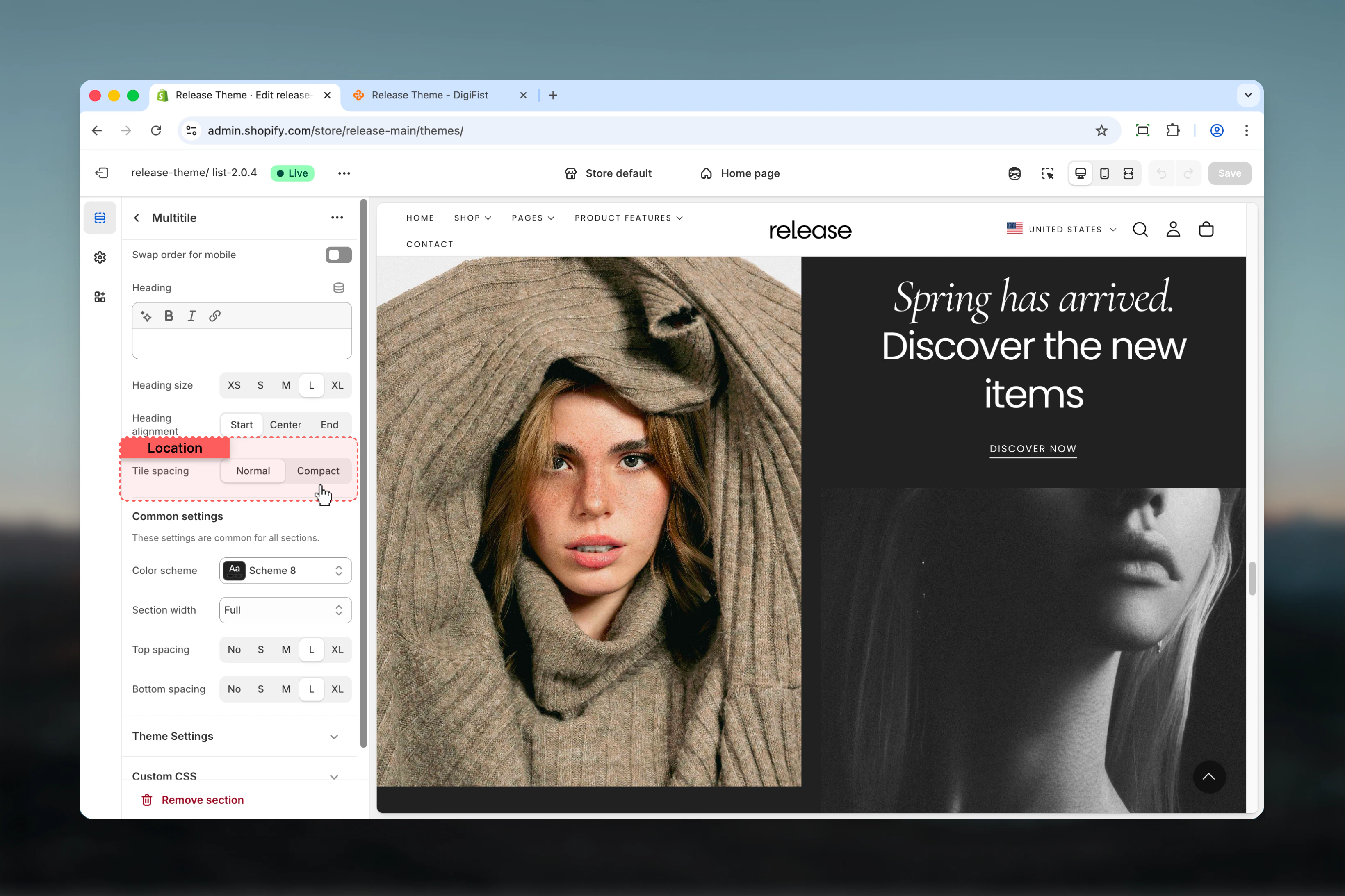
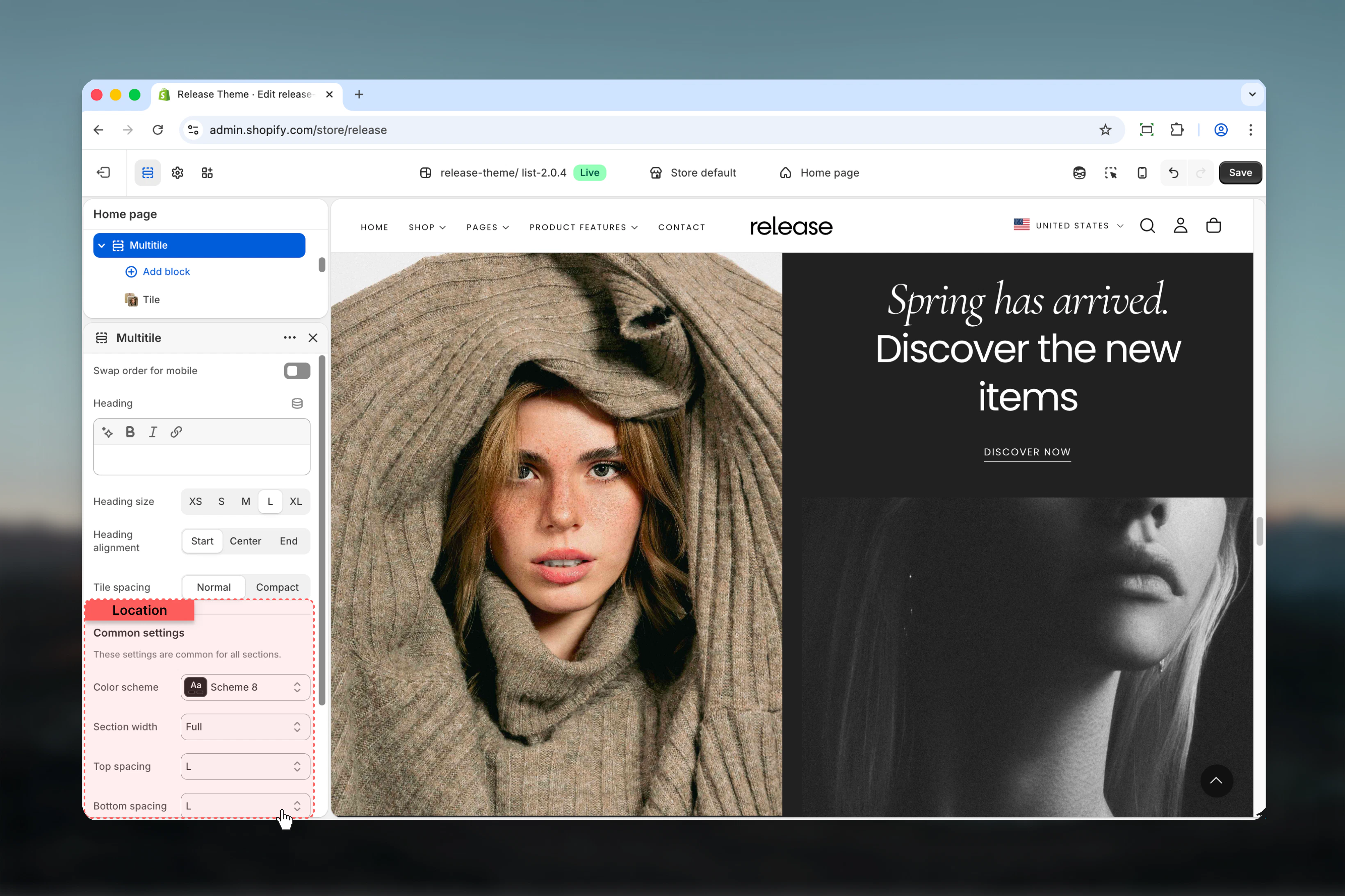
Section settings
Section settings control overall layout, heading, and spacing.- Layout
- Settings
Block order mobile
Reverses the order of blocks on mobile devices.Options: True / FalseDefault: FalseHeading
Optional section heading.- Inline rich text supported (bold, italic, links)
Heading size
Controls the size of section heading.Available options: XS, S, M, L, XLDefault: LHeading alignment
Controls horizontal alignment of heading.Available options: Start, Center, EndDefault: Start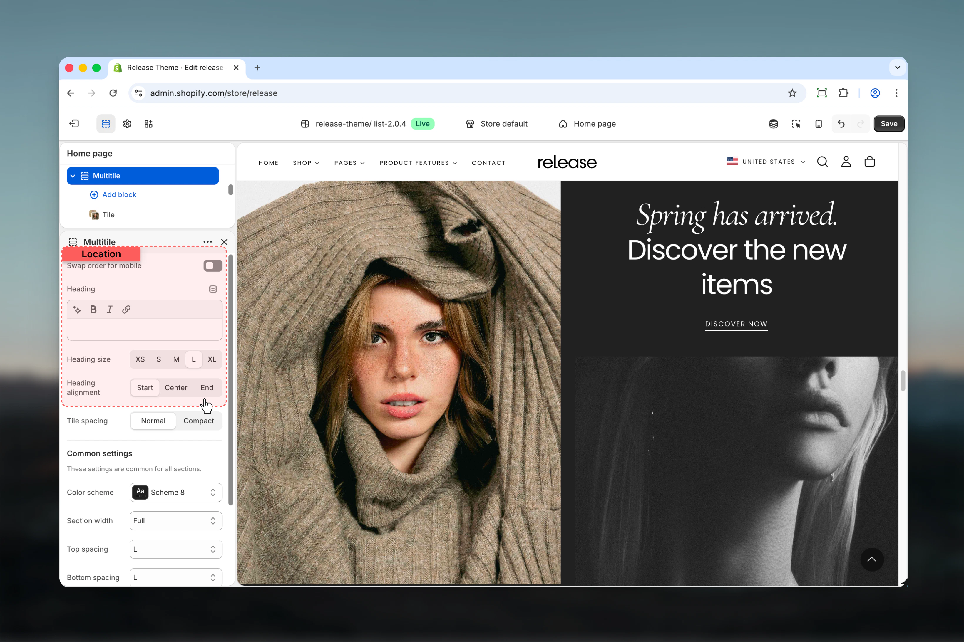
Spacing tile
Controls spacing between tiles.Available options:- Default: Standard spacing
- Compact: No spacing between tiles
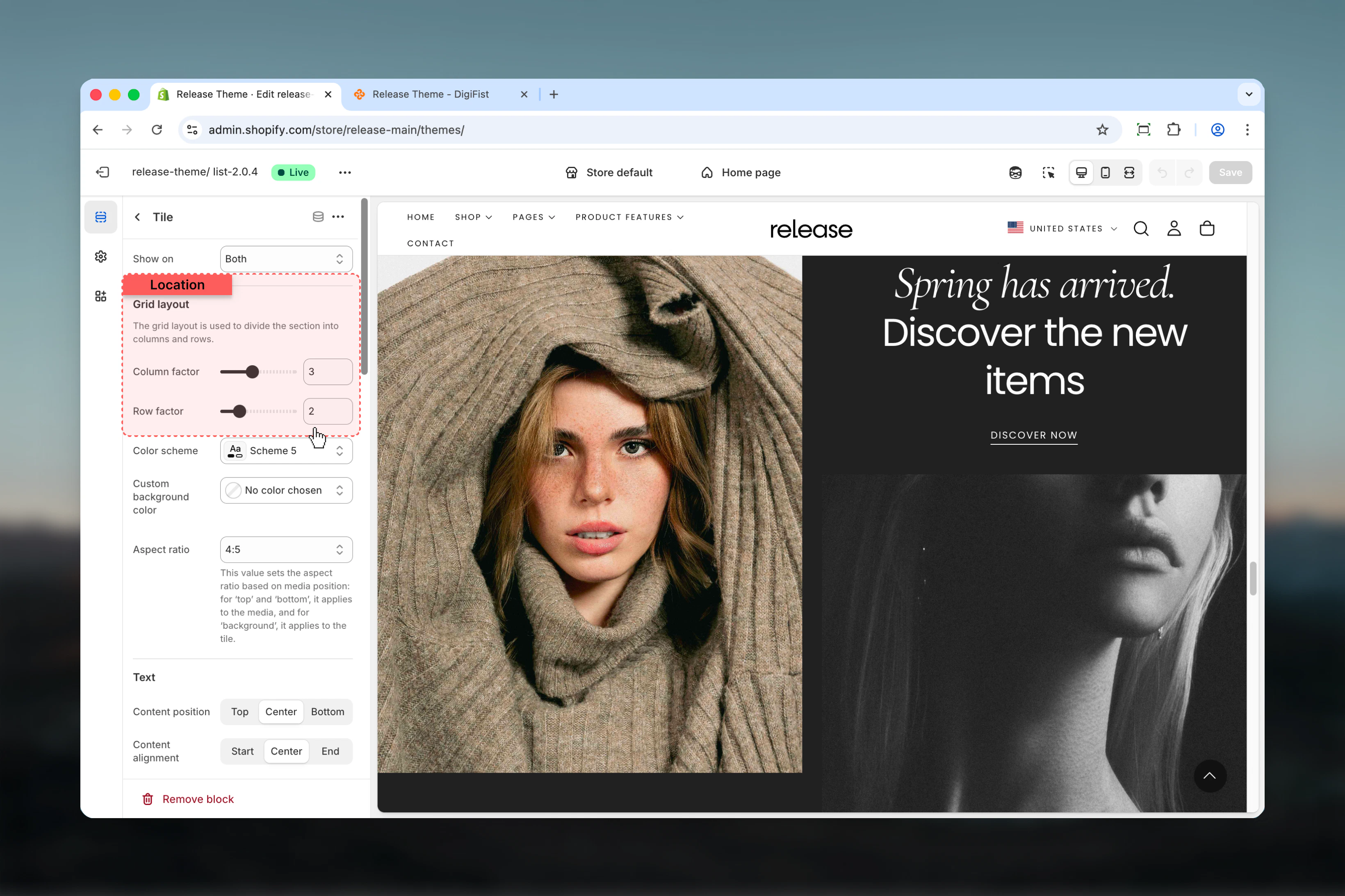
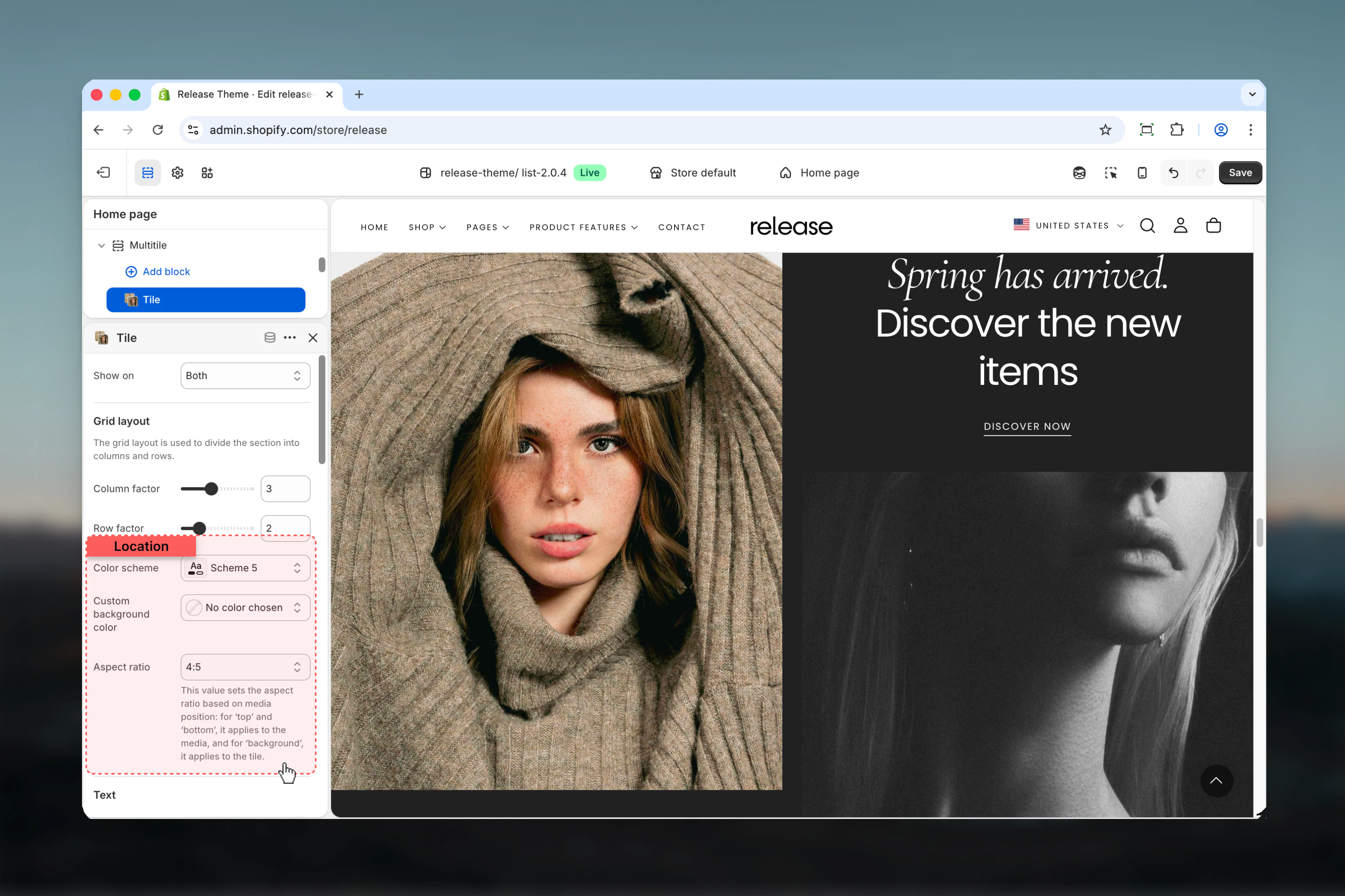
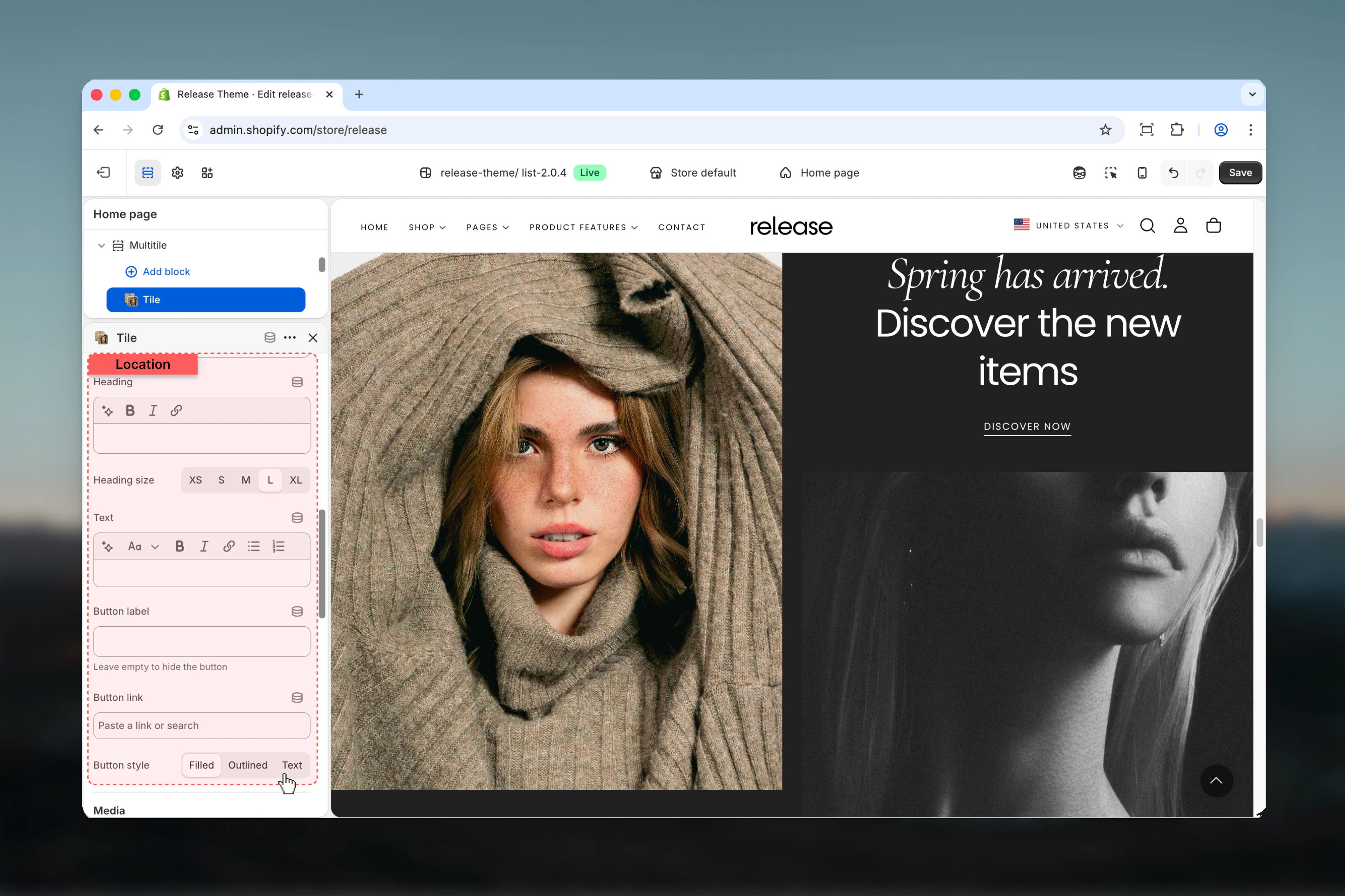
Block settings
The Multitile section supports two types of blocks: Tiles and Slideshows.- Tile Block - Grid
- Tile Block - Styling
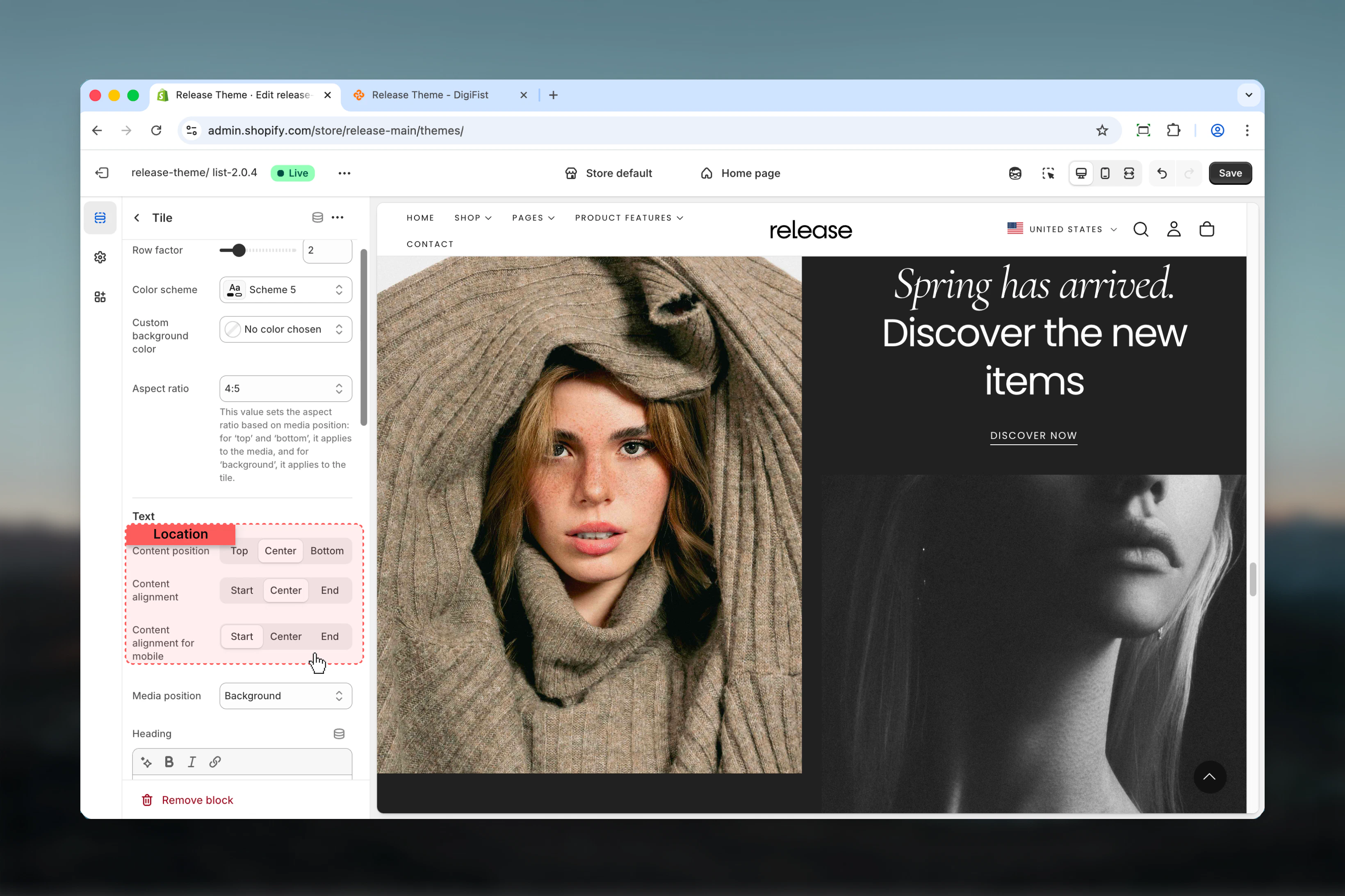
- Tile Block - Content
- Tile Block - Media
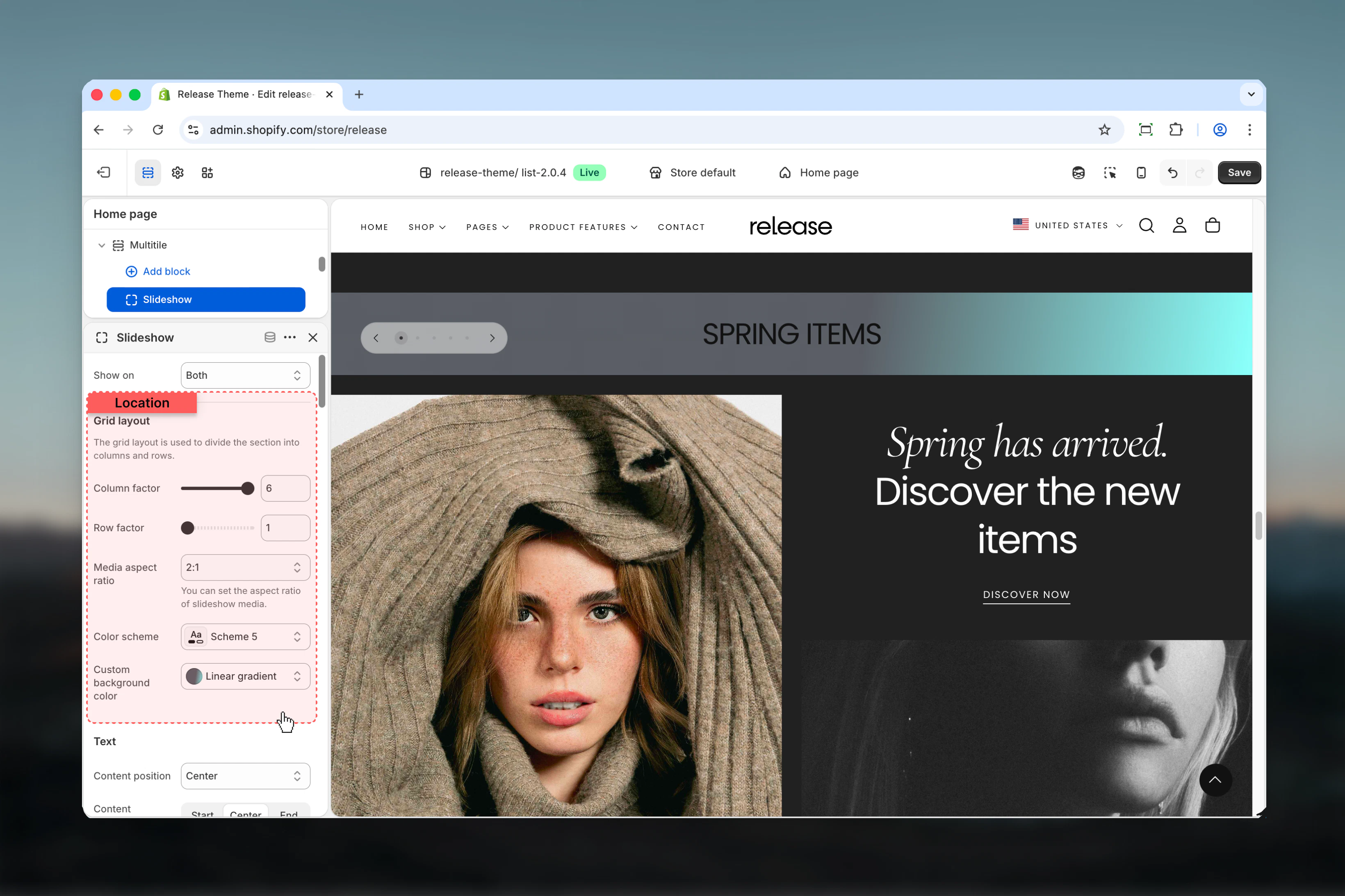
- Slideshow Block
Show on
Controls where the tile is visible.Available options:- Desktop: Desktop only
- Mobile: Mobile only
- Both: All devices
Grid layout
Column factor - Number of columns the tile spansRange: 1 – 6Default: 1Row factor - Number of rows the tile spansRange: 1 – 6Default: 1Controls the tile’s position and size in the grid layout.
Best practices
- Use grid layout strategically - larger tiles (2x2, 3x2) for hero content, smaller (1x1) for supporting elements
- Test grid layout on different screen sizes to ensure proper responsive behavior and avoid awkward gaps
- Use compact spacing for magazine-style layouts without gaps between tiles
- Limit column/row span to 3-4 for optimal mobile experience and readability
- Use consistent aspect ratios across similar tiles for visual harmony and professional appearance
- Desktop and mobile visibility options help create device-optimized layouts with different content priorities
- Background media position works best with overlay content and sufficient text contrast
- Use metaobject slideshows for dynamic content that updates frequently without manual changes
- Keep tile count manageable (6-12 tiles) for performance and user experience
- Use reverse mobile order to prioritize important content on smaller screens
Common use cases
- Homepage hero grids - Create dynamic, magazine-style hero sections with varied content sizes
- Product showcases - Display products in varied sizes to emphasize featured or bestselling items
- Content blocks - Mix text, images, and videos in custom editorial layouts
- Category navigation - Visual grid of categories with varying emphasis on key categories
- Instagram-style galleries - Create social media-inspired grid layouts for visual storytelling
- Feature highlights - Showcase multiple features with mixed content types and sizes
- Promotional campaigns - Design custom promotional layouts with maximum flexibility
Related guides
Common Settings
Learn about common settings shared across sections