What this section controls
This section controls accordion-based content displays with the following capabilities:- Expandable and collapsible content topics
- Individual topic expand/collapse functionality
- Default expanded state configuration
- Rich text or dynamic page content support
- Progressive disclosure for long-form content
- Clean, organized information architecture
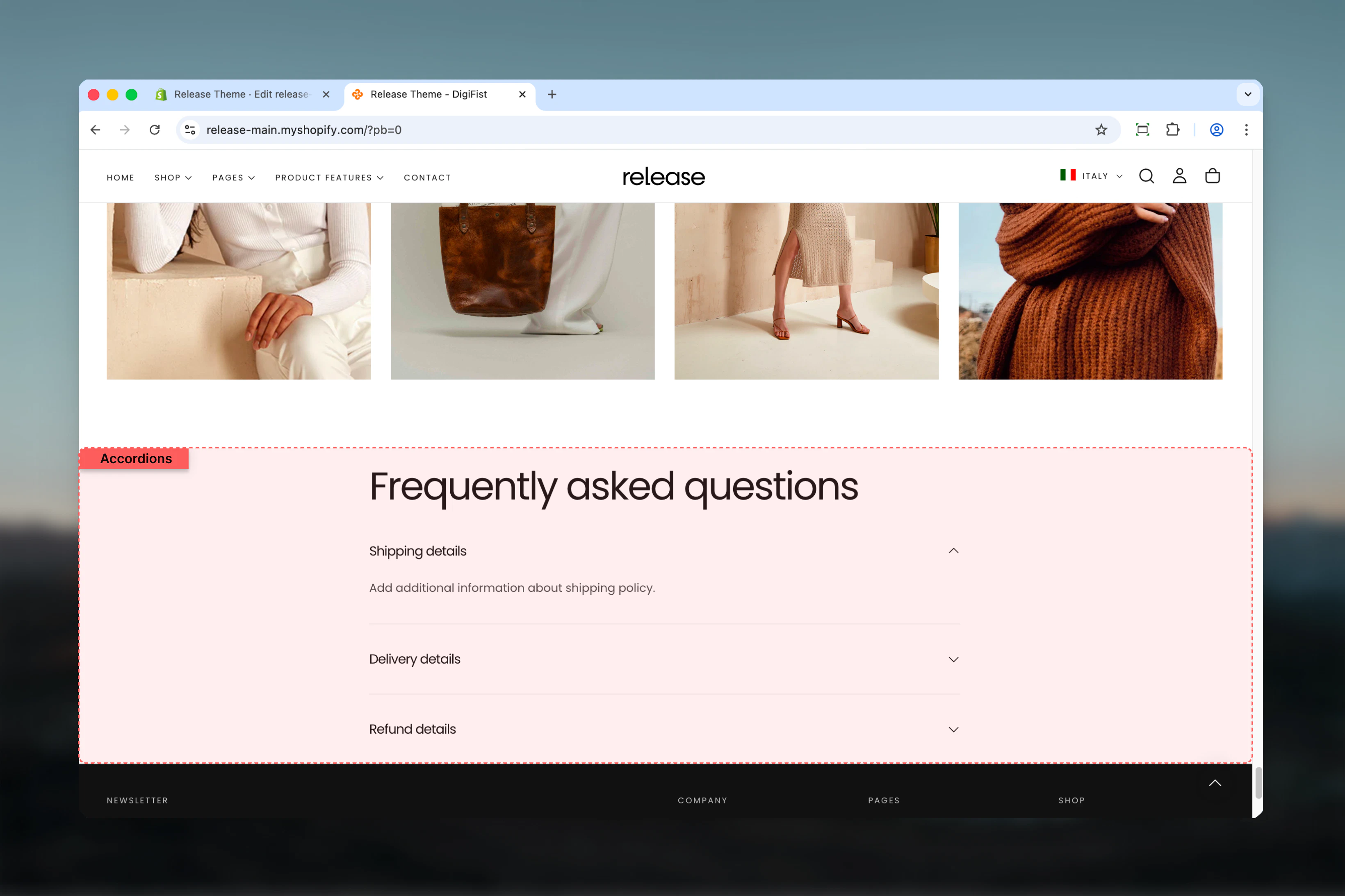
How the Accordions section works
The Accordions section uses a block-based topic system:- Displays content in expandable accordion items
- Each topic can be opened or collapsed independently
- Content can be shown by default on page load
- Supports rich text or dynamic page content
- Helps reduce visual clutter on long pages
Getting started

Section settings
Section settings control the main heading of the accordion group.- Heading
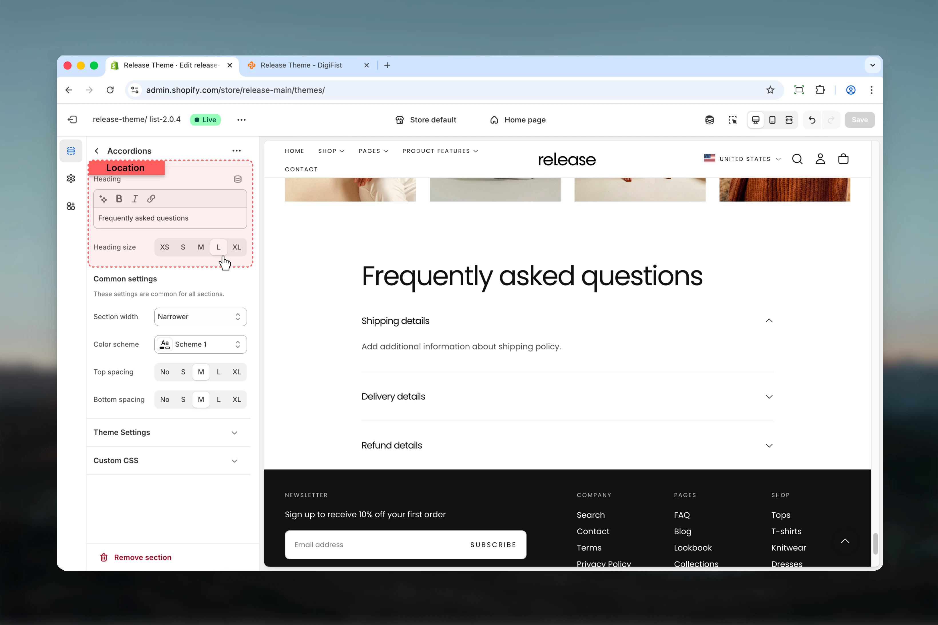
Topic blocks
Topic blocks control individual accordion items. Each block represents a single accordion topic.- Topic settings
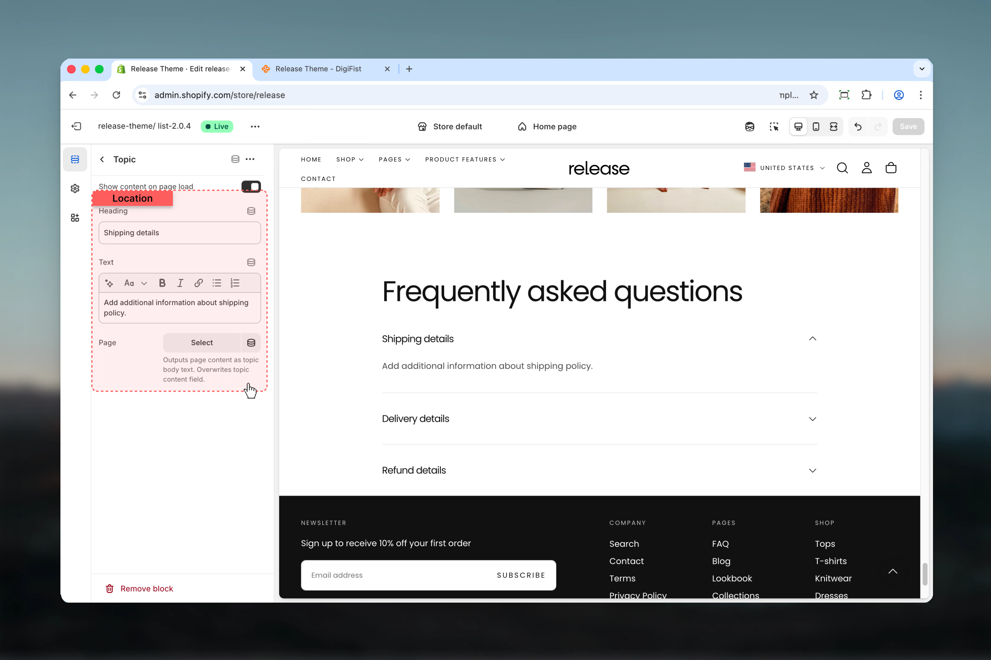
Show content on page load
Controls whether the accordion content is visible when the page loads.- True: Content is expanded by default
- False: Content is hidden until the user clicks the heading
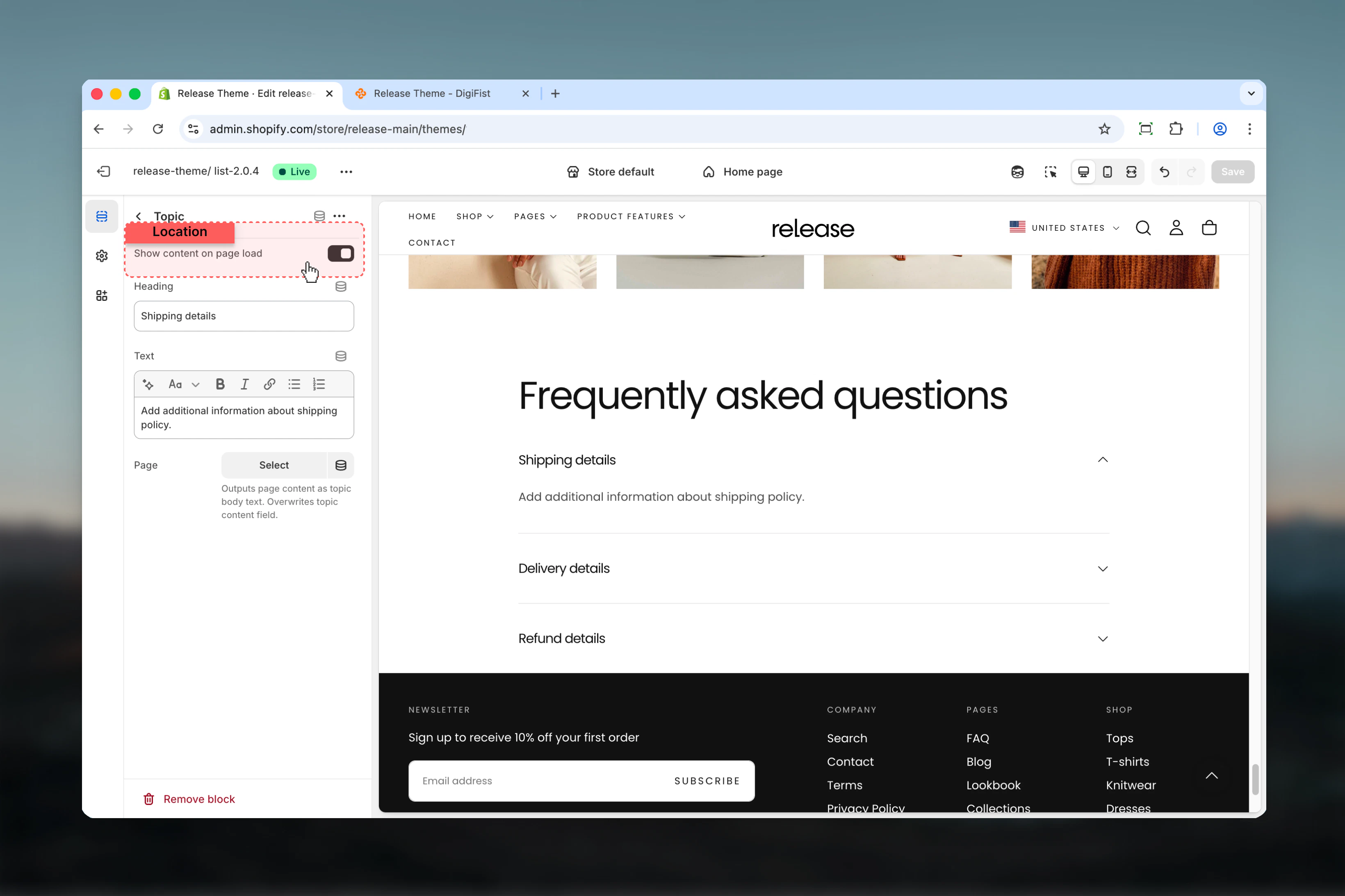
Heading
Title of the accordion topic.- Text input
Text
Main content displayed when the topic is expanded.- Rich text supported
Page
Outputs the content of a selected Shopify page as the accordion body.- Shopify page selector
Best practices
- Keep headings concise and descriptive (5-8 words maximum) for quick scanning
- Avoid opening too many topics by default to maintain clean initial page state
- Use Page content for long or frequently updated information to simplify management
- Group related topics together logically for better user experience
- Ideal for FAQs, size guides, and policy sections where users seek specific information
- Test accordion interactions on mobile to ensure smooth expand/collapse
- Consider using first topic as expanded by default to demonstrate functionality
- Order topics by importance or frequency of access
- Use consistent formatting within accordion content for professional appearance
Common use cases
- Frequently asked questions (FAQ) - Answer common customer questions in organized format
- Shipping and return policies - Display policy details without overwhelming the page
- Product specifications - Show detailed technical information progressively
- Store information - Share operational details like hours, locations, contact methods
- Legal or informational content - Present terms, privacy policies, or guidelines
Related guides
Common Settings
Learn about common settings shared across sections