What this section controls
- Collapsible content blocks (description, shipping, etc.)
- Complementary product recommendations from Shopify Search & Discovery
- Optional featured image display
- Drawer or collapsible block types
- Link to page blocks
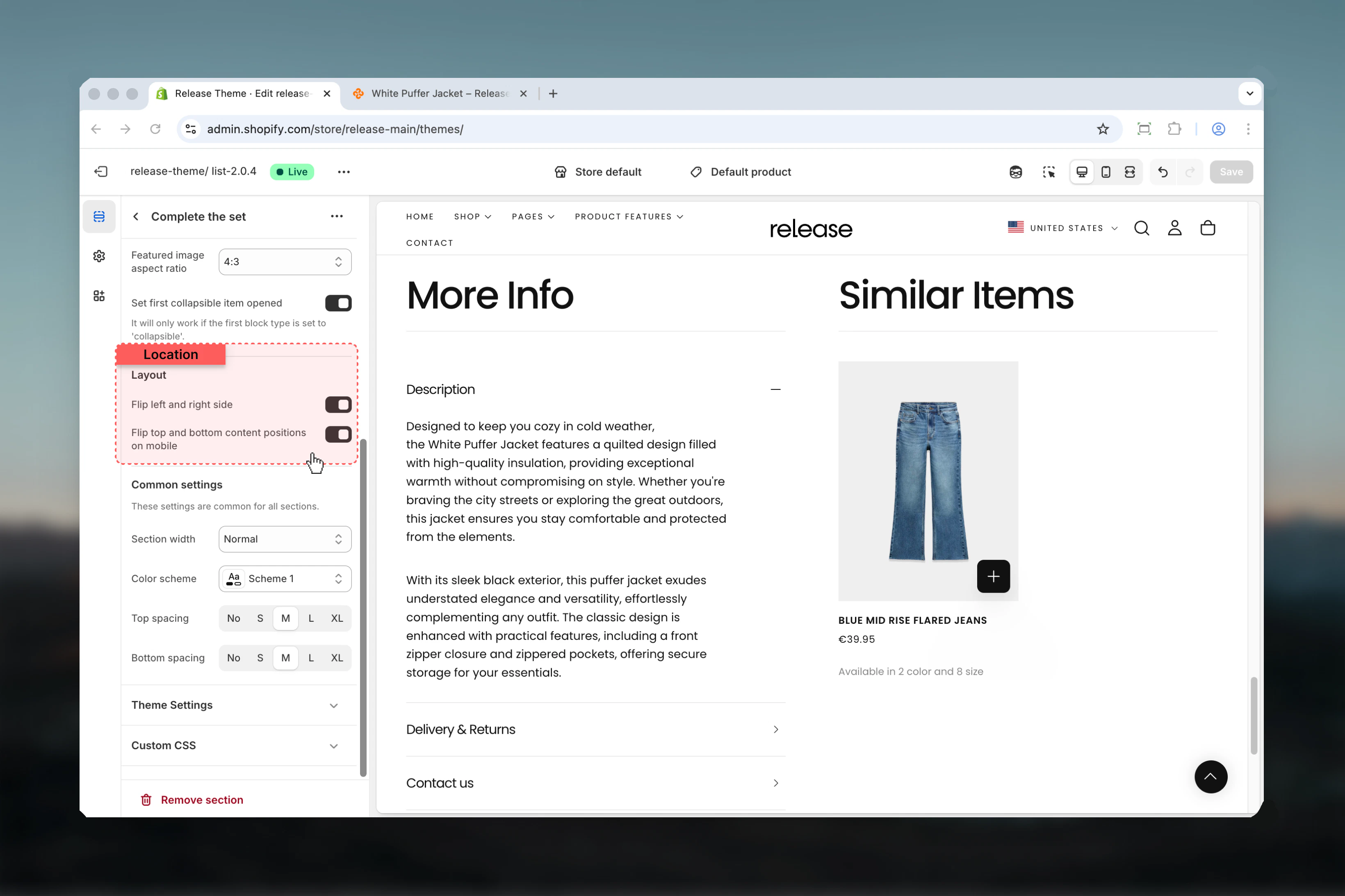
- Desktop and mobile layout flip options
Getting started
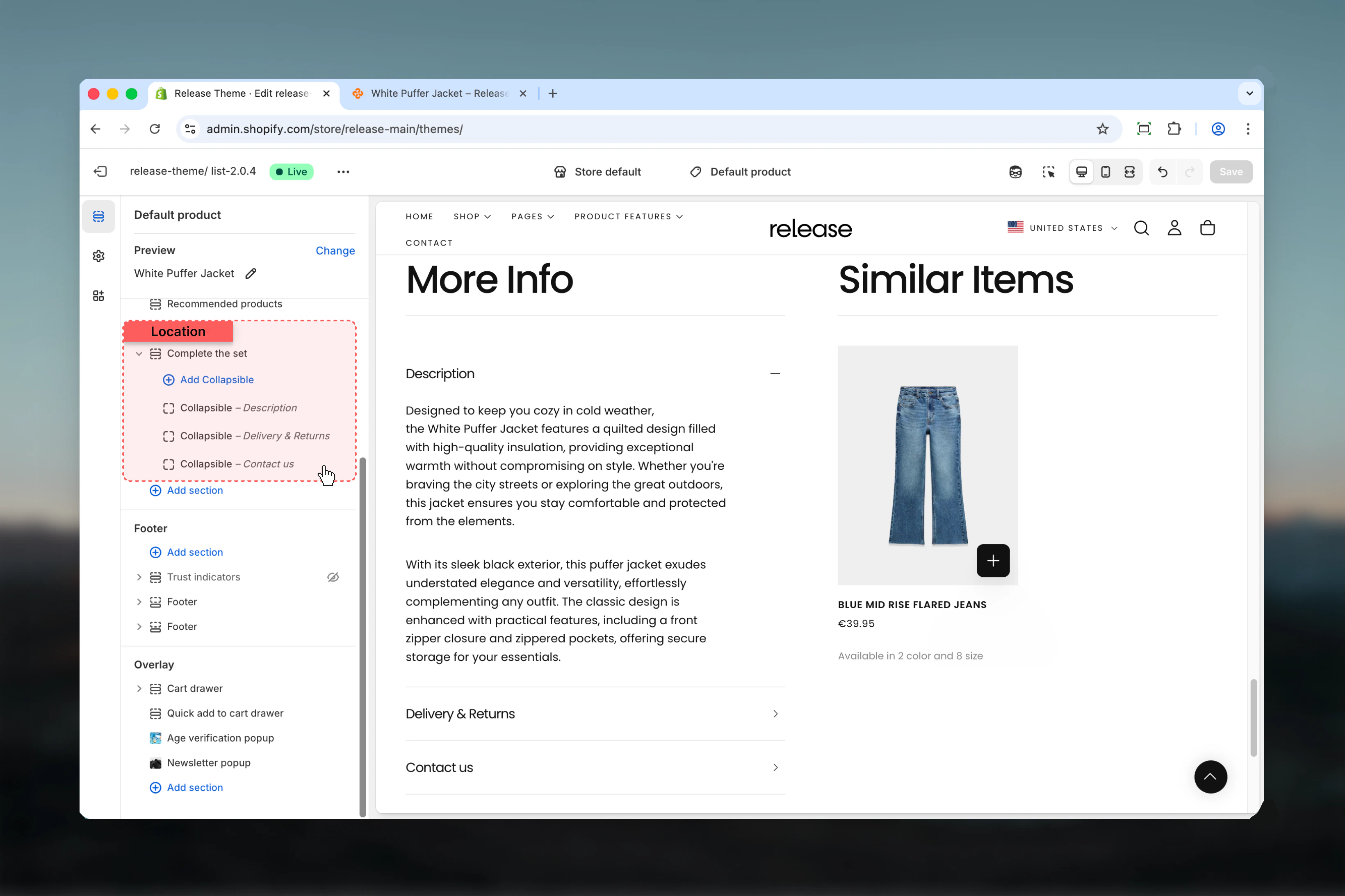
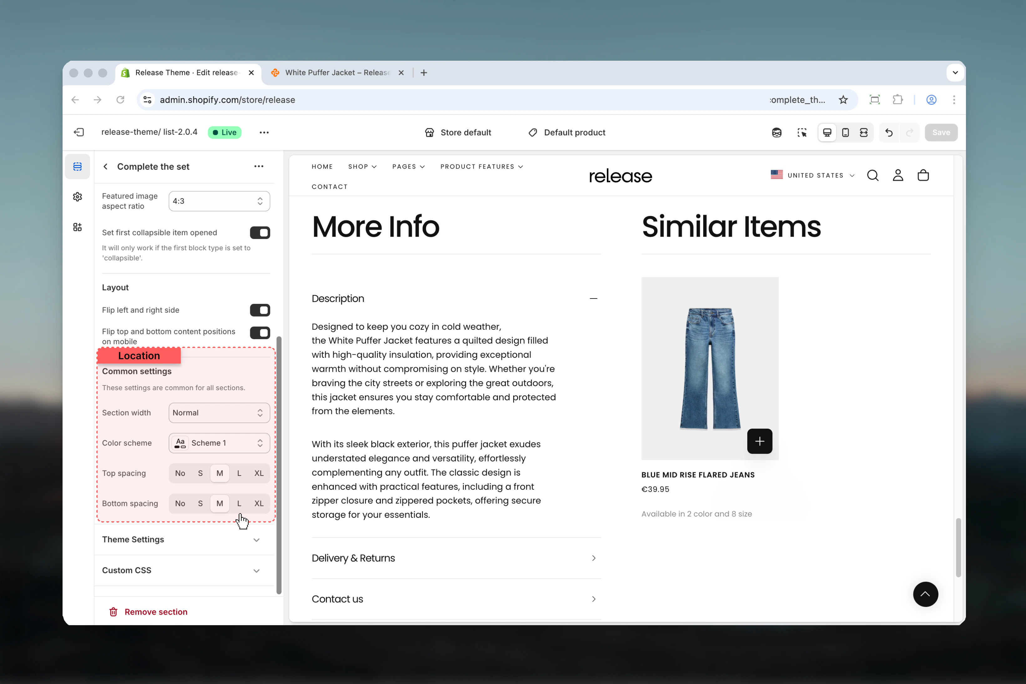
Section settings
- Content
- Layout
- Settings
Heading
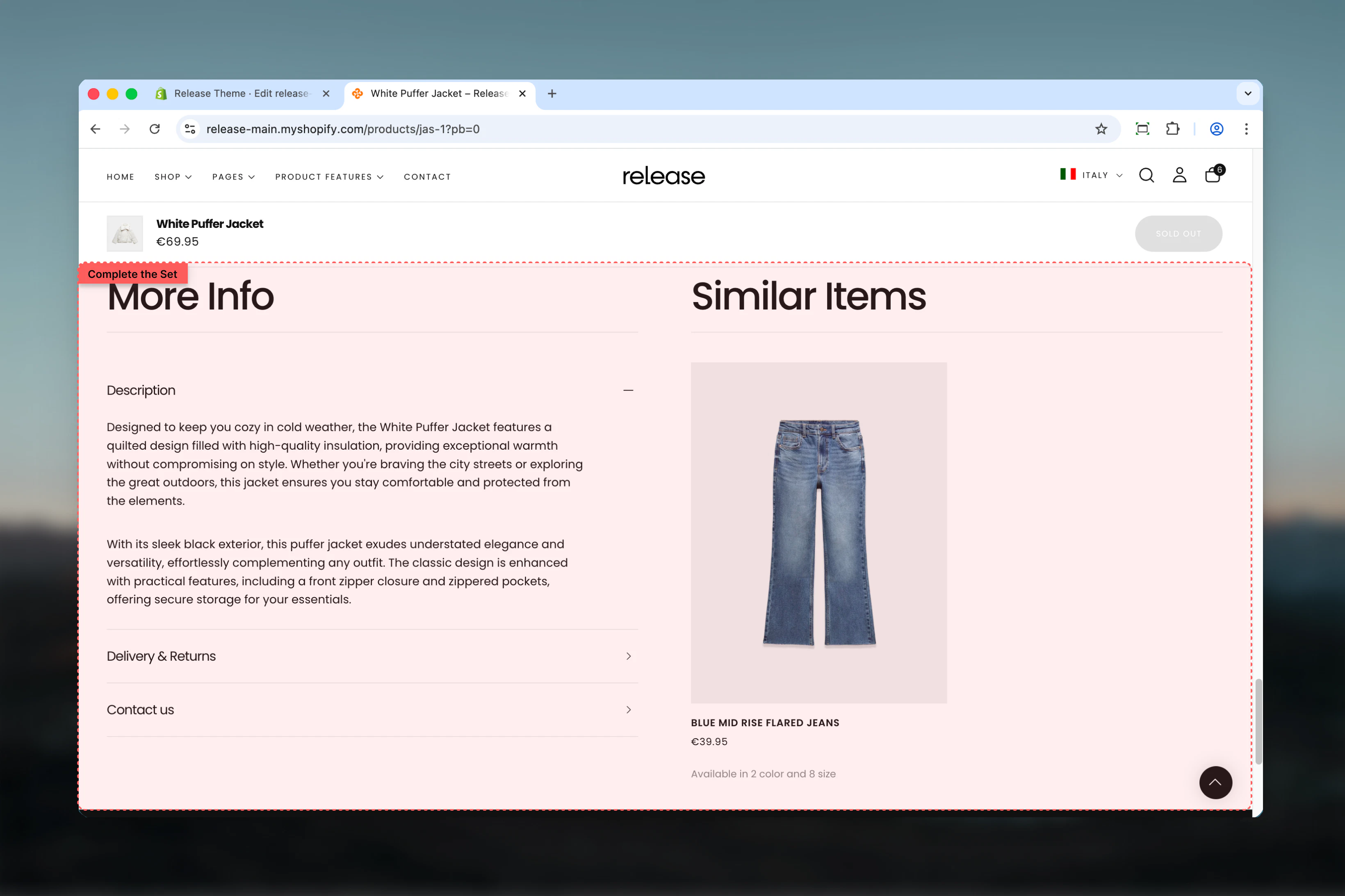
Main section heading.- Inline rich text
- Default: “More info”
Content heading
Heading for the complementary products or featured image area.- Inline rich text
- Default: “Similar items”
Heading size
Controls size of both headings.Available options: XS, S, M, L, XLDefault: LContent type
Controls what appears alongside collapsible content.Available options:- None: Only collapsible blocks
- Featured image: Display a custom image
- Complementary products: Show product recommendations
Complementary products are customizable through the Shopify Search & Discovery app. Learn more
Featured image
Image to display when content type is “Featured image”.- Shopify image picker
Featured image aspect ratio
Controls aspect ratio of featured image.Available options: Auto, 1:1, 3:4, 4:3, 16:9Default: 4:3Set first collapsible item opened
Opens the first collapsible block by default.Default: True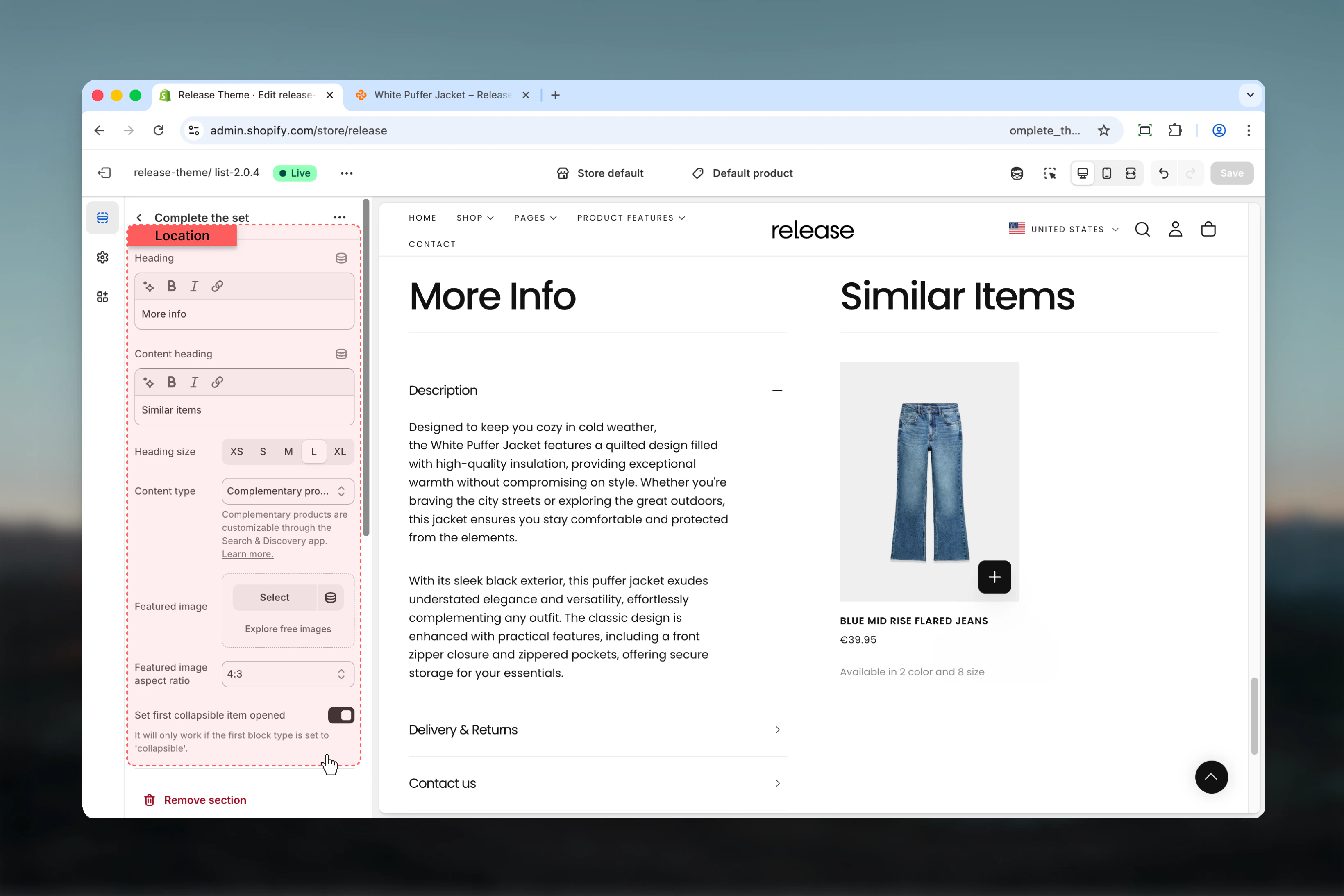
Block settings
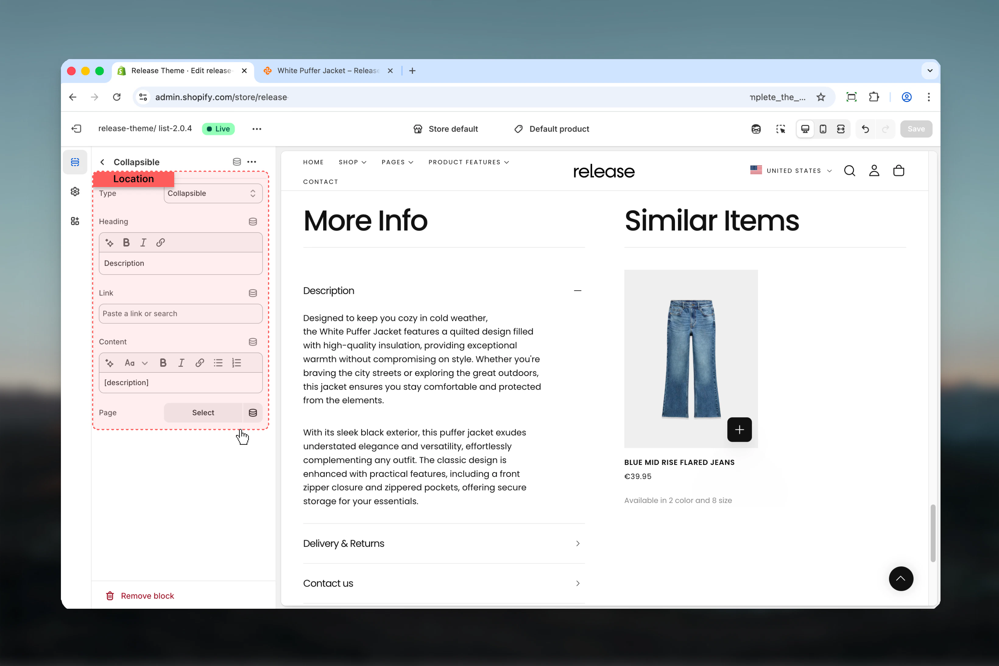
Collapsible Block
- Type & Content
Type
Controls how the content is displayed.Available options:- Collapsible: Expands/collapses inline
- Drawer: Opens in a slide-out drawer
- Link to page: Links to another page
Heading
Title for the collapsible item.- Inline rich text
- Default: “Content”
Link
URL for link type blocks.- Shopify URL selector
Content
Rich text content for the block.- Rich text editor
- Use
[description]to show product description dynamically
Page
Link to a specific page for content.- Shopify page picker
If page is selected, the content setting will be ignored.
Best practices
- Use “Complementary products” content type to increase average order value
- Set first collapsible (product description) to open by default for better UX
- Use drawer type for lengthy content like shipping policies or size guides
- Use collapsible type for quick-scan information like materials or care instructions
- Place most important information (description) as first block
- Use
[description]placeholder to keep product info synchronized - Consider flipping mobile layout to prioritize product recommendations on smaller screens
- Link to dedicated pages for detailed policies rather than including lengthy text
- Keep collapsible headings concise (2-4 words) for better mobile experience
- Use featured image option to showcase product lifestyle or detail shots
Common use cases
- Product details organization - Organize description, specs, shipping in collapsibles
- Cross-selling - Display complementary products to increase cart value
- Size guides - Use drawer type for detailed sizing information
- Shipping policies - Link to shipping policy page or include brief details
- Care instructions - Collapsible block for product care and maintenance
- Warranty information - Drawer for detailed warranty terms
- Material details - Collapsible for fabric composition or materials
- Brand story - Featured image option with brand imagery
Related guides
Product Page
Learn more about product page customization
Common Settings
Learn about common settings shared across sections