What this section controls
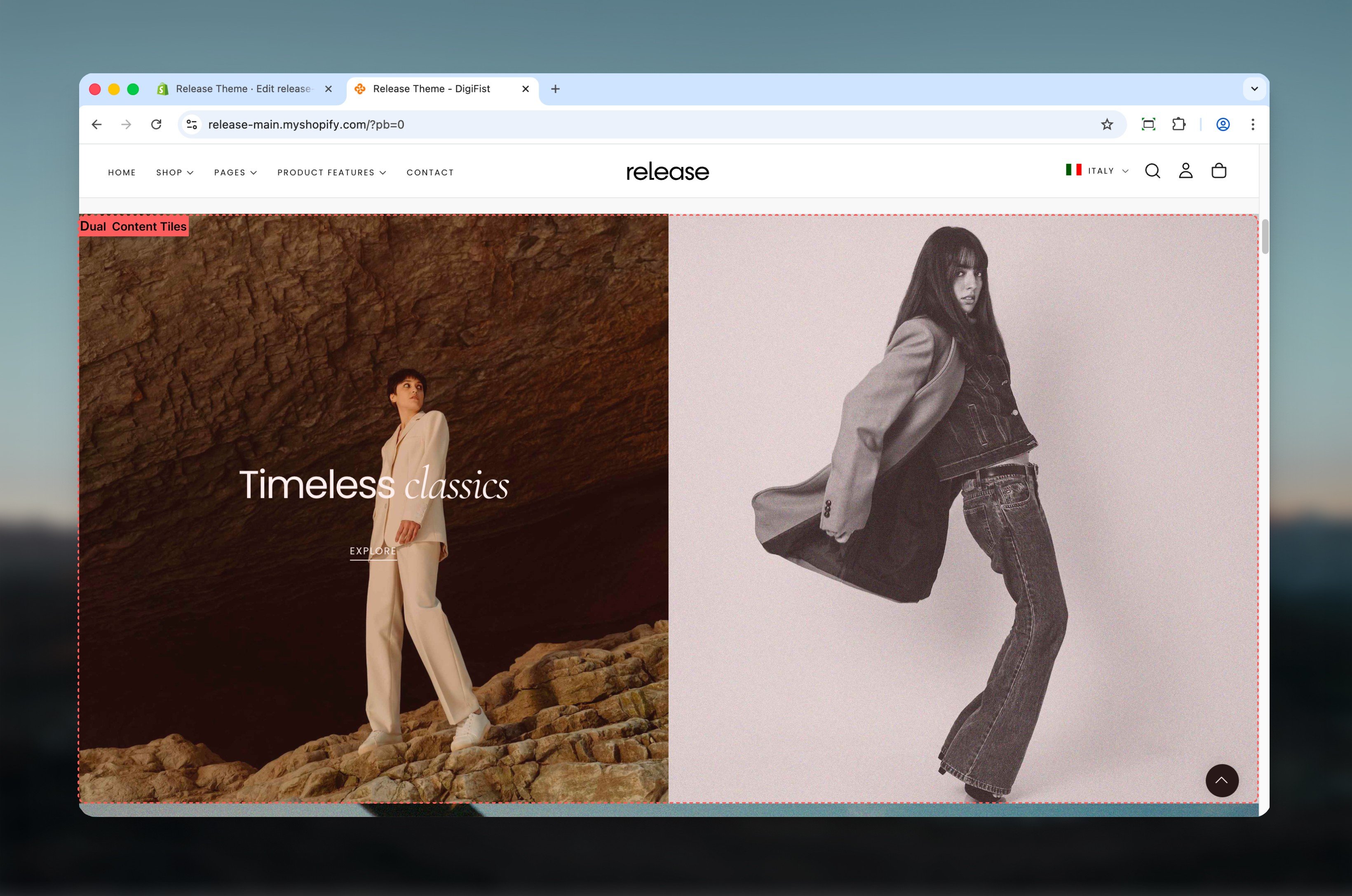
This section controls dual-tile layouts with the following capabilities:- Two side-by-side content areas with independent configuration
- Flexible tile sizing and spacing options
- Desktop and mobile-specific media and positioning
- Optional product card integration within tiles
- Rich text content with buttons and media support
How the Dual Content Tiles section works
The Dual Content Tiles section uses a block-based system:- The section supports a maximum of 2 tiles
- Each tile is added as a block
- Tile sizes and alignment are controlled at the section level
- Content, media, and product behavior are controlled at the block level
Getting started
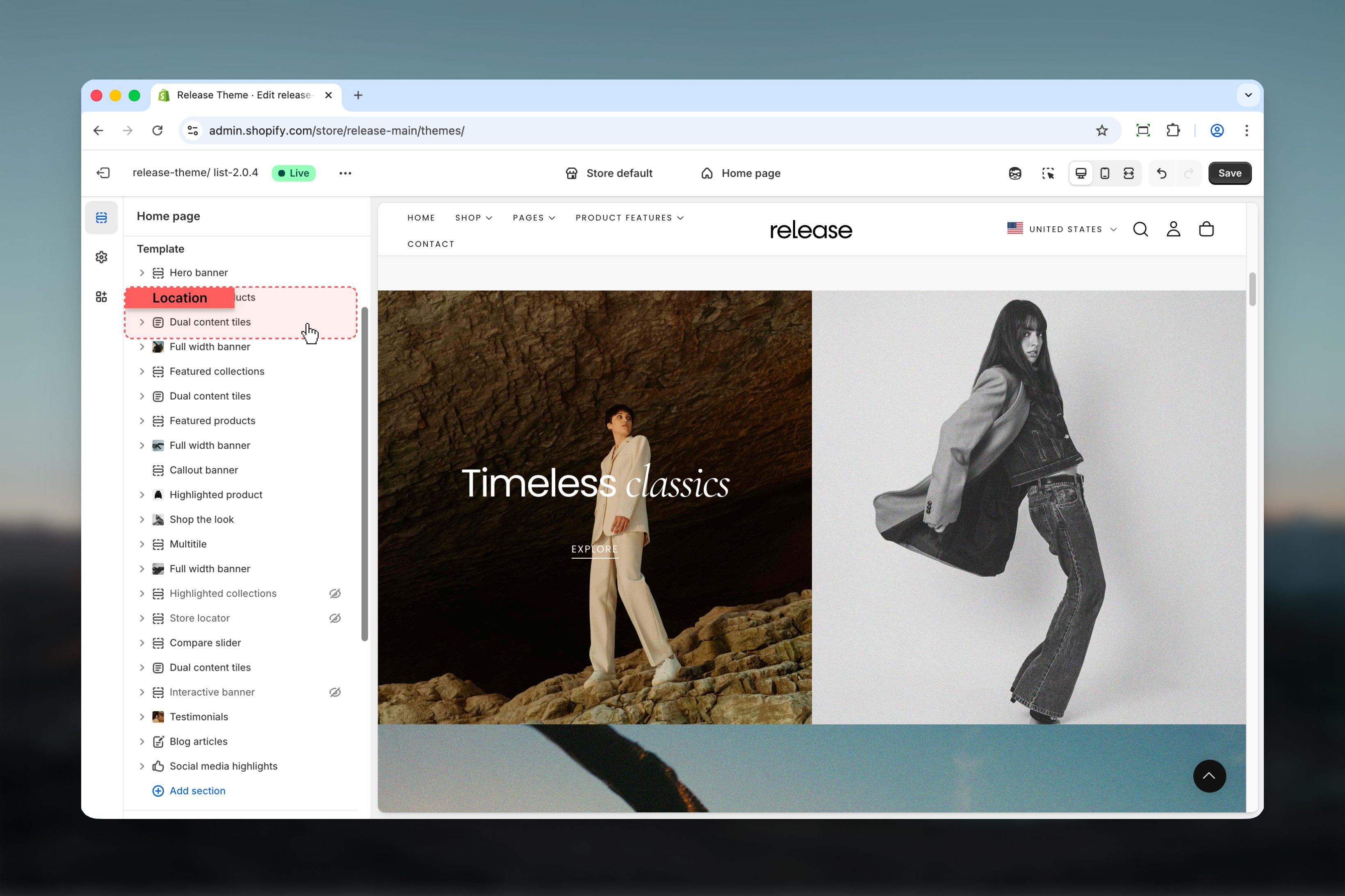
Section settings
Section settings control the overall layout and behavior of both tiles.- Layout
- Heading
Section layout
Controls the spacing between the two tiles.Available options:- Normal: Tiles are visually separated
- Compact: Tiles are displayed without spacing and appear attached
First block size
Controls the width and height of the first tile. The second tile is automatically adjusted based on this selection.Available options: Full, Half, Large, Small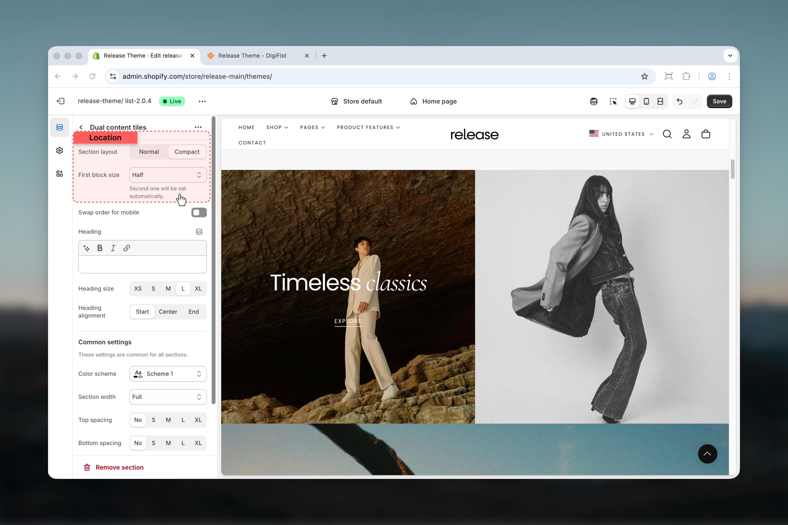
Swap order for mobile
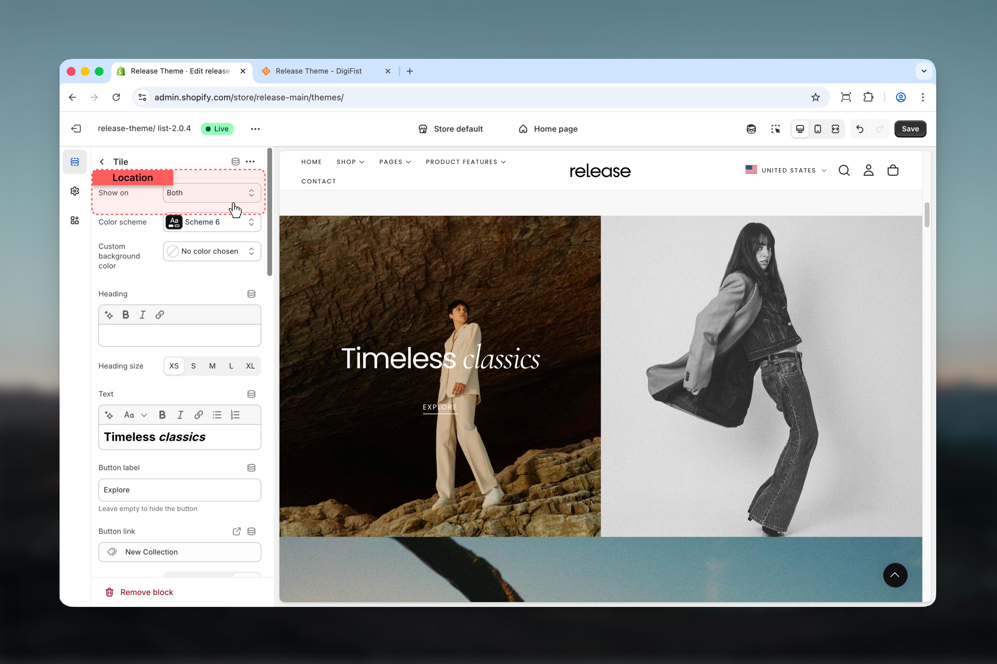
Reverses the tile order on mobile devices.Options: True / FalseBlock settings
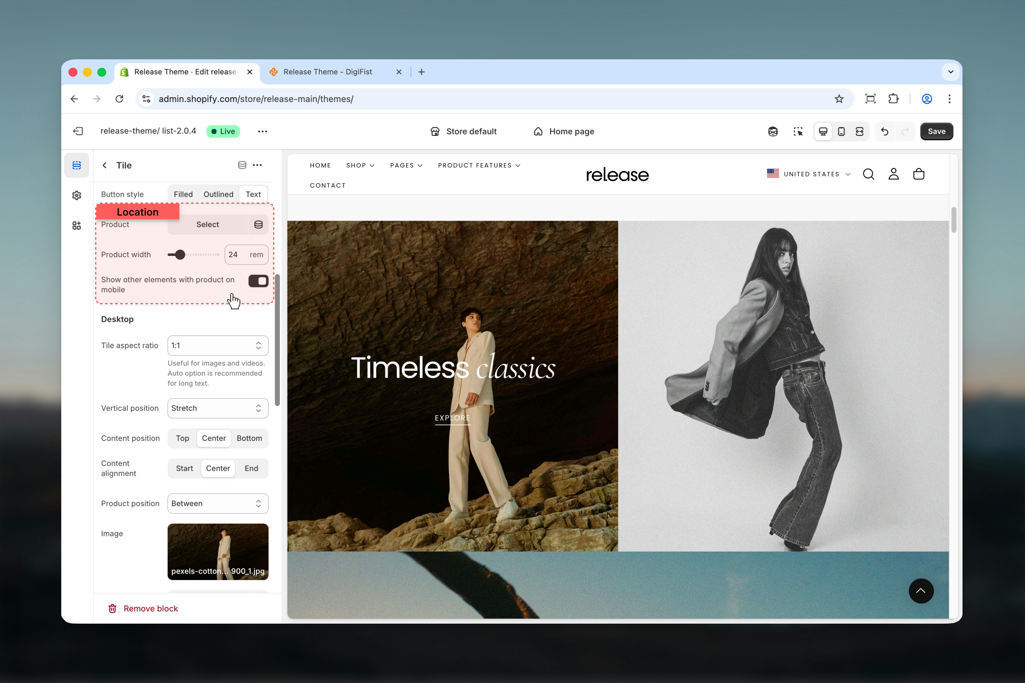
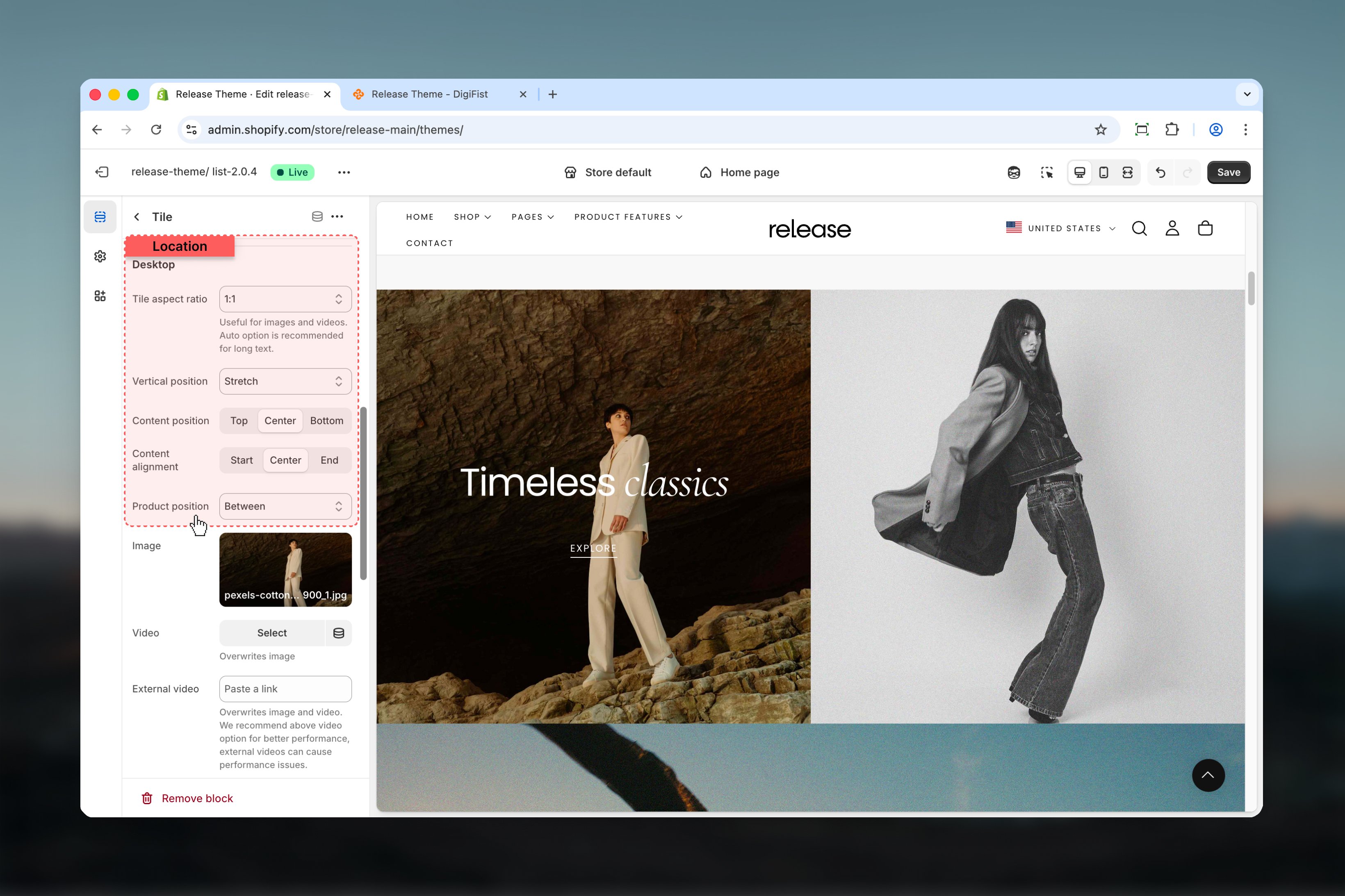
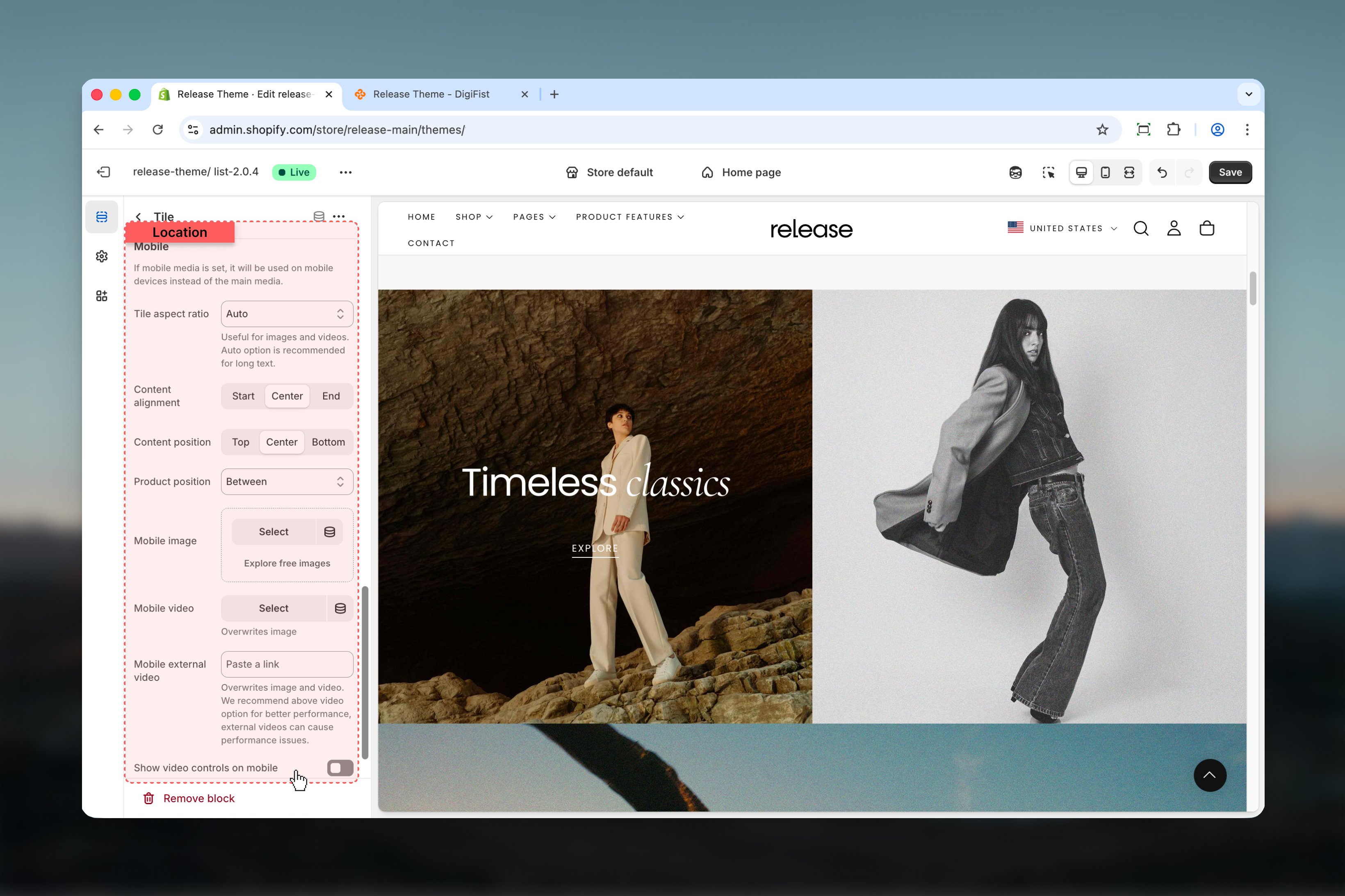
Block settings configure each tile independently. Each tile represents a unique content area with its own media, text, and optional product.- Visibility
- Background
- Content
- Product
- Desktop media
- Mobile media
Best practices
- Use Compact layout for visually continuous designs and seamless transitions
- Limit content length when using fixed aspect ratios to prevent layout issues
- Be cautious when increasing product width as it may affect tile height
- Prefer Shopify-hosted videos over external videos for better performance
- Test mobile layouts when using product-only mobile views to ensure content visibility
- Ensure tiles have similar content lengths for visual balance
- Use high-quality images that maintain clarity at various aspect ratios
- Consider color scheme contrast when placing products within tiles
Related guides
Product cards
Learn about product card configuration and styling options
Theme settings
Understand global theme configuration options