What this section controls
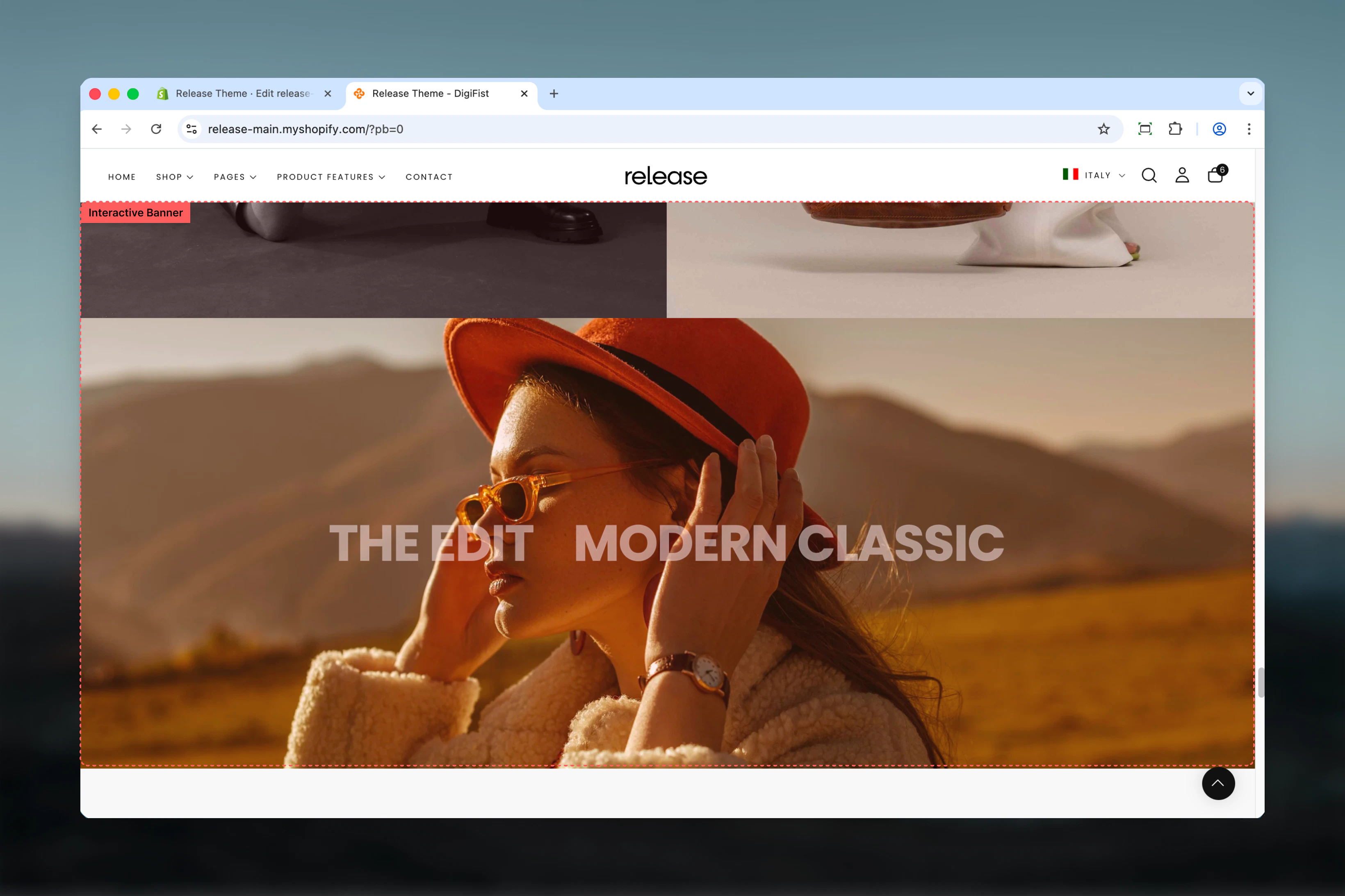
This section controls interactive banner displays with the following capabilities:- Multiple slides with hover-triggered media changes
- Layered headings that act as navigation triggers
- Separate desktop and mobile media configuration
- Click-through functionality with custom links
- Up to 5 slides per section
- Customizable banner height and content width
How the Interactive Banner works
The Interactive Banner uses a block-based slide system:- Displays multiple headings layered on top of a single banner area
- The first slide is active by default
- Hovering over a heading changes the background media with an animation
- Clicking a heading navigates to its assigned link
- Supports both images and videos
- Desktop and mobile media can be configured separately
- Maximum of 5 slides per section
Getting started
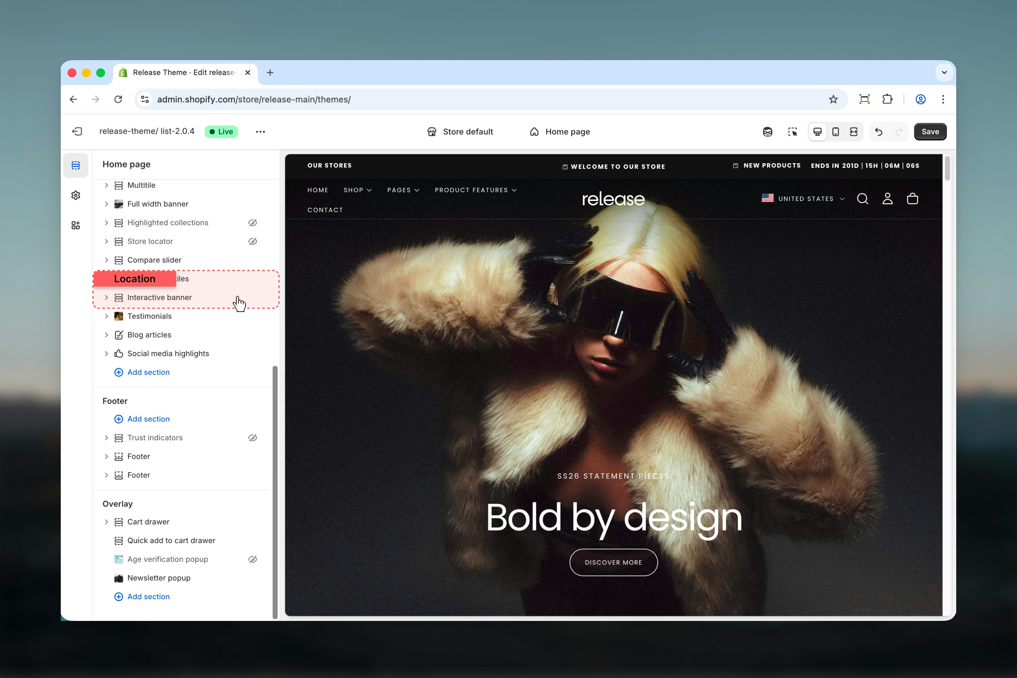
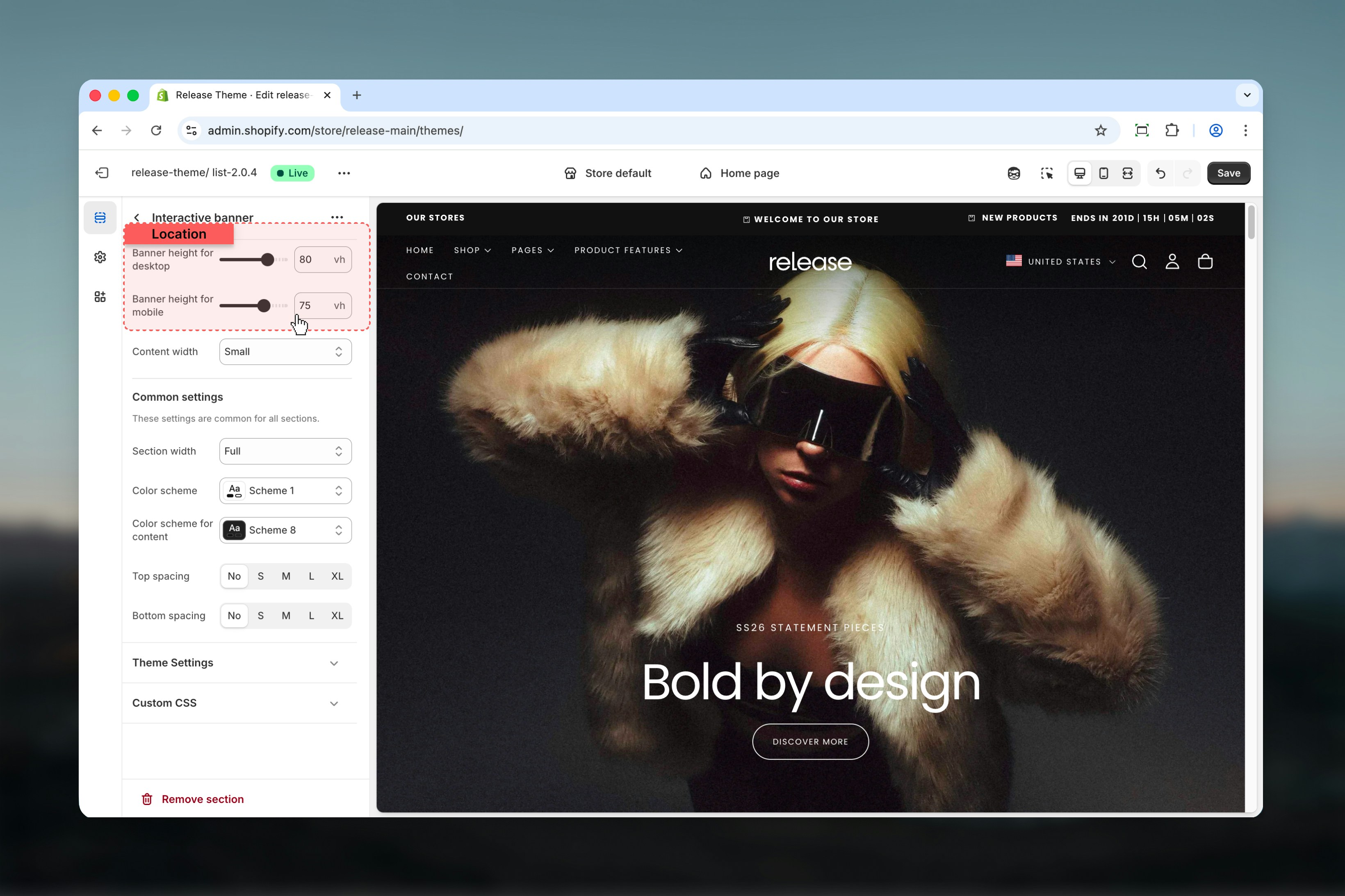
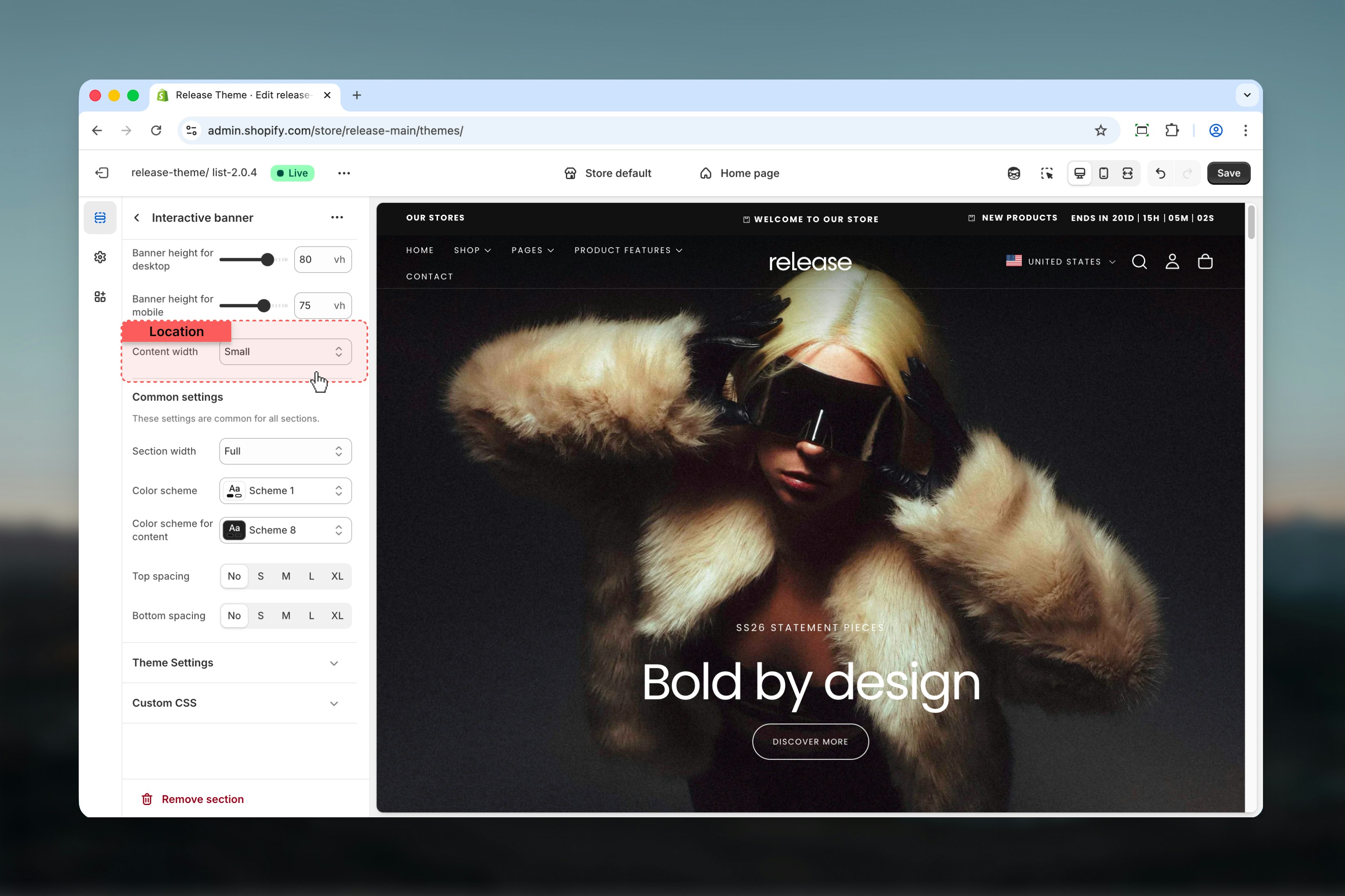
Section settings
Section settings control the overall size and layout of the banner.- Content width
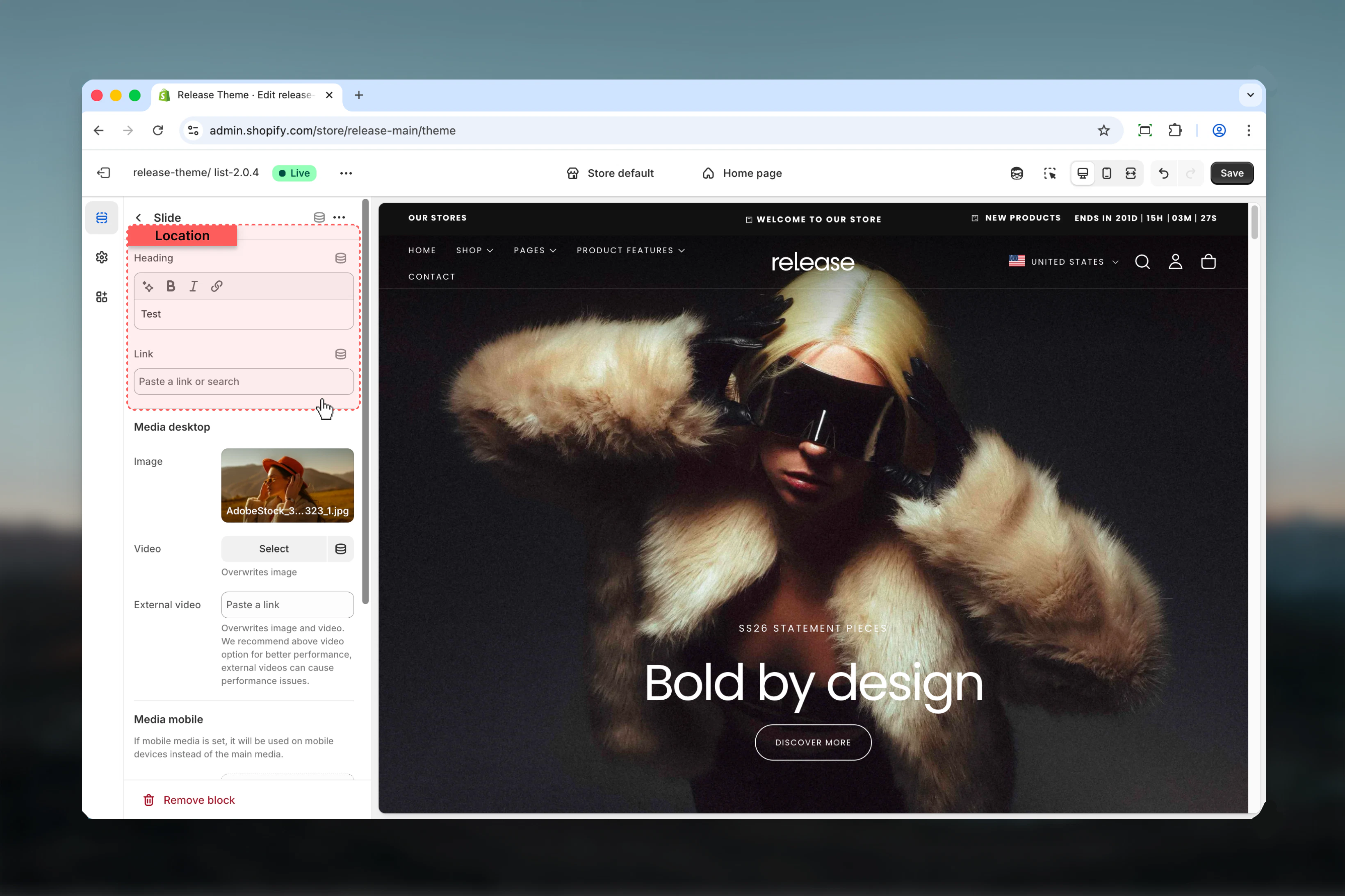
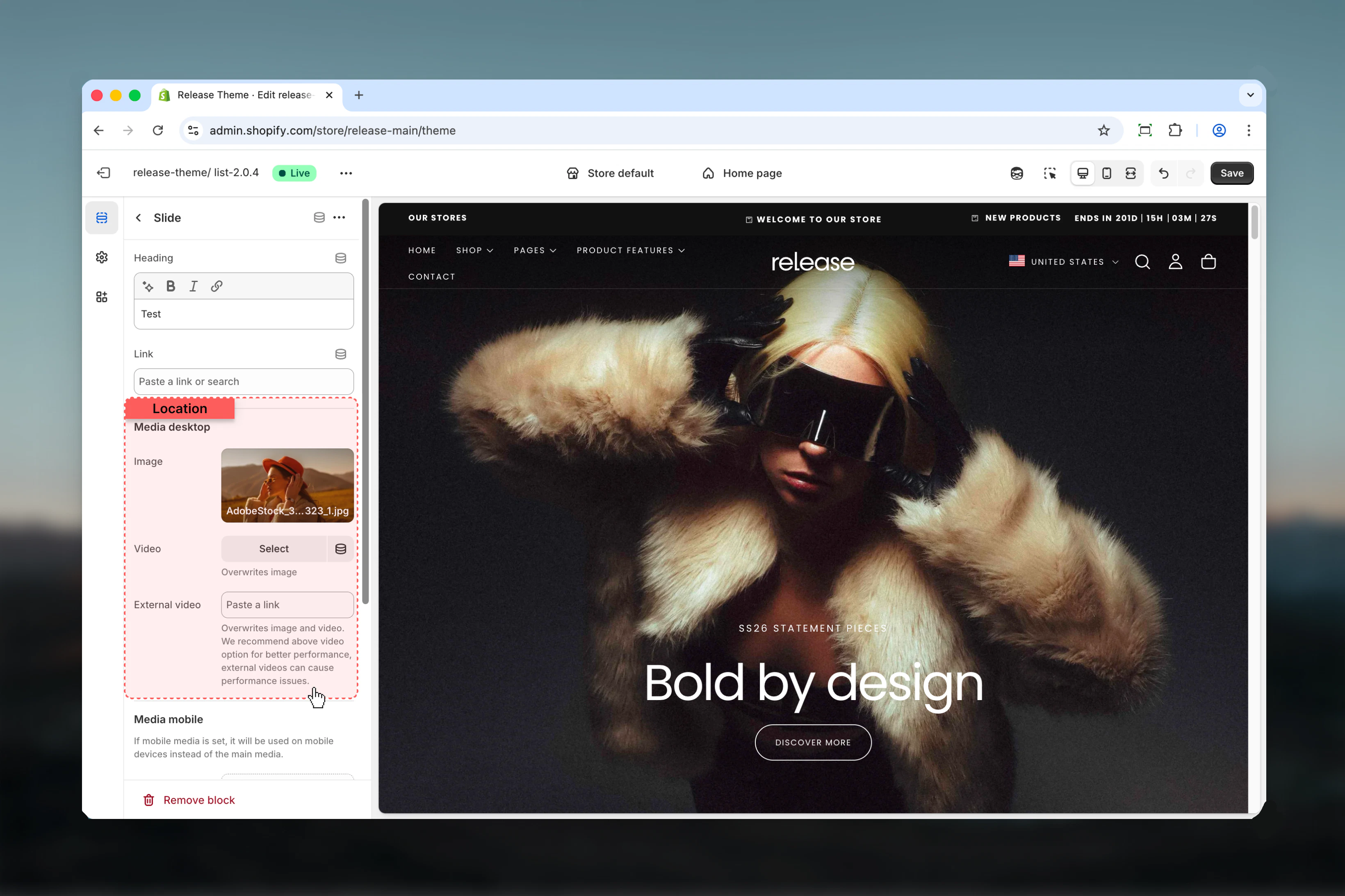
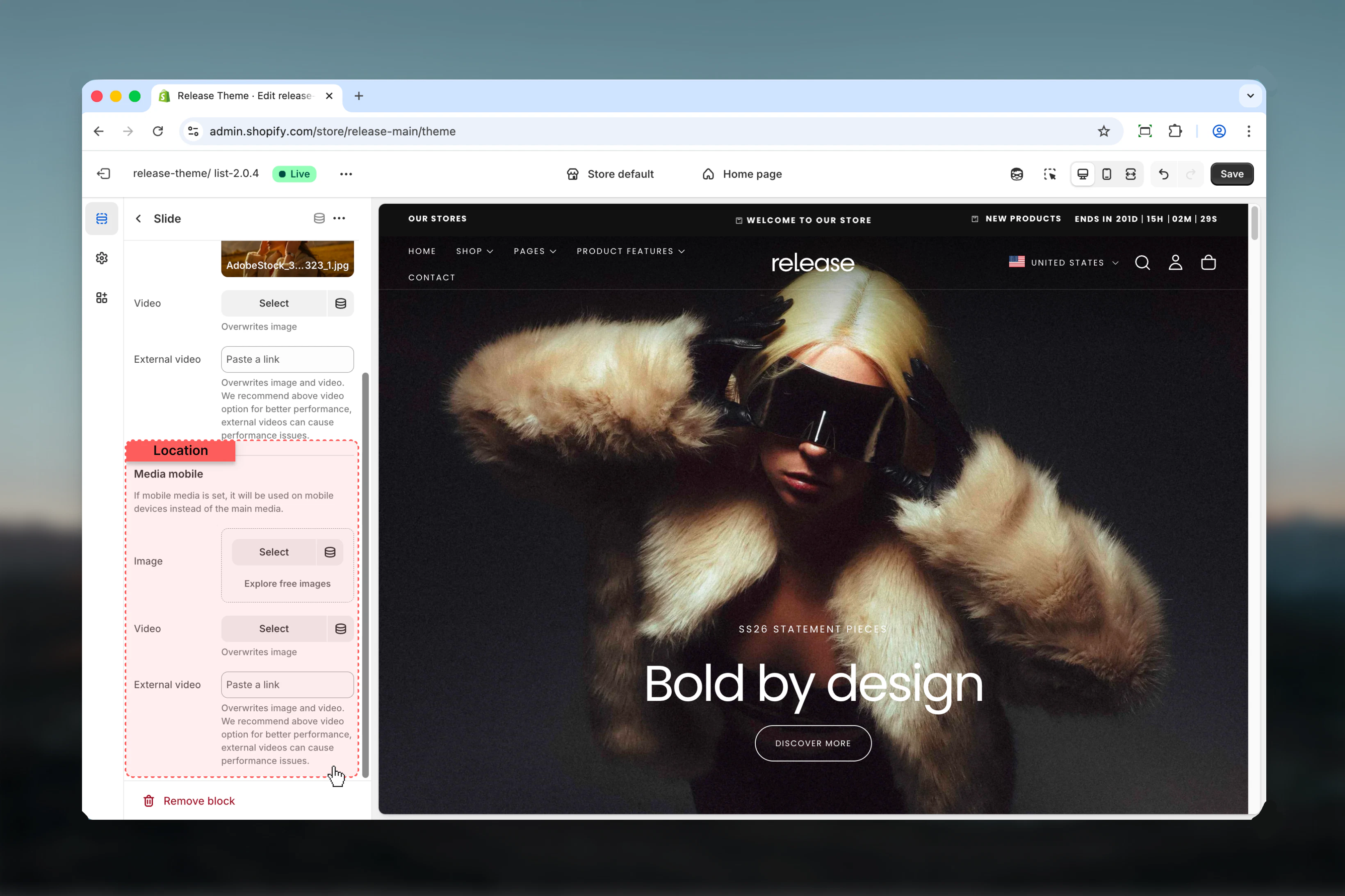
Slide settings
Slide settings control individual interactive slides. Each slide represents a single interactive state of the banner.The first slide in the list is automatically active on page load.
- Heading & link
- Desktop media
- Mobile media
Best practices
- Keep headings short and scannable (2-5 words maximum) for quick comprehension
- Use consistent image or video styles across slides to maintain visual coherence
- Limit slides to 3–4 for better usability and to avoid overwhelming users
- Avoid external videos unless absolutely necessary due to performance impact
- Ensure sufficient contrast between headings and media for readability
- Test hover interactions on desktop to ensure smooth transitions
- Use high-quality media that maintains clarity at full width
- Consider load time when using videos for multiple slides
- Make sure headings clearly communicate the destination or value proposition
Common use cases
- Campaign landing headers - Showcase multiple campaigns with interactive exploration
- Collection highlights - Feature different product collections with visual appeal
- Editorial storytelling banners - Tell brand stories through interactive narratives
- Brand positioning sections - Highlight key brand values or pillars
- Seasonal or promotional hero areas - Display time-sensitive offers with engaging visuals
Related guides
Common Settings
Learn about common settings shared across sections