What this section controls
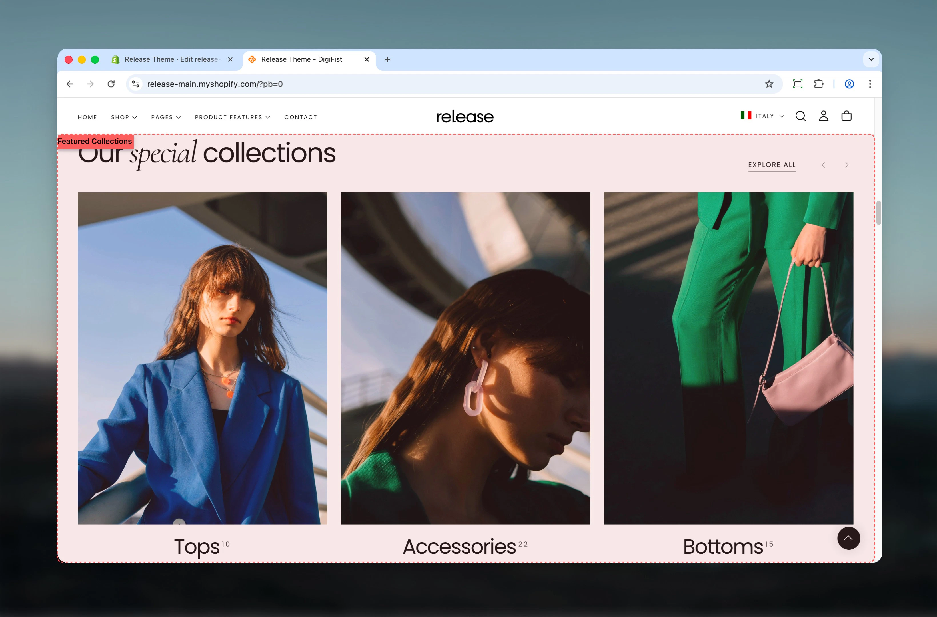
This section controls collection showcase displays with the following capabilities:- Multiple collection card layouts and styles
- Carousel behavior with customizable slides per view
- Flexible heading and button positioning
- Collection, product, or text-based card types
- Desktop and mobile-specific slideshow controls
How the Featured Collections works
The Featured Collections uses a block-based system:- Displays selected collections as cards
- Supports carousel behavior for better space usage
- Card appearance and content vary based on layout and card type
- Collections are added as individual slides using blocks
Getting started
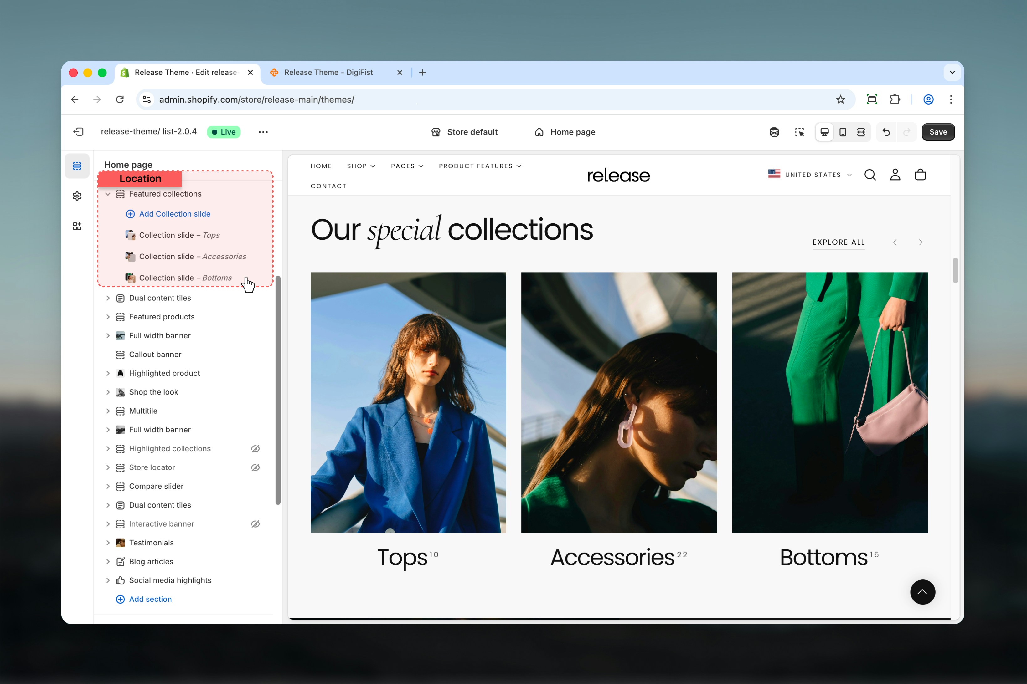
Section settings
Section settings control layout, heading content, spacing, and slideshow behavior.- Layout & content
- Collection card settings
- Slideshow settings
Layout
Determines the positioning of:- Header content
- Action button
- Navigation arrows
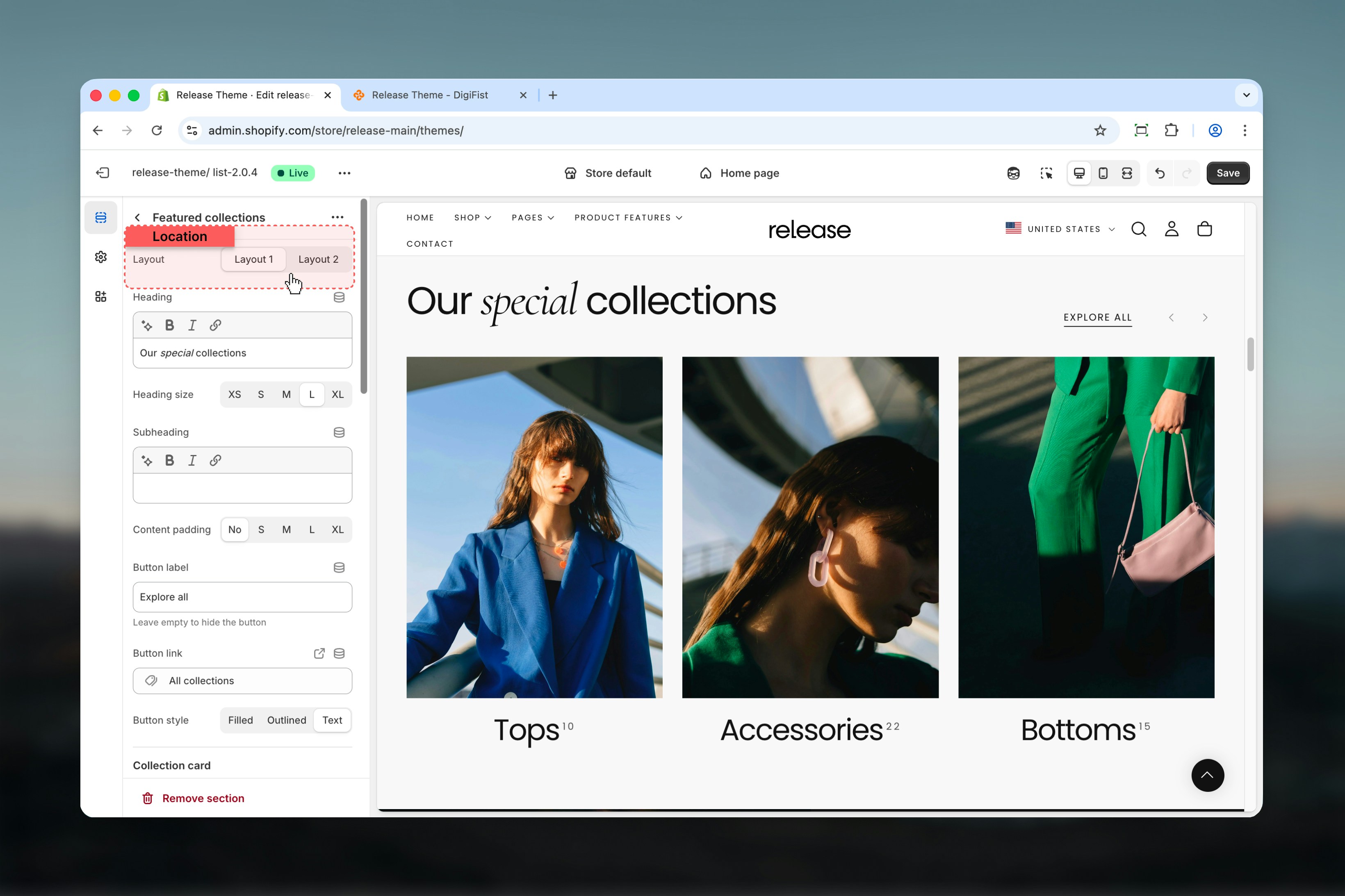
Heading
Main section heading.- Supports bold, italic, underline, and links
Heading size
Controls the size of the heading text.Available options: S, M, L, XLSubheading
Secondary text displayed below the heading.- Supports bold, italic, underline, and links
Content padding
Adds spacing around the content area of the section.Available options: No, S, M, L, XLButton label
Defines the action button text.Leave empty to hide the button.
Button link
URL used for the section button.Button style
Controls the visual appearance of the button.Available options: Filled, Outlined, Text
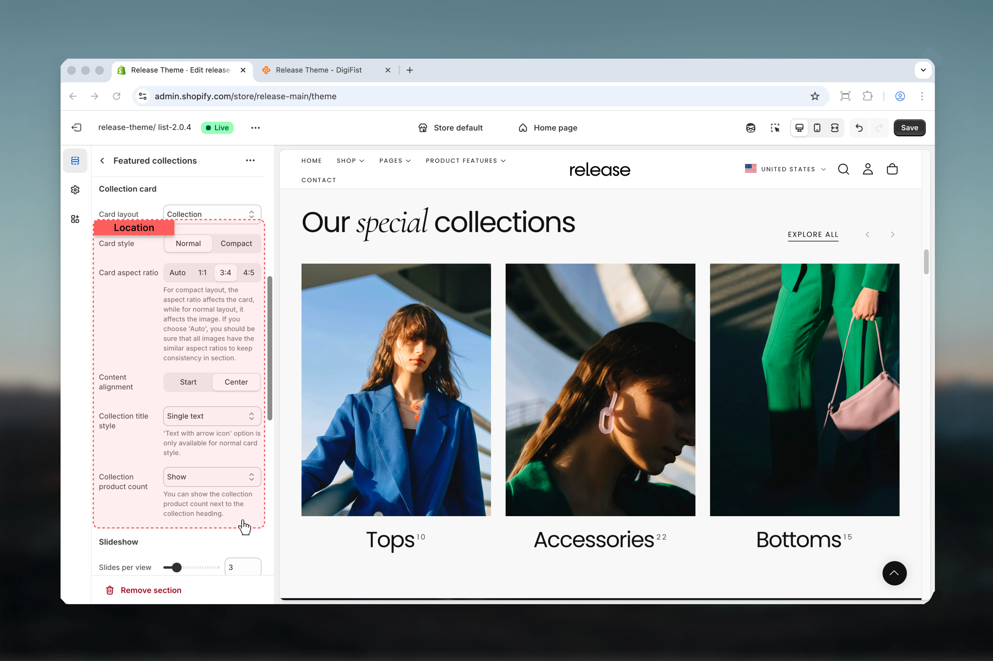
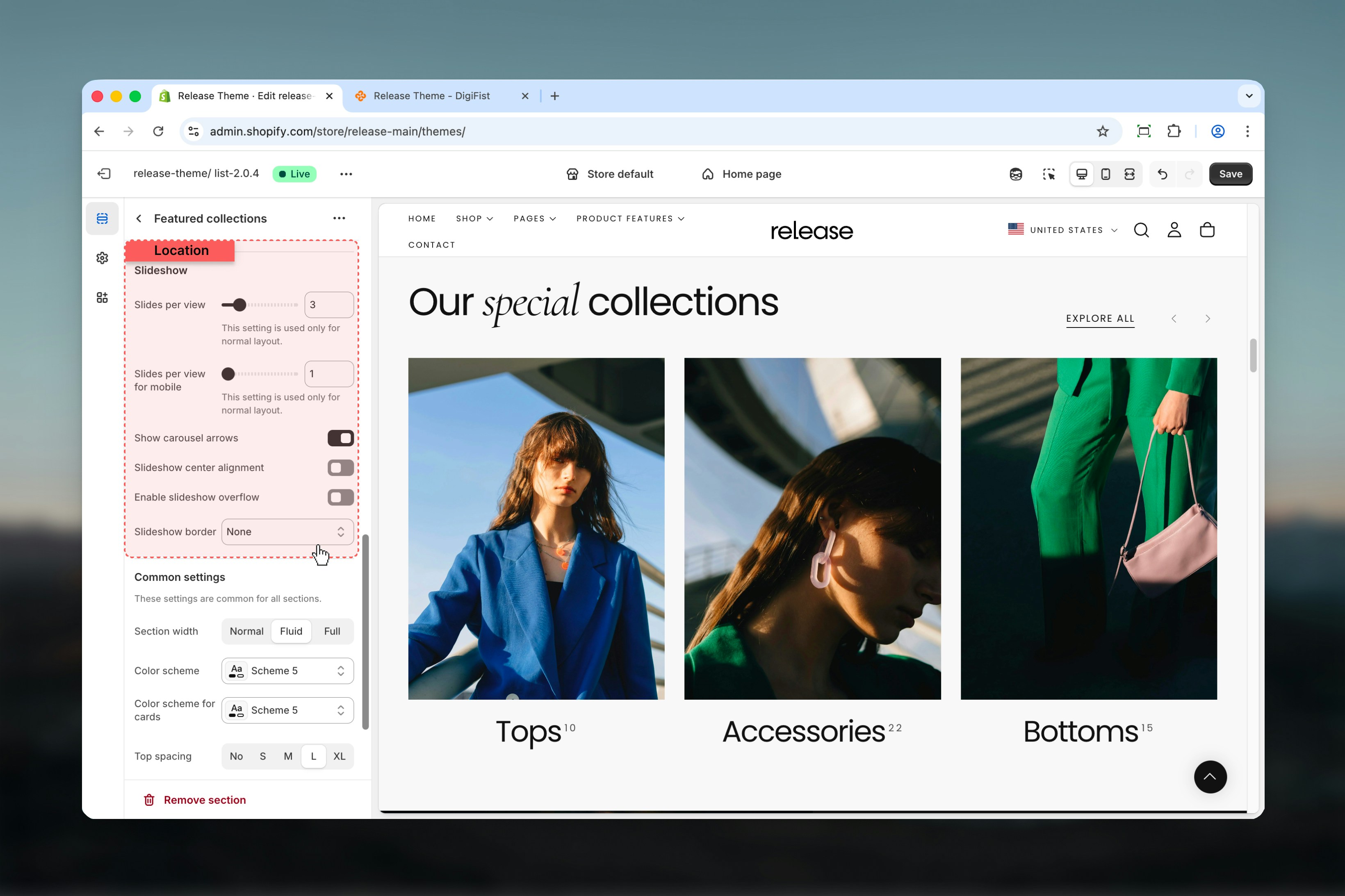
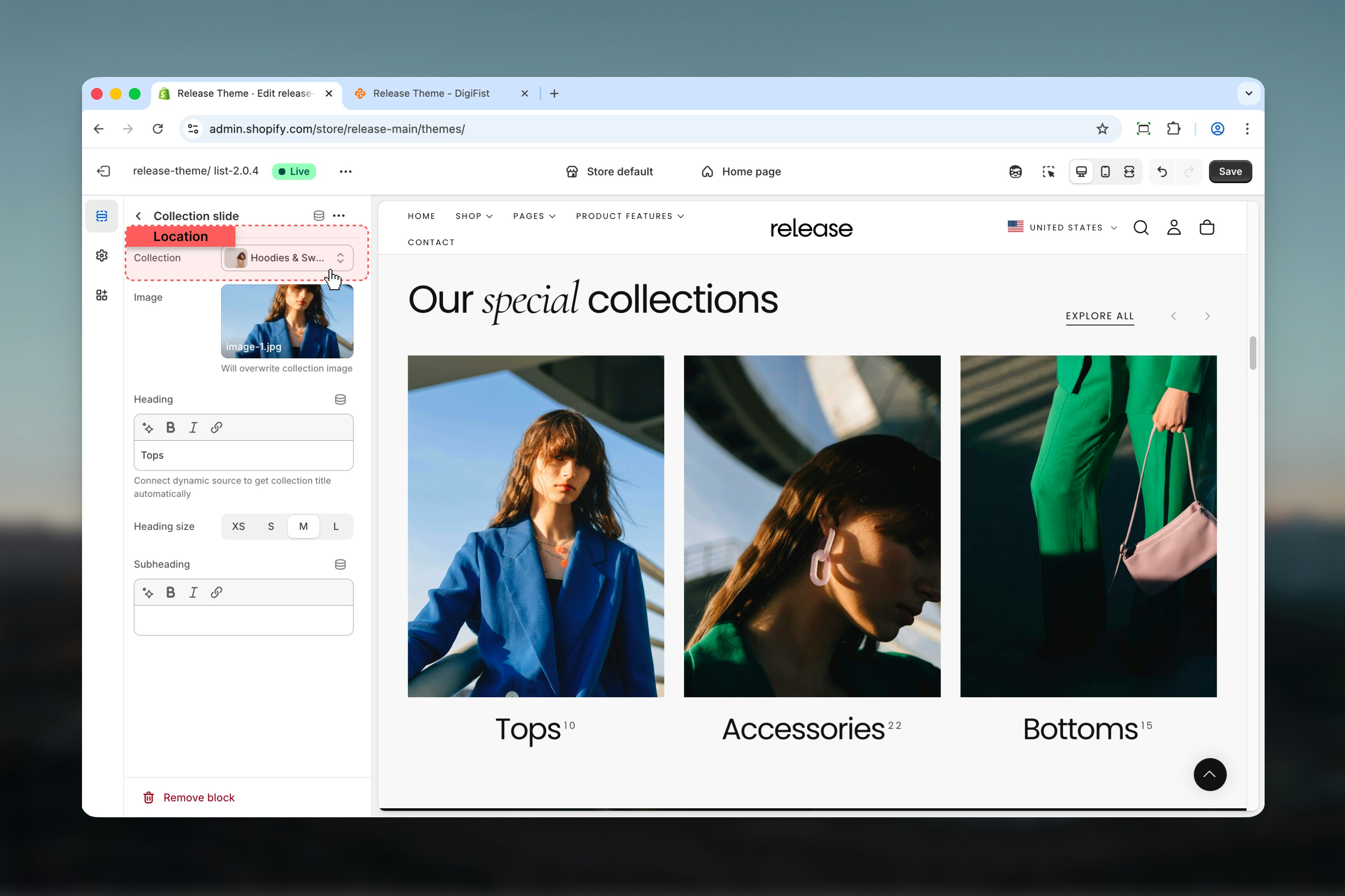
Block settings
Block settings control individual collection slides. Each block represents a single collection card.- Collection
- Image & content
Best practices
- Use Normal card style for image-heavy collections to showcase visual content
- Use Compact style for dense layouts with multiple collections to maximize space
- Keep aspect ratios consistent when using Auto to maintain visual harmony
- Limit slide count to 6-8 for better mobile usability and faster loading
- Enable overflow for a modern, editorial look that hints at more content
- Use consistent collection images across all cards for professional appearance
- Consider card layout based on content type (Collection for images, Product for actual products, Text for category navigation)
- Test slideshow navigation on mobile devices to ensure smooth interaction
Related guides
Common Settings
Learn about common settings shared across sections