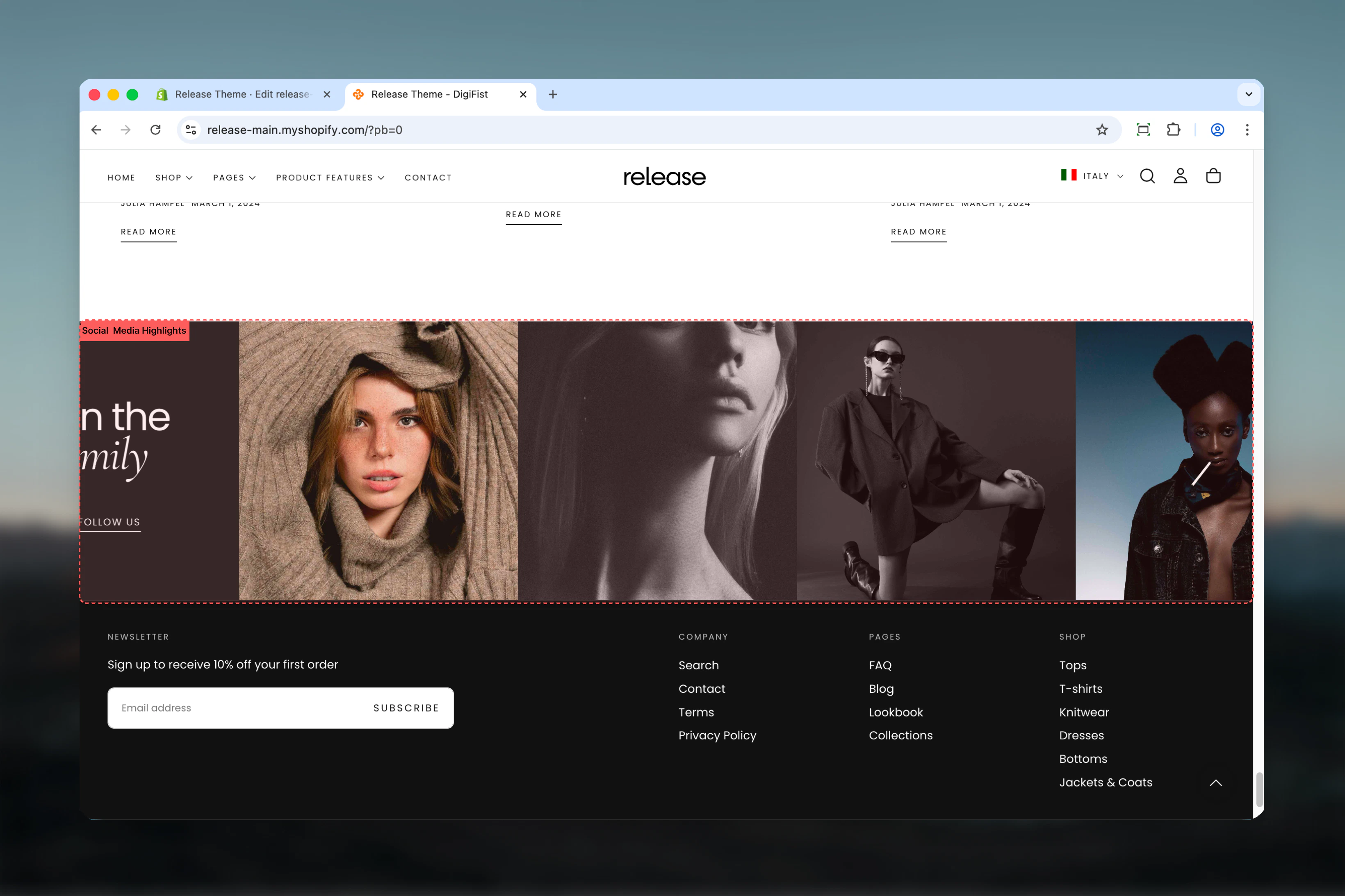
What this section controls
- Grid or stacked layout options
- Customizable content card with heading, subheading, and button
- Media blocks with images, videos, or external videos
- Adjustable media aspect ratios
- Multiple color schemes
- Desktop and mobile column control
Getting started
Section settings
- Layout
- Content
- Settings
Layout
Controls section layout style.Options:- Simple: Standard grid layout
- Stacked: Stacked layout
Remove desktop spacing
Removes spacing between items on desktop.Default: FalseVisible only when layout is “Simple”Media aspect ratio
Controls aspect ratio of media blocks.Options: Auto, 1:1, 4:3, 3:4, 3:2, 2:3, 5:4, 4:5, 16:9, 9:16Default: 1:1Block settings
Media Block
- Image: Image picker
- Video: Video file
- External video: YouTube/Vimeo URL
- Show video controls: Enable/disable controls
Video and external video override image when set.
Best practices
- Use 1:1 (square) aspect ratio for Instagram-style feeds
- Keep desktop columns at 3-4 for optimal display
- Enable mobile columns of 2 for better mobile experience
- Remove desktop spacing for seamless grid appearance
- Use brand-instagram icon for Instagram follow buttons
- Match content card color scheme with brand colors
Common use cases
- Instagram feed display
- Social proof showcase
- User-generated content galleries
- Community highlights
- Influencer collaborations
- Brand storytelling through social posts
Related guides
Common Settings
Learn about common settings shared across sections