What this section controls
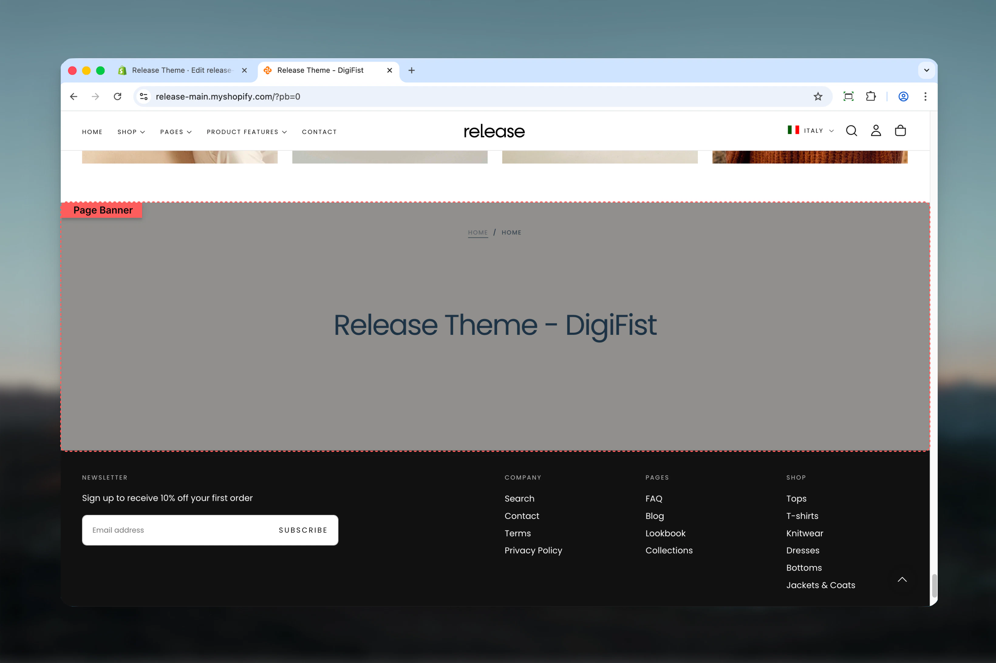
This section controls page hero banners with the following capabilities:- Automatic page title display with custom overrides
- Optional default or custom descriptions
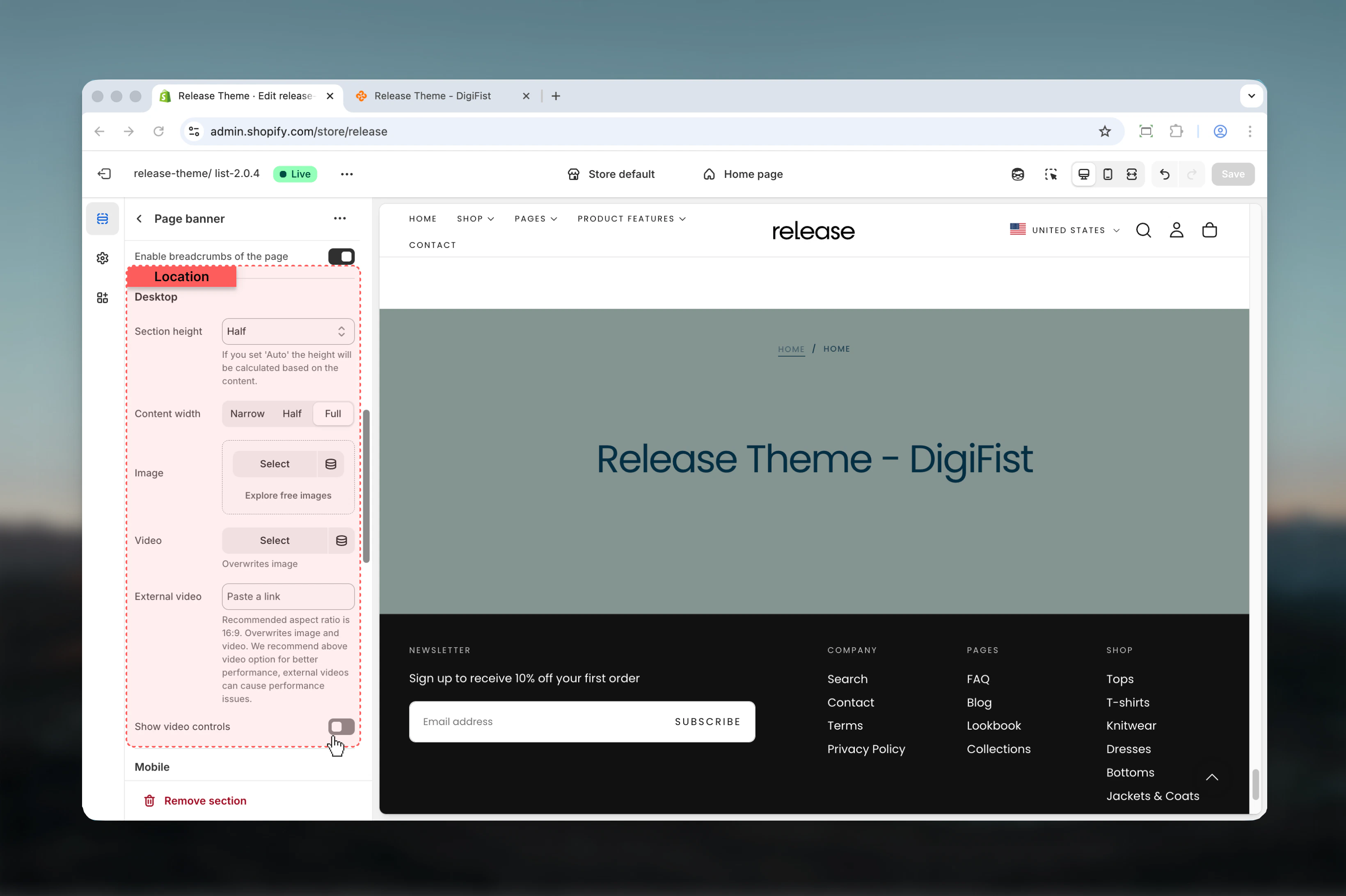
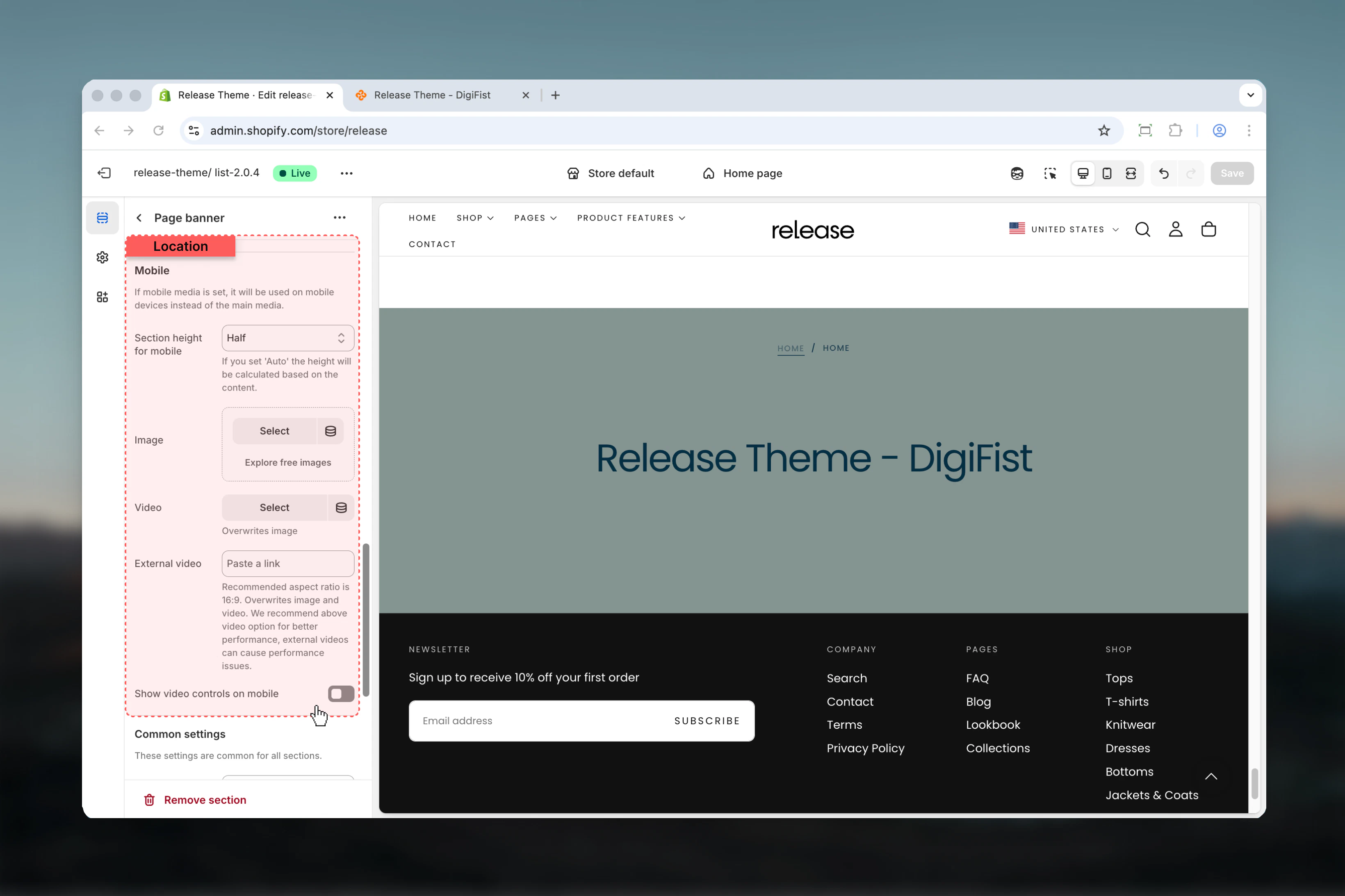
- Desktop and mobile-specific media (images, videos)
- Transparent header support
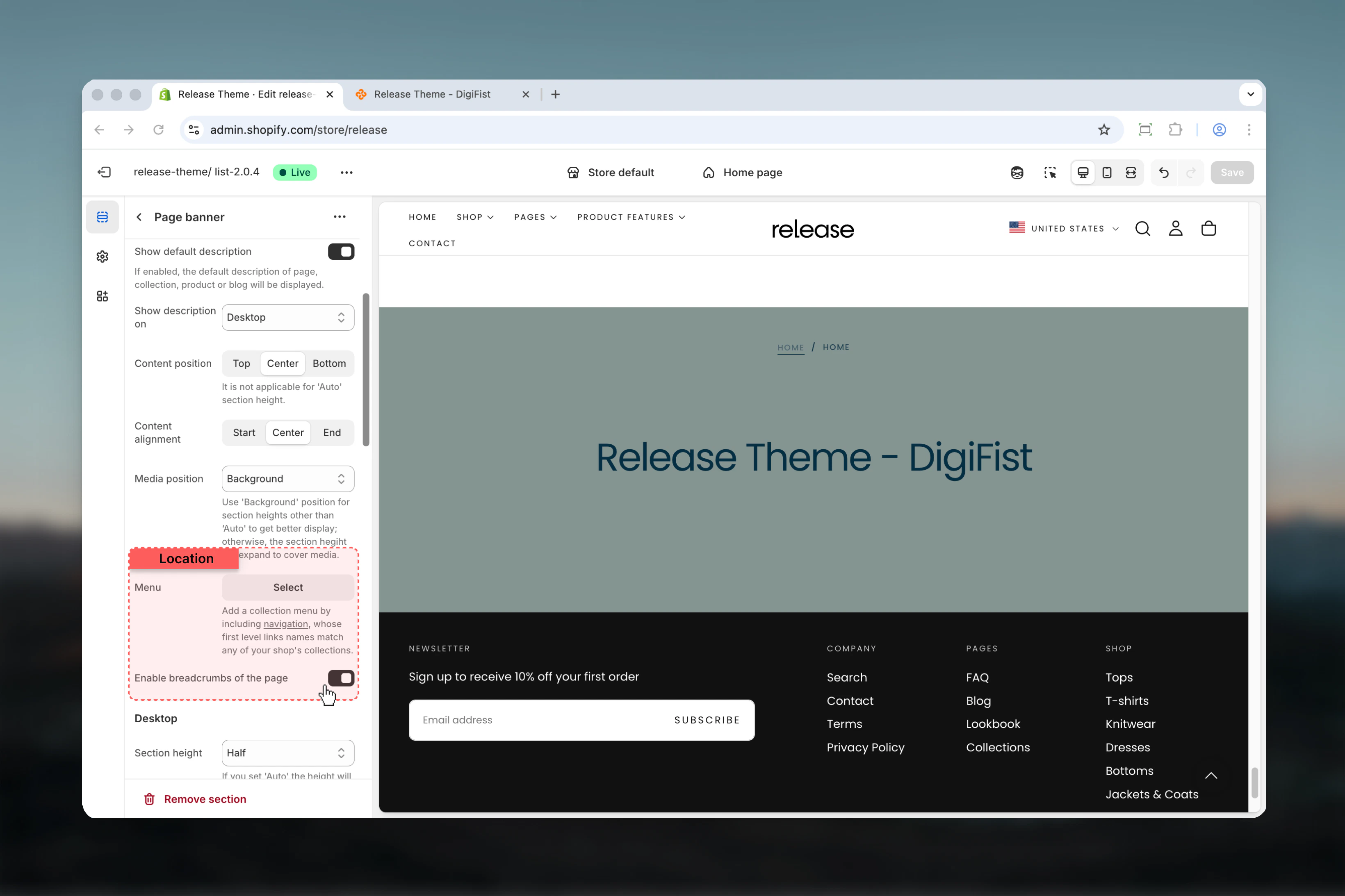
- Breadcrumb navigation
- Collection menu navigation
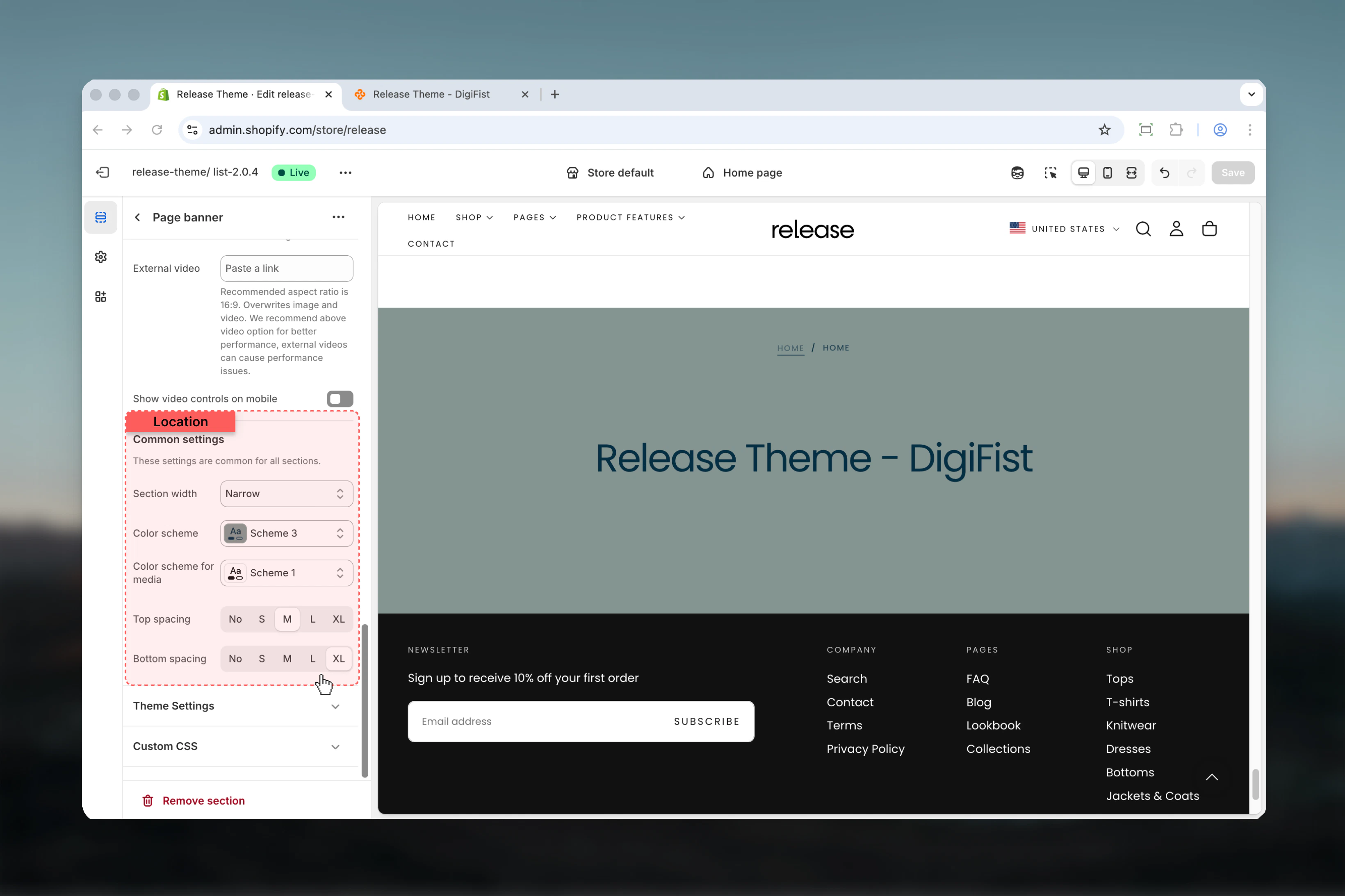
- Flexible content positioning and sizing
- Multiple section height options
How the Page Banner section works
The Page Banner adapts to your template type:- Automatically displays page/collection/product/blog title
- Shows default description or custom text
- Supports background, top, or bottom media positioning
- Can enable transparent header over background media
- Displays breadcrumbs when enabled in theme settings
- Shows collection navigation menu if configured
Getting started
Navigate to target template
Go to the page, collection, product, or blog template you want to customize.
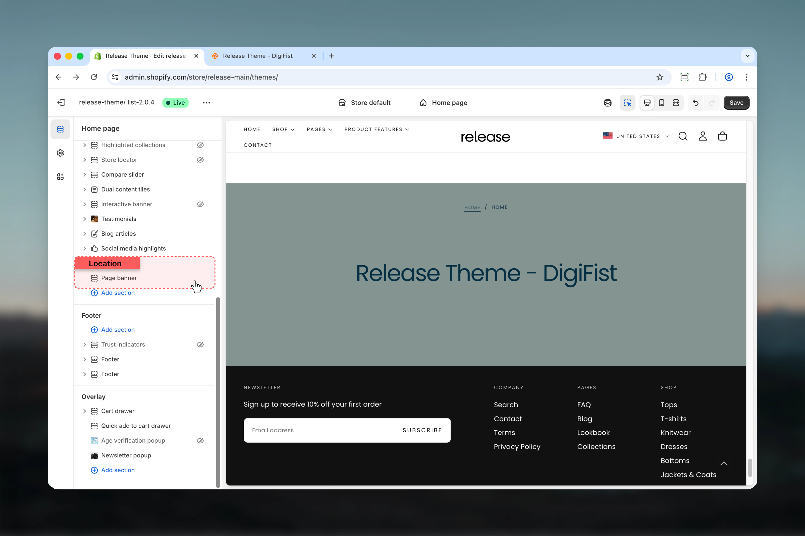
Section settings
- Content
- Layout
- Desktop
- Mobile
- Settings
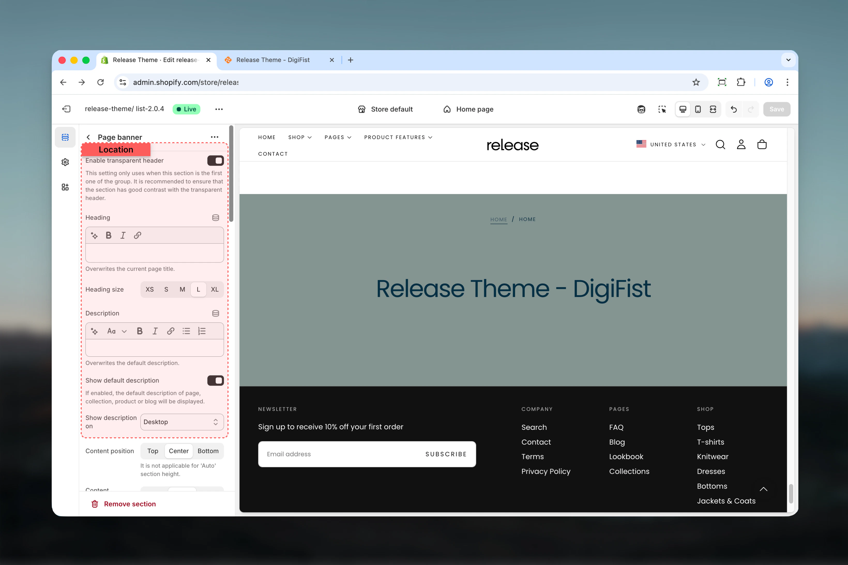
Enable transparent header
Makes header transparent over banner when using background media.Default: TrueHeading
Custom heading text that overwrites the default page title.- Inline rich text supported
- Leave empty to use default page title
Heading size
Controls the size of heading text.Available options: XS, S, M, L, XLDefault: LDescription
Custom description text.- Rich text supported
- Overwrites default description when set
Show default description
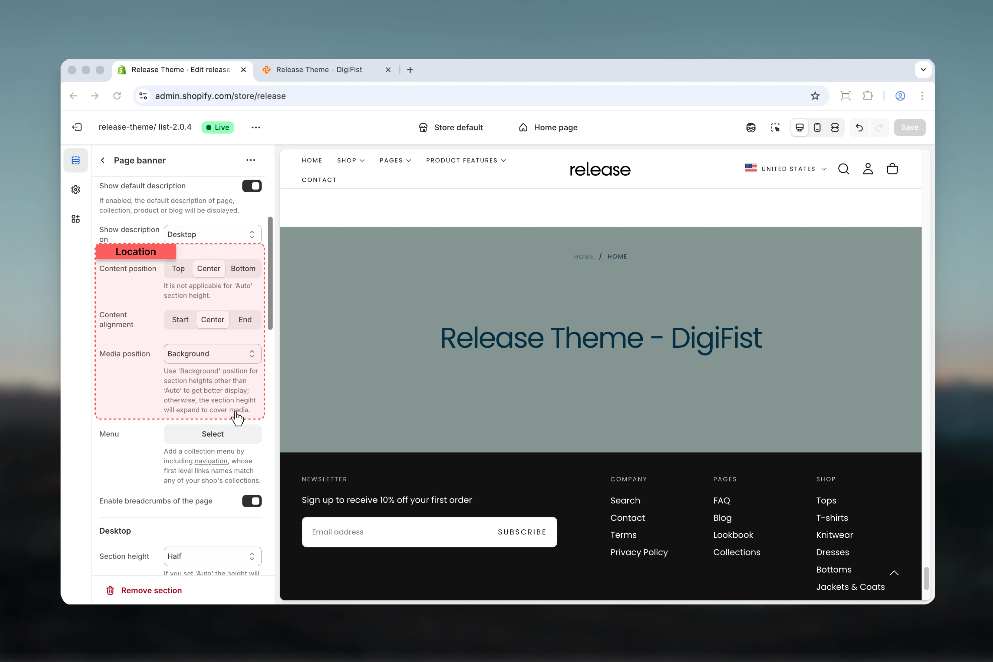
Displays the default description from the current template (page/collection/product/blog).Default: TrueShow on description
Controls where description is visible.Available options:- Desktop: Desktop only
- Mobile: Mobile only
- Both: All devices
Best practices
- Use background media position with fixed heights (50svh, 100svh) for consistent, impactful banners
- Enable transparent header on first section only for seamless design
- Keep content width at 50-100% for optimal readability across devices
- Use auto height with top/bottom media positions to avoid awkward spacing
- Provide mobile-specific media for better performance and appropriate framing
- Test transparent header with different color schemes to ensure text visibility
- Avoid external videos when possible due to performance concerns; use uploaded videos instead
- Enable breadcrumbs for improved navigation and SEO
- Match collection menu link names exactly with collection handles
- Use center alignment for hero-style banners, start alignment for content-heavy pages
Common use cases
- Homepage hero - Full-height banner with transparent header
- Collection pages - Medium-height banner with collection title and description
- Product category pages - Branded banners with category information
- Blog index pages - Editorial-style headers with featured images
- About/contact pages - Custom branded headers with company imagery
- Landing pages - Campaign-specific banners with conversion-focused messaging
- Store information - Location or brand story headers
Related guides
Common Settings
Learn about common settings shared across sections