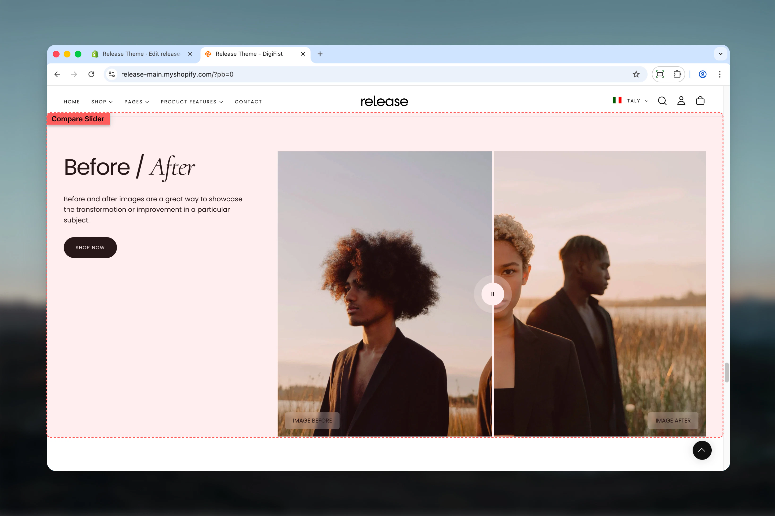
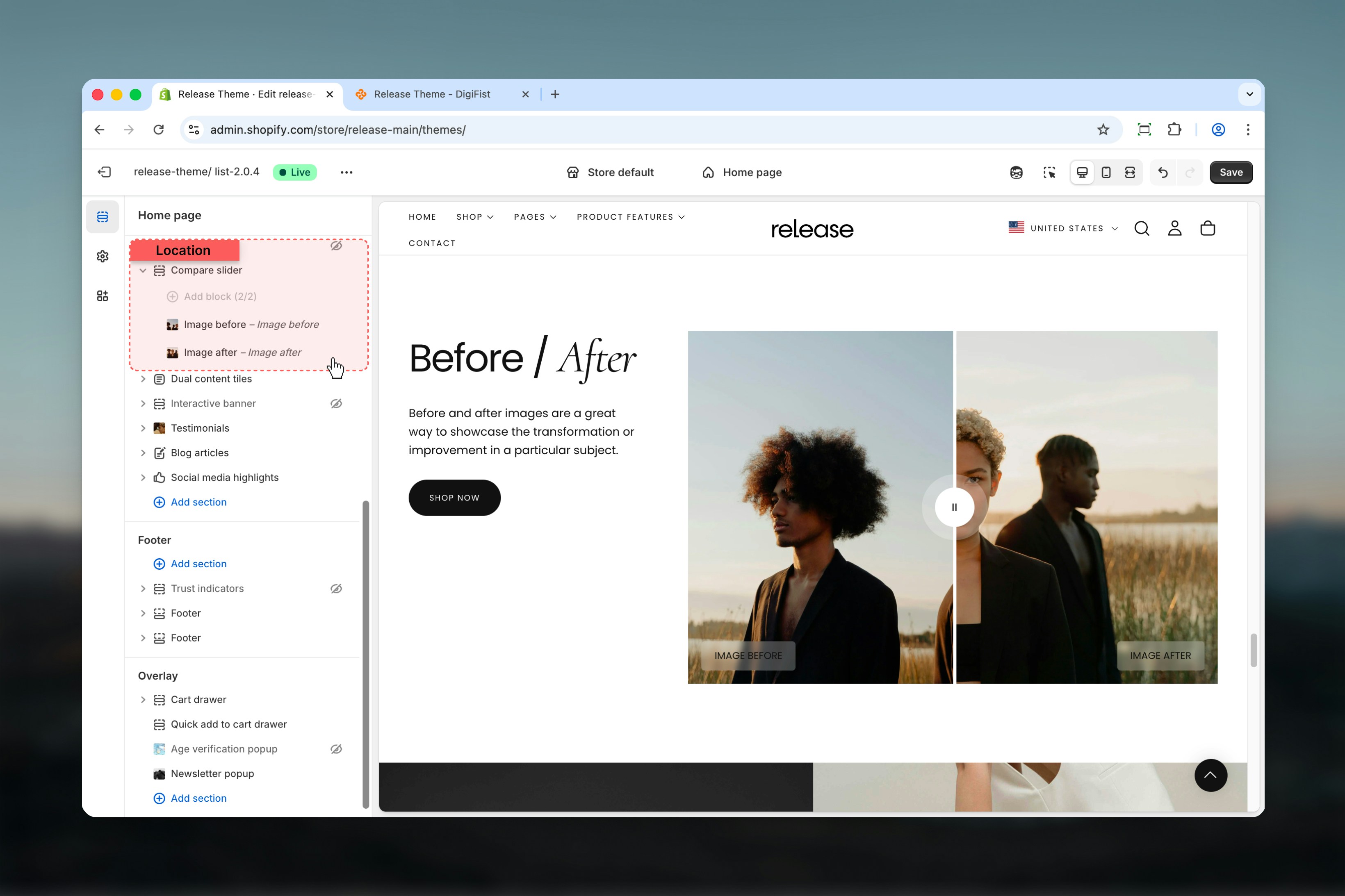
What this section controls
This section controls interactive image comparison with the following capabilities:- Side-by-side image comparison with draggable slider
- Before and after image blocks
- Customizable labels and color schemes
- Full or constrained width layouts
- Multiple aspect ratio options
How the Compare Slider works
The Compare Slider uses a block-based system:- Displays two images stacked horizontally
- Users can drag the slider to compare images
- Supports up to two image blocks (Before / After)
- Works best with images that share the same dimensions and perspective
Getting started
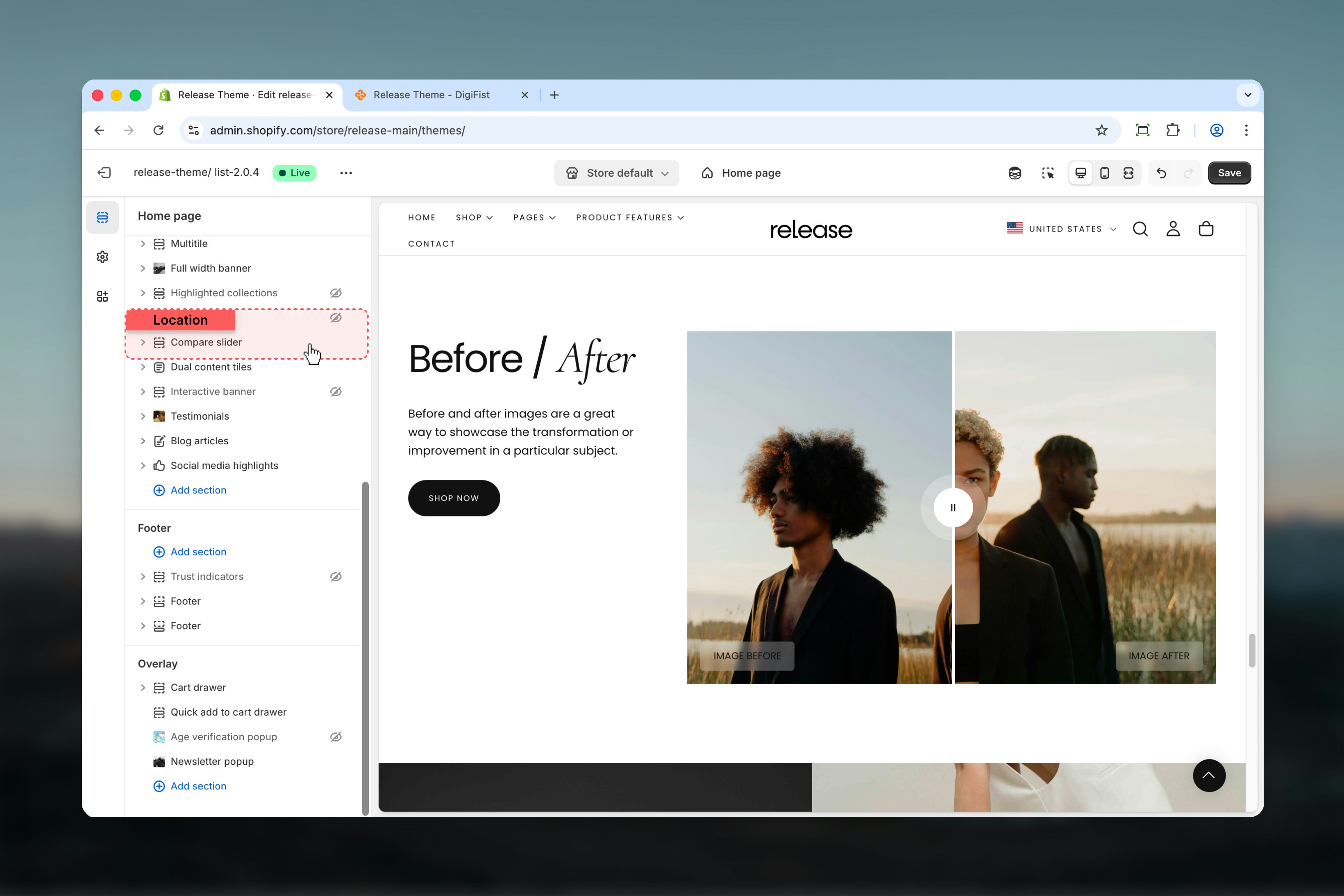
Section settings
Section settings control layout, text content, button behavior, and image proportions.- Layout & content
- Media settings
Section layout
Controls the overall width of the section.Available options:- Full: Section spans the full width of the page
- Shrink: Section is constrained to the content width
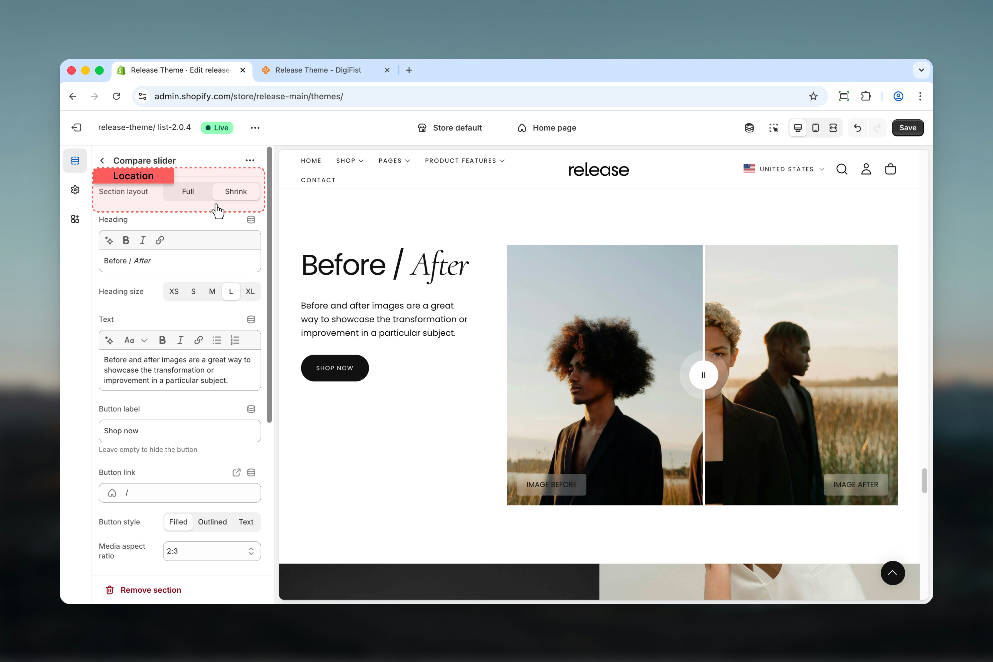
Heading
Main title of the section.- Supports bold, italic, underline, and links
Heading size
Controls the size of the heading text.Available options: S, M, L, XLText
Additional descriptive content displayed under the heading.- Rich text support (paragraphs, formatting, links)
Button label
Defines the section action button text.Leave empty to hide the button.
Button link
URL for the action button.Button style
Controls the appearance of the button.Available options: Filled, Outlined, Text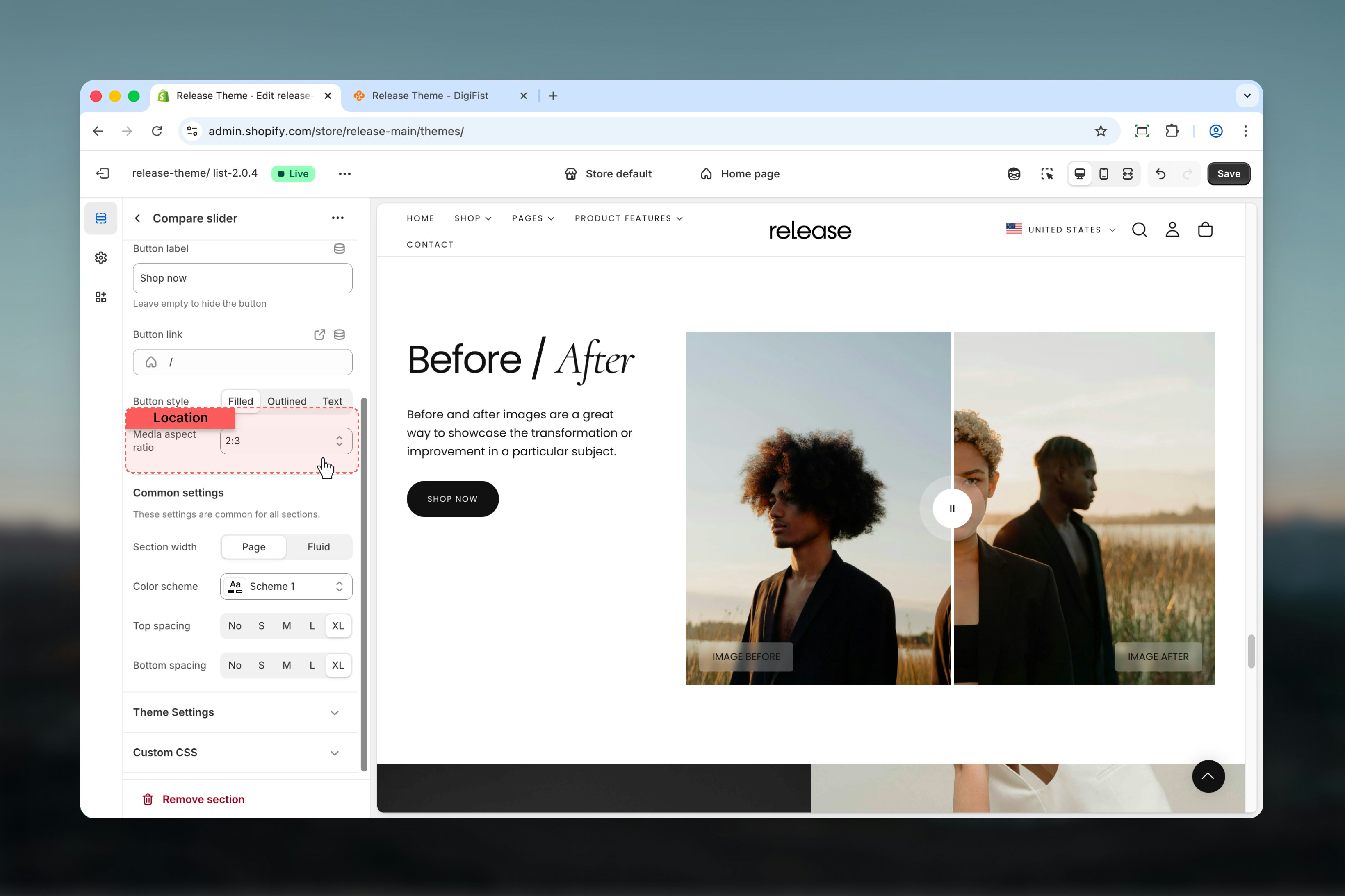
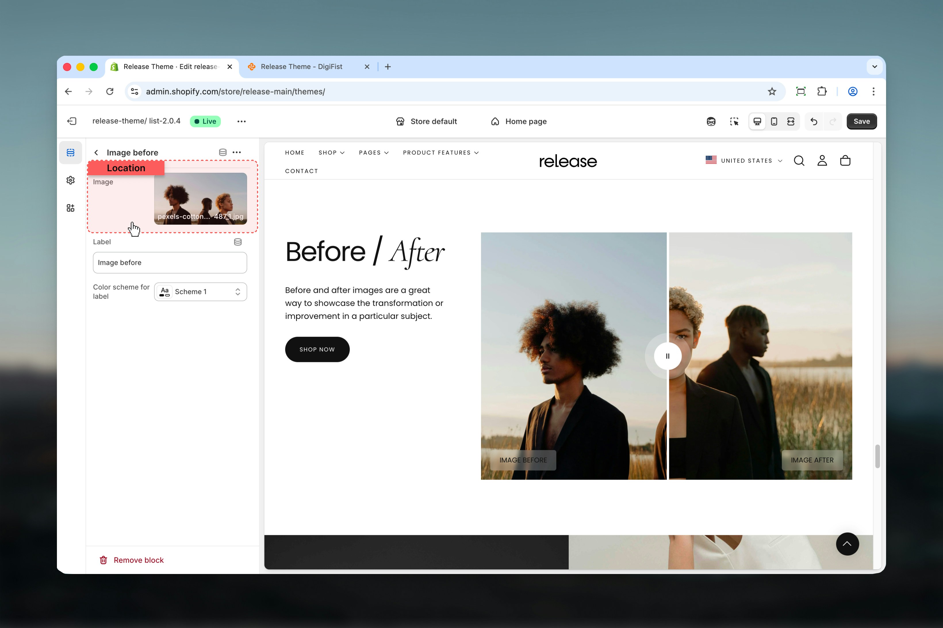
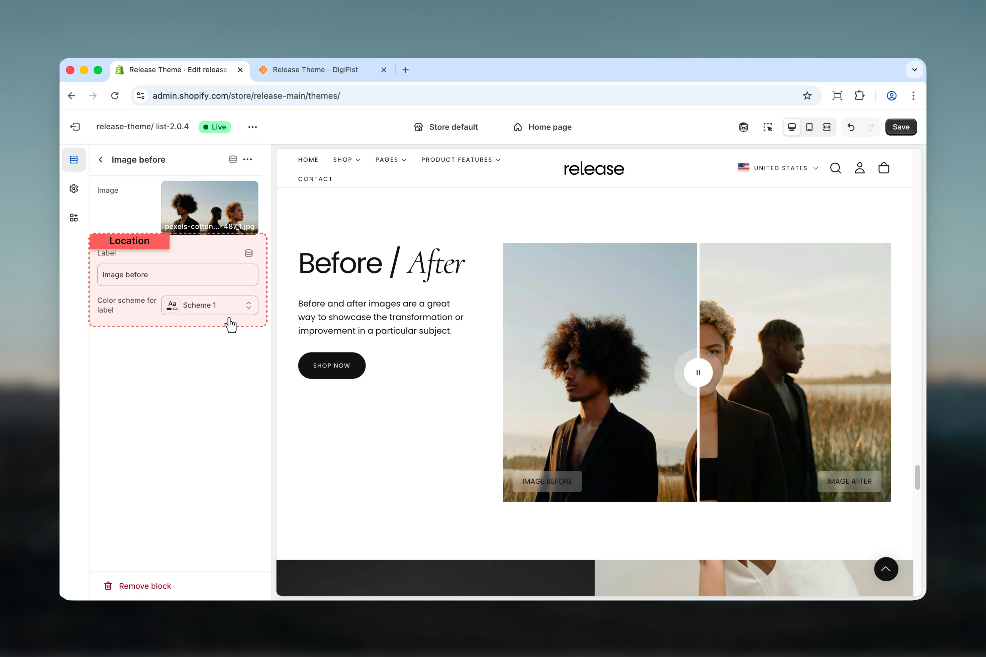
Block settings
Block settings control individual image blocks. The Compare Slider supports a maximum of two blocks.Available block types
- Image before
- Image after
- Image
- Label
Best practices
- Always use exactly two blocks (Before & After) for proper functionality
- Keep images aligned and visually consistent with matching dimensions and framing
- Avoid heavy text inside images to maintain focus on the comparison
- Use concise labels for clarity (single words like “Before” and “After”)
- Choose aspect ratios that match your media orientation (portrait vs square)
- Ensure both images have similar lighting and perspective for accurate comparison
- Test the slider interaction on mobile devices to ensure smooth dragging
- Use high-quality images that maintain clarity when scaled
Common use cases
- Before / after product results - Show product effectiveness (skincare, cleaning products)
- Image retouching comparisons - Demonstrate editing or enhancement services
- Design transformations - Showcase interior design, renovation, or styling changes
- Feature highlights - Compare product features or different versions
Related guides
Common Settings
Learn about common settings shared across sections