What this section controls
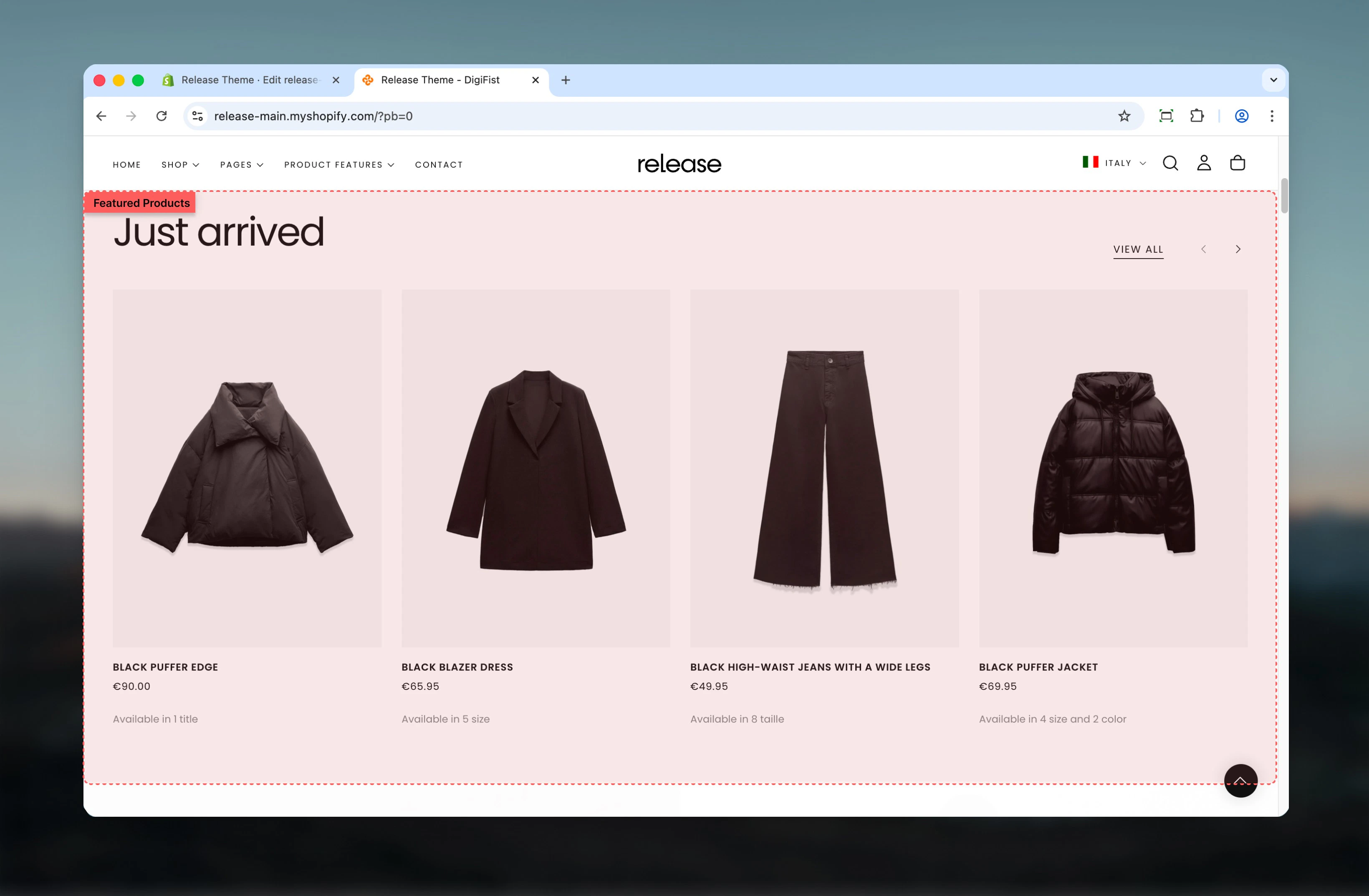
This section controls product showcase displays with the following capabilities:- Multiple layout options for heading and button positioning
- Product carousel with slideshow controls
- Tab-based navigation for multiple product groups
- Manual or collection-based product selection
- Optional promotional card at the end of product list
How the Featured Products section works
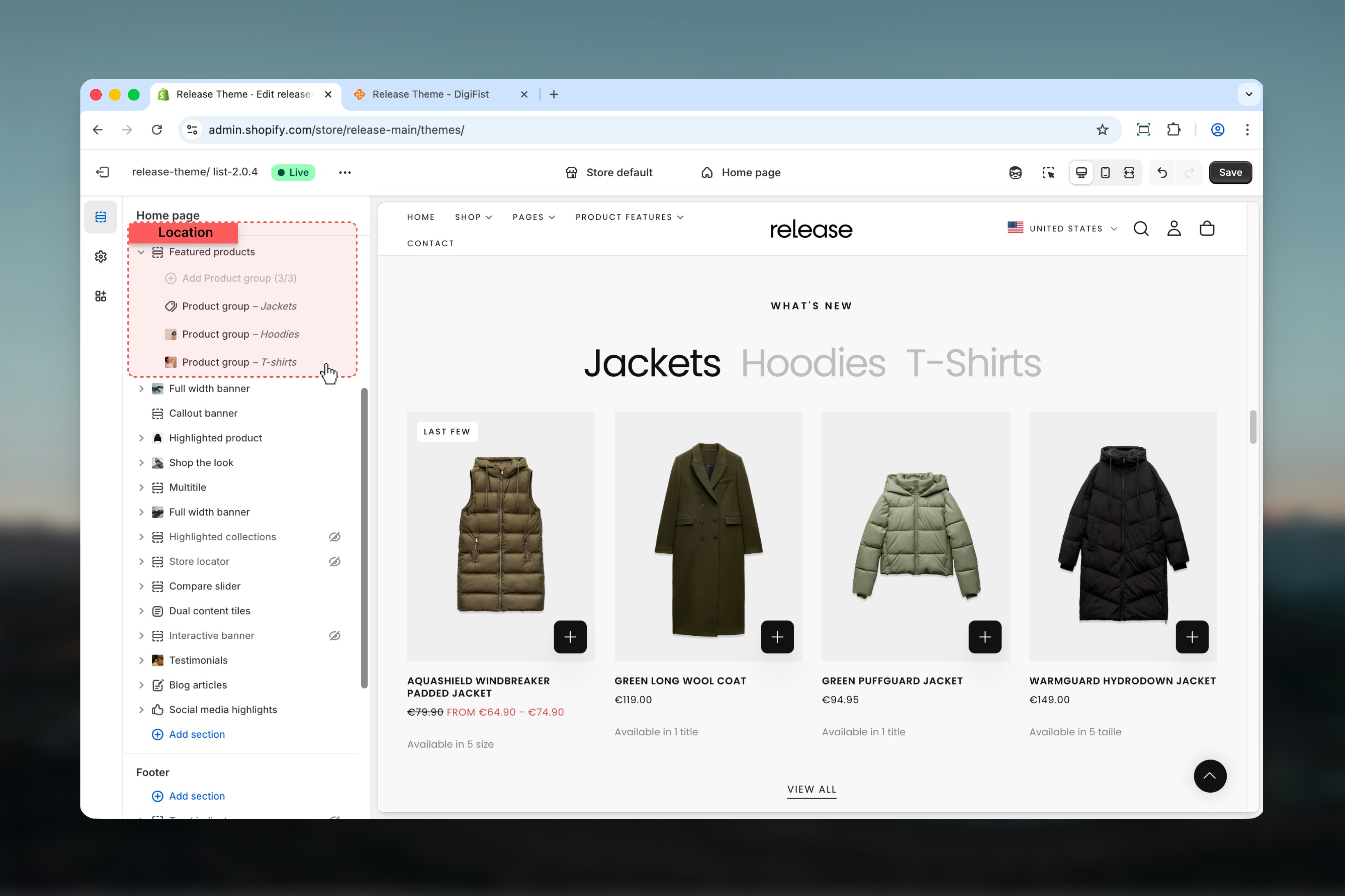
The Featured Products section uses a block-based system:- Products are displayed using Product group blocks
- Each Product group represents one collection or product set
- If multiple Product group blocks are added, the section can display tabs
- Products can be sourced from collections, manual selections, or vendors
Getting started
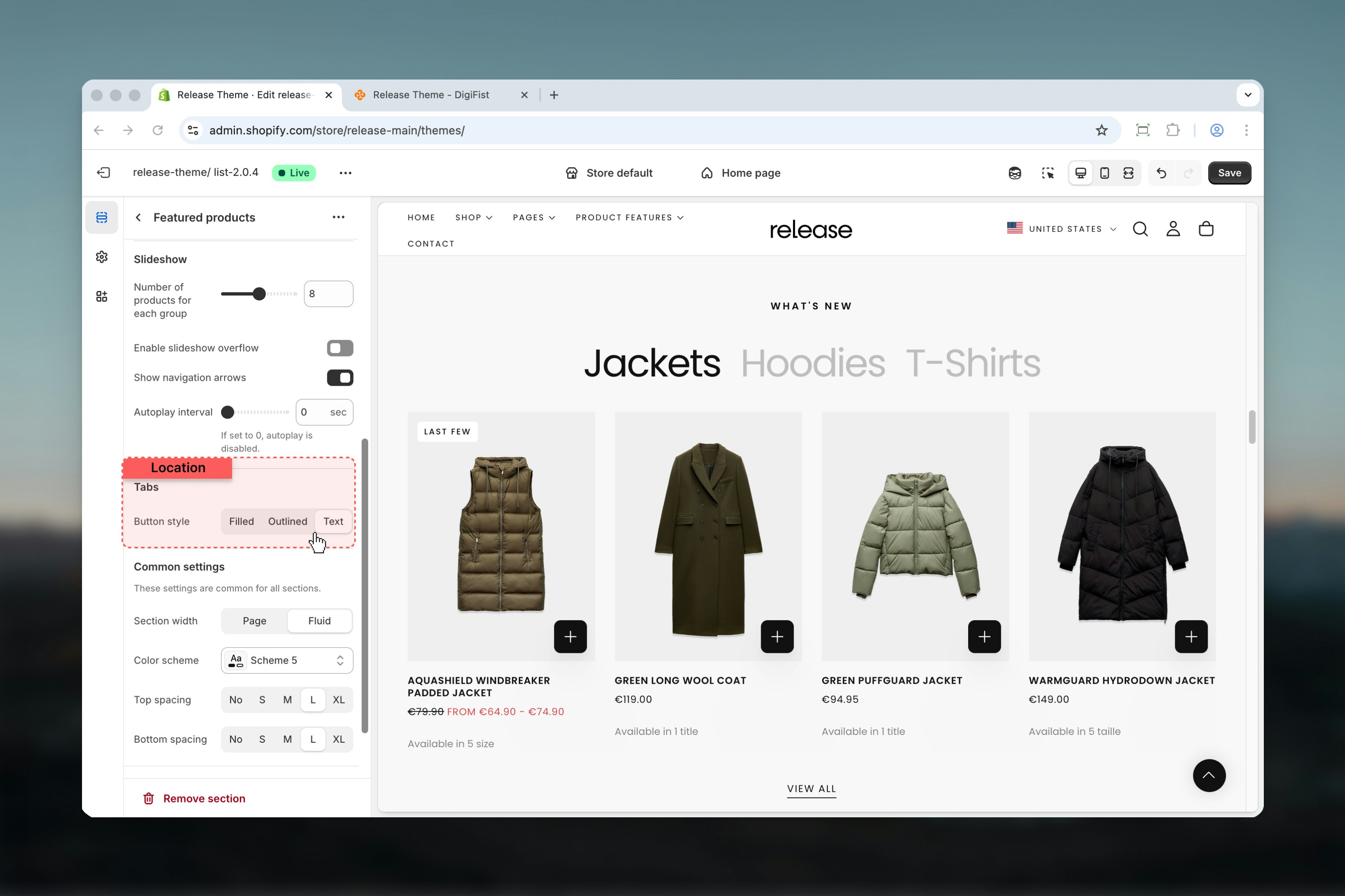
Section settings
Section settings control the overall structure, layout, and behavior of the Featured Products section.- Featured products
- Slideshow
- Tabs
Layout
Controls the positioning of the heading and action button. Product card layouts remain the same across layouts.Available options:- Layout 1: Heading aligned to the start, button aligned to the end
- Layout 2: Heading centered, button displayed centered at the bottom of the section

Heading
Main section heading.- Supports rich text
- Allows bold, italic, underline, and links
Heading size
Controls the visual size of the heading.Available options: S, M, L, XLSubheading
Secondary text displayed below the heading.- Supports rich text
- Allows bold, italic, underline, and links
Button label
Defines the label of the section-level button.Leave empty to hide the button.
Button link
Destination URL for the section button.Button style
Controls the visual style of the section button.Available options: Filled, Outlined, Text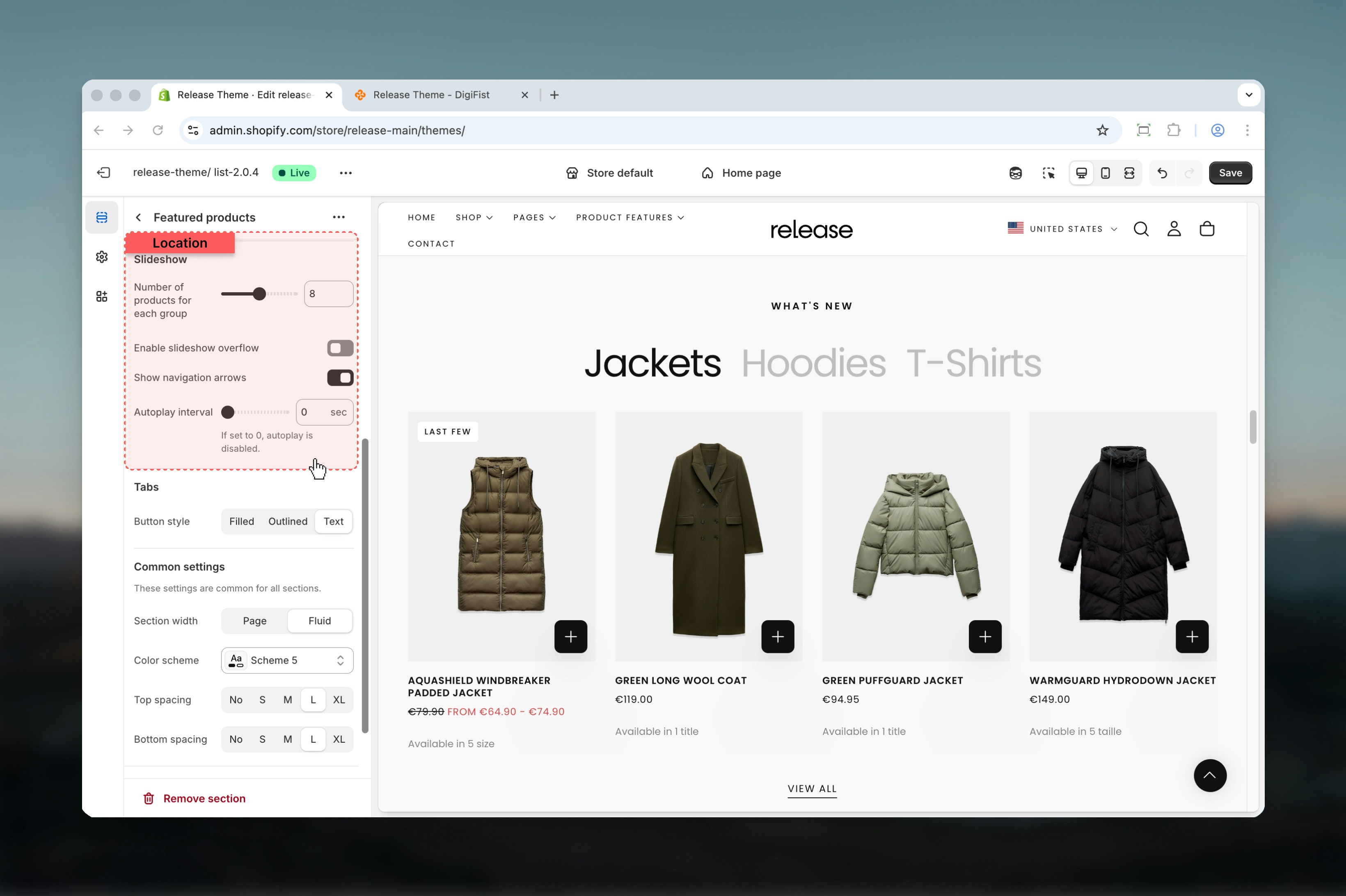
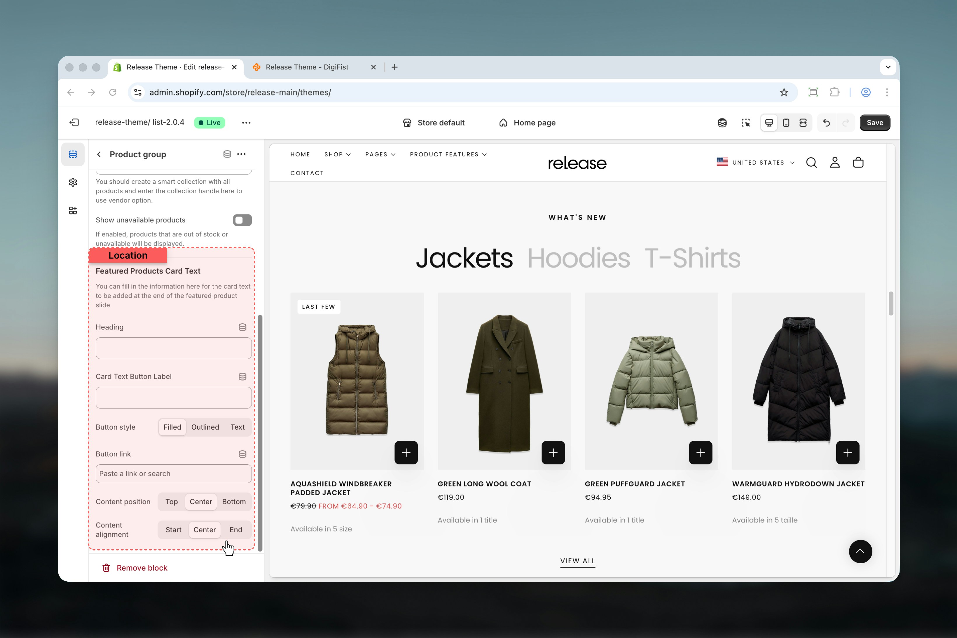
Block settings
Block settings define the product source and configuration for each Product group. Each Product group represents a unique collection or product set.- Product source
- Featured Products Card Text
Title
Defines the tab label when multiple Product groups are used.Plain text only.Collection
Select a Shopify collection.Products
Manually select individual products.Used when no collection is selected.Vendor
Displays products from a specific vendor.- Accepts vendor names as text
- Can be connected via metafields
Collection of products
Used together with the Vendor option.Enter the handle of a smart collection containing all products. This allows vendor-based filtering to work correctly.Show unavailable products
Controls whether out-of-stock or unavailable products are displayed.Options: True / False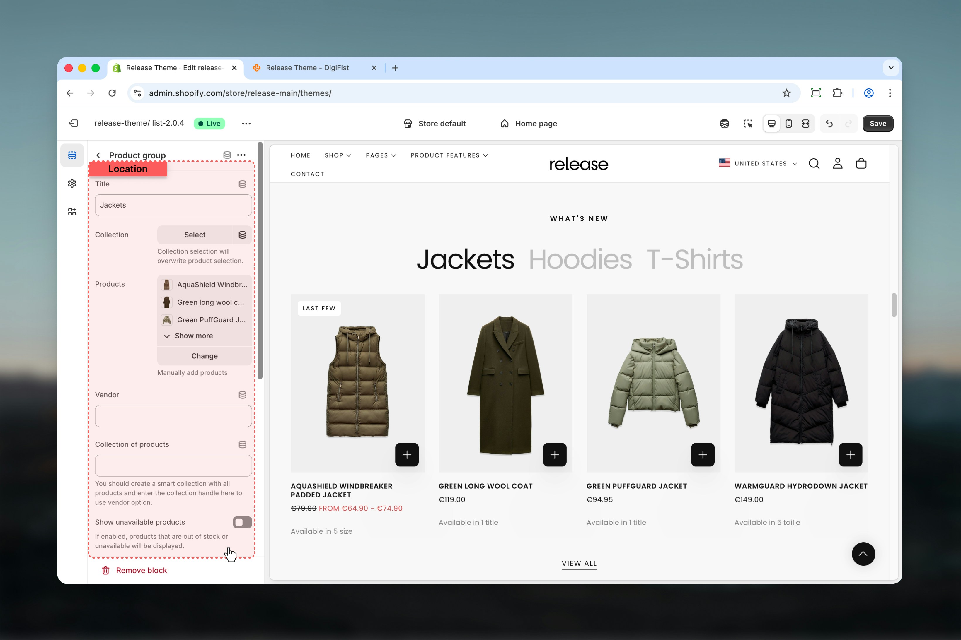
Best practices
- Use collections for easier product management and automatic updates
- Limit the number of tabs to 2-3 to maintain clarity and reduce cognitive load
- Enable slideshow overflow to hint at more products and encourage interaction
- Avoid autoplay for product-heavy sections to allow users to browse at their own pace
- Keep card text concise and action-focused for better conversion rates
- Test different layouts to find what works best for your store’s design
- Ensure product images are high-quality and consistent in dimensions
Related guides
Product cards
Learn about product card configuration and styling options
Theme settings
Understand global theme configuration options